While effective websites can have just a single page or dozens of pages, the vast majority of sites are four to 10 webpages. This number isn’t a coincidence — it represents the most efficient way to organize and present relevant information.
While effective websites can have just a single page or dozens of pages, the vast majority of sites are four to 10 webpages. This number isn't a coincidence — it represents the most efficient way to organize and present relevant information.
Our list of the six most important pages on a website covers the essentials of any basic business-oriented website design. Read on to find out which pages you need, what content to include on each, and how to optimize them for best results.
Why is website structure important for user experience and SEO?
A website with a well-organized structure holds two distinct advantages over its disorganized counterparts. Firstly, organization enhances the user experience (UX), allowing visitors to navigate the site effortlessly between pages to find the information they need quickly.
Secondly, user experience and search engine optimization (SEO) go hand in hand. When a site offers a great user experience (by making navigation seamless, for example), search engines crawl and index it more efficiently, leading to higher placement in search engine rankings and more search visibility, which increases organic traffic.
Since search engines prioritize metrics such as relevance, quality, and usability, a stellar site UX directly enhances SEO.
In the design phase, it’s important to use content mapping to ensure all vital information is both present and intuitively placed. Equally important is structuring page URLs into a logical hierarchy to effectively communicate the site’s architecture to human users and search engines. And when it’s time to launch, create (or autogenerate) a sitemap that captures your website architecture and submit it to Google to expedite the indexing of your site.
What are the essential pages every website should include?
This list of website pages outlines the foundational structure for common smaller websites, like those for freelancers and small businesses. Larger entities — such as major corporations and ecommerce businesses offering a broader range of products, services, or information — require more pages and complex layouts. Regardless of the scale of the project, this list is an excellent starting point for building and organizing a website.
1. Homepage
The homepage must engage visitors immediately. While homepage design varies, the most common components include a hero image, a unique header, and a call to action (CTA) “above the fold” — meaning visitors can see it before scrolling further down. These elements offer a quick insight into what the business or site offers, enticing visitors to explore further.
As visitors scroll below the fold, homepages typically present essential information about the product, service, and company organized under distinct headings. This placement strategy capitalizes on users’ initial interest captured above the fold with appealing images and compelling headers.
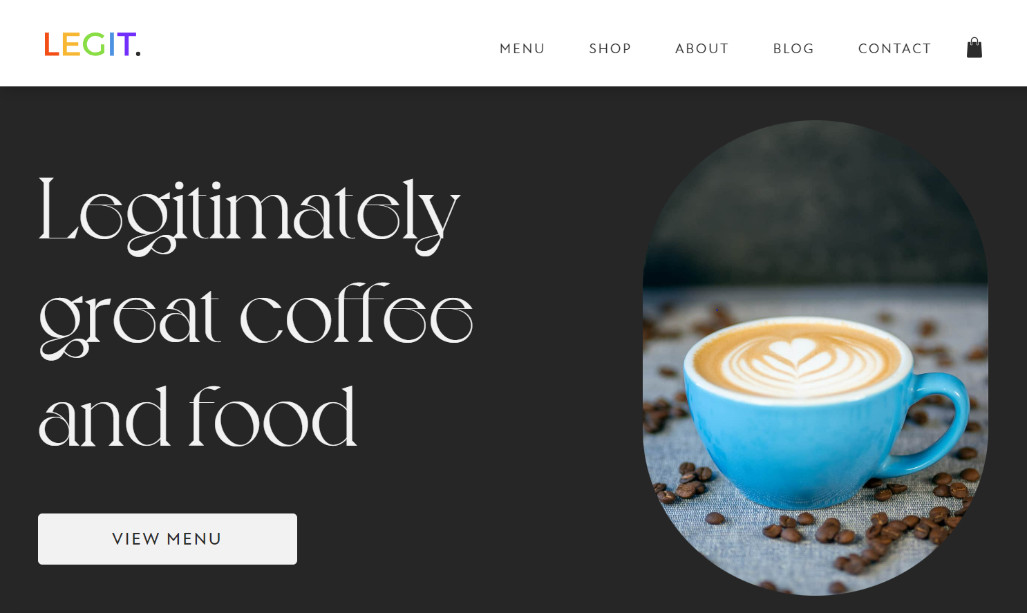
Take Aidan Quigley’s homepage design for LEGIT Coffee Co as an example — a beautiful hero image, a header in the evocative Voyage typeface that reads “Legitimately great coffee and food,” and a gentle CTA to view the menu come together to invite visitors to engage further. More in-depth details are placed farther down the page so the homepage isn't overwhelming at first glance. This approach provides a structured user journey that starts with a captivating hook and gradually offers more information for those who'd like to learn more.
2. Products or services page
The products or services page showcases the business’s offerings by detailing each option and its advantages. If prices are standardized, include them for transparency — that’s a detail visitors often appreciate. When standard pricing isn’t applicable, provide a clear path for users to request a quote.
For ecommerce sites, this page might transform into an online store, complete with search functionality so visitors can quickly find what they’re interested in. If you’re marketing a service, consider laying out a step-by-step description of the process on this page. It'll demystify what you offer, instill confidence in potential customers, and help them understand what to expect. Ultimately, this approach builds trust and makes it easier for visitors to make a decision.
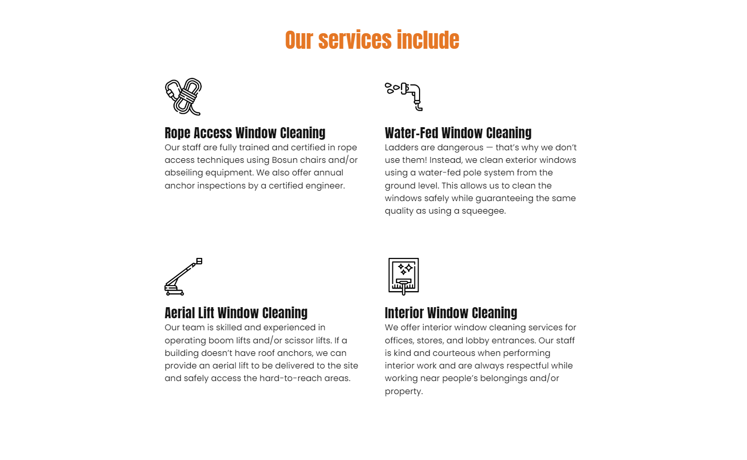
Cathy Matovu’s services page for industrial window cleaners The High Rise Guys sets out the available services clearly, using icons to visually break up the description and help visitors remember the content. The explanations go beyond the basics by offering reassurance about privacy and safety concerns to address any doubts visitors might have in booking the service.
3. About page
The about us page is one of the most frequently visited website pages. It’s important for differentiating the business from competitors, as users often consult this page to understand what sets a business apart. Highlighting aspects that make the business unique — including the team’s background, values, and principles — showcases what qualifies the business in its field or industry.
Always ensure the copy is customer-centric. Instead of adopting a boastful tone, emphasize how the background and expertise of the team or individual ideally position them to address and fulfill the customer’s needs. By doing so, you not only build trust but also demonstrate dedication to solutions-oriented service rather than just self-promotion.
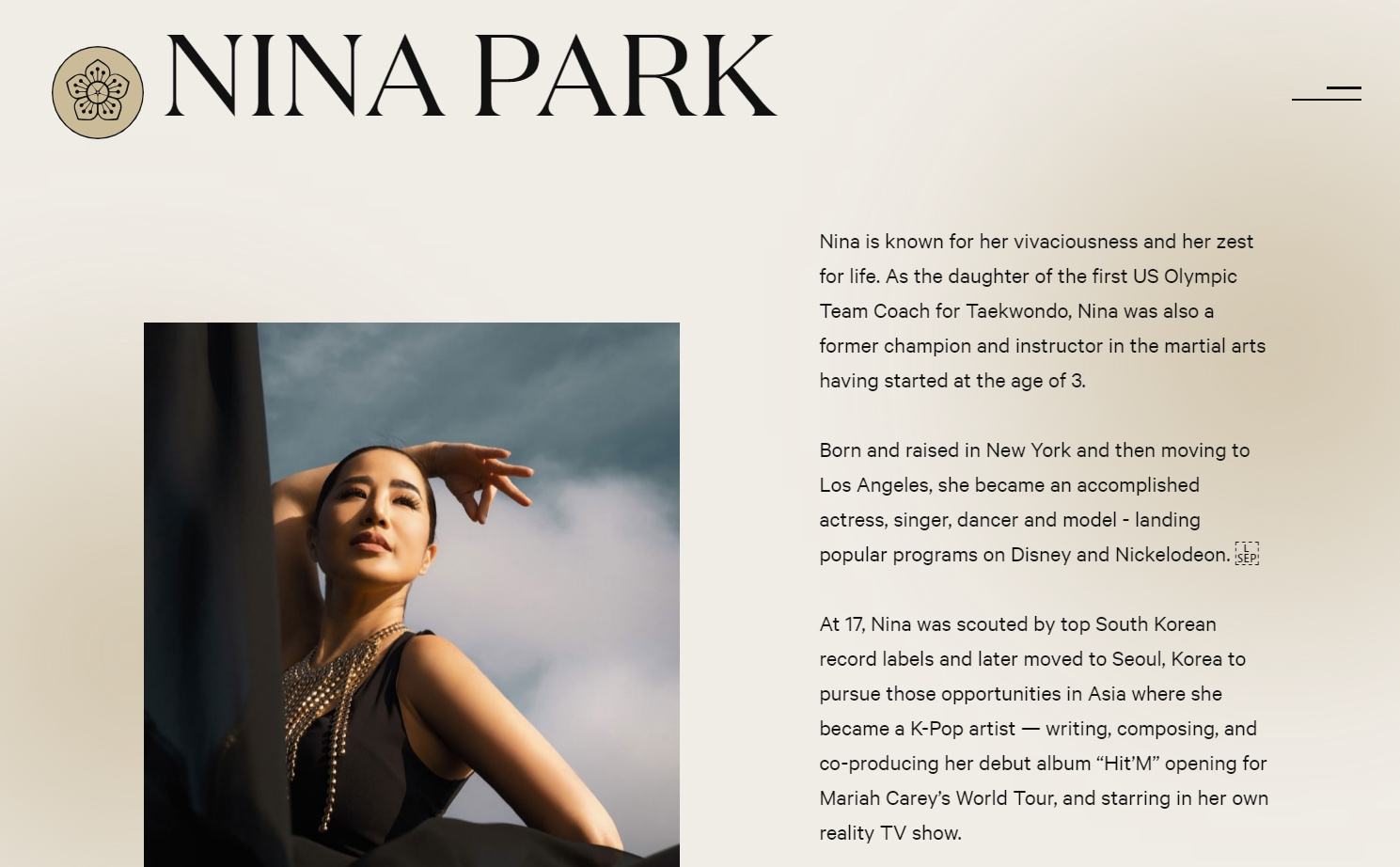
An excellent example is Ocrism Studio’s about page design for Yoga by Nina. The copy sparks curiosity about Nina’s classes and thoughtfully conveys her extraordinary background as a taekwondo champion, actress, K-pop artist, and reality TV star. By explaining what drew Nina to yoga and how her background informs her teaching approach, this about page offers a compelling narrative that connects with potential clients, letting them know why her experience enhances her yoga teaching.


Free ebook: Web design 101
Master the fundamental concepts of web design, including typography, color theory, visual design, and so much more.
4. Contact page
If site visitors are intrigued by the business’s services but find it challenging to reach out, they may opt for a competitor’s site instead. Keeping the contact page accurate and current is paramount to avert this. Offering a variety of contact channels is ideal to cater to different customer preferences.
For effective communication, consider including:
- An email address: Caters to those who value a written record of their correspondence
- A phone number: Useful for those seeking an immediate, direct conversation
- A physical location and/or mailing address, plus business hours: Promotes transparency and aids those interested in visiting in-person or sending mail
- An online contact form: Allows visitors an uncomplicated method to initiate contact directly from the website
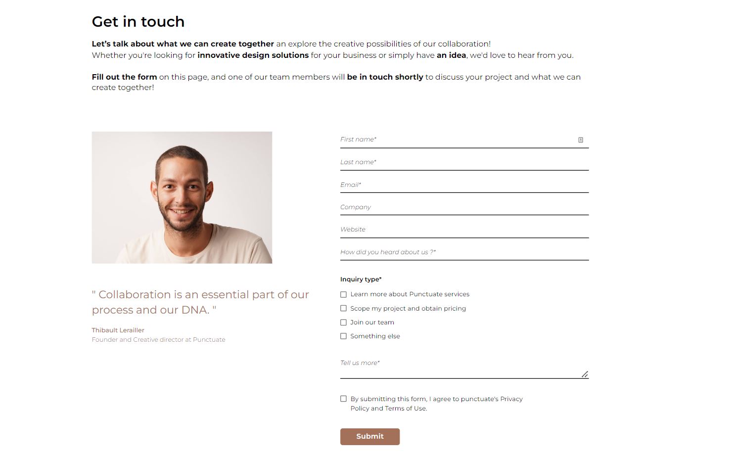
Thibault Lerailler’s design studio website, Punctuate Design, exemplifies this approach. It features a welcoming contact form, letting visitors communicate freely, and a friendly photo of Thibault that adds a personal touch. The site also includes easy-to-access contact information in a footer section on every page, along with a “get in touch” CTA, phone number, and physical address. This comprehensive approach ensures visitors feel valued and have multiple ways to reach out, enhancing their overall experience with the business.

5. Privacy policy page
If you gather names, addresses, or any personal details from your visitors, you're legally required to include a privacy policy on your website. It should clearly explain how you're collecting, storing, and using that data, and it should be written in plain, easy-to-understand language.
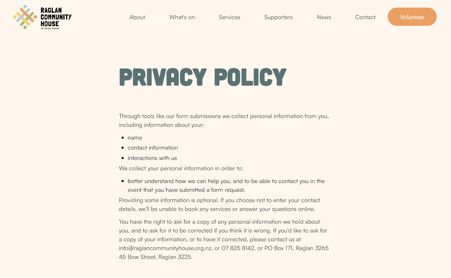
Creative studio HNDRX’s privacy policy for the New Zealand community organization Raglan Community House is written in clear, nontechnical language. It concisely describes the types of personal information the site collects, the purposes for collection, and how users can request a copy of the stored data. By maintaining clarity and accessibility, the privacy policy page reassures visitors and demonstrates responsible handling of confidential information.
6. Terms and conditions page
While terms and conditions pages aren’t legally required like privacy policies, they’re crucial for business websites. Including one can help businesses prevent disputes and legal trouble. Irrespective of user traffic, it’s a good idea to maintain a terms and conditions page to serve as an insurance policy against potential problems.
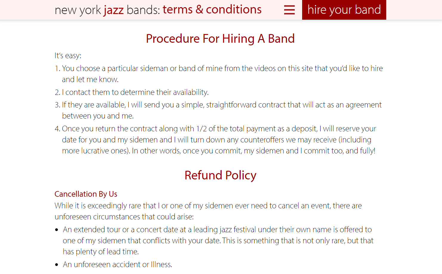
The terms and conditions page for New York Jazz Bands clearly sets out the hiring procedure, cancellation policy, refund policy, and privacy policy in clear, nontechnical terms. Designed by Organic Web Design, this page on the site serves as a document that the band can use to educate customers about their responsibilities ahead of time and protect the band against financial losses from last-minute cancellations.
What additional pages can enhance functionality and engagement?
The six pages outlined above are essential for most small and medium-sized businesses. However, expanding your site with additional pages, like a blog page, can be beneficial. A blog informs your clients about product innovations, events, and offers and bolsters your SEO efforts.
Two additional pages can increase conversions. An FAQ page addresses common questions, easing potential customers’ concerns, while a testimonials page offers social proof, reinforcing purchase decisions.
Presenting case studies from successful collaborations with previous clients also builds credibility. Showcasing a portfolio page further highlights your work and helps you stand out. For businesses running digital marketing campaigns, special landing pages can enhance digital marketing efforts by providing targeted information.
A dedicated 404 page is also worth highlighting. It can help keep visitors on your site by guiding them back to relevant content if they land on a missing or inactive page, turning a potential dead end into a chance to engage further.
Create an organized website with Webflow
Designing in Webflow helps you create beautifully structured and visually stunning websites. By dividing content into page folders, you can ensure even the most complex sites stay neatly arranged and follow a clear hierarchy. Webflow's visual canvas makes this organization intuitive and seamless.
If you’re looking for more examples of core website pages, browse our selection of industry-specific templates. Each template includes the essential components every business site needs to succeed, enabling you to create a tailored and cohesive design.
Webflow University’s tutorials are always available to help you learn more about optimal website structure and bring your web design ideas to life on the screen. These guides assist you in creating comprehensive, user-friendly sites, providing you with practical knowledge to turn your website vision into reality with Webflow.

Get started for free
Create custom, scalable websites — without writing code. Start building in Webflow.


