

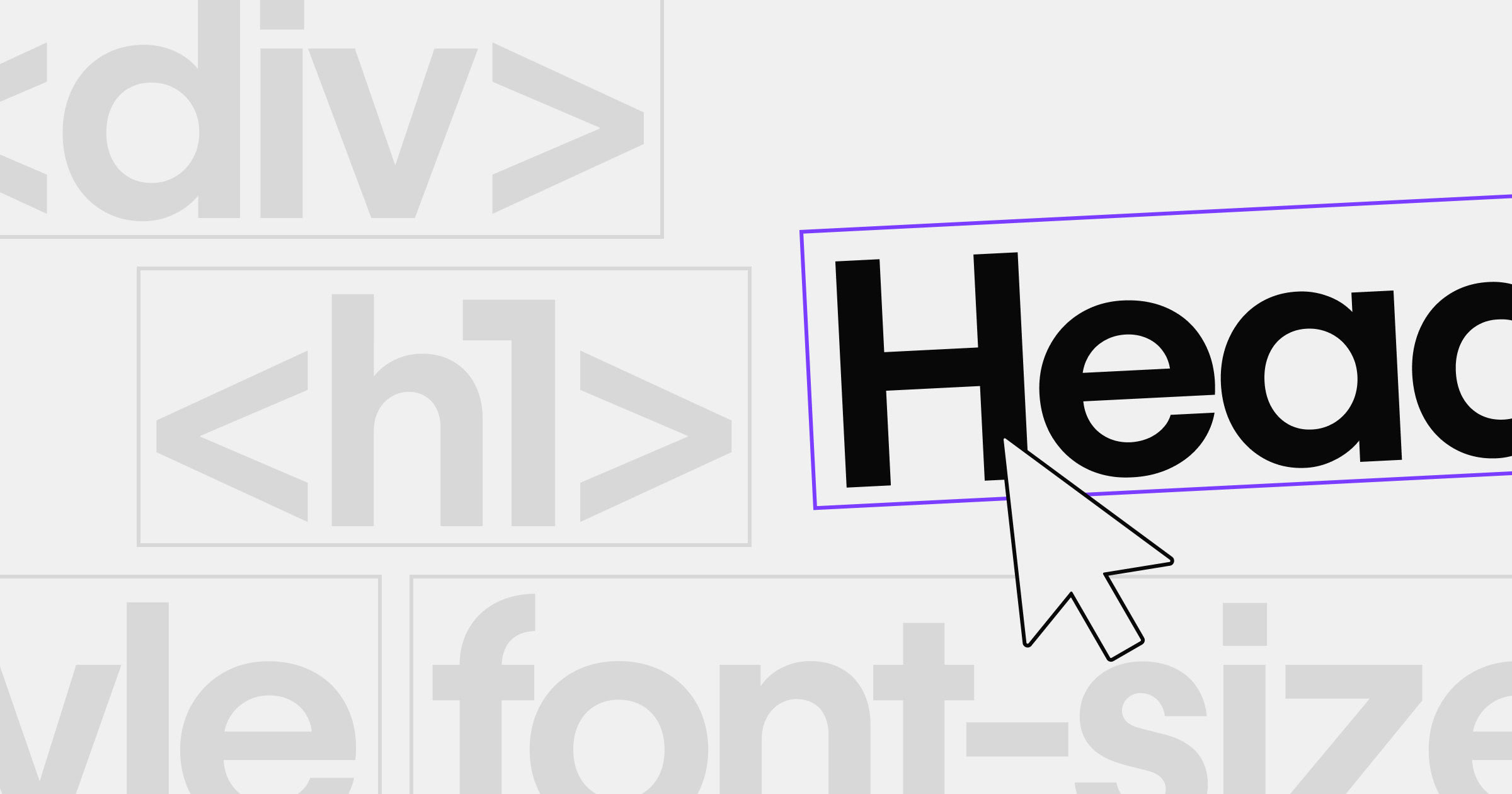


Design with confidence using web-safe fonts that prioritize readability, compatibility, and loading speed.
If you’ve ever launched a website and viewed it on another device, you might have noticed that the text looked very different. Devices and browsers don’t come with all the same font families and typefaces installed. If they’re forced to load the next best option, it can make your site difficult to read and undermine your brand aesthetic.
However, some web-safe fonts are universally installed by default. Using these gives you more control over how your site looks to all visitors. While this does limit your options, there are many great web-safe fonts to choose from.
In this article, we’ll share the top 20 options and explain how to choose a font that fits your vision while supporting accessibility.
What are web-safe fonts?
Web-safe fonts are typefaces that come installed by default on most devices, operating systems (OS), and browsers. Since these fonts are universally available, visitors’ browsers won’t have to choose and fetch replacement typefaces.
They ensure your site’s text is always readable and that its appearance stays consistent. Plus, web-safe fonts help your site load more quickly.
Web fonts vs. web-safe fonts
Web-safe fonts are installed on most devices and browsers by default. They’re designed with accessibility and readability in mind.
Web fonts are typefaces that are available online. Browsers can download them when needed, through services like Google Fonts.
Common types of web fonts
Your choice of font says a lot about your brand’s style, but you must balance design with readability and layout. Here are the five main categories of font families you can choose from:
- Sans-serif fonts, such as Arial and Helvetica, lack embellishments and are carefully spaced to ensure maximum legibility.
- Serif fonts, such as Times New Roman and Garamond, have added decoration (serifs) on each character. This is more visually appealing but can lead to tight spacing and hard-to-read text.
- Cursive fonts, such as Pacifico, connect each character in a flowing script that can be difficult to read.
- Monospace fonts, such as Roboto Mono, have equal spacing between each letter. They’re typically used for code samples, but some websites use them for text.
- Display fonts, such as Tahoma and Palatino, can be any of the above types, but they’re specifically designed for headings and visuals that use large font sizes.
Benefits of using web-safe fonts
Web-safe fonts are vital to an effective site design. When you use them on your website, you get:
- Consistent design: Each visitor has the same visual experience across all devices — the exact one you designed.
- Faster loading speeds: Browsers aren’t forced to download a custom font from a library or choose an alternative, so your pages load quickly.
- Fewer compatibility issues: There’s no risk of an OS-chosen alternative font causing clashes between your UI, heading, and text typefaces.
- Better readability: Text is accessible to all website visitors by design, regardless of OS, device, and browser.
20 best web-safe fonts
Here are 20 of the best fonts to use on your website. Each is designed to optimize readability and browser compatibility, while still offering a distinctive look.
1. Arial

Arial is as familiar as it is legible and accessible. It’s the perfect fallback font because every OS, device, and browser supports it, and it’s very readable.
Arial’s simple, unembellished characters aren’t interesting or stylish, but they make it easy for visitors to focus on your message and content.
2. Verdana

Verdana is similar to Arial, but with more space between characters. It’s legible and simple, which makes it a versatile font, but the added spacing can complicate some layouts.
If you opt for Verdana over Arial, be sure to test your layouts in languages that tend to have much longer words, like German.
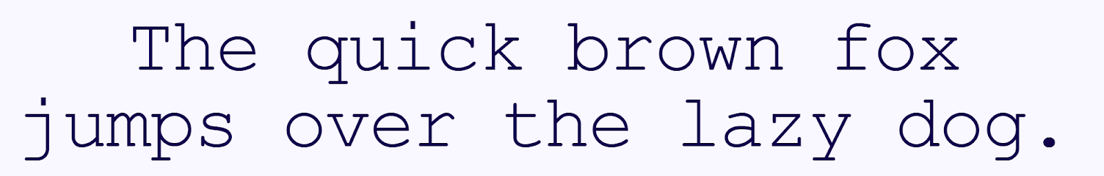
3. Segoe UI

Segoe UI has consistent stroke weights and plain characters that prioritize readability. The tight spacing fits more characters into each textbox, but some letters can run together, as you see with the “z” and “y” above.
That doesn’t usually hurt Segoe UI’s accessibility at large sizes, such as for headings and UI elements, but it does make this font slightly less legible when used as body text.
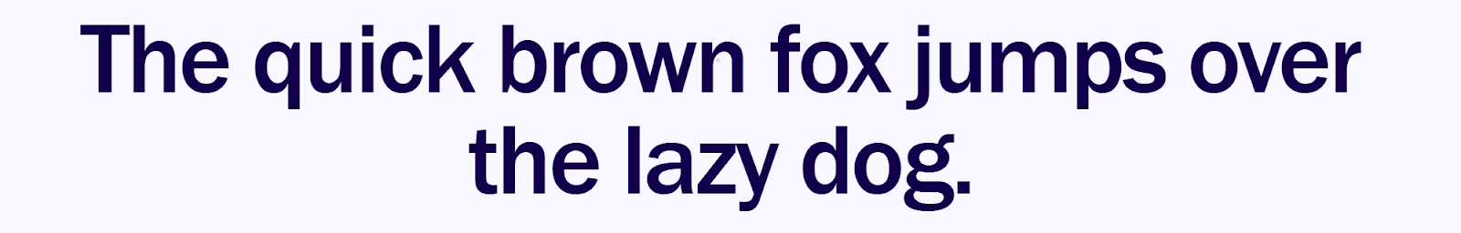
4. Tahoma

Tahoma has thick, consistent stroke weights that read well in headings, body text, and UI elements. This typeface offers a good balance between Verdana's legible versatility and Segoe UI's tight, even spacing.
If your text isn’t black or white, the thick lines can offer more leeway in contrasting font colors with backgrounds.
5. Trebuchet MS

Trebuchet MS walks the line between serif and sans-serif, adding a few modest adornments. It has more styling than many web-safe fonts, making it useful for headings and UI elements. Yet it’s still legible enough for body text.
There’s just enough spacing between characters to make this font accessible while keeping it compact.
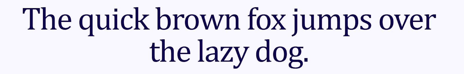
6. Times New Roman
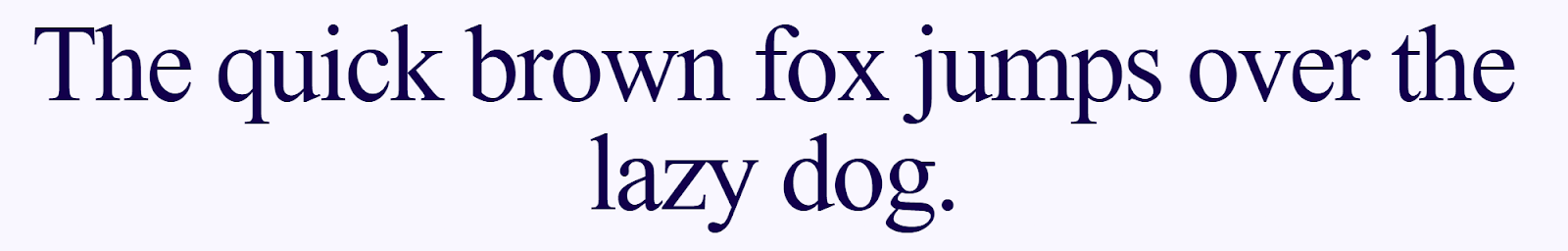
Times New Roman is the classic serif font, used in everything from newspapers to college essays. These associations make it instantly recognizable, and you can lean on those connections if they resonate with your brand.
If you want digital text to evoke a printed reading experience, Times New Roman is a solid choice.
7. Georgia
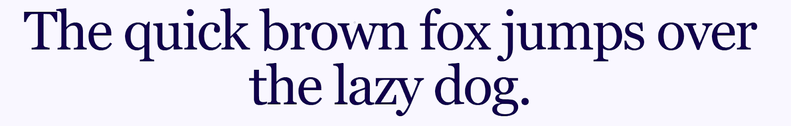
Georgia offers all the classic appeal of Times New Roman, but with thicker stroke weights that keep it more accessible. The two fonts pair well — for instance, you could use Georgia for headings and UI text, and Times New Roman for body text.
Either way, you’ll achieve a familiar reading experience that evokes print media but is still web-friendly.
8. Garamond
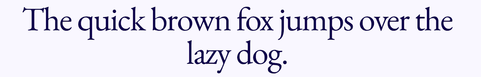
Garamond takes serif fonts to a new level with variable stroke weights, strong flourishes, and very tight spacing. All of that makes this typeface less ideal for body or UI text, but excellent for headings and titles.
Garamond’s serifs are unique when compared to Georgia and Times New Roman, so it pairs best with a sans-serif font to avoid visual clashes.
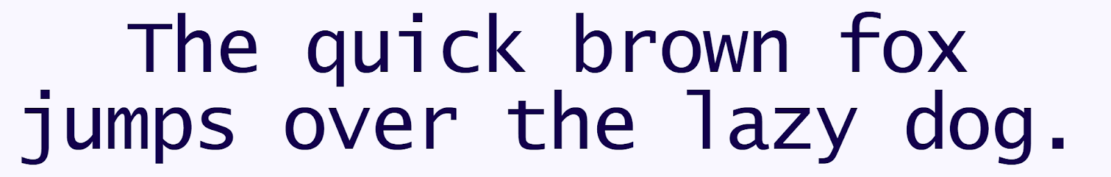
9. Courier New
Courier New is a monospaced font with modest frill and thin lines. It strongly resembles a typewriter font, which gives it a retro look and a niche appeal. It’s a unique choice for headings and decorative text if it aligns with your brand’s aesthetic.


Accessibility at Webflow
Learn about our commitment to web accessibility and how you can build more accessible online experiences.
10. Lucida Console
Lucida Console has a similar typewriter look, but less pronounced than Courier New. That makes it more versatile.
Its inconsistent spacing and variable character sizes result in visually interesting text. However, it’s less accessible than some other stylistic typefaces. You’ll want to reserve it for UI in one or two-word button text, where the style can come through best.
11. Lucida Sans Unicode

Lucida Sans Unicode is a plain, versatile, sans-serif font. It’s noticeably different from Arial and Verdana, thanks to its tight spacing and consistent character sizes. But this font’s sharp edges and thick strokes keep it just as accessible, making it a good alternative to more widely used fonts.
You can use Lucida Sans Unicode just about anywhere you need to maximize readability, especially for body and small UI text.
12. Palatino Linotype
Palatino Linotype is another serif font that’s compatible with Times New Roman. The serifs and variable stroke weights are similar enough that you can pair the two fonts without confusing readers. At the same time, they’re distinct enough to differentiate headings from body text.
This typeface works for titles, UI text, and body text, provided there’s enough contrast with the background to support the varying stroke weights.
13. Impact
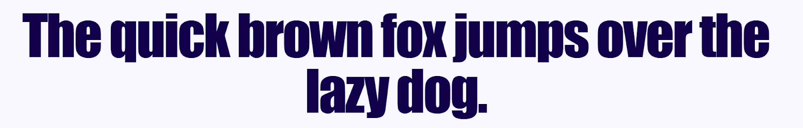
Impact font is defined by bold, crowded, thick characters that jump out from the page. If you try to use this font in body text, readability will suffer, and readers will probably feel like you’re shouting at them.
However, as a heading typeface or a font for larger UI buttons, Impact is a great way to show off your brand colors. This is because there’s plenty of room to contrast text with backgrounds.
14. Open Sans

Open Sans prioritizes readability and even spacing over style, with medium-weight lines and lots of spacing. This font is great for long-form content, like blog posts and documentation, where hard-to-read text can cause eye strain.
Open Sans is probably too dull for attention-grabbing elements like headings, but using it as body text gives you more freedom to get creative with everything else.
15. Century Gothic

Century Gothic isn’t as accessible as some other sans-serif fonts, due to its stylized curves and short line work. As such, it’s a poor choice for body text, but it works well for headings.
This font can be effective on minimalist and visually forward websites, where the exaggerated curves suggest style and sophistication.
16. Franklin Gothic
Franklin Gothic is a rare font that combines thick, bold lines with variable stroke weights. Those variations are very pronounced in letters like “x” and “v.” The bold characters are quite readable as body and UI text, making this a versatile font that’s good for grabbing attention.
Be aware that bolding this font doesn’t alter its look, so it’s not a good choice for long-form content where you need to apply formatting.
17. System UI

System UI maximizes readability in headings, UI text, and body text, making it a font that can fit in almost anywhere:
- In documentation, it responds well to italicizing and bolding.
- On homepages and landing pages, the thick lines create high-impact headings.
- In UI buttons and navigation menus, the consistent spacing supports readable text.
System UI doesn’t have the most unique look, but it may be the most versatile typeface on this list.
18. Candara

Candara is a stylish font with a wide range of stroke weights. That adds plenty of character, but the font’s fairly even spacing and consistently sized characters keep it readable in most applications.
Candara pairs well with a plain sans-serif font that won’t distract the reader with unpredictable character styles, like Open Sans or Arial.
19. Consolas

Consolas resembles a code environment font. But the lack of monospacing makes it a great display font for headings and UI text on tech-focused websites. It can work for short blurbs of body text, but for long-form content, you’ll want to pair it with a more readable typeface like System UI.
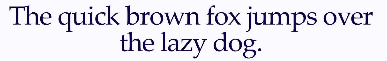
20. Cambria
Cambria is a serif font that pairs well with Georgia and Times New Roman. It can even replace them as a versatile, readable typeface that isn’t overused.
This font’s unique character designs stand out nicely in headings and UI text, but can be less legible in body text. Cambria works well in short-form content, such as newsletters and landing page blurbs, but it’ll likely cause eye strain in long-form documentation or blog articles.
How to choose the right web-safe font
There are many web-safe fonts to pick from, so here are a few tips for choosing the right one:
- Match your brand’s tone and aesthetic. Consider typefaces that convey your brand identity and tone, especially in headings and other short elements.
- Prioritize readability. Visitors must be able to read your content, so pick fonts that make legibility a top priority.
- Consider font pairing. Some fonts fit together perfectly, while others clash or cause confusion, so it’s important to find the best font pairings.
- Test across multiple browsers and devices. You’ll want to see how the font looks in various contexts before you publish. You can also leverage Webflow’s responsive design feature to verify that your layouts respond correctly to screen size changes.
How and where to use fonts that aren’t web safe
While it’s usually best to stick with web-safe fonts, there are two times you might want to branch out and use more decorative typefaces: in images and animation, and as fallback fonts.
Advertisements, visual demonstrations, and animated effects can benefit from unique typefaces that draw visitor attention. As long as the text characters are rendered in the visual itself, browsers won’t need to install or replace the font. This is especially useful if you have a proprietary typeface for your brand.
You can also specify fallback fonts in your font-family CSS property. This controls which typeface browsers use if your preferred font isn’t available. Doing this is called “building a font stack.” If you do this, be sure you view both your primary and fallback typefaces when testing the site design.
Web-safe fonts and seamless designs powered by Webflow
Choosing typefaces may seem simple, but it’s an early decision that can make all the difference when designing an effective website. The right fonts create a stylish but readable website that’s consistent across devices and browsers.
Whether you decide to stick with web-safe fonts or experiment with more unique options, Webflow offers a large library of typefaces to choose from. Check them out in the visual-first editor or play around with our free font generator.
Power your website design with Webflow.
Get started for free
Create custom, scalable websites — without writing code. Start building in Webflow.

.jpeg)


