Out-of-the-box Webflow is super powerful! But here are 6 of my go-to code snippets I use to extend Webflow’s functionality. These customizations showcase your thoughtfulness as a designer and increase the user experience. Win-win!
1. Style the scrollbar
The scrollbar is so commonplace, quietly hanging out in the background. Styling it can lend to the overall user experience — a little extra detail that won’t go unmissed and is sure to delight!
Step 1: Add the snippet
Paste this code snippet in your website’s Custom Code section in the settings page.
<style>
::-webkit-scrollbar {
width: 8px; /* Controls the overall width of the scrollbar */
padding: 2.5px; /* Controls the padding of the Scrollbar */
}
/* Track - This is the part that contains the bit you click and drag */
::-webkit-scrollbar-track {
background: transparent; /* Sets the background to transparent, change to a Hex or RGB value if you would like */
}
/* Handle - This is the bit you actually click and drag */
::-webkit-scrollbar-thumb {
background: #3b3b3b; /* Change the Hex value to change the scroll handle */
border-radius: 6px; /* Change the "px" to adjust the scroll handle's border radius*/
border: white 1px solid /* This controls whether the scroll handle has a border, right now it's set to a White, 1px Solid border, you can change these settings or remove this line altogether if you don't want a border */
}
</style>
I’ve annotated the code snippet above. Feel free to strip them out for your published site. Each note gives you a brief description of what that line does to the scrollbar and how you can change the values.
Note: Support for this is not currently available on Firefox or Edge — those browsers will show the default styling.
2. Add a Javascript-powered back button
I use this snipped mostly for clients with a blog or something similar — a page with multiple entry points. Going back should be as easy as possible, but a static link button leading back to the main blog page doesn’t work since the user didn’t necessarily start there.
JavaScript to the rescue! This snippet remembers the user’s last location and and takes them there with a click.
Step 1: Add the button
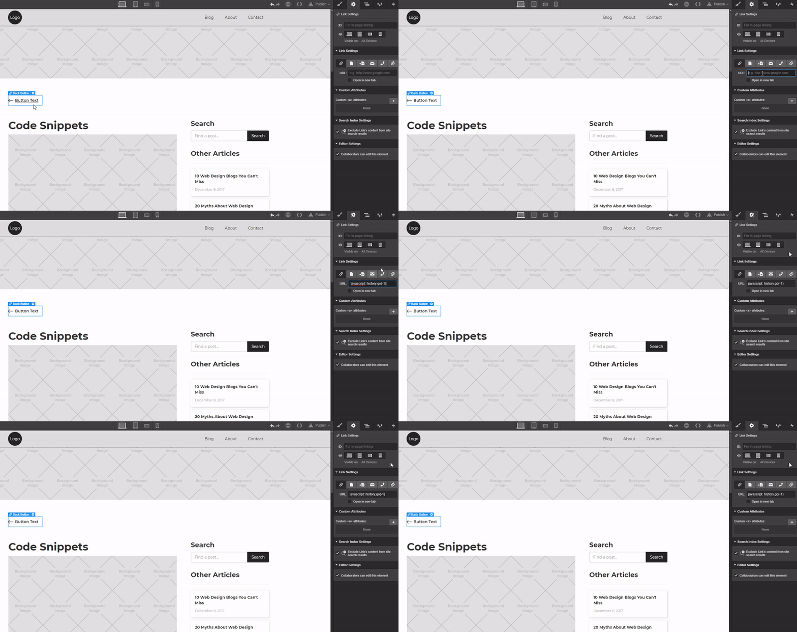
Navigate to the elements panel in the designer and drag a Button to where you’d like your back button to live. I chose to place mine just above the start of the blog post.

Give it a class of “Back Button” and use the following settings:
- Padding (left): 25px
- Margin (bottom): 30px
- Font-color: #333
Background image settings:
- Left Arrow (SVG icon available from Flaticon)
- Width: 19px
- Position: Left
- Tile: None

Step 2: Add the JavaScript snippet
Click to select the button and in the settings panel on the right, paste the snippet below. Don’t hit enter to submit the link — Webflow will break it by adding “https://.” To avoid this and complete the process, simply click away from the link.
`javascript: history.go(-1)

You’re done! publish and test!


Design interactions and animations without code
Build complex interactions and animations without even looking at code.
3. Update copyright information annually
Copyright is in force whether the information is on your site or not. Displaying copyright can deter plagiarization of your hard work. And having up-to-date copyright information — even if it’s a pain — is important. Especially if you manage multiple sites. Here’s a neat little JavaScript snippet that will update copyright as the years roll by.
Note: We’re assuming you have already set a body font for your project.
Step 1: Add the Style
Add a Text Block to the canvas and give it a class of “Copyright” with the following settings:

- Font-size: 10px
- Color: White (I’ve made my text white because of the dark footer, but feel free to change the colors to suit your needs)
- Text-align: Center

Step 2: Add the code snippet
Copy and paste the code below into an HTML embed widget on your canvas and place it where you want it displayed. I’m putting mine in the footer, below the text block I just styled.
<div class="copyright">Copyright of “Company Name” <script language="javascript" type="text/javascript">
var today = new Date()
var year = today.getFullYear()
document.write(year)
</script></div>
You can see in the snippet above that there’s a line of text: replace the Company Name with whoever owns the copyright. Save and close.

You’ll notice that the newly placed copyright info is styled exactly the same as the previous text block we added. That’s because they share the exact same class name. Now we need to remove the original text block we styled, leaving behind just the HTML embed.
Warning, there are some gotchas!
If you were to delete the copyright text block, the next time you clear the unused classes from your project, you’d lose the style to your HTML embed. To avoid this we need to place the copyright text block on an unused page.
I often set up a page in my Webflow project called “/Assets.” I place anything on this page that I want to keep or use later. This way the Webflow system won’t delete the class.
4. Customize the Android Chrome color
Not all browsers are created equal — Chrome is by far the most popular browser in the world. Lucky for us designers, they offer some great options for customisation! Google’s Chrome browser allows you to alter the color of the browser to create a seamless branded mobile-web browsing experience.
Below is an example of how this snippet is applied by the browser. I think you’ll agree, it’s another great tool in your ever-growing arsenal to customize the user experience.

Step 1: Add the code snippet
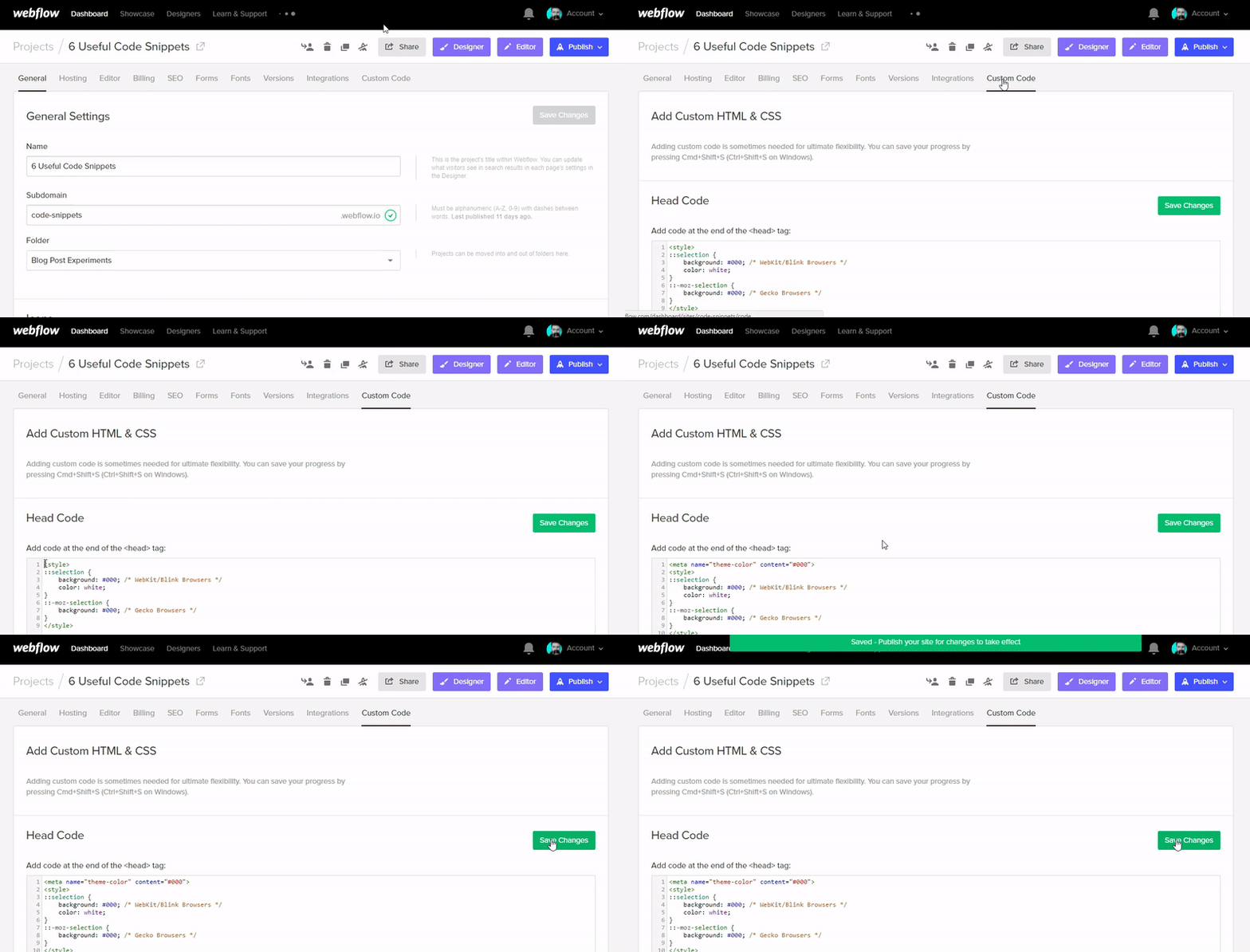
Open the settings panel of your project, navigate to the Custom Code section and paste the following code snippet in the Head Code section.
<meta name="theme-color" content="#000"> /* Change the "#000" to whatever color matches your projects them and style */

It’s as simple as that, publish it and open it on an android device.
5. Style text highlighter
Designers often forget about system defaults like the text highlight color. But, again, it’s this attention to detail that makes all the difference.
Step 1: Add the snippet
Copy the code snippet blow to your clipboard and navigate to your projects settings. Open the Custom Code tab and paste the snippet in the Header Code section.
<style>
::selection {
background: #000; /* WebKit/Blink Browsers */
color: white;
}
::-moz-selection {
background: #000; /* Gecko Browsers */
}
</style>
Click Save Changes and publish the site. Preview it on the published site.

Step 2 - Adjust the colors
I’ve left the snippet with a black background and the text in white, but you have full creative freedom to change this to whatever color you see fit.
In the snippet, simply change the hex codes to your desired color.

Just remember to save changes and publish to view it on your live site.
6. Hyphenate!
If you’re a type geek, you know that a hyphen in just the right place can make the difference between a beautiful read and a block of text that will make you cry rivers.
Especially if you’re using fully justified text. (We don’t recommend it.) Or publishing in a language that, like German, is prone to polysyllabic words.
Of course, you can manually add the HTML entity ­ to tell browsers “hyphenate here if you need to,” but that can get laborious in any site with more than a couple of pages. And it won’t work in rich text fields.
Thankfully, CSS has come to the rescue with word-break and hyphenation.
.my-class {
word-break: break-word;
-webkit-hyphens: auto;
-moz-hyphens: auto;
-ms-hyphens: auto;
hyphens: auto;
}
To work backwards through that declaration:
- Hyphens: auto This tells browsers to go ahead and automatically hyphenate words as needed, based on the browser’s dictionary for the language you declared for your site. And yes, this means you need to specify your site’s language in the HTML tag. You can do that in the Advanced Settings section of the Custom Code tab in your Project Settings.
- The 4 hyphen-abbreviation-hyphen lines These are just browser-specific versions of hyphens-auto to ensure hyphenation will work on all browsers.
- Word-break: break-word This is a bit of a safety inclusion, as it all it really does is tell the browser that it’s okay to add a line break in the middle of a word if needed. Which is sort of the point of all the “hyphens” declarations anyway.
It's worth noting that Chrome on Windows doesn't yet support auto hyphenation.
Hat tip to forum user @prohaska for this handy snippet.
What custom code do you use?
That’s it! These are core code snippets I use on pretty much on every Webflow project. I hope they help take your designs to the next level.


