


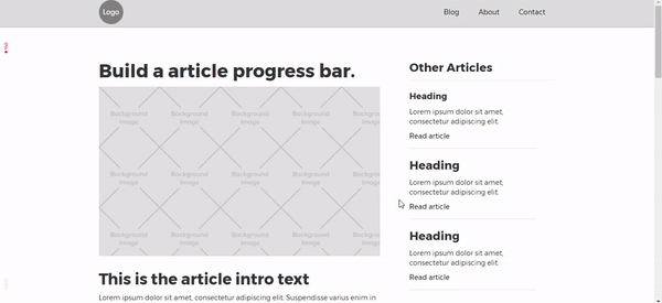
Time is valuable, which is why it helps your audience to know how long they’ll need to, say, read a blog post. With Webflow’s Interaction 2.0, let’s create a page progress bar and a call to action for sharing.
Whether you’re installing a program, transferring files, or uploading videos, progress bars give users the feeling of momentum by framing the length of engagement. In this article, we’ll show you how to create a progress bar using Webflow’s Interaction 2.0.
What is a progress bar?
A progress bar is a computer graphic that provides a visual representation of how long a task takes to complete. You can create progress bars using a wide variety of programming languages such as HTML and CSS, as well as frameworks like Bootstrap.
Three-step progress bar tutorial
Time is valuable, which is why it helps your audience to know how long they’ll need to accomplish tasks like reading a blog post. Sign up for a free account so you can create a page progress bar and call to action using Webflow’s Interaction 2.0.
Note: for this tutorial, we assumed you set a default font on the body.
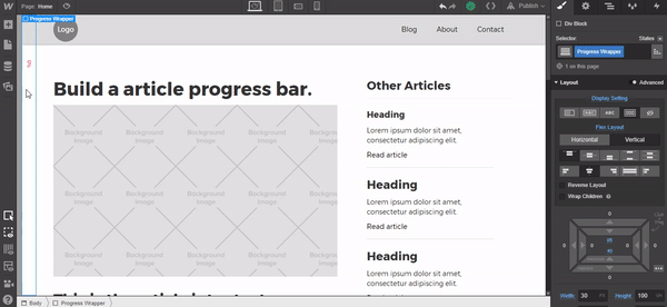
Step 1: Add and style container div
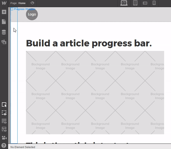
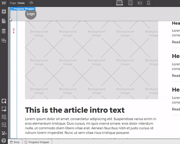
Place a div on the canvas, give it a class of “Progress Wrapper,” and apply these settings:
- Display Settings: Flex
- Flex Layout: Vertical
- Justify: Start
- Align: Center
In our case, we’re adding a padding to the top of “95px,” but that’s because we have a Navigation bar we don’t want overlapping the progress bar. Feel free to adjust this setting to match your design.
- Padding Bottom: 40px
- Width: 30px
- Height: 100vh
- Position: Fixed, Left.
- Z-index: 9999

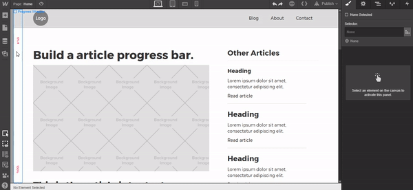
Next, click the Tablet view mode in the designer.
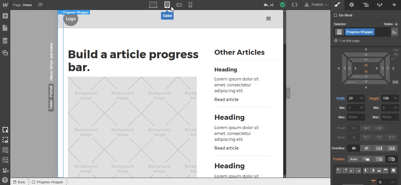
With the Progress Wrapper highlighted, change the width to “20px.” Return to the Desktop view and we’ll continue styling and adding the elements.
Mobile Settings Note: When viewed on mobile devices, you may find that the progress bar sits a little close to the text content. If this is the case, as in the example below, add extra Padding to the page’s Body. I’ve added “30px” on Tablet, dropped it “20px” on Mobile - Landscape, and removed it completely on Mobile - Portrait for comfortable clearance and composition.
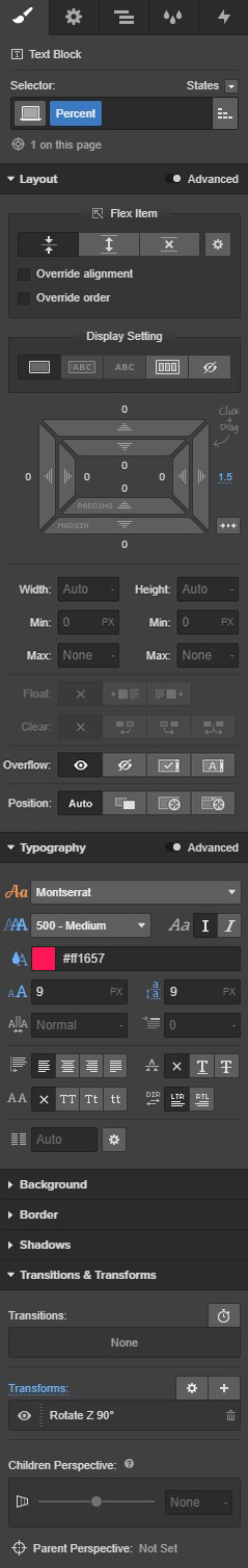
Add a “Text Block” inside the Progress Wrapper and change the text to “0%.”
Add a class of “Percent” to the text block, use the following settings:
- Margin Right: 1.5px
- Font Weight: 500 - Medium
- Font Color: #ff1657
- Font Size: 9px
- Line Height: 9px
- Transforms: Rotate Z 90°
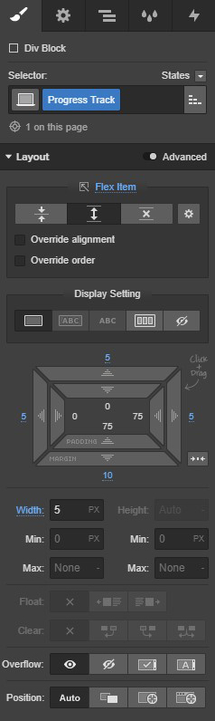
Next, add a div to the Progress Wrapper below the 0% text block, give it a class of “Progress Track,” and use these settings:
- Flex Item: Expand
- Padding (Top, Right & Left): 5px
- Padding (Bottom): 10px
- Width: 5px
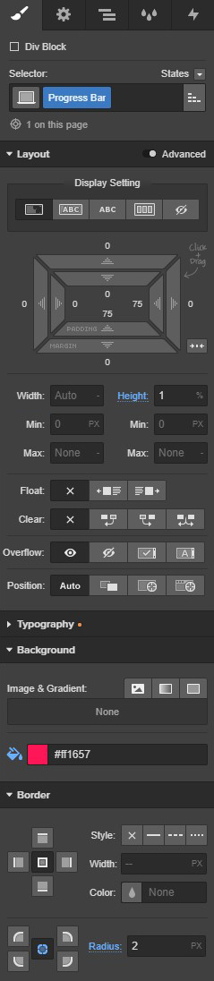
Add a div inside the progress track div, give it a class of Progress Bar, and add these settings:
- Height: 1%
- Background Color: #ff1657
- Border Radius (All sides): 2px


Design interactions and animations without code
Build complex interactions and animations without even looking at code.
Copy the “0%” text block we created earlier by right clicking and selecting Copy from the dropdown menu. Then right click again on Progress Wrapper div and select Paste Inside from the dropdown menu.
Double click the newly-placed text block and change the copy to “100%.”
Step 2: Add the Call to Action
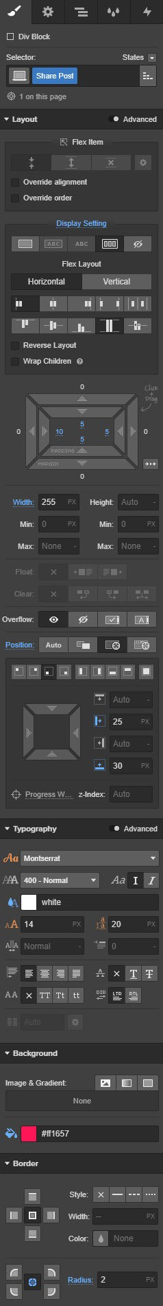
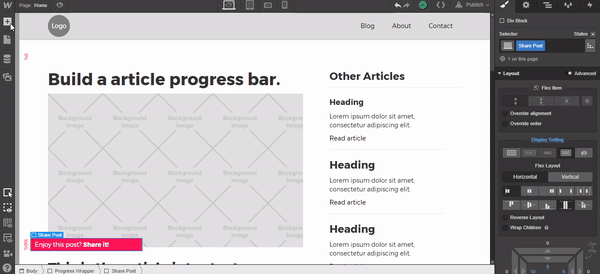
We’re on the home stretch! Add a div below the “100%” text block and give it a class of “Share Post” using these settings:
- Display Setting: Flex
- Flex Layout: Horizontal
- Justify: Start
- Align: Stretch
- Padding (Top, Right & Bottom): 5px
- Padding (Left): 10px
- Width: 255px
Position Settings:
- Position: Absolute, Bottom Left
- Left: 25px
- Bottom: 30px
- Font Color: White
- Background Color: #ff1657
- Border Radius: 2px
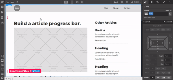
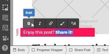
Add a Text Block in the Share Post div and replace the text with “Enjoy this post? Share it!” Highlight the “Share It!” copy and select Bold.
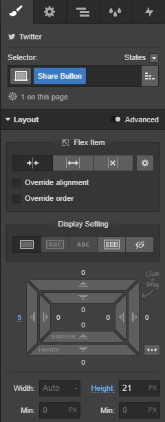
Next, add the Webflow “Twitter Widget.” Tick the checkbox “Show Bubble” to off and give it a class of “Share Button.”
Add the following settings:
- Padding (Left): 5px
- Height: 21px
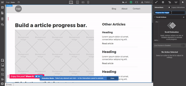
Step 3: Add the Interactions
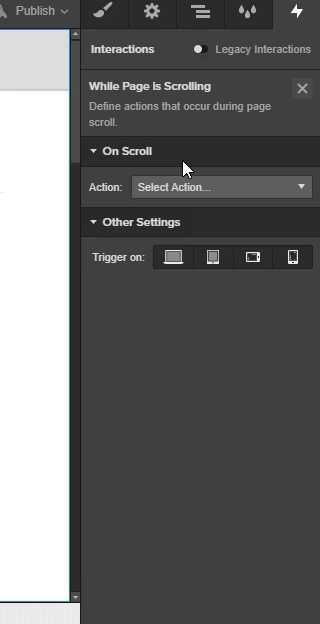
Navigate to Interactions panel and select the plus icon in the On Current Page section. From the dropdown menu choose While Page is Scrolling.
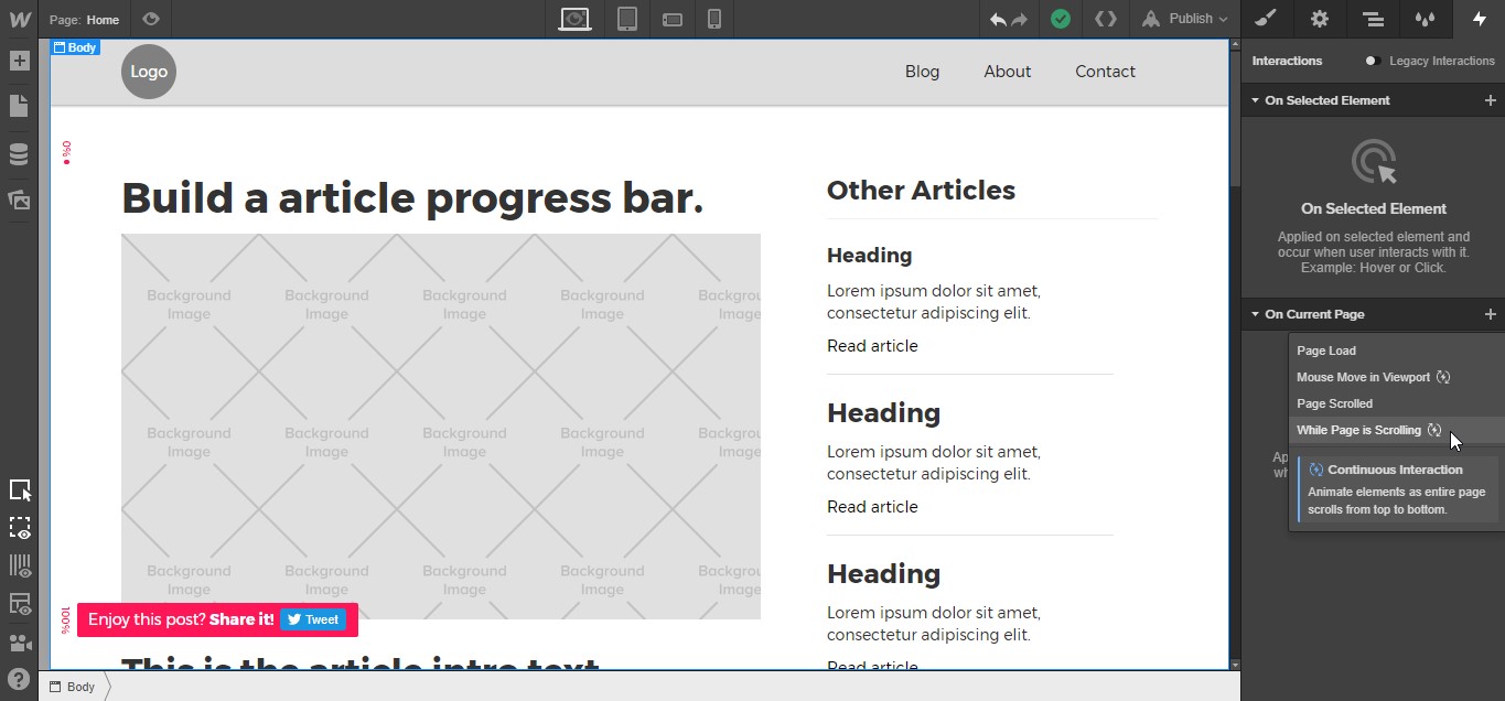
From the Action dropdown menu select Play Scroll Animation and change the Smoothing to “90%.” Finally, click the plus icon and rename the interaction “Progress Bar Trigger.”
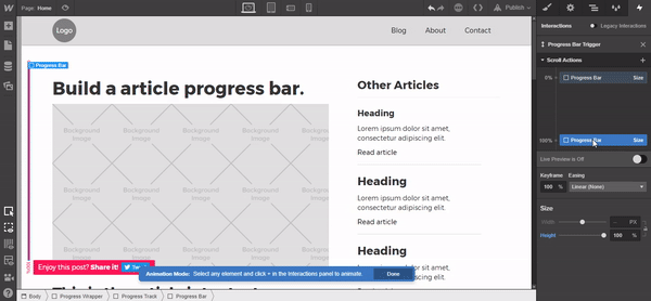
Next, select the Progress Bar div and click the plus icon next to Scroll Actions. Select Size from the dropdown menu, select the interaction at the 0% position in the animation pane, and add a height of “1%.” Now, select the interaction at the 100% position and change the Height to “100%.”
Feel free to test it out at this point!
Next, select the Share Post div, hover over the plus icon at the 0% position in the animation pane, and select Opacity from the dropdown menu. Set it to “0% Opacity.”
Add another interaction point at around the 85% mark on the animation pane and, again, select Opacity from the dropdown menu. Set it to “0% Opacity.”
Finally, add the last interaction at the 100% position in the animation pane by choosing Opacity from the dropdown menu. Once it’s selected, leave the default opacity level at “100%”.
We’re done! Publish and test it out!