Popup modals get a bad rap — often, for good reason. After all, they’re interruptive, tend to fire far too early for most readers, and rarely fit an actual customer need. But there’s also no denying that they can work very well. I’ve personally seen popups increase subscription conversion rates by 5x. On content that wasn’t even optimized for conversion!
Plus, chances are that you’ve had more than one client request a popup modal for exactly that reason. So today, we’ll show you how to build a popup modal with a little twist — because this one’s user-initiated. That is, the user actually clicks a button to fire the modal, which provides a nicely focused UI to finish the transaction in. (Of course, you can also switch up the trigger to meet your needs.)
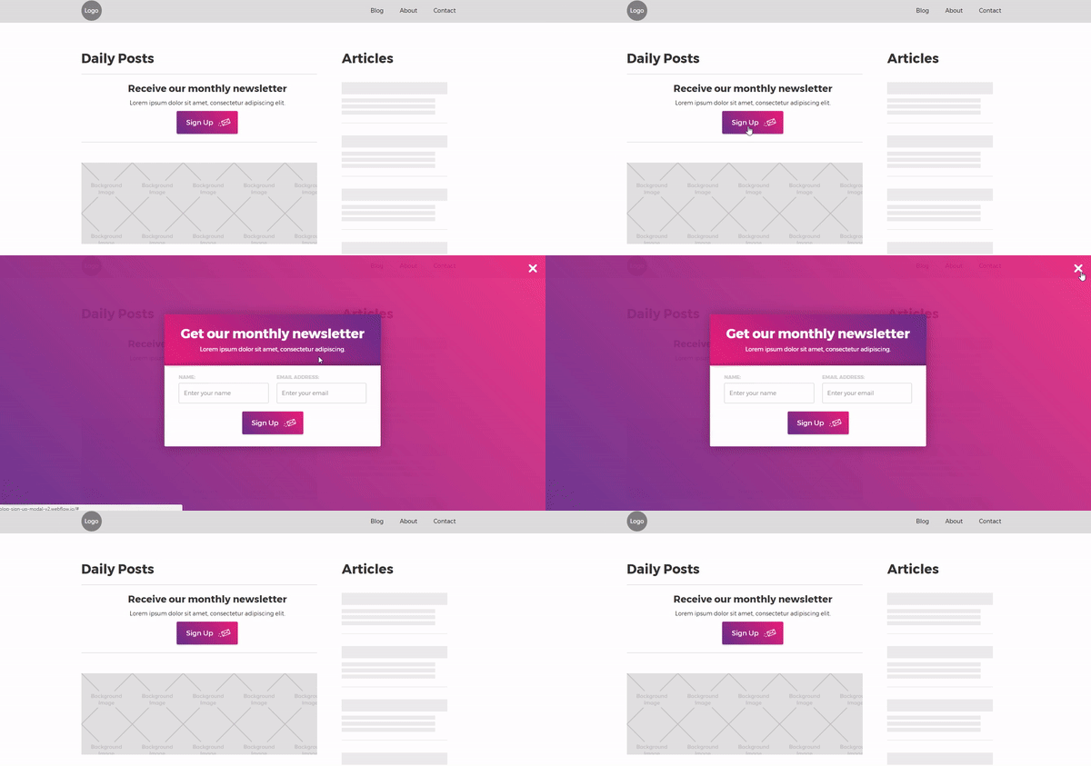
Here's what we're going to make together.
Note: for this tutorial, we’ve assumed that you’ve set a default font on the body.
Step 1: Add your headline text and a button
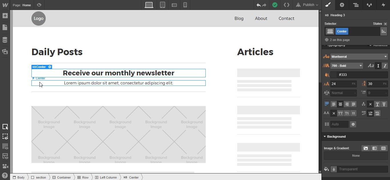
Place an H3 and a paragraph on the canvas, and update the text as needed. Add a class of “Center” to both and change the text alignment to center.
PRO TIP: Create a class called “Center” and set the text alignment to center. This gives you a reusable class you can add to any text element to clear out the default left alignment and preserve your carefully crafted type settings.

Now, add a button below your paragraph and give it a class of “Sign Up Button” with these settings:
- Margin left and right: Auto
- Padding top and bottom: 18px
- Padding left: 25px
- Padding right: 60px
- Width: 155px
- Font size: 17px
- Border radius: 3px
Drop shadow settings
- Color: rgba(0, 0, 0, 0.32)
- Angle: 180°
- Distance: 1px
- Blur: 4px
We’re also going to add a gradient background and a background image to this button. So scroll down to the Background section, select the gradient tab, and add these gradient colors: #662d8c to #ed1e79. Set it to linear with an angle of 45°.


Then click the add background image tab and select an icon from your computer. (Or download the icon I used from Flaticon.)
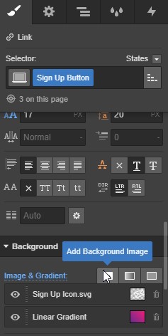
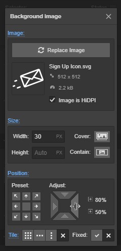
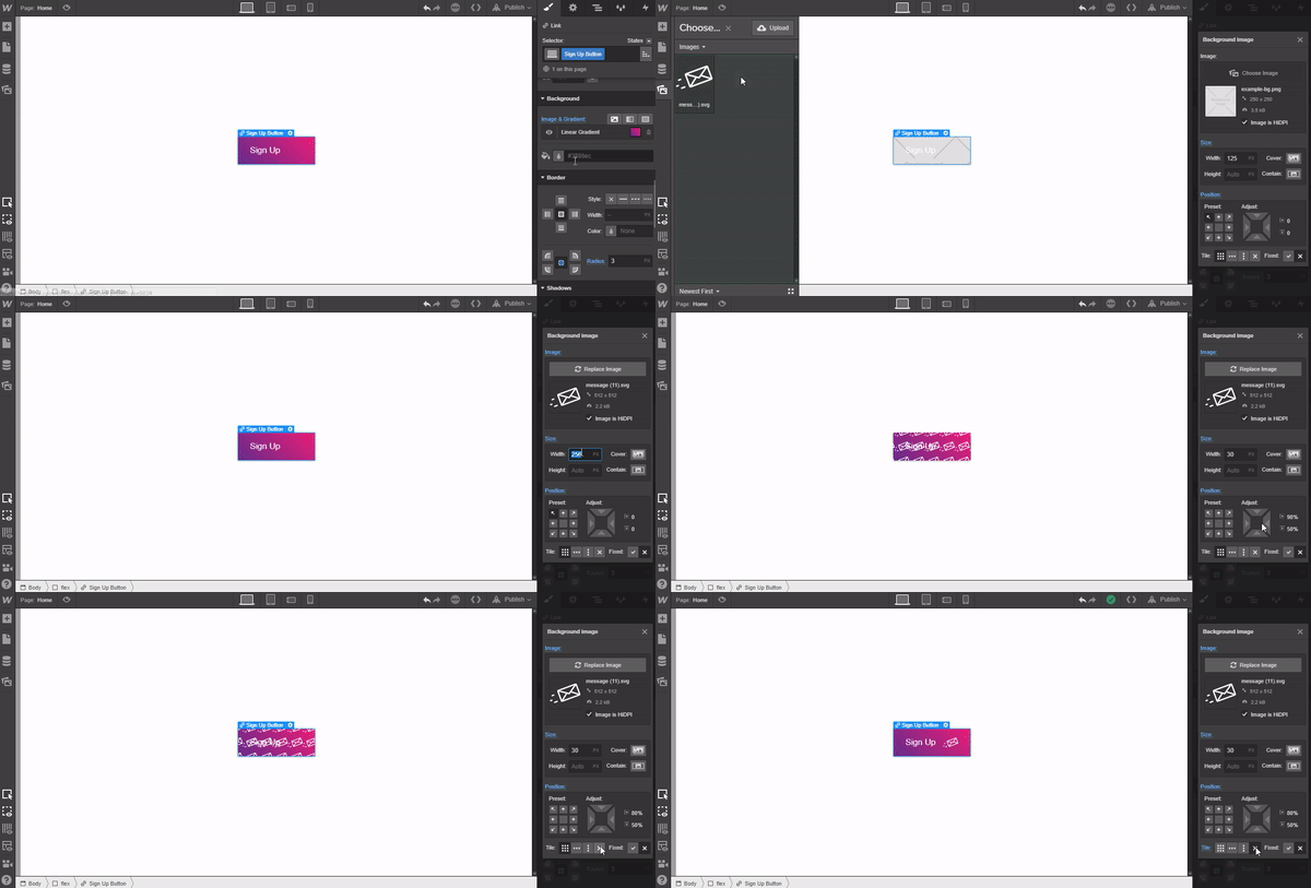
Then just add these settings to the background image:
- Size: 30px
- Position from right: 80%
- Tile: No repeat
Step 2: Add and style a div to contain the modal
Add a div anywhere on canvas. Since we’ll set its position to fixed, its place on the canvas doesn’t matter.
Give the div a class of “Modal Wrapper” with a display setting of flex, horizontal, with justify:center and align:center. Then set the position to fixed and select full, give it a z-index of 9999 — that makes sure the modal will display above everything else.
Modal Wrapper styles
- Display: flex
- Flex layout: horizontal, center, center
- Position: Fixed, full
- Z-index: 9999

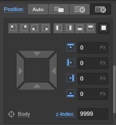
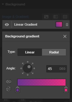
Finally, add a linear gradient background with slightly more transparent versions of the colors we used on the button’s gradient: rgba (102, 45, 140, 0.95) and rgba (237, 30, 121, 0.89). Set the angle to 45°.
Step 3: Add and style the signup form
Now drop a form component inside the modal wrapper div and give it a class of “Sign Up Form.” Then add these styles:
- Bottom padding: 30px
- Overflow: Hidden
- Text align: Center
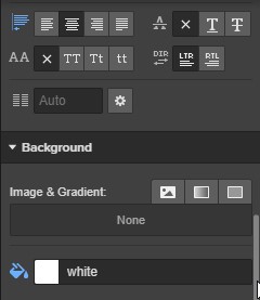
- Background color: #ffffff
- Border radius: 3px


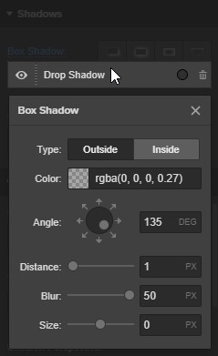
We’ll also add a drop shadow to the modal to reinforce the layering of elements:
Drop shadow settings
- Color: rgba(0, 0, 0, 0.27)
- Angle: 135°
- Distance: 1px
- Blur: 50px
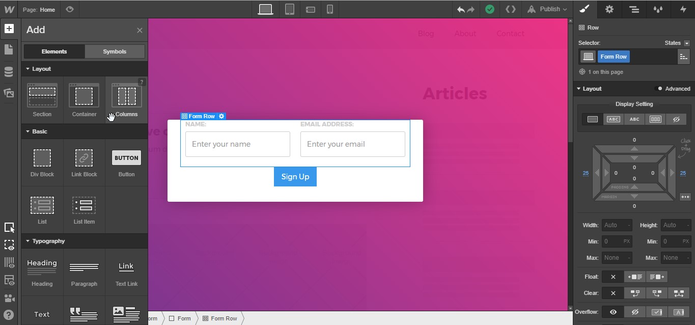
Add a column row to the form, give it a class of “Form Row,” and add 25px margin to the left and right. Place a label and an input field in each column.
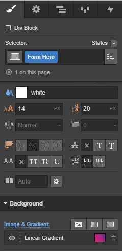
Now add another div to the modal wrapper above the form, call it “Form Hero,” and apply bottom margin of 20px and these padding settings:
- Top: 10px
- Left and right: 40px
- Bottom: 20px

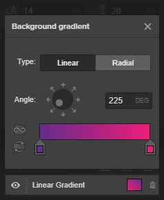
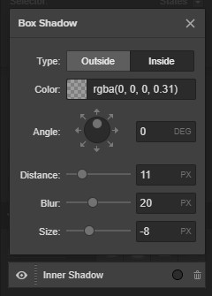
Change the text color to #ffffff and add a linear background gradient going from #662d8c to #ed1e79 with an angle of 225°. Then add an inner shadow, with the following settings:
Inside
- Color: rgba(0, 0, 0, 0.31)
- Angle: 0°
- Distance: 11px
- Blur: 20px
- Size: -8px
Now add an H2 and a paragraph to the form hero div. No need to style these as they’ll inherit text color and alignment from the parent div.

Now to style the input fields. Give each a class of “Input” with the following properties:
- Bottom margin: 20px
- Min height: 50px
- Border radius: 3px

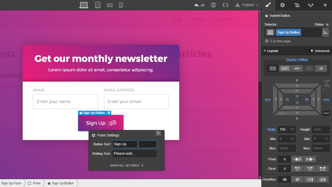
Add our already created “Sign Up Button” class to the form button and change the text to Sign Up.
Now we just need one last element for the modal: a close button.
Place a div anywhere in the Modal Wrapper, give it a class of “Close Modal Button,” and add these styles:
- Padding: 5px (all sides)
- Width: 30px
- Position: absolute, top right, with a top and right margin of 20px
Place your close icon inside the div. I’m using this close icon from Flaticon.


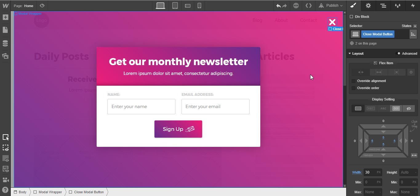
Now for the fun part: bringing it all to life with interactions!
Step 4: Add your interactions’ initial states
To get started, we need to define the modal’s initial state — what it’s doing when the page loads. Which in our case is … invisible.
Select your Sign Up Form, open the Interactions panel, and create a new interaction on the current page, with a trigger of page load.
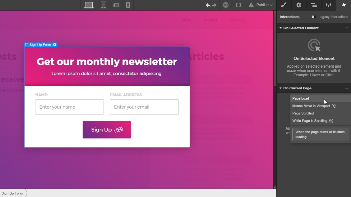
Select the start an animation option from the dropdown menu.
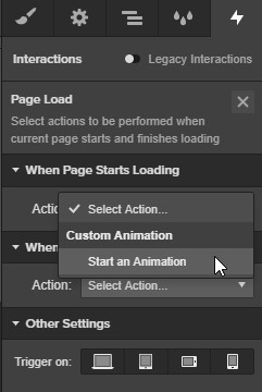
Create a timed animation by clicking the plus icon. Name the animation “Sign Up Form Hide on Load.”
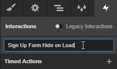
Add a timed action of scale.
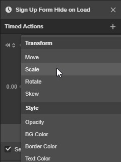
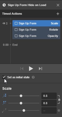
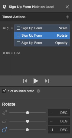
Tick the initial state checkbox and set the X and Y scales as 0.8. Add another timed action of rotate set to initial state with a Z rotation of -4°.
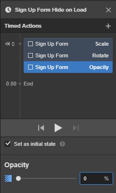
Last one! Add a timed action, set it to initial state, and set opacity at 0%. Done!


Design interactions and animations without code
Build complex interactions and animations without even looking at code.
Now we’re going to be doing a similar set of actions with the Modal Wrapper. Select the Modal Wrapper, open the Interactions panel, and add a current page interaction with a page load trigger.
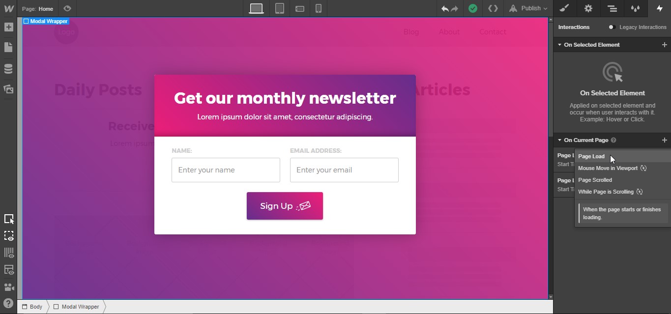
We’ll choose to start an animation when the page starts loading.

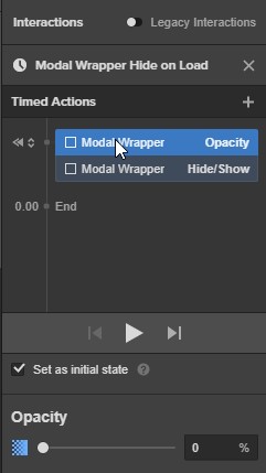
Now create a timed animation and name it “Modal Wrapper Hide on Load.”

Then add an initial state of opacity 0%, and another of the “hide/show” type, with “hidden” selected.

Step 5: Add the on-click interactions
Now we need to add the trigger interaction to the Sign Up button on the canvas.
You have two options to access the Sign Up button, as it’s behind the Modal Wrapper. Option 1: Find and select it in the Navigator panel. Option 2: set the Modal Wrapper to no-display. Handily, everything still works fine if you leave the modal wrapper hidden.
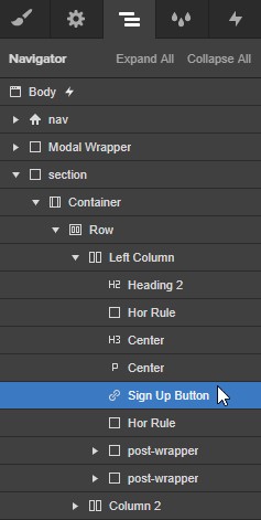
With the Sign Up Button selected, open the Interactions panel, and add a “selected element” interaction with a trigger of click/tap.

Then start an animation on first click.

Create a timed animation and call it “Open Sign Up Form Trigger.”

Add a hide/show interaction and set the display to flex. Add a second interaction for opacity, change the start to “With Previous Action,” then set the duration to 0.5s with linear easing, and bring the opacity up to 100%.

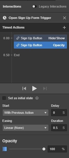
Now because we want this interaction to target another element, go back to the interactions list by clicking the X in the top right (closing the current interaction creation flow).
Then right click the interaction, select "Change Target" from the dropdown, and click "Modal Wrapper." Now the interaction we just created affects the Modal Wrapper div.
We’re done with this interaction, so click the X in the upper right, until you’re back to the Interactions panel.
Now we’re going to add another interaction, this one on the selected element, triggered by click/tap.
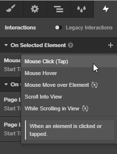
Select “Start an Animation” from the “On 1st Click” dropdown menu.

Create a timed animation and call it “Show Sign Up Form.” Then add 3 timed actions:
- Opacity 100%, linear easing, 0.4s duration
- Rotate, set to start with previous action, linear easing, 0.4s duration, Z set to 0°
- Scale, set to start with previous action, in out quart easing, duration 0.5s, X and Y to 1


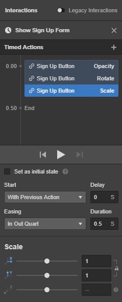
Then close this panel, right click the interaction, select "Change Target" and click “Sign Up Form.”
We’re so close! We just need to make two more interactions for the close button.
Highlight the close button div, open up the interactions panel, click on the plus icon and select “Mouse Click (tap).”

Select “Start an Animation” from the “On 1st Click” dropdown menu.

Create a Timed Animation by clicking on the plus icon.
Name the Interaction “Close Modal Trigger.”
Add a Timed Action for opacity, leave the easing on Linear set the duration to 0.2s and the opacity to 0%.
Add another Timed Action for Show/Hide, set the Start to “After Previous Action” then set the display to hidden.

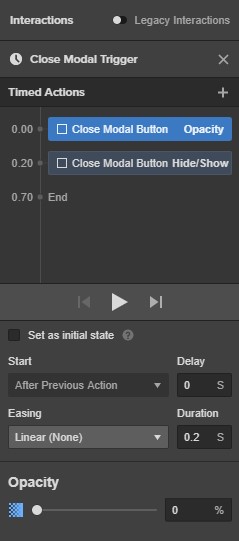
We’re done here.
Next, right click the interaction, select "Change Target" and click “Modal Wrapper” — this action now affects the Modal Wrapper.
Just one more to go!
Go back to the Interactions list, select “Mouse Click (tap)” to add another interaction.

Create a Timed Animation by clicking on the plus icon.
Name this “Close Modal Form,” add a Timed Action of Scale with a duration of 0.2s, set the scale to 0.8
Add another Timed Action for Rotate, a duration of 0.2s with Z set to -4°.
Finally, add a Timed Action of Opacity, duration is the same at 0.2s with opacity set to 0%.


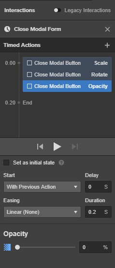
Now, right click the interaction, select "Change Target" and click “Sign Up Form” — this animation now targets the Form.
We made it! Publish it and test it!


