If you’ve been to our homepage recently, you might have noticed some changes. Here’s a quick look at what’s new, why we’re changing it up, and some “behind the scenes” resources so you can see how we built different pieces.
Time to grow up: homepage edition
At the outset of this project, we focused on where we needed to improve, asking ourselves “what’s not being said on our website?” And while our old homepage did a decent job explaining what Webflow is, it didn’t always help people understand “the dream” — i.e., how to use Webflow to overcome the problems they face in their daily work.
Plus, the last redesign of our homepage took place in December 2016, and since then, the product had matured. A lot.
While we added landing pages here and there to reflect some of our major feature launches, we hadn’t revised the homepage, so it began to feel cobbled together and ultimately, incomplete. With Webflow Ecommerce approaching, we realized that Webflow, the platform, was quickly outgrowing Webflow, the website.
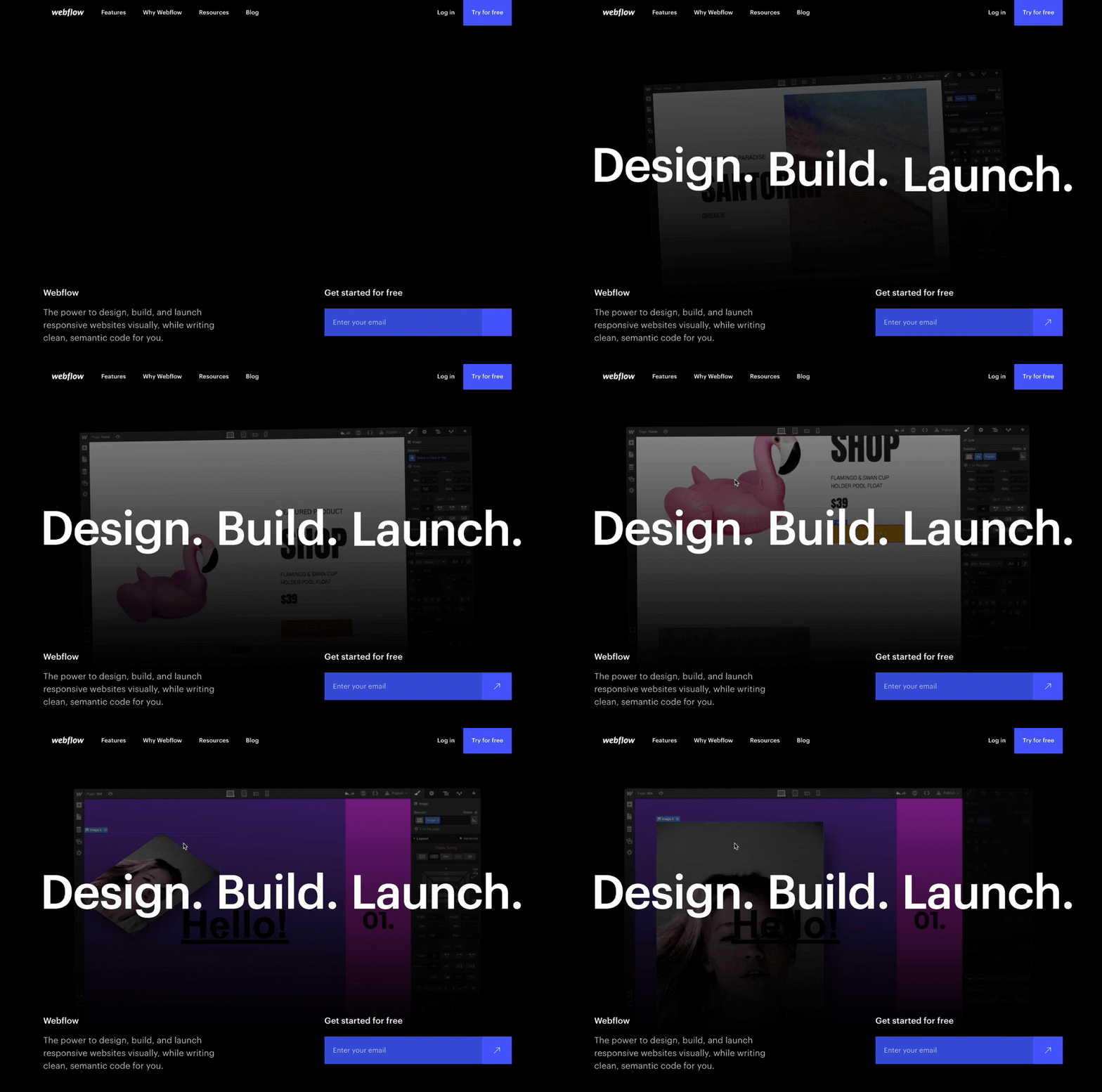
We needed to reconsider the “story” of Webflow through the lens of how you use Webflow. That meant bringing to light the many different use cases of our tool through dedicated pages for freelancers, business owners, agencies, and prototypers.
Defining our story
While we wanted to do a better job speaking to the many different ways you can use Webflow, we also needed to distill the platform into a framework that both:
- Captures the experience of working with Webflow, and
- Could serve as a foundation for our product story over the coming years
Ultimately, we landed on three core “phases” of Webflow’s platform: design, build, and launch. These three phases roughly map to the lifecycle of a Webflow site, and serve as umbrellas for our core features:
- Design: This encompasses the creative freedom and precision that Webflow offers designers. This means the core Designer experience (building layouts) and the creative freedom of Interactions.
- Build: This involves the more “database-y” powers that Webflow unlocks with the CMS and, in the future, ecommerce.
- Launch: This is the life of websites once they’re complete, including our hosting stack, and the experience of using the Editor to maintain the site.
Prototyping and building in Webflow
Once we had a clear content direction, we spent weeks and weeks prototyping the motion and layout in Webflow, which allowed us to cycle through different iterations much faster than other prototyping tools.

Ultimately, this made life a lot easier. Once we landed on a page that felt right in terms of motion, we were able to build on top of the prototype and add in the detail needed to move it toward the finish line.
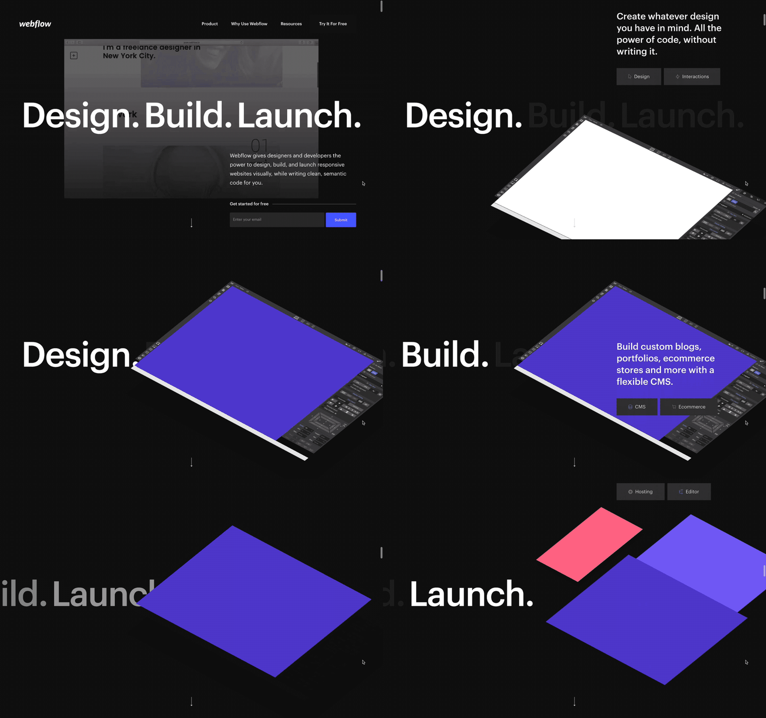
We were also able to invite the content peeps into the Designer to touch up copy while we continued to cycle through our final phases of the content discussion.


The modern web design process
Discover the processes and tools behind high-performing websites in this free ebook.
The so-called “MEGANAV”
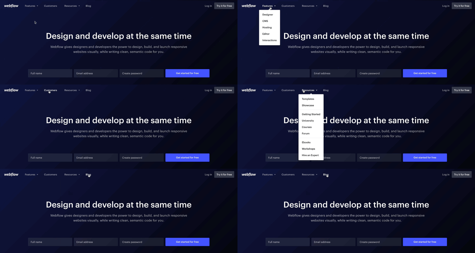
One of the more notable new features on our website is the popover navigation, referred to internally (and lovingly) as the MEGANAV. This not only created more room for more links and pages, we also saw how a more visually rich navigation could better orient people to the platform as a whole.
Room for improvement
As our site grew over the past year, our old dropdown navigation was doing a poor job exposing people to the many different resources we had, and at times felt unorganized as our “resources” bucket became a hodgepodge of miscellaneous pages. Our case studies were buried beneath a “customers” landing page, and we knew we were soon releasing a set of persona-focused pages that would only make this problem more pronounced.
More than just a nav
Not all navs need to be MEGA, but at Webflow, the sheer number of products and use cases need to be captured in a way that’s visually informative and helps users understand the breadth of Webflow’s platform.

So we broke it up into three main sections, each with their own visual treatment and microcopy:
- Features: We brought the “Design, build, launch” structure into our nav to expose the pillars of the platform, giving people the chance to really hone in on specific areas of Webflow.
- Why Webflow: We’ll discuss these pages below in more detail, but this section is less about “what” Webflow is, and more about “why” Webflow matters
- Resources: Having a product is one thing, but having a supportive community and an extensive resource center for learning is just as important. Given how important learning is for Webflow, we wanted to feature the resources behind the platform front and center.
With all this in mind, the new navigation better orients people to the platform and answers the question: “What’s Webflow, and why should I care?”
Building MEGANAV in Webflow
Building this in Webflow was its own challenge. We explored a number of approaches — if you’re interested in how we did it, check out a couple prototypes (version 1, version 2) of earlier iterations that came before the one we landed on (be forewarned: as prototypes, these are not mobile-friendly).

“Why Webflow?” pages
As a creative tool, Webflow can do a lot, but the breadth of use cases it covers aren’t always obvious after exploring pages about our core features.
For example, when a product designer comes to Webflow.com, they might be able to infer that Webflow works for prototyping, but we make their job a lot easier if we simply tell them why and how prototyping with Webflow helps them work with developers.
To help frame people’s introduction Webflow, we decided to build pages that speak specifically to the benefits and features that matter most to the four core ways we see people using Webflow:
Going into this project, we knew we already had extensive content in our features specific pages about what Webflow is, but not very much content on the why aspects. These pages are meant to bridge that gap.
Design supporting content
From a design perspective, we knew there was a lot of information packed into each of these pages, but we wanted to make sure that the actual experience of browsing and going through them was still inspiring and capable of evoking emotion.
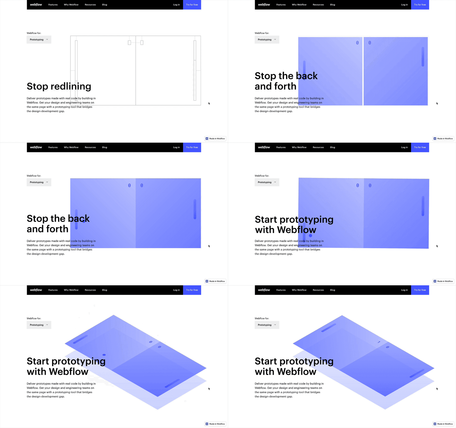
There was also a lot that could be said with motion and design instead of just text. For example, we used “stacking” scroll patterns to reinforce the sense of “process” that each persona goes through when they’re working in Webflow, which ties back into our core focus on emphasizing the breadth of Webflow as a platform.

Beyond this, we relied on illustration in the hero sections of each page to bridge an emotional connection with visitors, which can be hard to do with just copy. (We got extra creative with the prototyping page — check out a cloneable version of the hero so you can see how it’s built).
What do you think of our latest redesign(s)? How do you approach redesigns of your own? Let us know in the comments!


