


Competition for visitors’ attention is high, as you only have a fraction of a minute to make a good first impression — or risk users abandoning their website.
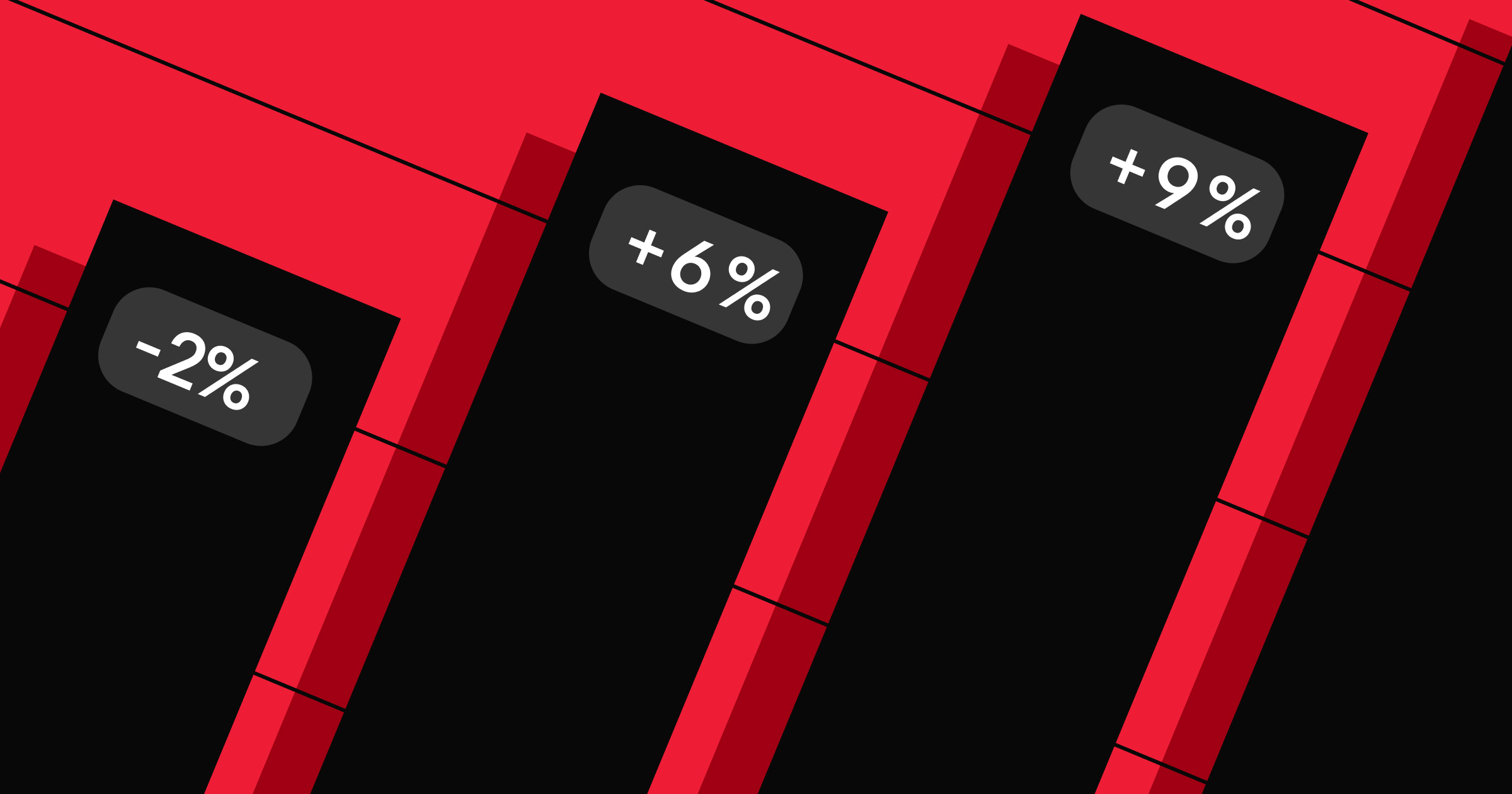
To capture and retain user attention, you must prioritize a great user experience that enables users to complete key actions with minimal friction. However, building a good user experience requires getting a thousand details right. Even minor annoyances can lead to rage clicks away from your website, resulting in a 6% reduction in page views.
In this blog post, we’ll cover eight common website mistakes and how you can solve them to boost your website’s user experience and conversion.
1. Intrusive pop-ups
A website pop-up is a trigger-based window that appears when a user browses your website. It can be triggered when they click a button, scroll to a certain point on the page, or after a set time.
Pop-ups can be a great way to inform users about important information or guide them to take action. For example, a pop-up might ask users for consent to track cookies. However, many websites have poorly designed pop-ups that interrupt and “hijack” a user session, creating an extremely frustrating user experience. Users may abandon your site if these pop-ups appear too frequently or keep blocking important content.
To overcome these challenges, integrate pop-ups with your website’s design rather than as an “add-on” element that interrupts the key flow of your user experience. Consider implementing the following best practices:
- Concise messaging: Keep your message brief to dissuade users from clicking away without reading.
- Simple design: Use your brand’s colors, fonts, and themes in your pop-up’s design so the momentary interruption feels like a natural extension of your website’s experience. If you’re using Webflow, you can use Webflow’s templates to find inspiration for well-designed pop-ups.
- Strategic timing: To minimize a disruptive experience, show the pop-up when the user is least likely to be interrupted: after the user has been on the page for a certain amount of time, after they click a button, or when they scroll a certain distance on the webpage.
- Holistic approach: Instead of designing a pop-up in isolation, create it in the context of the other pop-ups a user might see. Ensure that their experience isn’t blocked by pop-up after pop-up (especially if it’s the same one), as that will create a negative user experience and impact your conversion rate.
2. Autoplaying music and video
Adding interactive content like videos and music can make your website more engaging. But if done poorly, it can have the opposite effect.
Autoplaying audio and video can confuse or distract users. Instead of interacting with your website’s content, visitors must figure out how to stop the video and/or audio. This can result in users spending less time on your website, or worse — rage clicking and abandoning.
Autoplaying content also creates accessibility issues. The screenreader’s voice will overlap with the website’s audio track, creating a jarring and confusing user experience for visitors who use screen readers. Additionally, it can impact SEO, as videos and audio take longer to load, slowing your website and impacting SEO ranking.
To fix this, give users control over when to start playing the content. They should also be able to pause, play, and rewind the content. For example, creative agency OSCO Studios embeds multiple videos on its website, but all require user input to start playing.

3. Slow page loads
If a page takes over three seconds to load, over 53% of mobile visitors will abandon the website. This statistic reflects the rising user expectation that pages should load quickly and instantaneously. You can benchmark your website speed with Google’s Core Web Vitals framework, which provides three metrics to measure the speed of a website:
- Page load performance: how fast the page elements load
- Responsiveness to user input: how quickly the user can interact with the page
- Visual stability: how well it minimizes disruptive layout shifts as the page loads
You can use these metrics to understand which part of your page load experience needs to optimize. Here are some other best practices to keep in mind when optimizing your website’s performance:
- Optimize images: Large, unoptimized images can significantly reduce page load speeds since they require servers to transfer more data to browsers. Invest in tools to help you optimize your images before you add them to your website.
- Minimize HTTP requests: Adding more HTTP requests to your website adds bloat, which increases load time. Audit your third-party requests, JavaScript libraries, and CSS styles for redundancy and necessity, and remove unnecessary requests.
- Choose reliable web hosting partners: Reliable providers host your website on high-performance servers optimized for speed, uptime, scale, and security. For example, Webflow’s hosting platform handles 10 billion web pages across six continents and provides features such as global CDN, image compression, and SSL certificates.
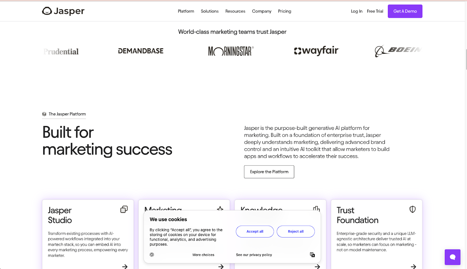
4. Confusing navigation
An inconsistent or unclear website navigation impacts users’ ability to find key information, resulting in users rage-clicking and abandoning the website. For example, a user expects to see a clear “log in” CTA on the homepage, but if the link is hidden in the “Profile” page, they might get lost and abandon the task.
The solution is to have a clear information architecture (IA) for your website. An IA organizes your website's content into clear logic and predicts how visitors will naturally browse the webpages. Creating the IA requires understanding how users expect to navigate your site and complete specific tasks, then leveraging this understanding to build out the key flows.
Ask yourself these questions as you create the IA:
- What key tasks do users come to my website to do? Where might they expect to find these actions?
- What key information do users need to know on my website?
- What order should I organize this information?
Once you have your IA, you can quickly implement it by reorganizing your page navigation using Webflow's design tools.


.jpeg)
9 B2B website optimization ideas that work
In this ebook, learn strategies to increase B2B website conversions
5. Non-responsive design
As more users primarily use their mobile devices to browse websites, they expect responsive websites that work seamlessly across all device types — laptops, tablets, and smartphones. When users come across a non-responsive design, they might miss critical content, creating a frustrating experience. For example, if a website is designed only for laptops, the CTA button or other contact information might disappear or be difficult to find when someone views it on their phone.
To solve this challenge, brands must implement responsive design principles to provide a good user experience across all device types. A platform like Webflow makes it easy to design responsive pages through built-in features to preview and adjust layouts across all devices.
6. Poor color and contrast
Contrast is a powerful design tool that makes pages visually appealing by using different colors, sizes, and shapes to create a visual hierarchy. This can help call attention to specific elements (like CTAs) or improve the text’s readability.
However, if done poorly, it can increase cognitive load and negatively impact the user experience. For example, yellow text on a white background creates insufficient contrast, making content difficult to read and failing key accessibility standards for people with visual impairments.

To overcome this challenge, take a thoughtful and iterative approach to contrast. Some tips to keep in mind:
- Determine what to emphasize: Use contrast sparingly to highlight the most critical elements of your page, such as CTAs, the brand’s value proposition, or key product features. For inspiration on how other brands have effectively utilized contrast, take a look at the examples in our blog post.
- Maintain consistency: Contrast should align with your site’s central visual identity to avoid confusion or a chaotic appearance. Stick to a consistent color scheme and typography hierarchy. If you need creative inspiration, browse Webflow’s templates for ideas on utilizing contrast on your page — or better yet, reuse the template for your site.
- Test and iterate: What works in theory may not always be effective in the real world. Show your design to others or use tools like Webflow Optimize to test new designs.
7. Lack of accessibility
Web accessibility refers to your site’s accommodation and availability to users, regardless of their abilities or challenges. Neglecting accessibility means many potential visitors can't use your site effectively — alienating them and exposing your organization to compliance lawsuits, which damage brand reputation. Additionally, creating an accessible website brings your site design closer to industry-standard web design best practices, improving the overall user experience.
To ensure your website is accessible to all users, follow the Web Content Accessibility Guidelines (WCAG). These standards outline specific recommendations to minimize usability issues for folks with visual, hearing, motor, and cognitive disabilities. With Webflow’s suite of accessibility tools, you can audit your website and get guidance on implementing these guidelines.
8. Poor form design
Forms are critical to a website’s conversion funnel and fuel lead generation or payments. However, poorly designed forms can result in a frustrating user experience, such as:
- Endless form scrolling: Users see new fields as they scroll down instead of all the fields upfront. This can be frustrating and prevent them from understanding the form's length or completion status.
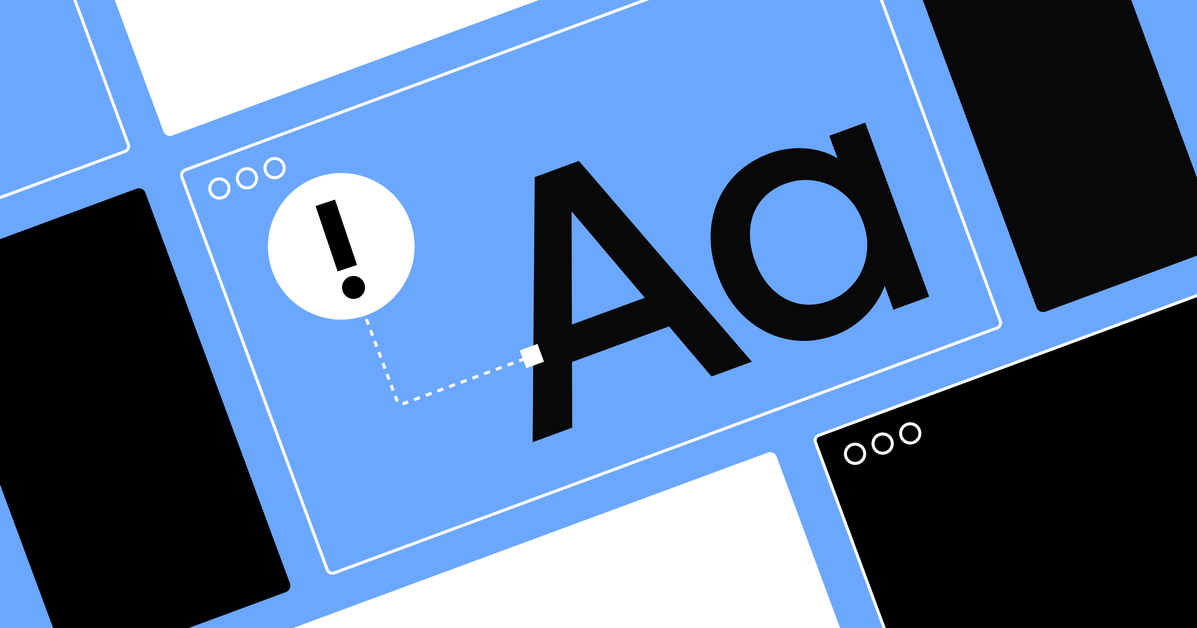
- Improper error validation: When users get a submission error but aren’t told what went wrong, they don’t know how to fix it. This can impact your form completion rate and website conversion rate.
- Lack of confirmation states: If users successfully submit a form, they expect a confirmation page or message. Without this confirmation, they might get confused about the status of their submission.
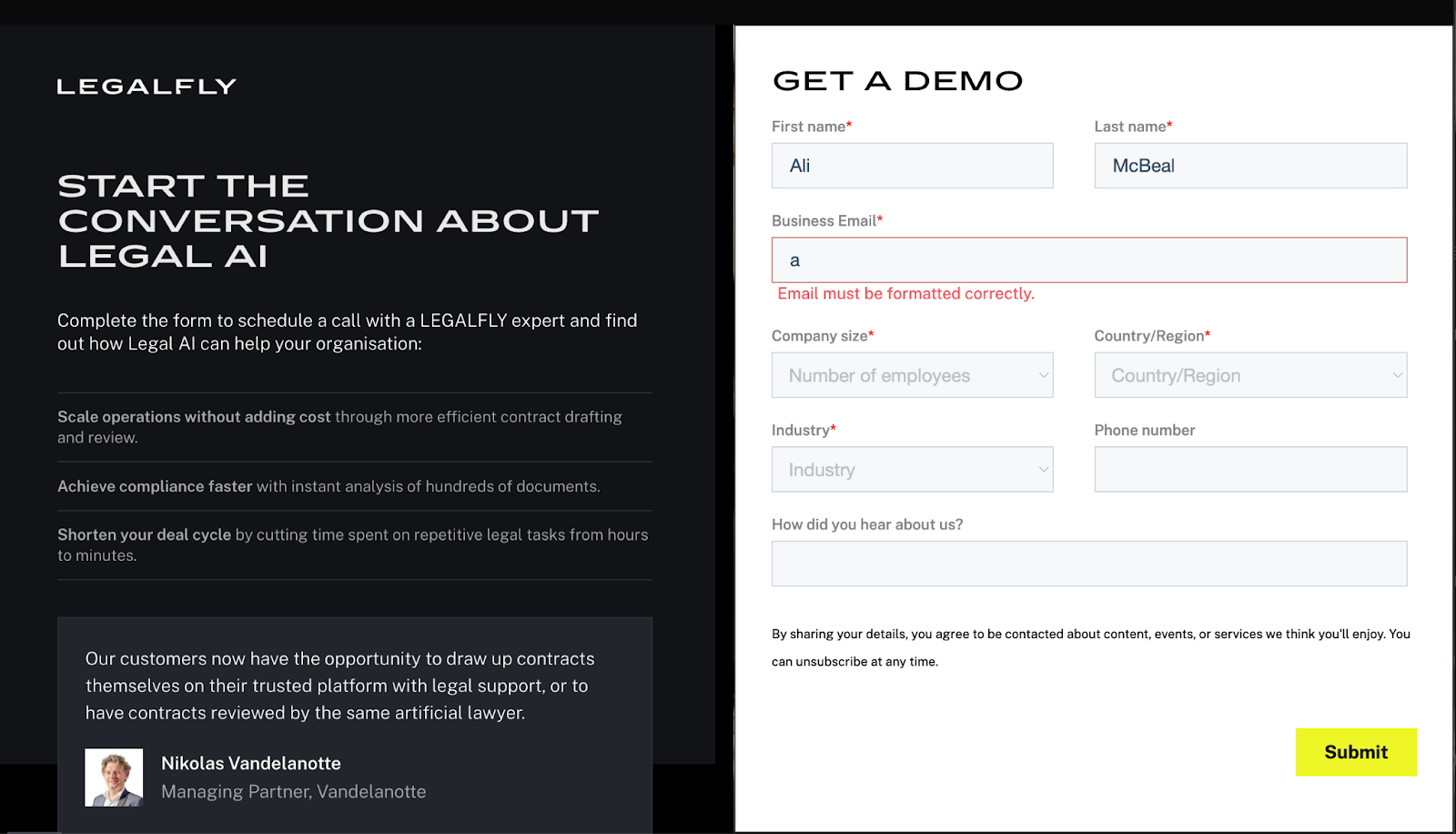
To avoid making these mistakes, here are some best practices to keep in mind when designing your forms:
- Set clear expectations: Show users exactly what they're getting into. Show all fields upfront so that users can immediately gauge the time commitment. For long and complex forms, use a progress bar to showcase completed and remaining sections.
- Give users feedback: Provide real-time validation as users complete each field. This instant feedback builds user confidence, maintains momentum, and prevents frustrating submission errors.
- Pay special attention to error states: Ensure all error states have helpful messages to help users fix their errors. This allows users to successfully resubmit the form, reducing frustration and improving form conversion.
If you’re using Webflow, you can browse pre-made form templates that already follow these best practices.
The compounding value of user experience
The difference between website success and failure often comes down to user experience. The brands that thrive continuously iterate and improve their user experience, fixing mistakes and optimizing key touchpoints across the customer journey. These improvements might appear minor in isolation, but the impact compounds — resulting in significant top-level conversion gains in the long run.
Want to learn more strategies to improve your website’s user experience? Check out our ebook on proven B2B website optimizations.