
Well-designed website forms don’t just look better — they perform better.
Traditional form designs can be monotonous, with plain boxes occupying valuable real estate on your client's website. Whether conducting feedback surveys or encouraging visitors to get in touch, forms are essential for converting casual browsers into action-taking customers.
With a few thoughtful design tweaks, you can turn static forms into high-converting design elements. Here are form design best practices and innovative patterns to inspire you.
4 web form designs for your next project
Effective forms capture user information you can leverage in your marketing strategies. But to encourage users to fill out your forms, you need to design them thoughtfully for optimal function and engagement. Here are four primary form patterns to consider.
1. Boxless forms
Boxless forms are minimally designed without conventional input fields like rectangular-shaped boxes. Instead, they use subtle cues like lines to tell visitors where to enter information. This design gives a website a sleek appearance, encouraging engagement without overwhelming people with busy elements.
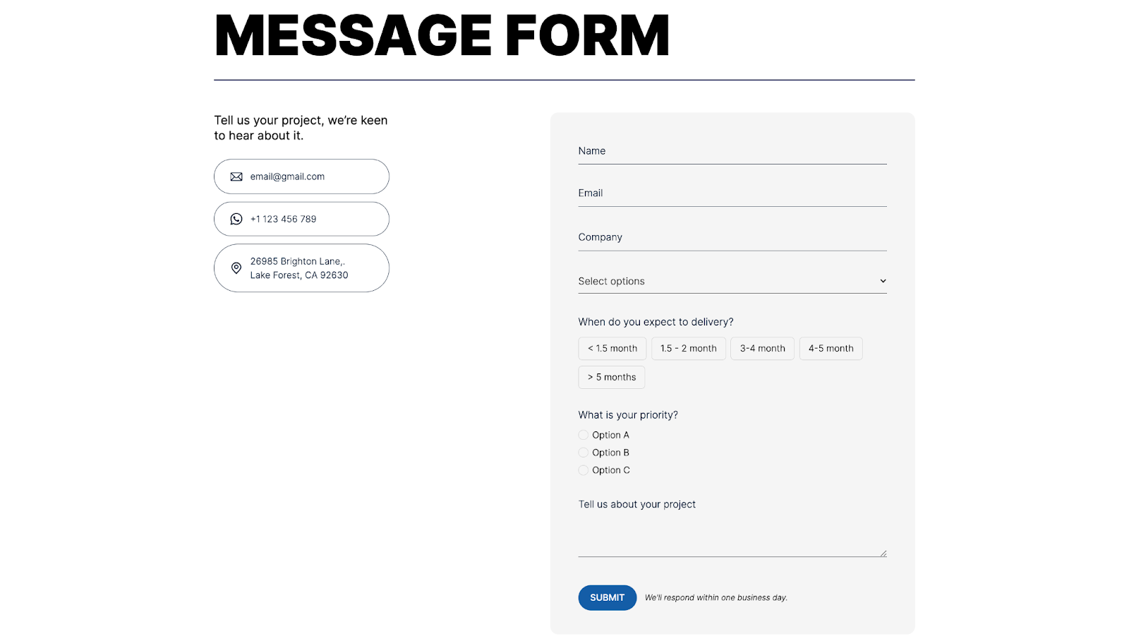
While surrounded by a traditional box design, Zoe Tang's Instant form validation website has boxless input fields indicated by subtle lines. Each field's text has clear labeling to guide you and left-aligned labels to maintain a consistent visual flow.
Interactive elements like the drop-down menu for "Select options" and the radio buttons for "What is your priority?" add functionality without overloading the viewer with information. The blue "SUBMIT" button stands against a neutral background, indicating the form's completion.
The input fields create a logical visual hierarchy and reduce cognitive load by condensing complex, multiple-choice answers into predefined choices.
2. Step-by-step (procedural) form design
Step-by-step forms are divided into multiple stages, presenting only a few input fields at a time. They're ideal for long or complex forms as they don't overwhelm people with excessive information at once.
Dividing the form into manageable steps improves user focus and guides visitors to completion. With a clear path to follow, people are less likely to make errors while filling out the form.
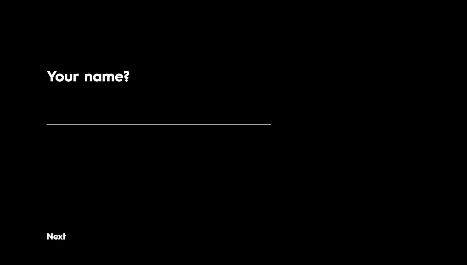
Philippe da Ponte's Multi-Step Form design combines procedural elements with a boxless design. The form presents only one input field at a time, helping you maintain focus while filling out the form. Each step provides explicit instructions so you understand how to complete it, providing feedback in case you make errors.
The navigation buttons, such as "Previous," "Next," and "Submit," are also prominent to support smooth transitions between steps. With a clean, black background and high-contrast white text, the form is easy to read and navigate. These design choices reduce input error and increase completion rates.
3. Animated forms
Animated forms bring movement and life to the form-filling process. They add fluid motion and dynamic transitions to guide users through input fields, making the experience more interactive and less mundane.
Animations also reduce perceived wait times and draw attention to essential elements, encouraging visitors to take action. By adding a touch of creativity to these interactions, form-filling becomes enjoyable and engaging, making people more likely to submit information.
There are two types of animated forms:
- Slide in from the bottom or side — These forms slide into view from the bottom or side of the screen, creating a smooth transition that catches attention without being overly intrusive.
- Full-screen form — Full-screen forms occupy the entire screen, eliminating distractions and focusing the visitor's attention solely on completing the form. This format helps visitors focus on detailed or long forms, improving conversion rates and avoiding errors.
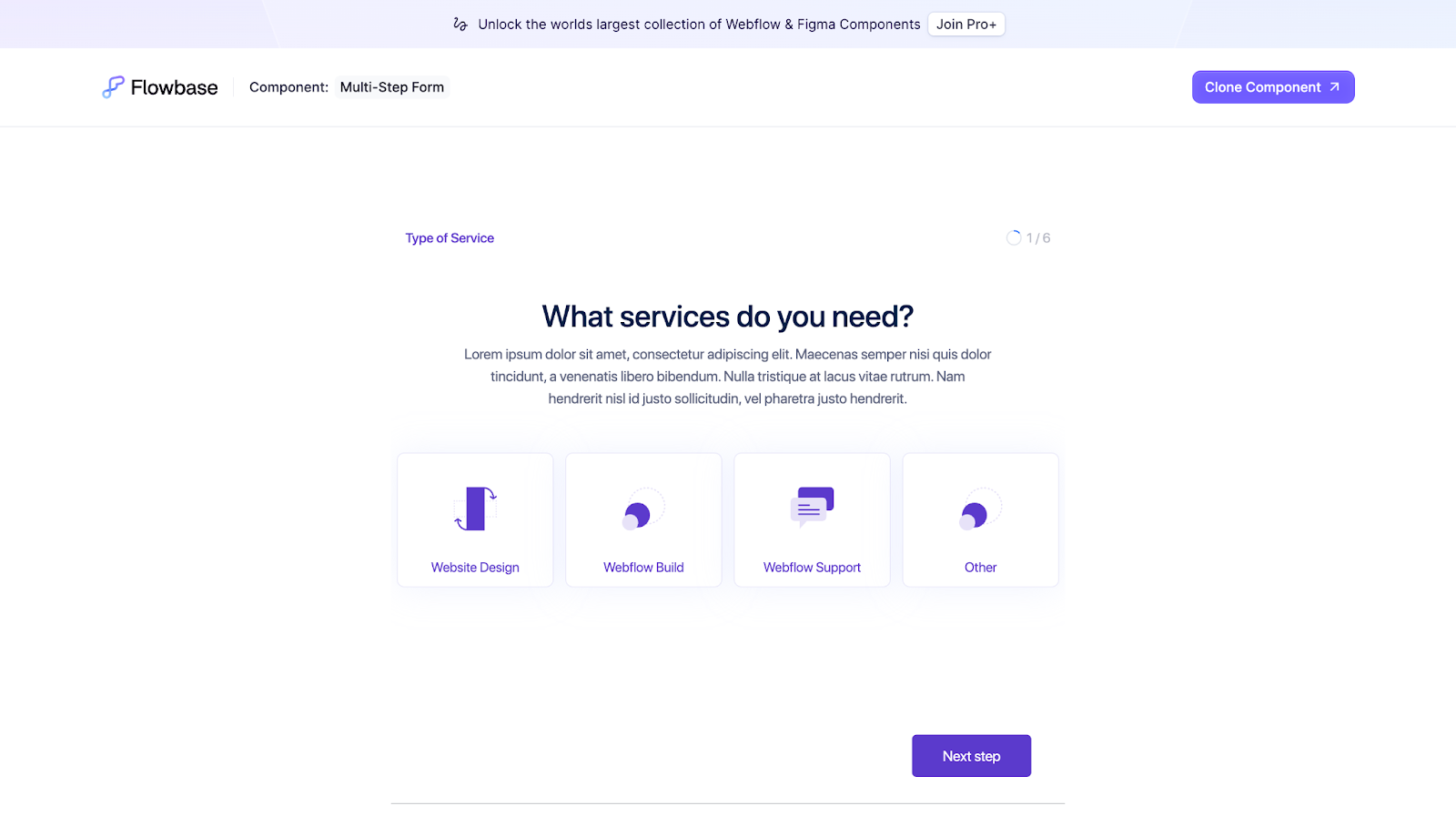
Flowbase's Multi-Step Form uses animated elements to bring a step-by-step form to life. Each step provides several inline options. Choosing an input type highlights your selection in green, providing immediate visual feedback and validation and confirming that the site registered your choice correctly.
Proceeding to the next step shows a subtle animation where the form slides in from the bottom — the question appears first, followed by the interactive elements to create a smooth visual hierarchy.
4. Natural language forms
Natural language forms present questions in a conversational tone. Instead of the usual labels and boxes, these forms allow visitors to fill out forms as if responding to a series of questions from another person. Natural language forms reduce friction by mimicking real conversation, making form-filling feel more personalized and user-friendly.
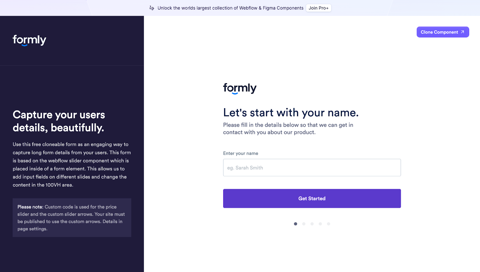
Flowbase’s Onboarding Form follows natural language principles by presenting questions in a conversational tone. Each step asks a straightforward question — like "Let's start with your name" or "What best describes you?" — so the process is more like a dialogue than a traditional form. This format makes visitors feel comfortable and more willing to fill out information.
This form also has a step-by-step format with animated transitions to keep people focused on one question at a time. Purple action buttons — like "Next Step" and "Complete Submission" — contrast against the white background to guide visitors through each question.


Ultimate web design
From 101 to advanced, learn how to build sites in Webflow with over 100 lessons — including the basics of HTML and CSS.
How form designs boost the user experience
Effective form designs are crucial for encouraging visitors to take action. Here are a few benefits they provide to elevate the user experience.
Improved clarity and focus
Designs like step-by-step forms break information into digestible sections, reducing visitors' cognitive load. They can focus on one task at a time, and the sales funnel becomes narrower and more straightforward.
For example, a multi-step registration form for an online design tool subscription might first ask for personal details, followed by account settings and payment information. In these scenarios, use text fields with clear instructions to guide visitors, ensuring they know what to enter and don't feel overwhelmed by multiple fields at once.
Increased engagement and interaction
Interactive elements, like those in animated forms, capture attention and break up static elements on the page. Components that keep people engaged also encourage interaction, making people more likely to complete the form.
For example, a subscription form could subtly slide from a blog's side to grab attention without disrupting the reading experience. Adding animated transitions and action buttons, like "Buy now" or "Sign up," also incentivizes visitors to interact.
Streamlined aesthetic
Boxless forms use minimalist design principles to create a clean appearance with flat elements. Their simplicity makes them inviting, especially on visually sophisticated sites where the surrounding content can be overwhelming.
Say you have a portfolio website with creative typography and vibrant project thumbnails. You can use boxless forms with underlined input fields instead of traditional boxes to distinguish the form from these sections and help it stand out.
Personalized interaction
Natural language forms turn form-filling into a more conversational experience, making it feel personal and less robotic. By asking questions in a human tone, these forms make visitors feel more comfortable and willing to provide information.
For example, you can create feedback forms with questions like "How can we improve your experience?" or "Tell us what you liked about this product!" You can also add radio buttons or checkboxes for quicker, more convenient responses.
Better content organization
Organizing form fields into logical sections creates a visual hierarchy. A well-composed design is more intuitive to work with, ensuring visitors can quickly navigate to forms, understand them, and provide information without other elements distracting them.
Grouping related fields in a contact form, such as personal details in one section and a message in another, helps visitors find and complete the necessary information with minimal fuss.
Build high-converting websites with Webflow
Incorporating innovative form design techniques, like boxless layouts, step-by-step animations, and natural language, can significantly improve your client's conversation rates.
With Webflow, you have the tools to bring these designs to life. Learn how to customize forms on Webflow University and take inspiration from the design community to find new ideas and cloneable templates.
Build top-performing websites for your clients with Webflow.
Get started for free
Create custom, scalable websites — without writing code. Start building in Webflow.
.jpeg)