

Make your website more accessible, readable, and visually engaging by using contrast.
Contrast in web design isn’t just about making things pop — a well-contrasted site embodies fundamental design principles to make pages visually appealing and interesting without affecting functionality.
Your website must have proper contrast to avoid losing frustrated visitors due to poor legibility. With a well-thought-out layout, you can make your site more accessible and see higher traffic rates. Read on to learn how to use contrast in your web designs.
What’s contrast in web design?
Contrast is the visual difference or separation between factors such as color, size, and shape. It thoughtfully arranges opposites in these categories to make design elements stand out from each other. This graphic design principle lets you emphasize a subject or create a visual hierarchy within a layout so visitors can easily distinguish between different parts of the page.
For example, high contrast between text and background (like black text on a white background) makes content more readable. Similarly, contrast in size and color draws attention to elements like call-to-action (CTA) buttons and headlines.
Why is contrast important in web design?
Here are a few reasons contrast is critical in your designs:
- Establishes a visual hierarchy. Contrast helps determine a clear visual hierarchy on your website by making important components like headlines, buttons, and CTAs stand out. Creating a contrast between elements guides visitor attention to the most crucial information and helps them quickly understand it.
- Improves accessibility. Proper contrast ensures your website is usable for as many people as possible, including those with visual impairments or color blindness. Sufficient contrast between the text and background makes content more accessible to read, creating a more inclusive experience for all visitors.
- Ensures compliance with accessibility standards. Web standards, such as the Web Content Accessibility Guidelines (WCAG), emphasize contrast ratios to meet accessibility requirements. Following these guidelines supports inclusivity and protects your brand from potential legal risks.
- Boosts the user experience. A well-contrasted composition reduces visual fatigue in visitors and makes your website easier and more satisfying to navigate. It keeps people engaged longer and encourages them to explore.
6 types of contrast in web design
Contrast comes in many forms, and each contributes to your site’s aesthetic and functionality. Here are six fundamental categories.
1. Color
Color contrast is the hue, brightness, or saturation difference between two colors. High color contrast improves readability and draws attention to specific elements. For instance, a yellow font on a navy background creates high color contrast for headlines and paragraphs, while a vibrant red button on a neutral background highlights a CTA like “Buy now!” or “Sign up!”
2. Background
Background contrast focuses on the separation between background and foreground content. It prevents elements from blending together so the foreground subject stands out. For instance, using a subtle gradient or a semitransparent overlay behind text on a busy or patterned image background separates the text from everything behind it, making it more legible.
3. Size
Size contrast refers to the difference in scale between design elements. Differences in size can emphasize a scale of importance and help people identify the most essential information at a glance. For example, larger headings grab attention first, while smaller subheadings and body text naturally follow. Similarly, oversized buttons make CTAs more eye-catching.
4. Shapes
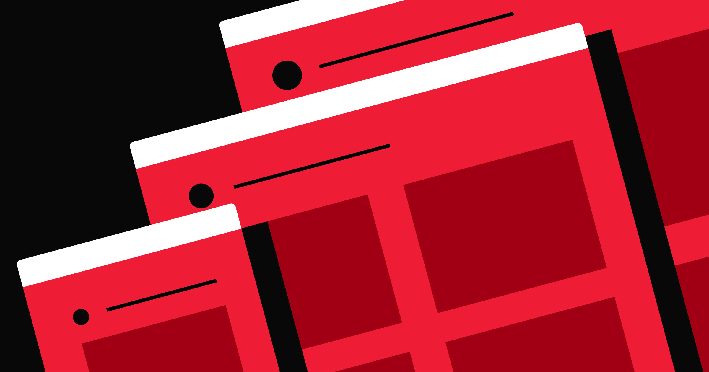
In shape contrast, you use different forms to distinguish between elements. This adds pleasing variety and draws focus to a shape’s unique features. For example, a circular “Buy now!” button among rectangular text boxes and images grabs attention and encourages visitors to take action.
Mixing shapes can also create visually exciting layouts by breaking the monotony that similar or static elements produce.
5. Space
Spacing contrast involves using white space or negative space around elements. It creates breathing room and emphasizes certain components relative to their surroundings. For instance, generous spacing around a featured product image makes the visual stand out as a focal point and helps avoid a cluttered page.
6. Visual elements
This type of contrast involves differences in design elements like texture and patterns, adding a sense of depth and enhancing visual complexity. For example, pairing a flat illustration with a seemingly textured background makes the illustration pop while adding interesting character to the design.


Ultimate web design
From 101 to advanced, learn how to build sites in Webflow with over 100 lessons — including the basics of HTML and CSS.
Best practices for using contrast
Incorporating contrast into web design requires a thoughtful approach to ensure your site is visually appealing and user-friendly. Here are some best practices to consider.
Determine what to emphasize
Not every element on your website needs to stand out. Prioritize key components like CTA buttons, headlines, and contact forms. These are what will draw readers in and encourage them to take action, like reaching out to your team or adding a product to their cart.
Use contrast to guide the visitor’s focus, then emphasize the subject to encourage interaction and maximum engagement. For example, make a sign-up button brighter and larger than other page elements to grab attention without overwhelming the layout.
Maintain consistency
Contrast should align with your site’s central visual identity to avoid confusion or a chaotic appearance. Stick to a consistent color scheme and typography hierarchy. So if your primary contrast is between a dark background and white text, keep this consistent across similar sections of your website to reinforce familiarity and maintain readability.
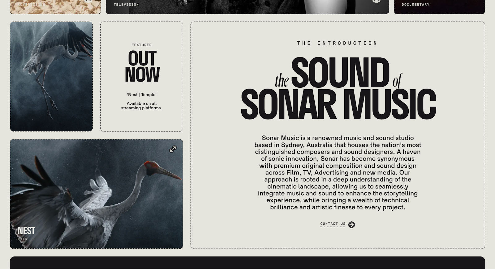
For example, Sonar Music’s website has black text on off-white backgrounds with dotted black box outlines throughout the layout. Vibrant images break the text monotony, keeping the aesthetic intriguing and consistent.
Play with addition and subtraction
Employing contrast isn’t just about adding bold or bright elements. Sometimes, removing unnecessary details improves the overall design, too. For example, taking away extraneous images allows more white space to let other elements breathe and pop on the page, creating contrast by reducing visual clutter.
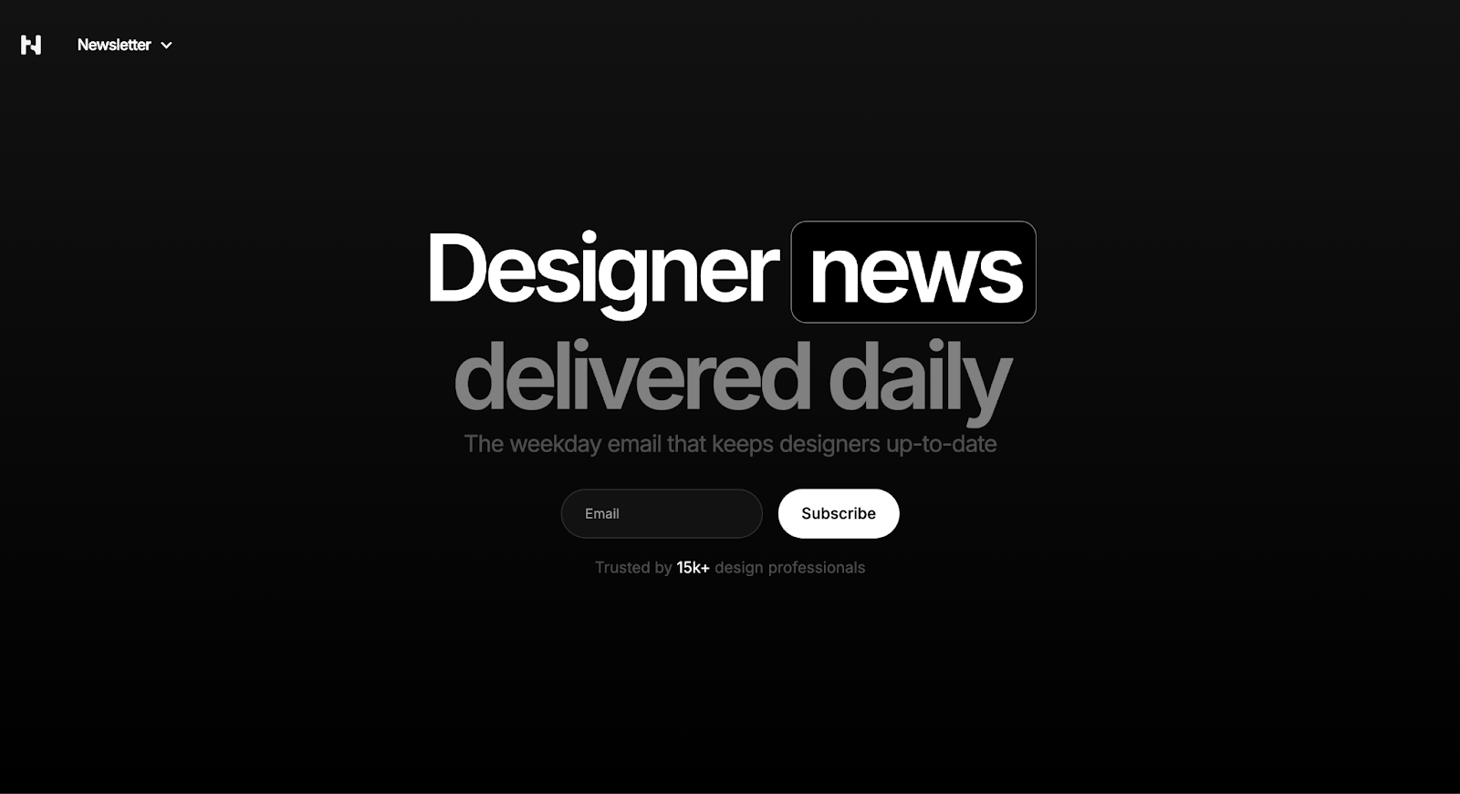
Today in Design’s website is an excellent example of contrast in a website— the white headline has nothing around it except an email form and a subscribe CTA button. The negative space lets these elements stand out while conveying information and encouraging visitors to act.
Use layers for depth
You can also create contrast with layering and shadowing to provide a sense of depth. Use subtle overlays, shadows, and gradients to separate text from images or backgrounds.
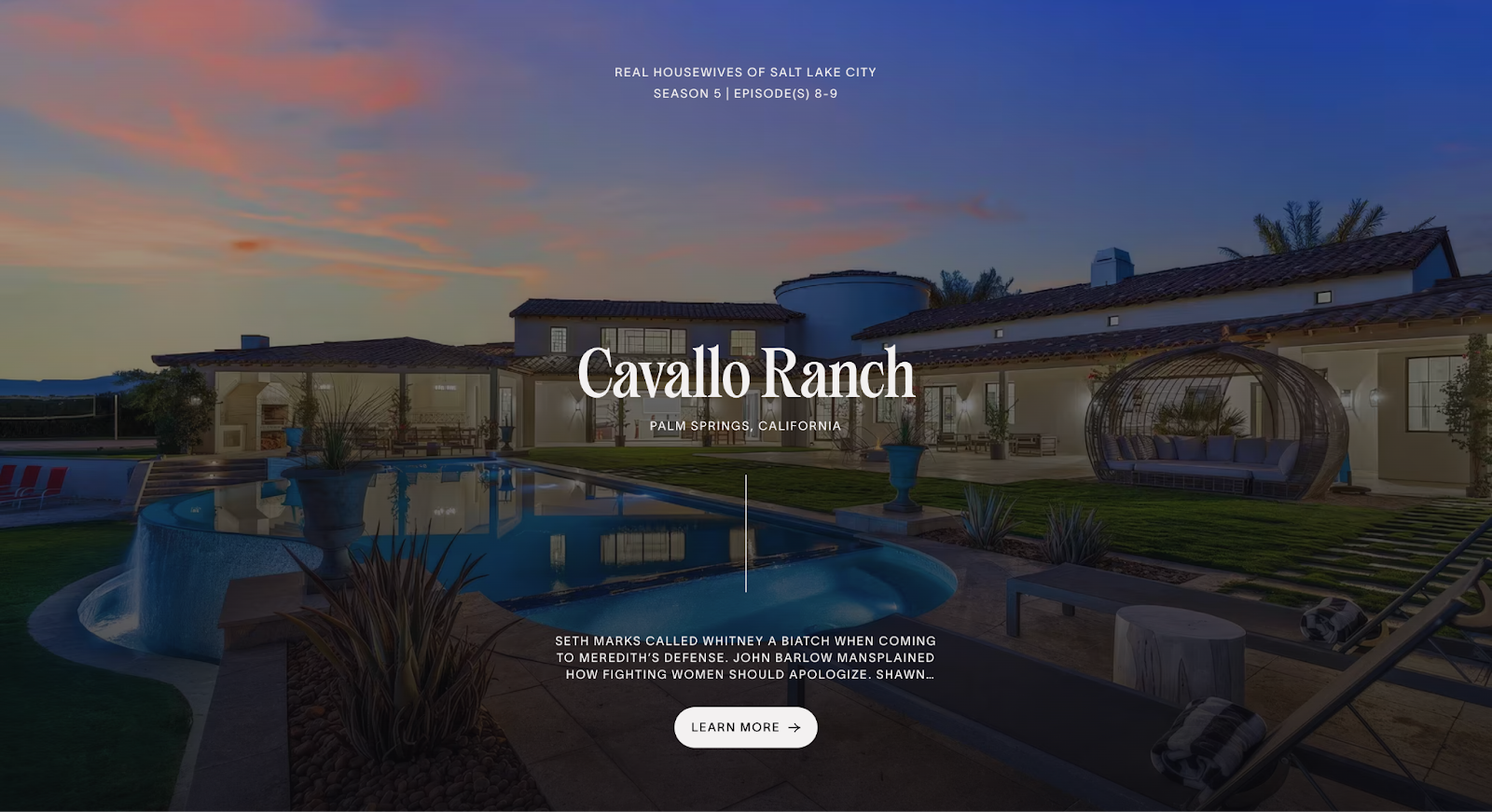
For example, a semitransparent overlay behind white text on a colorful image improves legibility while preserving the background picture’s visual impact. This way, both elements fulfill their purpose without cluttering the layout — like on The Real Hotels’ website.
Test and iterate your design
What works in theory may not always be effective in the real world. Test your design by showing it to other people or try web optimization tools to check whether site elements are performing as intended. Using heatmaps and A/B testing can reveal how viewers interact with your design and highlight where to make adjustments.
Create designs that pop with Webflow
Contrast is a must-have design principle for your website projects, whether you want to add more visual components or take elements away. With Webflow’s visual design tools, you can create sites that stand out without compromising performance.
Webflow lets you take full control of your development process. With our visual web experience platform, you can use Design features and Edit modes to build and enhance your sites without limits. If you need creative inspiration, you can start with premade templates from our Marketplace and customize your pages until they match your vision and needs.
Attract more traffic with an accessible site and find inspiration for your new web designs with Webflow.
Get started for free
Create custom, scalable websites — without writing code. Start building in Webflow.