


Knockout text — text that looks like it’s been cut out of a surface to reveal the background — is a beautiful design effect for your website. And with just a little custom code, Webflow makes knockout text quick and easy.
Update: You can now natively fill text with gradients, images, and overlays with background clipping! Check it out here.
The most straightforward way to create knockout text is with the background-clip property. In this article, we’ll show you how to use CSS background-clip in Webflow.
But first, we’ll take a quick look at why you should use real HTML text and the background-clip property instead of a custom graphic — as well as some of the reasons you might not be able to use this effect on production projects.
How I used to create knockout text: in Photoshop
Before I discovered the process of using Webflow to make knockout text, I used to make it by hand in Photoshop. I’d mask text over a background image and export the graphic to slap into my website. It only took a few minutes, and the results were beautiful.
But it wasn’t a web-friendly result, for several reasons:
- If I ever decided to update the text itself, I’d have to create an entirely new graphic in Photoshop.
- Because it’s a static image, the text itself can’t be indexed by Google — a big SEO problem, particularly for the homepage headlines I often created this way — nor can it be copied/pasted.
- The images files tend to be quite large, especially at higher resolutions, bogging down the site’s loading speed on slower connections.
Luckily, there’s a better option for creating the knockout text effect directly on the web with -webkit-background-clip and -webkit-text-fill-color.
How I create knockout text now: -webkit-background-clip and -webkit-text-fill-color
To create a web-friendly and easy-to-update version of this effect, we’ll use two CSS properties:
- -webkit-background-clip, which specifies whether an element’s background image extends past its border
- -webkit-text-fill-color, which specifies the fill color of text. If this property is not set, it will use the value of the color property.
The -webkit-text-fill-color property, unfortunately, is non-standard, so it won’t work for everyone. Used together, the -webkit-background-clip and -webkit-text-fill-color work in browsers using the webkit engine, like Chrome, Firefox, and Safari. Also, adding flexbox to the text itself prevents the styling from being implemented due to a known bug.
So be sure to use -webkit-text-fill-color for fun personal projects, not for large-scale web projects where providing the same experience to all browsers matters.
Despite the lack of cross-browser compatibility, this method was one huge benefit: It’s real HTML text, so it achieves the trifecta of web design amazingness:
- Searchability
- Accessibility
- Ease of editing
Creating knockout text: the web-friendly way
With all that out of the way, let’s do this. It’s a pretty simple tutorial, but if you’d like, you can also clone my knockout text project for more details on how it’s built.
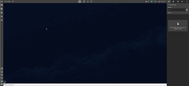
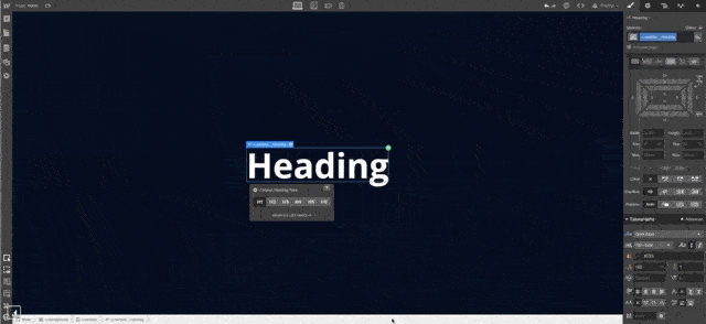
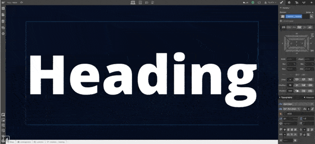
1. First, place the text you want to use on the canvas. I used flexbox to center the text vertically and horizontally in a full-screen container, but you can position it however you’d like.
2. Next, add a class name to the text. Anything will do, but I’ve named this one c-section__heading, because I’m a big fan of BEM.


Design interactions and animations without code
Build complex interactions and animations without even looking at code.
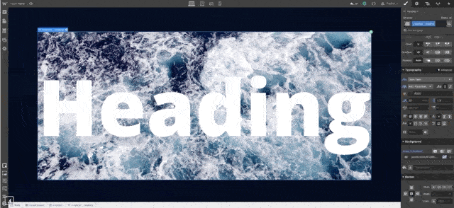
3. Now, add your background image to the heading element, and make sure the line height extends below the text, so no parts of the letterforms show the text color.

4. Next, open the page's custom code tab, or add an Embed element directly on the page. The second option allows you to see the custom code work within the Designer (pretty cool!).

5. Enter the following custom code, replacing .c-section_heading with your heading’s class name:
5. Enter the following custom code, replacing .c-section_heading with your heading’s class name:
<style>
.c-section__heading {
-webkit-text-fill-color: transparent;
-webkit-background-clip: text;
}
</style>

6. Finally, publish your project to see your text clip with the added background in your live project!

Just share it
Knockout text is an epic effect to add to your site and, luckily, easy to build in Webflow.
Now, clone this project. Customize it, and share it with us when you’re done. Take this little tutorial site and make it amazingly yours!