


Hover effects are an essential interaction for linked elements. Adding a hover effect not only adds more fun to your sites design, but it also helps the user understand which elements are interactive and which aren’t.
In this simple demo, I’ll show you, step by step, how to create a hover zoom effect. Once you master these fundamentals, I encourage you to go beyond this zoom effect and do something even more creative.
Step 1: Select the element and add an outer glow
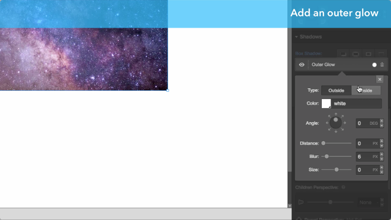
Select your image (or whichever element you would like to give this interaction to), then scroll down to the Shadows section of the Style tab. In my example, I set the outer glow to black with an opacity of 50%, with a blur of 10px to give the element some depth.
While this isn’t necessary for the zoom effect, we’ll make the interaction effect this shadow to add more drama to the interaction later.
Step 2: Scale the element down
Then, scroll down to the Style tab’s Transforms section. Click the plus sign to add a new transform, switch to the scale tab, then set the X and Y axes to 0.95.
Doing this in the image’s default state will allow us to scale back to 1 on hover, creating the zoom effect.
(Optional) bonus effect: Set a grayscale filter
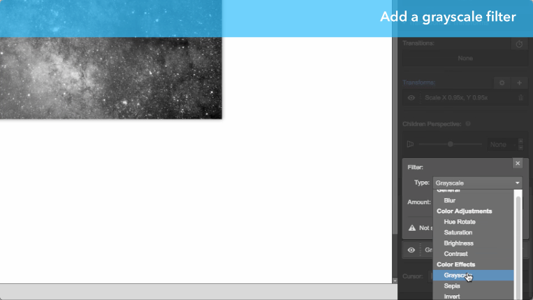
Scroll down to the Effects section of the Style tab. In the filters section, click the plus button to add a new filter, then select “grayscale.” This will make the image black-and-white by default, and we’ll bring the color back on hover.


Design interactions and animations without code
Build complex interactions and animations without even looking at code.
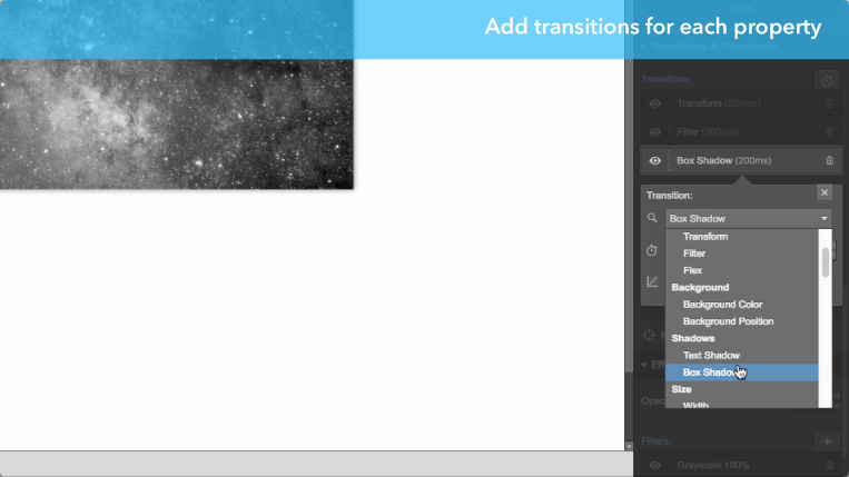
Step 3: Add transitions for each property
Now scroll back up the Styles tab till you reach the Transitions & Transforms section. Add a transition timer for each property you just added:
- Transform (for the scale down)
- Filter (for the greyscale filter)
- Box shadow (for the outer glow)
This will set timing so each transition feels smooth and non-disruptive.
Step 4: Set your hover styles
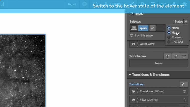
At the top right of the Styles tab, you’ll find a States dropdown menu. Open that dropdown and click hover.
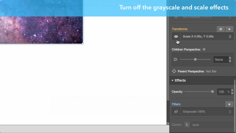
Then hide your scale and grayscale styles by clicking the eye icon next to each style.
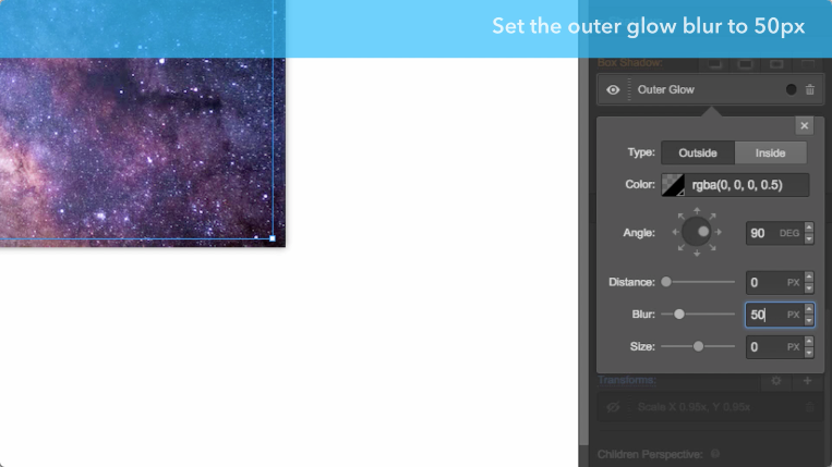
And finally, set your outer glow’s blur to 50px to give the element more depth. That’s it!
Step 5: Preview your work and enjoy
Click the preview button at the top left of the Designer and hover over the image to see your work.