I built an agency website in Webflow. I used minimal classes, flexbox, the CMS, and the API to create it. In this four-part series, I’ll give you tips about using each, and how to get started.
Part 1: Laying the foundations with a style guide and Collection structures
Design agency websites are tooooo cool. They showcase the pinnacle of creative and forward-thinking talent.
Audiences and visitors are sold the idea that hiring said agency will make their shiny whatsit or gidget fly right off the shelves. They also feel like brushing the mere hem of the agency’s collective frock would leave said client giddy with new potential and forethought — bursting at the seams with notions of innovation and disruption that would make even the most savvy and tenured VC quake in their Allbirds.
They evoke a veritable onomatopoeia of emotions. Wow! Zoom! Pop! Bang! Kablewie!
Parallax! Ohhhhh!
Minimal color palettes! Ahhhhh!
Buuuuuuuuuuuut.
That … sounds really expensive. Not to mention arduous. You’re in the market to make your agency’s web presence jump off that iPhone? Well, sailor, you’re probably better off going with an old trusty WordPress template. No one has time for all that custom, bespoke nonsense. You’ve got businessy things to do, after all. Tut tut!
But wait! You can build and design it yourself! Yes you — designer who can’t code. You can! With Webflow.
Webflow, I tells ya!
Okay, all the grandeur and over-the-top introductions aside, you really can build a fantastic agency site — from start to finish — with Webflow. This is not a WYSIWYG. This is not Dreamweaver or Flash. It’s not some half-baked design tool that vomits sloppy code. It’s not a code tool that acts like it knows how to be a design tool, but really requires you to learn mocha-soy-halfcaf-lattescript. This is a tool that exposes all CSS attributes in a visual way so you can create clean, concise, amazing sites.
If you know how to design websites — stop handing them off to someone else to build them differently than you intended. And, if you know how to build websites — stop messing around with unreliable frameworks or slow ramp-up times. Use a tool that creates code just as well as if you lovingly wrote each opening and closing tag by hand. Webflow!
The following four-part blog post series is a how-to guide for that. I’ll give you a glimpse into my own process, which has been honed by using Webflow for website, product, and prototype design over the last three years.
I’ll give you step-by-step instructions on how to get your site up and running, including how to:
- Make your own CMS items, configure the data you need for each type of content, and understand how APIs work
- Think about your site in terms of design systems, so you’ll have the building blocks to quickly implement new content while staying consistent.
- Use new web technologies like flexbox to make your site scale more easily and mold itself to a device of any size
- Craft great interactions for desktop and mobile users, keeping the interaction methods of your users in mind
- Integrate your new CMS system with external APIs so you can pull content from around the web super easily
- Open your site to internal and external contributors so they can keep your community alive, well after the site is live
- Use Webflow to make something awesome that you’ll be proud of
Interested? Great. Let’s get to it.
Step 1: Start with a baseline
I “designed” this Bespke site in Webflow.
I say “designed” because I didn’t do the whole design part inside Webflow, or even by myself. I started with this Mirror template from UI8 to make things easier to get off the ground. It’s more of a portfolio theme, but I love the large text and dark UI. I think it has a great premium feel, so I chose it as my starting point.
You may be starting from scratch as the designer, or you may be getting specs like the files in the Mirror template if you’re the developer. I’ve found it’s better not to start with a blank canvas in Webflow — consistency takes too long to happen. I recommend starting with a sketchpad then moving to Photoshop, Sketch, or, in my case, Figma.
I’ve written about Figma, but the primary reason I used it here was for the dev-handoff features. I was able to get exact pixel measurements from the Sketch files I imported into Figma. And I knew I’d be working with some vectors, so it made sense to keep everything together.
Whatever tool you choose, the most important part is having a base design to work from. I almost immediately started making my own changes to the design, but working from a baseline easily cut my time in half. For me, Webflow is a fantastic tool for iterating, but can be too rigid for true experimentation. So I like to flesh out my ideas before I refine them inside Webflow. But your mileage may vary!
Step 2. Define your default styles
Every website features a few common elements. Webflow applies some very basic styling to all of these, but for your projects, you’ll really kick things off right by restyling them to fit your needs.
Here’s a non-exhaustive list of all the elements in Webflow with a default class that can be overridden:
- Body
- Links
- Headings
- Paragraphs
- Quotes
- List Items
There are others, but these are the most important ones.
Let’s start with the body element. It’s not in the add elements sidebar, because it’s already present on every page — it functions as the parent wrapper for your entire site. Configuring the default styles of the body element helps you save a lot of time. I’ll tell you more about that shortly.
First, select the body element and then select the Body (All Pages) class like this:
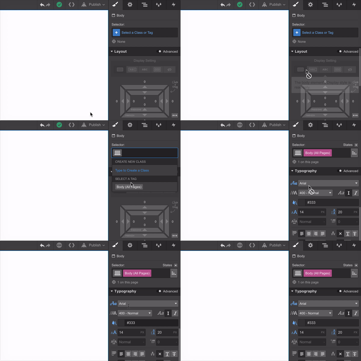
Now. Here’s why we’re doing this. If you define your font styling at this level, those styles will flow throughout the rest of your site. Let’s say you want to have a site built on the font Lato, and you want it to be black. If you don’t define it here, you’ll have to define it differently in every different instance of font stylings.
Also, if you decide to switch over to Helvetica down the road, you only have to change it one place. It’s a life-saver!
One other thing: The size you give your font at the body level will dictate what an em unit is. Basically, if you set your font to be 12px, then for the rest of your document, 1em = 12px. The emunit is super handy if you’re planning on doing responsive typography. Mileage may vary though, so be sure to read up on that if you’d like to try it out and wow your friends.
Here’s how I configured the Bespke site:
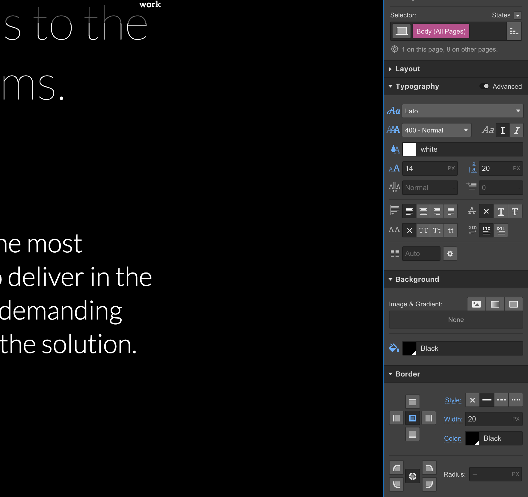
I knew I wanted the default font to be white, and I wanted Lato as my base unit. This is also where I set a black background throughout my site.
Once you have your body styles defined, work through the other elements I noted in the list above. When you’re done, you might have something like this:
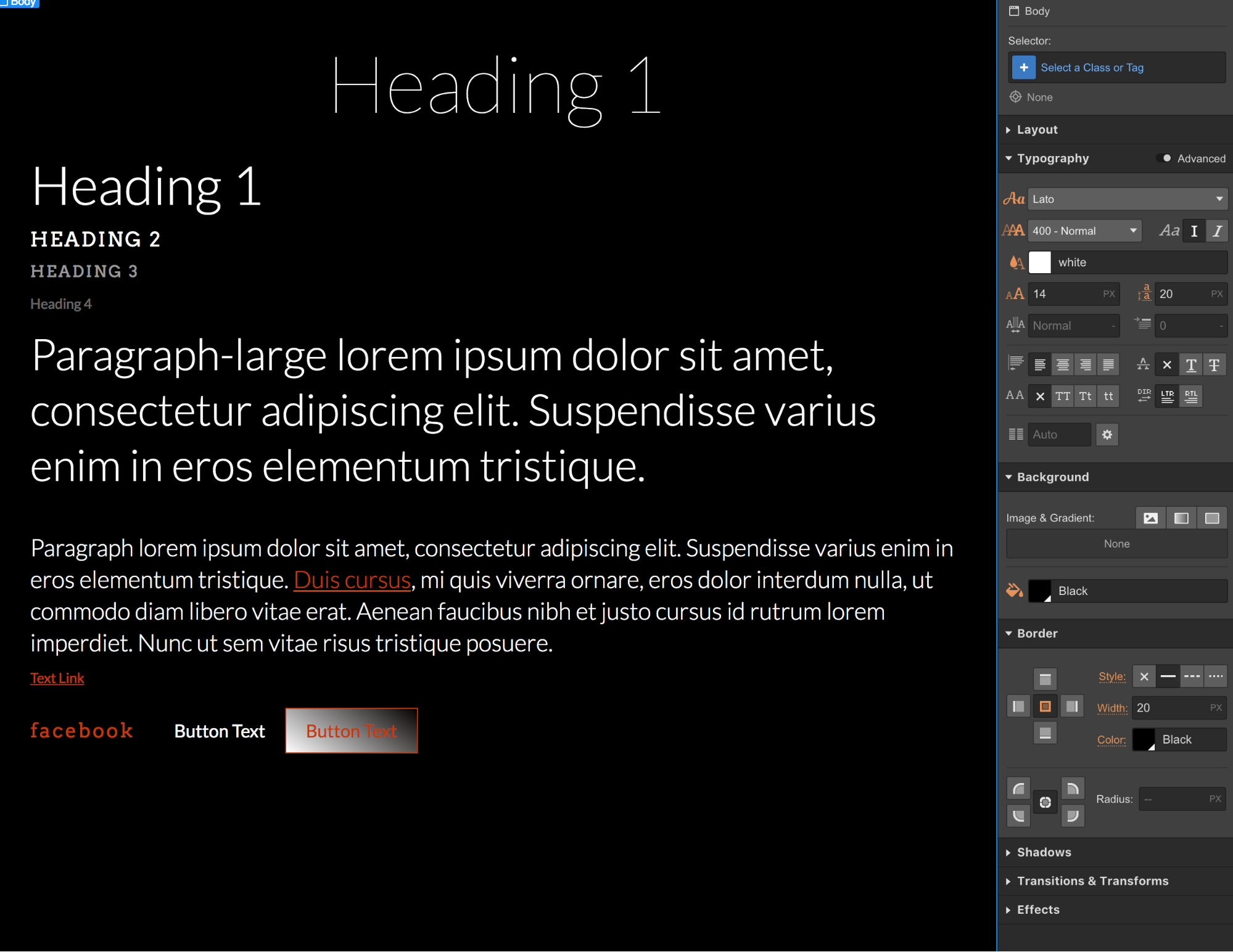
I like to call this a style guide page. After I initially configure it, I only make changes if I realize later that a base style isn’t quite right. You could even go more in-depth here and start making a pattern library of atoms and components.
The idea here is to make it as comprehensive as you need. For the Bespke site, I knew I wouldn’t be adding to it over time, that I had a very limited color palette, and that I wouldn’t be sharing the template with a team. So I didn’t bother writing about the whats and hows of everything — I didn’t need to.
But if I were working with a larger team, documentation would be a must-have for this style guide.
Oh, speaking of color palettes: make sure that the ones you define here are global so they can be changed easily. Here’s what I mean:


The modern web design process
Discover the processes and tools behind high-performing websites in this free ebook.
Step 3: Define your Collections
Okay, so you’ve got your styles and your project laid out, but it’s not time to start the site design just yet. Next, I’d recommend defining your Collections — or at least start thinking about the Collections you’ll need to create.
What is a Collection?
A Collection is a group of data that can be reused in multiple places throughout your website. If you’re a developer, think of it like an API object inside of a relational database. If you’re not a developer, think of it like a grouping of information that can be pulled in to your site.
For example, if you’re setting up an “Our Team” page on your site, you’d want to create a Collection to keep track of your individual team members. Inside that Collection, you’d likely include content like:
- Name
- Profile picture
- Bio
- Bio summary
- Job title
- Phone number
- Twitter link
- Facebook link
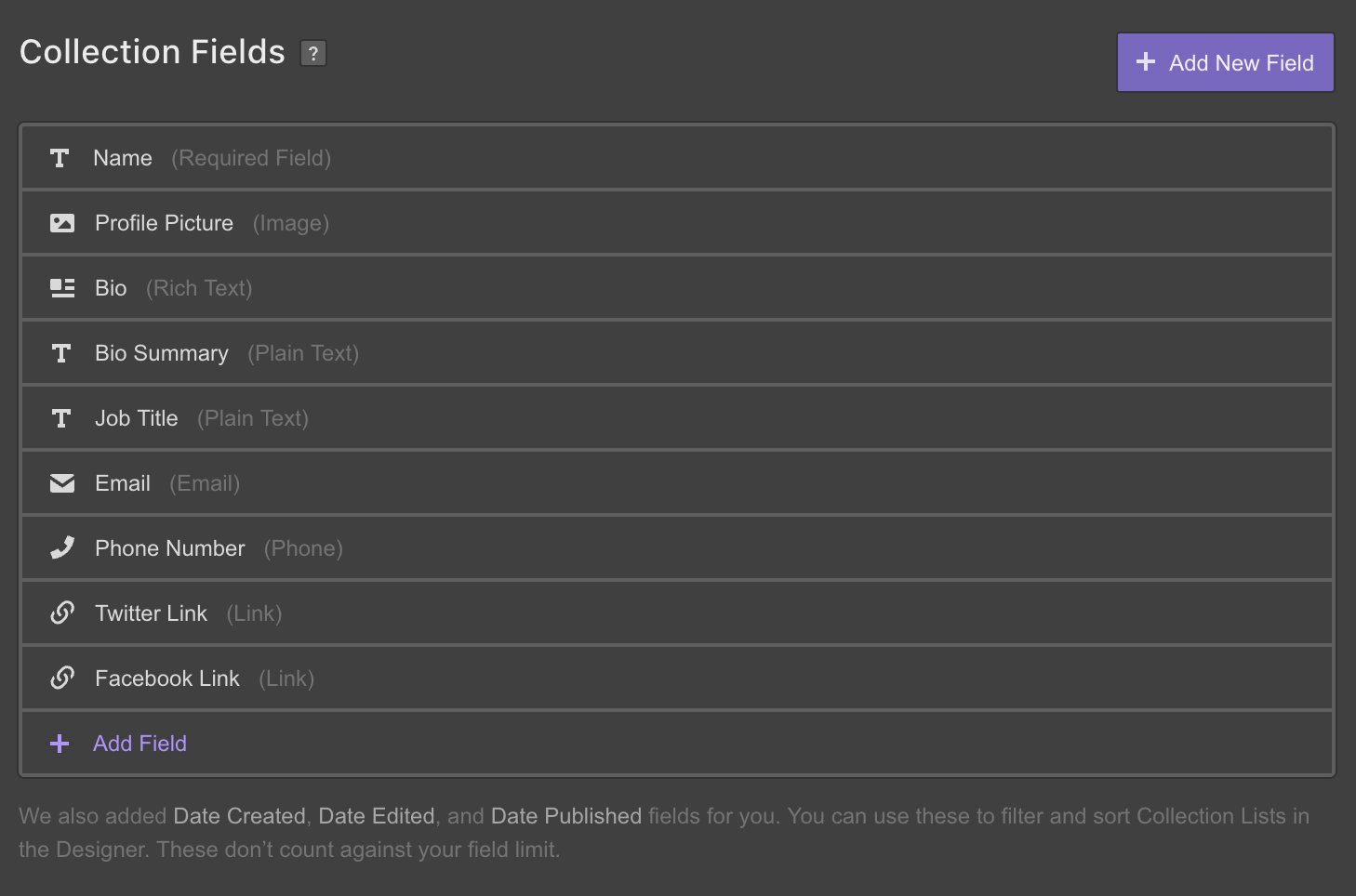
As a matter of fact, this Collection is actually using one of the prebuilt Collection types that Webflow makes for you. It’s just a few clicks to get this one up and going.

But if your site doesn’t need the Facebook link and you’d rather link to another social media platform, it’s as simple as changing the label on that entry to Github, Dribbble, Pinterest, etc. If you have a goofy photo and a normal photo of each team member, add 2 different photo fields and name them accordingly.
Really, you can add pretty much anything to a Collection. If you miss something, it’s super easy to go back and add it later.
If you want more information about Collections, Webflow has a great tutorial.
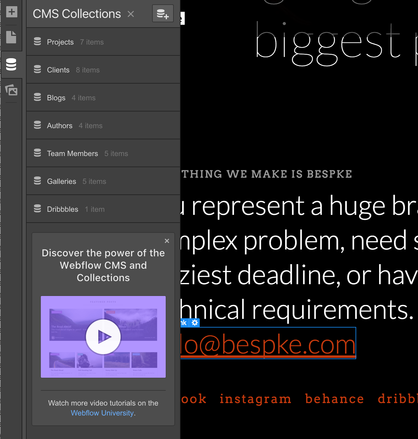
Here are the Collections I set up for the Bespke website:
- Projects
- Clients
- Blogs
- Authors
- Team Members
- Galleries
- Dribbbles
Some advice on setting up Collections
Now, the way you set these up is up to you, but here’s my advice: Don’t make Collections too comprehensive. Break them into pieces so they can repurposed and reused in different situations.
An example of this would be the separation of the Blog and Gallery Collection. You could make every blog entry contain a gallery, but keeping them different from each other has a number of benefits.
First, Webflow limits the number of fields any Collection can have to 30. This might seem like a bummer, but if you separate the content out into different Collections, you can get around that issue. Just make sure the two Collections reference each other so you can share data from both Collections in a single Collection list.
If you have content to put in the Collections now — start doing that. If not, Webflow has a handy feature to create dummy content to give you an idea for how things will look and feel.
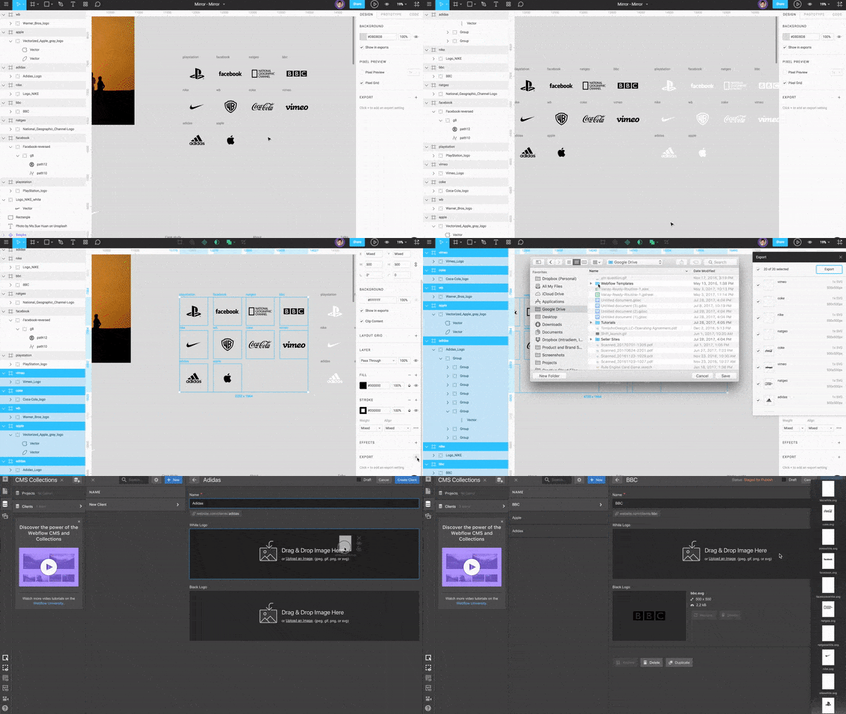
Here’s an example of a very basic Collection I created called “clients” with only the company name and 2 logo variations. I kept it separate from the “projects” Collection, so I could use it as a standalone section and a reference to the project itself.
Now that you have your Collections at least partially defined, you’re ready to start working on putting the pieces together.
Stay tuned for part two: planning pages and defining layouts
In the second part of the Bespke series, we’ll talk about how to plan pages and classes, and how to harness the power of flexbox.
Stay tuned!


