


Layered fonts (aka, 3D fonts, multicolor fonts, and chromatic fonts) are typefaces that come with several variant looks you can layer to create a variety of fun and beautiful typographic effects.
Balboa Plus, Discourse Middle, and Sutro Shaded are very popular examples of layered fonts, but there are a ton of 3D font options out there.

Combined with Webflow CMS, layered fonts are surprisingly easy to use and can give your headlines and other text elements a unique, characterful look.
These fonts provide designers an exciting design option: the ability to display several colors and textures within a single piece of text. Unfortunately, layered fonts aren’t widely used on the web, because of the advanced layout techniques required, as well as the file weight they can add to a site.
To use layered fonts for a title, for example, you need to create one title element for each layer of the font you want to use, then layer them precisely using CSS position attributes.
For this tutorial, we’ll use this design for inspiration:

What you’ll need for this tutorial
A layered font you can use in Webflow
We’ll use Sutro Shaded, as it's available on Typekit, which comes included in Adobe CC. But feel free to use whatever layered font fits your fancy — just know that we’ll be using Sutro Shaded’s various names as class names throughout the tutorial, so if you use a different font, you’ll be using different names, most likely.
The knowledge that many web fonts can slow down your site
To build this example, I've loaded all variations of Sutro Shaded, exploding the weight of my kit to 708K! That’s unacceptable for a production site, so be sure to limit the number of layers you’ll use.
A dynamic Collection
You can obviously use this technique for any text on your site, but it really comes into its own when used with dynamic content.
Now, on with the show!
Step 1: Add your first font layer
First, we need to create an element to contain our title. So we’ll drag a div onto the canvas and call it “layered title container.” Then we’ll give this div position: relative.
Since we’re building a dynamic post title, we’ll drag a Heading element into that div, set it to H2, and name it “layered sutro title.”
Note: Generally speaking, you wouldn’t want to use a specific font's name in a class name, as you might well decide to switch to a different layered font in future.
Step 2: Style your heading layer
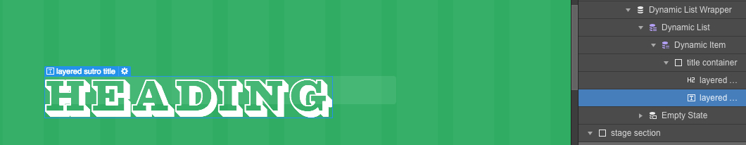
Next we’ll style our H2, selecting the Sutro-shaded-primary font and giving it a nice and chunky 45px size. Since the font is full of details, we’ll need it big to render nicely.
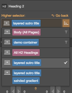
Now let's create a combo class called “shaded primary” and give it position: absolute, with both top and left set to 0.
Step 3: Add a second text layer
Since we don’t want multiple H2s with the same text on our page, we’ll add a text element to the page and give it the class “layered sutro title” so it’ll look the same as the first heading layer.
Since it's positioned absolutely, the new layer should appear on top of the first layer. Don’t panic if you can’t see it: it’s there.
Now, replace the “shaded primary” combo class on this new text layer with a new combo class called “shaded fill.”
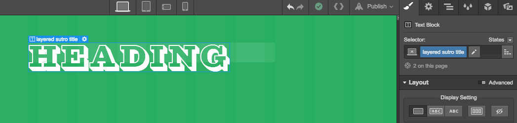
Then select the “fill” variant of the Sutro font, and give it a different color, just so we can see it while we work.


The modern web design process
Discover the processes and tools behind high-performing websites in this free ebook.
Step 4: Repeat as needed for your font
Now let's repeat the operation twice for the “hi lite” and “gradient” layers, selecting the corresponding variant of the font for each new text layer and combo class. Just be sure to give each new layer a different color to simplify the design process.
Step 5: Get your layers in order
Once you’ve got all the layers you need, you’ll want to make sure they’re in order.
To do that, use the Navigator panel to select the first layer and give it a z-index of 1. Then repeat as follows:
- Fill layer: z-index 2
- Hi lite layer: z-index 2
- Gradient layer: z-index: 3
Adjust the colors for each, and you should see this:

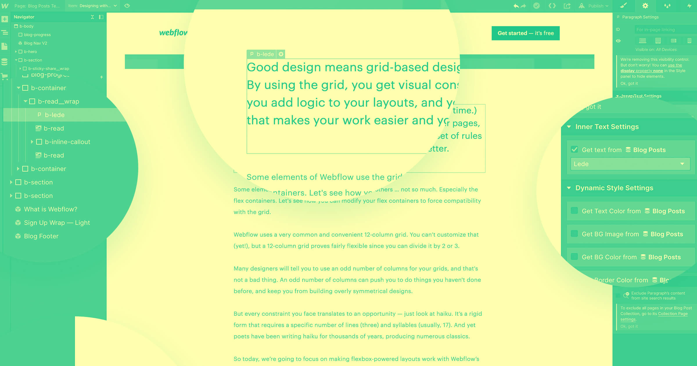
Step 6: Hook it up to the CMS
At this point, you’ve probably realized that this title is pretty work-intensive. Every time you want to change it, you’ll have to do it 4 times — on elements that are hard to reach and select.
That's what make the CMS a great way to use those layered fonts — because it’ll handle all the hard work of editing for you.
To link your fancy new heading to a Collection, select the title container div and place it either in a Dynamic List or a Collection Template page.
Then, one by one, select each layer and tell it to “get text from” the title (probably your Name field) from your CMS Collection. After the first layer, it’ll look something like this:
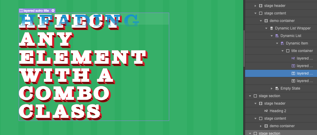
Once all your layers are connected to the appropriate field, you’ll probably need to adjust the line height (otherwise, lower lines will overlap those above). Just make sure to adjust the line height on the root class of the title element (if you’re using our sample class names, that’s “layered sutro title”—otherwise, it’s just the first element of each combo class), so it affects all the layers that make up your title.
And you’re done! Now, every dynamic post title will show up in your beautifully style layered font, without you doing all the work. Nice, right?
What’s your favorite typographic flourish?
Layered fonts can be a powerful stylistic tool, especially if you’re building a CMS-powered site with a vintage style. But there are tons of other great typographic approaches out there. Let us know what your favorite is and we’ll see about creating a tutorial on it!