By the end of this tutorial, you’ll learn how to create your first homepage in Webflow and leave with a solid understanding of how to build powerful websites in Webflow — by visually coding HTML and CSS.
There’s a lot of hype around the no-code movement — a wave of technologies that allow us to build software without code. But code is at the internet’s core. It’s not about the absence of using it to build websites and apps. This movement is actually focused on making it easier (and faster) to code — by making it visual. Meaning, you just design and platforms like Webflow write the code for you.
If you approach Webflow with the mindset of designing, based on the fundamentals code, you’ll be able to learn it quickly. And on top of that, you might end up learning how to code as well.
What is Webflow?
Webflow is a design and web development tool, ecommerce, CMS, and hosting platform. Each aspect of the platform is represented by a particular product/feature set:
The Designer
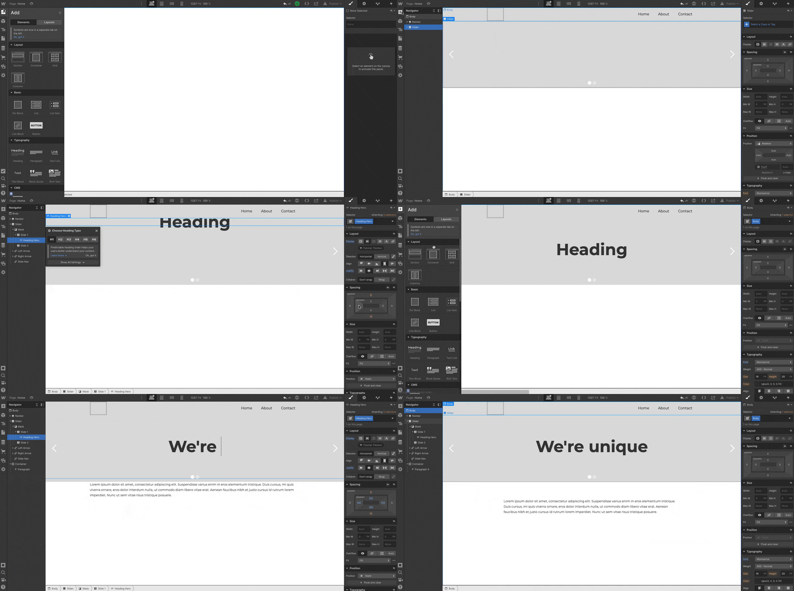
A visual web design tool firmly grounded in web standards and best practices, the Designer translates your design decisions into clean, production-ready HTML, CSS, and JavaScript. We built it to enable designers to develop websites in a familiar way — i.e., visually — without sacrificing quality.
If you’re mostly a prototyper, you can use the Designer alone, either sharing the prototype with devs to reproduce, or exporting the code.
But to experience the full power of Webflow, you’ll want to combine the Designer with the CMS and our Hosting.
The CMS
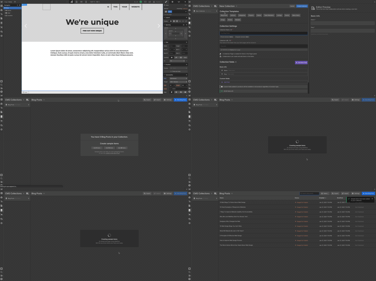
Like the Designer, the CMS is a code-free web development tool. It has both in-Designer elements (where the site designer works) and on-site elements (where the client and/or content managers work). We call the latter element the Editor, but more on that later.
For now, just know that in the Designer, the CMS lets you structure content types you’ll publish over and over again — like blog posts, product pages, etc. — by combining modular “fields.” Once you’ve created your content types, which we call Collections, you can then use the Designer to determine how Collection items look on the site (like how individual blog posts look).
Ecommerce
Webflow Ecommerce lets you take the power of the Designer and CMS to create a fully custom ecommerce experience. Any Webflow project can be converted into an ecommerce site, but the hosting price differs slightly from a regular website.
You can connect your ecommerce website with payment gateways like Stripe, Apple Pay, Paypal, or Google Pay, while also extending your stores capabilities with various integrations.
Hosting

The final piece of the Webflow puzzle is our Hosting platform. Backed by Amazon Web Services (AWS) and Fastly, it’s blazing fast, super-reliable, has enterprise grade security, and you’ll need it to enjoy some of our best features, including:
- The CMS
- The Editor
- Form management
- Responsive images (automatic resizing of images by device to improve performance)
- Free SSL/HTTPS (improved site security that Google is basically making a must for sites that ask for visitor information)
Okay, now that we have the lay of the land, let’s talk about diving in.
Designing and building a homepage
Before we create our first blank project, we need to understand how websites are fundamentally built on the web — with HTML and CSS.
The fundamentals: box model
Websites use the box model, a design principle that lets us understand that everything on a web page is basically a box within a box. These boxes are HTML components known as “divs.”

In the image above, we have a section (outlined in black), a container (outlined in red) to keep everything responsive within the section, and various divs (outlined in blue) that act as content within the container.
The nomenclature for section, container, and div comes down to how you style and label the divs, using what are known as CSS classes.
We use CSS for spacing, positioning, alignment, fonts, and styles of these HTML boxes and their contents. We add what is known as a CSS class to each box, which is like a preset you create for style settings. Classes are reusable throughout the site and allow you to stay organized as you build out your website.
To sum it up:
- HTML is the component on a page
- CSS is the design of that component
Congratulations, you now have a general understanding of how websites are built. A fun exercise you can do now is go to your favorite website, say apple.com, and open up your web browser’s inspect element.

You can view the code (on the right) and see how everything is a box (aka a div). Within those divs are sometimes other divs with content like headings, paragraphs, and buttons. This is all HTML. You can see how the designer of apple.com labeled their classes for each component/element and div, while also being able to view the CSS in the Styles section.
Okay, let’s get building.
Building in the Designer
The best way to learn Webflow is to actually build in Webflow. To get the most out of this guide, I’ll need you to follow me in all of the steps we are about to go over.
The first step is to create a blank project.
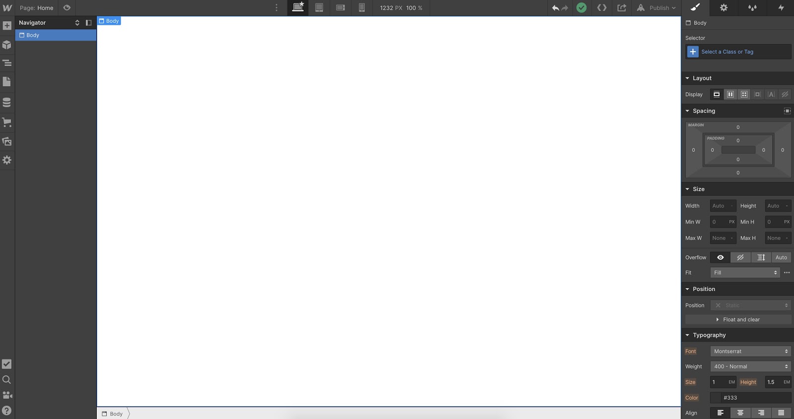
Here you’ll see everything you need to build any powerful website. On the left side, you’ll see everything you need to add and edit components, and on the right, you’ll see everything you need to style those components.
In Webflow, the first 3 buttons on the left side of the Designer are what you use for HTML elements.

The first is your Add Elements panel. Here you can add components like divs, buttons, text, images, forms, etc. The second is where you can add and manage symbols. These are sections that you can pre-save and reuse on multiple pages, like your navbar or footer. The third is the Navigator, where you can see the hierarchy and structure of your components.
Before we drop any elements onto the canvas, let’s determine our typeface and the font size of our Body (the main page we build on).
Start by selecting Body in the Navigator. Then, head over to the Style panel (on the right) and select the class "Body (All Pages)." Any style edits we do to this class can be reused on additional pages of our website. For example, if we want to add a main background color to all of our pages we would do that here. In this case, we’re keeping it the default white color.
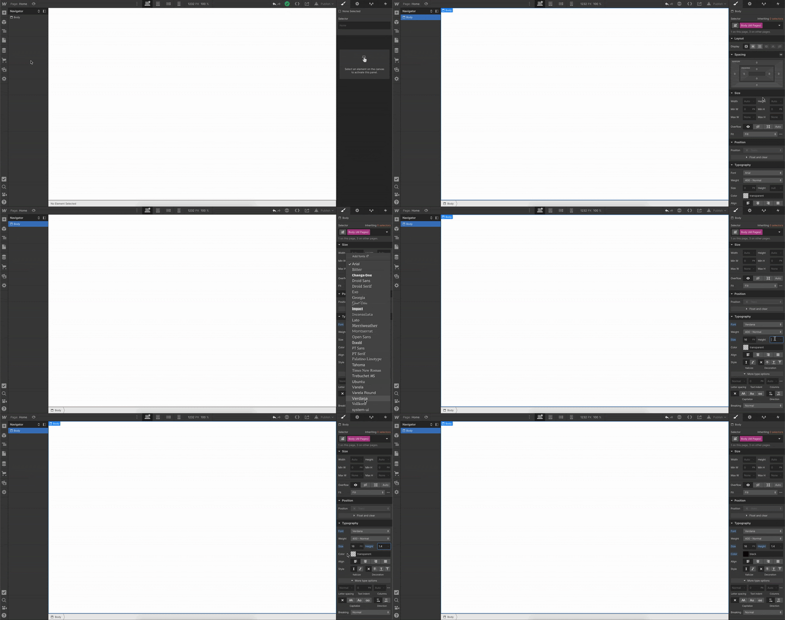
We’ll want to establish our base font and sizes by going to Typography and selecting a font from the list. You can also add a custom font in your project settings which will reflect in the dropdown.
We selected the font Verdana, and now we want to select the base font size. 16px is a standard for font size, and adding “1.4-” for the height will make sure that the font height is 1.4 times the font size. If you want to learn more about advanced web typography and font settings check out this video:
Okay, let’s add some elements. We’ll start by adding a pre-built navbar.
Next, below that we’ll add a Section div for our hero section. Once we drop in the Section div, we can add a class to it and name it “Hero Section,” just so we can stay organized and see all the elements neatly in our Navigator.
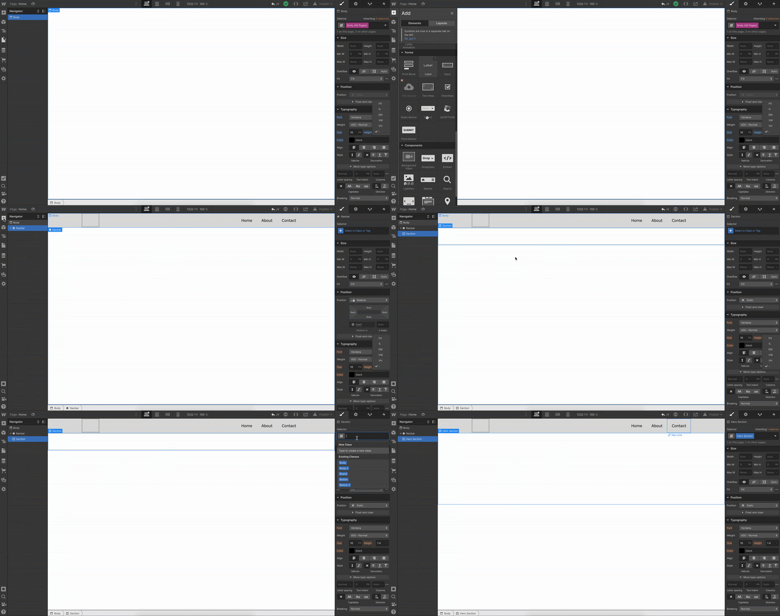
We can now make some styling changes to our navbar, starting with making the background the same color as our Body.

Just select the navbar in the Navigator and change the background color in the Style panel.
Now let’s add a logo. Make sure to have your logo saved as either a PNG or SVG and upload it to the asset manager in your Webflow project. From there, you can drag and drop the icon asset onto your canvas.
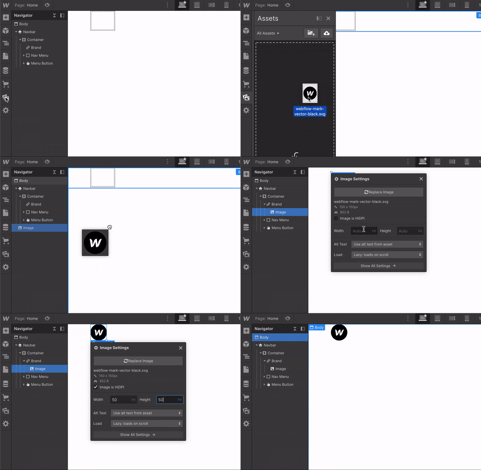
Now let's adjust the padding on the logo and add an extra nav link.

Adding a new navbar link is as simple as copy and pasting — Command C and Command V on Mac, Control C and Control V on Windows.
Nice, we have a simple navbar. Let’s get down to the hero section.
We’ll start by adding a Container to our Hero Section. We want to recreate the current Webflow homepage (kinda) so we’ll also need to add a Grid to our container.
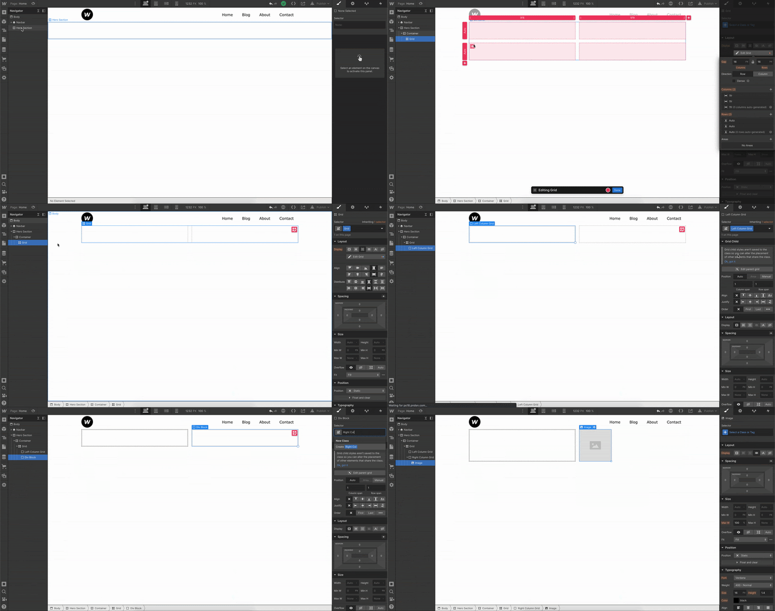
Once the Grid is added, we can right click on it and delete the default extra row. This way we have a simple two column grid within our container.
Referring back to the box model, we’ll also want to add a div into each column and add classes to them (Left Column Grid and Right Column Grid) so we have them labeled properly and can style them later.
We added an image element to our Right Column Grid and now we can add our content within the Left Column Grid.
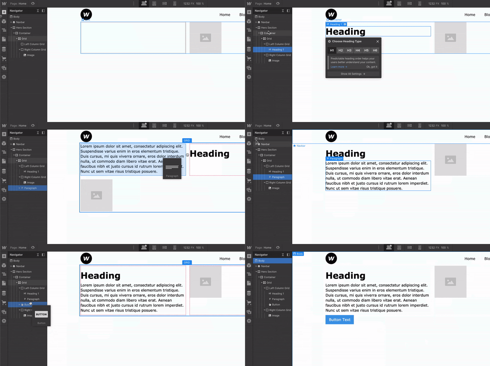
We start with a heading, a paragraph, and a button. As you can see in the video above, we can add our elements by dragging and dropping them onto the canvas, or by dragging and dropping them straight into our Navigator. When working with grids, it’s easier to align things within the Navigator. As you can see, we added the paragraph in the Navigator instead of on the canvas. This is because the element wasn’t going where we wanted it to go.
Now, we can add our content and style them using the Style panel on the right. Let's adjust the font size and add margin for spacing.
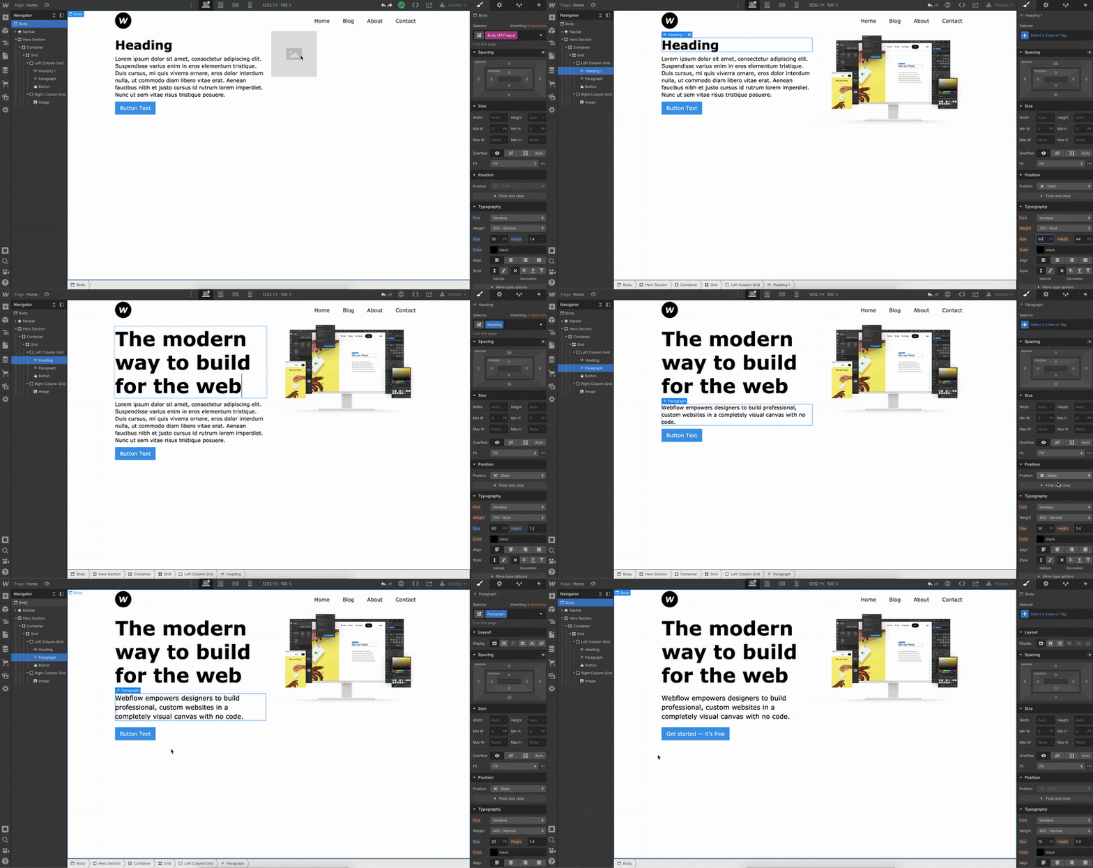
Okay let’s make this look a bit better, starting with the CTA (call to action) button.
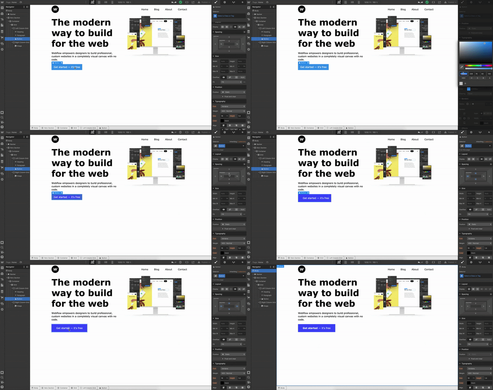
Let’s change the button color and add more padding between the button text and the inside edges of the actual button.
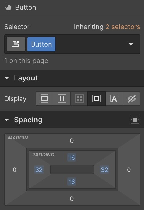
We use padding for creating space inside elements, and margin for creating space outside of elements. For something like separating our heading, paragraph, and button, we used margin because we wanted to create space between these elements. But for our button, we wanted to create more space inside of the button element, so we used padding.
Which leads us nicely into the part where we add padding to our Hero Section to give our Grid some room from our navbar.
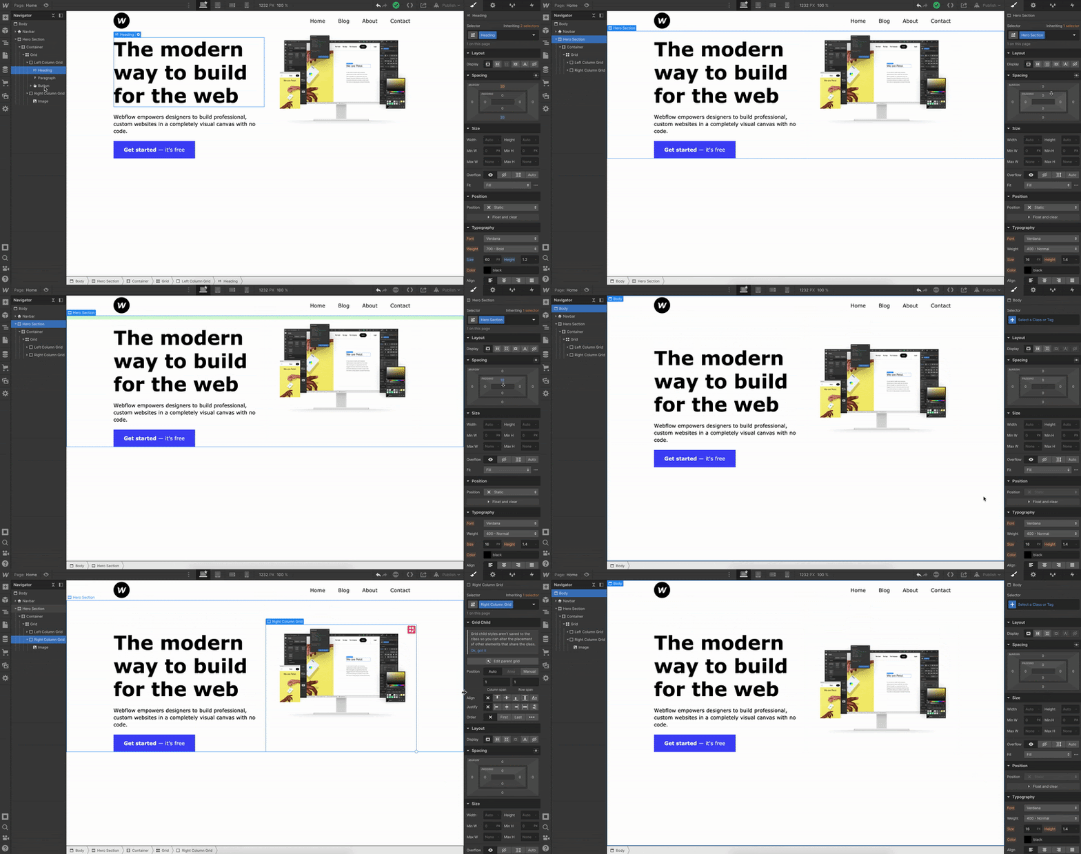
After adding padding to our Hero Section, we also want to center our image within the Right Column Grid to line it up with our Left Column Grid.
To do this, we just select on the Right Column Grid we made earlier and within the Style panel, click Align to Center. This will make sure all contents within the Right Column Grid fall to the center of the box.
Now let’s add a section to show off all the clients that we have.
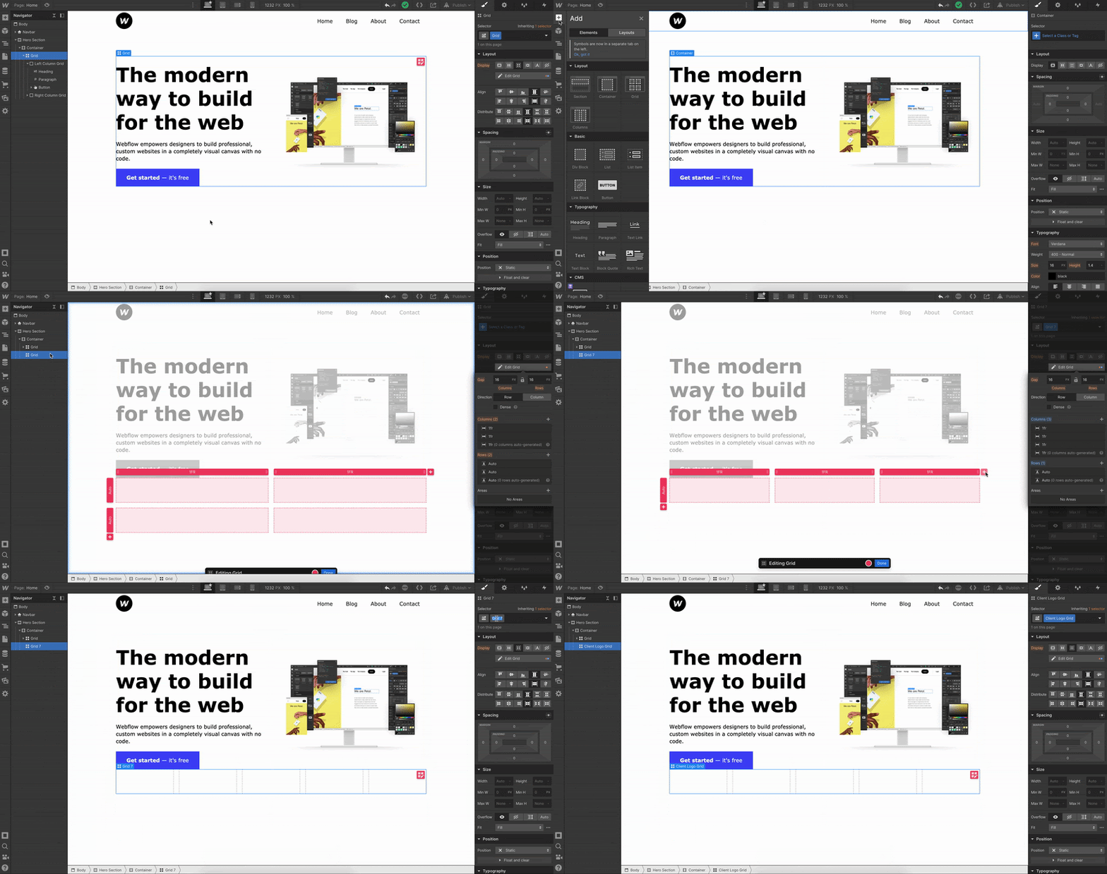
After we create our five column grid, let's set the class name on the Grid to Client Logo Grid. Now, we'll want to upload our logos to our asset manager. I’ll be using one logo five times for demonstration purposes.

Simply drag and drop your logos into each column on the grid. After dropping the first image, we want to make sure our logo is in the middle of our grid. To center the logo, select the image and in the Style panel click Justify to center.
Because we are using the same logo for all five columns, I simply copied and pasted them (Command C and Command V on Mac, Control C and Control V on Windows) in the video above.
We just built our first homepage!
I’m not a great web designer, but hopefully you have a better understanding of how to approach Webflow as a beginner. If you can get this far, your Webflow development skills will pick up in no time.
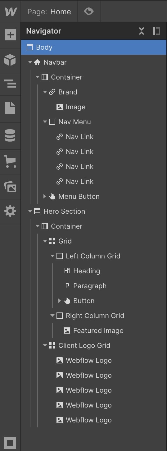
For reference, here is how my Navigator looks. Notice the placement of our components:
But wait, we only know that this looks good on desktop. What about tablet or mobile?
Make it responsive
Now, if you’ve ever worked with responsive design before, you’ll know that things can get a little hairy at this stage.
The good news is: Webflow has already done a lot of the hard work for you! To see that in action, we’ll step down through the various device previews available at the center of the Designer’s top bar:

Now toggle through each breakpoint and see how it affects your design.
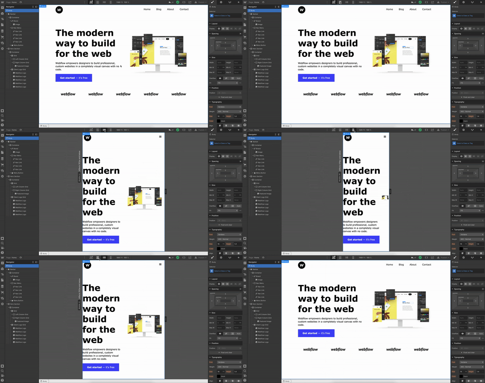
If you design the way we did, Webflow will automatically try and make everything responsive. But sometimes you need to scale down, or move things around, if using Grid (which we are).
We can see that anything in tablet mode, or smaller, makes our featured image look off. Our font size is also a bit too big, along with our content being too close to the edges.
Let’s fix all of this.
Whatever design changes we make in tablet mode will reflect down to the smaller sizes. So start in tablet mode and work your way down as needed.
First, start by fixing the way the featured image is displayed. Instead of the image being squished to the right, we want to move it to the bottom of the hero section.
To do this, click on edit grid. From there add one extra row, and right click to delete the left column our featured image is in. This will automatically force our Right Column Grid, with our image in it, to the new bottom row we created.
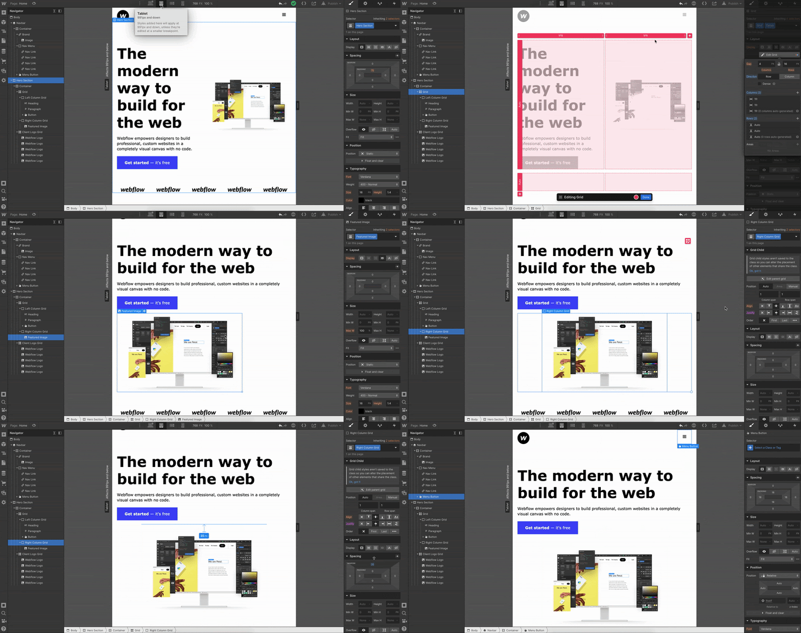
Once that happens, click Right Column Grid and move the image to the center of the div by clicking on Justify center. From there, add some top margin to Right Column Grid to bring it down.
Looking good, let’s move down to mobile landscape mode.
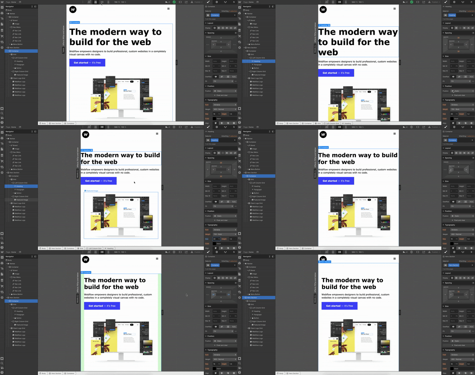
First thing we see is that the font size is too big, let’s decrease that. Next, we want to bring our content in from the edges. To fix this, select the Container that our entire Grid is in and add padding to the sides.
Last one, let’s go to mobile portrait mode.
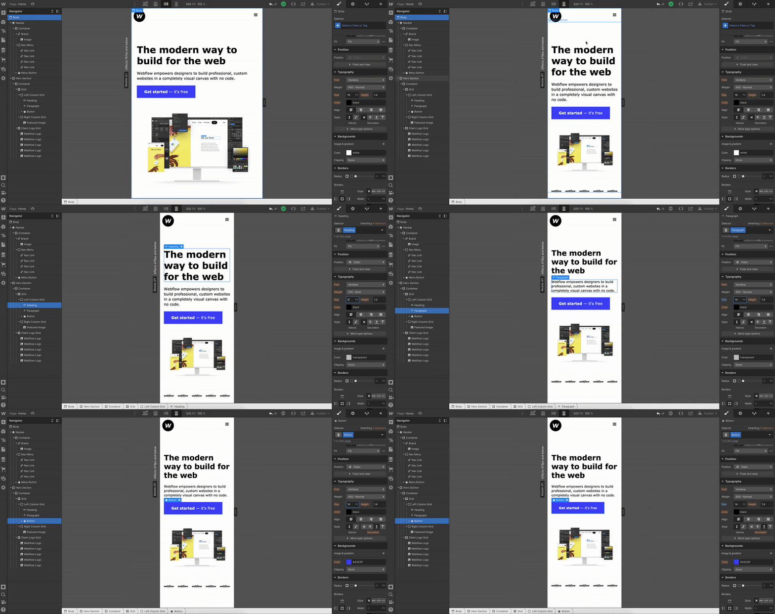
Again, the font is too big. Let’s downsize the heading, paragraph, and button text.
We’re done!
As you can see, the client logos at the bottom stayed responsive and downscaled themselves. But if you want the logos to stack on top of each other, follow the exact same process we went through for the grid in our hero section.
You did it, your first responsive homepage, built in Webflow.
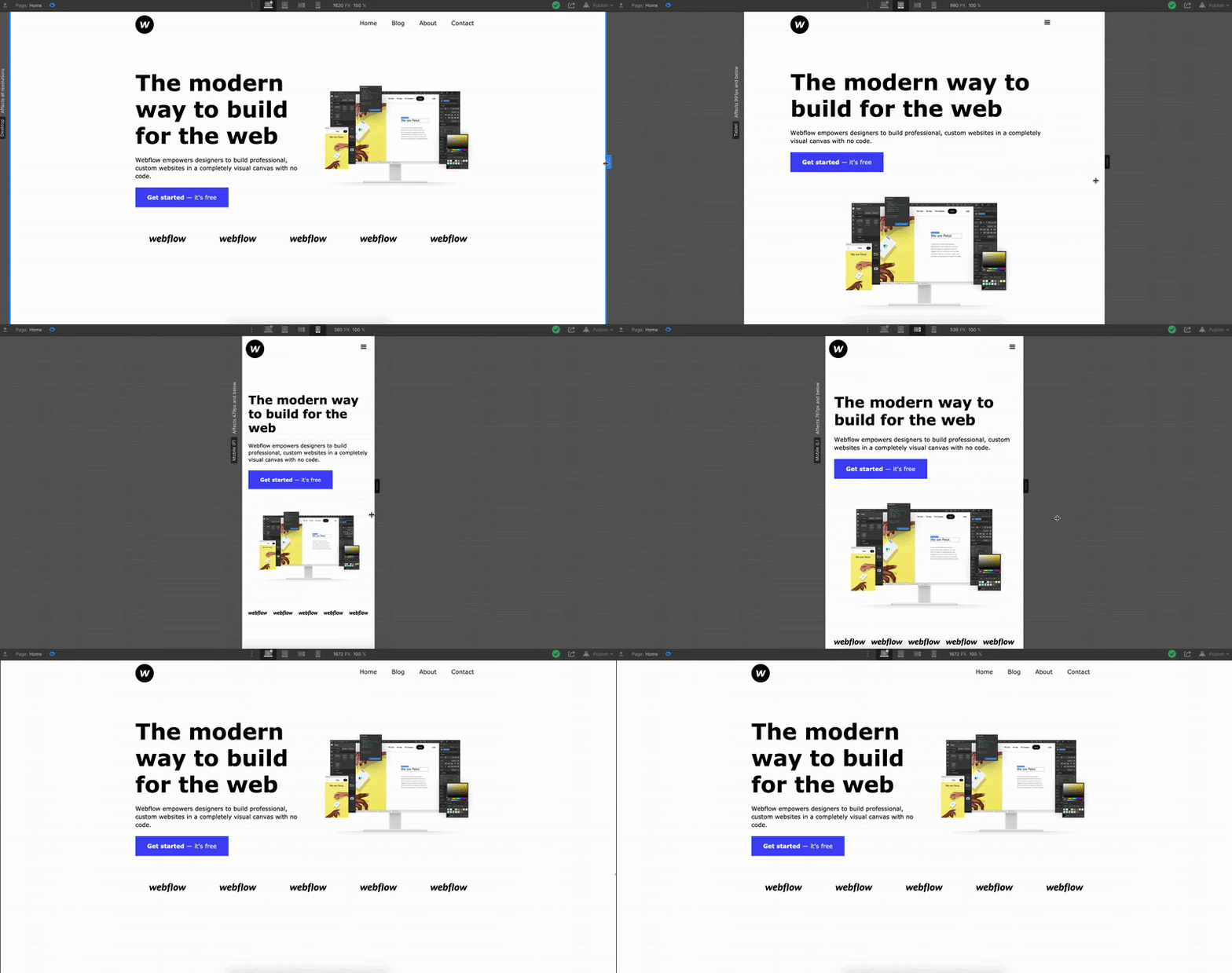
You should be proud, I know I am. We just visually developed a whole homepage with code. Building in Webflow let us experience the power of code, without actually writing it. Check out all the HTML and CSS we visually wrote in this guide:
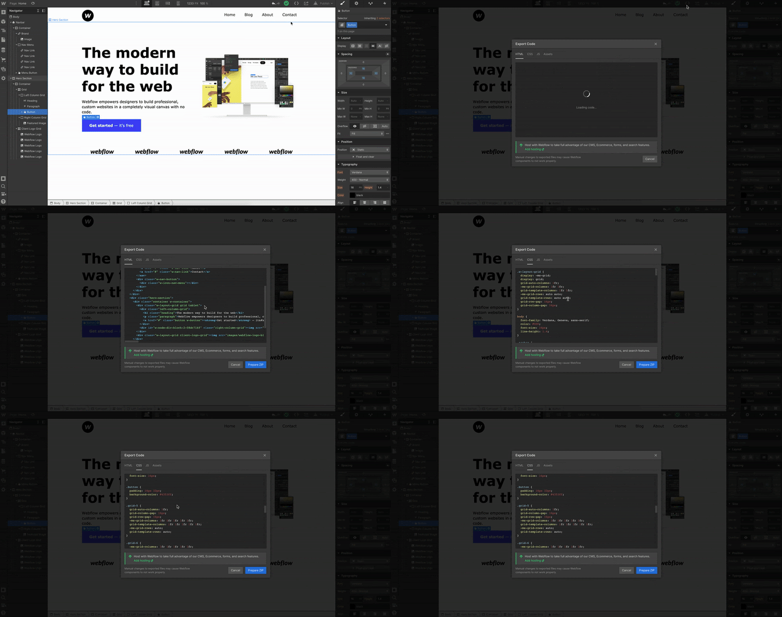
That’s pretty cool if you ask me. If you have any questions, feel free to leave them in the comments below — happy creating!


Get started for free
Create custom, scalable websites — without writing code. Start building in Webflow.
More resources
If you want to develop your web design skills, we highly recommend you check out our Ultimate web design course and other resources below:
- Webflow University: learn web design, development, and time travel
- Webflow Forum: Q&A center
- Webflow Community: to talk to other people about your projects and learn about upcoming events and launches
- Webflow Blog: web design inspiration, guides, and tips
- Template Marketplace: purchase pre-made templates
- Webflow Showcase: the community hub for websites, including cloneables
- Webflow Experts: hire Webflow designers to help


