

Progressive disclosure — the idea of revealing information as it’s needed — is a core concept of web design. And though it’s usually discussed in terms of page-level interactions, you can also make smart, delightful use of the idea within card-based UIs too.
Expandable cards are the perfect way to display just the right level of information — and then a little more, right when the user asks for it. You can use them in team members’ vcards, pricing tables, feature comparisons — wherever a user might want more details, they offer a great level of interactivity.
For simplicity, we’ll be building this UI with static content, but you could do it in the same way using content pulled from your Webflow CMS Collections.
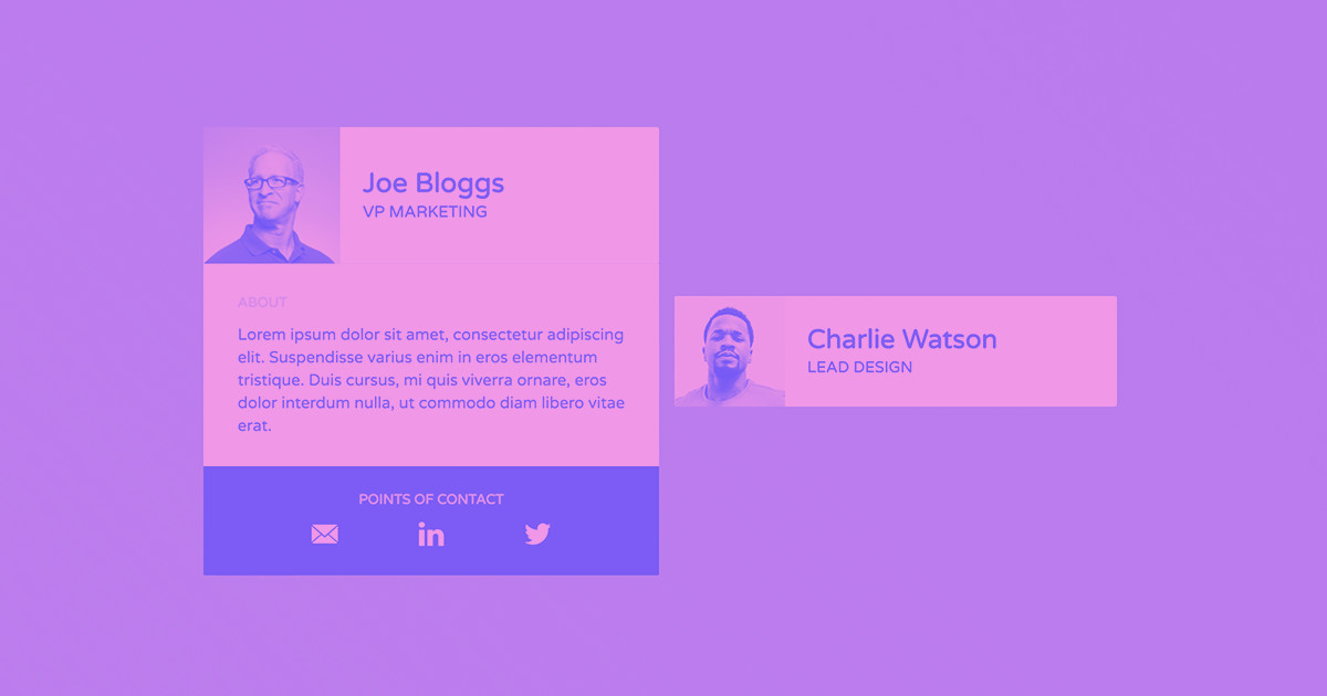
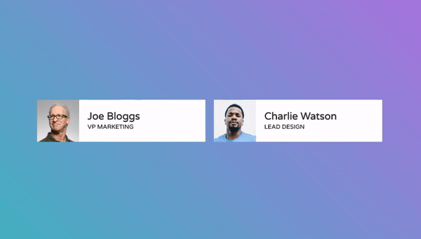
Here's what we're going to make together.
Note: for this tutorial, we’ve assumed that you’ve set a default font on the body.
Step 1: Add and style a div to contain the whole card
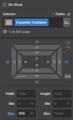
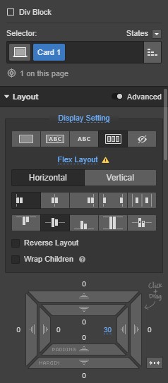
Place a div on the canvas, and give it a class name of “Expander Container.”
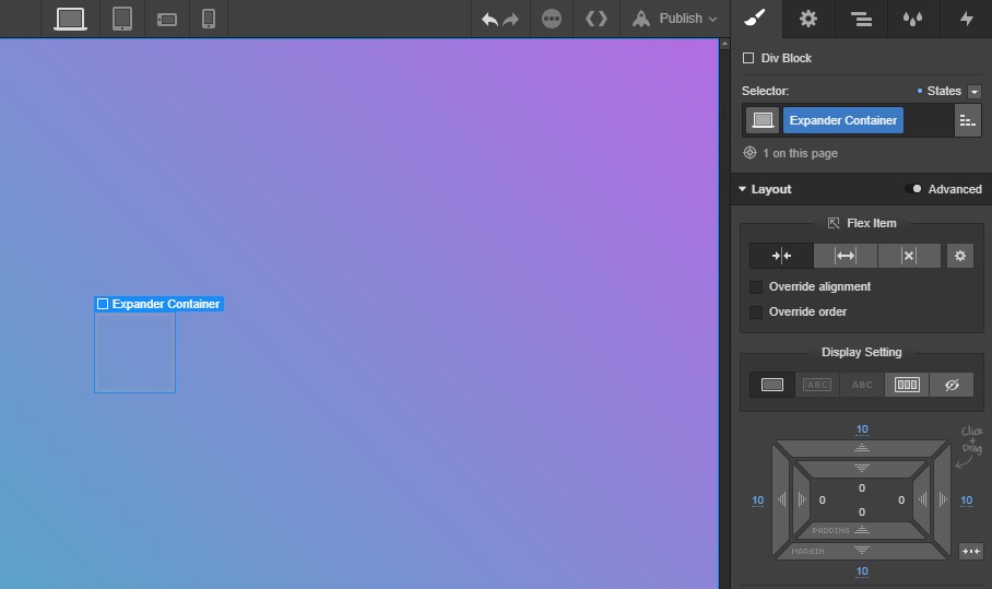
Place a div on the canvas and give it a class of “Expander Container”
Then, give your container a margin of 10px on all sides and a max width of 400px.
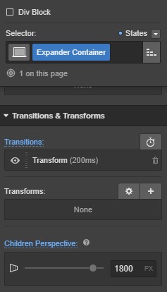
Then, add children perspective of 1800px and a transition of transform, 200ms, ease. This controls how the transition from default state to expanded state will look.
Next, go to the states dropdown and select the hover state. While hover is selected, any styles you set will only apply when a visitor hovers their cursor over the card.
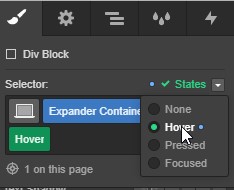
Then scroll back down to the Transitions and Transforms section and add a transform of scale, setting a value of 1.03 for both the X and Y axes.
Step 2: Add the flip cards
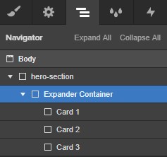
Place 3 more divs inside the Expander Container, and give each one a unique name. I’ve used Card 1, Card 2, and Card 3 here.
Step 2a: Style Card 1
Select Card 1 and give it the following styles:
- Display: flex, horizontal, start, center
- Padding-right: 30px
- Position: relative
- Z-index: 999
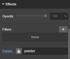
- Background color: white
- Cursor: pointer
Those styles are largely presentational, controlling appearance and layout only. The Z-index setting ensures that Card 1 will display above any items with a lower Z-index (such as cards 2 and 3). Setting the cursor to pointer lets visitors know this card is interactive.

Step 2b: Style Card 2
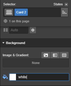
Give Card 2 the following styles:
- Padding-left and -right: 30px
- Padding-top and -bottom: 10px
- Background color: white
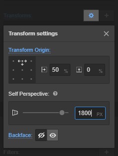
In the transform settings, set:
- Transform origin: top
- Self perspective: 1800px
- Backface: hidden

Step 2c: Style Card 3
Give Card 3 the following styles:
- Padding all sides: 20px
- Text alignment: Center
- Background color: #242424
Then add the same transform settings we gave to Card 2:
- Transform origin: top
- Self perspective: 1800px
- Backface: hidden
Step 3: Add your content to the Card divs
Now we need to pack our 3 Card divs with content. We’ll start with the first team member’s photo.
Step 3a: Add and style the photo
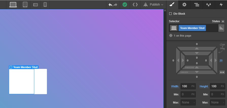
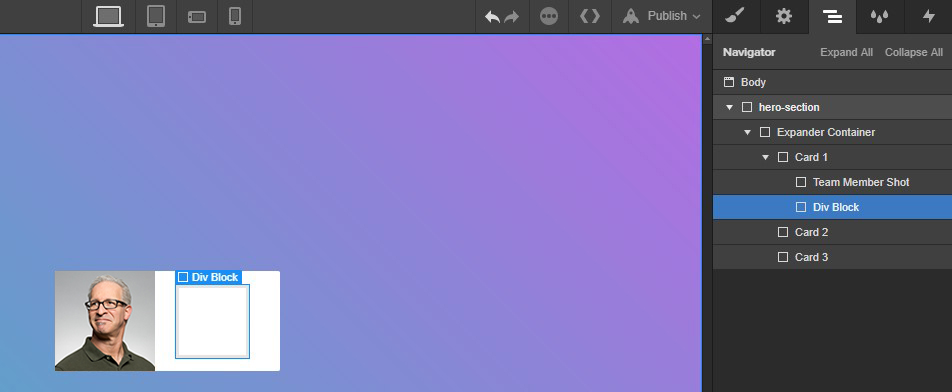
Add another div to Card 1, give it a class of “Team Member Shot” and give it a width and height of 100px. Then add 20px of margin on the right.
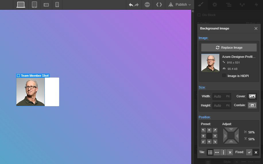
Finally, add the team member’s photo as a background image and set it to cover with a position of center.
Here are those styles again:
- Width and height: 100px
- Margin-right: 20px
- Background image: cover, center
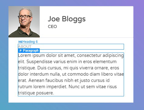
Now we need a container for the text. Add another div inside Card 1. No need to add a class to this one, as it’s just a container for the name and job title and won’t be affected by the flex settings we added earlier.
Then add an H3 and an H5 to the div, and give them both a class of “No Margin” — then remove the default top and bottom margins that come with the heading elements.

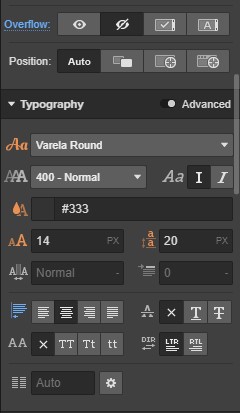
PRO TIP: Create a class called “No Margin” and set the top and bottom margin to 0px. This gives you a reusable class you can add to any text element to clear out the default margins and preserve your carefully crafted type settings.
Step 3b: Add content to Card 2
Add an H6 and a paragraph, filling them with the appropriate content (in our case, “About” for the heading, and a short snippet of lorem ipsum to placehold for the bio).


Design interactions and animations without code
Build complex interactions and animations without even looking at code.
Step 3c: Add content to Card 3
Add an H6 and replace the text with whatever you need. We used “Contact.”
Then add another div and give it a class of “Flex Row.” Set the display to flex, horizontal, justify center and align center. Finally, give it margin left and right of 15% and bottom margin of 25px.

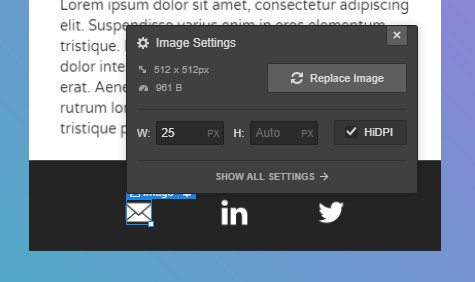
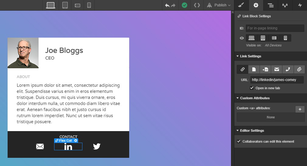
Next, add 3 link blocks and give them each a class of “Flex Col,” with flex item set to expand. Now add your contact icons. I used email, LinkedIn, and Twitter with a width of 25px.
To finish up your contact icons, select each link block and add the corresponding URL in the Settings panel.
Step 4: Add interactions
We’re finally down to the fun part! Let’s get to it.
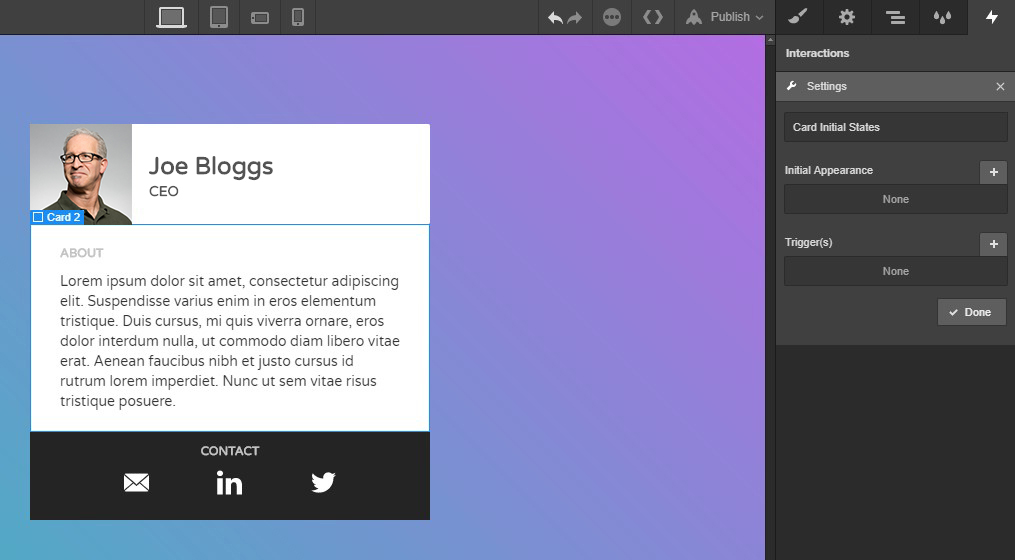
First, select Card 2 — the “about” section — and open the Interactions panel. Then create a new interaction called “Card Initial States.” Give it an initial transform of rotate X -95° with a height of 0px.
Then apply this interaction to Card 3 too.
As the name “Card Initial States” suggests, this interaction controls the card’s default state, before it’s clicked, so it’s not visible on load.
Now select Card 1, open the Interactions panel, and create a new interaction called “Card Trigger.”
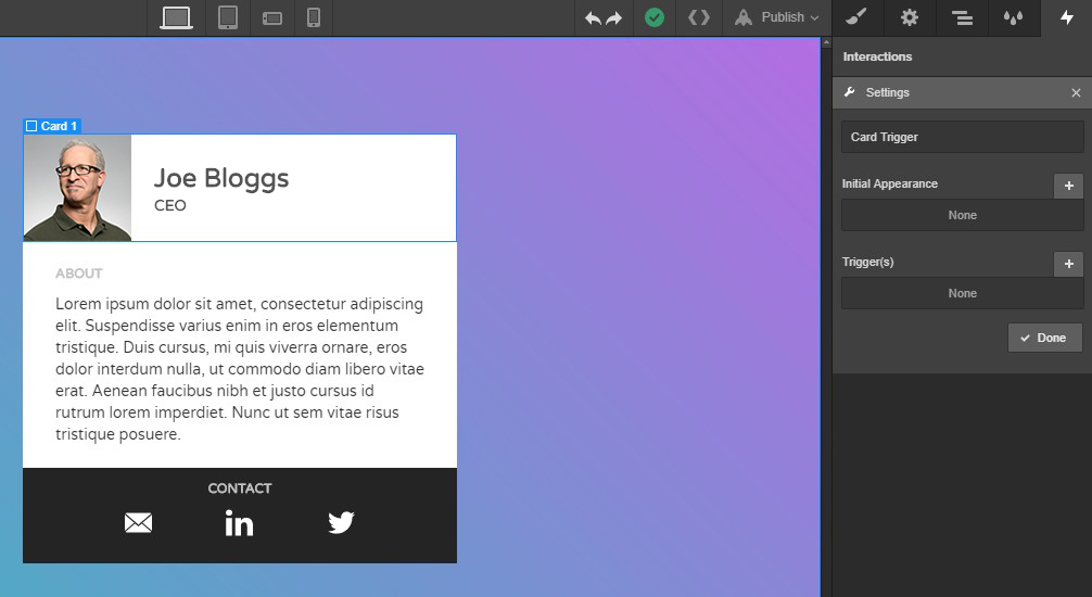
Then add a trigger of click.

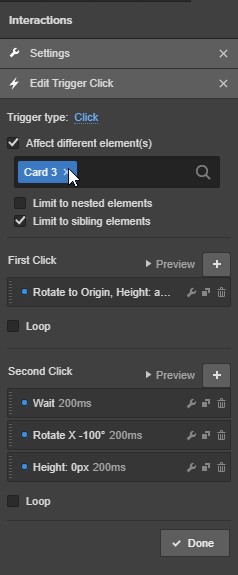
Then select Affect Different Element(s), type Card 2 in the search bar, and limit it to sibling elements. Then add a new first click step.

In the Transforms panel, set rotate to origin to 250ms with an ease-in-out transition. Then set the height to auto, with a transition of 350ms ease. Click done.
Then add a step in the second click section and a 200ms wait. No more, no less.
Then click new step.

In this new step, set rotate X to -100° with a transition speed of 200ms, ease-in-out. Then add yet another new step.
Here, set the height to 0px with a transition of 200ms, ease. Click Done.
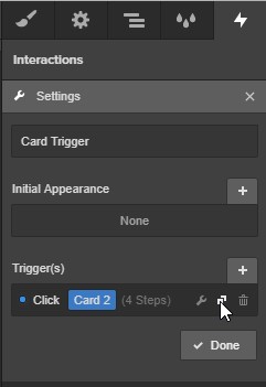
Next, we’re going to duplicate the trigger by clicking the icon of overlapping squares highlighted in the image below.
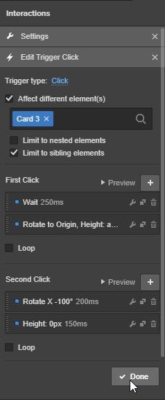
Open the trigger you just duplicated and change the affect different element(s) title to Card 3. From here we’ll make only a couple of changes to the interaction.
First, we’ll add a wait time of 250ms on the first click. And change the height transform to 150ms ease.
Next, remove the wait time from the second click and change the height transform to 150ms ease.
Aaaaaaand click Done. You’re all set, test it out and enjoy!
What tutorials would you like to see next?
We want to see you succeed with Webflow, so let us know what else you need help with, and we’ll see what we can do!