

When it comes to fonts, sometimes the book, product, or even sign associated with the letters are more memorable than the fonts themselves.
Anyone who has used a computer can probably recognize popular fonts like Times New Roman, Arial, Helvetica, or Futura. Many designers can identify dozens of typefaces on sight, regardless of the text. We remember font names because we have to select them in programs like Google docs or Photoshop to use them.
But sometimes fonts earn a place in our memory not because we’ve used them, but because we’re been exposed to them again and again.
Let’s dig into five fonts that you may not know by name, but you’d recognize thanks to their context.
The mediums that brought 5 famous fonts into the spotlight
Dune
The first of the Dune series by Frank Herbert released in 1965. While the series and author have used a few different fonts since then, one stands out as the signature look for both the book titles and author name.
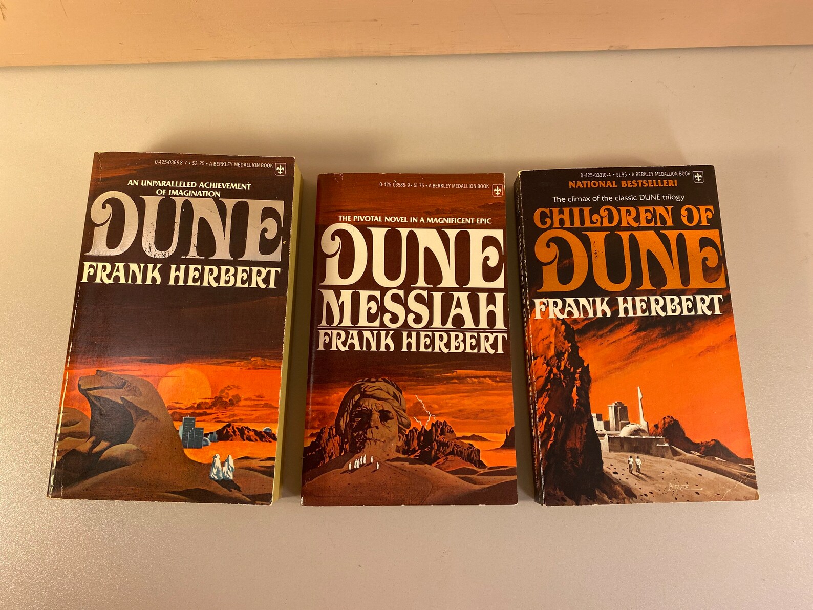
The all-caps serif font with curvy flourishes and mix of thick and thin lines became so linked to Dune that you’d think it was custom-made for the books — but it’s actually a now-famous font called Davison Art Nouveau.
An in-depth exploration of Dune books and products along with other works by Frank Herbert show that the font became a part of his author brand, even though it wasn’t specifically designed for him.
The typeface got its name from lettering artist, Meyer M. Davison, who created it for a now-defunct typesetting company called Photo-Lettering, Inc. (PLINC). The font was exclusive to PLINC and not available for licensing. Anyone interested had to place an order directly with the typesetting company, which is how Frank’s publishers acquired the usage rights.
Davison Art Nouveau appeared on paperback editions of the first two Dune books and was used again for the hardcover release of the third book, Children of Dune. After that, Frank’s works bounced between various publishers, but Davison Art Nouveau moved with Frank and his works. So, even though the creator named the font after himself, Frank Herbert is the name most people would associate with this unique typeface.
Avatar
James Cameron’s Avatar film used an incredibly famous and hotly debated font called Papyrus. Before the release of Avatar, Papyrus was mostly associated with cheesy designs that were meant to look vaguely old or antique. The original use made sense, seeing as the font designer, Chris Costello, wanted a calligraphy-style font reminiscent of Biblical times.
In the 2000s, Microsoft began including Papyrus with Microsoft Office and the font started showing up everywhere from business cards to graphic design projects. It was such a famous font that it became a font that everyone loved to hate. Even the creator said it was “way overused.”
But somehow, nearly a decade later, James Cameron did not realize that the Avatar film title used a slightly modified version of the Papyrus font — he assumed it was a custom font created by the art department. So, the blockbuster film released with “AVATAR” prominently displayed in a font that anyone with Microsoft Office could use.
This probably would have turned into a bit of trivia buried on Avatar’s IMDB page, but a Saturday Night Live skit starring Ryan Gosling solidified this graphic design blunder into movie and entertainment history.
In the Papyrus skit, Ryan Gosling’s character is tortured by this inexplicable design decision. During the three-minute skit, we watch Ryan fight insomnia, talk with a therapist, and flip tables — all over the frustration of the Avatar logo being written in Papyrus font.
Unfortunately for Ryan’s character, his worst fears came true — the modified Papyrus font was used again for the 2022 film, Avatar: The Way of the Water.
Goosebumps
Goosebumps, a horror book series by R.L. Stine is iconic to '90s kids everywhere. The famous Goosebumps title — which originally had a raised, bumpy feel on the cover itself — maintained a consistent look even as the secondary font choices varied.
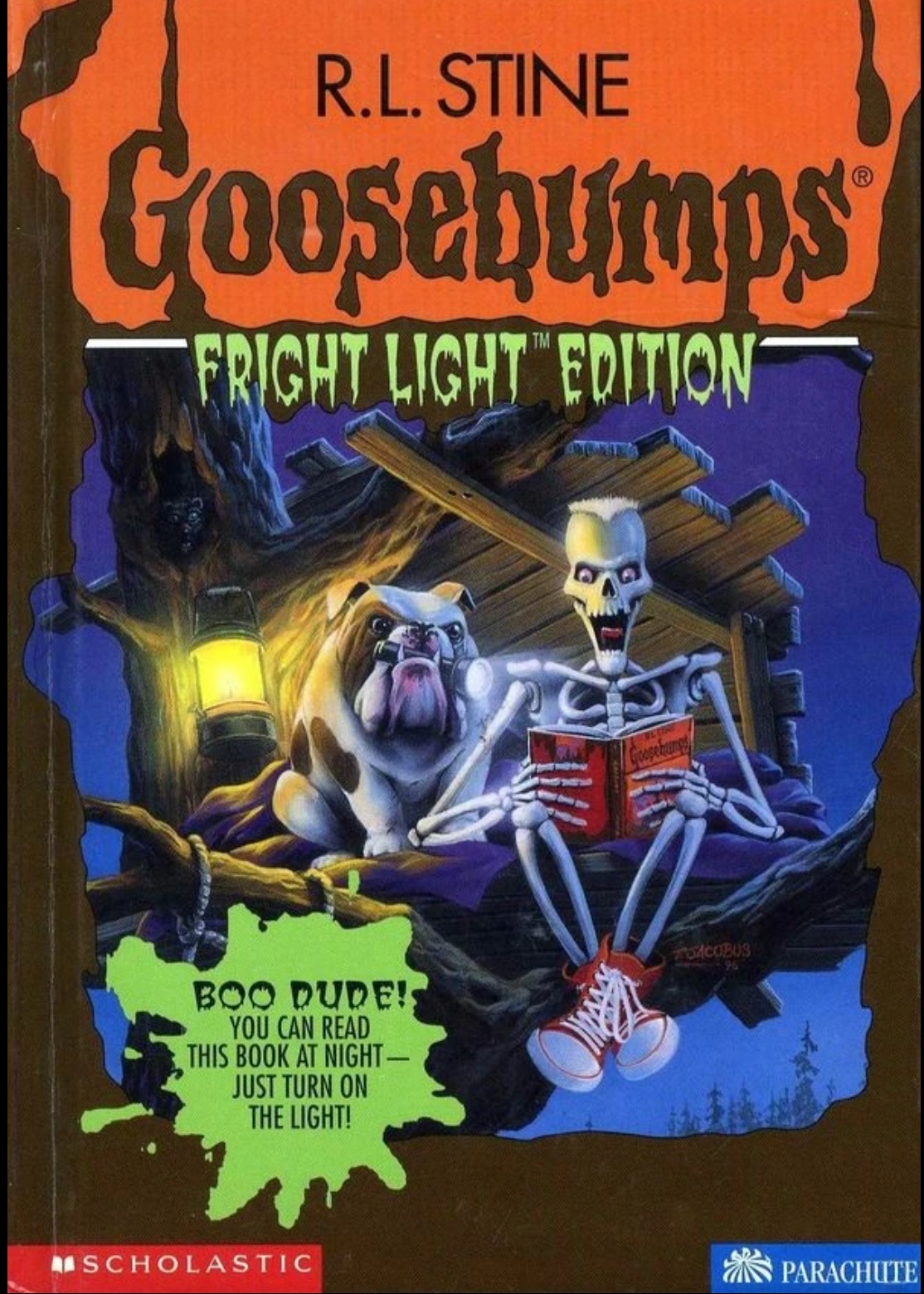
The lettering you see on every book in the Goosebumps series isn’t actually a font — it’s a hand-lettered logo. However, the slimy, slightly creepy appearance of the Goosebumps title has inspired many similar fonts, some of which were eventually used on Goosebumps covers.
According to the Goosebumps fandom wiki, the spinoff font PostCrypt appeared on the book covers for “Fright Light” editions — Goosebumps books with glow in the dark text. PostCrypt is one of many fonts that drew inspiration from the signature dripping slime look of the Goosebumps logo. Font foundries are now full of similar spooky fonts like Goose Pimples, Liquidism part 2, Green Fuz, and Meltdown MF just to name a few. Many of these fonts fall into the generic “horror” category which includes fonts with spooky elements like blood, slime, spiderwebs, and monster-inspired letters. In fact, Goosebumps author R.L. Stine’s name appeared on many covers in Voodoo House font, which looks fitting for a Frankenstein movie poster.
Rae Dunn
If you’ve ever browsed the aisles of a Marshalls or TJ Maxx, you’ve seen the Rae Dunn font. The skinny, all-caps letters mark everything from coffee mugs to cookie jars with obvious labels like “coffee” and “cookies,” respectively.

Technically, there is no official Rae Dunn font, but the letters that look like a crafty person with a felt-tip marker decided to neatly label everything they own have become a tell-tale sign of a Rae Dunn product.
Fonts like The Skinny, Cami Rae Regular, Amatic SC, and Sunn are among the many typefaces inspired by the Rae Dunn font. These fonts have become increasingly popular in craft communities. Etsy and font websites offer a variety of Rae Dunn font spinoffs, many of which are compatible with Cricut — a cutting machine favored by crafters. So while this famous font still doesn’t have a single official name, searching for fonts “inspired by Rae Dunn” will provide plenty of options that mimic this recognizable style.
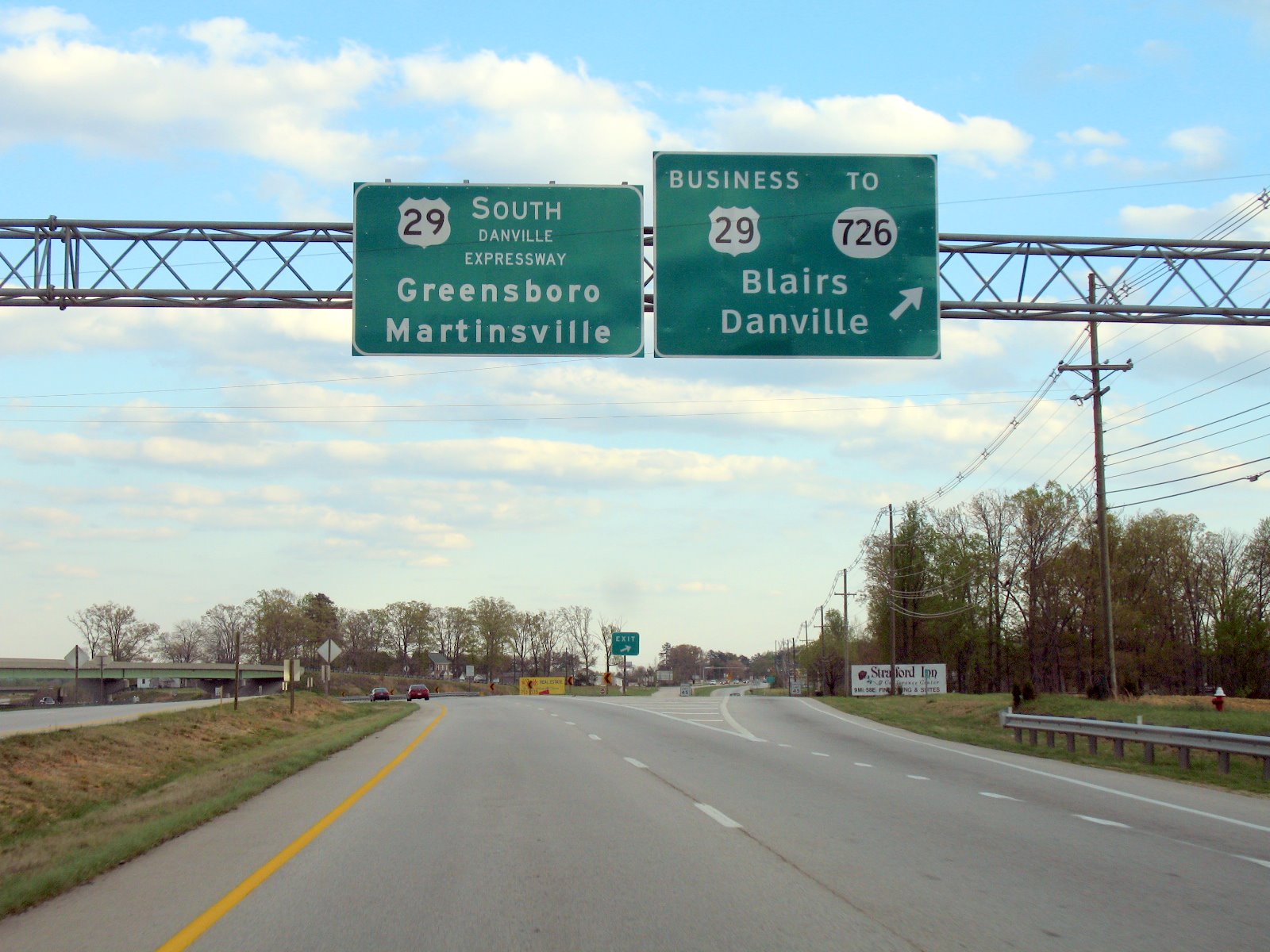
Highway road signs
If you’ve traveled in the United States, you’ve no doubt noticed that there are standard colors for highway signs — but did you know that the font is also standardized?
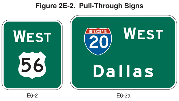
The aptly named Highway Gothic typeface was designed by The Federal Highway Administration (FHWA), an agency within the U.S. Department of Transportation that supports the design, construction, and maintenance of highways throughout the U.S. Part of that work is establishing standards for signage.
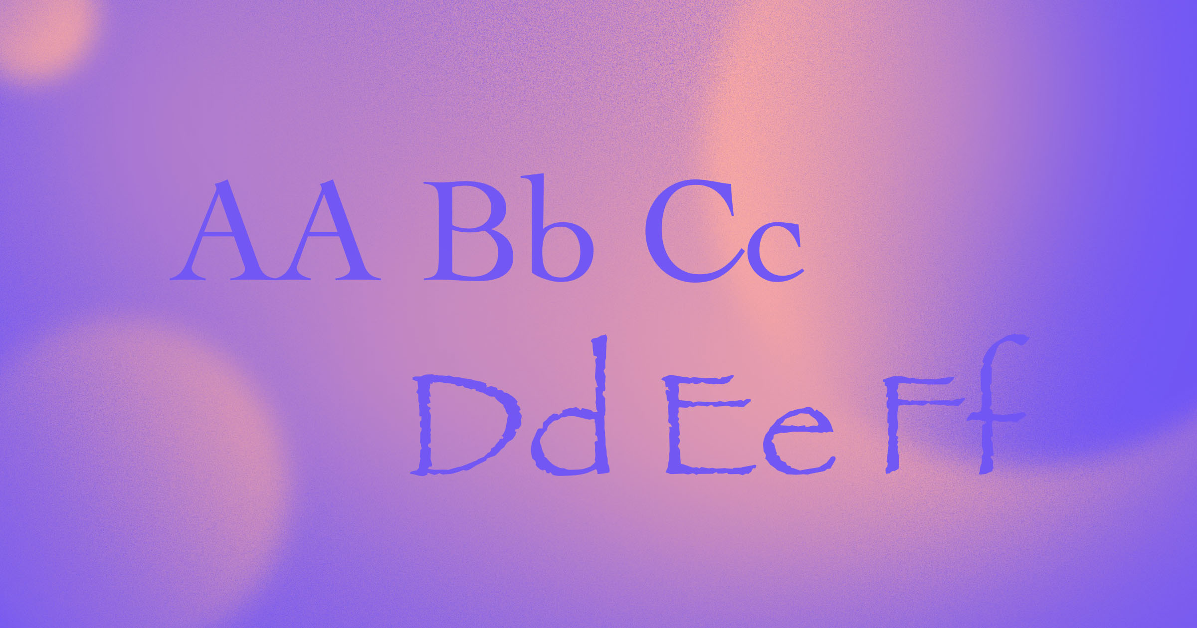
The typeface family Highway Gothic contains six fonts, ranging from the narrowest version “A” through the widest version, “F.” The typeface was designed to be easy to read from a distance while traveling at a high speed, making it ideal for highway road signs.
For several decades, it was the only approved typeface for highway signage. But in 2004, Penn State researched alternatives with the goal of making reflective road signs more legible. The FHWA approved interim use of Clearview typeface for this purpose, but has since gone back and forth on this decision. It seems Highway Gothic is still the preferred typeface, but signs written in Clearview are not required to be replaced, which is why you’ll see a mix of the two typefaces throughout the U.S.
Fonts stick in our minds because of how and where we see them
Typefaces and fonts stick in our minds both because we use them and are exposed to them in various ways.
Savvy designers don’t just choose typefaces and fonts because of how they look. They consider what people associate with certain fonts or how a font looks in different contexts. Times New Roman feels right for a document, but you probably wouldn’t use it for a logo design. Raleway, on the other hand, might be an extremely popular font for web design, but it’d be tough to read from a distance while driving on a highway.
So next time you notice a font you love, consider whether you’re intrigued by the lettering or by medium for those letters.


Get started for free
Create custom, scalable websites — without writing code. Start building in Webflow.

.jpeg)