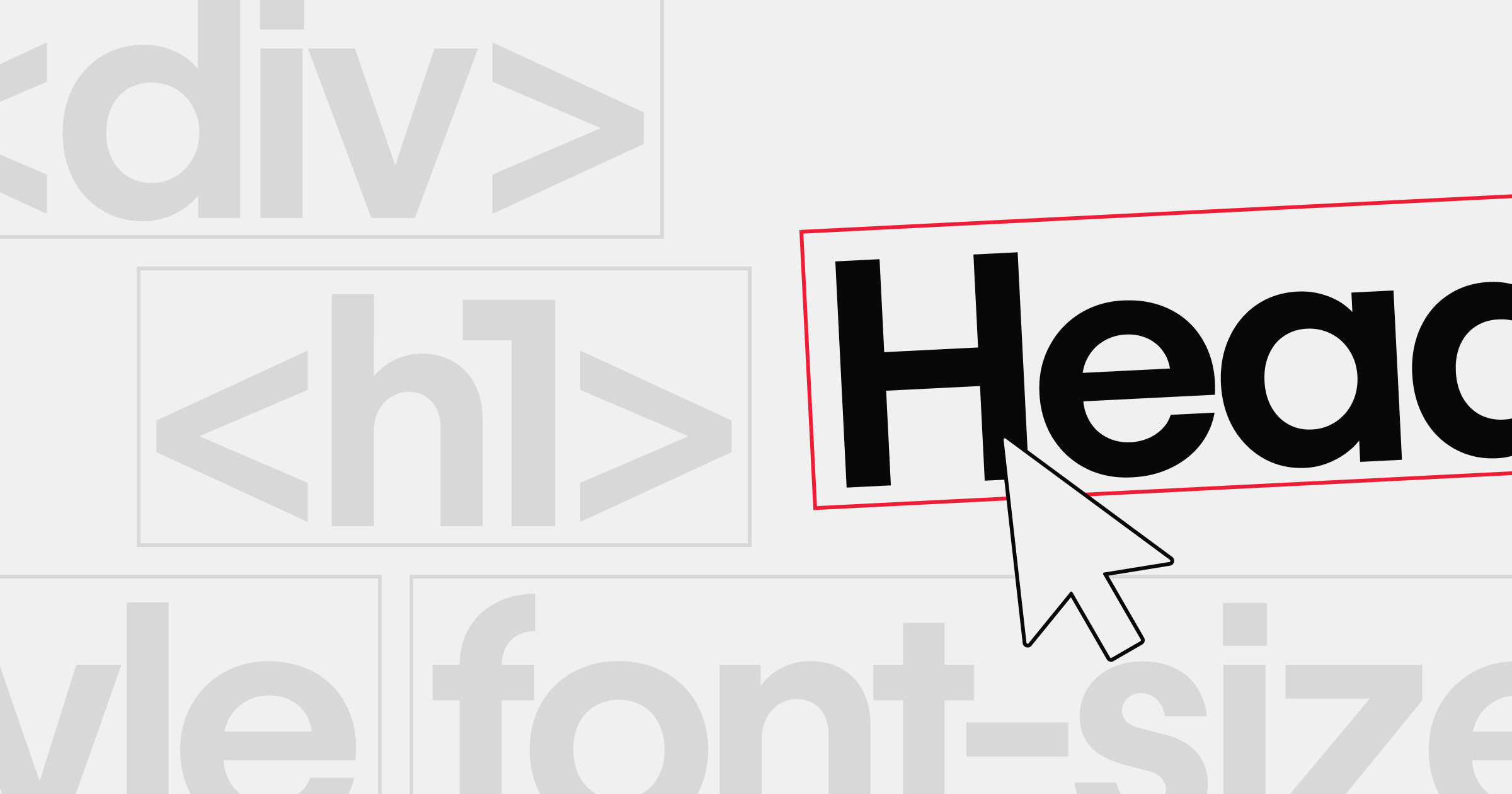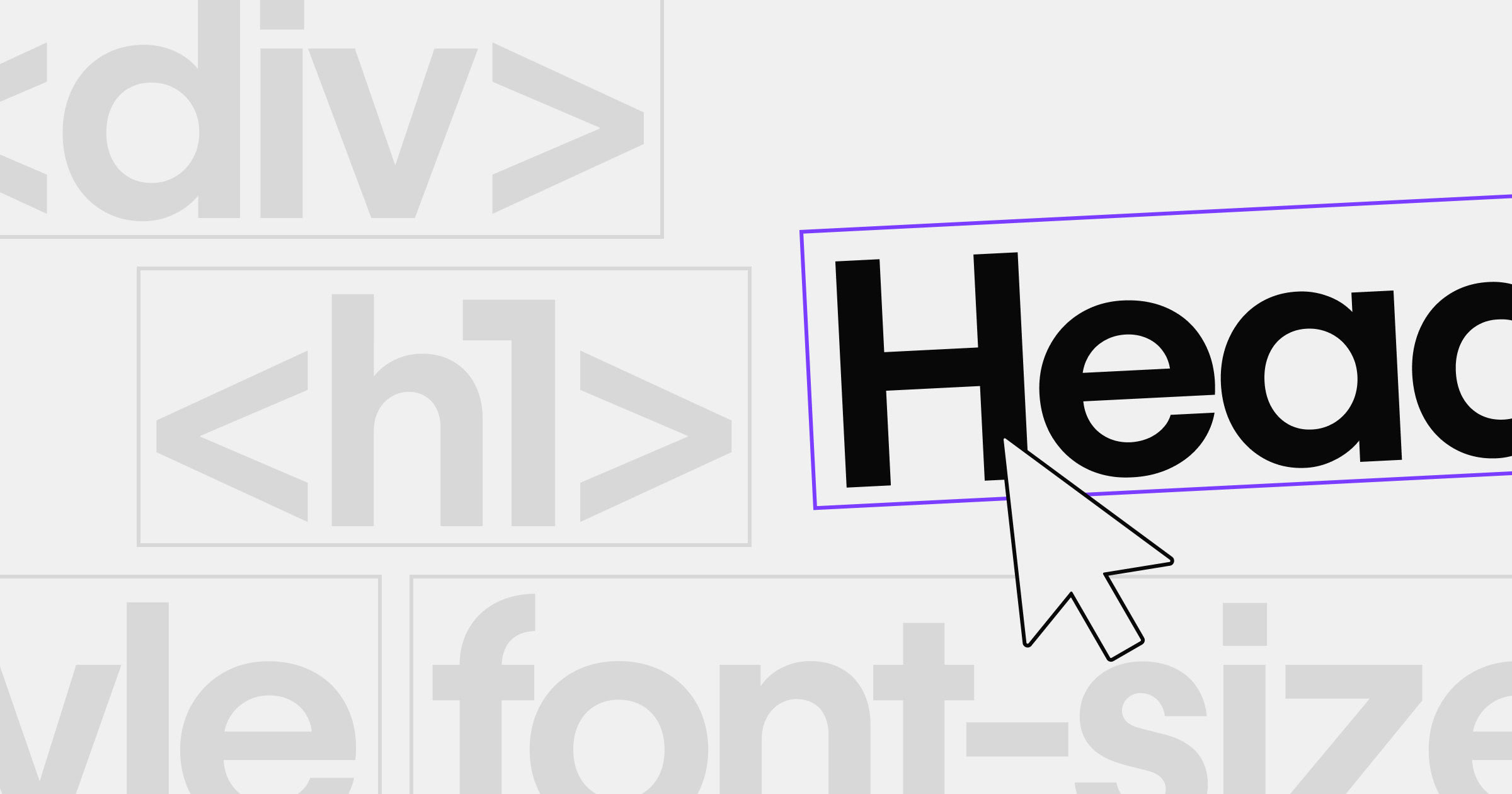


Font choice is a crucial detail that can dramatically influence your web design.
Finding a strong font choice can shape how users experience your website, driving both readability and visual appeal. With countless options, it's helpful to focus on your project's functionality, aesthetic goals, and user needs.
To help determine some of the best fonts for web design in 2025, we dug into the top font choices of Webflow users.
The 11 best fonts for web design
1. Roboto (+ condensed and slab)
Roboto is an incredibly popular font choice for web designers, and it’s no surprise that basic, sans serif Roboto as well as the Condensed and Slab variations have been frontrunners for Webflow users for the past few years.

The Roboto font family offers a wide range of variation in weights, widths, and styles — making it a versatile choice for website design. The condensed versions provide more space efficiency, while the slab versions provide a serif option to pair with the classic Roboto.
Roboto has excellent character support for many major writing systems, including Latin Extended (for all European languages), Cyrillic (Russian/Bulgarian/Ukrainian etc.), Greek, and Hebrew alphabets amongst others, making it perfect for multilingual websites. For a modern yet approachable layout, pair sans serif Roboto with a custom serif font in headlines or subheadings. Remember to consider thoughtful font pairing with Roboto for a cohesive brand message.
Roboto's wide range of variations helps maintain clarity in multiple viewports.
2. Libre Franklin
Libre Franklin is a modern and versatile web font that brings classic American typeface aesthetics to the internet. It’s a common choice for multilingual websites because it supports both Latin-based languages and non-Latin languages like Greek, Cyrillic, and Arabic.
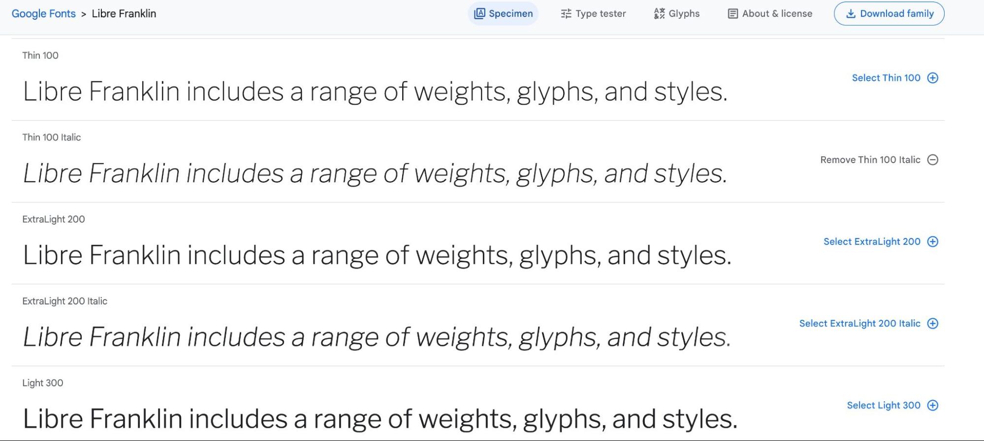
This digitally-optimized font was built with OpenType features like small caps, ligatures, fraction formatters, and other stylistic alternatives. This ensures the font remains crisp and clear regardless of screen size or how far viewers are zoomed in or out. And with more than 700 glyphs and three different weights, Libre Franklin gives designers plenty of options for typographic design. Designers often use Libre Franklin for clear body text alongside a bolder display font for headlines. Don't forget that pairing Libre Franklin with complementary serif or script fonts can elevate your design.
Libre Franklin's digit-optimized design ensures consistent legibility at various sizes.
3. Raleway
Raleway is a san serif font with open letterforms that make it easy to read on screens. Thanks to the various weights, widths, and stylistic alternatives — including swashes, ligatures, fractions, old-style numerals, arrows, and circled letters — designers have a lot of options to work with when designing with this classic font.

Both Windows and Mac operating systems support Raleway. It’s also available on Google Fonts, making it one of the best fonts for web design because designers can access the font without having to worry about licensing or downloading any files. In Webflow, you can add Google Fonts directly to your project. Raleway's versatility means it can function as both a headline font and an accessible body typeface, making it ideal for modern layouts. Keep font pairing in mind for an even more striking visual hierarchy.
Raleway's open letterforms improve legibility on smaller screens.
4. Inter
Inter was specifically designed for screens and user interfaces. Because it’s a variable font, Inter works especially well in responsive designs because it can easily adapt to different screen sizes and resolutions — ensuring that your content's always easy to read on all devices including small screens.
Inter features a range of stylistic alternatives which allow designers to add subtle nuances to their typography. And because Inter is an open-source project, designers have the option to customize it to suit their specific needs. Inter pairs nicely with more decorative script or serif fonts, creating a balanced visual hierarchy in UI design. This font is also an excellent candidate for thoughtful font pairing that ensures a seamless user experience.
Inter's focus on clarity keeps text readable at any screen size.
5. Source Sans Pro
Source Sans Pro is one of the best fonts for web design because it was specifically designed for maximum legibility and readability on the web. This sans serif font has clear and concise letterforms that make it skimmable. Generous spacing also helps Source Sans Pro stand out against busy backgrounds or images on webpages.
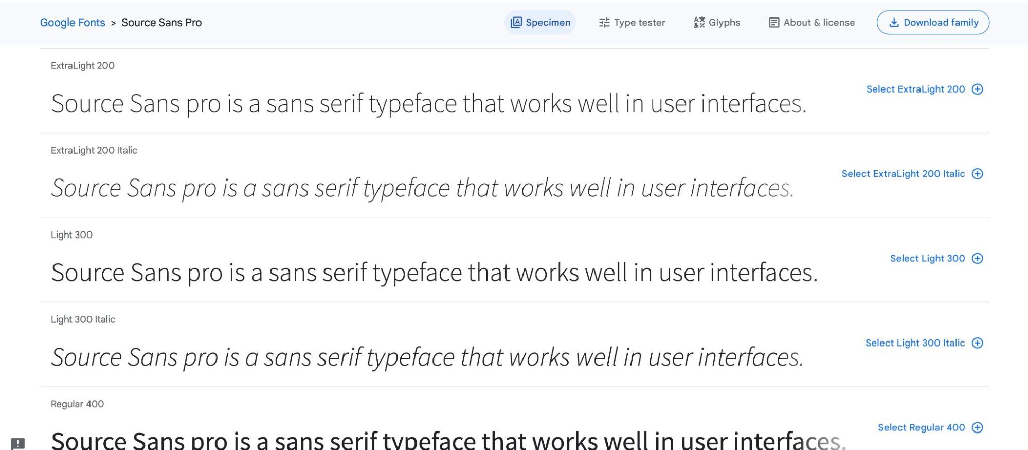
The character set of Source Sans Pro covers over 200 languages and variations like Cyrillic, Greek, and Vietnamese — making it ideal for multi-language and international websites. Plus, this typeface has been designed with anti-aliasing technology, which makes it look great even on low-resolution screens. For a strong typographic contrast, pair Source Sans Pro with a bold serif headline font. Exploring different font pairings with Source Sans Pro can further refine your project's distinct look and feel.
Source Sans Pro's generous spacing maintains readability even with busy backgrounds.
6. Poppins
Poppins is a sans serif font that can handle characters from Latin alphabets and the Devanagari system used by languages like Hindi or Sanskrit. If you're looking for an internationally versatile font, Poppins is a great choice.
Poppins’ geometric shapes keep the type readable in small sizes, while its modern yet timeless curves look striking when blown up on big screens or mobile devices. It’s perfect for web and UI designs that demand style, clarity, and legibility.
Plus, Poppins' OpenType features offer a ton of potential for customizing text.For example, ligatures can combine two or more characters into one glyph shape.Collaborate Poppins with a flowing script font for an eye-catching modern brand, or keep it solo for a minimal, clean layout. Don't forget to experiment with font pairing to find the perfect balance in your design.
Poppins' geometric shapes remain crisp, especially on mobile devices.


Ultimate web design
From 101 to advanced, learn how to build sites in Webflow with over 100 lessons — including the basics of HTML and CSS.
7. DM Sans
DM Sans offers a clean, modern appearance that works well in minimalist design. This sans serif typeface features a geometric form with rounded corners that give it a friendly yet professional look. You’ll often see DM Sans used as body text on websites because it was intended for small text sizes.
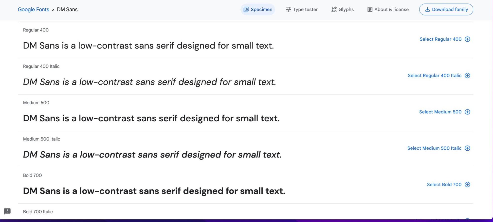
Thanks to the Latin Extended glyph set, DM Sans works well for English and Western European languages. In addition to the five weights, DM Sans includes OpenType features like fractions, ordinals, superscripts, subscripts, case-sensitive forms, proportional figures, and tabular figures. DM Sans works especially well in minimalist designs, often paired with subtle animations or bold accent fonts. Font pairing with another typeface can further enhance DM Sans's crisp, modern feel.
DM Sans's low-contrast letterforms make it easy to read at small sizes.
8. Playfair Display
Playfair Display is a serif display font with strong, bold lines and a modern feel that works well for headlines and titles. The font features slightly condensed characters that have an open shape and rounded terminals, making it suitable for small text sizes as well.

Thanks to the Latin Extended glyph set, DM Sans works well for English and Western European languages. In addition to the five weights, DM Sans includes OpenType features like fractions, ordinals, superscripts, subscripts, case-sensitive forms, proportional figures, and tabular figures. Playfair Display's bold lines pair well with a simple sans serif, helping headings stand out. For that reason, thoughtful font pairing with a modern sans serif can create a striking yet balanced layout.
Playfair Display's bold lines help letters remain distinct in headlines.
9. Font Awesome (solid 900, brands 400, 400)
FA (Font Awesome) Solid 900, FA Brand 400, and FA 400 aren’t technically typefaces but rather, they’re three versions of the same powerful icon font library used in web design. Font Awesome is a collection of highly customizable icons that can be added to any website. These icon sets are worth mentioning because they’re incredibly popular in UI and web design.
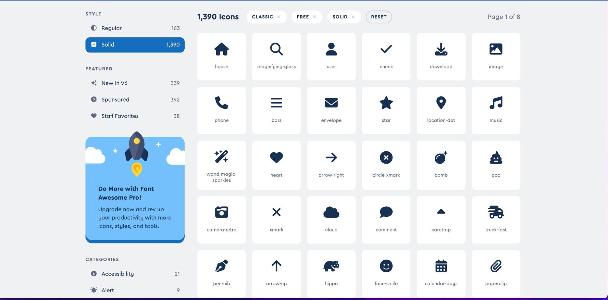
FA Solid 900 has the highest contrast and boldness available, making it ideal for headers. FA brand 400, on the other hand, offers slightly less contrast but includes unique features like color, animation, and other styling options that can be resized on demand. The FA 400 version combines both quality and complexity suitable for larger user interfaces or small icons that require more detail without sacrificing clarity. Many designers incorporate Font Awesome icons alongside any of these typefaces for consistent branding and quick visual cues. Consider strategic font pairing with these icon sets for a cohesive brand presence.
FA icons maintain clarity at a range of sizes, making them easy to identify in various UI contexts.
10. Rubik
Rubik — named for the Rubik’s cube — is another geometric sans serif font available via Google Fonts.
On websites, Rubik is great for headings and titles, especially when used in combination with a more traditional serif font for the body text. The Rubik font family includes nine weights and an impressive range of OpenType features as well, making it ideal for designers who want a legible font that still leaves room for some creativity.
Not only does Rubik work well in Latin-based alphabets, it also supports Cyrillic script languages such as Russian or Bulgarian. It's a perfect choice for bold titles and modern branding, pairing seamlessly with a simple serif for body text. Don't overlook the impact of font pairing with Rubik to reinforce a unified visual narrative.
Rubik's modern geometry supports clarity across different device resolutions.
11. Lora
Lora is an elegant, modern font that features a unique blend of old-style serif letterforms and modern sans-serif elements, creating a beautiful aesthetic for any design project. With its slightly condensed letters, it helps draw the eye to headings or important visuals on the page while still providing excellent legibility.

In addition to its four widths and nine weights, Lora also includes many ligatures which allow its letterforms to be connected gracefully without compromising readability at different sizes or when used in different contexts. Consider pairing Lora with a clean sans serif for a refined, balanced look.
Lora's timeless serif details keep text legible at various scales.
Before settling on a font, prototype and test your choices on different devices and screen sizes to ensure consistency. Gathering real user feedback or input from team members can confirm whether your font selections meet both readability and brand goals.
What makes a font work for web design?
Choosing the right style, ensuring legibility, and aligning with your brand's personality are key. Strive for a font that supports readability at different sizes and resonates with your website's tone.
Tips for selecting the best fonts in 2025
From traditional serifs to creative scripts, choosing a font for your website can be an exciting challenge. With countless options, it's helpful to focus on your project's functionality, brand personality, and user needs. Remember to consider legibility, brand personality, and pairing potential when making your selection. Variable fonts can adapt their weight or width in your design without multiple files.
Serif, sans serif, or script: Which style works best?
When picking a font, it's crucial to decide if a serif, sans-serif, or script typeface aligns with your brand. Each style offers a distinct vibe — serifs feel more traditional or formal, sans-serifs are modern and clean, and scripts add elegant or playful flair.
Understanding brand alignment
Your brand's identity should dictate font choices. If your brand's established and professional, a classic serif might fit. If it's cutting-edge, a contemporary sans-serif might serve you better. It's about consistency and reinforcing your brand voice.
Pairing and hierarchy
- Use bold, eye-catching type for headlines
- Choose a simpler body font
- Establish consistent styles that guide the reader's eye.
As you weigh these 11 options, consider how each font's style, weights, and language support align with your brand.
Web-safe fonts vs. modern web fonts
Web-safe fonts are pre-installed on most operating systems to ensure consistency across all browsers. Modern web fonts, like those offered by Google Fonts or through CSS fonts, expand your design options with unique styles, broad language support, and greater brand expression. Balancing these choices can help you create a website that's both accessible and visually distinct. Keep in mind that fonts from different repositories may come with usage rules. Always check licensing details, especially for commercial sites.
How to implement your chosen fonts
Test your font selections on various devices to confirm readability and loading speed. Adopting efficient hosting methods can ensure a smooth user experience across different screen sizes.
What's your next font choice?
Ultimately, choosing the “right” font for your website comes down to striking a balance between creativity, legibility, and accessibility. When selecting fonts, be sure to consider not just the visual impact, but also whether it’s an accessible, web-safe font.
Consider how each typeface aligns with your goals. If you're ready to learn more, check out how to add Google fonts to your Webflow project, generate a font, or use variable fonts.
Build websites that get results.
Build visually, publish instantly, and scale safely and quickly — without writing a line of code. All with Webflow's website experience platform.