
Movie posters have been around for as long as we’ve had movies. They serve as promotional tools, offering glimpses into the plot, setting, and tone of the movie they’re advertising.
But more than that, movie poster design serves as a complementary art form to the film medium, with posters that aim to capture the visual aesthetic and mood of the movie itself.
While graphic design experience would be beneficial, the art of creating an effective movie poster is a specialized skill. Just like great book covers, the most impressive ones are often hailed as masterpieces in their own right.
And when paired with the right movie, they can go down in film history as iconic pieces of art. Think of Jaws (1975), The Godfather (1972), or Breakfast at Tiffany’s (1961) — our memories of these films are inextricably linked with the iconic images on their famous posters.
Movie posters have always been a part of the language of cinema
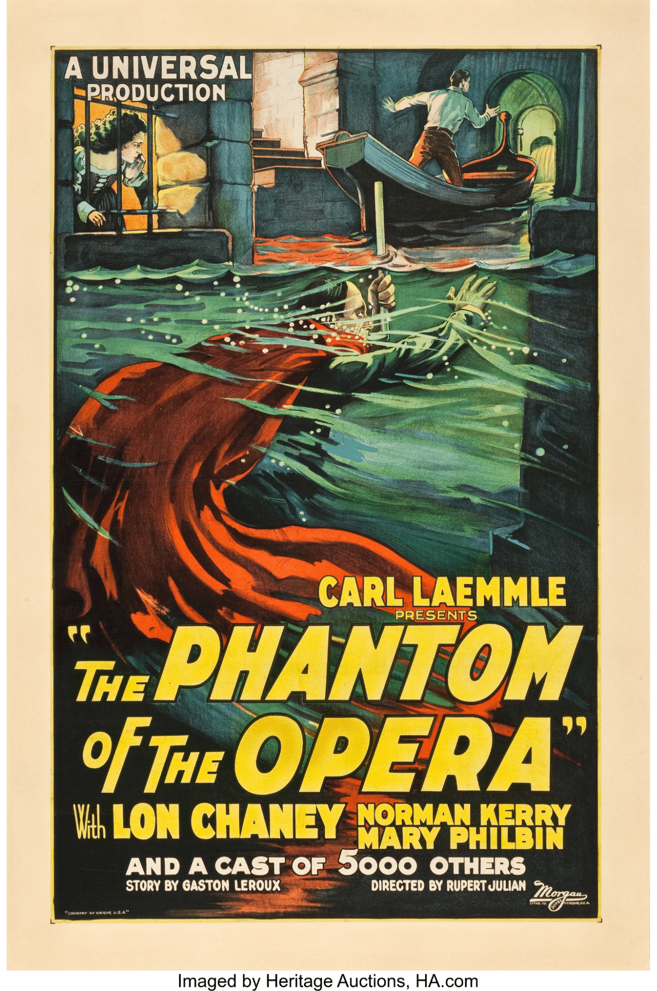
While the first narrative feature was the 1906 Australian film The Story of the Kelly Gang, the first poster advertising a work of moving images was created by Parisian artist and lithographer Jules Cheret in 1890. It was a lithograph for a short film titled Projections Artistiques, and it depicted a young girl holding up a poster with the times of the show.
The 1895 short film L’Arroseur Arrosé had what is considered to be the first poster designed to promote an individual film. Instead of focusing on the technological wonders of film as a grand novelty, L’Arroseur Arrosé’s poster actually depicted an event from the work it was advertising. Just like the burgeoning film medium, the artform was gradually refining itself.
However, it wasn't until the 1920s that movie posters really took off with the emergence of Hollywood as a major player in the film industry. This was the golden age of silent movies and the film industry was booming. Movie theaters got larger, with grand architecture that provided room for not only more patrons, but also plenty of wall space for movie posters. These posters were mostly hand-drawn illustrations designed to be displayed outside theaters to attract people walking by the building.
As the movie industry grew, so did the importance of movie poster art. Studios realized that the poster was a crucial tool in getting people to see their films, and that a stylish and intriguing movie poster had the potential to attract large audiences. In the 1940s and 1950s, the use of photography on posters became more common, allowing movie studios to feature the film’s top actors more prominently and recognizably.
By the 1970s, movie posters had evolved into colorful, eye-catching designs, with poster makers often collaborating with the filmmakers to create a work of art that conveyed the film’s tone and themes. The 1970s also happened to produce some of the best movie posters of all time, such as the timeless and iconic posters for Star Wars, Dirty Harry, The Exorcist, Apocalypse Now, and more.
Since then, movie posters have expanded into an incredible amount of styles and approaches, from minimalist designs to the most ornate depiction of a film’s themes and narrative. These days, movie posters are more likely to show up on social media feeds than on the outside of a cinema, but the role is essentially the same — to attract attention. Movie posters are often the first point of contact that audiences have with a movie, and the posters play a vital role in conveying the film’s aesthetic and theme.
What makes a good movie poster?
If we think of a movie as the experience being advertised, then we can think of a movie poster like a landing page for a product or company.
Landing pages and movie posters both need to be visually compelling, easy to understand, and accurately convey what’s being offered — whether that be a product or a movie experience — in order to nudge consumers towards a purchase.
Movie posters and landing pages employ design elements like composition, color, typography, and relevant images to convey a brand identity, leave a lasting impression, and increase the likelihood of a conversion. It’s all about putting the right pieces together in the right configuration.
Those pieces include color, typography, and composition.
Color palette: Color is one of the greatest tools for movie poster design, as it’s a way to create mood and evoke emotions. It also serves as a shorthand to communicate a film’s genre. For instance, take note of the many times you see a poster for a comedy made up of a white background with a large amount of negative space.
An example of color trends in movie poster design include blue and orange being paired together for action movie posters. This combination has gained prominence over the course of the last two decades, given its satisfying contrast between the two colors (they sit at opposite ends of the color wheel) and energetic look and feel.
Similarly, you might see combinations such as blue and green to convey the same feeling of dynamism. Indie movies on the other hand, seem to often feature posters with a yellow background. And a horror movie poster may use dark, moody colors like black and red to create a sense of foreboding and unease.
The choice of color in the movie poster may also mirror the film’s cinematography or color scheme.
Typography: Just like color, typography is an incredibly useful tool for the creation of movie posters. It is used to convey important information about the movie such as the movie title, tagline, and release date. Choosing the right typography can imbue your poster with a sense of drama, emotion, and personality, helping to catch your audience’s attention and make it more memorable. And just like color, it can be used as a way to quickly and clearly convey the intended genre.
The most important thing is that the typography is arranged in a way that ensures it’s legible and visually appealing.
Composition: Put simply, composition refers to the arrangement of the various visible elements to create a sense of balance and visual interest. For example, a movie poster may use the rule of thirds to create a balanced, visually appealing composition. But composition also refers to the structure of the image shown in the poster itself, not just how the elements of the poster are arranged relative to each other. This can refer to the use of the rule of thirds, the use of negative space in an image, or the famous floating-heads poster style that has become very popular in contemporary poster design, particularly for blockbusters with several leading actors.
So what are the key qualities of a good movie poster? Let’s explore while taking a look at some recent notable posters.
A good movie poster is visually striking
In the digital era, attention is a scarce commodity. Nothing matters more than capturing a potential viewer’s attention and holding on to it. If a movie poster accomplishes this with a visually striking image, it’s already overcome its first hurdle: cutting through the noise and clutter of social media and other distractions.
Eye-catching images, colors, typography, and composition play a huge part in this. If it’s a poster for a film starring very famous actors, movie poster makers can catch people’s attention by prominently displaying those famous faces. Similarly, if the film belongs to a popular franchise, employing its iconography and placing it front-and-center is a smart move.
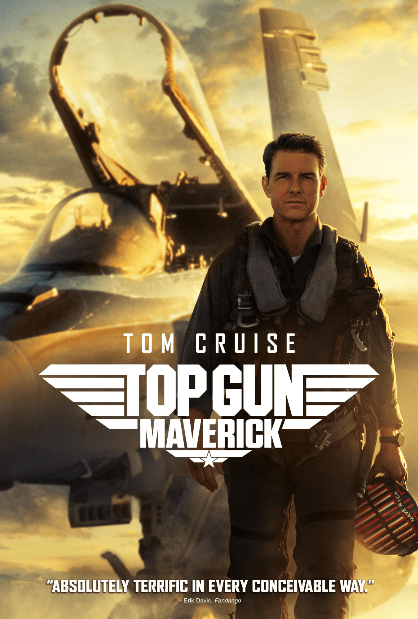
Top Gun: Maverick, the sequel to the seminal 1986 film by Tony Scott, is an interesting case. Not only did the poster have to evoke the feeling of the iconic original film, it also had to convey a feeling of excitement and anticipation that could draw in younger viewers unfamiliar with the original. The end result features Tom Cruise's character, Pete "Maverick" Mitchell, standing in front of a fighter jet, staring off into the distance with a determined look on his face. The title of the film — an updated version of the original Top Gun logo — is prominently displayed in the lower half of the poster.
The poster effectively captures the essence of the Top Gun franchise, known for its high-flying action and thrilling aerial fights. The image of Maverick standing in front of the jet emphasizes his status as a skilled and fearless pilot, while also hinting at the movie's focus on advanced aviation technology. The sun shining down on Maverick gives the entire poster a golden hue and hints that the film will center around the character. And finally, putting Tom Cruise front-and-center will attract fans of Tom Cruise’s work and his particular brand of action film.
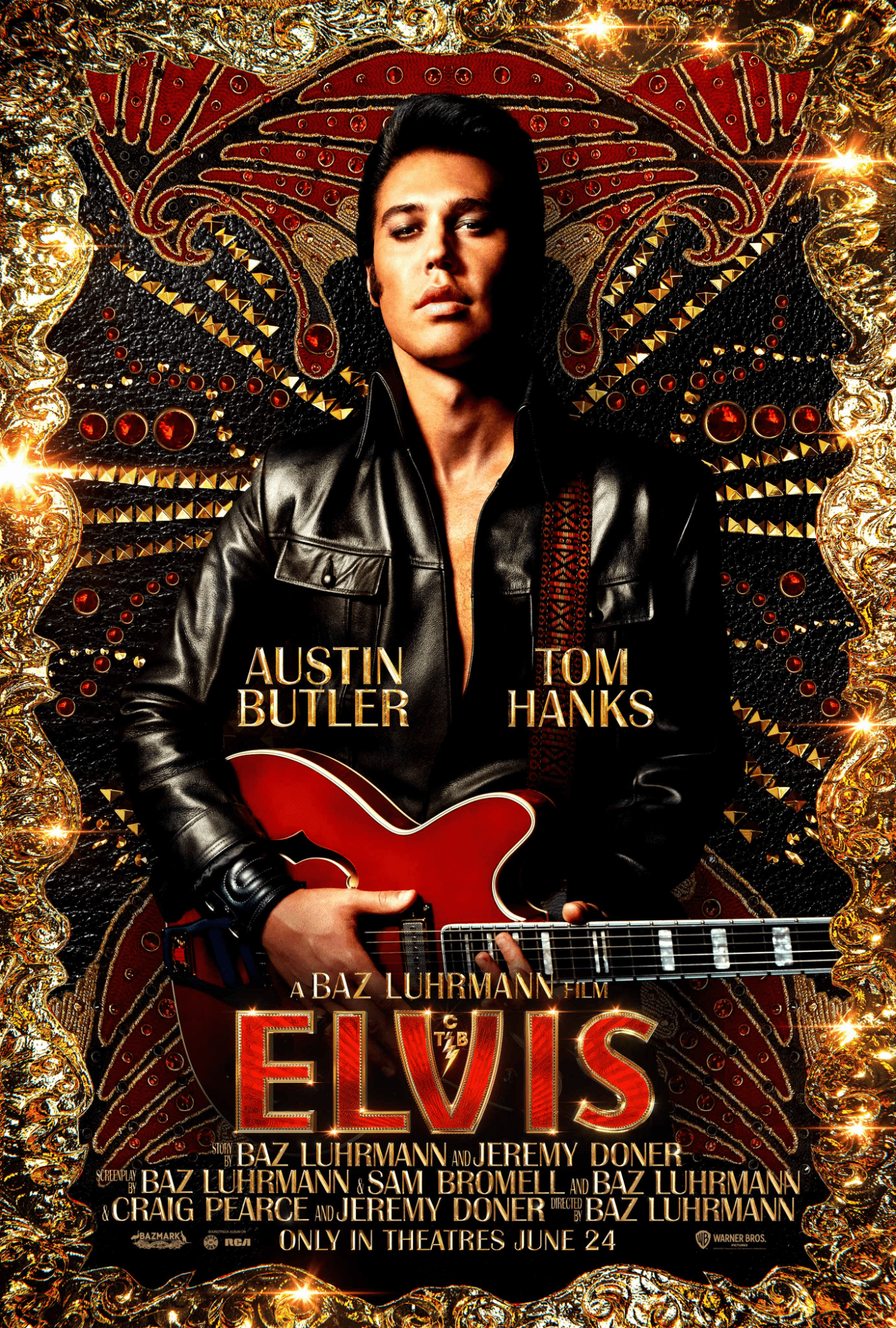
Another one of 2022’s Best Picture nominees, Baz Luhrmann’s Elvis is an often frantic, ultra-stylized, and over-the-top romp through the life of the legendary singer. The film’s poster has to communicate not only the film’s identity, but also the artistic identity of Elvis Presley himself. The poster achieves this with a bedazzled background reminiscent of Elvis’s outfits, while also prominently displaying the film’s star, Austin Butler.
The use of colors here is absolutely striking, resembling the style of the King of rock ‘n roll himself as well as the colors of Las Vegas — a setting that Elvis would go on to become closely associated with. The gold and red contrasts with the black leather jacket, making this image pop.
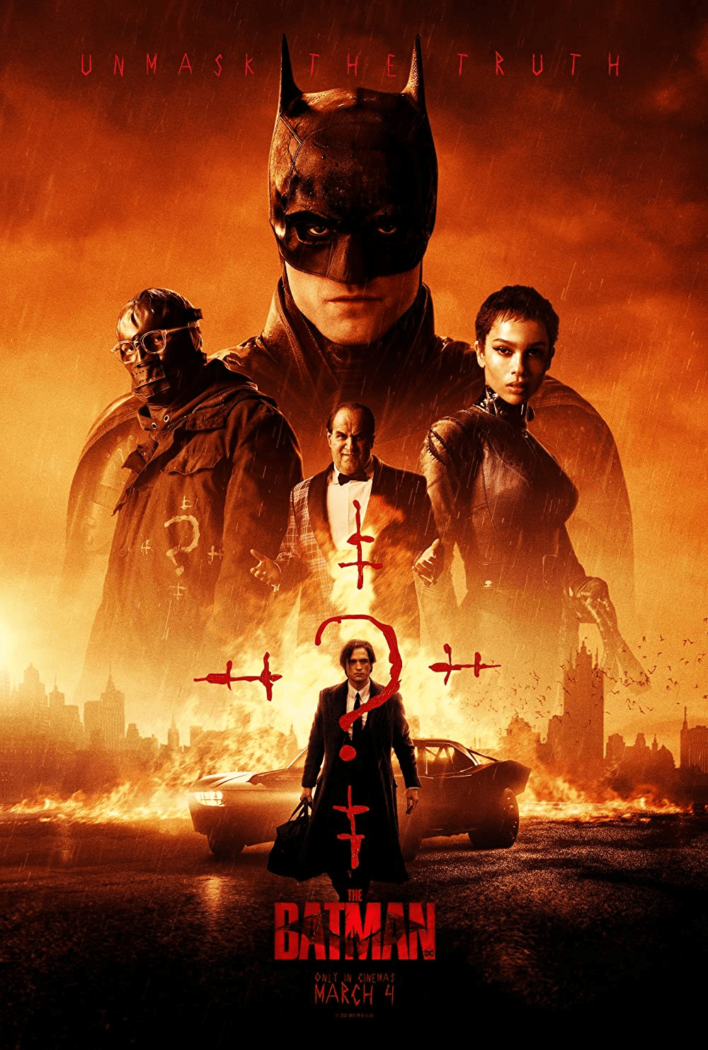
Another great example of movie posters is that from The Batman, Matt Reeves’s 2022 adaptation of the caped crusader, which has a very distinct look and feel to it. To properly convey the film’s overwhelming sense of menace, the poster designers used the contrast of orange and black as the poster’s overall color palette. Coupled with the floating-heads approach to displaying characters, as well as the inherent recognizability of the Batman cowl, this is a remarkably effective movie poster for a superhero action film.


Get started for free
Create custom, scalable websites — without writing code. Start building in Webflow.
A good movie poster is memorable.
Catching someone’s attention is not enough. Movie posters need to be unique or exciting enough to stick in a potential audience member’s mind. Memorability is hard. There is no easy way to achieve it. But many movie poster designers choose to zero in on one particular element of the film — for instance, a particularly significant or interesting moment that occurs in the plot — and bring that to the forefront.
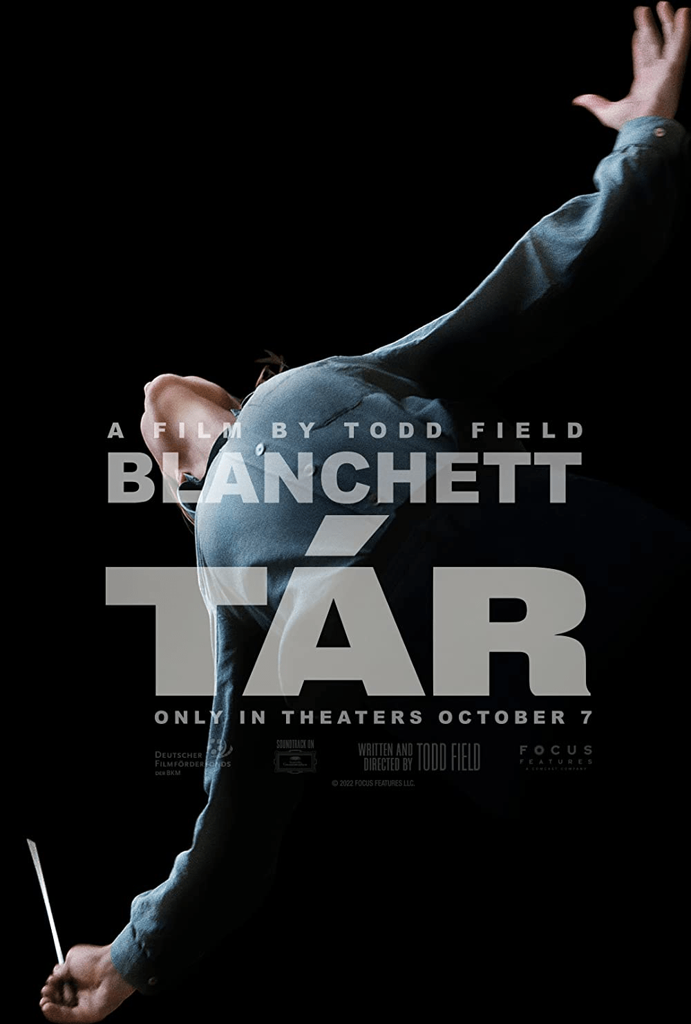
Todd Field’s 2022 psychological drama Tár has a memorable movie poster featuring the titular character posing dramatically while conducting her orchestra. Notably, star Cate Blanchett faces away from the camera, so we can’t actually see her face. But the blocky, all-caps font covering the actor lets us know who we’re seeing. This is a powerful and enduring image, filled with gravitas and, much like the film, an unsettling sense of ominousness.
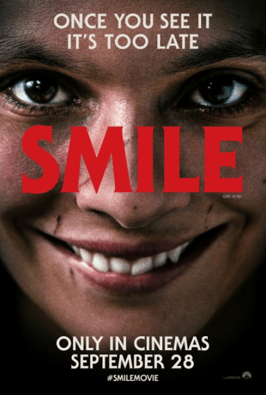
The poster for the 2022 horror film Smile is also unsettling. It’s disturbing because of the extreme close up of actress Caitlin Stasey, who is too close for comfort. Her face is warped into a strained and unnatural smile — the kind that makes us uncomfortable to watch for too long. It’s a fittingly unnerving movie poster design for a horror film about a supernatural curse that causes people to adopt the creepy smile before meeting a terrible fate.
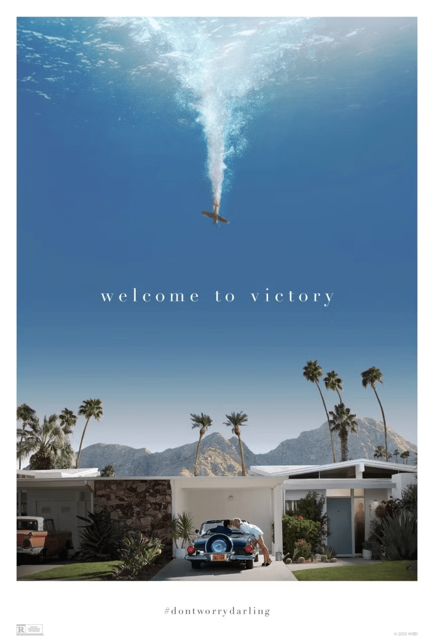
Don’t Worry Darling is director Olivia Munn’s take on the Stepford Wives trope. It depicts a couple living in a sunny, Palms Springs-esque community where all is not as it seems. And the movie poster conveys this with a clever use of composition; the characters are displayed in their idyllic bliss at the bottom of the frame, while a plane appears to shoot down from the sky above them.
This memorable image is taken from a plot point in the film, and while it is not a still from the movie or an exact depiction of how it happens, it’s an artistic portrayal of how their blissful lives are about to change due to disruptions beyond their control.
A good movie poster communicates the film’s essence
Creating a striking, memorable image is important. But it can’t be completely disconnected from the film you’re presenting to the world. A good film poster conveys the film’s overall tone and aesthetic approach, while also providing potential viewers with a look at what they might expect from the story. In order to accomplish this, it’s useful for film poster designers to be intimately familiar with the film in question, and they will often collaborate with the filmmakers in deciding how to best portray it.
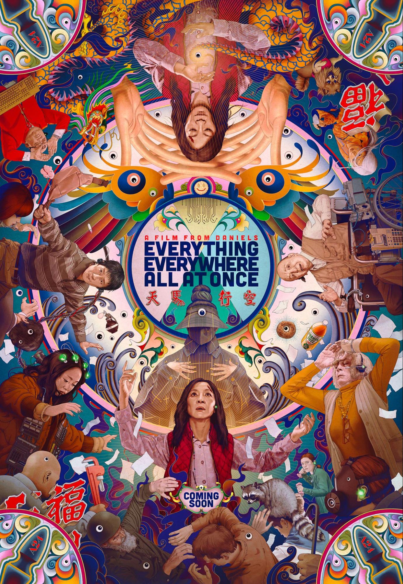
Everything Everywhere All At Once is an ambitious movie that spans multiple realities and lifetimes. In fact, multi-dimensional travel is at the heart of the film’s plot and thematic exploration, with the main character of Evelyn (portrayed by Michelle Yeoh) spinning into different realities to defeat a great danger. It is a psychedelic, extremely colorful movie. However, it is also generally light-hearted in terms of tone, and often very humorous.
As such, the film’s bright, prismatic poster communicates this trippy approach to story, with elements such as eyeballs, wrenches, orange soda, and various versions of the film’s cast of characters floating around Evelyn. This slightly chaotic, colorful approach is striking in its design, memorable in its imagery, and effective in conveying the film’s tone and personality.
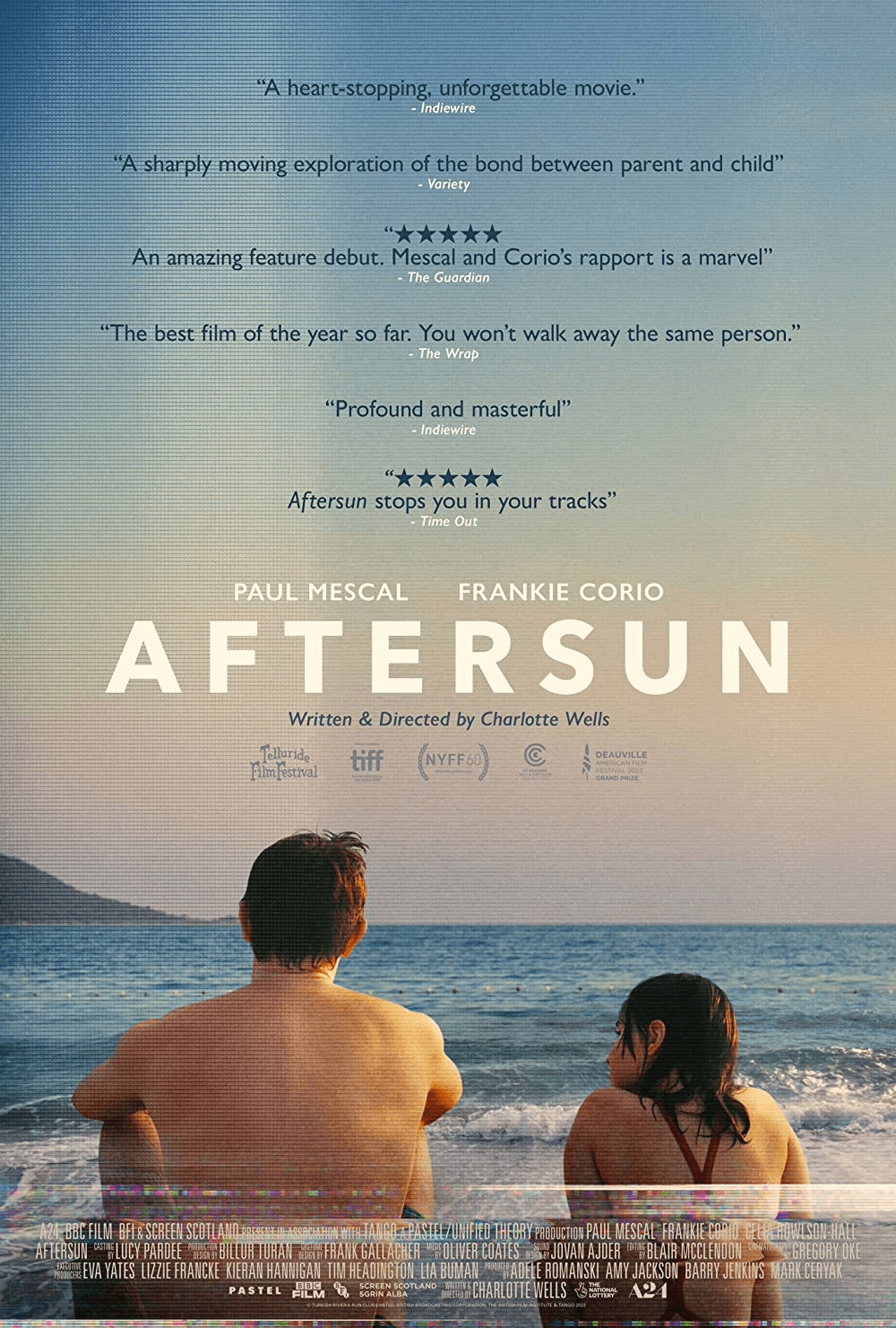
The poster for the film Aftersun, directed by Charlotte Wells, is a simple but effective design. The film itself is a nostalgic look back at a father and a daughter’s vacation, which is charged with meaning and regretful longing. In the film, that vacation is captured through the use of home movies, recorded on VHS tape that the daughter is now rewatching in adulthood.
It’s a sad, emotionally complex, and very sweet film. Its poster reflects this beautifully, depicting both characters looking out at the ocean, the rest of their lives still ahead of them. There is a VHS-style wear-and-tear effect applied to the image, which further captures the film’s overall tone and aesthetic.
Creating a great film poster is like creating a great website
There’s a history, an artistry, and a tradition to film posters that make them more than simple promotional tools. They are works of art in and of themselves, involving a combination of visual design elements that all work together to support and represent the main work of art: the film.
Web design has followed a similar path. What were once straightforward, unadorned sources of information have become mediums to express creativity, engage audiences, and promote products and services.
Many of the design elements that make an effective movie poster are also relevant to great web design. High-quality images of a product take the place of an actor’s headshot, but the importance of thoughtful color choices, typography, and composition remain.
And with Webflow’s intuitive tools, you have the power to bring your work to life. Webflow offers tools and resources to help you create the very best landing page for any business — whether it be a SaaS business or an indie film studio.
Build websites that get results.
Build visually, publish instantly, and scale safely and quickly — without writing a line of code. All with Webflow's website experience platform.