The weather’s getting warmer, the birds are chirping, and creativity abounds — courtesy of our creator community and the Webflow Showcase.
Whether it’s a cool new portfolio site, or some fun cloneables — April’s been chock-full of Webflow projects you have to check out.
Here’s the rundown.
1. François Lemeiux
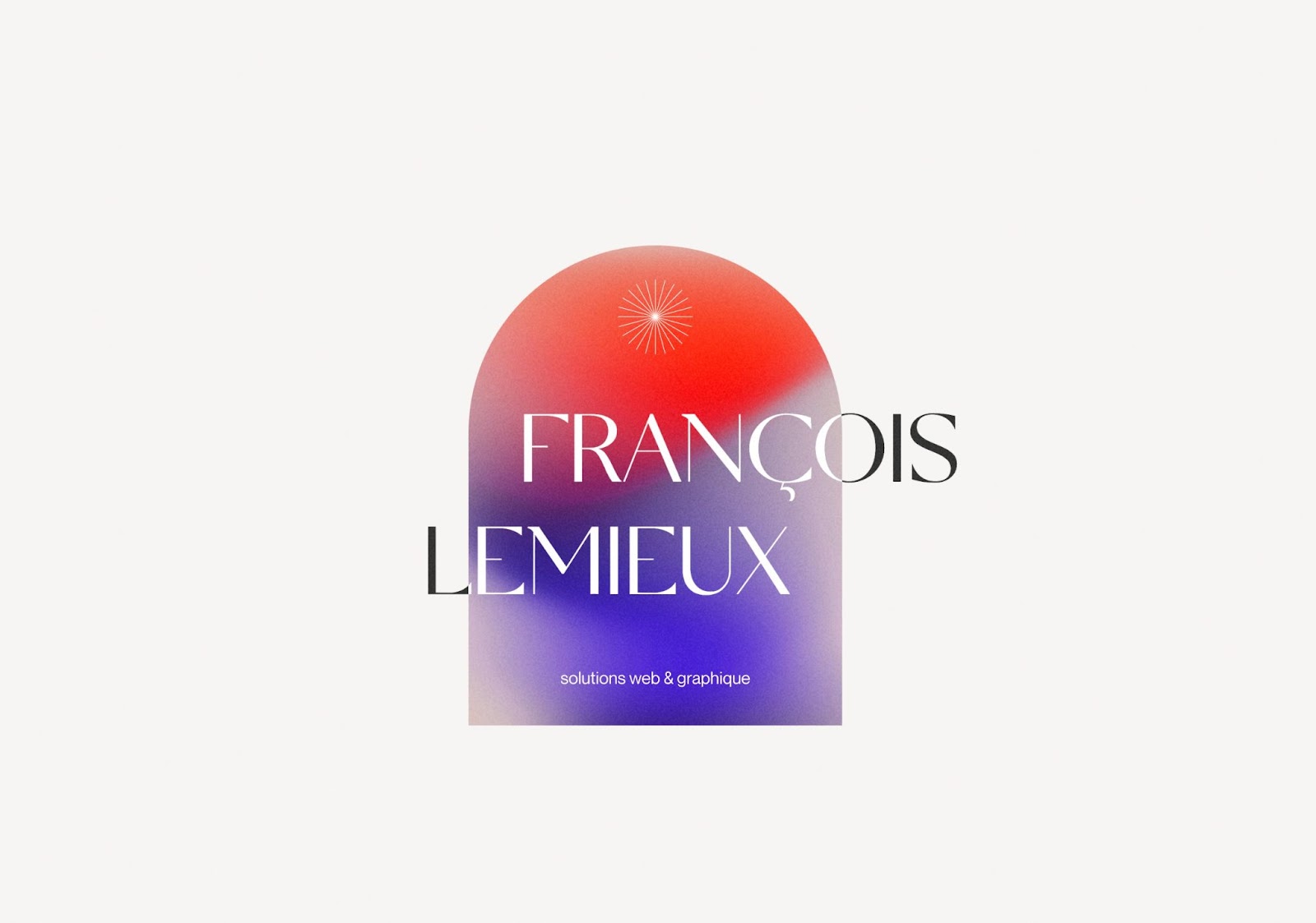
First off, we have this dreamy landing page site from Montreal-based François Lemeiux. It features his credentials, services, and a place to contact him.
We especially love how François utilizes both whitespace and eye-catching color combinations that meld together in gradients. To tie the whole page together and present a natural flow, François incorporates a smooth scroll animation to gently push you along the page. It’s a treat for the eyes, and more importantly, a great way to showcase his skills to potential clients.
2. Build With Flow
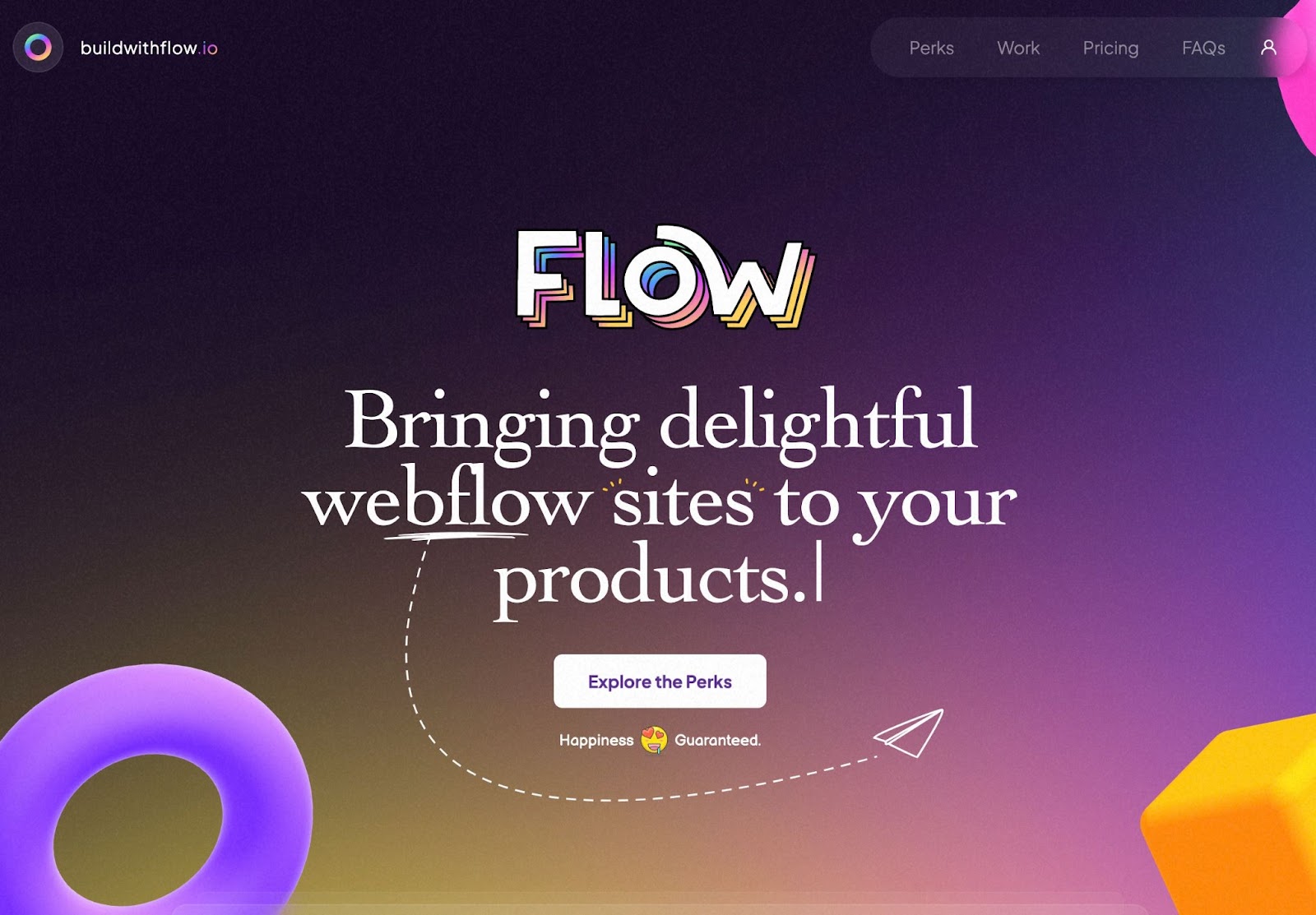
On the topic of “flow” — we have Build with Flow — a site by Raleigh-based Neftali Loria to advertise his expertise and creativity to brands, organizations and individuals. Neftali is incredibly experienced — having worked with the likes of Bridgestone, Hilton Hotels, Google, Deloitte, and more.
What struck us immediately with Build with Flow was its quirky and bold design. Throughout the site, Neftali uses clashing typefaces, gradients, fun 3D graphics, and animations galore. He then intersperses helpful information such as pricing, FAQs for potential clients, and his design philosophy — a great example of showcasing your design style without sacrificing function.
3. Paradam Studios
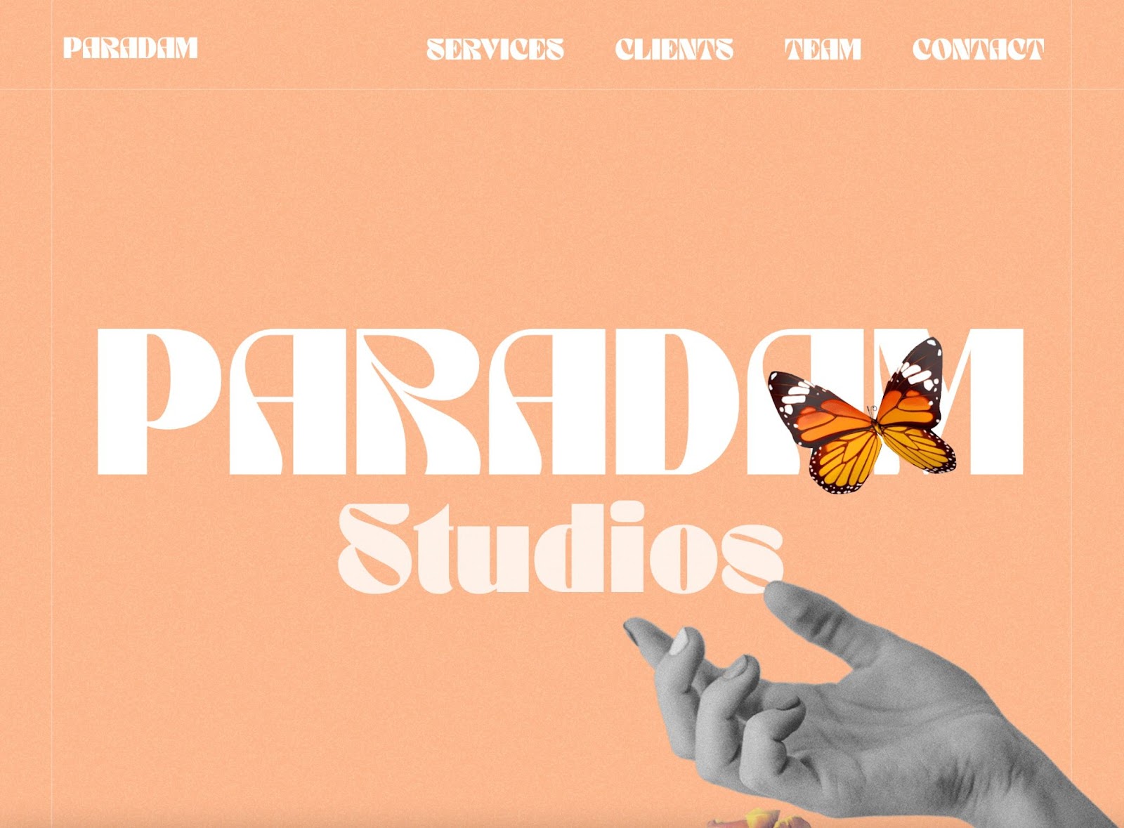
What happens when you mix millennial, new-wave spirituality with a healthy dose of Dadaism? Answer: the Paradam Studios website.
Paradam Studios is a Los Angeles-based creative studio that specializes in everything from brand identity to podcast production and creation. We love how the Paradam Studios site leans into their overall brand theme with their clever copy.
Whether it’s the option to select what you’re seeking (an awakening, high frequency, living connection, new wave) in their contact form, or the horoscopes of their staff members on their Team page, or quippy CTAs like “Transcend with Us” to direct potential clients around the site — you definitely feel the “vibes” of Paradam Studios and their team throughout.
4. Fowski Studio
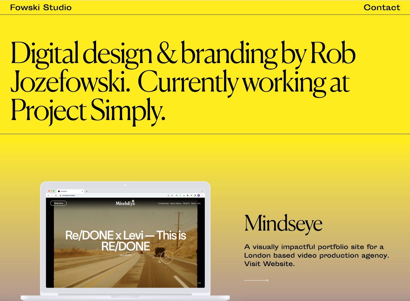
Can minimalism be maximalist? According to the Fowski Studio site, it sure can.
Fowski Studio — the digital design and brand studio by Rob Jozefowski — utilizes a simply animated scroll site to feature past work and provide contact information to get started on your own project.
Our favorite part of the site is how color is incorporated into a decidedly minimalist site. A bold rainbow gradient full of shocking yellows, bold blues, and bright pinks delightfully contrasts with the grid-like format and elegant typography.


Build websites that get results.
Build visually, publish instantly, and scale safely and quickly — without writing a line of code. All with Webflow's website experience platform.
5. Joanna Puga
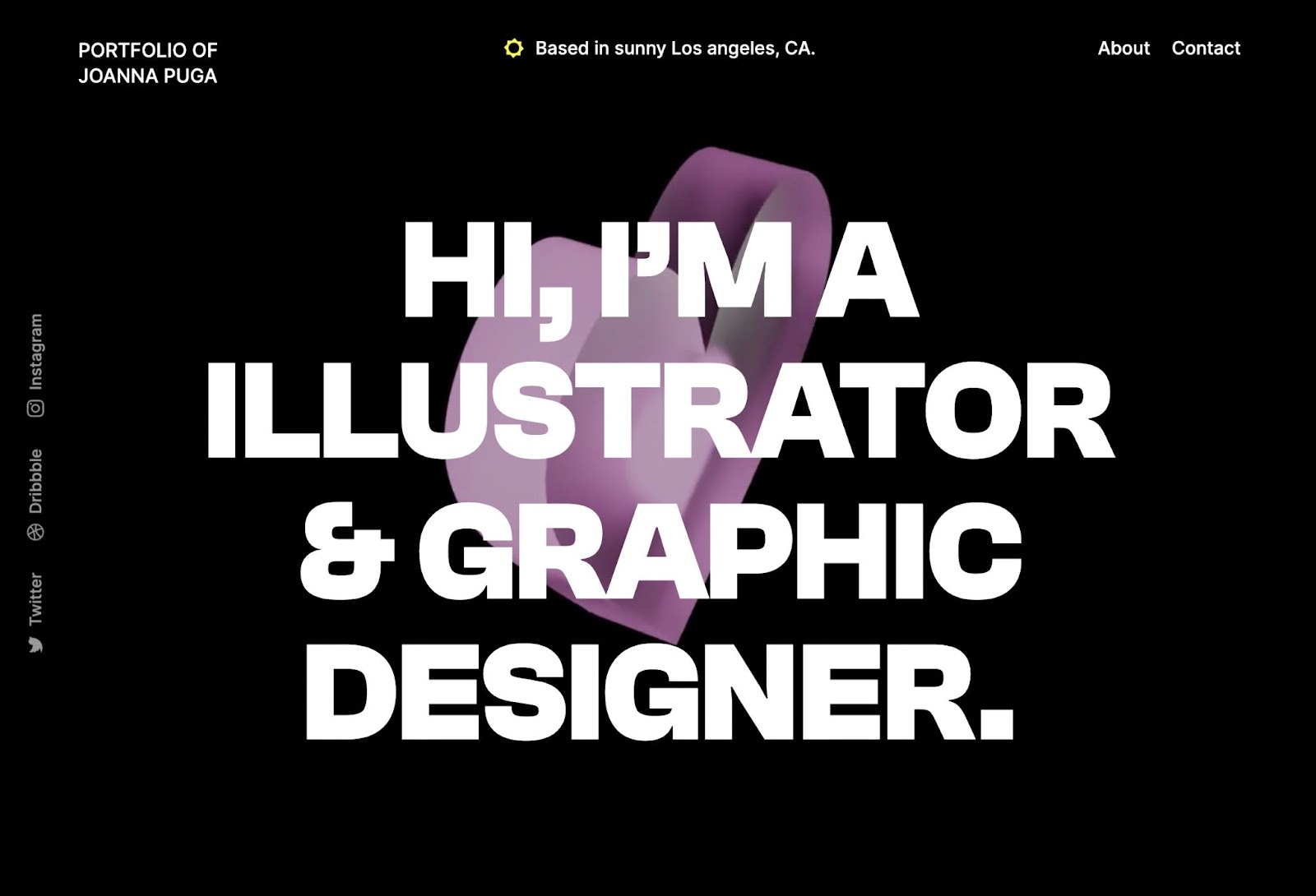
Illustrator and graphic designer, Joanna Puga opens their portfolio with large typography over a 3D glassmorphic heart that slowly spins in the background. The heart is a constant throughout the site, rotating behind images and text. Joanna also uses the same pink color for icons, creating a sense of continuity throughout the design.
Below the fold, Joanna’s selected works appear in a horizontal scroll. Both their projects and “about” page clearly communicate that Joanna has a passion for futuristic art, illustrations, and layouts.
6. Rogue and Rosy Ecommerce Homepage (cloneable)
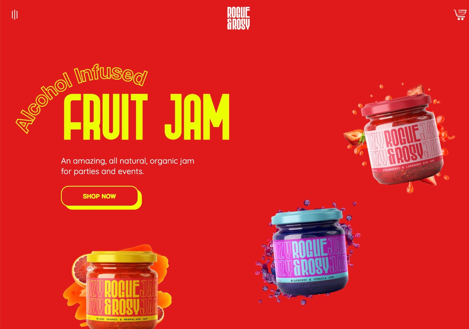
This website for a (sadly) fictional booze-infused jam does a great job showcasing how to apply branding to site design. Not only does the webpage feature typography and colors that match the product labels, it also mimics the fun, breezy style of a product designed for parties and events.
Rogue and Rosy’s website shows off 3D images of the jam jars that seem to hover on the page. We also love how this one-page website design keeps us engaged with scroll-triggered animations like arrows and sparkles highlighting key selling points. Plus, this cloneable ecommerce template includes all the essentials — shop now buttons, placeholders for testimonials and social proof, social media buttons, and standard company information in the footer.
7. Responsive Postage Stamps (cloneable)
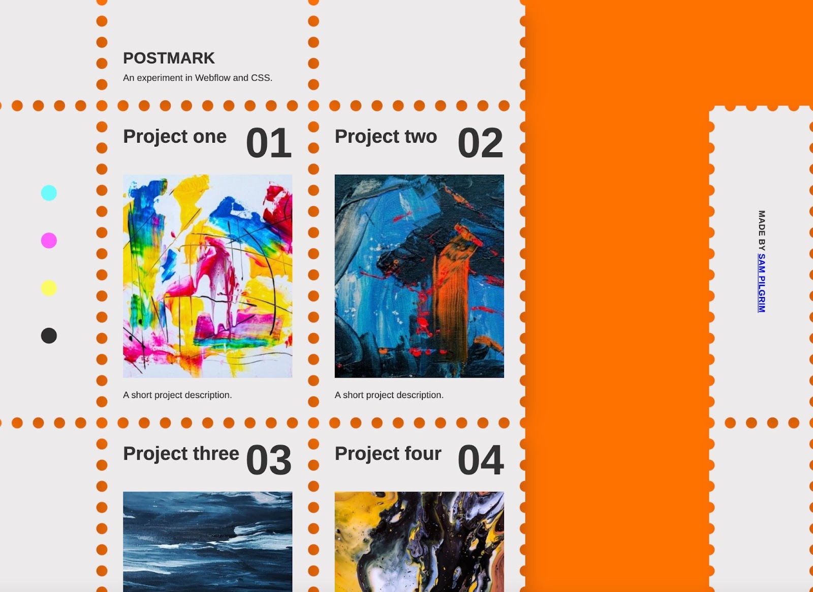
Tracking update: fun design is on the way! This cloneable project features a postage stamp-style layout that’s perfect for highlighting different projects or categories.
Upon hover, the stamps seem to rise off the page and tilt slightly to the left. Each stamp allows a project title on top a short project description underneath, making it easy to provide a project preview.
8. Améa
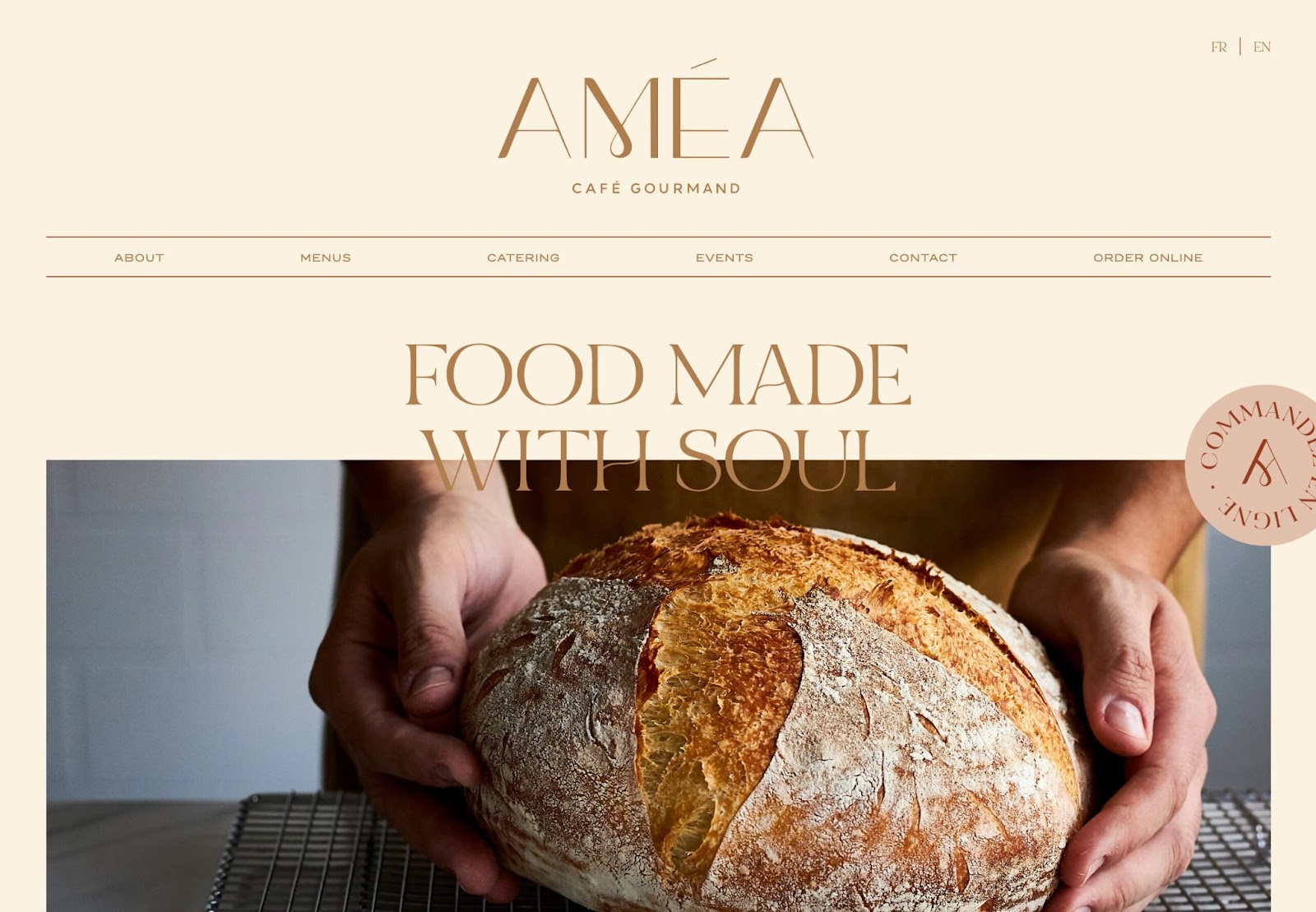
Mediterranean-inspired gourmand resto + coffee shop, Améa, brings coffee shop vibes to their web design. With a muted color palette, high-resolution photography, and ornamental typography, Améa’s site communicates simple elegance.
What we love about this design is how it caters to visitors. The top menu gives visitors an option to dig into specifics about the restaurant, while the homepage offers up key information including photos of menu items, pick-up ordering options, directions to the physical location, and operating hours.
Show off your creativity
Don’t forget to submit your amazing #MadeinWebflow projects to our Showcase — you might just see your site in our next featured projects post!


.jpeg)


