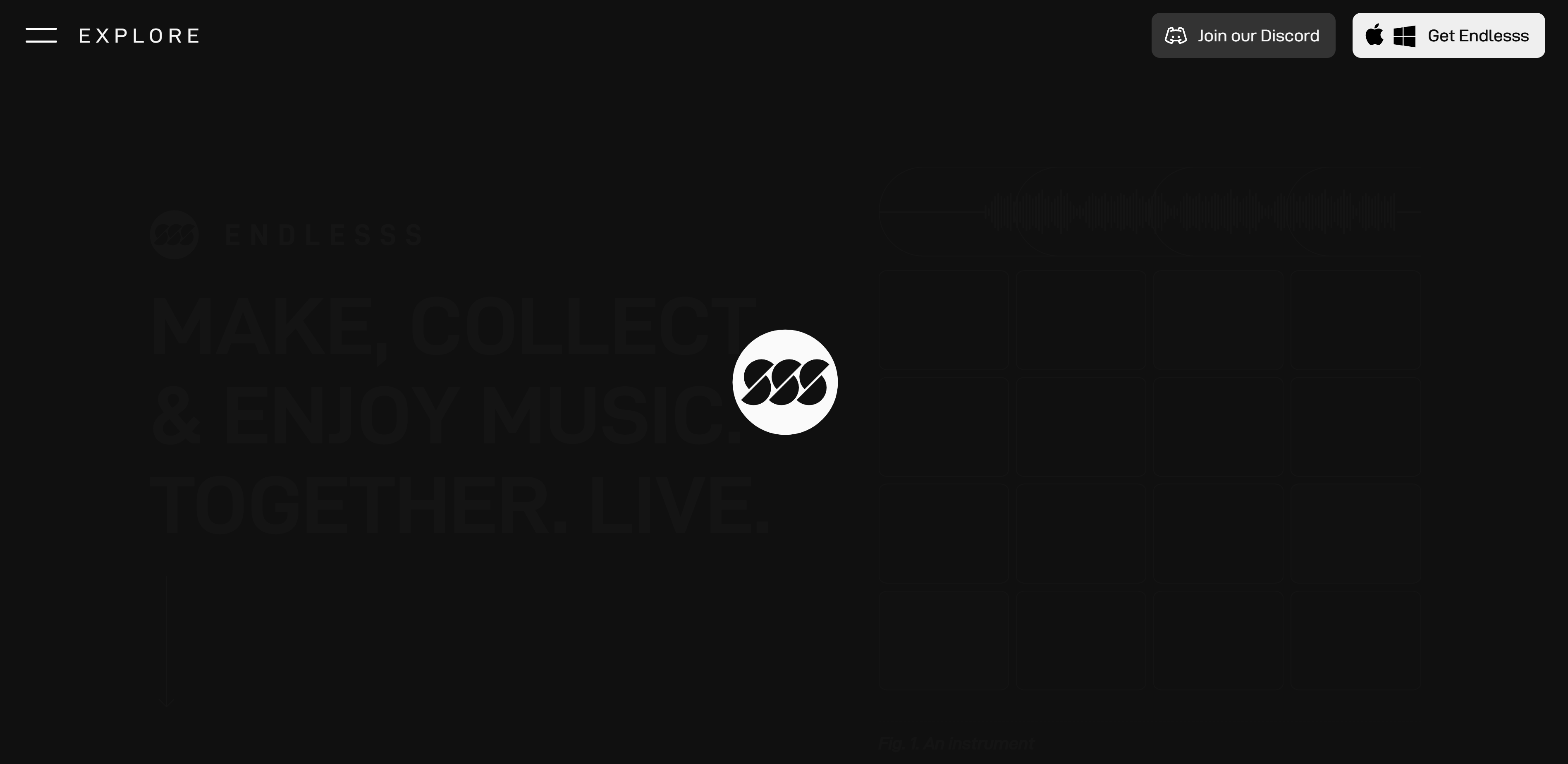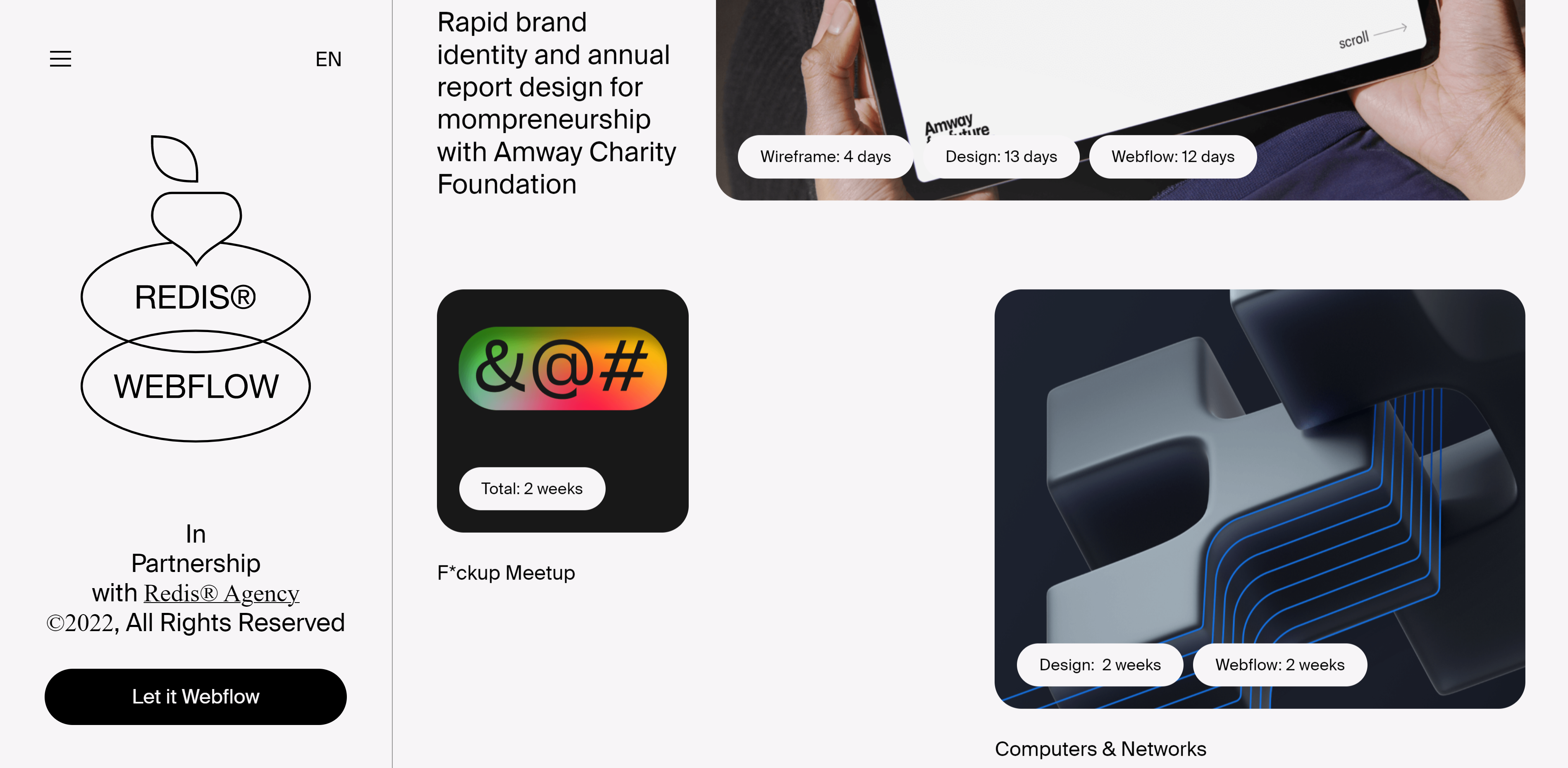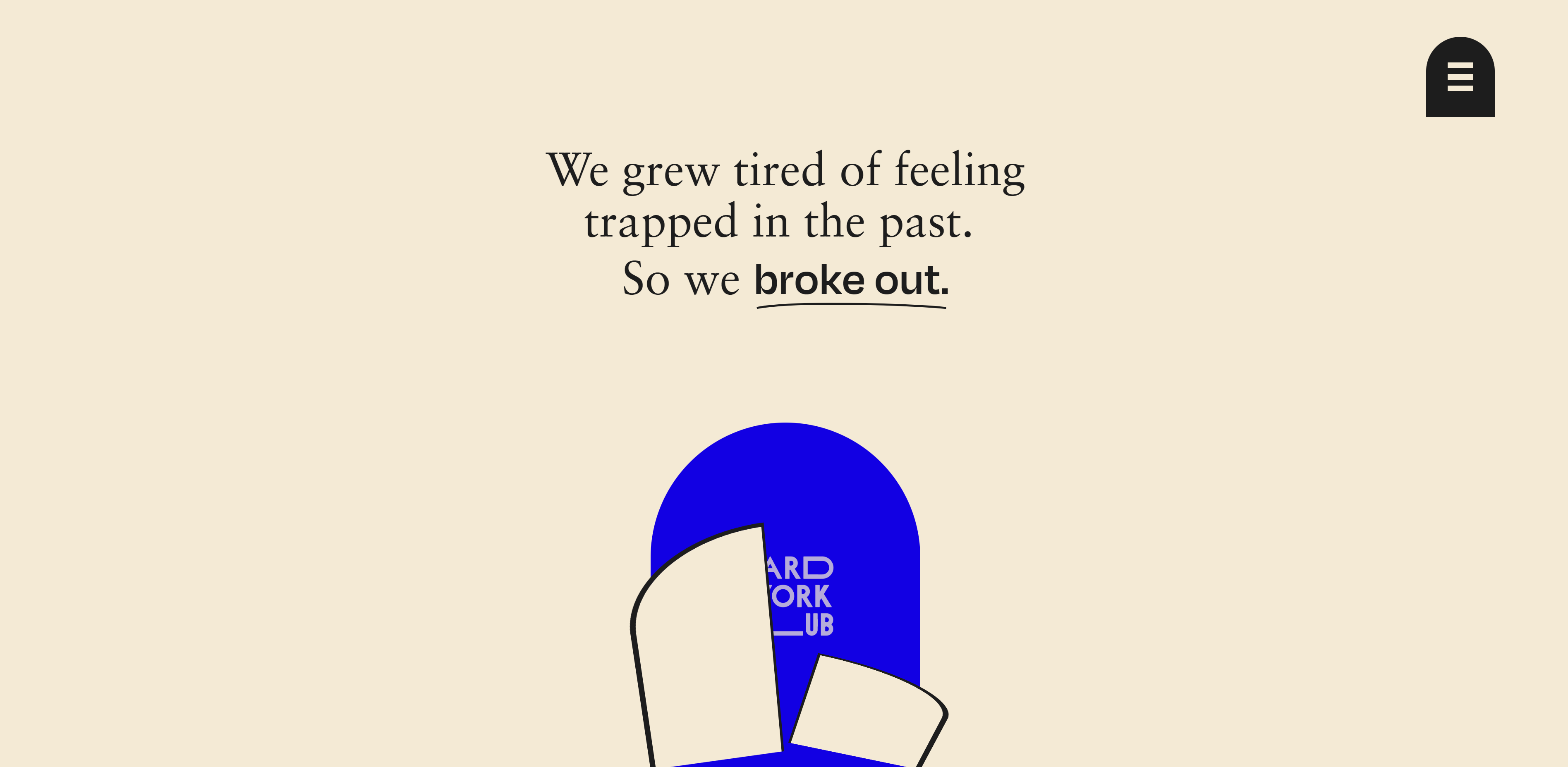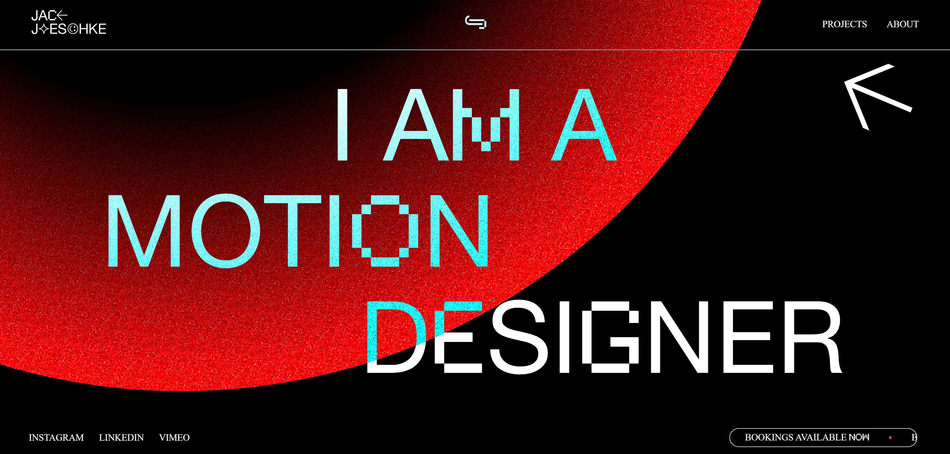




9 website animation examples: Drive interest and action through motion

Explore nine eye-catching website animation examples and learn best practices for enhancing your site with immersive, attention-grabbing interactions.

9 website animation examples: Drive interest and action through motion

Table of contents

Interactions & animations

Learn how to animate multiple elements and bring your designs to life with rich, sequenced interactions and animations.

Interactions & animations

Learn how to animate multiple elements and bring your designs to life with rich, sequenced interactions and animations.

The right animations help your website come alive, creating more immersive digital experiences.

Website animations add motion to your pages through techniques like hover effects and parallax scrolling. These elements inject interest and interactivity into your web designs, making pages feel more responsive. They’re also functional: By using triggered animations, you can give your visitors a guided user experience and enhance your site’s storytelling.

In this article, we’ll look at nine examples of websites that use animation effectively. We’ll also share best practices and tools for putting what you learn into action.

What are website animations?

Animations are elements that move or change state as visitors explore a page. That includes transitions between pages and sections, moving graphics, hover states, and scroll effects. You can use these elements to enhance your website's interactivity while guiding visitors through the intended user journey.

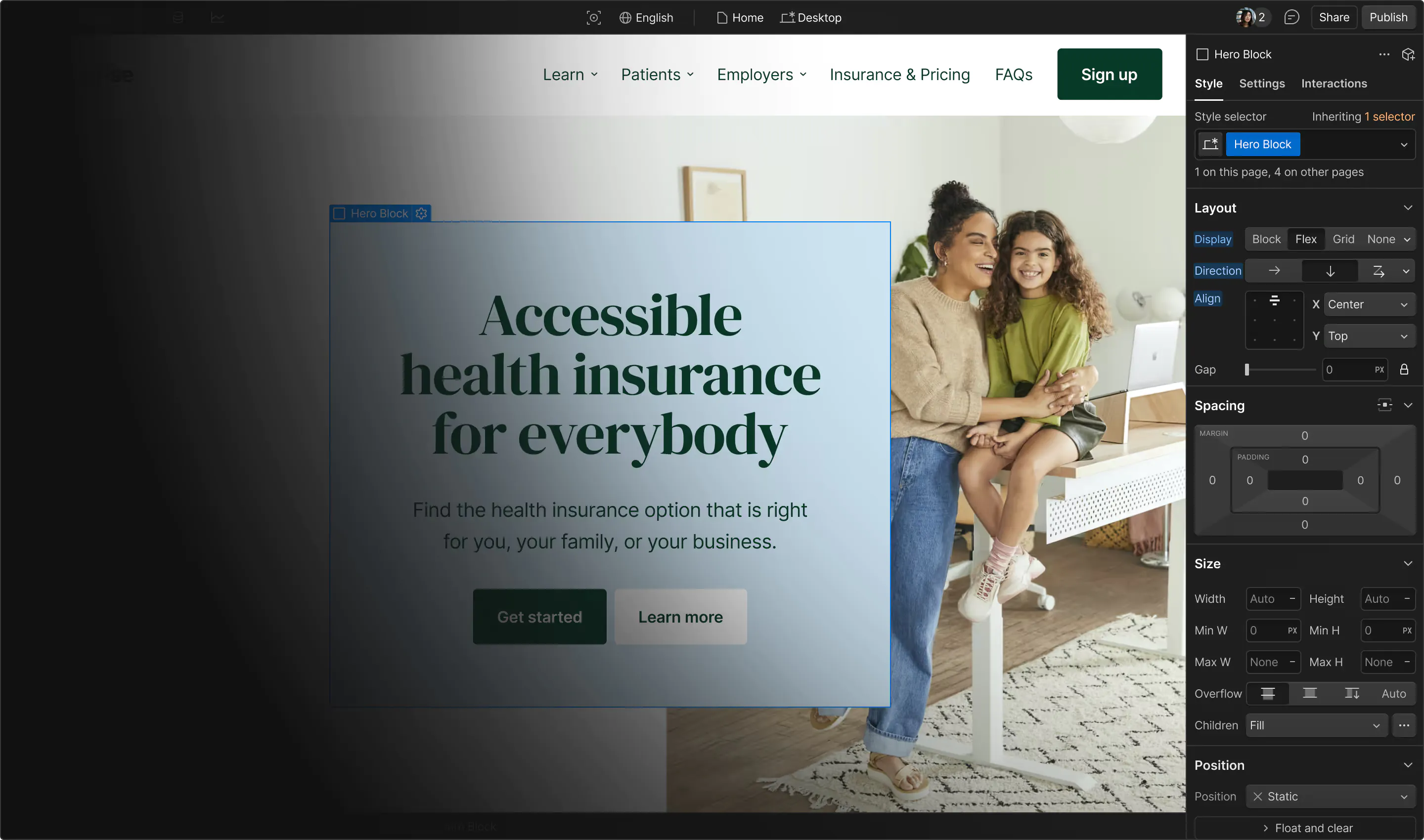
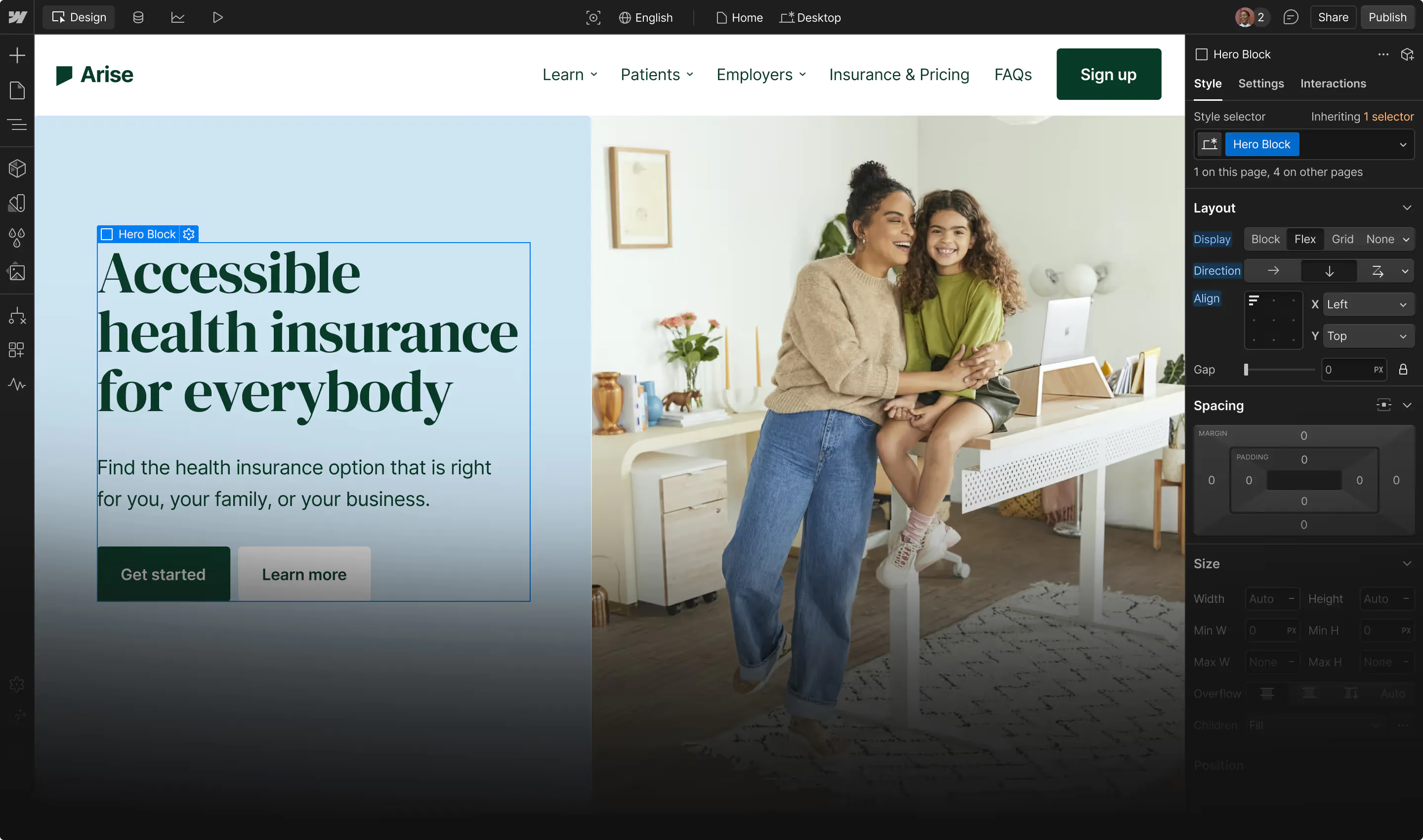
Under the hood, these animations are driven by code and technologies like Lottie, WebGL, and JavaScript. However, you no longer have to write intricate animation scripts personally, since modern platforms like Webflow offer tools for creating and fine-tuning animations visually.

Why animations are a great addition to most websites

People tend to notice movement quickly, so animations are one of the best ways to direct visitors toward important elements and paths. You can highlight key calls to action (CTAs) and interactions, all while making the site feel more creative and memorable.

Strong animations can also:

  • Improve conversions by pointing visitors to signup forms and contact pages
  • Communicate important information about states (e.g., whether a page has been clicked on yet or if a video is still loading)
  • Enhance storytelling by guiding users along an intended experience
  • Add interactivity when the visitor’s actions result in visual changes

9 website animation examples to inspire your designs

Crafting web animation effects that stand out requires some inspiration. To get the ideas flowing, here are nine examples of what you can achieve.

  1. OneTech
  2. Paris by Emily
  3. LITHOSQUARE
  4. Anton
  5. AKARI
  6. Agile by Design
  7. Pani
  8. Refokus
  9. CMCC Global

1. OneTech

Source: OneTech

OneTech’s homepage features a 3D animation of an airbrush spraying orange paint from side to side as visitors scroll down the page. This immersive touch makes it look like the airbrush is painting out each row of content. The site’s dark mode design and bright orange primary color, which matches the airbrush paint, add to that illusion. Integrating your animations with other design decisions in this way helps them mesh with the rest of your content.

2. Paris by Emily

Source: Paris by Emily

Paris by Emily’s website, uses hover states and scroll animations to add interactivity to the user experience. Nearly every element changes or shifts in some way while visitors move through the page. This means there’s a lot of motion, but media and text elements are sized and spaced generously, so there’s never too much happening on screen at once. The site’s minimalist design keeps the user oriented, while the motion and human-centric visuals convey the excitement of travel experiences.

3. LITHOSQUARE

Source: LITHOSQUARE

The one-page site for LITHOSQUARE, uses subtle animations to add a touch of depth. For example, there’s an animated navigation menu that only slides out on hover. This site has a lot of prominent visuals, and a navigation bar that stays tucked away leaves more screen space for high-quality imagery. In addition, quick scroll effects break up each section on the page, creating momentum by encouraging visitors to keep scrolling far enough to center the new content and reach CTAs.

4. Anton

Source: Anton

Anton Lukashchuk’s digital portfolio showcases over five years of UX work with an interactive experience. When you click on one of the main topics, such as “Expertise” or “Portfolio,” a gradual color palette change introduces the new page smoothly. And in the portfolio preview, a small, frequently moving hand icon points to the carousel and invites visitors to click through. This example shows how animations can serve as CTAs that are more interesting than static buttons.

5. AKARI

Source: AKARI

AKARI is an experimental website created by Lusion, which introduces collision detection between website animations. You can try out this technology and get a sense for the possibilities through the site’s multiple minigames. If you’re interested in designing animations beyond the norm, creating a web interaction playground like this is a great way to explore what’s possible before applying it to your brand website.

Design interactions and animations without code

Build complex interactions and animations without even looking at code.

Read now

6. Agile by Design

Source: Agile by Design

Agile by Design, offers an excellent example of how you can use animations to reinforce brand personality. The white background, when combined with elements that gradually appear and disappear, makes each page look like a board the designers are drawing on and erasing in real time. There are even text boxes that come in from the side and fold into place like scraps of paper, reflecting this design agency’s fun, informal brand tone.

7. Pani

Source: Pani

Pani’s website, uses animations sparingly — just one or two appear on screen at a time. This choice makes the animations stand out well, so they’re placed to draw attention toward important visuals and header text. Parallax and scroll effects make moving down the page feel dynamic, while staying subtle so they don’t distract from the feature descriptions and CTAs.

8. Refokus

Source: Refokus

The Refokus website begins with a loading screen animation that gives the page’s scripts space to load, while keeping the visitor updated through a fast-moving percentage bar. When the page is ready, visitors encounter a full-screen, cursor-sensitive visual of Refokus’ logo, immediately followed by several transitions and animated text reveals. This is another example of a site that uses a lot of motion well, transitioning from highly animated sections to quieter ones to keep the visitor from getting overwhelmed.

9. CMCC Global

Source: CMCC Global

CMCC Global is a venture capital firm specializing in blockchains; so its website, has a homepage animation that resembles a chain made from blocks. This initial animation establishes a design style that carries throughout the site, using both static and moving squares to decorate backgrounds and section off other elements. These subsequent visuals are more straightforward than the initial animation, but draw from the same elegant color palette to maintain consistency.

Best practices for using animations effectively

Here are some best practices to keep in mind as you experiment with website motion design:

  • Use movement for a clear purpose. Motion makes an element feel important, so it should always have a deliberate function. Choose animations that improve the UX by making the intended path clearer or adding useful interactions.
  • Keep animations short and subtle. Visitors should feel free to explore the website, which means they shouldn't run into roadblocks that slow down navigation or interaction. Make animations quick and precise, while prioritizing usability over style.
  • Match motion to brand personality. Because animations draw attention fast, they provide a great opportunity to say something immediate about your website’s brand. Consider how animations can reflect brand personality — big, bold effects communicate a different tone from subtle, slow ones.
  • Optimize performance. Animations tend to have large file sizes, so they can have a sizable impact on page performance. Make sure CSS animations use GPU-friendly properties, such as opacity and transform, and rely on lazy loading to minimize load times.
  • Design mobile-friendly pages. Your animations need to perform well on small screens, so follow a mobile-first design process. You can also create breakpoints to serve optimized experiences to different viewport sizes.

Create animations that drive results with Webflow

Animations provide both form and function, adding visual interest to your website while guiding visitors through the intended journey. When you place animations carefully and align them with the rest of your site’s branding and style, they can drive attention to important CTAs and create memorable experiences.

Best of all, you don’t need a degree in animation to use this technique on your site. With Webflow’s website experience platform, you can design custom animations that play in response to specific triggers, then fine-tune how they look and react. You can tailor interactions to work smoothly on any screen size, and rest assured that these elements are backed by clean code that keeps your pages loading fast.

Design a uniquely interactive experience with Webflow.

Get started for free

Create custom, scalable websites — without writing code. Start building in Webflow.
Read now

Last Updated
April 3, 2026
Category

Related articles

After Effects and Lottie, meet Webflow

After Effects and Lottie, meet Webflow

After Effects and Lottie, meet Webflow

Inside Webflow
By
Barrett Johnson
,
,
Read article
Motion design isn’t just eye candy; it’s UX infrastructure

Motion design isn’t just eye candy; it’s UX infrastructure

Motion design isn’t just eye candy; it’s UX infrastructure

Design
By
Jasmine Andria
,
,
Read article
How to use loading animations in web design (plus 12 superb examples)

How to use loading animations in web design (plus 12 superb examples)

How to use loading animations in web design (plus 12 superb examples)

Design
By
Webflow Team
,
,
Read article
How to design interactions effectively

How to design interactions effectively

How to design interactions effectively

Design
By
Neal O’Grady
,
,
Read article
Top 15 animation apps for creating impressive visuals to try in 2025

Top 15 animation apps for creating impressive visuals to try in 2025

Top 15 animation apps for creating impressive visuals to try in 2025

Design
By
Webflow Team
,
,
Read article
15 best microinteraction examples for web design inspiration

15 best microinteraction examples for web design inspiration

15 best microinteraction examples for web design inspiration

Design
By
Webflow Team
,
,
Read article

verifone logomonday.com logospotify logoted logogreenhouse logoclear logocheckout.com logosoundcloud logoreddit logothe new york times logoideo logoupwork logodiscord logo

Get started for free

Try Webflow for as long as you like with our free Starter plan. Purchase a paid Site plan to publish, host, and unlock additional features.

Get started — it’s free
Watch demo

Try Webflow for as long as you like with our free Starter plan. Purchase a paid Site plan to publish, host, and unlock additional features.