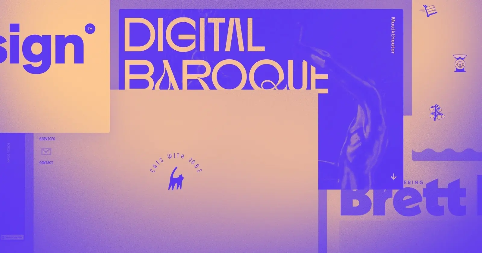
Check out these 8 Webflow websites and projects that caught our attention in the month of May.
In case you missed it — we’ve made some major changes to what you formerly knew and loved as the Webflow Showcase. Still the same great place to share your work and see what fellow designers have been up to, Made in Webflow is the fresh new home (and name) for showing off and sharing the best of what our community is building.
Here are 8 websites made in Webflow that are worth checking out.
1. Good Root Pizza (cloneable)
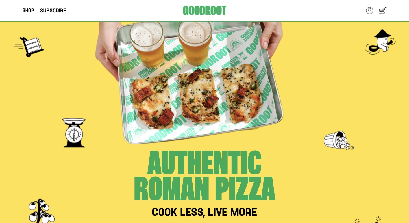
We’re big fans of analogous color schemes. By using colors that are close together on the color wheel — a sense of harmony is created. Good Root Pizza’s site is a great example of this, filling its space with a lovely combination of yellow and green which gives it a grounded and natural feel.

Along with this, there are engaging animations. Ripples of green break up each section, a hand reaches out to offer a piping hot slice, and text scrolls over a crispy pie fresh from the oven. These bursts of motion are not only a delight to the eyes but also keep you moving through the page.
Good Root Pizza comes through with a design full of action, eye-pleasing colors, and most importantly, big and brilliant photos of pizza that will leave anyone hungry. If you’re a fan of this design, you can clone it for free!
2. Creatus (cloneable template)
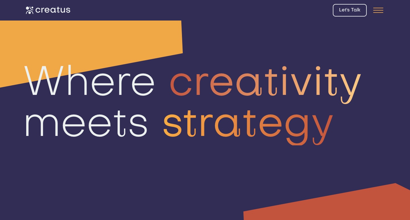
With an angular layout full of shapes, scroll-triggered effects, video embeds, and a combination of smart colors, Creatus is a one-page template that’s perfect for SaaS companies. Relume’s component library has been on our radar, and we’re happy to see some of their ready-made Webflow layout elements utilized throughout this page. And the extra focus on design not only looks good, but also provides a smooth user experience.
If you’re looking for a template with a modern-tech aesthetic, Creatus is a great option that you can clone for free.
3. Black Music Project

From the call and response spirituals to Detroit techno, almost every genre of American music has been shaped by the Black community. The Black Music Project is an online learning center that educates visitors about how Black history and music are intertwined.
This design offers a rich multimedia experience. There are photos, stories, and embedded audio, as well as video content that all acknowledge the importance of the Black experience and its impact on the music industry. On top of all of this great historical content, it’s well organized, and is easy to navigate through and explore.
We love seeing websites that tap into the creative potential of design as a vehicle for communicating ideas and spreading knowledge. Whether you’re a music fan or not, you’ll find so much on the Black Music Project that’s illuminating and insightful.
4. Brett Land
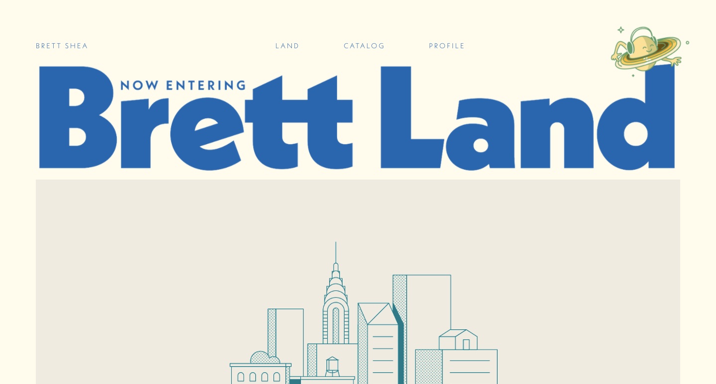
Unlike design-centered portfolios where visuals are often the focus, building a portfolio website for copywriting can be tough. You want a website that showcases your writing chops, but also offers a user experience that’s more than lengthy blocks of text to scroll through.
Brett Land is that rare copywriting portfolio that not only features examples of Brett Shea’s best work, but does so with a visually-compelling design.
We especially love how Brett incorporates a minimalistic — yet retro — design, leaning into clean lines, bold text and an off-white background.


Discover inspiring design work from the Webflow community
Made in Webflow is the place to browse, clone, and customize the latest websites built by the Webflow community.
5. Webflow Scroll Snap (cloneable)

Are you looking to use scroll snap for your Webflow designs, but don’t want to mess around with Javascript or CSS? All you need to do is to clone this template, and then change up the text and color scheme to whatever you’d like.
We always love seeing designers helping each other out by sharing what they’ve created, and this ready-made layout makes pulling off scroll snap quick and easy.
6. Cats with Jobs (cloneable)
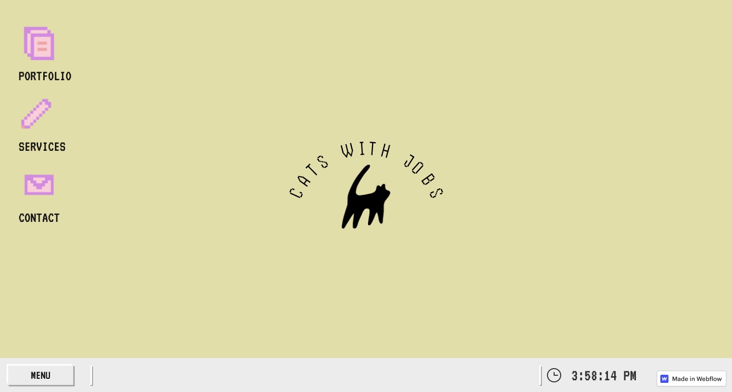
Not every web design needs to be serious and have a purpose. Cats With Jobs exists for no other reason than to celebrate cats and nostalgia for obsolete operating systems. Inspired by Windows 98, you’ll find a joyful mishmash of outdated design elements like clunky buttons, primitive pop-ups, and pixelated icons.
You can clone this retro-inspired design for free, and to learn more, check out KC Creative’s video taking you step-by-step through how it was created.
7. Digital Baroque
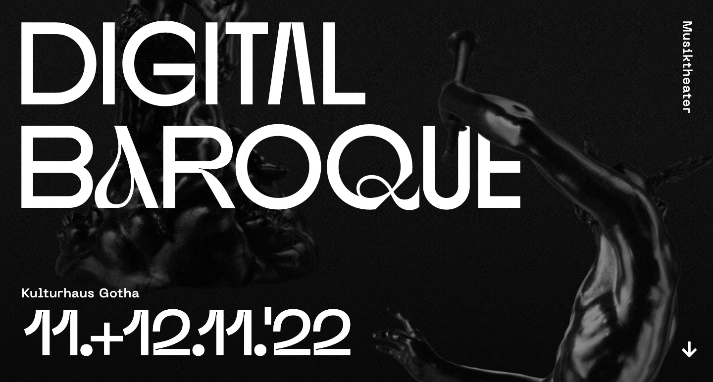
Merging dance, baroque music, video processing, and robotics, Digital Baroque certainly qualifies as avant-garde. With a stark black and white website, images of old-world style statues, and the futuristic and brutalist font Neue Machina, this hybrid of modern and old fits right in with Digital Baroque’s combination of artistic mediums. If you’re in the mood for something experimental, be sure to check out this surreal design.
8. Predesign
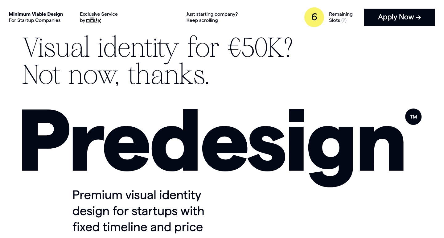
In their rush to launch a minimally viable product, many startups are often short on time or resources necessary to really flesh out their visual identity. Predesign is an agency that focuses on helping budding businesses come up with effective branding.
For their own site — Predesign creates a bold, yet simple design. The text is large and gets right to the point. There’s ample negative space. It’s uncomplicated — but not overly simplistic. Through their design, they show that they pay attention to details and can communicate what’s important in a way that’s clear and immediate.
Share your designs with the Webflow community
Whether you’re a new designer or someone who has been doing it for a while, Made in Webflow offers a supportive space to post your designs and see what others have been creating. Be sure to check out our refreshed project gallery — and if you haven’t created a profile yet, we encourage you to take a minute to do so and start submitting your own projects. We’re excited to see what you’ve been working on with Webflow, and who knows — maybe your website will be in next month’s Made in Webflow roundup.


