A picture may be worth a thousand words. But in graphic and web design, text carries just as much weight as the images it sits next to.
There’s an art to weaving words into a design without overshadowing or clashing with the other visual elements. It’s called typography, and its importance in graphic design is inarguable.
What is typography?
We often think of graphic design as a computer-age invention. But books, broadsides, and newspapers have been around for centuries, and the quest for tools and techniques that simplify the printing process stretches back just as far.
Enter typography, the art of creating and arranging text to ensure content is readable and appealing.
Typography’s history dates back to at least the mid-15th century when Johannes Gutenberg invented a movable printing press that brought the mass-produced Gutenberg Bible to the Western world.
For a quick example of typography in action, compare the readability of these two images:
Below, compare two approaches to the same quote and see how font selection and color usage can either confuse or clarify your message.
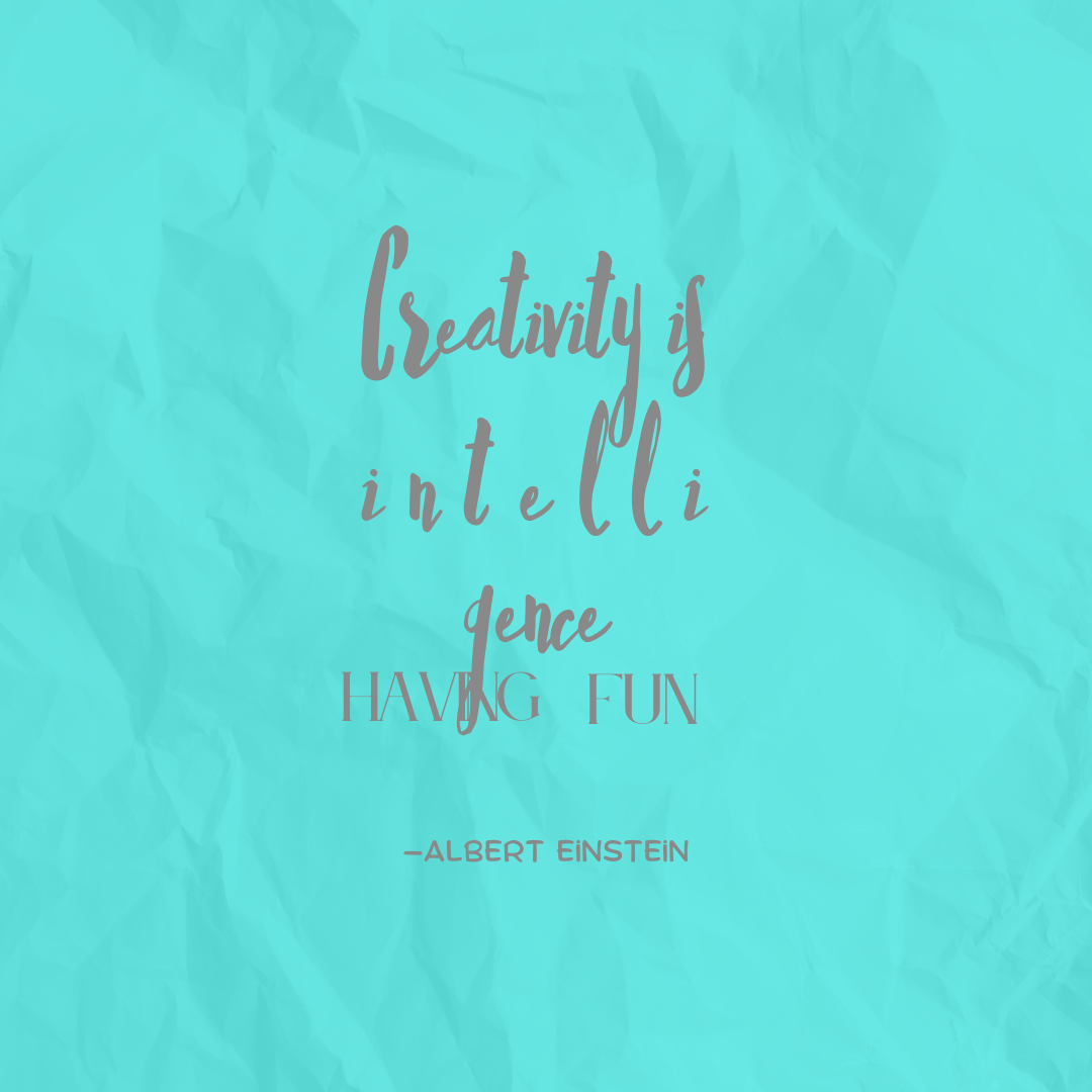
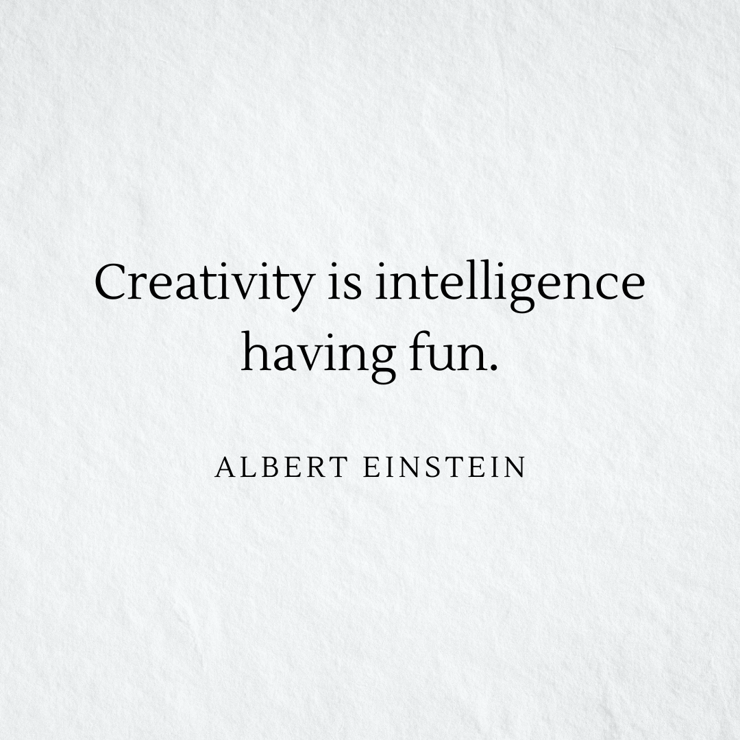
Both images bear the same Albert Einstein quote: "Creativity is intelligence having fun.” But one uses a mix of three different fonts: an illegible, inconsistently spaced script that splits a key word between two lines; an awkwardly kerned serif font that pairs poorly with the script; and the controversial Comic Sans. The font pairing choice of combining pale gray colored text with a too-bright background makes the quote even more difficult to read.
The other image keeps things simple. The evenly spaced serif font is highly legible, and the text’s black font color contrasts well against the slightly textured off-white background.
These images illustrate what typography is at its core: the use of elements like color, font, layout, line spacing, letter spacing (also known as tracking), and kerning (the often customized space between individual characters) to make a text enjoyable to read.
But good typography isn’t as clear-cut as using consistent spacing and plain black fonts. Adding color or sans-serif typefaces isn’t off limits, as long as you use them wisely.
Why is typography important? 6 reasons
Graphic designers are visual communicators who use images, colors, text, and illustrations to convey a message. In graphic design, typography is what makes written messages sing. Here are some key examples of how typography does more than just convey information through text.
1. Increases accessibility
Intentional use of the following aspects of typography will follow accessibility design guidelines and open your designs up to a much wider audience:
- Line and letter spacing: Using appropriate line and letter spacing can make distinguishing between letters and words easier for people with visual disabilities.
- Contrast: Low-contrast color combinations make text hard to read for everyone, especially those with visual impairments.
- Font style: Simple, clear font styles are easier for people with cognitive disabilities or dyslexia to read, especially in web design. Sans serif fonts like Arial, Helvetica, and Verdana tend to work better than serif fonts like Times New Roman or Georgia.
- Text formatting: Bolding, italicizing, or underlining can help emphasize important words or phrases, making it easier for people with cognitive disabilities to process large amounts of text.
2. Draws attention
Imagine if every poster, book cover, product label, and website relied on 12-point Times New Roman to convey the design’s message. You'd gloss over every piece of text in a graphic design because it all looked the same.
In design, typography is one of the best ways to grab a viewer’s attention. And typography allows essential information to stand out when it’s competing against other visual components for attention in a design. Designers use several elements of typography to achieve the desired effect, including:
- Font size: Using different font sizes within a typographic design draws attention to the most important words on the page.
- Contrast: Using contrasting fonts creates visual interest and helps certain elements stand out.
- Color: Using bright or bold colors lets critical information stand out.
- Placement: Placing important information in a prominent location on the page, such as at the top or in the center, naturally draws the eye to the text that matters most.
- Whitespace : Using whitespace — the space around an element that’s left intentionally empty — emphasizes that text within the negative space.


Ultimate web design
From 101 to advanced, learn how to build sites in Webflow with over 100 lessons — including the basics of HTML and CSS.
3. Establishes hierarchy
Typography allows graphic designers to create a clear visual hierarchy of information, guiding a viewer's eye to the most vital textual elements on a page, whether it's a heading, subheading, or body text.
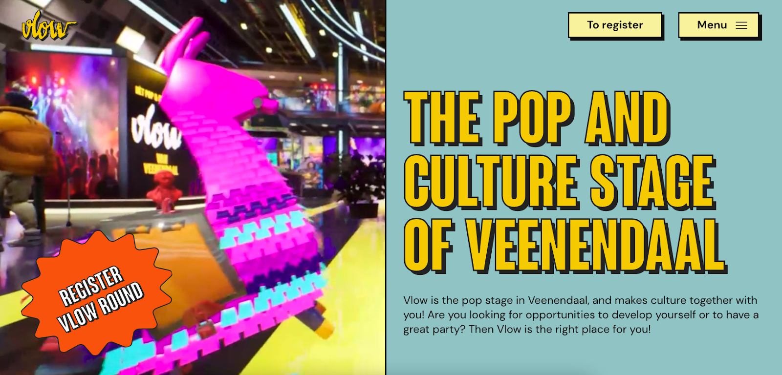
You’ll see what we mean on the homepage for Vlow, a Dutch events company. Design agency Mediaploeg designed the site with a bright, in-your-face pop culture theme. An equally vibrant video showcasing the event space plays on a loop on the left side of the split screen, but strong typography choices ensure the text on the right side grabs the viewer’s attention. A bold yellow heading gives visitors the first piece of information they need: who the company is. The eye naturally travels down from the heading to the body text, which offers a few more details about the services offered. And on the left, a comic-style call-to-action button stands out against the busyness of the video, ready for viewers to take the next step after they've gotten a feel for what Vlow has to offer.
4. Shows personality
Personality is a big part of the design elements representing a brand’s identity. The colors and typefaces of the words on Vlow’s website communicate the brand’s fun, hip personality.
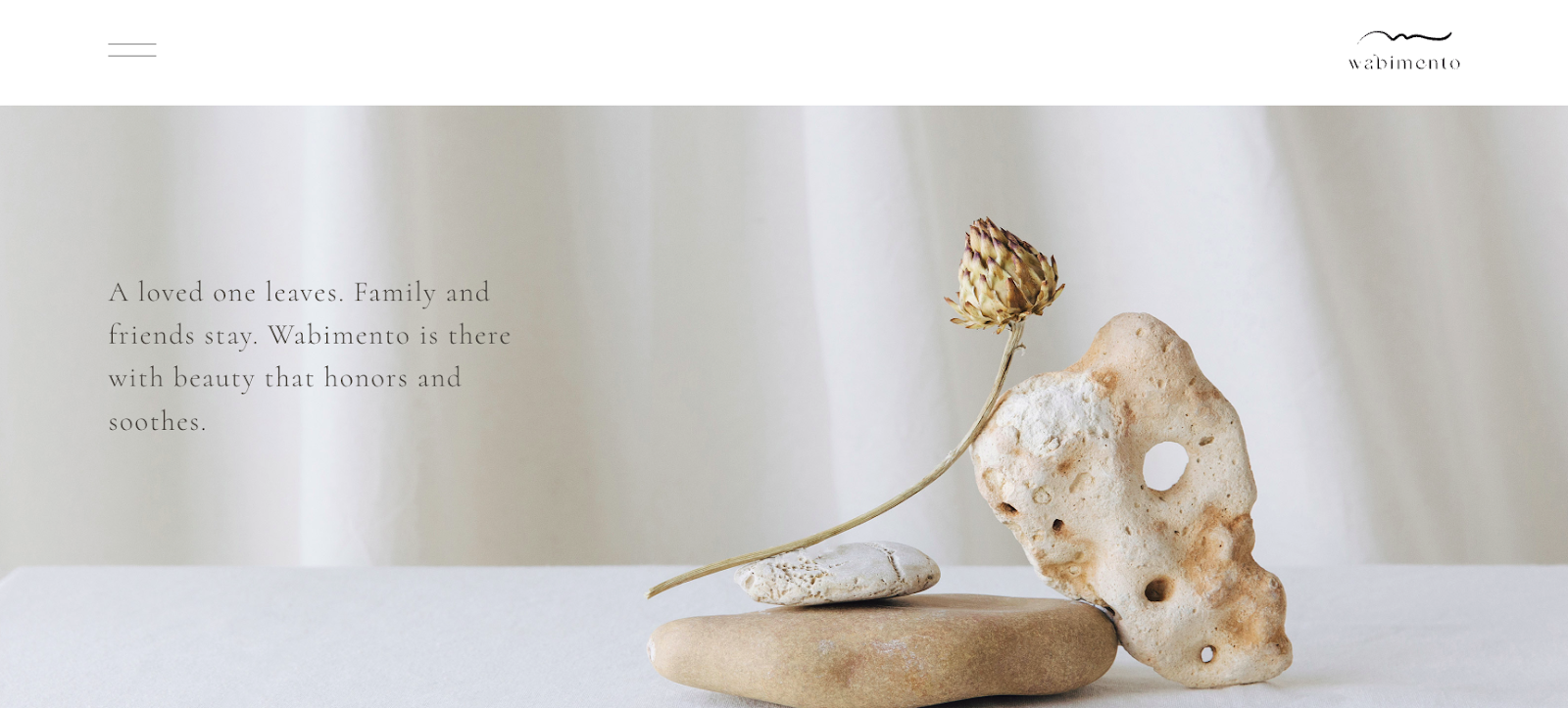
But that sort of typography wouldn’t suit a brand like Wabimento, a funeral services provider catering to people grieving the loss of a loved one. To give visitors a sense of Wabimento’s gentle, comforting personality, Webflow designer Roem chose a delicate typeface that communicates its message softly, perfectly complementing the website’s soothing images.
5. Sets the tone
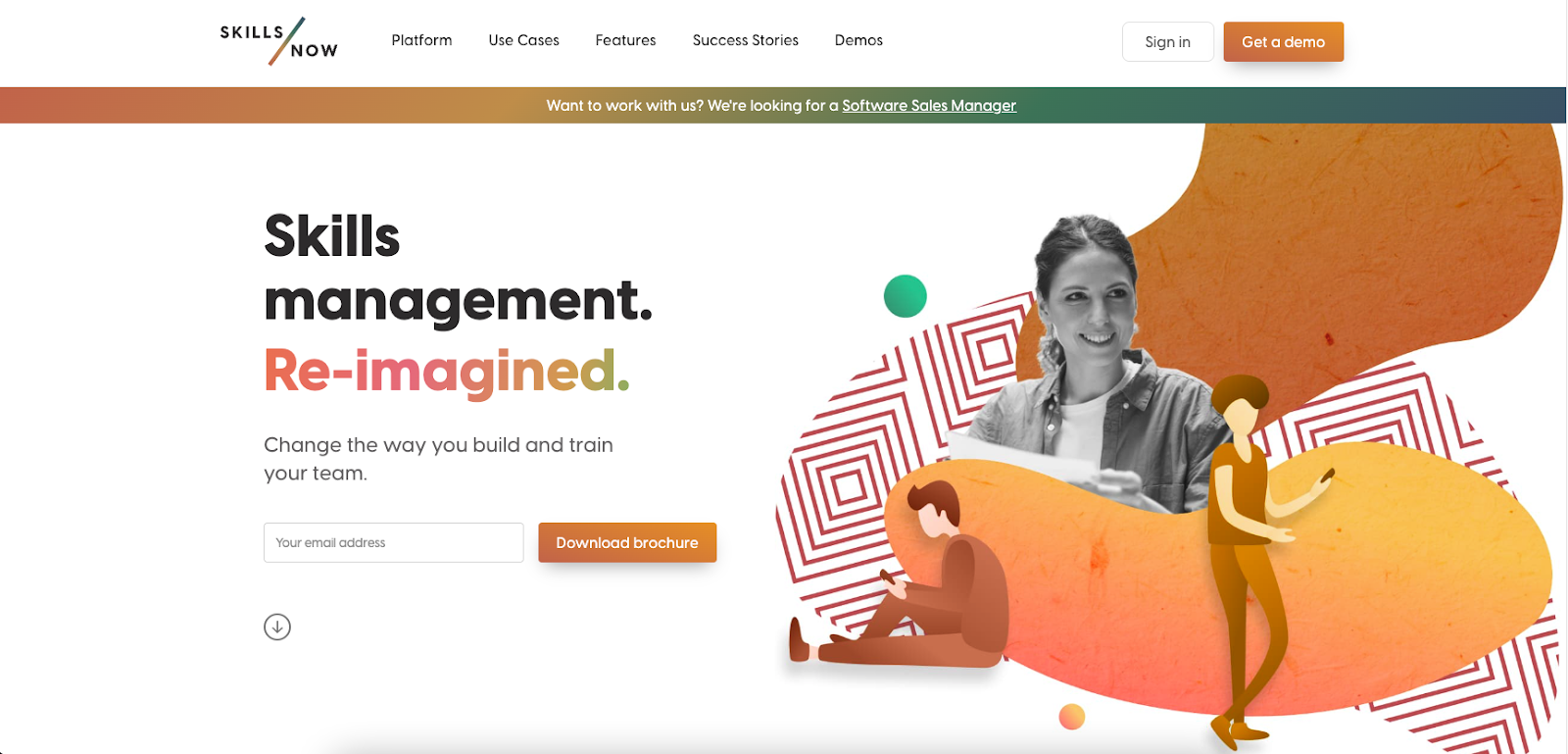
Typography sets the tone for a campaign, using visual elements to create a sense of urgency, excitement, calmness, or whatever emotion will help the content resonate with viewers. For SkillsNow, an HR and training app, designer James Wood used color to position the drab, single-toned status quo, “skills management,” against the future, with a bright, gradient for the word “re-imagined,” setting a hopeful tone that inspires visitors to imagine what’s possible.
6. Promotes brand recognition
Brand recognition helps businesses establish a strong presence in the market while differentiating themselves from competitors. Many factors come together to influence brand recognition, like customer service and product quality. But brand design plays a significant role in cementing a company’s place in consumers’ minds. When a company uses the same visual elements across all marketing channels and touch points, words are often unnecessary — consistent color schemes and packaging are all it takes to signal the recognition that gives a consumer confidence in the brand.
When words are necessary, it’s essential that they align with the other visual elements of the brand identity, and typography makes it possible. Consider Vlow’s logo, which is a wordmark or logotype that’s nothing more than the company’s name:

The brightly colored logo’s bubbly shape and rough edges resemble a graffiti font, making Vlow’s playful, edgy identity clear. The homepage’s primary heading uses a different typeface:
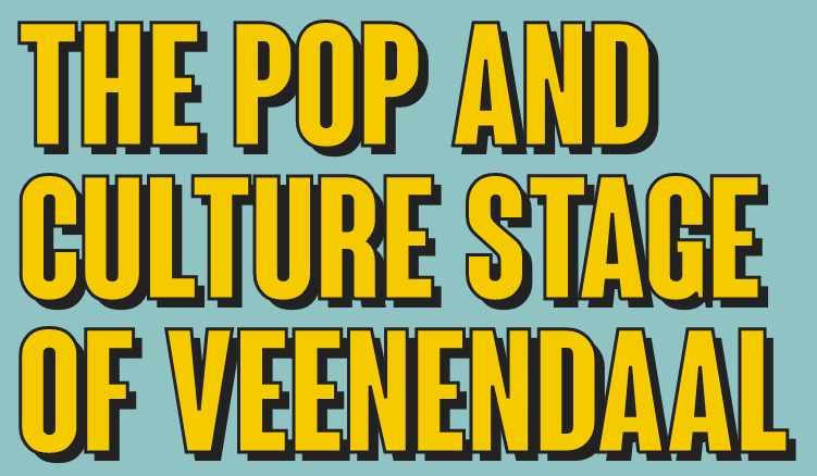
But by mirroring the shadows and colors of the logo, the webpage heading serves as a recognizable piece of Vlow’s larger brand identity.
Learn more about typography with Webflow
Good typography adds clarity and stability to any design, guiding the viewer's eye and making content more approachable.
At Webflow, we offer the tools to make websites and the tutorials you need to master them. Learn about the latest typography trends in web design, the best typography tools for designers (including Webflow's free font generator), and more with guidance from our blog and lessons from Webflow University. You’ll find all the information you need to master typography, plus a collection of templates and websites to inspire your best design yet.

Launch with Webflow Templates
Choose from hundreds of professionally designed website templates for any industry or style. Customize visually, launch instantly — no coding required.
