Your website can be a valuable tool for driving leads—but that doesn’t mean it will automatically convert visitors. In fact, without regular and rigorous testing, strong CTAs, and social proof, your site will serve as no more than a portfolio.
Luckily, the following best practices can help anyone build a website that converts. Use these ideas to spruce up your current website or start a new one from scratch.
Optimize your landing pages with A/B testing
Testing is the most important part of building a website that drives leads. Design best practices give you a strong starting point, but without the proper application of the scientific method, you’ll never know what’s working — or what isn’t.
Just about any element of your website could be worth a test, but you’ll get the most bang for your buck testing:
- Headlines
- Calls to action (CTAs)
- Forms
- Page layout
- Text
Test call to action (CTA) placement
Test CTAs at the top and bottom of the page. Maybe it drives more clicks above the fold, or below the testimonial section. Or maybe a CTA in the hero section with another sticky one that follows people as they scroll would work better?
Test CTA copy
The way you phrase your CTA is just as important as its location — if not moreso — and it should be focused on the visitor/reader: “The reader is ready to take the next step to find out if you offer what they need—what do they want the next step to be? Figure that out, and make that your call to action,” says Adam Thompson, Director of Digital Strategy at 10xdigital.
Test form fields
If you’re using a form, test the information you’re asking for. Typically speaking, the fewer fields you have, the better. However, testing by Eloqua has shown that between 5 and 10 fields can strike a good balance between completeness and conversion rate.
Test pages
If you’re driving visitors to a specific landing page, test the text, CTA, forms, and design on that page, but do it one at a time. Over time, you’ll build a “blueprint” for an optimal landing page you can use for future launches. (Just keep in mind that context is everything, so what works for one audience or situation won’t necessarily hold true for all scenarios.)
There are a variety of tools you can use to test these pieces of your website, including:
- Heat-mapping software: best for identifying what draws people’s eyes
- Google Analytics and other analytics tools
- Landing page platforms
- A/B testing software like Optimizely or Google Content Experiments
You can also try more scrappy methods, such as tweeting two links to the same page, using different copy, and seeing which performs better. This is far less scientific, obviously, but can be handy for informing copy.
Pro tip for A/B testing
When testing, change just one element—like location of the CTA button—so you know exactly what caused a lift, or a drop. If you change more than one element, even if it’s “just” the CTA text and button color, you won’t know exactly what created the difference.
Drive blog readers to convert with “ads”
If your blog gets traffic, but you aren’t actively trying to drive leads, “you’re missing out on what is perhaps not only your best opportunity to convert organic web traffic into actionable, measurable sales inquiries, but also the best way to actually show real ROI from your social media investment,” according to marketing experts at SpearMarketing.
Luckily, there are a number of ways to get these readers into the lead funnel. You just have to find the one that’s most effective for you.
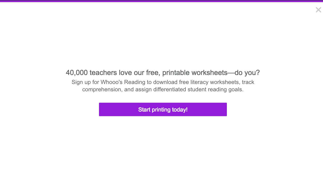
I found that drop-down, page-takeover ads were most effective at driving leads for Whooo’s Reading, an education blog I manage, after testing a variety of different options. Using HelloBar Pro, I design “ads” that drive readers back to the main website. With this tactic, I’ve been able to drive almost 3,000 high-quality leads.
Now, I know what you’re thinking: popup ads and banners annoy users, distract them from reading, and generally ruin the user experience. And depending on your audience, that can be 100% true. But we’re not saying you definitely must use page takeovers. It’s up to you to strike a balance between UX and conversion that you’re comfortable with. But you might find it’s worth a try.

You can also drive leads with a banner or sidebar “ad” — both of which I use on the same education blog.

Pro tip for converting blog readers
If you use multiple methods to drive people to convert, be sure to tag each one’s link with a different parameter so you can find out which one is most effective. This will help determine what ads need tweaking and testing. Google’s Campaign URL Builder is handy for this.


The missing guide to the freelance designer's life is here
Learn everything you need to know about making the leap to freelancing, from how to find clients to how to price your services.
Embrace the power of social proof with testimonials
Testimonials add a human element to your “selling” and give potential clients something to identify with.
Any time a customer is being sold to, they are on their toes for deception. It’s only natural. Nobody wants to spend their hard-earned dollars and cents on a product presented as far more valuable than its reality. As consumers, we’re all more willing to believe in what’s being advertised if we can identify with the source of the information. Testimonials can provide the perfect way to bridge that gap.
–Mike Whitney of Business2Community
If you don’t have any testimonials handy, reach out to clients to ask for one, and use this as a chance to check in, even if your work with them is done. That looks good for you and gets you the testimonial you need. You can also pull from your LinkedIn page, if you have good recommendations from past coworkers and bosses.
Pro tip for using testimonials
The best copywriters listen closely to their customers and audiences, and take what they say as source material for future copy. So if a customer feeds you an amazing line about your service or product, don’t hesitate to use it in your own tests!
Try a “soft” sell by giving away free content
The hard sell—“Work with me” or “Buy a package”—may be too much of a commitment for more cautious people. While conversion is always your ultimate goal, a less direct method can help you get more exposure and build interest in those more cautious folks.

Enter free content.
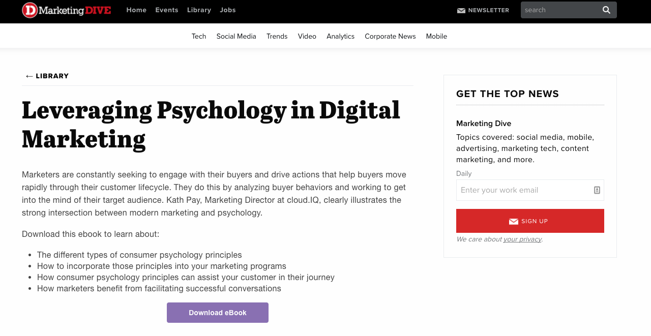
In this method, you create an ebook, whitepaper, or other piece of “gated” content that asks for a visitor’s email (and/or other contact info) for them to access. This is a low-commitment request, making it both more appealing and easier to sell.
It’s also still valuable to you, as a business owner. Now that you have their information on file (phone number, email address, location—whatever you ask for), you can now market to those people more effectively, turning readers and stray visitors into clients further down the line.
Create, test, analyze, repeat
In the end, the key to turning your website into a lead-driving machine is constant refinement, driven by deliberate testing, analysis, and revision. So always keep an eye on how your creations and tests affect your analytics, and don’t hesitate to try something different if you don’t like the numbers you’re seeing.
What methods have you tried to improve conversions? Let us know in the comments!


