Lead capture pages turn interest into an information exchange.
Lead capture pages are often the first interaction potential customers have with your brand. These pages introduce your offering and let you connect with potential buyers by convincing them to turn initial interest into a valuable exchange of information.
These pages also assist with prospect generation and nurturing through targeted marketing efforts by offering something of interest in return for contact details.
Read on to learn how lead capture pages kick-start the sales funnel and boost your return on investment (ROI).
Why should you create lead capture pages?
A lead capture page is a dedicated landing page for collecting visitor information, typically through a form. In exchange for the visitor’s contact details, these pages offer something valuable like a discount, exclusive content, or a free ebook. Unlike regular landing pages, these focus on gathering leads to grow a customer database.
Essential components for a lead capture page
No matter your goals or industry, here are a few essential elements to add to your lead capture page:
- A captivating headline. A headline is the first thing visitors see, so it should grab attention and communicate the value proposition of your offering to encourage visitors to stay and learn more. For example, “Unlock exclusive insights on cybersecurity trends and best practices!” instantly tells readers what they’ll gain from engaging with the page.
- A subheading. A subheading adds context to your headline by elaborating on the benefits and what the visitor can expect. It should be concise yet informative and reinforce the headline’s message without being repetitive, like “Download our free whitepaper to stay ahead of the latest threats and protect your organization.”
- Engaging visuals. High-quality images, videos, and infographics improve your lead capture page’s appeal. Visuals break up the text, making the headlines and subheadings more readable. Visual communication also creates variation between design elements to accommodate various engagement and learning styles. For example, an infographic on the impact of cybersecurity breaches or a happy customer’s video testimonial offers a varied way to engage with the page.
- Features and benefits. Focus on how your offering solves visitors’ pain points. You can lay these out in bullet points or use paragraphs. For instance: “Our whitepaper covers the latest cybersecurity threats, effective defense strategies, case studies from leading enterprises, and best practices for enterprise-level teams.”
- Social proof. Include testimonials, case studies, and logos of well-known customers to build trust and credibility, like “Trusted by over 500 leading tech enterprises!” Social proof reassures visitors that others are satisfied with your offering and encourages them to engage and convert.
- A strong call to action. A call to action, or CTA, is typically a link or button that encourages visitors to take a desired action. Use persuasive, action-oriented language, and make the CTA button color stand out visually. The CTA copy should be concise and create a sense of urgency, like “Access exclusive content for a limited time only!”
- Lead capture form. Ensure your lead capture page’s form asks for only essential information to reduce friction — you’ll likely only include fields for a name and email address. Place this form in a prominent spot to draw attention (like in the middle of the page horizontally, close to the top), and ensure it’s quick to complete.
- Privacy assurance. Reassure visitors that their information will remain secure and private and won’t be shared without consent. This builds trust and encourages them to fill out the form. You can do this with a brief statement near the form or a link to your privacy policy.


Unifying web design and data
Discover how using Hubspot's powerful CRM with Webflow can enhance customer experiences and drive your business growth.
How to design a successful lead capture page: 5 tips
Follow these five best practices to ensure you craft a lead capture page that converts visitors into valuable prospects.
1. Craft a compelling lead magnet
A lead magnet is an incentive offered to visitors in exchange for their contact details, like an ebook, whitepaper, or discount. Effective lead magnets address a pain point or provide insights that visitors can’t conveniently find elsewhere. Consider your industry, target market, and offering to ensure your lead magnet is highly relevant to your audience’s needs. And no matter your audience, highlight the item’s benefits in your headline and subheading.
2. Keep it short to reduce friction
Avoid overwhelming people with too much information or too many form fields. Visitors should find it highly convenient to submit their details. This means optimizing your form for mobile devices and conveying as much information as possible above the fold so visitors don’t have to scroll and scroll to enter their info. You might use bullet points to highlight your offering’s key benefits and limit your form to three fields: name, email, and company.
3. Refine your page with A/B tests
A/B testing involves creating and comparing the performance of two lead capture page designs. You can use different headlines, CTAs, images, and form fields to see which elements maximize conversions. Test one component at a time to understand its impact on your conversions and make data-driven decisions based on the results.
4. Experiment with one or more traffic sources
Now, it’s time to get people to your page. Experiment with multiple traffic sources, including organic search, social media, email marketing, and paid advertising, to determine which bring the most qualified leads. Use key performance indicators to track the performance of different traffic sources from campaigns and internet marketing strategies to allocate more resources to the most effective ones.
5. Follow up with your new lead
Capturing a lead through your page is just the first step. To maximize your lead generation efforts, follow up promptly with personalized communication. You can segment leads based on interests and behaviors and tailor follow-up messages to address these preferences. And use lead nurturing tactics to provide additional value and encourage return visits — this guides prospects toward making purchasing decisions.
For example, you might send a thank-you email immediately after a lead downloads a resource, like an ebook, followed by a series of educational emails offering more insights related to the ebook’s content.
Examples of effective lead capture pages
Here are three examples lead capture landing pages that effectively attract and convert visitors with strategically designed forms and well-placed CTAs.
Memberstack email sign-up form

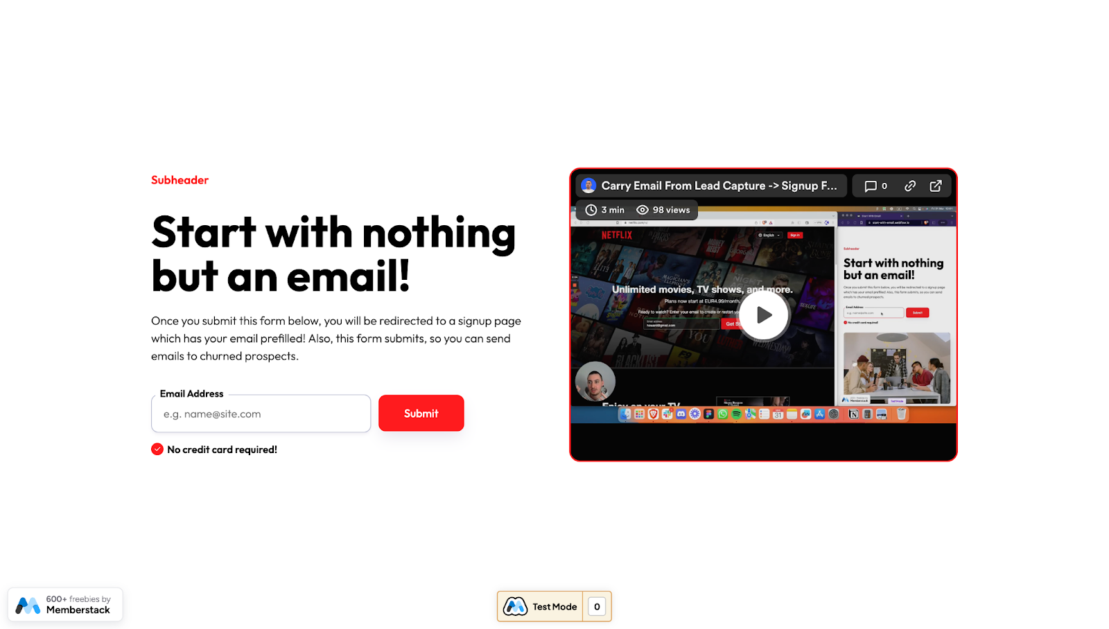
This lead capture page template, designed by Memberstack, uses a to-the-point headline “Start with nothing but an email!” to immediately tell visitors all they need to provide is their email address, reducing the barrier to entry. The subheading offers additional context by explaining the next steps after submitting the form and highlighting the benefits of doing so.
Beneath the minimal form (requiring only an email address), Memberstack places a red checkmark and the text “No credit card required!” to address potential concerns and encourage sign-ups.
This cloneable lead capture page template also includes a video explaining how to create a similar design in Webflow to suit your brand’s visual identity.
Web accessibility resource lead form

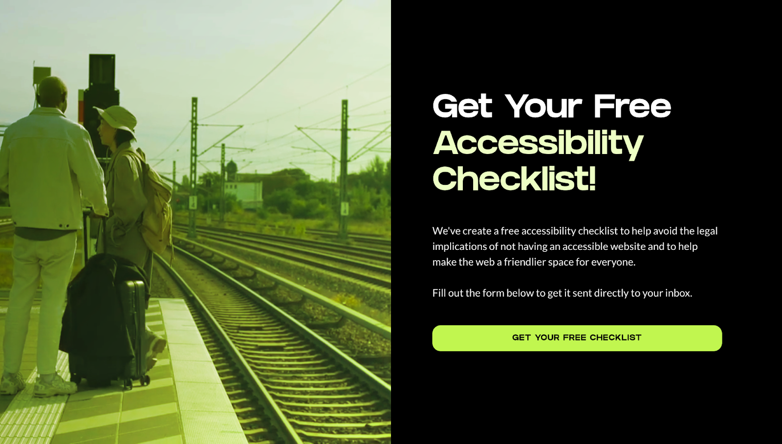
This cloneable lead capture page from Flow Sparrow is highly effective due to its focused approach and clear value proposition. The headline “Get Your Free Accessibility Checklist!” instantly showcases the offering and its benefits — you get an accessibility checklist, it’s free, and it’ll help you craft a more accessible site. And the supporting text explains the practical benefits (avoiding legal issues) and the broader impact (making the internet more accessible).
The background video breaks up the text with a more visual element and adds a neon green overlay to the site’s color palette. This contrast between the dark background and the bright text makes the headline and CTA stand out, drawing attention to the most essential elements.
Livestream MeetSure submission form

Livestream MeetSure’s cloneable lead capture page opens with the headline “Secure video conferencing software for compliance-driven industries” This immediately targets a specific audience and emphasizes the security and compliance features necessary for those sectors.
The form requests information like the visitor’s name, phone number, work email, company name, number of employees, website, and additional context about business needs. While more extensive than other forms on this list, the detailed fields ensure that leads are well-qualified and relevant to MeetSure’s target market.
Supporting text like “Meet confidentially” reinforces the company’s value proposition, while the site has logos from well-known clients to build credibility and trust.
Capture and convert leads with Webflow
Thoughtfully designed lead capture pages make strong first impressions and encourage visitors to submit valuable data for targeted marketing. By focusing on best practices and learning from inspiring examples, you can create more effective pages that help you optimize your marketing efforts.
Start crafting them in the Webflow Designer, a visual-first web development platform built for developers, designers, and marketers alike. Build high-converting landing pages — with or without writing code — and grow your business with Webflow today.

Webflow Enterprise
Trusted by over 300,000 of the world’s leading brands, Webflow Enterprise empowers your team to visually build, manage, and optimize sophisticated web experiences at scale — all backed by enterprise-grade security.


.jpeg)


