


Modals are an incredibly common design pattern. We’ll show you how to create your own in Webflow.
For this example, we’ll create a pop-up that appears when someone clicks a button on the page.
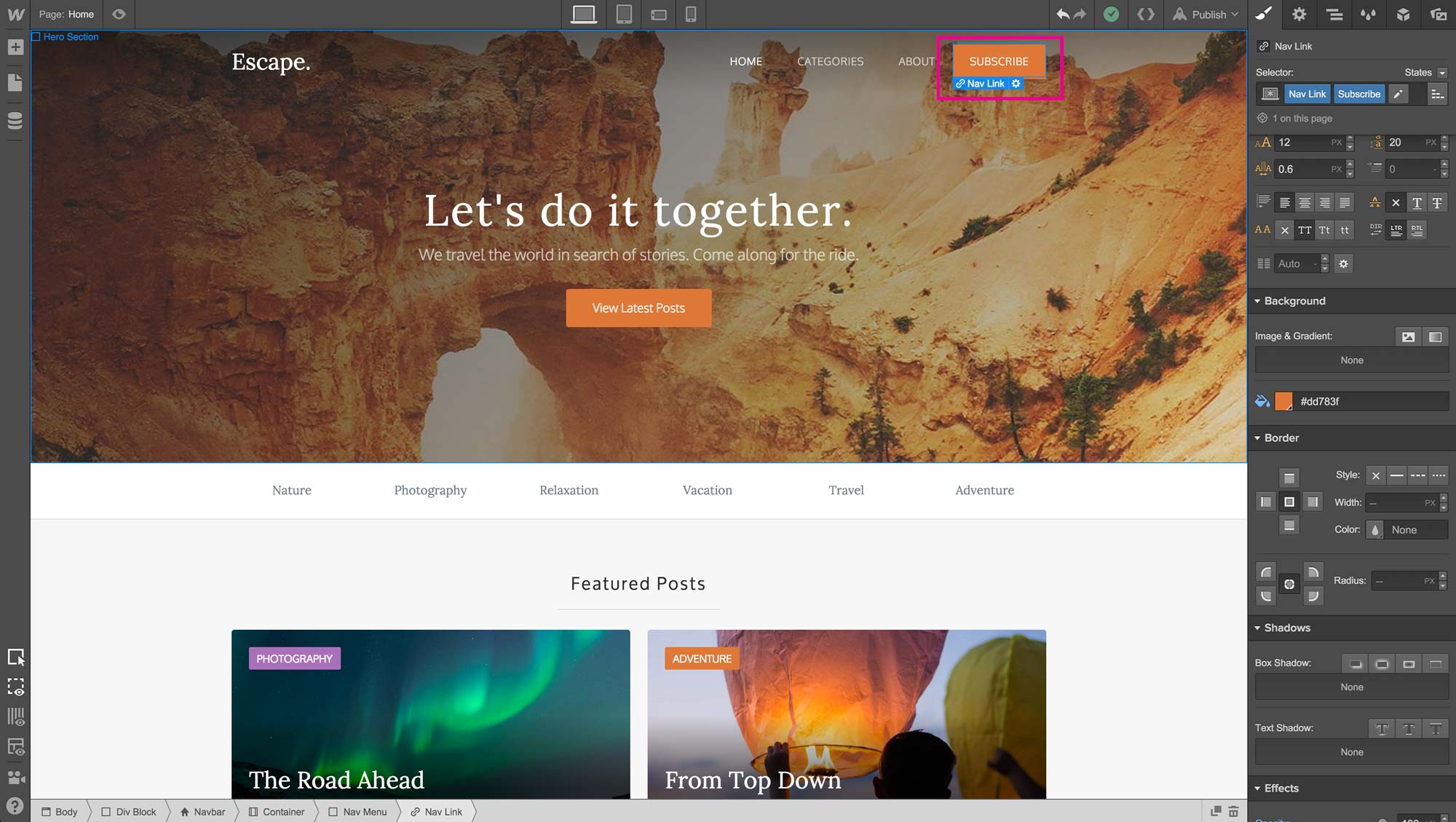
I’ll use our free blog template, Escape, and just add the subscribe button and pop-up to the template. Watch the video to see how and keep reading for details!
Step 1: Add the pop-up modal wrapper
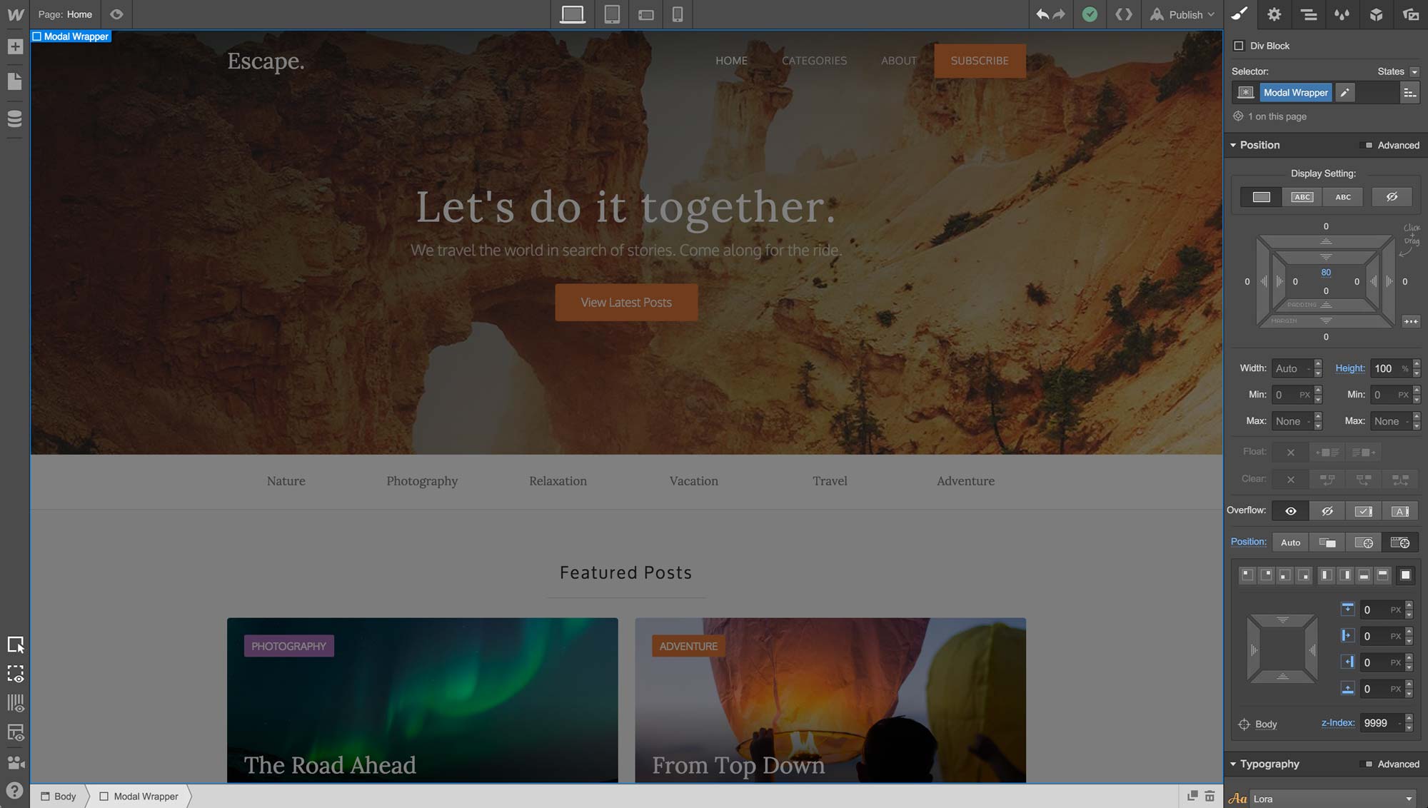
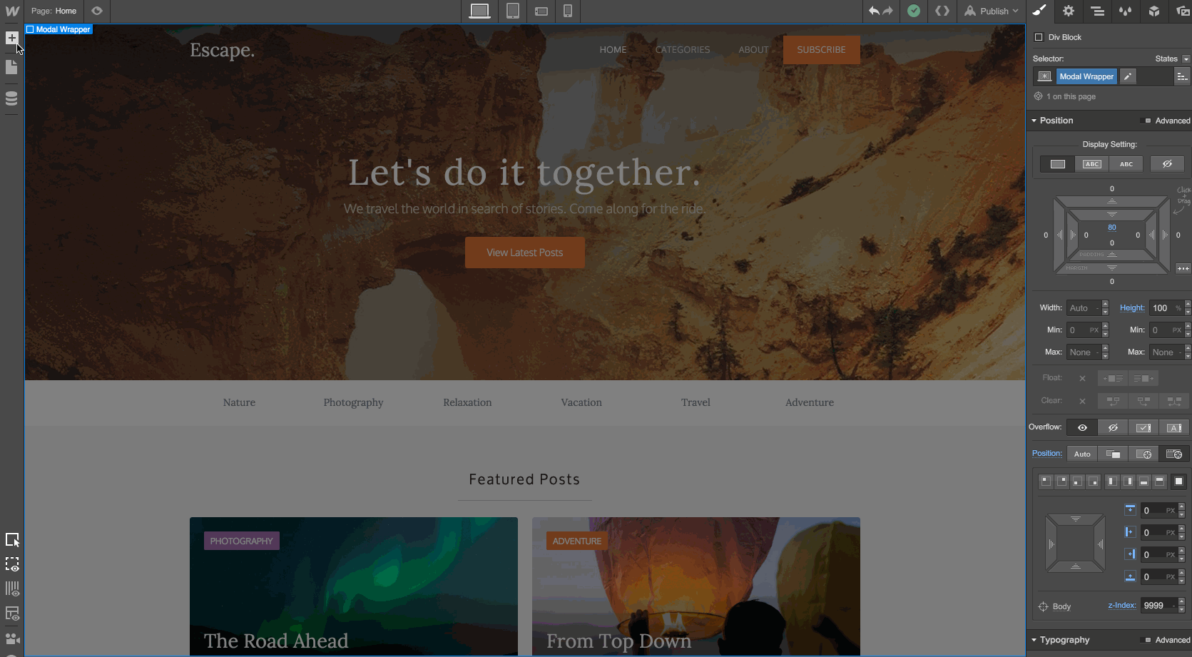
First, we’ll drag in a Div Block that will serve as the wrapper for the modal.
As you’re dragging that in, make sure it goes to the top of your site’s body — it’s easiest to do this using the Navigator pane.
Step 2: Style the pop-up modal wrapper
Once we’ve added the Div Block to the top of our page, we’ll give it a class so we can style it:
Class Name: Modal Wrapper
Top Padding: 80px
Height: 100%
Position: Fixed, cover full
Z-index: 9999
Text-align: Center
Background Color: rgba(0,0,0,0.5)
Now your screen should look like this:
Step 3: Add your sign-up wrapper
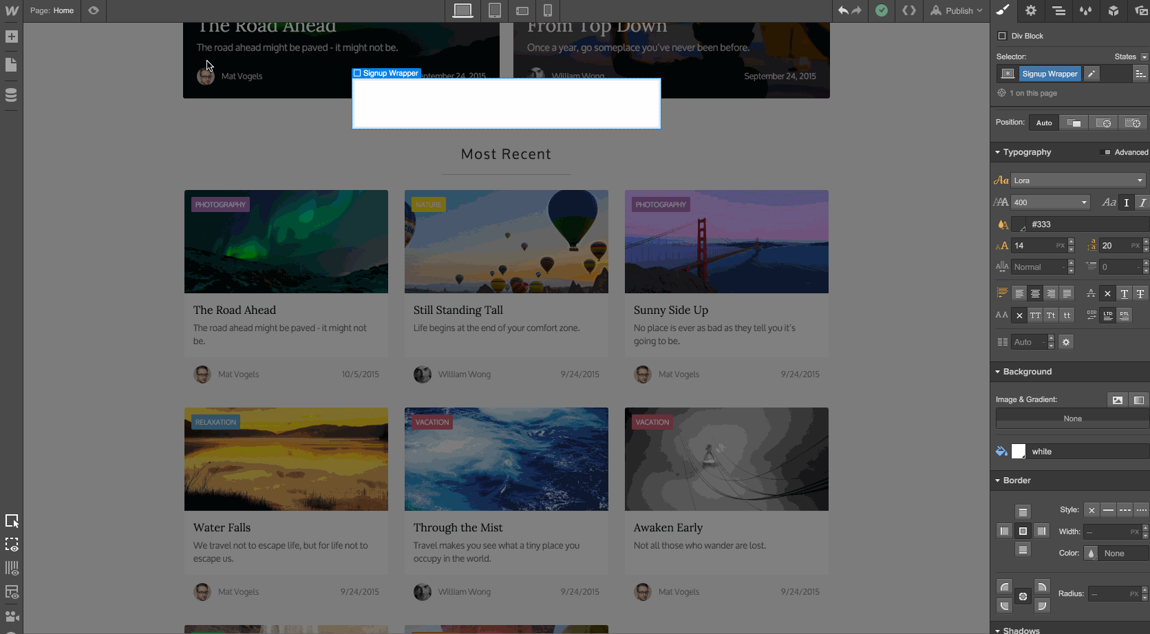
Now we’ll add another Div Block to our Modal Wrapper to actually hold our content, including our sign-up form.
Simply drag in a Div Block and drop it inside your Modal Wrapper.
Step 4: Style the sign-up wrapper
Now that we have the new sign-up wrapper inside our modal wrapper, let’s give it a class and style it:
Class Name: Signup Wrapper
Padding - All sides: 20px
Margin: Auto
Width: 450px
Max-Width: 100%
Background Color: White
Step 5: Add our modal's content
With our structure in place, let’s add the rest of the content.
First, we’ll drag in a Heading (H3), some paragraph text, and a Form element.
I’m going to cut the form element down to an Email field, and create classes around the form elements.
Class Name: Form Field
Height: 50px
Border: 2px #4aaec2
Class Name:Subscribe Submit Button
Height: 50px
Width: 100%
Background Color: #5cc489
(I also updated the default copy for the heading and paragraph text. Because you always want to design with real content.)
Step 6: Add a close link
Next, we’ll add a text link so people can close the modal once they’ve signed up.
Just drag a Text Link to the top of our Signup Wrapper, and give it a class with the following styles.
Class Name: Close Link
Display: Block
Text-align: Center
Font Size: 12px
Font Color: #999999
Step 7: Add an interaction to the modal wrapper
The final steps are all about interactions. We need to add an interaction to the Modal Wrapper, the Subscribe Button, and the Close Link.
Starting with the Modal Wrapper, we’ll add an interaction called Modal Wrapper.
We’ll set the Initial Appearance to:
Scale: 1.10
Opacity: 0%
Display: None
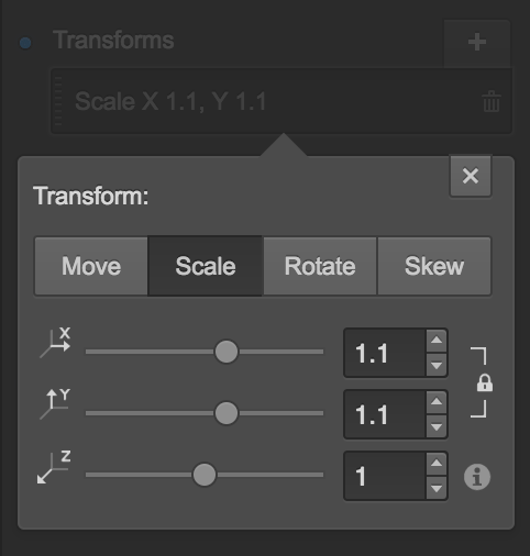
That’s it! This just ensures that when the page loads, the modal doesn’t display.
Step 8: Add an interaction to the subscribe button
Now we’ll add an interaction to the Subscribe Button that will open the Modal Wrapper on click.
First, select the Subscribe button, then add a new interaction. We’ll skip the Initial Appearance and go straight to setting up the Click Trigger.
Then, we’ll add the Modal Wrapper as the element we want this interaction to affect. To do this, simply type “Modal Wrapper” in the first text field.
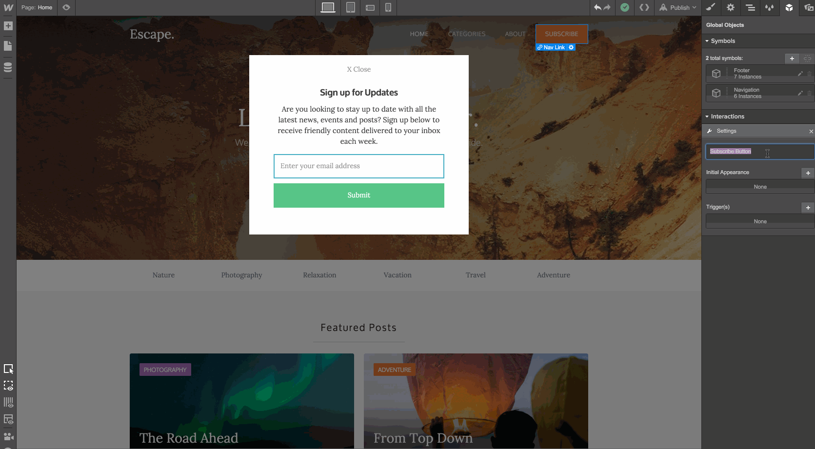
Now any interaction we add will affect the Modal Wrapper, not the button.
Let’s add the following for our First Click:
Step 1:
Display: Block
Step 2:
Scale: 1
Opacity: 100%
Since we don’t need it, we’ll leave the Second Click empty.
Step 9: Add an interaction to the close link
We’re almost done! The final piece is to add an interaction to the Close Link in the modal.
We’ll click on the link, then add an interaction to it.
Just as we did with the Subscribe Button, we want to add an interaction that affects the Modal Wrapper element.
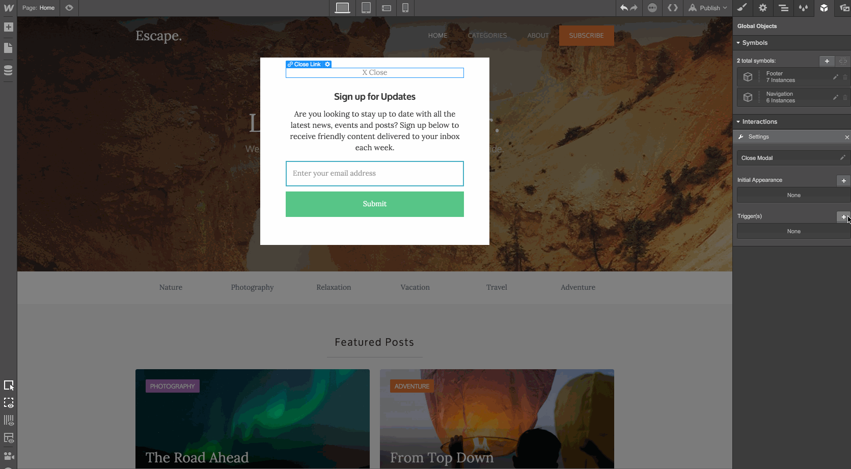
Add the following interactions to the First Click:
Step 1:
Scale: 1.1
Opacity: 0%
Step 2:
Display: None
Step 10: That’s it!
What we’ve done here is reproduce the interaction we created in the Modal Wrapper’s Initial Appearance, since we want this link to return the Modal Wrapper to its initial state of being invisible.
We’ve done it! If you take a look in Preview mode, you should see something that works like this:
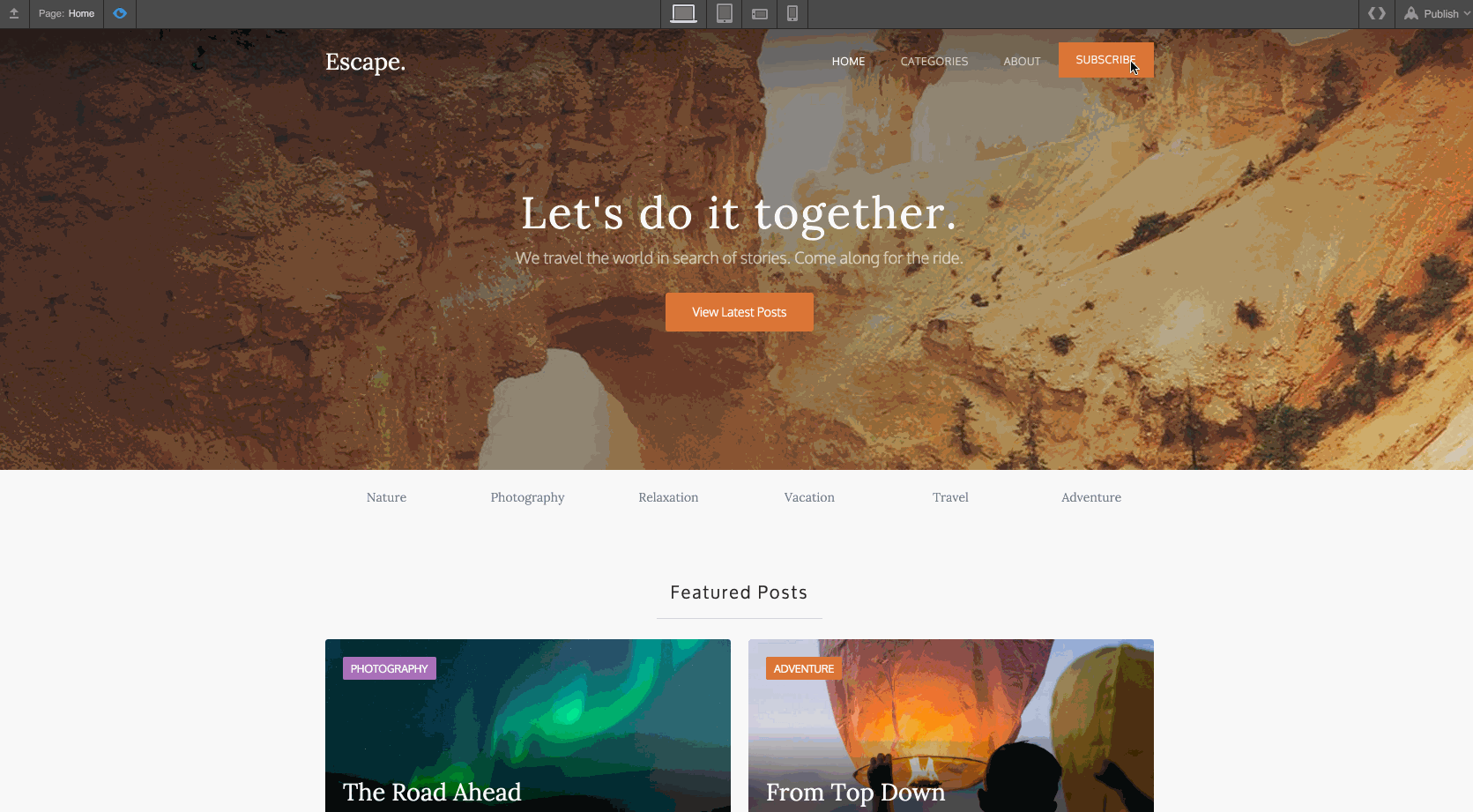
Check out the pop-up modal in Webflow.


Design interactions and animations without code
Build complex interactions and animations without even looking at code.