A simple lightbox elevates popup designs to give them a modern appeal.
Effective lead generation involves considering every option at your disposal, including tactics like popups. They’re challenging to do right, but popups work as long as they’re carefully timed and presented well. Lightbox popups, in particular, use a modern, eye-catching web design that offers increased success.
Webflow provides a broad collection of templates you can customize to suit your style, but you can also make your own lightbox popups from scratch. All it takes is a modal, a trigger, and an animation, and you’re all set to grab your reader’s attention with a sleek lightbox popup ad.
Benefits of lightbox popups for websites
A lightbox popup is used to focus the reader’s attention on a modal that features a call-to-action (CTA). When used properly, they can convert website visitors from casual browsers to purchasers with just a few clicks.
Here are a few benefits of using this popup style.
More viewer attention
Lightbox popups are small modal windows that overlay the content on the screen and dim the background to focus the reader on a smaller modal window. Typically, the reader must click the cancel icon to close them, but you can set them to close when the reader clicks anywhere outside the popup. Either way, you’ll catch the reader’s full attention for that moment.
Increased conversion rates
According to OptiMonk (a service that designs and personalizes popup ads), the average conversion rate for their popup ads is 11%. It fluctuates based on whether the ad has a lead magnet, image, or personalized experience, but an 11% average is impressive. The ads in their top 10% converted over 42% of readers, which shows how effective a well-calibrated popup can be.
Improved engagement
Most high-performing popups offer a personalized, conversational experience. They feature headlines that ask questions like “What are you searching for today?” and “Can we help you find something?” Readers can respond using interactive options like buttons or a search bar, and the best versions offer an incentive for doing so. The result is a personal, interactive experience that keeps the reader engaged.
More email subscribers
Signing visitors up for an email list is a great use case for lightbox popups. It’s a small ask (taking a few seconds to complete), which is a good fit for an ad that politely interrupts a reader’s activity.
Again, a little incentive goes a long way toward convincing website visitors to sign up, and it’s also an excellent way to compensate them for the momentary interruption.
Reduced bounce rates
Some popups, like an exit-intent popup, detect when a customer is about to leave a shopping cart behind. They appear at that moment to offer the customer an incentive in the hopes that they’ll complete their purchase.
The lightbox appearance is uniquely suited to this interaction because the rest of the screen dims as the popup takes over the UI. Your popup gets centerstage attention to re-engage the customer.
How to make a lightbox popup in Webflow
A lightbox popup consists of three main components. You start with a customized modal, then set a trigger for it, and finally, configure how it animates. The following steps cover the process more generally, but check out Webflow University for a full tutorial.
1. Create a wrapper
You’ll first need a wrapper to place your popup in. In HTML, your lightbox code is wrapped in a <div> element, hence the name “wrapper.” Everything you place within the <div> is contained and only appears when triggered.
Before you style the popup modal itself, configure it to place an overlay color over the rest of the screen. Set the overlay’s color to black and give it an opacity of around 80%. When the popup is triggered, its modal will appear at full brightness, and the overlay will cast an 80% shadow over the rest of the page.
2. Design your popup
Next, style the popup modal’s color, size, and content. If you’d like a headstart or want some inspiration, check out the Made in Webflow Marketplace for ready-made popup templates.
Give your popup a bold heading and an eye-catching color combination. Include a clear CTA and a compelling offer to entice readers to engage. Don’t forget to add a close button and, if possible, use a cookie to ensure the popup doesn’t show up again for the same user.
3. Set triggers
Set the trigger that determines when your popup modal will appear. Remember that the timing of a popup ad is crucial. Present it too soon, and readers will close it to return to what they were doing. On the other hand, readers who navigate away quickly won’t see it if it appears too late. Experiment or A/B test different options to find the timing that suits your site.
4. Set up animations
Add an animation to your trigger to give the popup some motion. One common animation is fading the popup in, but you can also have it slide or zoom in if that suits your site’s animation style. Don’t forget to add an animation to the close button, too. The close animation should reverse the open animation to give the popup a consistent look.
5. Test and deploy
Publish your changes and test the popup to ensure it works as intended. Try opening and closing it a few times to confirm that the animations are smooth and the modal styling is correct. Test submitting information through the form to make sure it arrives where it needs to, like in your customer relationship management (CRM) platform.


Interactions & animations
Learn how to animate multiple elements and bring your designs to life with rich, sequenced interactions and animations.
5 inspiring lightbox popup examples
There are a variety of ways to use lightbox popups. The following examples iterate on the basic design to create engaging, fresh experiences.
1. HubSpot
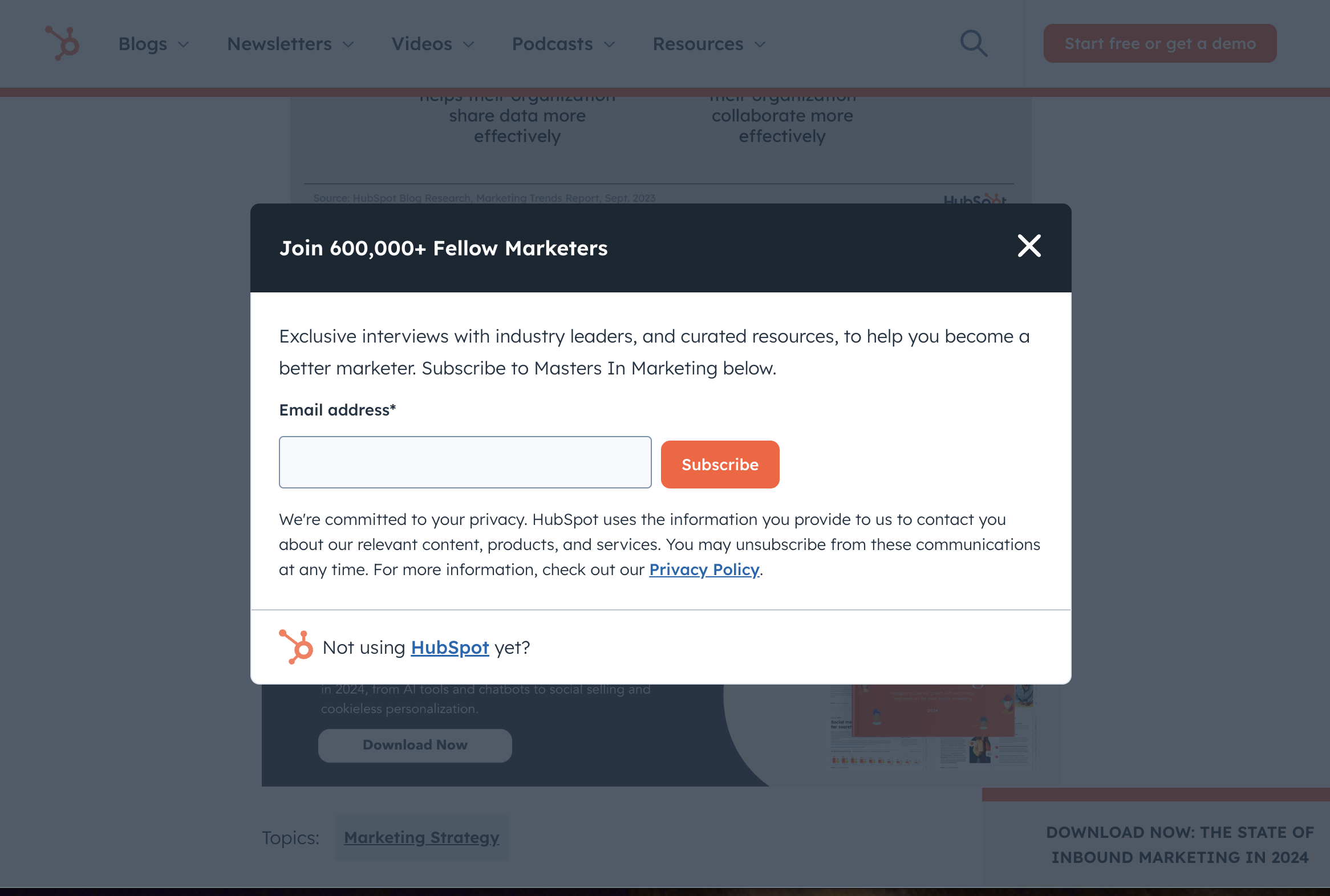
HubSpot is an all-in-one customer, sales, and marketing platform that hosts a blog with a deep content library. As you read their articles, this popup will appear to invite you to subscribe to their newsletter. Its single email field and simple subscribe CTA makes for a modest interruption that only adds the smallest distraction to the user experience. Placing the large close button so obviously invites customers to ignore the popup if they want to. This casual approach makes for a no-pressure experience.
2. Calm
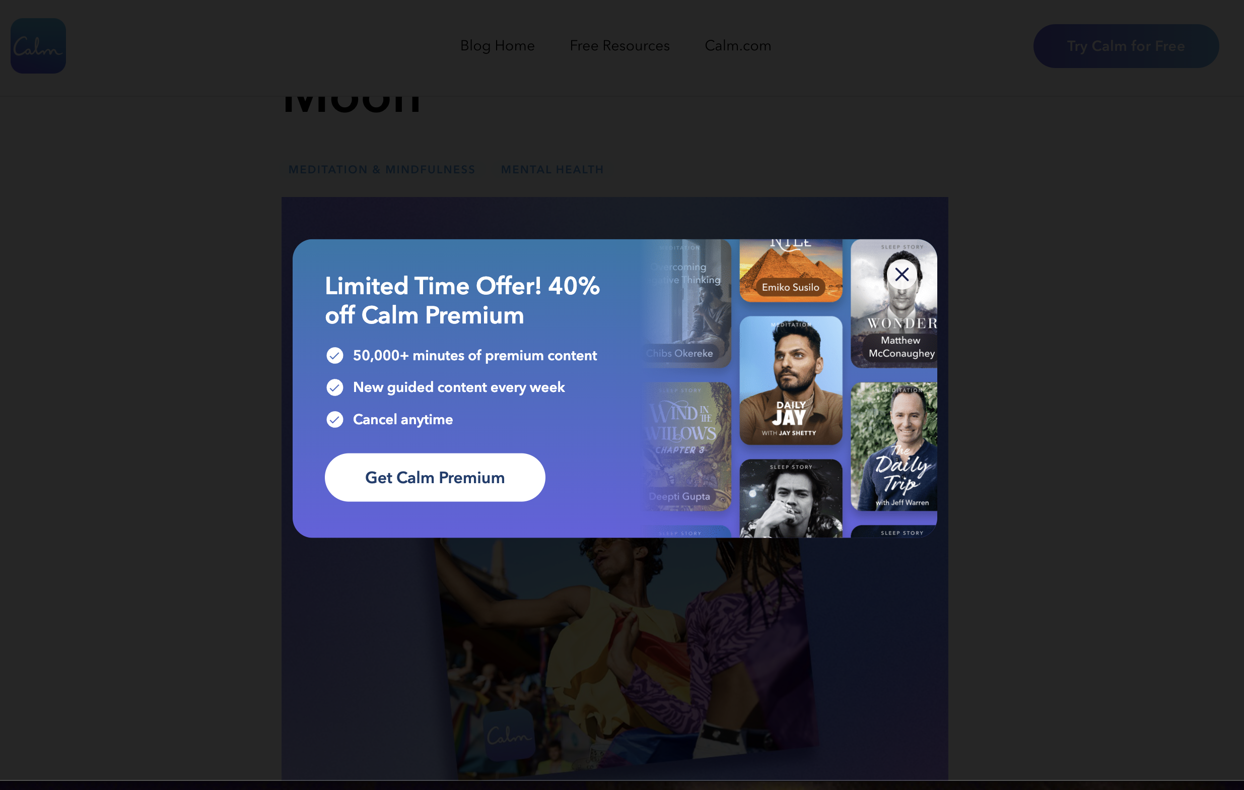
Calm is a health and wellness app that offers personalized experiences to help users stress less and sleep better. Their blog covers many fascinating topics about healthy lifestyles and mindfulness practices. As you peruse their articles, a lightbox popup offers a steep discount on their premium tier. It seems more subtle than other popups because it’s animated to slide in rather than suddenly appear, and the colors match the muted blue palette the rest of the site uses.
3. Grey Cup Festival
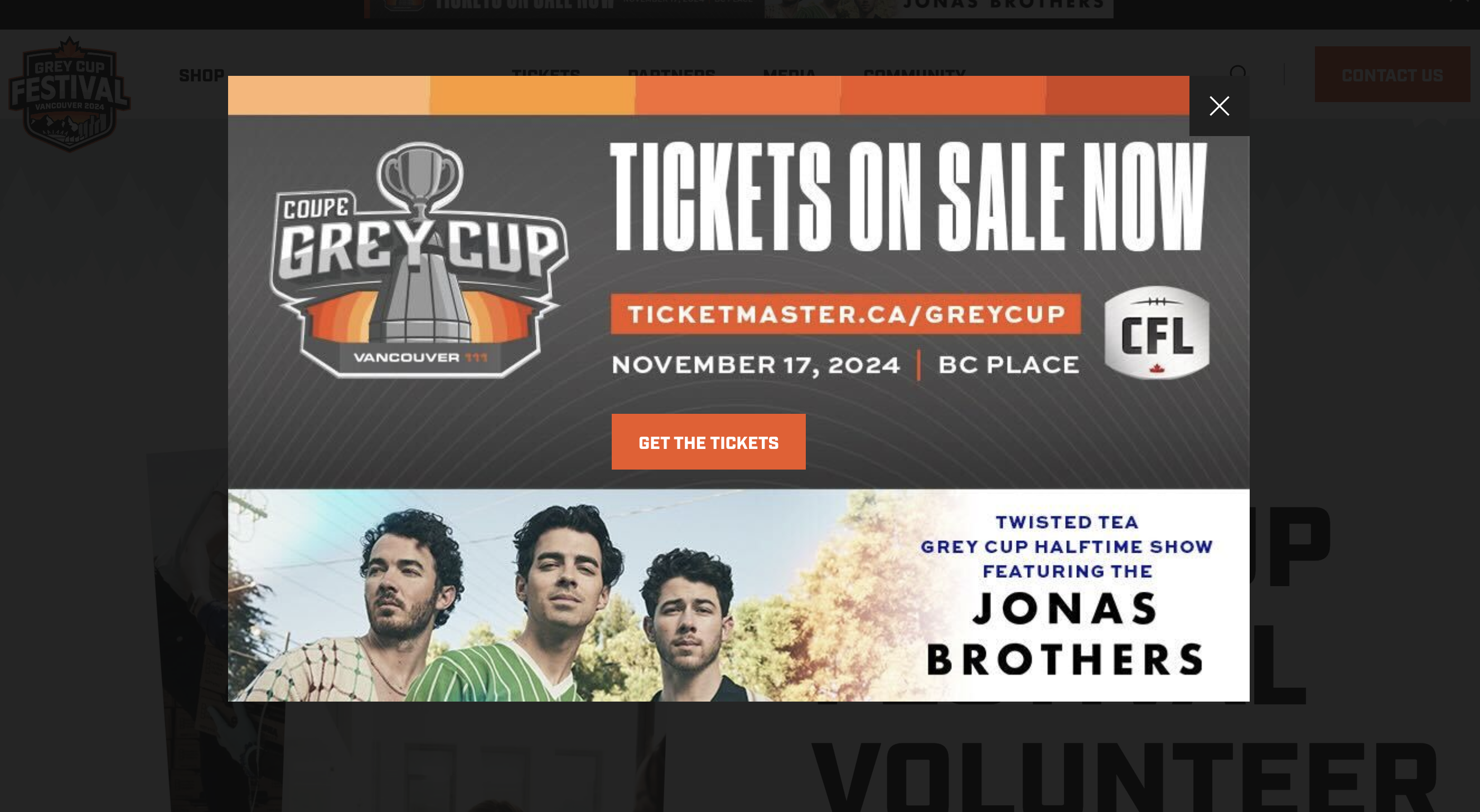
The Grey Cup is a Canadian football league, and the festival brings in a substantial number of fans. To drive ticket sales and show off the event’s headliners, this site’s web designers opted to use a large, bold lightbox popup that triggers while navigating the homepage. The heading’s large block letters immediately grab readers’ attention, and the bright banner at the bottom directs their focus to the “Get the tickets” CTA.
4. Bubbles
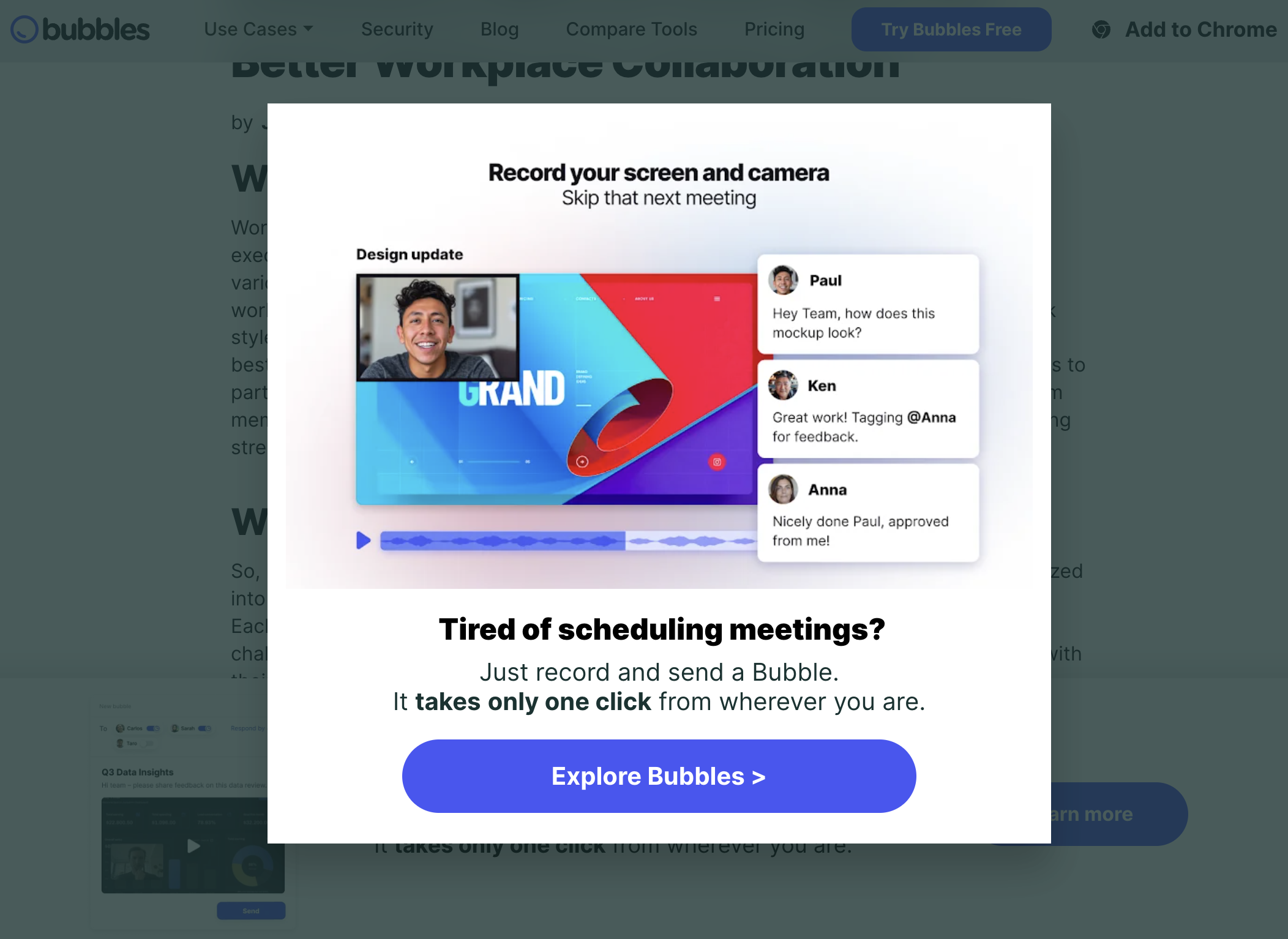
Bubbles is an AI-powered note-taking and video conferencing platform that aims to improve team productivity. The lightbox popup their site employs as you scroll through their blogs has a concise headline that appeals to a wide audience: “Tired of scheduling meetings?” It also uses a simple CTA format, “Explore Bubbles,” that explicitly indicates that it directs users to more information about the product.
5. Home Depot
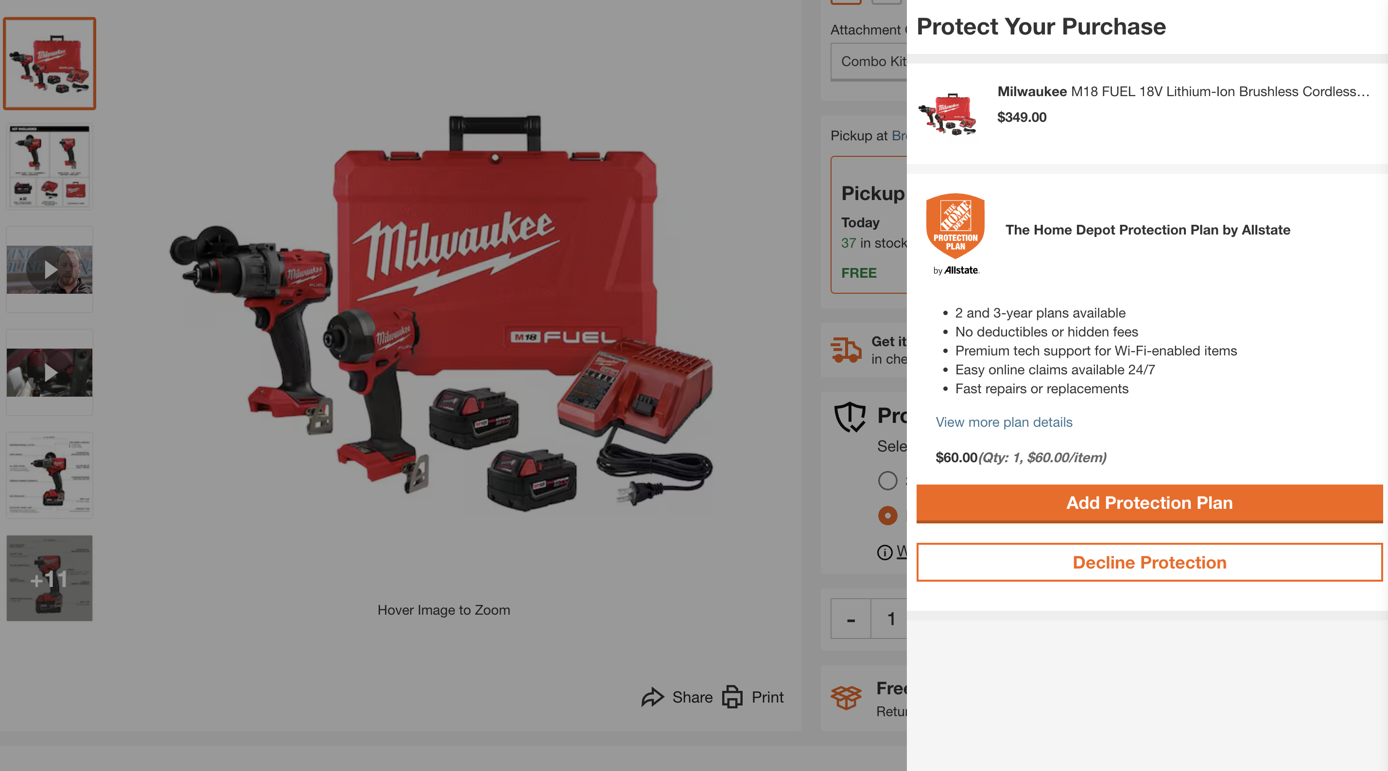
Home Depot uses the lightbox popup in a slightly different fashion. Instead of advertising a newsletter or directing traffic, it offers an add-on to something the user is already purchasing. It features a compelling headline, “Protect Your Purchase,” that asks users to consider adding a protection plan. The clear CTA, “Add Protection Plan,” suits the same purpose, and all the copy clearly and transparently tells users what the plan offers.
Design websites that convert with Webflow
Popups and other modals should enhance — rather than hinder or distract from — your web design and user experience. With a visual design interface and robust functionality, Webflow enables you to create and customize lightbox popups, so you can create a personalized web experience that drives leads — without extensive coding.
To learn more about crafting effective lightbox-style elements, head to Webflow University for an in-depth guide.

Build websites that get results.
Build visually, publish instantly, and scale safely and quickly — without writing a line of code. All with Webflow's website experience platform.


