


There are over 1,000 fonts on Typekit, and another 682 on Google Fonts. Somehow, you have to pick the best for your site—and ensure that they pair well. Where do you even start?
With all the fonts available, it's common to experience decision paralysis, then simply default to the same font you've always used. But if you want to make your design stand out, it’s time to finally explore new typography options.
If you take the time to learn the art of font selection, you’ll forever have a skill that can edge you above other designers. And it’s incredibly easy to learn — that’s the best part.
There are many helpful strategies for choosing beautiful fonts. Equipped with the knowledge below, hundreds of professional web fonts will start making sense to you.
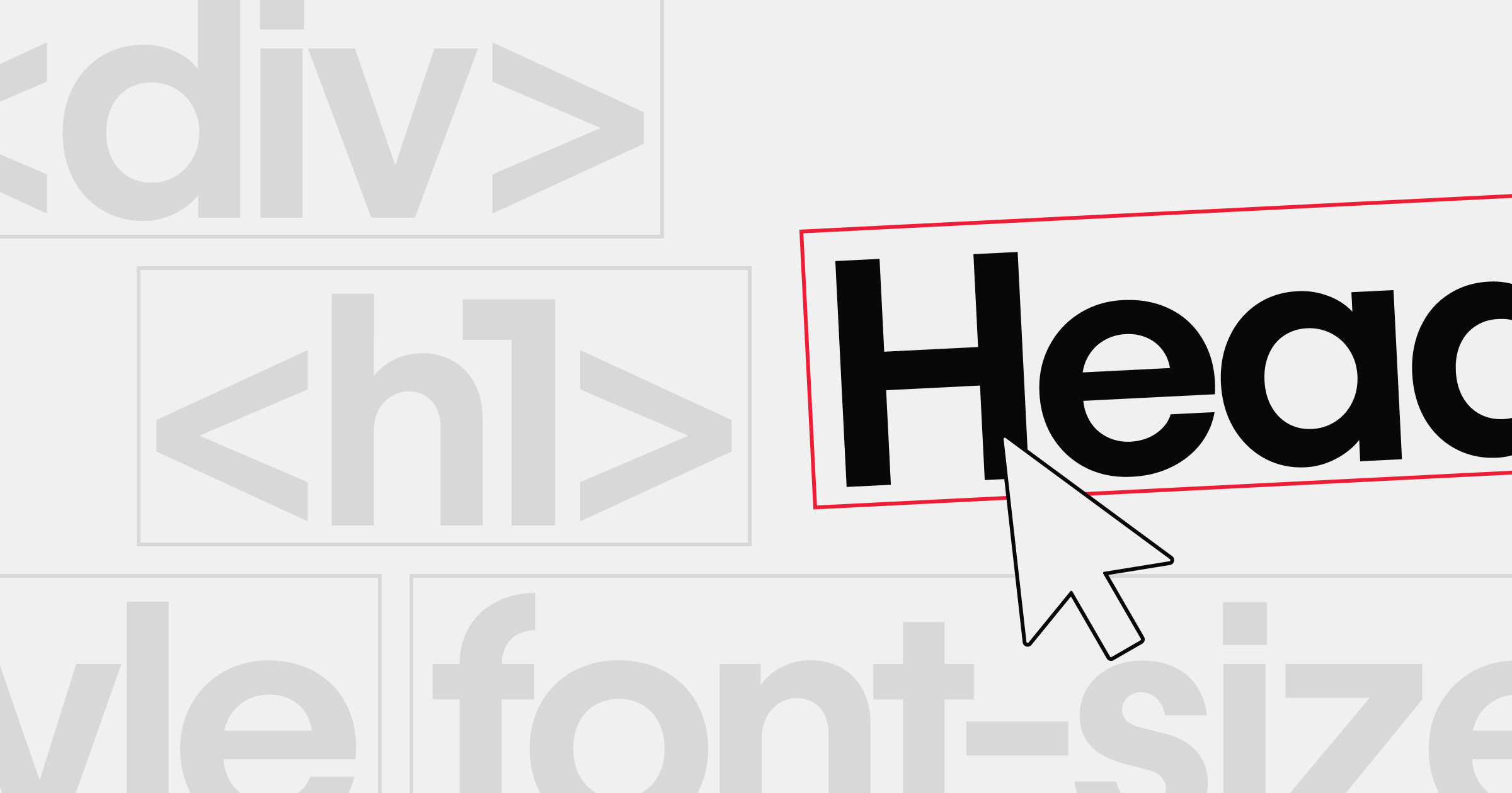
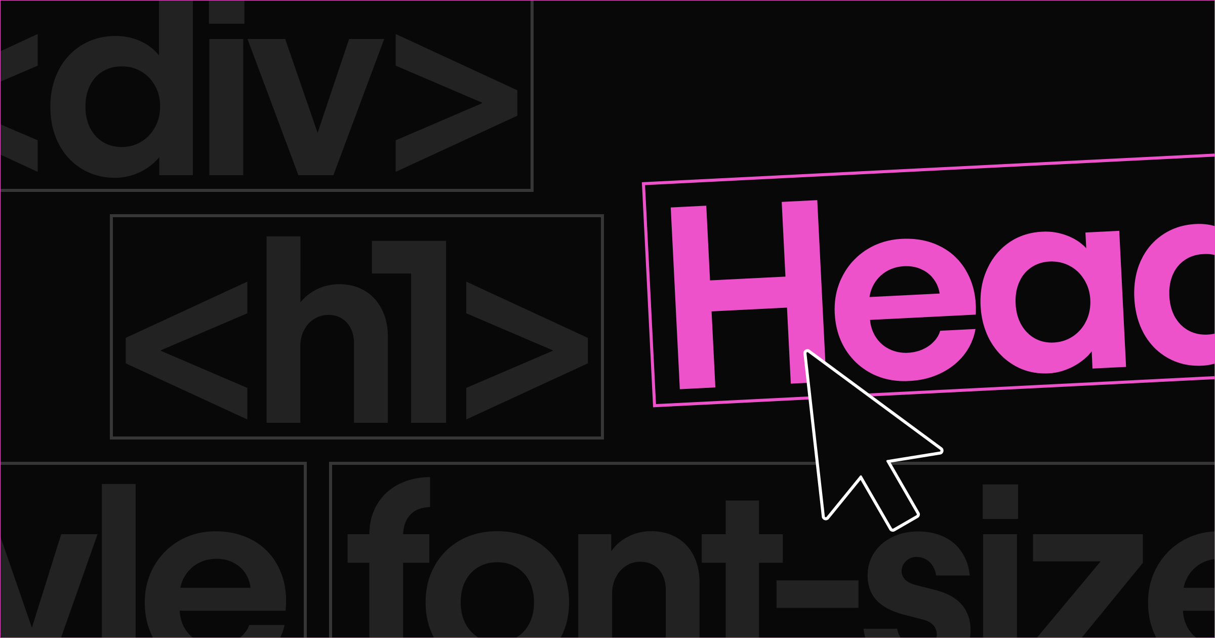
Strategies for choosing fonts
When you're choosing a font, your ultimate goal is to pick one that aligns with the intent of your design — not whatever merely “looks the best.”
Most of web's content is text. That means that text serves as the primary vehicle for conveying the ideas and feelings of a site, so you want to take a content-first (not aesthetics-first) approach to typography. Focus on how the content is going to appear on the page, and then begin to design around your that.
Keep that in mind as we explore the following strategies.
Consider font size
Legibility is crucial — content becomes useless if it's illegible. Text legibility is largely affected by font size, so always test a font at the smallest size it will be used on your site. Be sure to take mobile devices into consideration. That’s where you should always start when testing a font’s suitability. Once you have a suitable “small size,” you can scale up for various headers and the like.

Readers with vision impairment will especially appreciate it when you go out of your way to make content legible, but it benefits everyone who visits your site!
This brings up another dynamic: Some users will want to increase the font size, so consider testing your design at larger sizes as well. If your site looks bad when the font size is manually increased a few points, consider adding more white space to your design.
Consider devices and environments
People will read your website's content on a variety of devices and under many conditions. Make sure your chosen font and weight remain legible on mobile screens and retain clarity and definition across operating systems, including OS X, iOS, and Windows (which all tend to render fonts differently).
It’s also worth nothing that fonts don't necessarily render identically across browsers, and it is very possible that a font that looks great in one browser might have kerning (letter-spacing) or weight issues in another browser. Test a font's appearance with different browsers and mobile devices. You can use a tool like BrowserStack to preview how a design looks across the most popular browsers and devices.
Consider the tone of your content
Every font evokes a particular emotional response — whether playful, serious, or informative — or combinations of feelings.

The best way to determine if a font fits the desired response of your content is ... get ready for it ... to read the content typeset in the chosen font. You simply have to experiment because font appropriateness is less of a science and more of an art. So, read through your content with the selected font once or twice. Then quickly have a colleague read it as well, and — without giving them any hints — ask them to describe the content's tone. Then, typeset the content in a different font and reevaluate their response. Do this a few times and take detailed notes on their responses.
You might be surprised at the results: What you believed to be a playful font may come across as childish to others. The key is to empathize with the viewer – not to just choose whatever “looks great.”
Bonus! Here’s one of my favorite fonts: Brandon Groteque. A clean, rounded, and interesting sans-serif font. When I see this font in large, bold sizes, I can't help but think of the Gatsby era.

How to pair fonts
An important aspect of choosing fonts is knowing how different fonts play off each other – because you’ll likely want to have more than just one font on your site. This is a really enjoyable opportunity to get creative as a designer.
While it’s fun to accent a design with various fonts, don’t go overboard by setting each section or page in a different font. A font pairing rule to live by is to limit the number of fonts in your design to around two or three to reduce confusion and maintain consistency across your design. Don’t tax users’ brains with several busy or new elements — make navigating your site an instinctual breeze.
Below are a couple helpful considerations for pairing fonts.
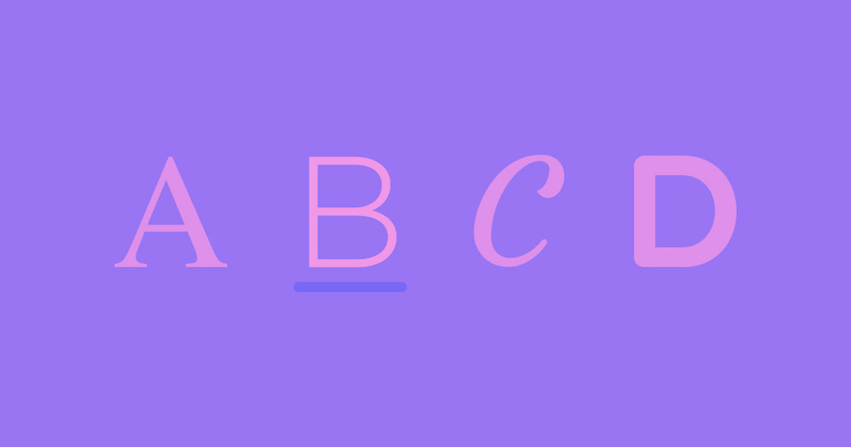
Contrast font styles
There are four main font styles, each of which have their own subtypes:
- Serif – Times New Roman, Georgia
- Sans-serif – Arial, Open Sans, Montserrat
- Script – Great Vibes, Indie Flower
- Decorative – Wingdings
Pairing fonts of different styles, like a serif for headings and a sans-serif for body text, tends to work quite well. It adds richness through differentiation. Pairing fonts not only opens the door to a more expressive and creative font palette, but also introduces a dynamic between the fonts that can set the emotional tone for the site’s design.
When possible, combine font styles from the same "superfamily," such as Museo (serif) and Museo Sans (sans-serif) in the example below. This leads to a more organic differentiation, and is a nice fallback when you don’t want to find entirely separate fonts that pair well.

While we're talking contrast, the simplest way to create contrast between fonts is by having different sizes. Always opt for size differentiation over font differentiation to help maintain aesthetic simplicity. Larger heading text contrasts with smaller body text, which not only helps aesthetically, but also reinforces their relative importance.
Balance readability between header and body text
Headings are generally short and designed to attract attention. With headings, using an "interesting" (i.e., visually complex) font is more forgivable than using such a font for body text — where legibility is of utmost importance.

For body text, it may be tempting to avoid “overused” fonts because you really want your design to stand out. But many fonts are common for a good reason: They have already proven effective across a variety of designs and environments. This often boils down to visual simplicity — e.g., being devoid of fancy ligatures and embossings — which means that they’re easier to read. And as we already learned, legibility is king.
Simply put, a font with more intricacies in its design will be harder for our brains to interpret at a fast pace, and is therefore less suitable for body text, which may contain complex ideas and thousands of words. Make it as easy as possible on your users to consume your primary content.
Test pairings
It can be tiring to download and test out a range of fonts together, so here are some great resources to quickly visualize potential font pairings:
- FontPair — a tool showing a variety of suggested font pairings, allowing for the insertion of custom text for each one.
- typeconnection — a typographic dating game. Answer a series of questions to have your optimized pair suggested to you.
- Just My Type — a series of suggested font pairings.
- Font Combinations — a tool that suggests pairings based on the main (Google) font you'd like to use. You can even preview a simple layout and swap out text to get an idea of what your copy will look like.
Many of the fonts featured on the above sites are available on Google Fonts and Adobe Typekit — many are even completely free to use.
If you’re using Webflow, it's quite fun to preview Google and Typekit fonts within your site settings: If you see a font on Typekit or Google Fonts, you can 100% use it within Webflow. Booya!
If you’re a visual learner, here’s a quick overview of the typographic styling power we provide designers:
Webflow Tutorial for Typography Styling. See more on our Help Center.
Pretty awesome, right? It’s typically easier to experiment with UI tweaks inside a visual web design tool than it is to do so in code.
Bonus! Here’s one of my favorite fonts: Garamond Premier Pro Display. A sophisticated, classy, and legible serif perfect for headings.

Wrapping up
As you can see, typography is truly an art – not a science. If you take it seriously and hone your eye, your sites can become more refined, more professional, and simply more readable. Remember: Experiment with fonts and font pairs before suddenly committing to a design, as the chosen fonts will set the tone for the rest of your design.
Here are a few fantastic sources to turn to for help choosing fonts and visualizing your text:
Now it’s your turn: Which are your favorite fonts? Which sites use typography to its maximum potential? We'd love to see your links in the comments!


The modern web design process
Discover the processes and tools behind high-performing websites in this free ebook.