


Picking the perfect font is never easy. And when your choice could make the difference between a delightful, easy-to-use interface and the new app everybody loves to hate, it only becomes more challenging. Here’s how to pick the right face for your users.
Picking the right font for a user interface poses some unique challenges. After all, you’re not just looking for a typeface that feels on-brand or has punch-you-in-the-face impact.
You’re looking for a real workhorse typeface. A font that performs well across contexts and devices. A face that looks just as pretty set at 72px as it does at 10px. A font that has easily distinguishable capital Is and lowercase Ls.
Why? Because after all that time you’ve spent making your interface clear and easy to use, you don’t want your text—which is there to help people, after all — confusing them instead.
With that in mind, here’s what to look for in a font for your UI.
1. Generous x-height
In typography, x-height measures the distance between the baseline (the imaginary line most letters “sit” on) and the mean height of lowercase letters when you ignore ascenders like the top of the H and T.

Why look at your font’s x-height? Because larger x-heights tend to translate to easier legibility when set at small sizes.
In interface design, you rarely have space for a lot of large-set text, so typesetting is all about striking a balance between text size and legibility. A font with a generous x-height will let you go smaller without becoming illegible.
2. Easily distinguishable letterforms
It really wasn’t designed for small sizes on screens. Words like milliliter can be very difficult to decipher. If you ever had to read or write a password with 1, i, l or I, you know the problem.
–Erik Spiekerman on the difficulties of using Helvetica in user interfaces
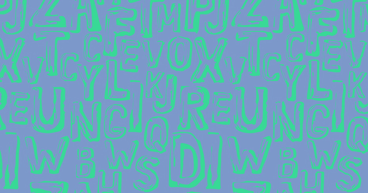
Alphabets enable an astounding range of expression with a very small set of graphical elements. That’s amazing — but the unfortunate side effect is that some letterforms are very easy to confuse, especially when they’re set at smaller sizes.
Here are the most common culprits for letterform confusion:
- a c e o (that’s A, C, E, and O)
- Il1 (capital I, lowercase L, and the number 1)
- O0 (capital O and zero)
This problem can be particularly pronounced in geometric fonts (like Futura, Avenir, Circular, etc.) so think carefully before choosing one of those for your UI.

Next time you’re evaluating UI typefaces, be sure to compare these letters to see how easy they are to distinguish.
3. Overall readability
It’s also important to take a step back from individual letterforms and consider the overall readability of a font at the word level. With a good UI font, you should be able to effortlessly distinguish words.

Comparing Brush Script MT and Source Sans Pro, it’s easy to see that the script font’s complex letterforms require more time and effort to decipher than the sans serif’s relatively simple forms. This comparison also highlights the already-mentioned value of a large x-height — believe it or not, both fonts are set at the same size, yet Source Sans looks huge in comparison.


The modern web design process
Discover the processes and tools behind high-performing websites in this free ebook.
4. Full family flexibility
This isn’t necessarily a must-have — you can design an entire UI with one font — but it’s incredibly useful to have a variety of weights and styles at your disposal. Type designers realized long ago that certain design variations worked better at large sizes than small, and vice versa, which is why you’ll see variant styles of a font like display, caption, condensed,etc.

So if your UI will include a variety of content types such as labels, help text, captions, and headlines, it’ll be incredibly useful for your font to support all those different sorts of text. It’s a bonus both for other designers on your teams and for your customers, as it allows you to use type expressively without risking a loss of cohesion in your designs.
You can even go a step further and look for a superfamily, a font that includes multiple font styles, like a serif, a sans serif, and a monospace. That takes your options for expressive typography even further while still allowing for a very harmonious feel.
A classic example is Luc(as) de Groot’s Thesis superfamily, which currently includes a serif, a sans, a hybrid serif/sans, a monospace, a hairline, and an Arabic.
5. Fitness for your purpose
Many fonts were designed with a particular usage in mind, so it pays to pick a font built to fit your site’s purpose.
For example, sans-serifs have practically become the go-to for task-focused user interfaces. But if you’re building an app focused on reading, you might want to go with a serif typeface instead, as long association has made that font classification the standard. In that same vein, if you’re building a news site, you’ll probably want to pick a serif face with headline, caption, and body copy variants — and maybe a sans-serif family member for UI and metadata elements.
It’s also worth noting that studies have shown that serif typefaces are considered more trustworthy — i.e., people tend to find statements written in a serif more credible than the same statement printed in a sans.
Beyond that finding, though, it’s worth noting that there’s no scientific backing for the common claim that serif fonts are better for long-form reading. It’s more likely that serifs are perceived as more “on-brand” for long-form reading, as they continue to be the (overwhelmingly) dominant font type for books.
6. Brand alignment
Finally, and very importantly, you want to make sure your UI font aligns with your site’s overall brand.
If you’re all about quirky, fun content, an eccentric font might be just the thing — just remember that quirky letterforms can be suboptimal in user interfaces. But if you’re gunning for the respectability of a New York Times, you’re going to want to go serif all the way. Unless, of course, you’re trying to reinvent the concept of news — in which case, go ahead and get sans-y with it!
You can usually get a strong sense of a font’s “brand” and how it relates to your site’s brand with just a look. But you don’t want to limit this evaluation to yourself: because your response to a font is subjective, you’ll want to ask others how they respond to your potential choices.
You might also want to look into the font’s history — the context in which it was built, and the purpose the typographer was trying to fulfill in creating it. If you’re building a feminist literary blog, Mrs. Eaves would be a very apt choice. Blogging about life in San Francisco? Lost Type Co-op’s Mission Gothic and Mission Script could make the perfect pairing.
Just don’t go too far with these associative choices: your Japanese restaurant site does not need a faux-Japanese-calligraphy font. Nor does your client site on ancient Egyptian hieroglyphics call for … Font-That-Shall-Not-Be-Named.
What are your favorite UI fonts?
We’d love to hear what your favorite UI fonts are — and why. So let us know in the comments!