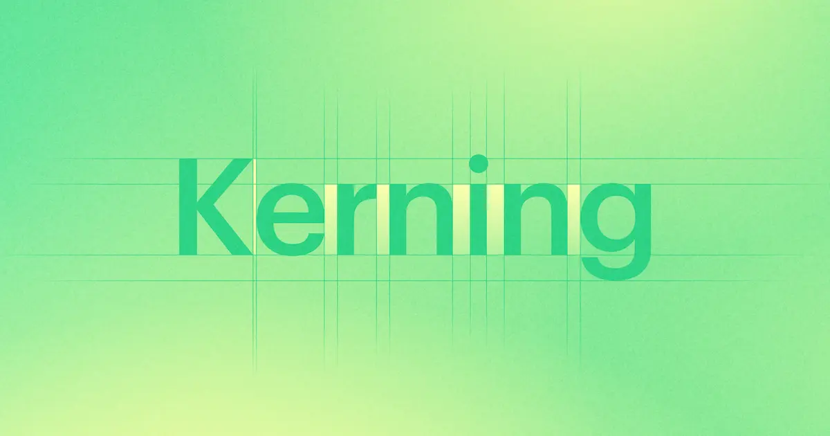


Kerning is an essential aspect of typography that can make or break your design.
As Robert Bringhurst said in The Elements of Typographic Style, "Good typography is partly a matter of good taste, but it is also a matter of following rules that have been developed over centuries. Kerning is one of those rules, and it can make all the difference between a readable and unreadable text.” In short, kerning involves adjusting the spacing between individual letters or characters to achieve an optimal visual appearance.
But what is “optimal"? To answer that question, let’s dive into an introduction to kerning, including what it is, why it's useful, types of kerning, and tips on how to use it effectively.
What is kerning?
In typography, kerning is the process of adjusting the spacing between individual letters to create a more visually appealing result. The goal of kerning is to achieve consistent visual spacing between letters, regardless of their shape or size. It is used to create a more harmonious and balanced look and feel, and can be applied to any font or typeface.
Over the years, designers have used several different definitions of kerning, depending on their area of expertise or need. For example, graphic designers may define kerning as the process of adjusting the spacing between letters to make a word or sentence look more visually appealing. On the other hand, web designers may define it as the process of optimizing the spacing between letters for web-based applications and devices.
Why is kerning useful?
Some say that kerning can make your final design more aesthetic. But Jim Krause in Design Basics Index suggests, “Kerning is not just about aesthetics, but about legibility and readability. It's about finding the right balance between letters, so that they work together to communicate a message.” Kerning is useful for various practical purposes, such as improving readability, creating typographic hierarchy, and improving the overall design.
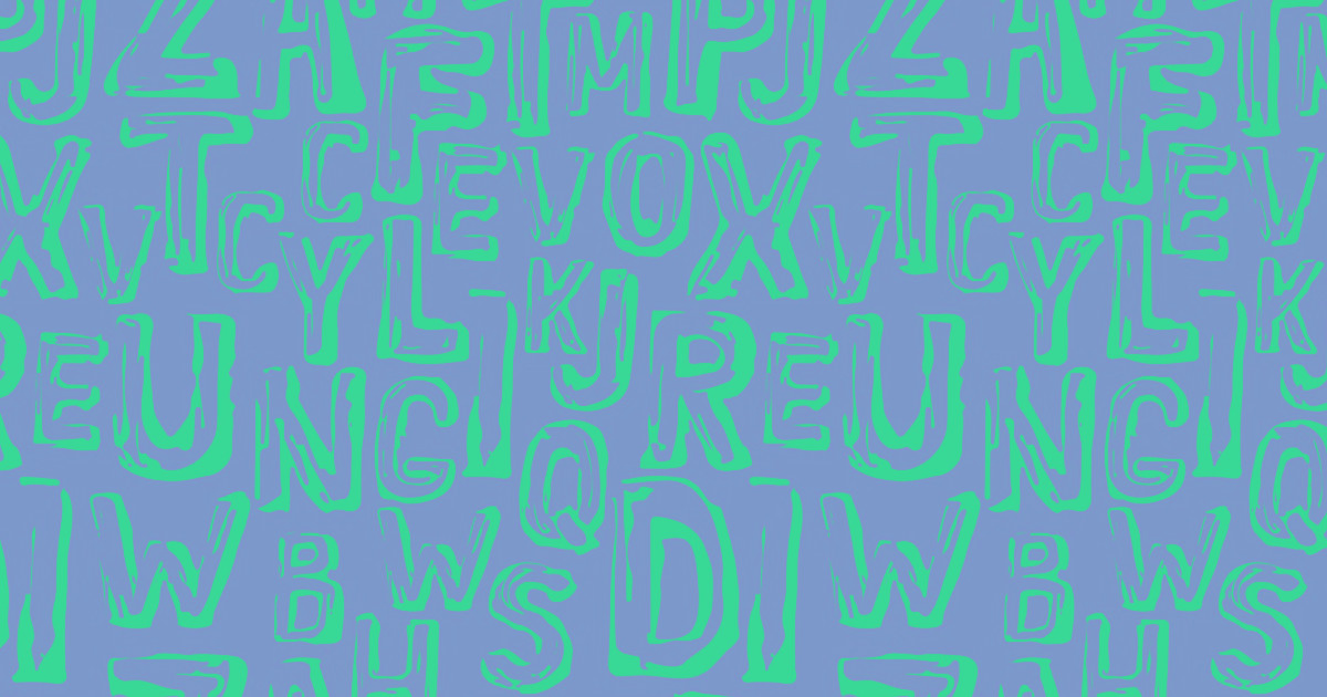
Here are some examples of bad kerning from r/badkerning:

Kerning is essential for headlines, typographic logos, signage, and other designs that require high levels of legibility. It is particularly important in designs where text is the primary visual element, such as posters or advertisements. And when done well, kerning can help create beautiful, polished designs.
Types of kerning & kerning tools
There are several types of kerning that designers can use. Plus, there are several powerful tools that are built into software that can help any designer tinker around with typefaces.
Manual kerning
Experienced designers who have honed their kerning skills for years may use manual kerning, which involves adjusting the spacing between individual letters manually. This type of kerning is often used for headlines, logos, and other designs where precise control over the spacing is necessary.
Manual kerning can be a time-consuming process, but it can also help designers achieve a more precise and polished look. To manually kern your text, select the text tool in your design software, click between two letters, and use the arrow keys on your keyboard to adjust the spacing as necessary.
Optical Kerning
Optical kerning is a type of kerning that adjusts the spacing between letters automatically based on their visual appearance. This type of kerning is based on the perceived space and shape of the letters rather than their actual size. This technique can be especially useful when working with a large block of text as it saves you from manually adjusting spacing between individual letters.
To use optical kerning, select the text tool in your design software, highlight the text you want to adjust, and select the optical kerning option from the typography or character settings.
Metric kerning
Metric kerning is a type of kerning that uses predefined spacing values based on font metrics. This type of kerning is usually the default in design software and is often used for body text. If you’re not sure how to start kerning, this would be your go-to type to study the “rules.”
Contextual kerning
Contextual kerning is a type of kerning that adjusts the spacing between letters based on their context within a word. This type of kerning is particularly useful for ligatures and other special character combinations. For those who aren’t aware, ligatures are when two or more characters are combined into a single glyph or symbol. This is often done for aesthetic or legibility purposes, as it can improve the spacing and appearance of the text. It helps the words flow smoothly.
In Thinking with Type, Ellen Lupton provides numerous examples of kerning, including the word "LOVE LETTERS." In this example, the kerning between the VE is adjusted so that the diagonal stroke of the V isn't so noticeable, creating a more even visual rhythm.

Automatic kerning
Automatic kerning is a type of kerning that is applied automatically by design software. This type of kerning is based on predefined rules and can be adjusted by the designer.
Kerning tips
Kerning can be a challenging skill to master, but there are some tips that can help most designers start experimenting.
Letter combinations
Some letter combinations require more attention when kerning to achieve optimal results. These include letter combinations such as VA, WA, AV, AW, TO, TY, and WA, which have slants in the characters. These letter combinations often require adjusting the space between the letters to prevent them from appearing too cramped or too loose. This can also happen between round letters. Especially when working with the English language. Other problematic letter combinations include:
- Letters K, W, Y, F, L, and T
- Words spelled in capital letters
- Uppercase combined with lowercase letters
In some other languages, this problem transfers to other letters or ligatures. Some examples include:
- In French, the language uses many accented lowercase letters, such as é, è, ê, and à. Kerning is important in French to ensure that these accents are properly spaced and aligned with the letters they are modifying.
- In German, the language makes frequent use of diacritical marks such as umlauts (ä, ö, ü) and the Eszett (ß). Kerning in German involves adjusting the spacing between these characters and the letters they are attached to.
- In Chinese, the characters do not have individual letter forms, but rather consist of complex combinations of strokes. Kerning in Chinese involves adjusting the spacing inside the characters themselves, in order to create a visually pleasing and easy-to-read text.
- In Arabic, the cursive script requires careful kerning by font designers to ensure that the letters connect properly and that the text is legible. Kerning in Arabic involves adjusting the space between each round letter, depending on its position in the word and the letters that surround it.
Over and under-kerning
Over-kerning is when the space between letters is too tight, causing the text to appear cramped and difficult to read. Under-kerning is when the space between letters is too loose, causing the text to appear disjointed and unbalanced. It's important to find the right balance between these two extremes to achieve optimal results. As designer Tobias Van Schneider says in this piece, "Designers with experience know that half of excellence is simply a love for detail...they perfect spacing and kerning on every page, for every screen size.They don’t overlook tiny elements and interactions like link states and favicons."
Spacing in text blocks
The space between letters is not only influenced by the individual letters themselves but also by the shape of the text block. For example, a curved text block may require more negative space between letters than a straight text block. It's important to consider the shape of the text block when adjusting the kerning so that it doesn’t hurt aesthetic sensibilities, or just look visually off.
Font sizes, font weights and spacing
Font size can have a significant impact on kerning. As font size increases, the space between letters needs to increase as well to maintain legibility. The larger the font size, the more space there is between letters, and this can make kerning less noticeable. Conversely, smaller font sizes require more attention to kerning to ensure that the spacing between letters is legible and visually pleasing. Additionally, font weight can affect kerning. Bolder, heavier fonts may require more space between letters to maintain legibility, while lighter fonts may require tighter kerning to avoid gaps or inconsistencies in spacing.
Print it and flip it
To get a better sense of the kerning, it's often helpful to print out the text or flip it horizontally (upside down). Looking at the same letters outside of the normal context can help one see the text from a different perspective and identify any issues with the spacing between letters.
Kern at the end
The rule of thumb says, kerning should be the last step in the design process, after all other elements have been finalized. This will ensure that the kerning is adjusted to the final design appropriately and not based on preliminary sketches or layouts. It also ensures that it’s not too much or too little. But it's important not to overthink it. As the father of type Jan Tschichold once said in his book, The New Typography: a Handbook for Modern Designers, “Perfect typography is certainly the most elusive of all arts. Sculpture in stone alone comes near it in obstinacy.”
Kerning resources for amateur designers
There are several resources available to help designers improve their kerning skills, including online games, built software tools, and tutorials.
- KernType: One popular typographic kerning game called "KernType," is a fun activity for newbie designers. This game challenges players to adjust the spacing between letters to achieve superlative outcomes.

- Kerning pairs: This is built into design software such as Adobe InDesign. Kerning pairs are pre-set adjustments that software programs make to the space between specific pairs of letters. You can access these pairs in the typography or character settings of your design software, and adjust them as necessary to improve the overall look of your text.
- Tracking: Tracking is a tool that allows you to adjust the overall space between all the letters in a word or sentence. This can be useful if you have a block of text that looks too tight or too loose. To adjust tracking, select the text tool in your design software, highlight the text you want to adjust, and use the tracking settings to increase or decrease the space between letters.
- Typewolf: Reviewing the work of others is a great way to learn about typesetting. This website provides a collection of typography inspiration and resources, including articles on kerning techniques.
- Adobe Creative Cloud: Adobe's suite of design tools includes resources and tutorials on typography and kerning.
- Design Cuts: This website offers a range of design resources, including tutorials on character spacing, typography, and kerning.
- Skillshare: This online learning platform offers courses on graphic design, as well as classes specifically on typography and kerning.
- Fonts In Use: This website showcases typography in use in real-world designs, providing examples of kerning techniques in action.
- Webflow University has free lessons such as Advanced web typography
Alternative ways to improve kerning and spacing skills
Ellen Lupton suggests in Thinking with Type that "Kerning is the secret ingredient that takes typography from ordinary to extraordinary. It's what gives text that perfect balance and flow." And this is why approaching kerning from a different perspective is often a crucial step to avoid bad kerning. So, if you’re just starting out, here’s what you can do:
- Analyze professional designs: Take a closer look at designs created by design veterans, paying attention to how the letters are spaced and balanced. This can provide valuable insight into effective kerning techniques.
- Experiment with different fonts: Try working with different fonts and adjusting the amount of space to see how the relationship between letters can affect the overall look and feel of the design.
- Use a grid system: Consider using a grid system to help guide your kerning adjustments, ensuring that letter spacing is consistent and balanced.
- Collaborate with other designers: Working with other designers can provide valuable feedback and insights into effective kerning techniques, as well as opportunities to learn from others' experiences and knowledge.
And lastly, sometimes stepping away from a design for a little while can provide a fresh perspective and renewed focus. This can help you to see kerning issues that may have previously gone unnoticed because you’ve looked at them too long. With practice and attention to detail, designers can master the art of kerning and create designs that stand out and communicate their message effectively, and we hope you’re on your way to mastering it already!


Get our 100 video course on web design — for free
From the fundamentals to advanced topics — learn how to build sites in Webflow and become the designer you always wanted to be.