Familiarizing yourself with the typeface versus font distinction helps avoid misusing these terms. People often use them interchangeably, but there are critical differences between the two.
Arial, Helvetica, Courier New: Are they fonts or typefaces? If you ask a typographer and a developer this question, they’ll most likely give you different answers. To untangle the meanings of “font” and “typeface,” we must closely examine how professionals in relevant fields use them.
Web designers straddle the worlds of graphic design and computing, so understanding how professionals from both worlds understand the difference between a typeface and a font opens the door to more effective website design and development.
Key differences at a glance:
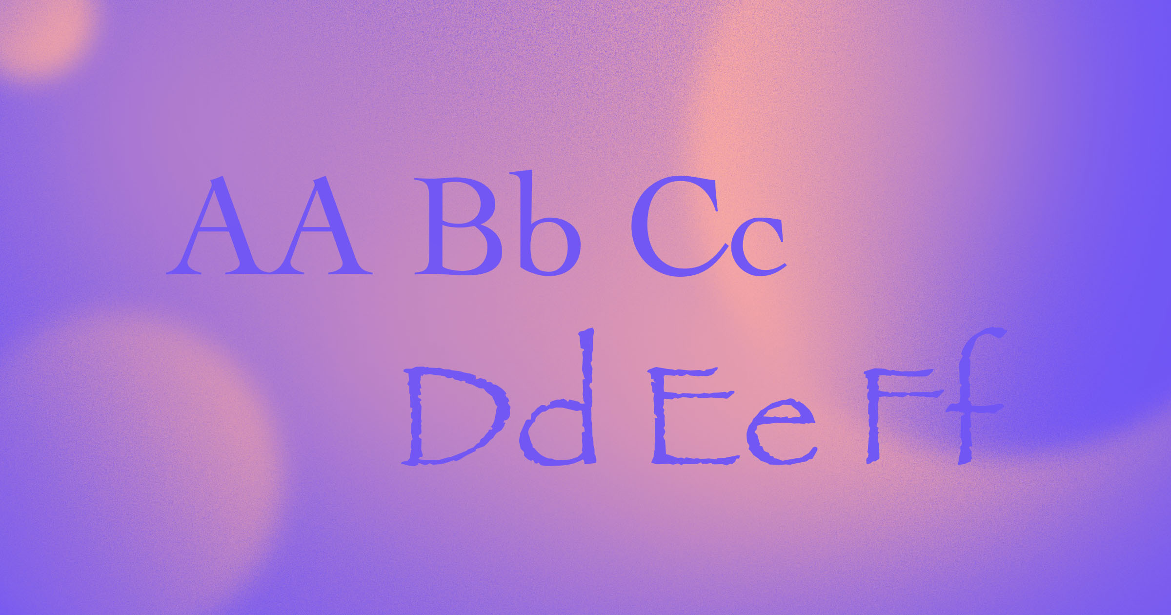
- A typeface is a complete family of designs (regular, bold, italic, etc.).
- A font is a specific weight or style within that family.
- In computing, a font is also a digital file containing style information.
What is a typeface?
A typeface is a collection of characters (often called type families)that share distinctive design features like spacing, height, angles, or serifs.
Each typeface has a unifying concept or design goal — designers who create a typeface for body text aim to maximize legibility. When designing a typeface for headings, they focus more on conveying a particular feeling or impression than optimizing readability because headings add visual interest and capture attention.
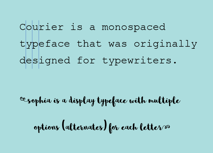
The Courier typeface served several goals. It was embraced by programmers for monospacing and is now standard for screenplays. Sophia, in contrast, adds a decorative flair for headings rather than body text.
Serif typefaces
The first typefaces designed for the printing press had serifs, or small decorative lines or strokes, added to the ends of characters. Serifs aim to increase legibility, especially in print and at smaller sizes, though it’s unclear whether they make a significant difference in practice. Because of their historical association with books, serif typefaces communicate trustworthiness, authority, and formality.
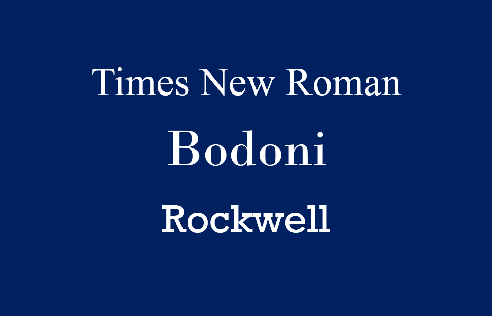
Serif typefaces come in a few different styles. Old-style typefaces, like Times New Roman, have bracketed serifs with a gradual transition between the serif and the character. Didone typefaces, like Bodoni, have characteristically thin and unbracketed serifs that contrast with the heavy vertical strokes of the characters. And slab serif typefaces, like Rockwell, have thick, unbracketed serifs.
Sans-serif typefaces
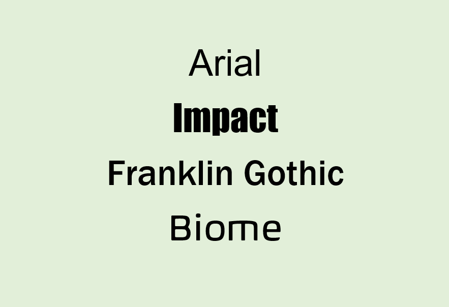
The first typefaces without (sans) serifs emerged in printing in the early 1800s, but sans-serifs weren’t popular in body text until around the 1950s. In the early stages of sans-serifs, they were all bold and condensed uppercase letters that many people considered ugly or malformed — that’s why when you see typeface names like “gothic” or “grotesque,” you know they’ll be sans-serifs.
Display typefaces
Typeface designers develop display typefaces for logos, headings, and other eye-catching text elements. These decorative typefaces aim to capture the look and feel of the brand they’re working with.
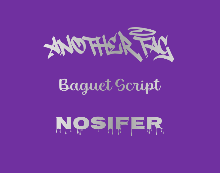
Wall-scrawl typeface Another Tag, script typeface Baguet Script, and all-caps typeface Nosifer are examples of display fonts. When used sparingly, these typefaces impart a distinctive look to designs that give them a unique visual impact. For example, integrating a graffiti typeface can lend a street-art aesthetic to urban-themed designs.
Typefaces designed for accessibility
These typefaces aim to help more readers and viewers engage comfortably, whether they have visual differences, reading challenges, or other needs.
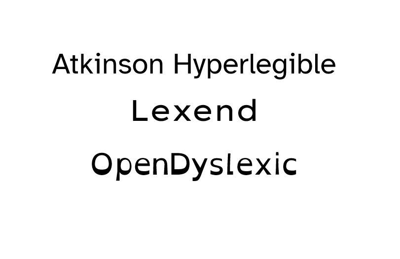
Atkinson Hyperlegible, Lexend, and OpenDyslexic are typefaces striving to improve accessibility.
The creators of Atkinson Hyperlegible designed it specifically for people with visual impairments, incorporating features such as increased spacing between letters, exaggerated letterforms, and selective serifs. For example, the serifs are visible on the “i” and “l,” but not the other letters.
Lexend comes in several versions with different degrees of spacing between the characters and was designed to help struggling readers. And the OpenDyslexic letterforms have a gravity effect that prevents dyslexic readers’ brains from mentally flipping around the letters.
So we know that typefaces are families of characters with a unifying design concept that might include legibility, decoration, and accessibility. Now let’s talk about fonts.


Ultimate web design
From 101 to advanced, learn how to build sites in Webflow with over 100 lessons — including the basics of HTML and CSS.
What is a font?
The word “font” has two different meanings. In typography and graphic design, a font is a specific size and style of a typeface. In computing, it’s a type of digital file. Understanding where these definitions come from will help you keep them straight.
Fonts in typography and graphic design
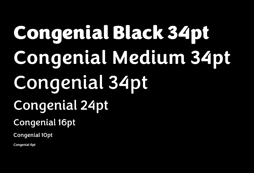
For typographers, a typeface is a family of different sized and weighted fonts. For example, Congenial is a typeface, while Congenial Medium 34 point is a font. Typefaces are often called type families or font families.
To understand this terminology, it helps to think back to manual typesetting. Typesetters couldn’t scale up the size of letters with the click of a button as we can today. Instead, they had to swap out one set of letters for another larger or smaller than the original.
The word “font” is based on the French word “fonte,” meaning “casting,” because type founders cast each set of letters from melted metal. Manual typesetting also gave us the words “uppercase” and “lowercase”: Typesetters kept the uppercase and lowercase letters in separate wooden cases, usually storing the capitals in the upper case.
Fonts in computing
In computing, a font is a file that holds the data required to represent the typeface on a screen or in desktop publishing. If you download a font and store it locally, it’s usually an OTF or a TTF file.
If you’re a web designer, downloaded font files aren’t all that useful. You might download a beautiful display font to your device, but if your users haven’t downloaded the same font, it won’t show up for them.
Instead, you have two choices. You can work with web safe fonts installed by default on most devices, like Arial, Georgia, Impact, and Times New Roman. Or you can use a web font — one hosted on the web, either on your site or a third-party hosting service like Google Fonts or Adobe Fonts. Web fonts are usually in WOFF or WOFF2 format.
Many foundries charge a monthly or annual fee, or link costs to page views. Always check license details so you understand your usage rights.
Some fonts go beyond preset regular, bold, and italic letter shapes. Variable fonts allow almost complete flexibility in weight, width, slant, and other features. That means you can create your glyphs as bold, italic, or both.
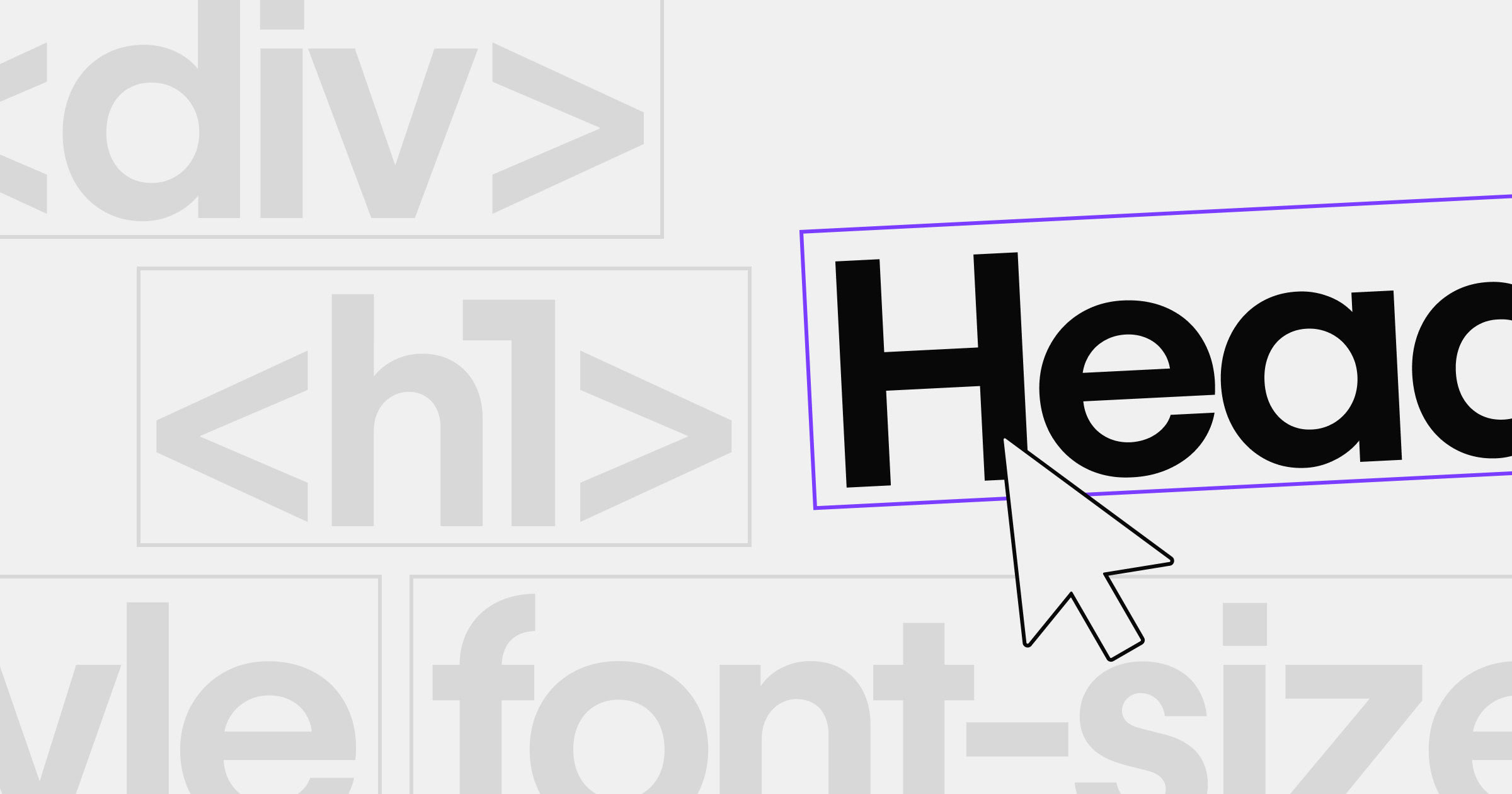
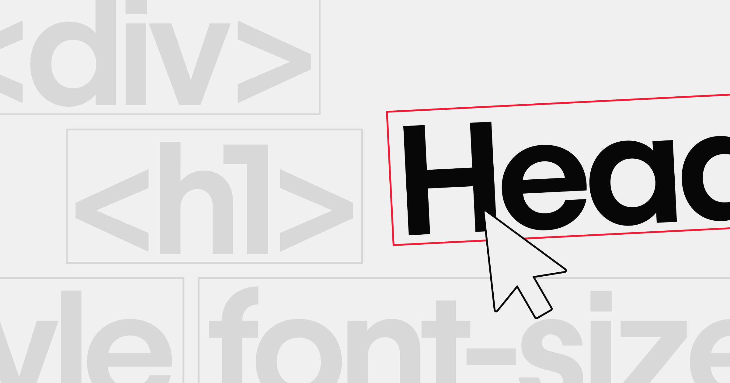
When choosing a typeface family in your design tool, you'll select fonts (like “Arial Bold” or “Arial Italic”) to convey different emphasis. If you’re coding, you might reference those fonts in CSS, ensuring style consistency across your site.
Do the differences matter?
Many designers and developers use these terms interchangeably, but paying attention to what “typeface” and “font” each refers to can shape your design clarity. This clarity helps you communicate effectively with clients, co‑workers, and even automated systems.
Using fonts and typefaces in your designs
While knowing the precise meanings of font and typeface won’t necessarily affect your web and graphic designs, it can help you work more effectively with people in different technical fields.
If you’re new to typography basics, start by identifying the visual goals of your site or brand. Once that’s clear, choose a typeface family that aligns with those goals. Then, experiment with specific fonts to reinforce your message.
To check out other designers’ typographic design choices, browse our list of the 11 most popular fonts for web design. If you’re feeling inspired, you could even design your own typeface — all you need is a font generator and a great design concept.
Build websites that get results.
Build visually, publish instantly, and scale safely and quickly — without writing a line of code. All with Webflow's website experience platform.