


All-caps fonts are a gamble. They can create stunning visual effects and add visual energy — or turn off visitors altogether.
That’s why if you’re considering an all-uppercase strategy, choosing the right script is a crucial design choice. But with so many options, picking the best font can be daunting.
We’ll show you some of our favorite all-caps fonts and explore how to navigate accessibility issues that uppercase letters can present. But first, let’s go back in time to the origins of capital letters.
What are the origins of uppercase text?
Capital letters are a quirk of the Latin alphabet — many other writing systems do just fine without them. To understand why designers have to manage two separate sets of characters, it’s worth doing a whirlwind tour through typological history.
If you were a fourth-century BCE Roman engraver (arguably the ancient version of a graphic designer), your inscriptions would be in all caps. That’s because capital letters were the alphabet — the Romans had no lowercase letters.
A classic example is the inscription on Trajan’s Column, a monument commemorating Roman emperor Trajan’s victory in the Dacian Wars, from 113 CE.
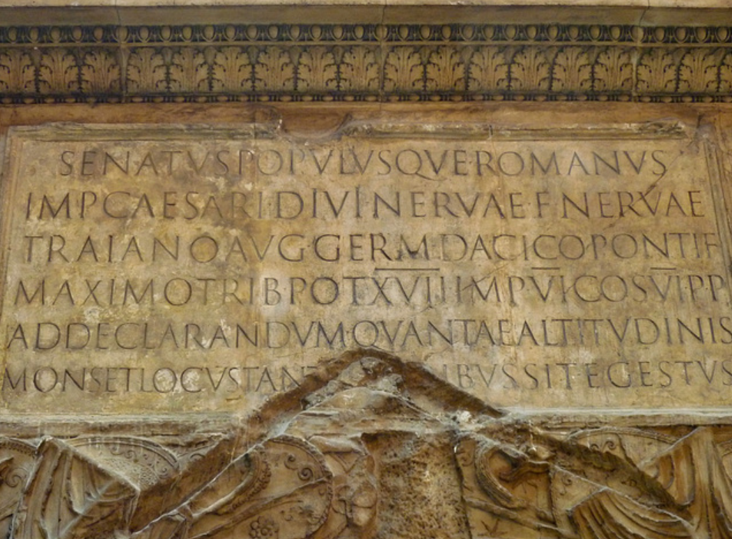
The angular letters suited the Romans because they were easier to carve into hard surfaces like stone and marble. As writing methods evolved, the alphabet changed to match: Curved letters became more prevalent as ink and parchment made it easier to write them quickly.
These days, most writing happens on keyboards and device screens instead of chisels and stones or quills and parchment. Nevertheless, uppercase and lowercase characters still help effectively guide the eye from one sentence to the next and differentiate proper nouns from their common counterparts.
On websites, all-capital fonts still carry some of the gravitas of a Roman inscription: They grab the viewer’s attention and firmly anchor a user’s journey around the site. But if you use all-caps text, doing it correctly is a must. Otherwise, you risk overwhelming the reader — or losing them altogether.
Should you use a true all-caps font for accessibility?
When it comes to accessibility, all-caps text can be a double-edged sword. Current best practice for website fonts is to avoid using all caps for long stretches of text, especially body text. That’s because it slows down reading for many and is harder for people with dyslexia and other cognitive processing disorders to read.
On the other hand, all-caps text is more legible for people with visual impairments when reading directly from the screen. But if people use assistive technologies, screen readers may interpret the all-caps text as an acronym and read it letter by letter, leading to misinterpretation and frustration.
Typographers often argue that lowercase letters are inherently easier to read because they create less uniform word shapes, but their readability is more likely down to practice. While the ease of reading lowercase compared to uppercase letters remains controversial, its impact on design choices is subject to debate.
Ultimately, choosing a letter case depends on various design considerations and goals, including the project’s tone and style, the target audience, and the message the designer aims to communicate. All caps may signal urgency and importance, for example, or depending on the font, a more traditional and professional appearance.
How to use all-caps fonts
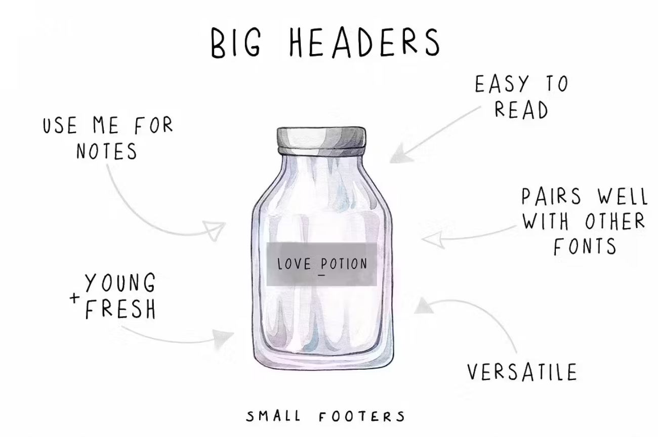
Remember, balancing visual impact with a practical user experience (UX) is an important consideration when using all caps. Good UX design is smooth, so it’s best to limit capital letter fonts to short bursts of text you want to call attention to, like logos, headings, and call-to-action (CTA) buttons. Keep all-caps headings brief and avoid overusing swash characters, which can seem visually busy.
To ensure a clean and polished look, use a true all-caps font instead of capital letters from a regular font such as Arial or Helvetica. Uppercase and lowercase letters from regular fonts complement each other in size and style, but using only uppercase letters from them can result in disproportionate and clashing characters. True all-caps fonts often come in two sets — embellished, with decorative flourishes or serifs added, and plain, without any adornments — that you can mix and match to add visual interest without overstimulating the viewer’s eye.
10 diverse all-caps font styles to suit a range of design needs
This list of some of our favorite all-caps fonts includes several free options, while others require licenses for commercial use. The cost of a commercial web license usually depends on the number of people using the font and the site views per page.
1. Azonix
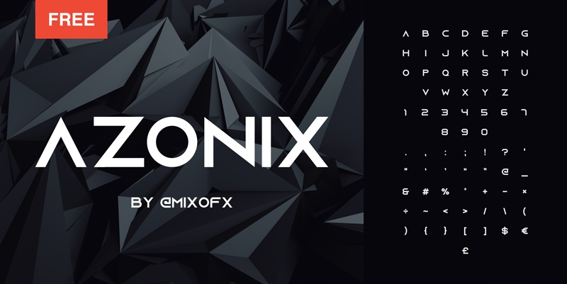
Azonix’s clean and angular design delivers a futuristic and sci-fi feel that aligns well with brands related to technology and innovation. The letterform’s sharp corners and lines evoke precision and efficiency, making it a compelling choice for communicating technical competence, for example, in climbing equipment or home appliances.
Azonix is free for personal use, and web licenses are available for purchase.
2. Bebas Neue
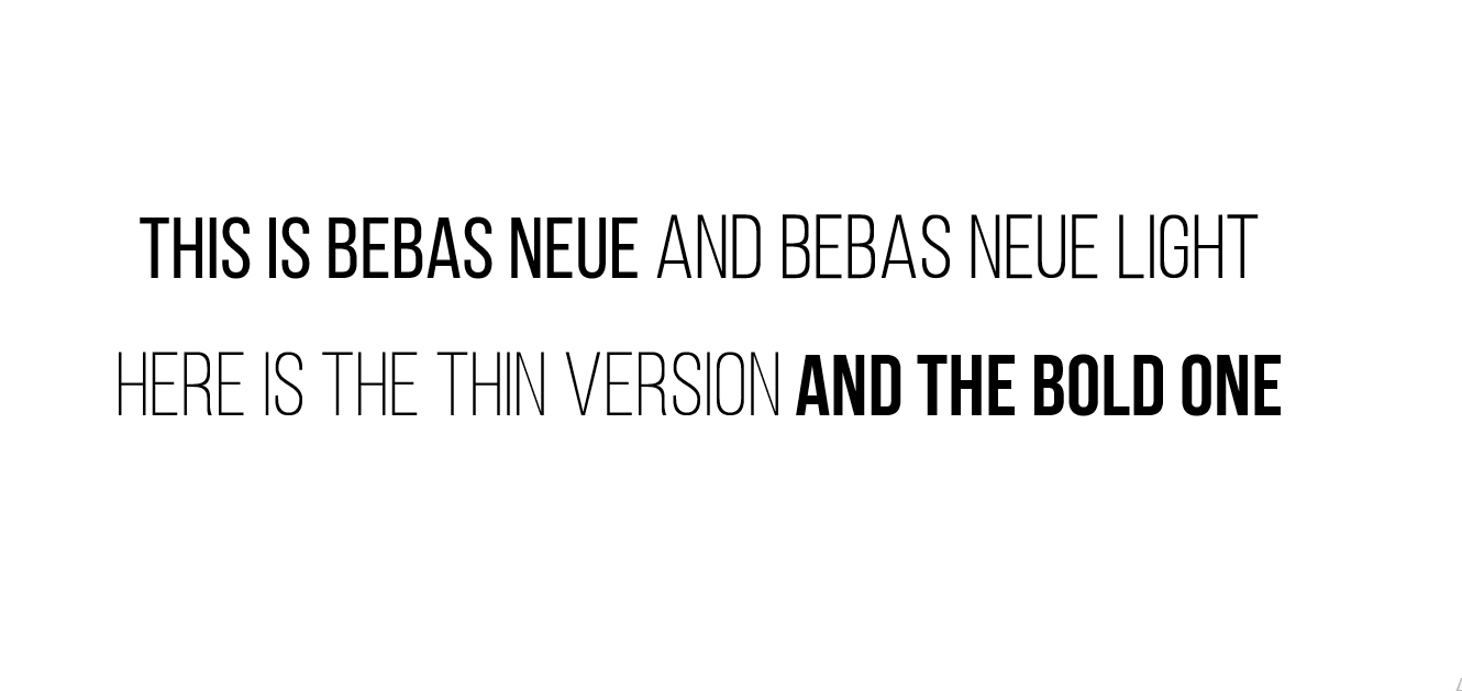
Bebas Neue is a versatile sans-serif font that’s bold yet friendly. The narrow lettering is ideal for designs where space is limited, allowing you to fit more text in a smaller area. It comes in a range of weights that you can use together to create a visual hierarchy, allowing you to emphasize certain words and elements while maintaining a consistent look and feel throughout the site.
Bebas Neue is a Google Font, which is free for personal and commercial use.
3. Black Drama
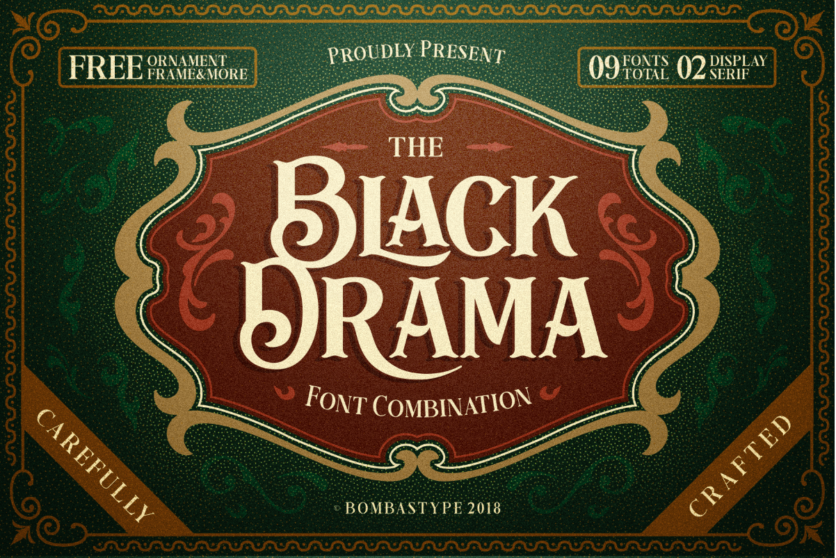
Black Drama’s antique, rustic style evokes old-time saloons and the Wild West. The beautifully crafted serifs, swashes, and ligatures add elegance and sophistication, while the alternate glyph options lend versatility and personality to the design. The complete font package includes two display options with plain and italic sets for characters, with additional rough versions that give a faded woodblock effect.
Black Drama is free for personal use. Commercial licenses are available for purchase.
4. Love Potion
Love Potion is a handwriting font with an imperfect, organic quality that inspires a youthful, rough-around-the-edges vibe. The irregularity and inconsistency of the letters offers a more human and approachable touch that connects with customers on a personal level. It likely suits natural beauty products and childcare brands.
Love Potion is available with a subscription to Envato Elements.


Get started for free
Create custom, scalable websites — without writing code. Start building in Webflow.
5. Milk & Clay
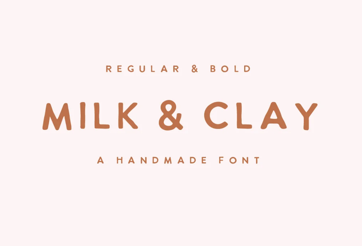
With its wide spacing and handcrafted aesthetic, Milk & Clay conveys an artisanal quality, as if sculpted by hand from pottery or dough. The script’s soft curves and subtle irregularities add naturalness, simplicity, and warmth to a design, which can appeal to restaurant logos, food packaging, or ecommerce sites selling crafts or natural products.
Milk & Clay licenses are available for purchase from Creative Market.
6. Permanent Marker
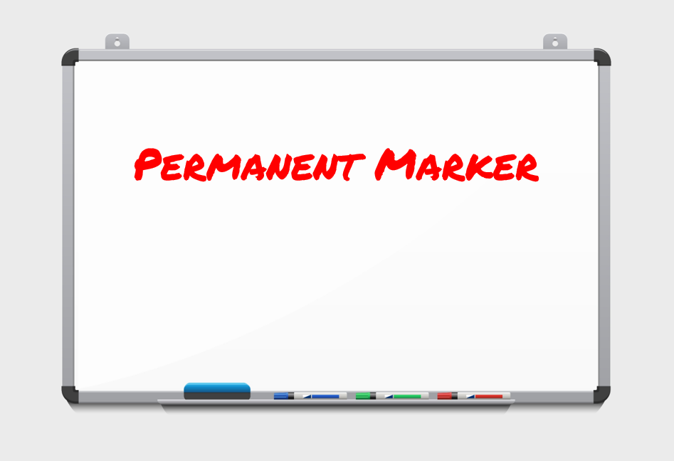
The Permanent Marker character set harkens back to school whiteboards, graded papers, and brainstorming sessions. Despite the small spacing between the letters, this bold font remains highly legible, making it an excellent choice for longer titles. It matches school-related products and services that involve hands-on feedback, like tutoring or consulting.
Permanent Marker is a Google Font that’s free for both personal and commercial use.
7. Porta
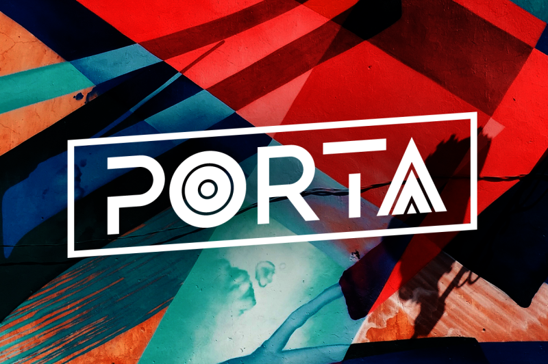
Porta is a creative geometric font with multiple glyph options for customization, allowing you to mix different styles to strike a balance between uniqueness and readability. Stylish and trendy while boasting exceptional readability, this stylish script is ideal for websites related to sports, the outdoors, art, and design.
Licenses to use Porta are available for purchase from The Hungry JPEG.
8. Primrose Gardens
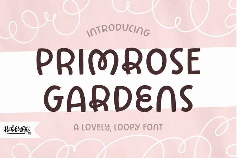
Primrose Gardens’ curved and curly letters create movement and fluidity, giving it a playful, carefree personality. The set includes a base set of curved letters plus curly options for B, E, K, M, R, W, and Y. This font’s fun nature makes it fit well for casual clothing brands, outdoor cafes, and brands that want to express warmth and openness while adding a touch of positivity and whimsy to their messaging.
You can buy a license to use Primrose Gardens from The Hungry JPEG.
9. Primus
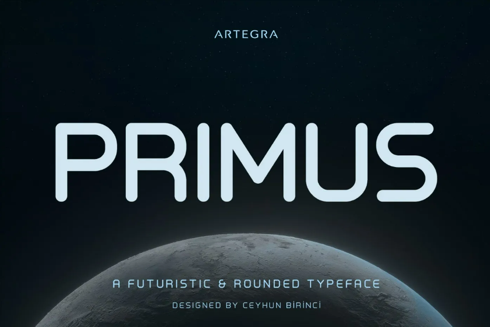
Primus combines legibility with a futuristic style. Its rounded square shapes suggest themes of computing and space-faring travel. The clean and simple design makes it a versatile font applicable in various design contexts. Still, it’s likely most at home capturing the essence of forward-looking, tech-focused brands.
Primus Light is free for personal use. To get access to the whole Primus family, you’ll need to buy a license.
10. Trajan Pro
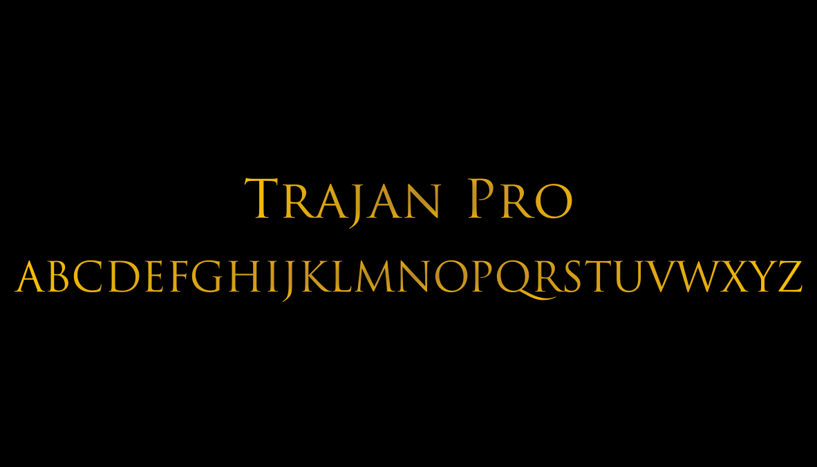
We’ve returned all the way back to the ancient Romans: Trajan Pro is an elegant serif typeface with letterforms based on the Latin inscription on Trajan’s Column. This classic font exudes gravitas and dependability, making it a good choice for brands related to safety equipment and health services. It also radiates a grand and epic air reminiscent of ancient legends and heroic tales, making it a top choice for story-based games and fiction book covers.
In an interesting twist, Trajan was a staple of movie posters in the 1990s and 2000s, appearing on promotional material for movies like The Bodyguard and Crouching Tiger, Hidden Dragon. (But not Gladiator, ironically.)
Trajan comes as part of an Adobe Creative Cloud subscription. Want a more accessible option? Google Font’s Cinzel, also based on ancient Roman inscriptions, is free for personal and professional use.
Using all caps: Pro tips
Typefaces should enhance the message, not distract from it, and in most cases, that means avoiding overly gimmicky fonts that call attention to themselves. Consider the overall design and style of the website or project, and choose a typeface that complements and reinforces the design objective and brand identity. When in doubt, user research can help you decide between different options.
Other advanced tips for using uppercase fonts include:
- Pay attention to letter spacing. All caps in big sizes are usually easy to read, but in smaller sizes, they benefit from bigger spaces between letters. Adjusting the kerning, or the spaces between individual letters, helps make all-caps text more readable.
- Pair them with highly readable body text. Font pairing is an art in itself, and it’s even more critical when you know one of your typefaces will slow readers down. Draw people’s attention with all-caps headings, but then give them a break by using a highly legible typeface for the body text and styling it for maximum readability.
- Improve screen reader accessibility by using styles. To prevent screen readers from reading all-caps text letter by letter, the American Psychological Association recommends typing the text as normal and then applying text effects or styles to make it appear in all caps.
- Develop workarounds for fonts that aren’t web safe. Web-safe fonts are typefaces that come with most devices by default and are safe for websites as they are less likely to render incorrectly. If your all-caps script isn’t web safe, consider using it in an image or animation instead of as text — but be sure to add alt text to the image so the words are still accessible for screen readers.
- Check for special characters and punctuation. Typographers create all-caps fonts with headings in mind, so if you need special characters or punctuation, make sure the set includes them before paying for a commercial license.
- Consider alternatives. If you come across a commercial-use font you love but it’s over budget, use What Font Is to find other options with a similar aesthetic.
From Roman inscriptions to custom fonts
All-caps fonts, when mindfully applied, add variety and visual impact to web designs.
If you’re inspired to try an all-caps typeface but nothing on this list quite fits, you can look at the all-caps options on our list of cool fonts, explore these places to find freebies, or even create your own all-caps script using a generator (including Webflow's font generator).
To add your new all-caps text to a Webflow project, upload it as a custom font so you can test it, edit it, and then show it off when you launch the site. Get started building your next website with your eye-catching all-caps font with Webflow’s visual site builder today.


.jpeg)