On March 11, 2017, Jen Simmons — Designer Advocate at Mozilla and all-around layout genius — fired off two epic listweets (am I going overboard with the portmanteaus?) that perfectly captured two different approaches to the web design process.
To explore these two distinct approaches — and the seismic shift in process we’re currently experiencing — I’ll borrow Jen’s own terms, but propose a different view of her #howidoit tag for the second approach. And then I’ll show how Webflow can be used for either approach — but how it truly thrives in an emerging take on the design process.
The “normal” process
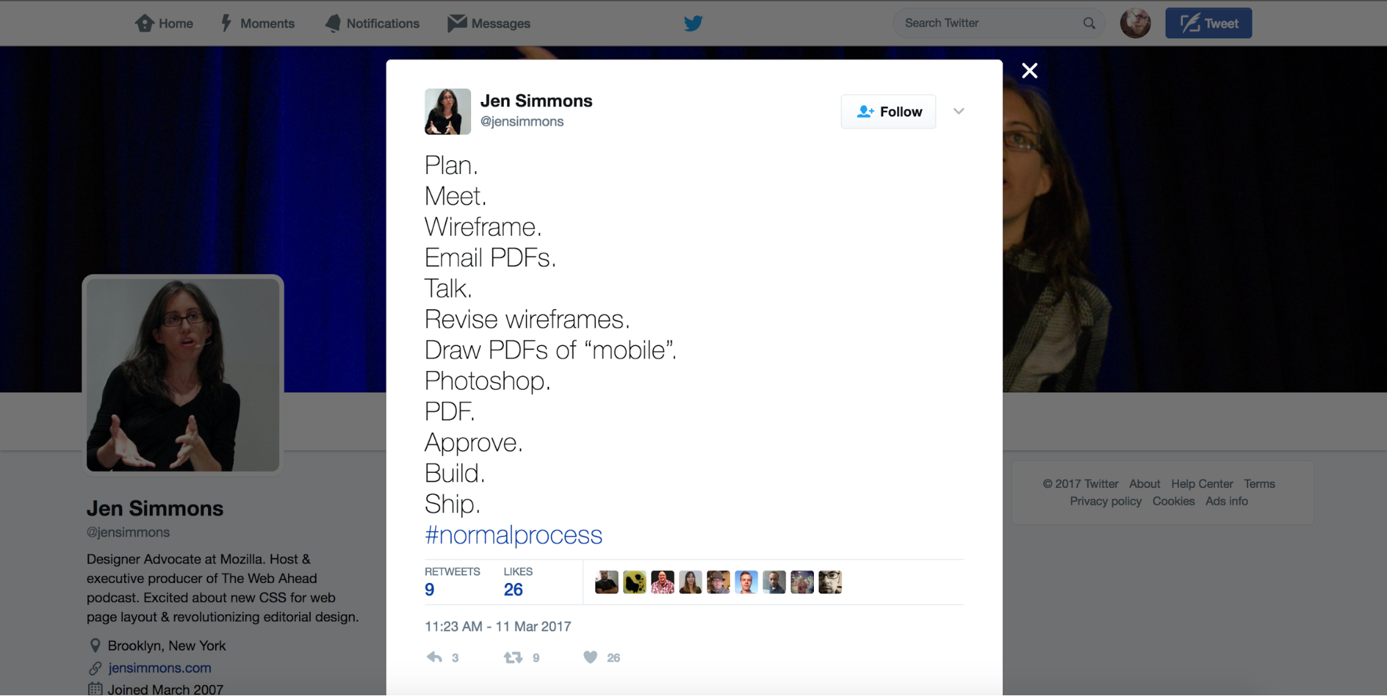
In Jen’s view — and I’d venture to say, the rest of ours too — the “normal” web design process looks something like this:
- Plan.
- Meet.
- Wireframe.
- Email PDFs.
- Talk.
- Revise wireframes.
- Draw PDFs of “mobile”.
- Photoshop.
- PDF.
- Approve.
- Build.
- Ship.
Much like Al-Anon, it’s a 12-step process. (And if I didn’t think it wildly inappropriate, I’d make some joke here about analogous numbers of failures along the way. But I won’t.)
Now, we could dig in and unpack each of those 12 arduous steps, but I’ll save us all the flashbacks and abstract a bit. In essence, the “normal” web design process is a circular one, where designers repeatedly:
- Strategize
- Mock up
Presumably in Photoshop or Sketch, but what matters here is that whatever format it's in, it’s not HTML/CSS/JS. - Share
- Review
- Revise
- Repeat
Until the site is approved, built, and shipped.
Noteworthy elements of the normal design process
To understand why there’s a growing dissatisfaction with the standard design process, it is worth exploring a few of the less-than-ideal elements of said process.
The “normal” design process is desktop-first
Whatever a “desktop” even is these days, it’s obvious that this process prioritizes the desktop, relegating “mobile” (aka, all the other devices, which frankly are becoming more widely used) to an afterthought: step 7 of 12.
Which is pretty darn odd — especially for an industry so driven by empathizing with our “users” and how they experience our work — when you consider that mobile is now firmly our primary tool for “consuming” the internet.

The normal design process is disposable, not recyclable
Another striking aspect of this “normal” process is its emphasis on the creation of artifacts that are:
- Disposable
- Abstract
- Static
In other words, we’re spending a lot of time drawing PDFs to act as conceptual models for the websites, apps, and digital products we’re building — rather than deliverables founded in the stuff of the internet: HTML, CSS, and JavaScript.
There’s an irony there. Here we are building for the most dynamic, interactive medium humankind has ever produced … and doing it all via static models grounded in rules that have nothing to do with how the internet works.
Most of which end up enshrined, at best, in our portfolio sites, and at worst, our trash bins.
Yay, fun.
Content is … nowhere to be found in the normal design process?
You might not notice this at first glance, because it’s an absence, not a presence. But where the heck does content — you know, the stuff most websites exist to contain — come into the process?!
It’s a total mystery. Which may help explain why designers (and all the other collaborators in the design process) are growing fed up with this “process.”
And turning to …


Get started for free
Create custom, scalable websites — without writing code. Start building in Webflow.
The new web design process!
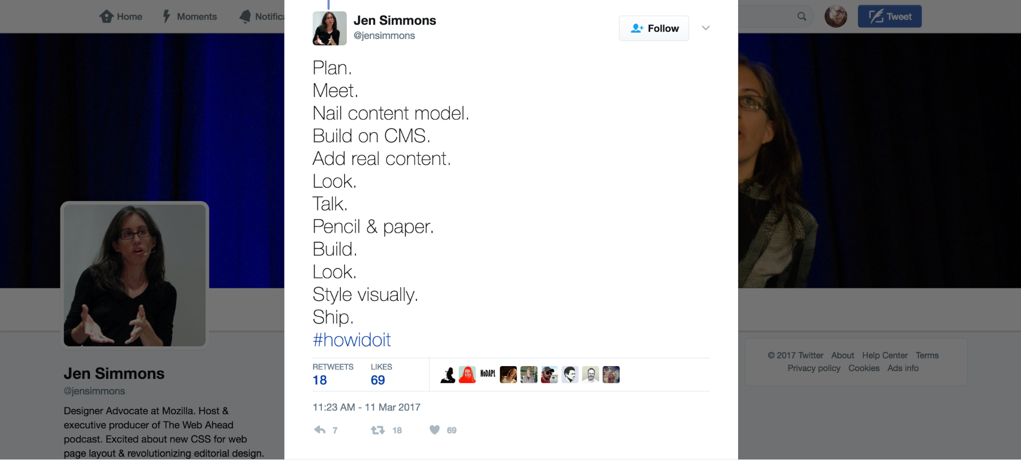
Simmons quickly followed her definition of the “normal” process with a second tweet hashtagged #howidoit. But she might’ve well as tagged it #thenewdesignprocess.
Here’s what it looks like:
- Plan.
- Meet.
- Nail content model.
- Build on CMS.
- Add real content.
- Look.
- Talk.
- Pencil & paper.
- Build.
- Look.
- Style visually.
- Ship.
Still 12 steps — but it’s a whole different ballgame. Let’s take a closer look at how:
The new design process is content-first — or content-modeling first
Instead of leaping to an early visualization of the final website — as the “normal” process does with wireframing in step 3 — the new design process focuses on the content.
Note that it doesn’t start with writing the content, but with modeling it. I detail the content modeling process in Why your design process should start with content, but to summarize: content modeling focuses on identifying three things:
- Required content types
- Relationships between content types
- Structure of the individual content types
As you model the content of your next website, make sure your content types and their structures meet the site users’ needs. So instead of thinking “wouldn’t it be cool if we had X content type?”, consider what would be “cool” from the user’s standpoint.
If, for example, you’re building a recipe website, users need:
- Recipes
- Ingredients
- Instructions
So as “cool” as it might be to have extensive histories for all the world’s major cuisines on your website, it shouldn’t necessarily be a priority since it doesn’t align with audience needs and expectations. It might offer a way to differentiate your recipe site from the stiff competition in that space, but it's not what you'd call table stakes.
The new design process uses real content
Instead of using carefully curated lengths of lorem ipsum to ensure beautiful, three-word headlines that never wrap, the new design process includes fleshing out the site’s database with real content as soon as possible.
This not only helps you identify design issues and edge cases (like overlong headlines) right off the bat, it also encourages greater empathy for the content creators your design should cater to.
The new design process leaves visual styling to the end
Perhaps surprisingly, you don’t get too deep into the visual styling aspect of design until just before shipping.
The benefit of this is that it allows design to be shaped by the content, instead of trying to shoehorn the content into the visual style after the fact. And since the vast majority of websites exist to present content that drives action, this approach places the emphasis where it should be: on the content and how best to present it.
So … how does Webflow fit into this design process?
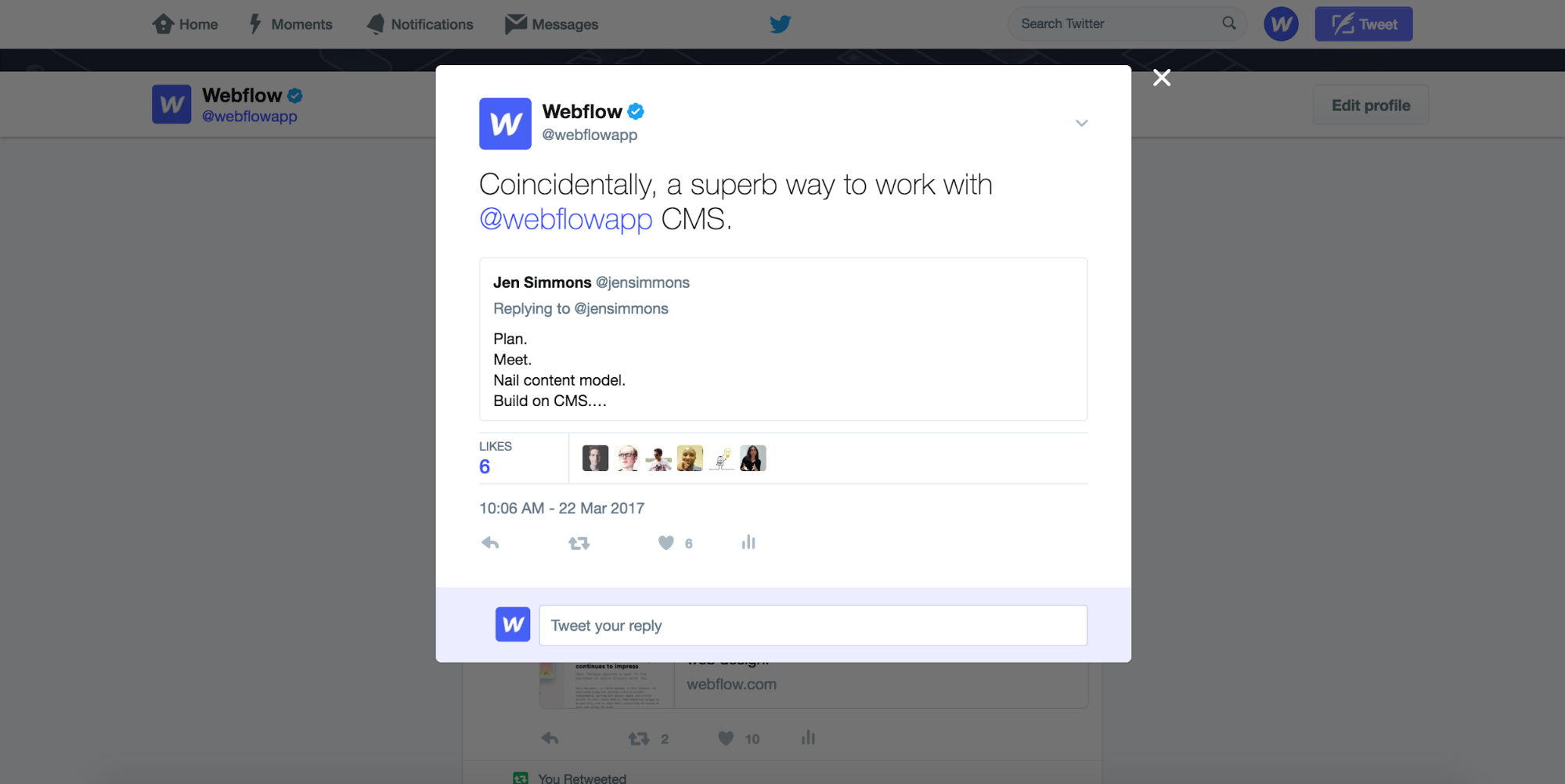
When I’m not writing content for Webflow, I run our various social accounts, including Twitter, so I excitedly quoted Jen’s commentary with the note:
Coincidentally, a superb way to work with @webflow CMS.
But in retrospect, I should’ve said, “Not coincidentally, a superb way to work with @webflow CMS.”
Because in reality, this is the ideal way to build websites with Webflow CMS. And it’s a process we’ve followed with a number of our creations, including Webflow for Prototyping, Webflow vs. WordPress, and even Webflow Experts.
That’s because Webflow CMS gives you a powerful, functional way to model website content that doesn’t (necessarily) involve a lot of spreadsheets and graphs.
Instead, you create the content model right inside Webflow via Collections, so you’re not only modelling the content in the abstract, but actually creating a working database that can drive every element of your website. That means you’re not creating “just another disposable artifact,” but a real deliverable — something that will not only guide the site’s creation, but also its long-term maintenance.
Once you’ve created the content model via Collections, you can start inputting your website’s real content, and start designing around it — at whatever level of fidelity you’d like, from wireframe to high-fidelity — immediately.
Even better, you can start clicking around your website to search for edge cases, opportunities, and to get a sense of the overall user experience. This is super-powerful because it lets you experience the content model in a concrete way, as the eventual end user will, so you have time to make adjustments to the information architecture and overall UX.
You also get a very real sense for the author experience you’re building.
When you’re building a CMS website, you’re not just creating an experience for the website’s visitors, you’re also creating a product for authors — a content management and publishing tool that should be grounded in the particulars of their editorial remit and style. Because you’ll be working directly within the CMS to not only flesh out the site, but also create its content, you’ve got a golden opportunity to build empathy with the website’s audience and its authors — the people who will be doing the real work of constantly creating, recreating, and refining the website.
For more on designing a great author experience, check out our 5 tips on designing for content creators.
What’s your Webflow CMS design process look like?
We’re always eager to hear about how Webflow-using designers approach process and execution, so let us know how you work in the comments below!


