

Though the HTML spacer is no more, we now have more sophisticated techniques for building negative space into a website that are even easier to execute with a no-code design tool like Webflow.
Negative space is essential to bring balance, focus, and legibility to your design, so it's important that you know how to use these modern techniques effectively.
The HTML spacer is obsolete
The spacer tag was used to create negative space, also called whitespace, between elements in a layout when writing HTML. Although this technique worked, designers eventually needed finer control as the websites they worked on became larger and more sophisticated. CSS and JavaScript were introduced and took control of the layout, presentation, and behavior — and HTML was relegated to creating the structure of the site.
The 2011 release of Firefox 4, which removed support for <spacer>, marked the beginning of the end, and it is now obsolete in all web browsers. Some sites that haven't updated from the HTML spacer tag should technically still work, with most browsers treating the HTMLUnknownElement as a span tag — but there's no guarantee that future browsers will allow this.
Of course, with any strong statement, like spacer is dead, you will have contrarian viewpoints, and there are advocates for resurrecting the HTML spacer tag in modern web design.
Today, web designers primarily add space by changing the code in the CSS or with no-code programs that allow you to design visually. Below, we will walk you through some of the most effective techniques for adding negative space to your design the no-code way in Webflow.
Webflow is a visual design tool that translates what you create on the canvas to clean, effective CSS. For the most part, the techniques used in Webflow can be done directly with coding but may be complex and time-consuming.
Understand the terms you need to create space in Webflow
EM or REM units
EM and REM units are relative length units that scale with typography. Using relative units instead of absolute units, like pixels, helps to make a website responsive, so it can adjust to different size devices, such as mobile phones.
REM units are relative to the root element and will scale with the typography of the body. If the user their browser window scales up or down or opens the website on a tablet or mobile screen, REM will support that and remain legible.
EM will scale with the typography of the parent element from which it is inheriting its attributes. This can result in unexpected inconsistencies if typography size changes have been made on any parent element within the stack between where the spacer is and the body. It requires a little bit more advanced knowledge to use EM properly, but it does allow for some fine-grained control in specific areas.
For more on size settings check out our Webflow University lesson.
Classes and combo classes
A class applies a specific set of style properties to any element it is applied to. Once the class is applied, changing the class will change all the elements assigned with that class simultaneously. This saves time and assists in making designs more consistent.
A combo class is an additional class that adds even more specific styles on top of the primary class. This can be used to make consistent variations or specific exceptions to the base class.
Using classes to add space as opposed to setting individual margins on each element in a page creates cleaner, more streamlined CSS. Classes in Webflow work exactly like classes in CSS.
For more on using classes check out our Webflow University lesson.
Symbols
A Symbol is an element in Webflow that repeats throughout a project. It can be a navigation bar, a button, or even a block of negative space. Once an element has been turned into a Symbol, it will appear in the Symbols panel and can be added into the design from there.
Symbols allow designers to build and maintain complex layouts more consistently and efficiently by creating an element only once and having it repeat. They are also especially beneficial in applying a design system across an entire site. If multiple people are working on a project, having premade Symbols ensures space is unified and consistent. Symbols are also visible in the Navigator, making it easier to see the overall structure of your page at a glance.
For more on Symbols check out our Webflow University lesson.
Create negative space as an object using div elements
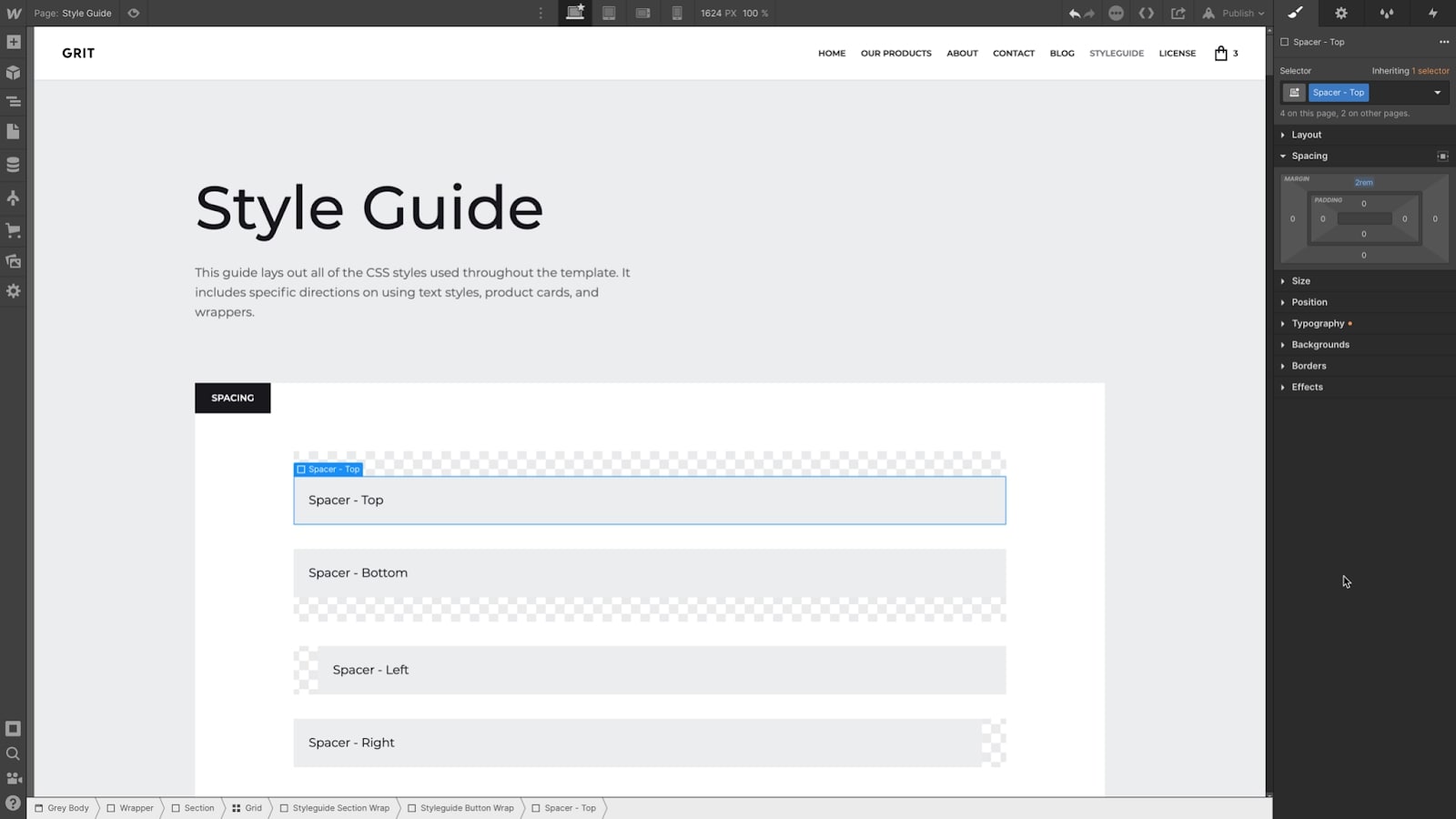
Using div elements to create space is a technique similar to using the former HTML spacer tag (RIP). It will create an invisible object that takes up a specific amount of space applied from a class. This class can even be called “spacer”. Once you have created this object (or objects), you can drop them into your layout as many times as you want, making this a very simple and work-efficient approach.
By adding further styling to the element, such as a border along one side, you can also use this technique to place dividers — lines, dashes, or symbols — into your layout.
How to use div elements
Begin by placing a div element onto the canvas in the area where you want your negative space. Set a minimum height and width using REM.
Pro tip: use min-width and min-height instead of absolute width and height, so the element will automatically fill the full parent element.

Rename the automatic class name (for example, “Spacer”). To create various sized spaces, you can create combo classes (such as “Large” and “Small”) and add them to your “Spacer” class wherever that specific size is needed.

To use these “Spacer” div elements as horizontal space, set the container with your paragraphs and spaces to flexbox. Then set the layout to horizontal, and they will become gaps between columns instead of vertically stacked space. If using grid, they will become empty spaces in the grid creating offset or non-symmetrical layouts.

The next step is to turn these elements into Symbols. Right-click on your element. At the bottom of the dropdown menu is “create Symbol.” Click this and name your new Symbol. You will want to create individual Symbols for each variation of the “Spacer” element. This Symbol can then be dragged onto the canvas and dropped anywhere negative space is needed on your site. Update the main symbol and it will update each instance.


Get started for free
Create custom, scalable websites — without writing code. Start building in Webflow.
Create negative space relative to an object using a margin utility class
In CSS, an object can be surrounded on the outside by three types of space — margin, border, and padding. Margin is the area outside the border, while padding is the area inside the border. Each of these spacings is relative to the element they are applied to. In this case, using margin will create visual space around and between elements.

Creating a margin class will keep your spacing consistent and make it quick to apply. Since the margin class is attached to each individual element, it can create unpredictable effects in your overall layout when two or more objects interact, which is important to keep in mind.
This technique is also slightly less visible when troubleshooting as it must be set as a class on each element instead of being inserted as an independent object like a “Spacer” div block.
How to use a margin utility class
First, create a utility class with margin as its only setting. This utility class can then be attached as a combo class to each element where space is needed.
Make versions of this margin class that create space in different directions (Top, Bottom, Left, Right, Vertical - Top and Bottom, Horizontal - Left and Right ) and combo classes to have multiple sizes (Bottom + Large, Bottom + Medium, Bottom + Small). It is not recommended to apply margin to All Sides when you are using this technique, as it can shift your layout in unexpected ways when the objects you have applied margins to interact on the canvas.
To create a global utility class, it is best to have a style guide or similar page to maintain these classes. Create each margin class on a div element and leave them on the style guide. This will make them easy to edit in the future and ensure they don’t get accidentally removed when using the Clean Up unused styles in the Style Manager panel. Now you can apply these margin utility classes to any element on any page to achieve the desired spacing.
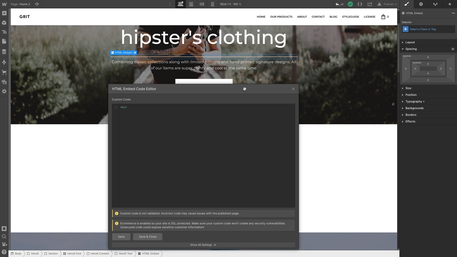
Use custom code to insert an hr element
Inserting a horizontal rule element creates a “spacer with some style” by inserting custom code to create an element that Webflow doesn’t natively support. To do this, you will want to add an Embed component and just type <hr>. You don't even need to have a closing tag. Again, turning this into a symbol will allow you to place it wherever you need to add space.
Pro tip: Contributors can add the horizontal rule directly into rich text elements too.
For more on custom code inside of rich text check out our Webflow University lesson.
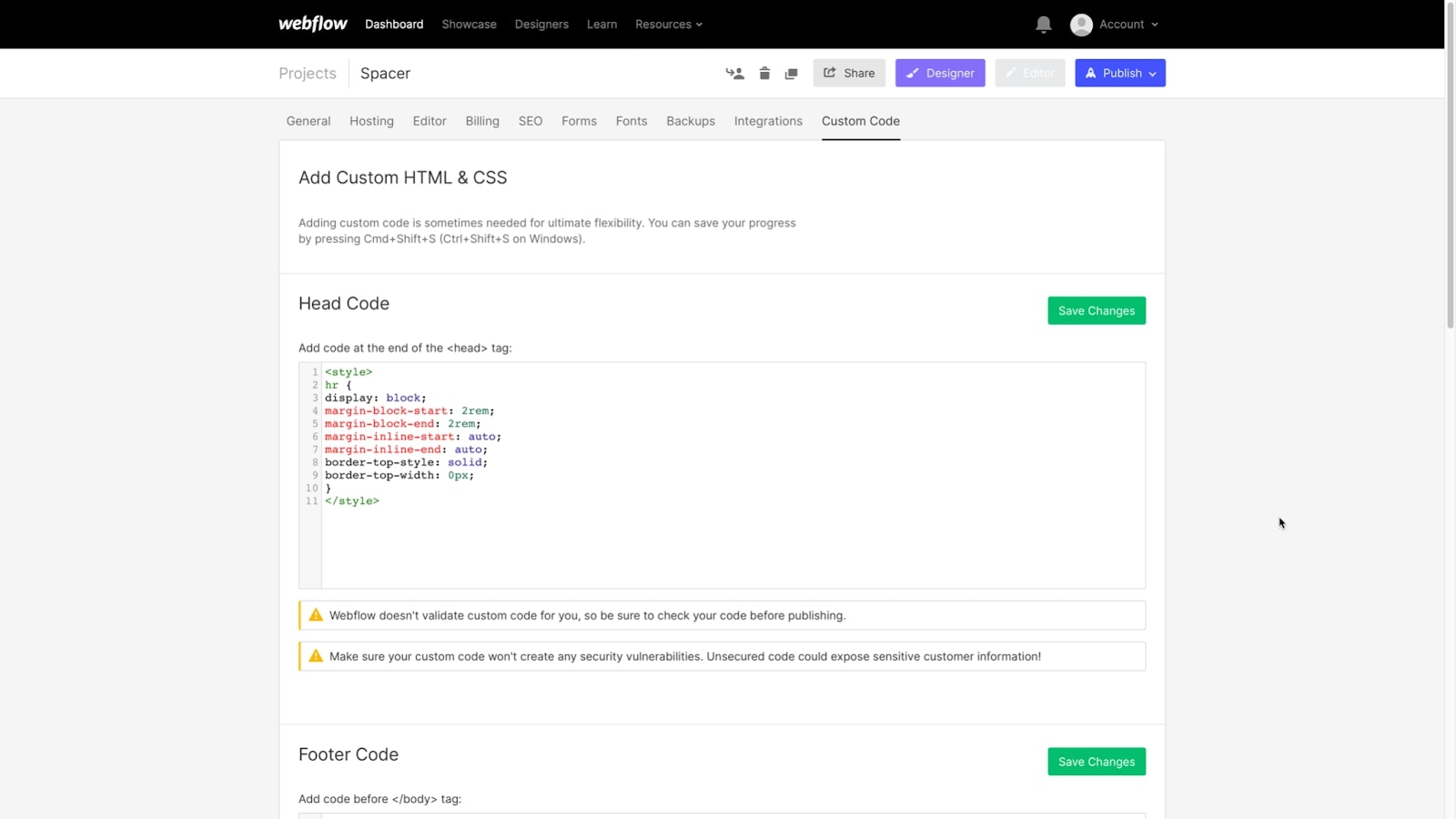
The settings for the hr element are being applied by the browser’s stylesheet. To adjust the way your hr element appears, place the code below in the Project Settings within <style> </style> opening and closing tags. Then adjust the properties within that code or add additional changes like color or style (border-color: red; or border-style: dashed;).
hr {
display: block;
margin-top: 2rem;
margin-bottom: 2rem;
border-bottom: none;
border-top-width: 1px;
border-top-style: solid;
border-top-color: #fff;
}
This code can even be written in shorthand in order to simplify it further.
hr {
display: block;
margin: 2rem 0 2rem 0;
border-bottom: none;
border-top: 1px solid #fff;
}
To make your hr element into a blank negative space, just set the border to none.
For more on custom code check out our Webflow University lesson.
hr {
display: block;
margin: 2rem 0 2rem 0;
border: none;
}
Create space within grids
You can also play with negative space using grids in your layout by setting the grid child element to manual positioning. Anywhere you don’t place an element (or place an empty div) will have a block of negative space that’s evenly placed and sized with the other elements in that grid.
The grid gap property can also be used to uniformly add space between each column and row within a grid.This is not the way you would want to incorporate space into your overall site, but it can be a useful design technique when laying out specific areas.
Be in control of your use of negative space
By effectively employing negative space (also known as white space), you guide the viewer’s eye through your layout, focusing it on what is important and providing space to breathe between elements. This makes your design simultaneously more beautiful and more effective. The HTML spacer served an important purpose during its time, and the techniques that have grown from it enable the same essential design function with more efficiency and finesse.

Thoroughly understanding the tools that can be employed to create space allows you to be in full control of your website’s structure to create dynamic and responsive designs. The benefit of modern no-code site design is that it allows for a polished, clean structure, both visually and in the code that is generated. Less back-end editing means easier site management and less opportunity for broken layouts and inconsistencies.
Negative space is inherently tricky — how do you make an absence of content into a concrete, controllable design element? Webflow’s approach makes these pieces visible and allows them to be named, fine-tuned, and repeated. Mastering these techniques will make your designs more modern, professional, and approachable.