

Getting started with website design doesn’t have to be overwhelming. Webflow makes it a snap to create a visually engaging design even if you don’t know how to code. We’ll take you through the steps to create a well-crafted website in no time.
Getting started in website design doesn’t have to be an overwhelming experience. Webflow makes it a snap to create a visually engaging design — even if you don’t know how to code.
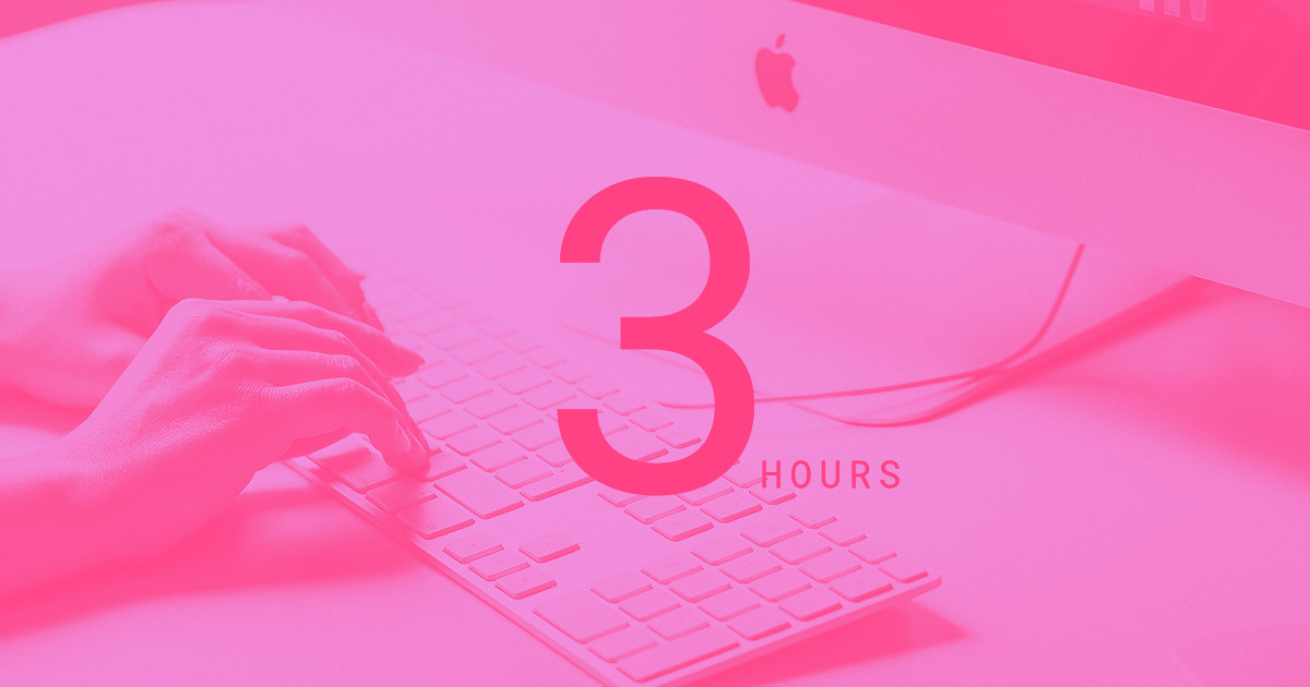
We’ll take you through the steps you’ll need to take to create a well-crafted website in just 3 hours, or less.
Join the club
With our free Starter account, you get so much. Choose one of our free, fully customizable templates and you’ll have a variety of cool font choices, dynamic interactions, and a simple yet powerful content management system at your fingertips.
We also offer Client Billing, so you can automatically charge clients for hosting and upkeep, and even add a little profit margin. Whether you’re a freelancer or work at an agency, we want to give you the tools to make web design faster, easier, and more fun.
Go ahead and sign up for a free account so we can walk you through just how effortless it is to design a website using our interface.
Start with content

You need to know what content is going to be on each page and the order that it's going to be organized. This will make designing your website more efficient and will lead to less restructuring later in the process. If the copy isn’t finalized, at least know what the main point of each section is going to be and have a few sentences that flesh that out. Most importantly, make sure you have a realistic sense of how much written and graphical content each section will need. There’s little more aggravating than having to restructure a page because the content and design don’t jibe.
Do SEO upfront

If you're starting a website from scratch, this is the perfect opportunity to nail SEO. You'll end up with a shiny new website brimming with the words and phrases that’ll be sure to get it up in front of the people who need to see it.
Yes, there are plenty of people you can pay to optimize your content or come up with a list of keywords and phrases to work into your copy. These services can be expensive. They can also result in terms and phrases that aren't always pertinent or would be awkward to weave into the content.
If you know your audience and do your own research, you can SEO optimize content on your own. Writing in a voice that the intended audience will understand will both help in SEO and making your writing more relevant. Make it the point to sound like a human, not a keyword-spewing automaton.
So do your research. What are the words and phrases people use to look up topics relevant to your site? What questions would they type into a search engine that would help them find your website as the answer? Looking at a competitor’s or a related website can be a good way to start familiarizing yourself with the vocabulary of a given topic or interest.
Just keep in mind that your audience’s language will be very particular to their lifestyles, outlooks, and experiences. Surfers talk about surfing in different ways than the average joe, and if you don’t take the time to understand how they talk about it, your audience will know.
Having these keywords and phrases in your back pocket will help you write meta titles, meta descriptions, and the H1s and H2s that will tell web crawlers what your website is all about and help improve its page ranking.
Not only will SEO optimization early on make your content better, but it will also shape its organization. Adding in SEO after the fact can change the flow of information, which could drastically alter the layout you’ve already put so much hard work into.
Check out “SEO and Webflow: the essential guide” for a more in-depth look.
Where to begin: template or blank canvas?
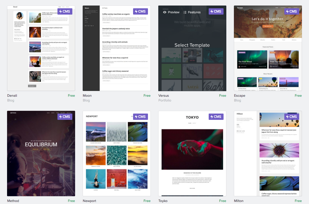
Even if you have little experience in web design, you'll be able to come up with a solid website in just a few hours. If you need a bit of a head start, templates are the way to go. These give you a basic framework to build your site on. Webflow also makes it easy to customize every element of these as you design.
Templates also offer you a great way to learn how web design works. Seeing the structure and how the different elements fit and work together will give you a deeper understanding not only of your website, but of web design best practices in general.
You can even use a template designed for a different purpose than what you want to use it for. You can hack it apart and mold it to fit your own design needs.
Picking a template to kick off the design process
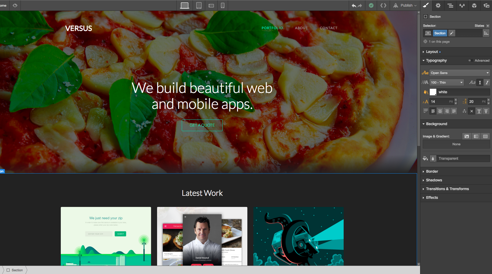
For this project, we're going to be designing a website for a restaurant. Webflow offers a variety of free templates, as well as a wealth of premium templates. In scanning through the free templates, I didn’t see one specifically built for restaurants. Not to worry.
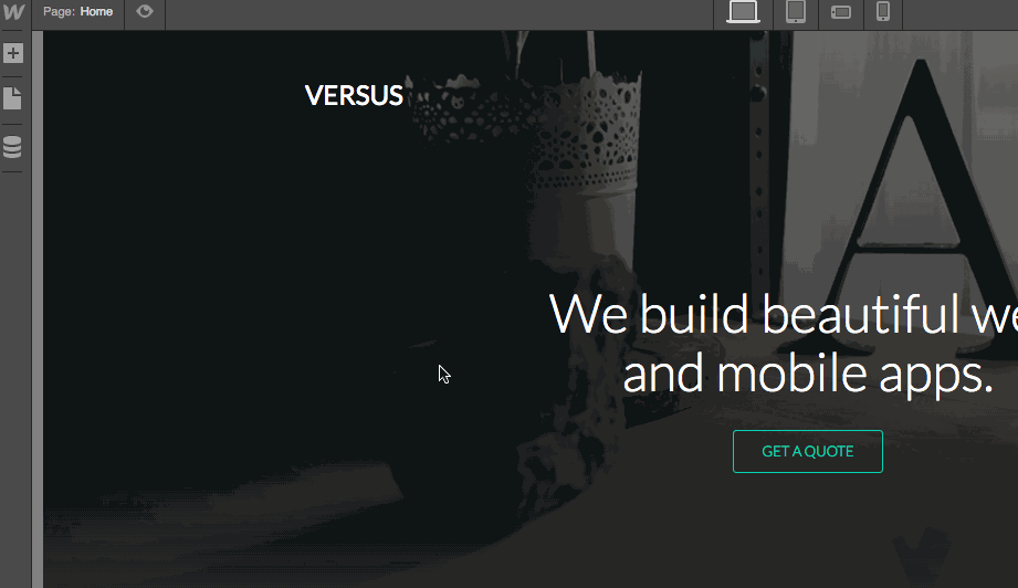
What's this slick portfolio template called Versus among the free templates? It looks like a nice, basic template with CMS included.
But, it's a portfolio template intended for a designer.
Then again, isn't a chef kind of like a designer? Instead of arranging pixels, they combine ingredients and compose plates. We can use this portfolio template to show off a restaurant’s culinary creations.
Once you’ve signed into your account, go to your dashboard and click Create New Website. Set the filter to display free templates, then select Versus. Then click the blue Create Website button in the upper right of the page.
And you’re off to the races.


Get started for free
Create custom, scalable websites — without writing code. Start building in Webflow.
Familiarizing yourself with the Webflow interface
So now we have our template up and ready to go.
Before we dive in to design, let’s just familiarize ourselves with a couple main features of the Webflow interface.
Go ahead and click the + symbol at the top left of the screen to open the Add panel. It holds all of the building blocks of your site, from structural elements like sections to content elements like headings. Feel free to scroll down to check out all the elements you have to work with.
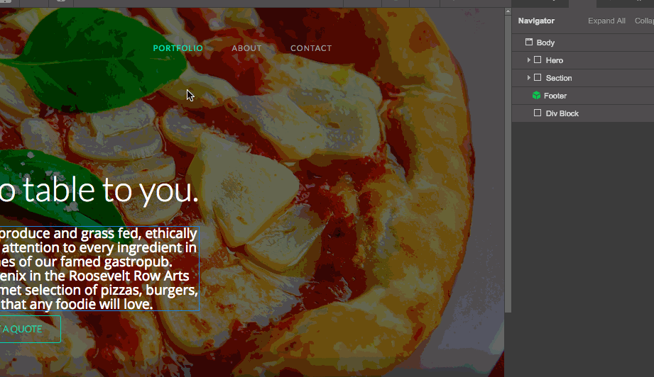
While we’re getting to know the interface, let’s go ahead and see how the current page is organized. Move your cursor to the top right of the screen and open the Navigator tab. We’ll check out all the other tabs later, but it’s important to understand how Webflow structures things first.
When we open the Navigator, we see all the different elements that comprise the website and how they’re organized.
At the top is the Body, a default element of all Webflow sites. It’s super-handy for adding styles that will appear across your site, like the default font. Below that, you’ll see two structural elements — Hero and Section — then the Footer.
That green cube next to the Footer element means that it’s a Symbol — a design element you can add to your site with just a click. Every instance of that Symbol is linked, so any changes you make to one instance will automatically update every other instance. Super handy.
Adding content to the template
So we know you have all sorts of awesome content ready to go, so let’s get started with the first thing visitors will see: the hero section.
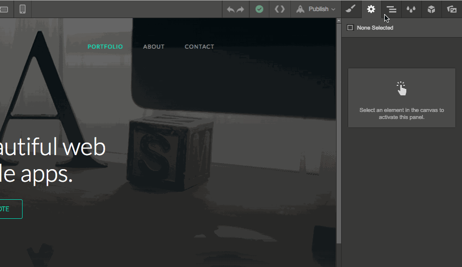
Let’s go ahead and get rid of the hero image and start with our own. Because any great story begins with a hero, right?
Click the hero section (either on the canvas, or in the Navigator) to select it. You’ll see a blue border around it. You’ll also see on the bottom left hand side of the screen a guide showing you where you are on the page. Go ahead and click the Paintbrush icon in the top right to open the Style tab, which is where you control the layout and appearance of objects in your design.
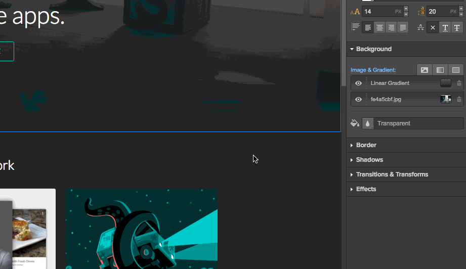
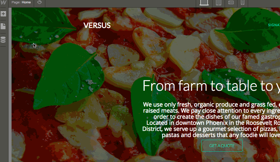
Let’s go ahead and swap out that background image with something a bit more appetizing for our restaurant site.
Scroll down to the Background section and double-click on fe4a5cbf.jpg in the Image & Gradient section. You can then upload an image from your computer, or pick one from the Asset Manager (the tab on the far right). At the moment, the Asset Manager is full of the template designer’s photos, so let’s upload one of our own.
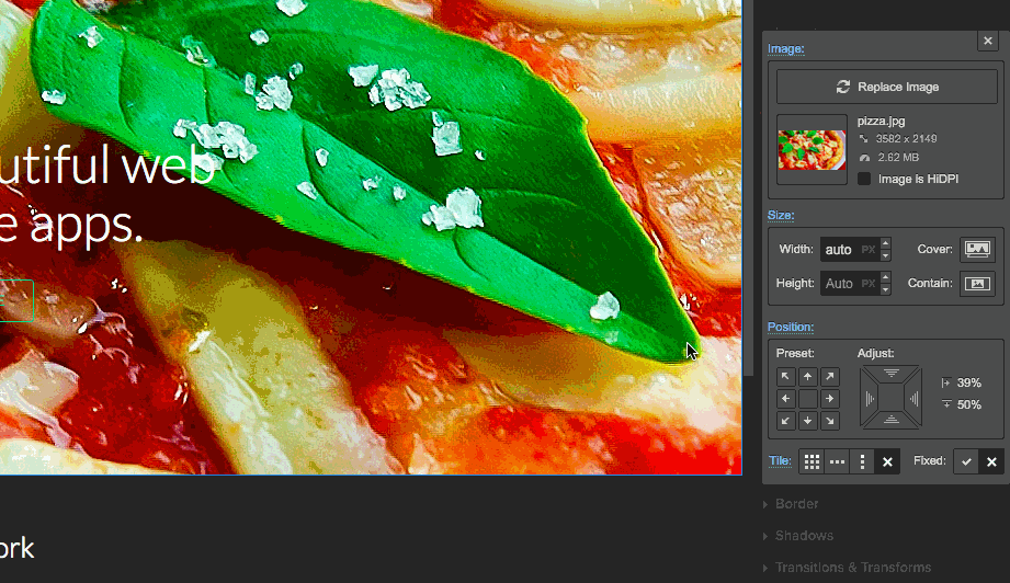
In this case, we’re going to upload an image of pizza. Make sure HiDPI is checked if you’re using high-resolution photos to ensure they display correctly.
Once the image uploads, you’ll see it appear in your design. Right now the image is way too big. And that gradient isn’t going to work with the pizza image. Let’s go ahead and fix this.
To adjust the image, change the width to Cover in the Size section.
We still want to keep a slight gradient, because without it, our image is a bit too bright and distracting. Let’s go ahead and change the stops of our gradient by dragging the handles on the spectrum at the bottom of the gradient interface.
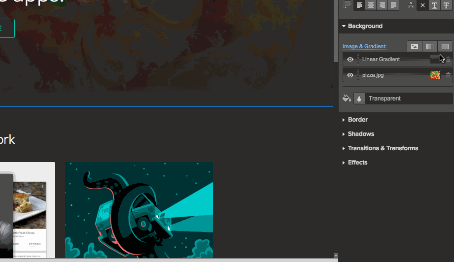
Okay, things are shaping up!
Updating the text content
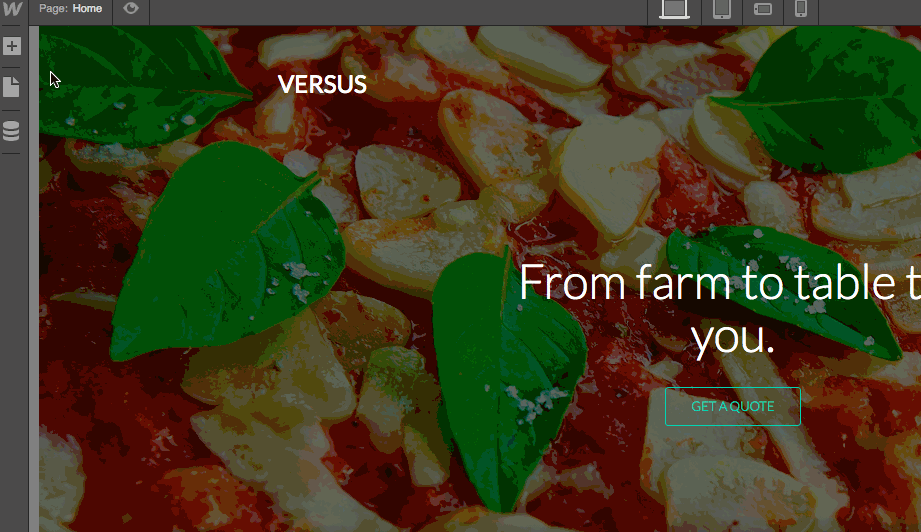
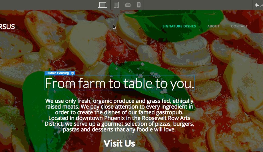
Okay, now we need to start adding our own copy. Let’s start with the H1.
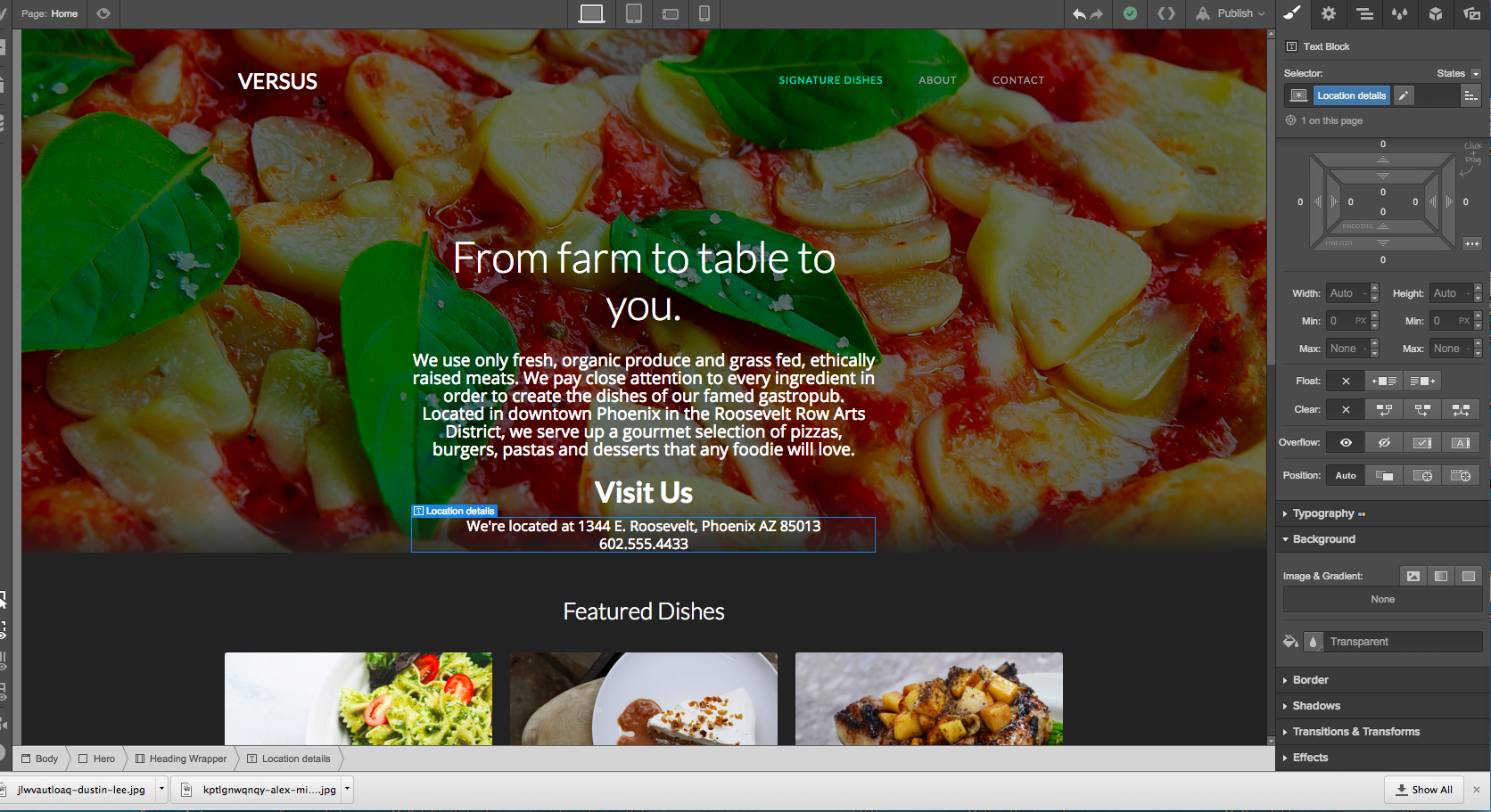
Go ahead and click on the H1 “We build beautiful web and mobile apps.” We can then type directly into the box. I went for, “From farm to table to you.”
For SEO purposes, and to give a bit more of an introduction of our restaurant, let’s add another section of text below our H1. To do that, just add a new div block below the main heading to contain our copy. (While you might be tempted to just pull in a paragraph element, placing your content in a structural element gives you more control.)
Pro tip for placing elements
While you’re placing elements, it’s a good idea to have your Navigator open to make sure you’re placing the div block where you want it.
Now open up the Add panel again. Then grab the div block and drag it over between your H1 and your button. You’ll see a blue line appear between these elements. You’ll also see in your Navigator that your new div block is between the main heading and button.
We can now select this new div block. Double click it and either type your copy directly into it, or copy and paste it from your text editor.
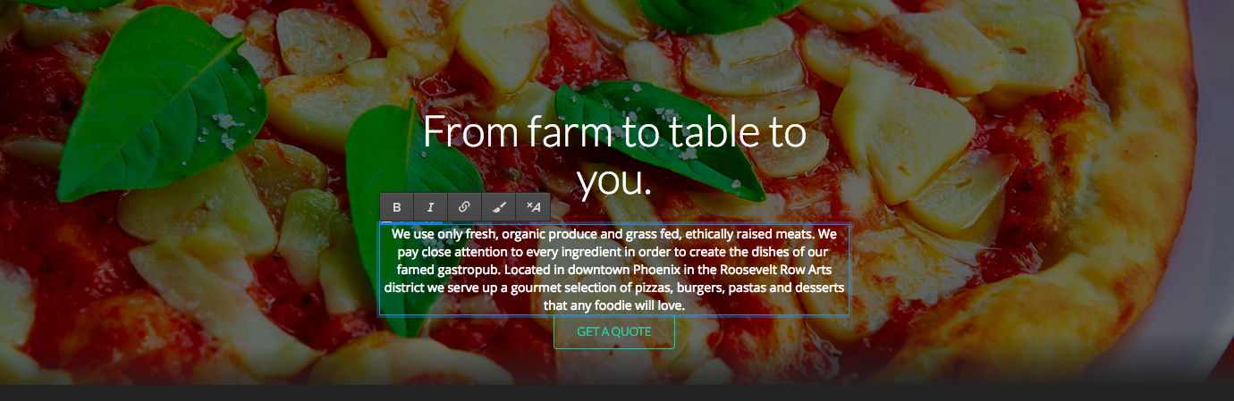
We now have our new text in place, but it’s a bit too small, so let’s create a new class so we can style it.
Creating new styles
We’re going to create a style for this selected text, so go ahead and click on it.
Now go over to Style tab and click the + sign to add a new one. We’re going to go ahead and name this new style Hero Content.

We’re now going to bump up the font size from 14px to 19px. When we increase this font size our lettering looks crowded. Open the advanced typography options and lets give our letters a bit more breathing room by increasing the line height to 23 pixels.
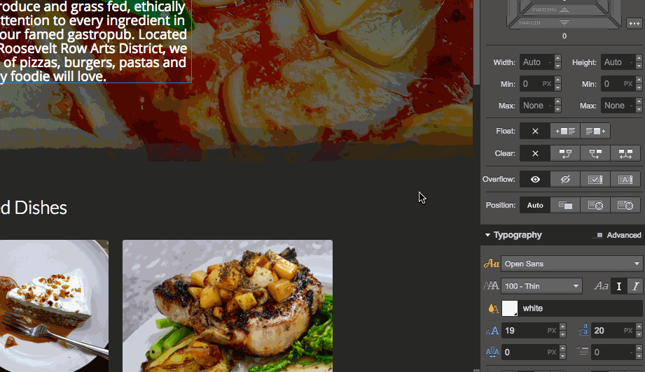
That’s much better.
Responsive design made easy
Webflow lets you preview your design to see how it will look across a variety of devices. At the top of your screen, you’ll see options to preview your site in four different views: desktop, tablet, mobile landscape, and mobile portrait.
If something looks off in any of these previews, you can adjust the styling for that element that on that viewport and smaller screens. (So be sure to fix any issues at the largest viewport size they appear — it may just fix the problem across all sizes.)
Let’s say we want to make our H1 bigger for tablets. We would preview it in tablet mode and adjust the class (or add a device-specific combo class). Webflow gives us the power to tailor our design for whatever device it’s going to be viewed on.
Adding our own call to action
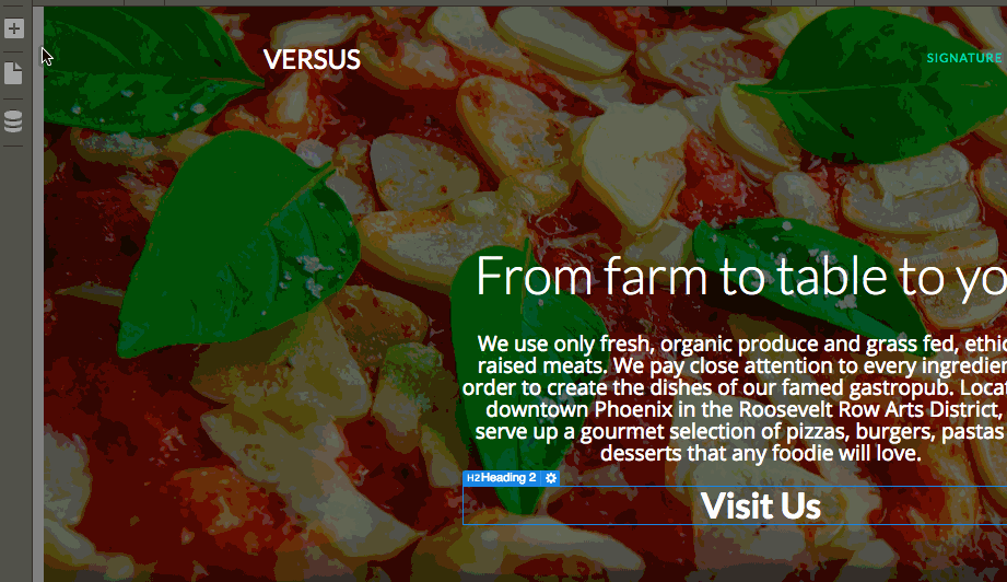
We don’t need that Get Quote button, so let’s replace it with a call to action of Visit Us, with the restaurant’s address and phone number below it.
Drag in a Header from the elements and make it an H2. Also, let’s pull over another section of text. We’ll make a new class for it, called “Location details,” making the font just a bit smaller to add some variety to the typography. Since this is a brick-and-mortar business, it’s important to get this very important information front and center for anyone visiting the website.
Now let's dive into the CMS portion of the design!
Creating dynamic content is simple with our content management system (CMS)
Before we do anything with the CMS, we’re going to make a modification to the nav bar on the top.
We need to change the word “PORTFOLIO” to something related to the CMS entries we’re going to create. Let’s change PORTFOLIO to SIGNATURE DISHES in the Nav Links in the header.
Go ahead and click above the link until you see the Nav Link in the Navigator. You can then type directly into the box to change the link text. Since this button is in the Nav Symbol, this update will appear anywhere else the Symbol is used.
We also need to get rid of Latest Work. Let’s change this to Featured Dishes by double clicking on the section, then typing directly into the box.
Making new CMS entries
One of Webflow’s most powerful features is its visual CMS. It allows you to create a custom structure for your dynamic content, as well as a layout that will be applied to every item, whether it’s a blog post, a portfolio project, or a signature dish. There’s a number of templates to get you started with whatever you need to create.
We now need to change these portfolio entries into dishes we want to be highlighted.
First, let’s go ahead and create new categories for all of the food we want to feature. You can use categories to better organize your content for both your collaborators and site visitors.
Go ahead and navigate over to Collections, click on it, then add the categories for all of these dishes. I’m adding the categories of entrees, desserts, and breakfast. For your own design, figure out what type of categorization will make the most sense.
Here I created broader categories so that all of the related dishes could easily be found. If I went a bit more specific, I could have created categories for burgers, pizzas, and cakes, but for the sake of simplicity, I went general.
We’re not going to make any changes to the post template for this tutorial. But if you’d like to, you can make changes in the Collection’s Settings. Just click the gear icon next to Projects to open up this panel. You can then structure these posts in a way that works for you.
Go into Projects and click + New in the upper right hand corner of the panel. Then add the name of the dish, in this case spaghetti, upload an image, and pick the relevant category.
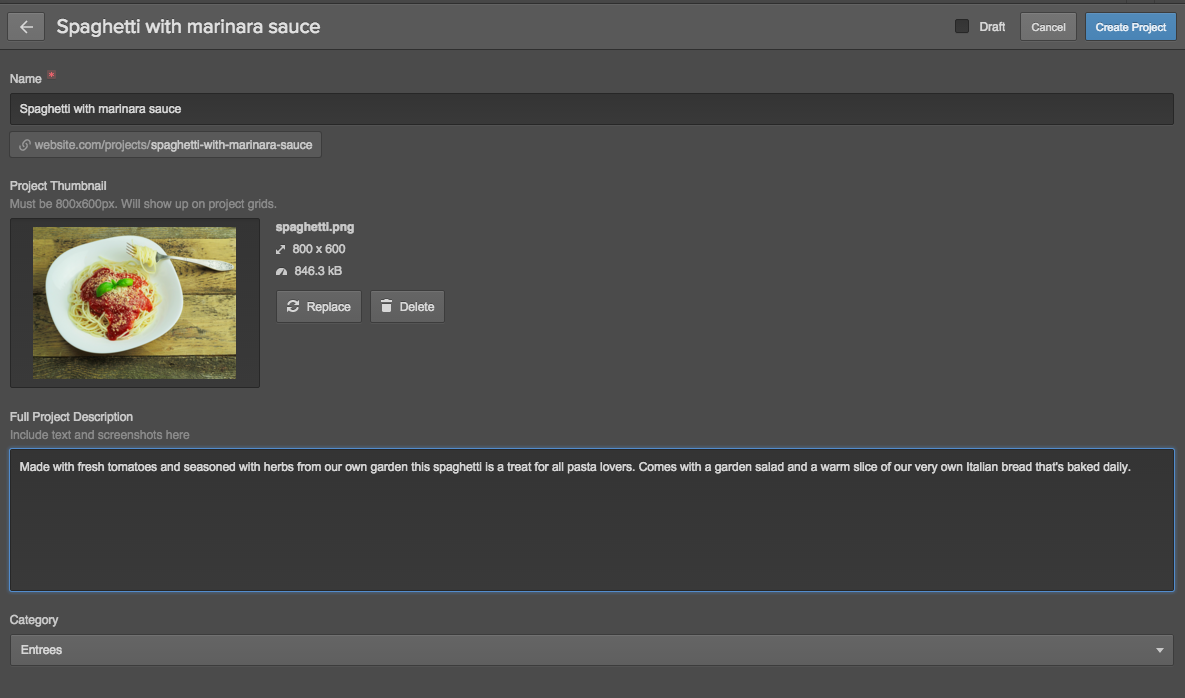
You can then repeat these process for each entry, adding a different dish for each post. Just don’t forget to delete all of the CMS entries that were included in the original Versus portfolio template!
Note: to keep things quick-and-dirty for the tutorial, we stuck with the template's Projects Collection for our dishes. Ideally, you'd create a new Collection and update the bindings on the site's homepage to use the new Collection. (Unless your chef is so experimental they refer to their dishes as "projects.")
Finishing up
Since this is a basic website, there aren’t a lot of different pages to update. To make changes to these other pages, just go to Pages in the left toolbar. Select the page, then update the content and images for each page as we showed you earlier.
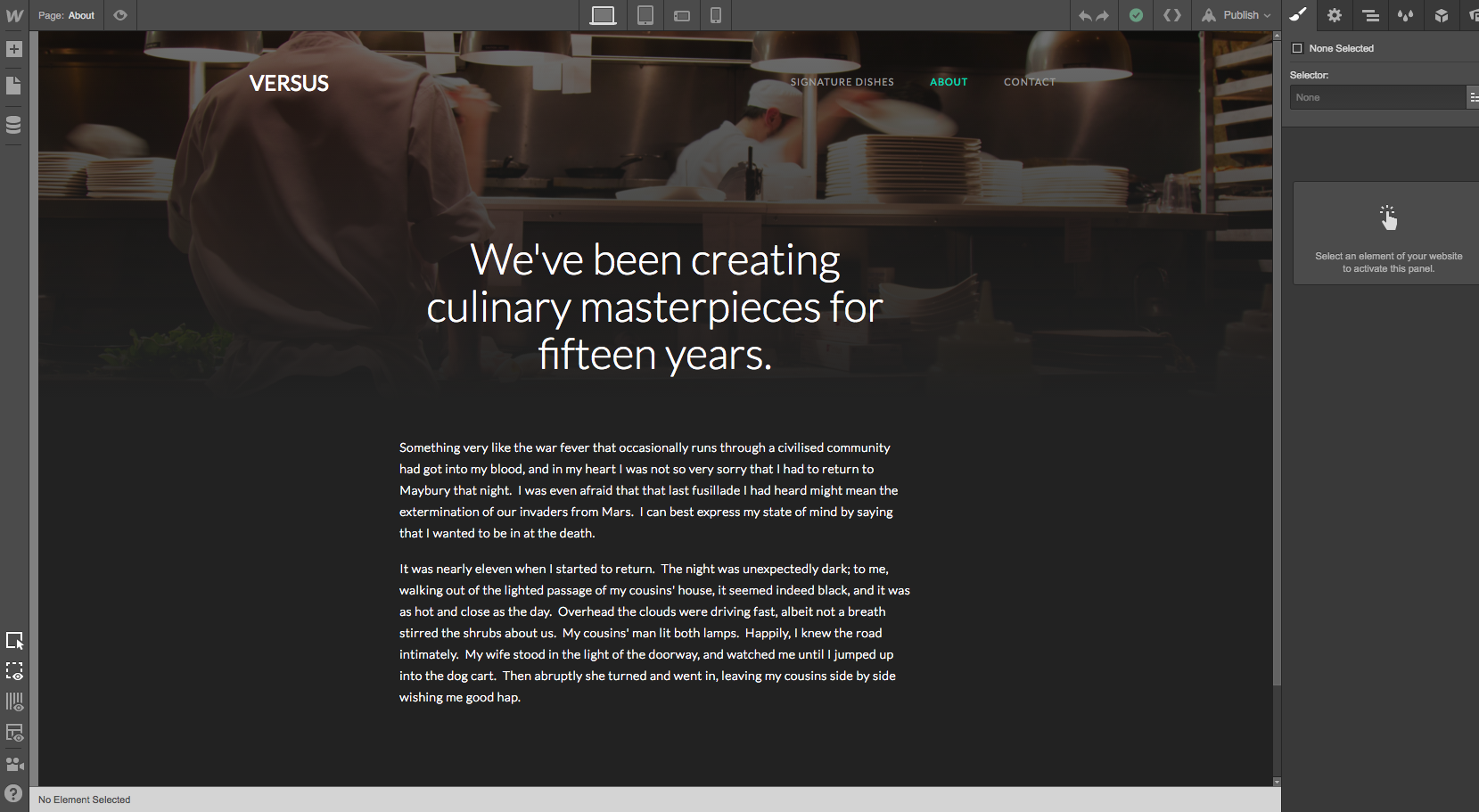
On the About page, I changed the text and added a different background image, making sure to set it as Cover so it properly fits the space. This template also has a gradient over this image. Since it looks okay, we’ll leave it as is.
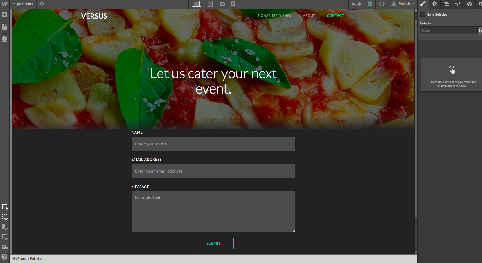
We’ll also change the Contact page with a new call to action, encouraging people to inquire about our catering services.
The only thing left would be to get rid of the Versus logo on the top right of our page and replace it with one of our very own. Once we’ve looked over everything and are happy with it, we could go ahead and publish the website.
Finally, we just need to pick a hosting plan, hook it up to our custom domain, and get ready to wow the world. And if you’re building this site for a client, you’ll want to set up Client Billing to pass the hosting payments off to your client.
Becoming a better web designer, one project at a time
We’ve taken you through how to transform a free portfolio template into one for a restaurant. Don’t be afraid to take a template and to tweak it to your liking. We make it easy for you to experiment and to try different things within your designs.
With each project, you will improve. We just give you the tools and intuitive interface you need so you can focus what’s on important: your creativity.

