


Material Design is a set of design principles launched by Google in 2014. Though it’s rooted in the Android operating system, many designers have taken its visual simplicity and navigational practicality and integrated it into their own design practices. Knowing the basics of Material Design can give you new perspectives on how you approach your own work.
We’re living in a material world
Material Design is informed by how we physically interact with our surroundings. These interactions are used as a starting point to build engaging designs and smooth navigation.
We’ve traditionally absorbed content through print materials. Material Design takes the tactile and visual experience of paper and translates it into pixels — crisp, straight edges and visual elements are layered into a concrete design. Navigating Material Design is easier because it’s intuitive — at least, so Google’s designers say.
Material Design uses drop shadows, bold colors, and multiple layers to highlight and organize its content. And though it incorporates plenty of straight lines, Material Design isn’t bound by strict rigidity — and if you’re an Android user, you’re likely already seeing more curves cropping up already. Instead, it uses movement with the clear intention of guiding someone and inspiring action.
You can check out more about these design principles in Google’s own words about Material Design, but they can be broken down into these three main concepts:
- Material is the metaphor
- Bold, graphic, intentional is the focus
- Motion provides meaning
Material Design is about the mobile experience
Material Design sprang from Google’s Android with the mobile experience at its center. Not only does Material Design inform the visuals on mobile devices, it organizes content and structures navigation. Elements like bottom navigation make single-handed navigation practical and effortless, while nested navigation, tabs, and navigational drawers have simplified and streamlined site navigation.

With the guiding principle of being “intentional,” it makes sense that buttons in Material Design are simple. They’re typically circular with a clear icon that defines their functionality. In the past, buttons were directly tied to specific content designed to prompt an action, but new practices let buttons stray as long as they fit the context of a page.
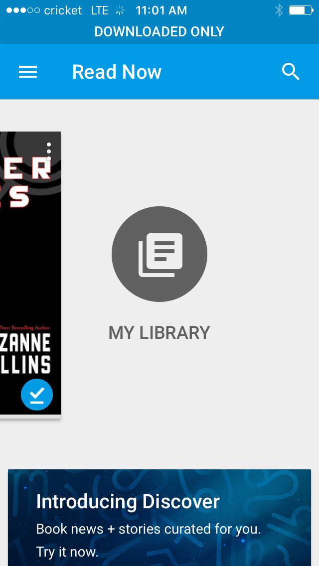
With Google's Play Books app, scrolling to the right of the Read Now option reveals the My Library button where you'll find all downloaded books. While you can also do this from the hamburger menu at the top, the My Library button is a more obvious choice. The button’s intention is clear, it simplifies navigation, and it’s tied directly to the context.
Material Design has leapt from mobile to influence desktop designs. Let’s look at eight websites using Material Design — maybe you’ll be inspired to use this design philosophy in your own work.
1. Rumchata
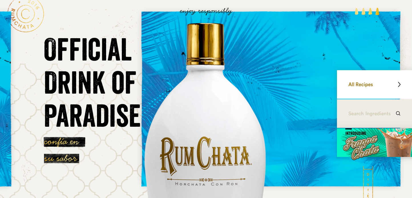
Do you like rum? What about horchata? Yes? Then Rumchata might be the perfect alcoholic beverage for you. It's possible I looked at this website way too early in the morning, because glancing through these sugary concoctions almost gave me a hangover. Luckily, the Material Design leads to a tasteful layout that didn’t leave me with a headache or a hankering for greasy food.
Rumchata’s design evokes a chilled, vacation vibe. The breezy movement of palm fronds is one part of their tropical ambiance. The Rumchata bottle sits in the center, standing out from the layers of color and textures.
The focus here is on all the drinks you can make with Rumchata. The site brings to mind flipping through cocktail drink cards or a recipe book. You can search by ingredients or by the occasion. The experience of browsing through recipes feels like something you’d do in your own kitchen.
It’s a shining example of Material Design taking something we normally do and translating it into an effective digital experience. And yes, some of these cocktail recipes actually look pretty okay.

2. Tombow
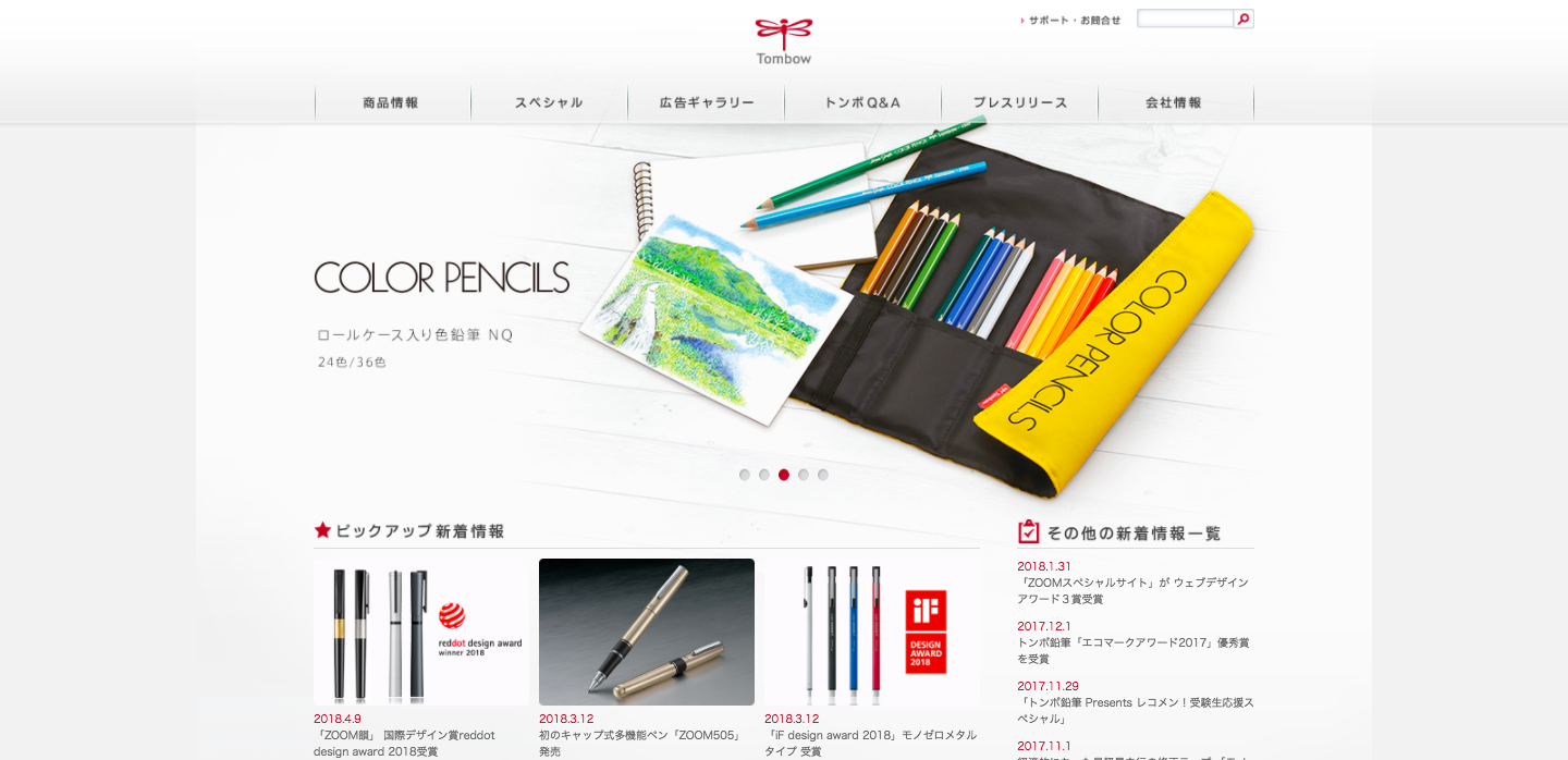
Tombow is a Japanese manufacturer of fancy pens and other office accessories. Their design theme incorporates paper white and shadows to capture their products' important role at the office.
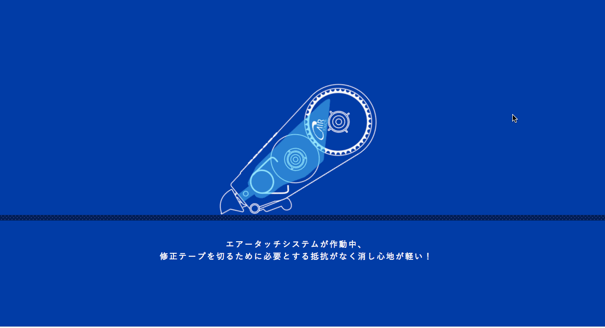
But things really get interesting on the page dedicated to their correction-tape dispenser — yes, this overlooked item from the office supply closet is the hero of this journey. A few clicks (or a scroll) bring you to an illustration of the device’s guts and gears.
Each click makes us feel like we’re uncovering these dynamic details, instead of having them thrust in our faces through big blocks of unmoving content. The tape dispenser demo is so clever — its impact is memorable.
Tombow’s website is a showcase of their high-end office products. And Material Design never lets us forget their importance and functionality in the real world.
This design isn’t a flat expanse. The products stand out as if they’re on a desk in front of you — there’s dimension to these office tools. It’s this nod to the physicality of objects in the real world that gives Material Design a more natural feel.
Physicality and digital abstraction come together on the page with an array of color markers float by. Moving the cursor over a particular marker nudges it as if you’ve used your finger. But this movement also triggers the circles dotting the layout to display that marker’s color. Combing a physical action to trigger something only possible in a digital medium is a strength of Material Design.

3. Botanist
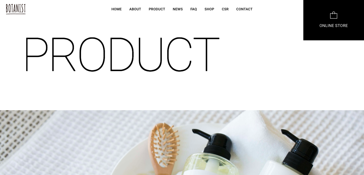
Botanist is a Japanese company that makes soaps and other beauty products. Their branding relies on the simplicity of black and white with plenty of negative space between the straight lines of its layout.
This airy design brings their beauty products to the forefront. High-quality images combined with a careful variation of font sizes keeps the products from being lost in a static field of black and white. Most of the products are photographed in a living space instead of a vacuous, white void. Shadows and other layers keep the design dynamic.
Microinteractions and their tiny movements pop these products off the page and grab your attention. This offers a bit more movement than your usual hover and zoom effect.

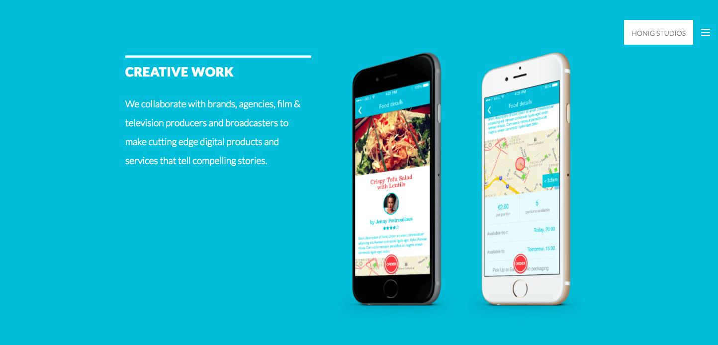
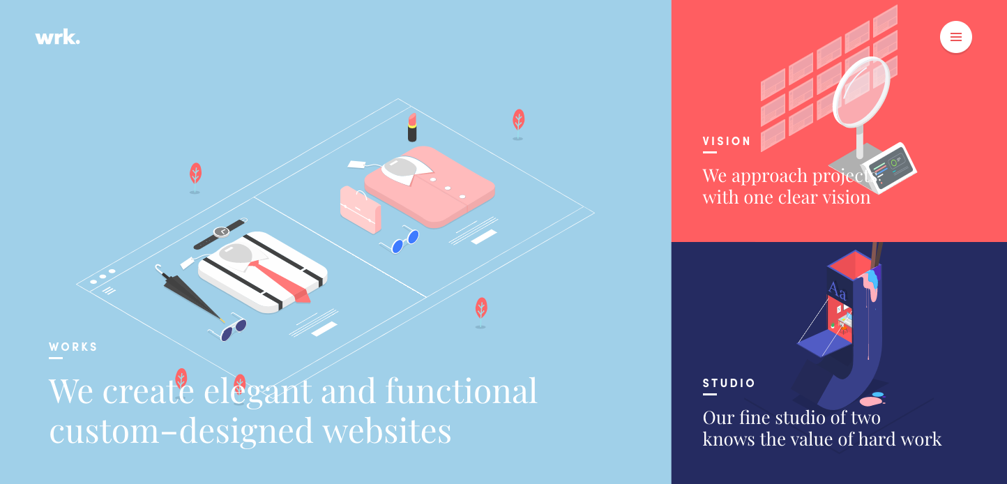
4. Honig Studios
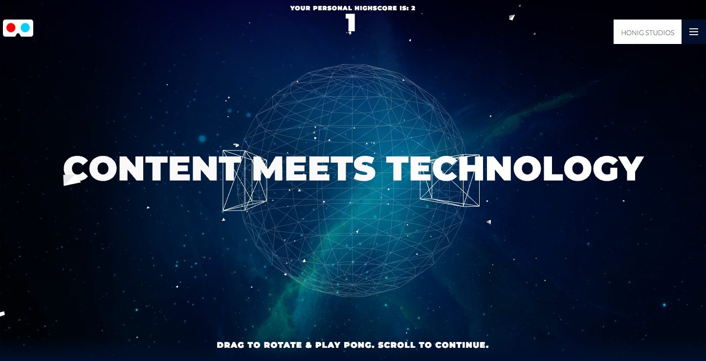
Honig Studios is an Emmy-nominated production company. Their web presence is thoughtful and packed with fun details.
Sure, some of the features are a bit of novelty — like how many people are really going to spend more than 30 seconds playing the integrated pong game? And how many have 3D glasses on hand to enjoy the 3D mode?
A principle of Material Design is to apply something from the physical world to the digital. Honig Studios uses this principle on their hero text, “Content meets technology.” On a down scroll it shatters into flying triangles that flutter like paper in the wind.
With bold background colors and light shading objects like phones and tablets, they take on a physical presence that jumps off the screen.
Honig Studios uses the basics of Material Design with a simple yet pleasing color scheme and their own flair of experimentation. It’s not a uniform experience, but it’s engaging. And the content never loses focus.


The modern web design process
Discover the processes and tools behind high-performing websites in this free ebook.
5. Google Play
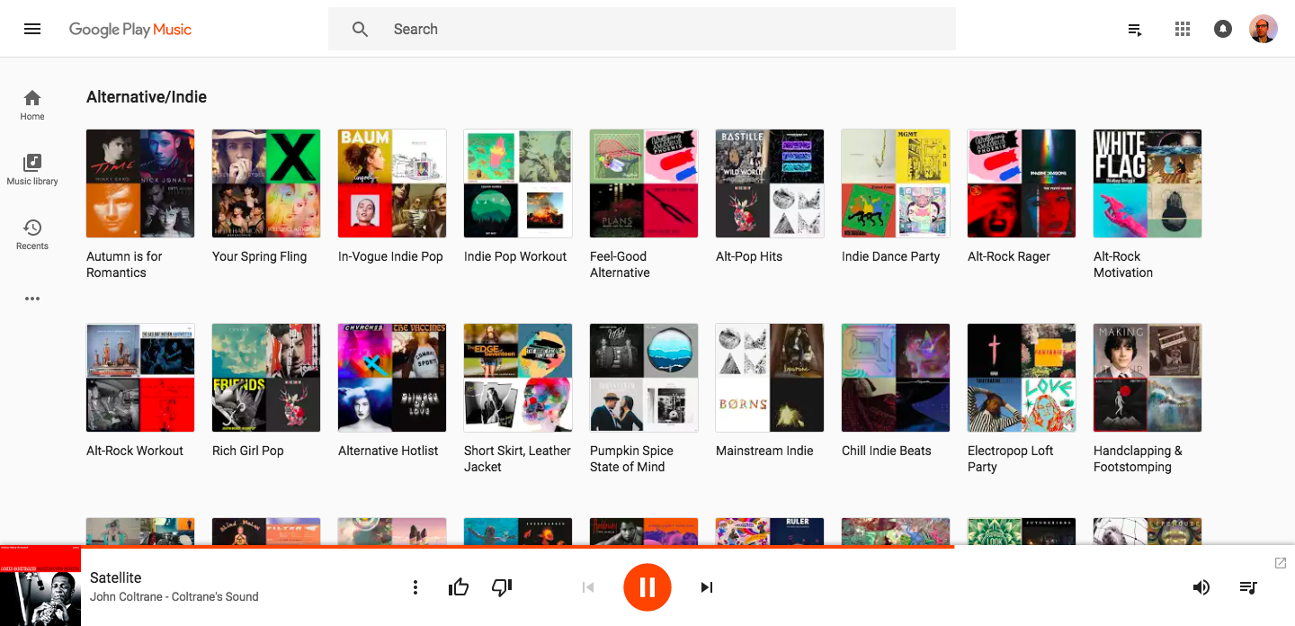
When discussing Material Design, why not go straight to the source and check out a Google application? Google Play is a true distillation of Material Design brought to desktop.
It's a simple grid layout — a signature of Material Design. Hovering over musical selections casts a shadow. This clean interface makes finding music to fit your mood an efficient process.
Material Design shows us that even a digital music player doesn't have to be a complicated experience. By embracing the principle of "bold, graphic, and intentional," Google Play has weeded out unnecessary actions and movements. All that’s left is smooth functionality.
6. Waaark
Waaark is a French design agency and their website is a hip hybrid of movement and stylized imagery. The illustrations all sit on the same 2D plane, looking like accessories from a Sims-like simulation. This, combined with a block layout, could have resulted in a still, unemotional experience. But there’s plenty of microinteractions and animated effects to stir things up.
Hovering over the block’s edges bends them like a rubber band and clicking swirls the background like paint. This liquid-like transition adds so much to the interest of this design — it’s effects like these that are a part of Material Design’s charm.
7. Birmingham Airport Holiday Inn

I don't know. I've never thought about staying at a hotel near an airport. They seem like a welcome shelter for a cancelled flight or a quick business trip, but not a … destination. The website for the Birmingham Airport Holiday Inn will change your mind about airport-friendly accommodations.
Material Design aims to take our real-world experiences and give them digital approximation. This design offers us a virtual tour through the hotel’s room selection. And the photography really captures the hotel vibe — most of the images are taken from eye-level, at a slight angle.
It's like you’re peeking in the door of each room. Everything is well presented, looking fresh and clean. Yes, even those bedspreads — the nightmares of … well … many of us.
The photos spring from an otherwise flat design composed of a simple color palette of white, black, and green. Important details are layered over images and pleasing iconography complements the text. You get everything you need to know in a design that feels effortless to use.
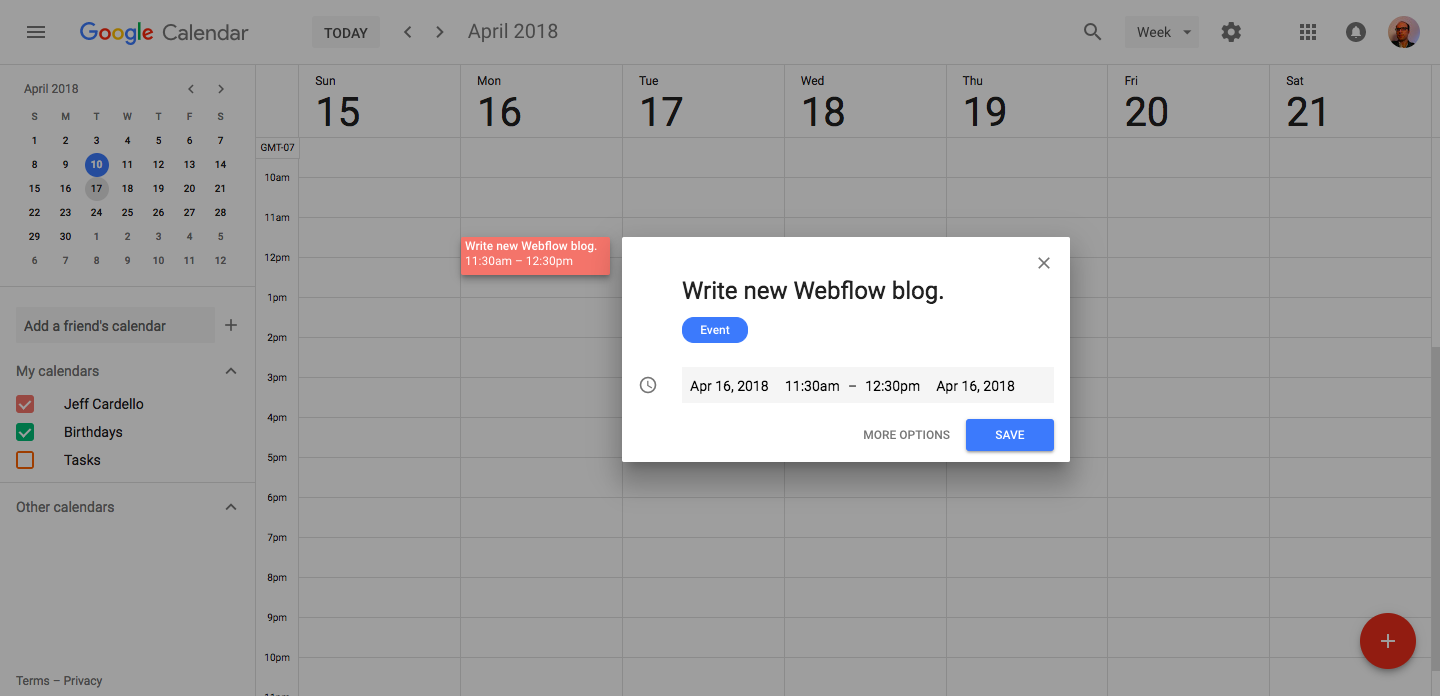
8. Google Calendar
Google Calendar is another one of those “how did we live without it” tools the web has given us. Google makes it easy to add events, reminders, and appointments whether you’re using it on mobile or desktop.
It’a a grid layout — standard for any calendar, but it’s a snap to use. It’s a sparse and almost minimalist design, but its clean lines, thoughtful use of shadows, and clean blocks maximize its usability.
Hone your Material Design skills
Of course, the best way to master Material is to work within its thoughtful constraints. And thankfully, Google has released a Sketch plugin called Material Theme Editor, which is designed, according to Google, to help you produce Material work that still fits your individual brand — which has been a big criticism of Material to date.
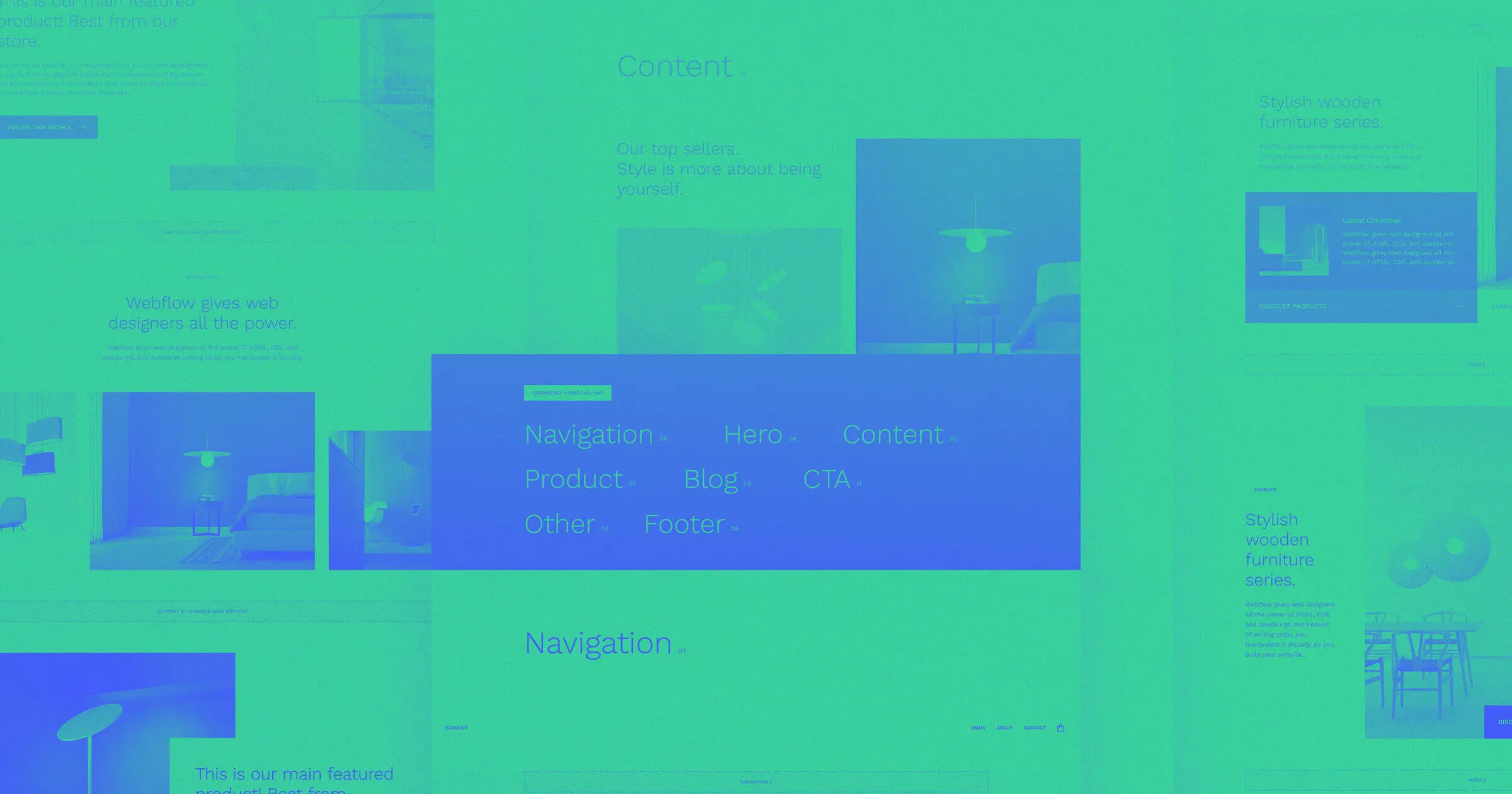
If you'd rather skip the static design phase and skip straight to Webflow, may we recommend this Material Design UI kit by Webflow user Marcel Mölter.
Material Design has the building blocks for a better user experience
As designers, there are so many different schools of thought we can draw from for inspiration. Some design philosophies may conflict with others (we're looking at you, brutalism). But part of being a great designer is the ability to find what's good from different design practices and combine them into a design that's fresh and easy to use. Material Design is here to remind us that a design can focus on practicality, while still leaving room for creativity and experimentation.
Do you have any favorite sites that use principles from Material Design? We’d love to hear in the comments.