We reached out to one of our most popular template designers – Craig Garner, founder of Medium Rare – to find out just how much work goes into creating top-notch templates, and his process behind them.
We’ve talked before about how useful website templates and UI kits can be for anyone wanting to get a website created quickly and easily. What we haven’t discussed, though, is how template designers are impacted by the growing market for templates.
Interview with Craig Garner, founder of Medium Rare
How long have you been using Webflow, and can you tell us a bit about your experience with the product?
We discovered Webflow when it was relatively new. As template designers, we were excited to have a new platform to publish on. Since starting on Webflow around 5 years ago, we have used it exclusively to build template products. It has been great to see the feature-set grow in that time and looking at what you can achieve today with Webflow compared with 5 years ago is amazing.
How much would you say your business and revenue has grown since you started selling Webflow templates?
We have been creating and selling templates with Webflow from near the beginning, so we have enjoyed a steady increase in sales as Webflow has gained traction over the last few years. While our Webflow sales once made up a fraction of our overall revenue, we are now seeing the contribution of Webflow templates to our bottom line increase and outperform that of other platforms.
Can you describe your process for creating new templates?
As a general rule, I start with around 4 or 5 reference designs which I source from other websites, brochures, product packaging or just about any form of media, then I turn to Figma to begin experimenting with different typography, color, shapes and photography combinations until I’ve struck upon a unique look.
Before committing anything to a style guide (which I find essential), I prefer to mockup an entire page that includes one of each type of style-able element (form inputs, buttons etc.) to get a good sense for how the design works as a whole.
Often, while designing in Figma, I'll have ideas about an interaction or an animation. I'll quickly fire up a blank project in Webflow to prototype and iterate upon it. This process will often spark new ideas that feed back into the broader design in Figma — as a designer I love this fluid workflow.
Can you share some best practices with designers in creating their own successful templates?
Keep abreast of visual trends that you see in the world around you and get into the habit of dissecting them — doing this allows you to build up a broad toolkit of visual motifs and arrangements which you can then apply to your template concepts .
It is also important to identify the scope of your project early and stick to it — sometimes it’s easy to get carried away with extra features and layouts but this doesn’t suit every kind of template. The beauty of Webflow is that a small, well-executed template can be successful — sometimes a less is more approach is the better option.
A successful template is a design that others would be proud to associate with their company and their brand. Templates, like fashion, are also aspirational and can embody a “certain something” that the customer wants - even if they can’t really pinpoint why. Aim to give the customer something that they didn’t know they wanted until they saw your template. I find that this mindset keeps my designs fresh and keeps me pushing forward.
How would you describe the collaboration with the Webflow templates team and the communication with other template designers?
The collaboration with the templates team is the most seamless we’ve experienced across any template marketplace. They’re very communicative and helpful during QA in identifying points in your template that need a little more work before it’s ready for sale.
We also keep in close communication with the template designer community.
Template design is a competitive space for sure, but there are a few Webflow template designers that we reach out to now and then. It’s nice to have a friendly community of designers who are all in the same position with the same goal. It is comforting knowing that there are others in the same boat, especially when working from home under the current circumstances.
What are the advantages of creating templates for the Webflow marketplace?
Due to the nature of the products, we find our Webflow templates the easiest to maintain, since all the heavy lifting is done behind the scenes in the Webflow system. When Webflow announces a new feature, we simply update and extend our templates accordingly. With our HTML-based templates, we spend a lot of time updating for new plugin patches and compatibility fixes, which distracts from the main objective of building templates.
Webflow offers the most level playing field when it comes to template features, which means that templates are allowed to sell based on their design merit, rather than how many javascript plugins are bundled in. We find that it is easy to get caught up in the “features arms race” on other platforms where there is no limit to the number of plugins and features that can be added to the template.
Webflow’s defined feature-set is a breath of fresh air for us as template designers. When you’re creating templates in the traditional way (writing the HTML, CSS and JS manually), the near limitless amount of plugins, libraries and APIs can be overwhelming — not to mention potential support headaches. By removing these obstacles, Webflow allows us to maintain a laser focus on design quality and frees us up to be more creative and vastly more productive.
What made Webflow stand out from similar tools that you might have used to create templates?
Due to the fully in-browser experience, Webflow is a much quicker, and more hand’s off way of creating templates that alleviates all the nuts-and-bolts work that usually goes into scaffolding and developing a template product. With Webflow we no longer need to worry about maintaining build pipelines, managing data files, updating plugins and wrangling templating systems. All of this work is handled behind the scenes, which frees us up to focus more on the design and improve the quality of our offering — not to mention the remarkable increase in our productivity and throughput.
What type of marketing efforts do you do on your own, to help to promote your templates?
We have found that social media marketing is not the best fit for our business and instead have relied on building a steady following via an email list that we use to alert our customers of product updates and see a great response when new templates are released.
How did this partnership impact your brand? Has your brand been impacted in any way since you began creating templates for the Webflow marketplace?
Many of our customers are web contractors who build sites for their own suite of customers, and many of them purchase the full range of our designs, often purchasing multiple copies, too! Where previously our customers have associated our brand with HTML and WordPress, we are now seeing a gradual shift in those traditional template users transitioning over from WordPress to Webflow as they discover its powerful but easy interface and integrated hosting options that make building and handing over sites to their clients easier than ever.


Get started for free
Create custom, scalable websites — without writing code. Start building in Webflow.
Medium Rare is one of the most successful designers in Webflow’s template marketplace.
With a unique style and flair, their well-crafted and easily adapted templates are fully equipped to meet project requirements, even from the most demanding clients.
Popular templates from Medium Rare
Check out some examples of their best work (so far!):
Spark
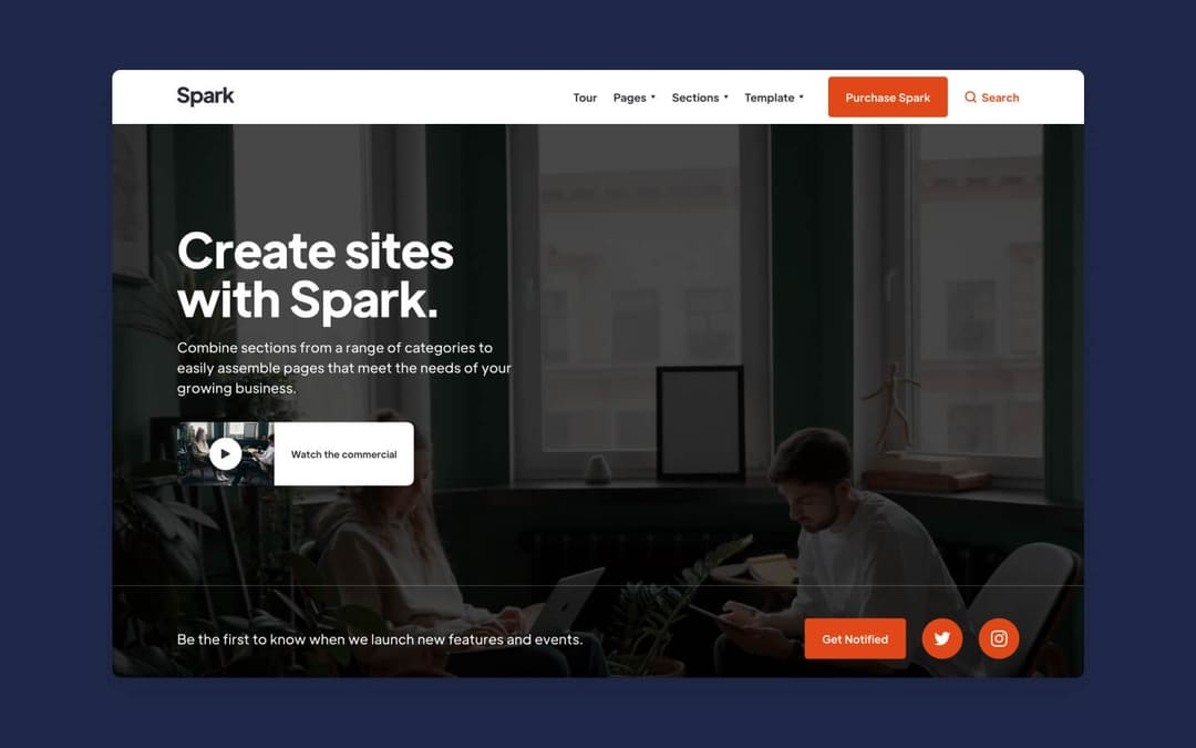
For those looking to build a commercial website for a company or a business, Spark gives designers plenty of options with 9 different landing page designs, 100 ready to go sections, as well as a variety of headers, footers, and navigational elements.
It’s nice to have a selection of landing pages that have different objectives. Whether you want to put an email signup form front and center, utilize an eye catching hero video, or do something like give your users a search bar, you’ll find a landing page among Spark’s templated layouts that will provide you with the functionality that you’re after.
We’re also fans of the pre-made elements that are included. With website components set up for showcasing videos, putting together pricing pages, and including calls to action, you won’t be scrambling to have to build anything you need from scratch.
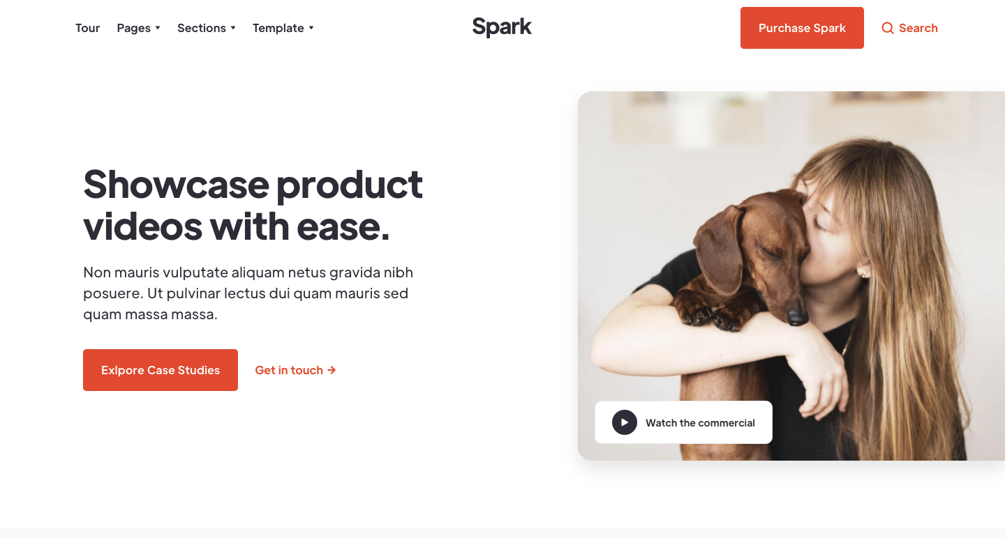
Another great thing about Spark is how it utilizes Webflow’s CMS. Blog posts, help center articles, and case studies have already been put together - all they need is actual content.
Delve
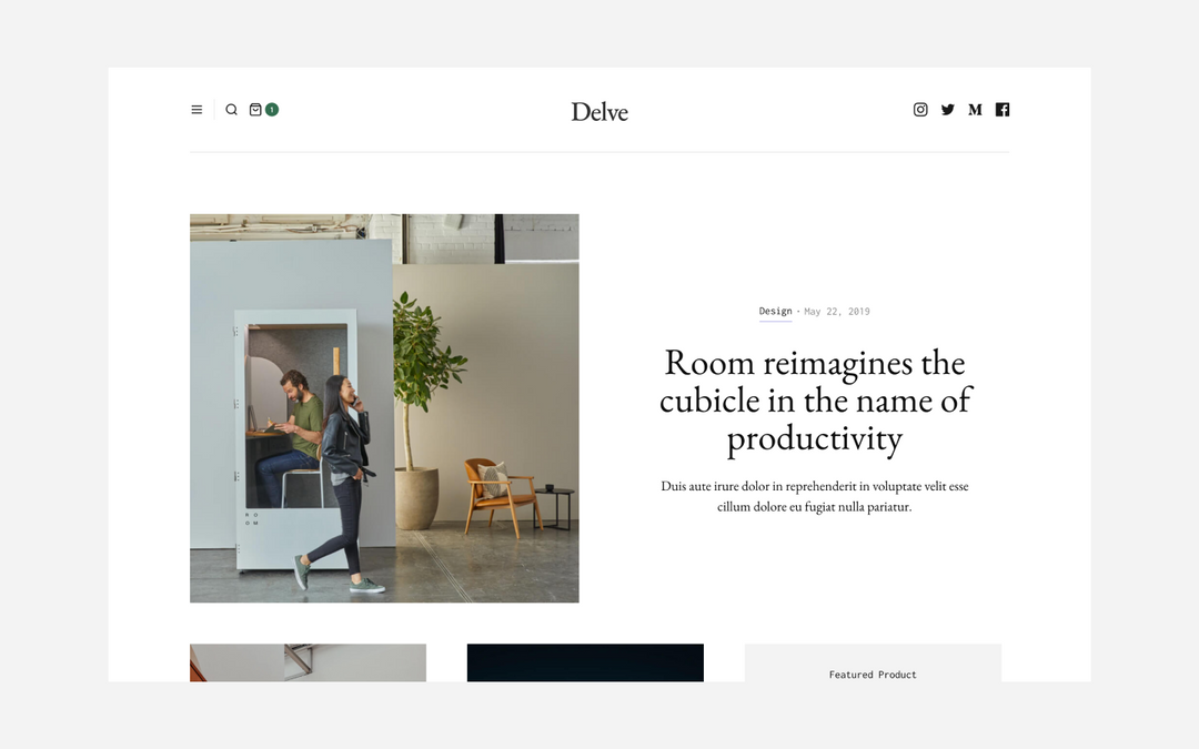
In the crowded sphere of ecommerce, it’s hard to stand out. One way that online retailers are giving their potential customers more than just a tidy grid of products, is quality content. With a design that takes its aesthetic from print magazines, Delve gives online shops a template that gives them plenty of space for adding in supplementary content, as well as showcasing their products.
With a layout filled with blocks, ample negative space, and big product images, Delve finds the right balance between artistry and practicality. Along with a number of layout choices, they also offer four different options for showcasing articles, giving you plenty of flexibility in how you want to present this content.
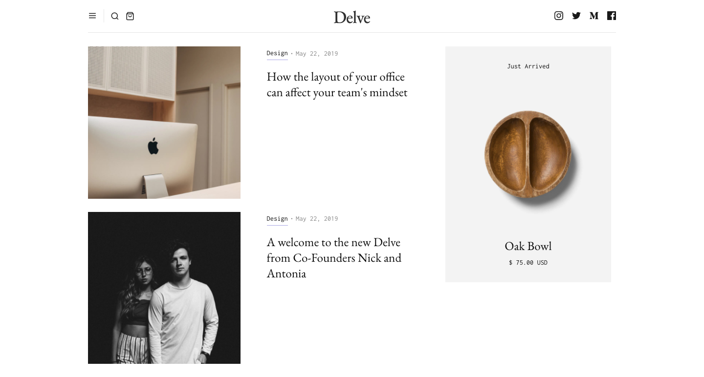
This is another design where Webflow’s CMS powers both the ecommerce side, as well as other dynamic content.
Uptime
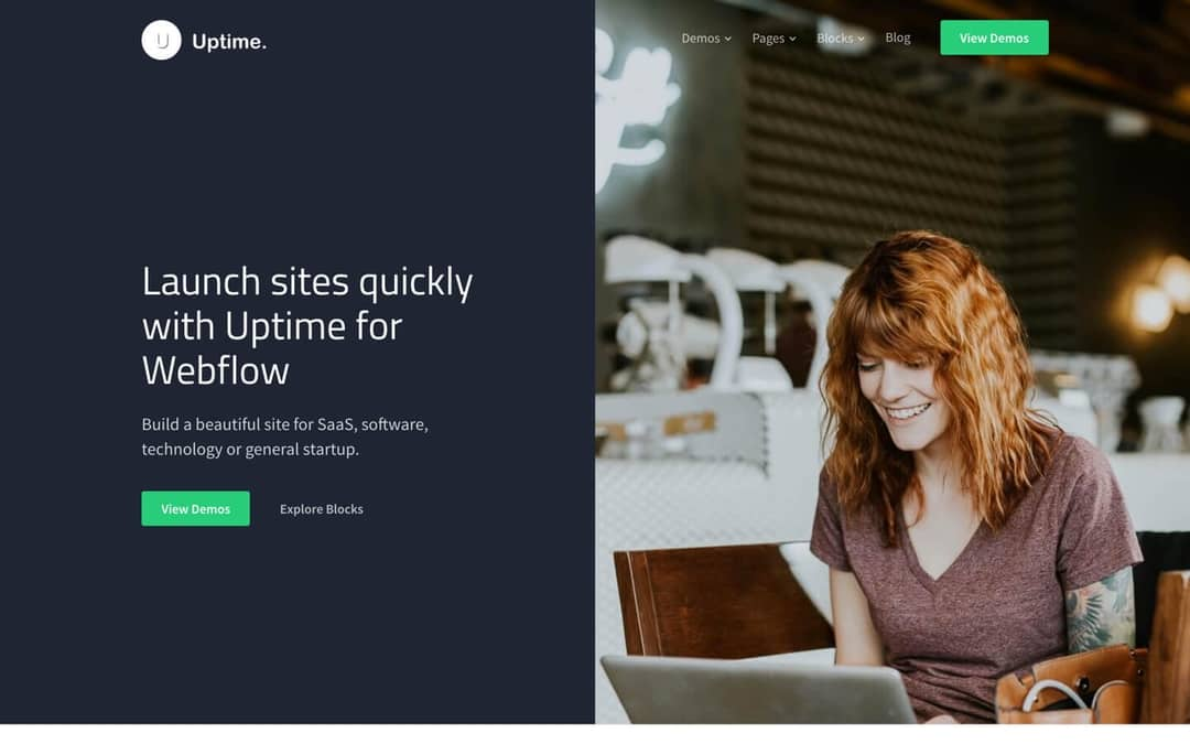
Medium Rare crafted Uptime with tech companies in mind. With a number of sleek layout options, modern typography, and a smart palette of colors, Uptime offers a consistent set of design elements for the tech crowd. Out of the box are well built landing pages, icon grids, product feature sections, and other parts ready to be assembled together into a web design.
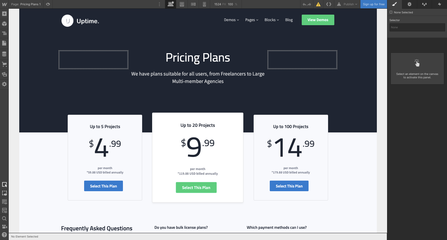
SaaS companies will especially like the selection of pricing plan blocks, which are essential in communicating this important information to potential customers.
We want to see your work
If you’re an agency or freelancer looking to boost your income, and show off your design skills, submit your application for review!


