

We’re beyond excited to share 3 new features that give you the power to easily create custom galleries from your CMS images and videos.
You can now upload, style, and showcase your CMS and Ecommerce photos and videos with ease thanks to three new features:
- The new multi-image field
- CSS grid 2.0
- An improvement to our lightbox component
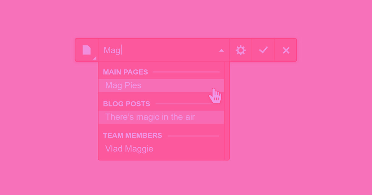
To show you a couple of these features in action, Meg, our newest community team member, created a gallery of product thumbnails on an ecommerce product page.
Upload up to 25 images at once with the new multi-image field
Batch uploads for the win! Our new multi-image field allows you to upload as many as 25 images. In a single field, you can drop in all the best shots of a portfolio project, a slew of product thumbnails, or even your 10 favorite GIFs of salsa-dancing dogs … as long as they’re under 4MB each, of course. You can also reorder your images however you’d like.
To add a multi-image field (or three) to your collection, head to the settings of any collection (including your Ecommerce products), click “Add New Field,” and select the multi-image field type. Fill in a label, add some help text (if you want), save your collection settings, and you’re ready to start dropping your images in.


Once uploaded, you can connect those images to any layout on a collections template page using a collection list. In this way, your layouts stay uber-flexible, dynamically pulling the images that correspond to each item, even if they vary in count.
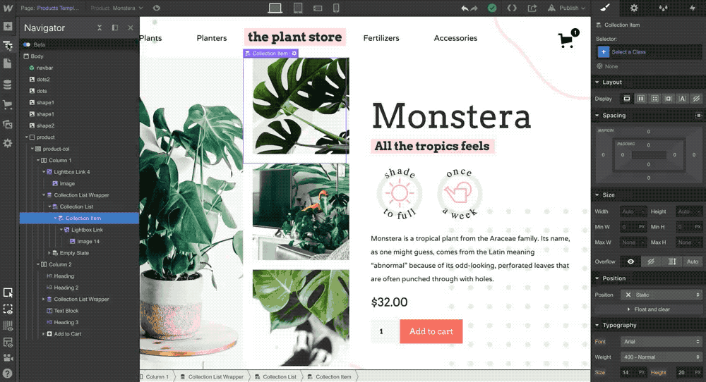
Create a dynamic image grid using grid 2.0
Last month we announced massive improvements to CSS grid in Webflow. Among those improvements is a new ability to create easily editable grid layouts of dynamic content, like, say, those portfolio project shots or the product thumbnails you just dropped into your new multi-image field.
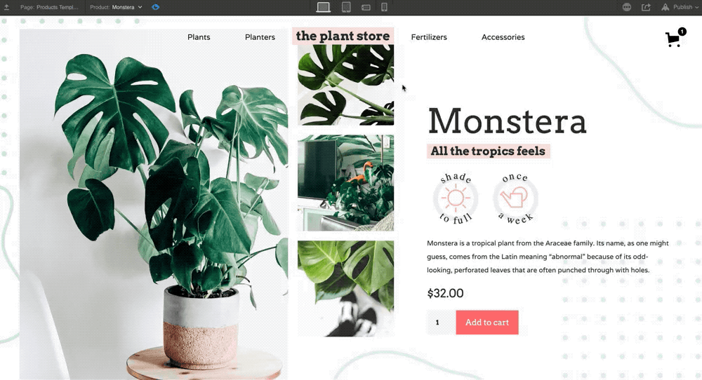
The launch of CSS grid 2.0 introduced the concept of autoflow, a new default mode for the positioning of grid children, which includes all dynamic content styled in a grid. Basically, that means your content will be a lot more flexible because the grid itself auto-places your content into the next available cell, no matter how you modify your columns or rows.
Autoflow makes responsive design with your dynamic content a seamless process. Take the example below. When we delete a column to better accommodate a mobile screen size, our content automatically shifts to fit the new layout.

To create a grid layout from dynamic content, drag a collection list into your project. Under the layout options in the style panel for your collection list (not your collection list wrapper), choose a grid layout. From there, you can customize the sizes of your rows, columns, and even the spacing between them. Modify column or row counts as you design for each responsive breakpoint.
To learn more about CSS grid 2.0, read our recent announcement, or get the lowdown in a full course on Webflow University.


Get started for free
Create custom, scalable websites — without writing code. Start building in Webflow.
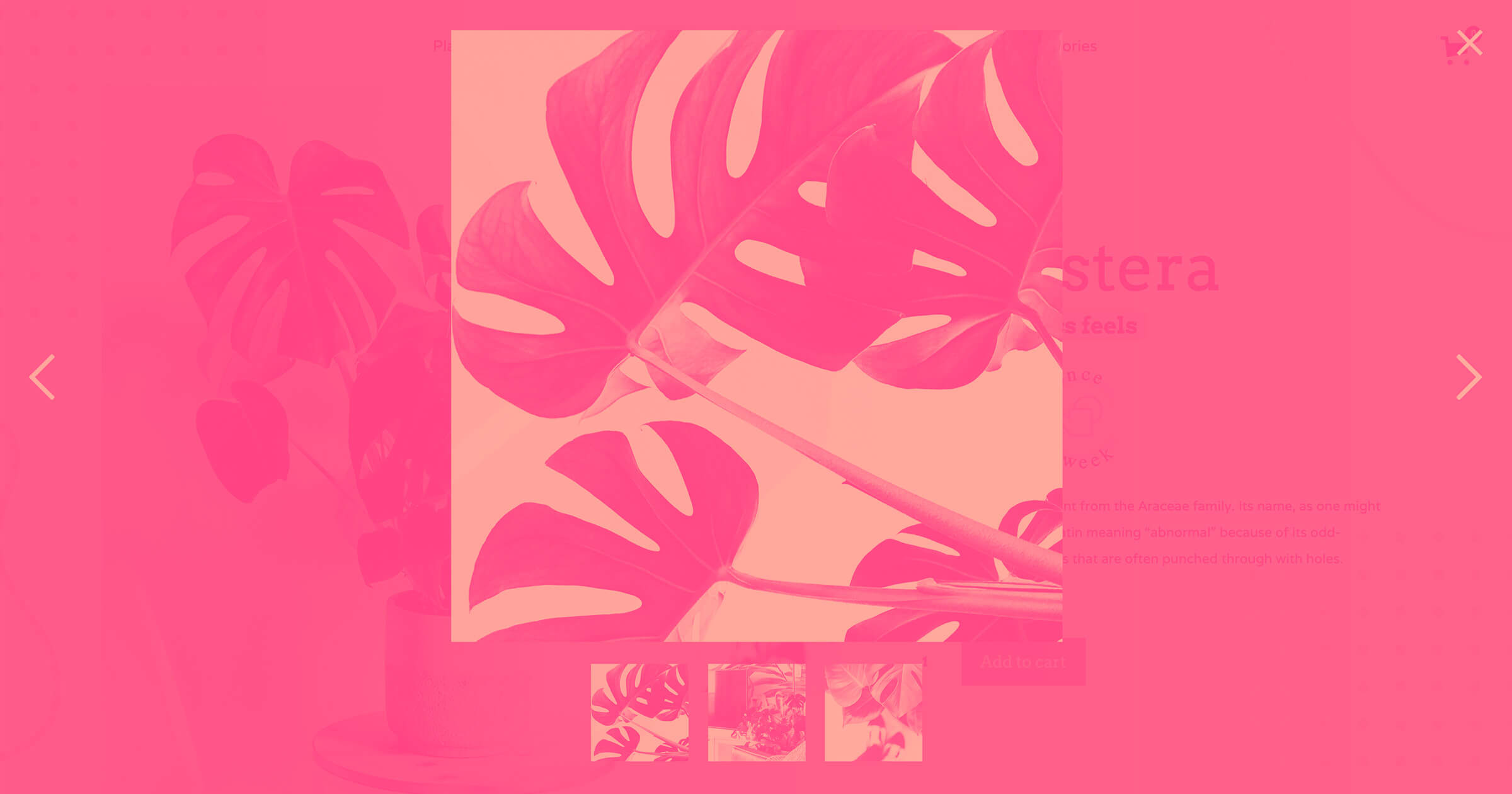
Showcase your dynamic images and videos using lightboxes
Webflow’s lightbox component lets you showcase your images in a full-screen window, creating an immersive and engaging experience. And now you can connect the lightbox component to your CMS and Ecommerce photos and videos!
To create a gallery in a lightbox experience, you’ll want to first create a collection list and connect it to an image source: this can be a single or multi-image field, or a video. Note that, for now, you can only display those images on a collection item template.
Drag the lightbox component into your collection list. You’ll have to connect your image or video source to both the lightbox link and nested image. To link your lightboxes for a true gallery feel, click the checkbox in your lightbox settings, and give your lightbox group a name.
And that’s it!
Show us your dynamic galleries!
We know many of you have been eagerly awaiting the ability to create dynamic galleries, and we can’t wait to see what how you create them. Be sure to share your creations with us here, or on your favorite social network with #MadeInWebflow.
What's next?
We're constantly working to make Webflow's dynamic capabilities better for you. The releases we shared today are just a drop in a bucket of the improvements we've either launched or are ready to queue up.
So far in 2019, we've launched things big and small. A few additional highlights in the world of dynamic content include:
- The official release of Webflow Ecommerce in late February
- A new “connections manager” that lets you see every instance where a collection is connected to your designs
- A new ability to reorder the display of CMS collections
- A new ability to filter collection feeds by multi-reference fields
- A new ability to password protect your Collection pages
While we can't promise a specific timeline on any of these, we have a few exciting initiatives we're already working on:
- A PayPal checkout experience for Ecommerce
- The ability to use the multi-image field with your product variants in Ecommerce
- The ability to schedule collection items
- Collection list “or” filtering
Have thoughts on how we can improve? Post or vote on our Wishlist. It’s an important source of truth for us as we prioritize new features.
Happy Webflow-ing!