About us pages are powerful tools that turn casual visitors into brand advocates by connecting with them on a human level. But crafting impactful about us pages goes beyond writing a catchy blurb. It involves understanding your audience and presenting a story that resonates.
Amid the impersonal nature of online transactions, where consumers often buy what they need without human interaction, about us pages move the personal connection back into the spotlight.
These pages act as powerful tools, particularly for service and B2B businesses. They emphasize relationship-building — a key component more critical in these industries than in product-focused and B2C ones. Some companies have even found that jazzing up the copy on their about us page increases conversions.
About us pages give brands and people a chance to let their personalities shine. Read on to learn how to craft pages that do just that — and get inspired by six outstanding about us page examples.
What makes an about us page effective?
A strong about us page design tells the brand’s story authentically and engagingly. It doesn’t just list qualifications and credentials — it expresses the human side of the business, including key staff members’ stories and what motivates them. The most effective about us pages follow these general principles:
- A clean layout with lots of visuals. They include various types of relevant photos — like photos of key staff members, important processes, and the business’s physical location — to create a visually appealing and genuine representation of the brand.
- Authenticity. They capture the brand’s voice in a way that doesn’t feel generic or forced to forge a genuine connection with visitors.
- Brand storytelling. Instead of just listing facts about the brand, they shape a compelling narrative that starts with the brand’s founding and inspiration and ends with its current status (or aspirations for the future).
- A customer-centric approach. Great about us pages move the focus back onto the customer by showing how the unique characteristics of the business translate into a better customer experience.
- Strengthened value proposition. Strong homepages convey a value proposition within seconds of visitors arriving on the page. The about us section is a chance to go deeper and explain why the company (or person) chose to add value in this way.
The 5 about us page essentials
About us page content should cover five key areas:
- Mission statement and core values: The motivations underlying the business’s offerings
- Brand story: A timeline of the company’s history, including its origin, key accomplishments, important milestones, and current state
- Team introduction: A photo of each key team member, a statement explaining their background and expertise, and clarification of their role in delivering exceptional products or services
- Unique selling point (or proposition): A clear explanation of what differentiates the brand from competitors
- Social proof: A showcase of the brand’s credibility through collaborations, positive reviews, and testimonials
6 about us page examples that do it right
Here are six exceptional about us page examples, each demonstrating one of these essentials in action.
1. Mission and values: Sydney Family Dental
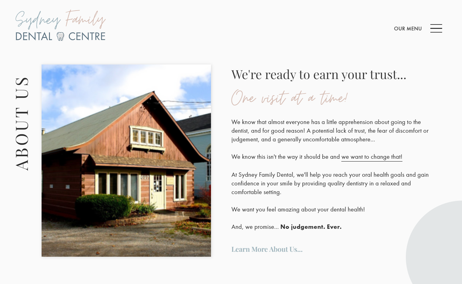
Sydney Family Dental is a Canadian dental practice aiming to eliminate the fear of going to the dentist. Design team Cageless Content uses the headline “We’re ready to earn your trust” to communicate the practice’s mission: to improve people’s relationships with their dentists through compassion and positive experiences. The designers also include a photo of the practice’s location — an ordinary-looking house — to reinforce prospective clients’ sense that this practice has a welcoming, family-like atmosphere.
2. Brand story: Juxtapose
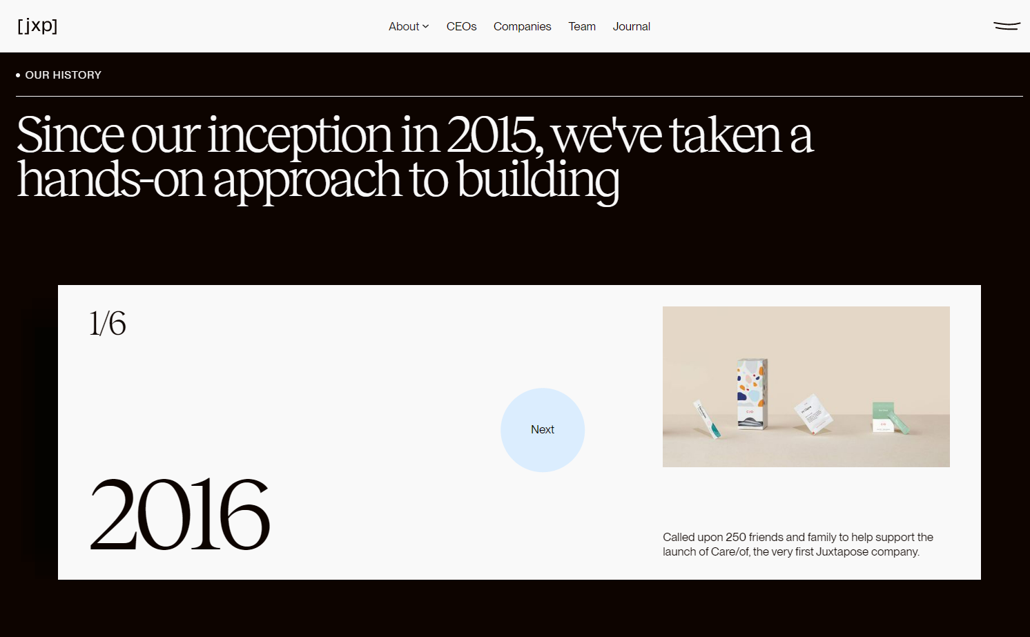
The website for venture capital firm Juxtapose, designed by Paper Tiger, has one of the most comprehensive about us sections we’ve seen. From the “About” dropdown menu on the top menu bar, you can navigate to three different pages: What we do, How we work, and What we believe. The “How we work” section includes a brand history told through an interactive animation of six cards that briefly describe key projects and milestones. Crafting concise descriptions and presenting one milestone at a time ensure you don’t overwhelm site visitors with excessive information.
3. Team introduction: Folk
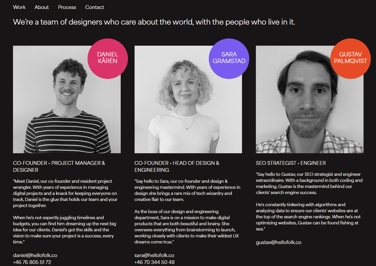
Swedish design team Folk’s about us page introduces each team member with a smiling black-and-white picture, a list of their roles at the company, and a friendly, authentic blurb. The team members’ names pop in brightly colored circles, contrasting against the black-and-white color scheme of the rest of the page. Individual contact information lets readers reach out directly to the staff member they feel most drawn to.


Free ebook: Web design 101
Master the fundamental concepts of web design, including typography, color theory, visual design, and so much more.
4. Team introduction (alpaca version): Alpa Casa
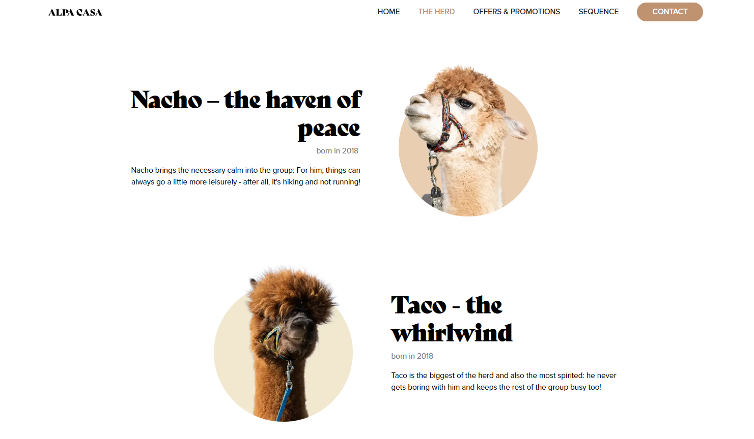
Team introductions aren’t just for humans. Alpa Casa, a German alpaca farm, hosts tours, children’s birthday parties, and corporate team-building exercises. Design studio N13 Media uses the farm’s about us page to introduce each member of the alpaca herd — the real stars of the show. This page’s creativity and goofy visuals indicate the real-life experience at the farm will be just as lighthearted.
5. Unique selling point: Eonix

Battery technology company Eonix produces high-performing batteries from novel materials. In the about us section of their website, titled “Our story,” design team Dunclyde highlights Eonix’s revolutionary battery science, emphasizing the product’s unique selling point (USP). The page describes the whole development process — they first needed to invent a new sensor before designing new battery materials — to show that Eonix’s USP is a holistic approach to battery technology rather than simply a new product.
6. Social proof: Cambridge Learning Center
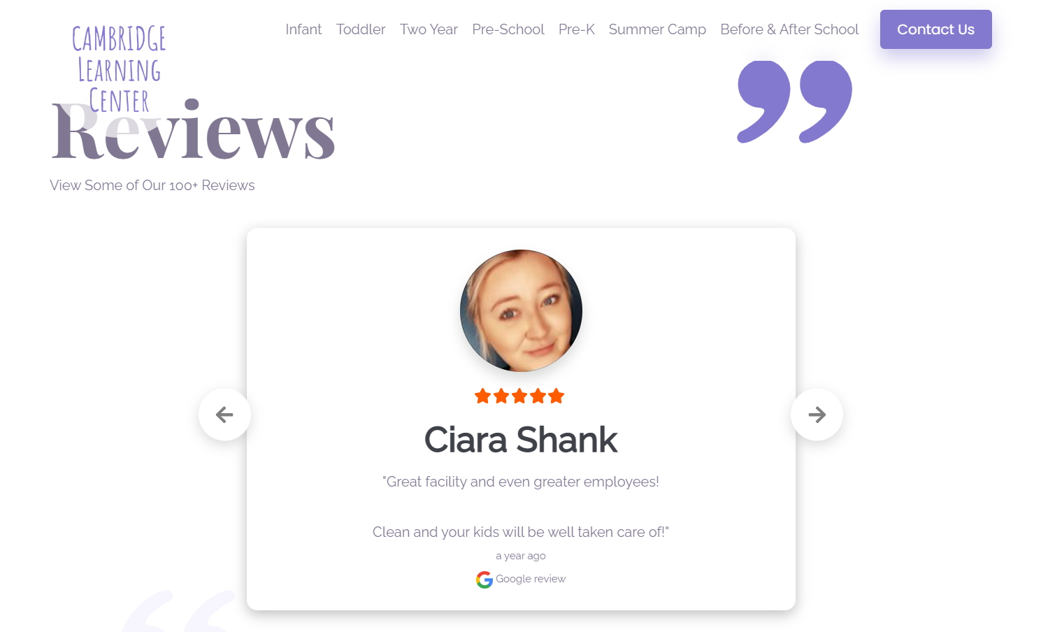
red K Studio’s design for the Cambridge Learning Center site features their about us section on the homepage, with testimonials directly sourced from Google. This deliberate approach builds more credibility than typical quote-based testimonials (which a company or designer could theoretically make up). The carousel presents a limited selection of reviews, but it invites users who scroll down to click on a call-to-action (CTA) button labeled “View review wall,” leading to a whole page of five-star reviews.
Tell your story with Webflow
A strong about us page creates a human connection between a brand and the audience. Many site visitors want to learn about the people and stories behind a brand, so communicating these in an appealing way inspires trust and encourages brand loyalty.
With Webflow, you can create a captivating website design aligned with a brand’s mission, story, and values. A well-presented about us page will strengthen this alignment by inviting prospective customers to interact with a brand more deeply. Browse our collection of templates and websites for more inspiration, or get started right away with our Designer tool.

Get started for free
Create custom, scalable websites — without writing code. Start building in Webflow.


