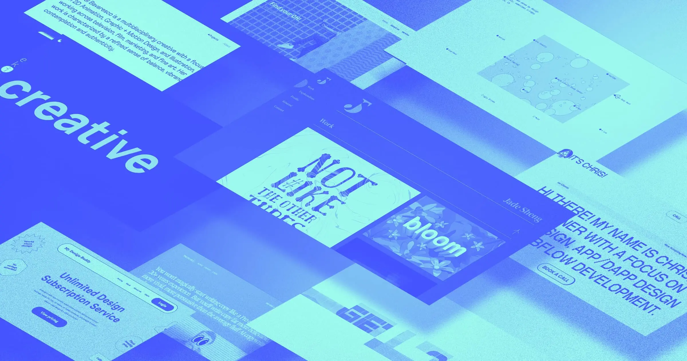


This month is all about bold design choices.
For our July 2022 project showcase, we selected projects that make great use of animation, lean into statement typography, or present a professional business through whimsical design.
Here’s our rundown.
Projects with captivating animation
Adding motion to a website can be a great way to grab visitors’ attention and leave an impression.
Rachel Bavaresco
Rachel Bavaresco’s website greets us with an animated loading screen, setting the tone for her 2D animation, graphic and motion design, and illustration portfolio.
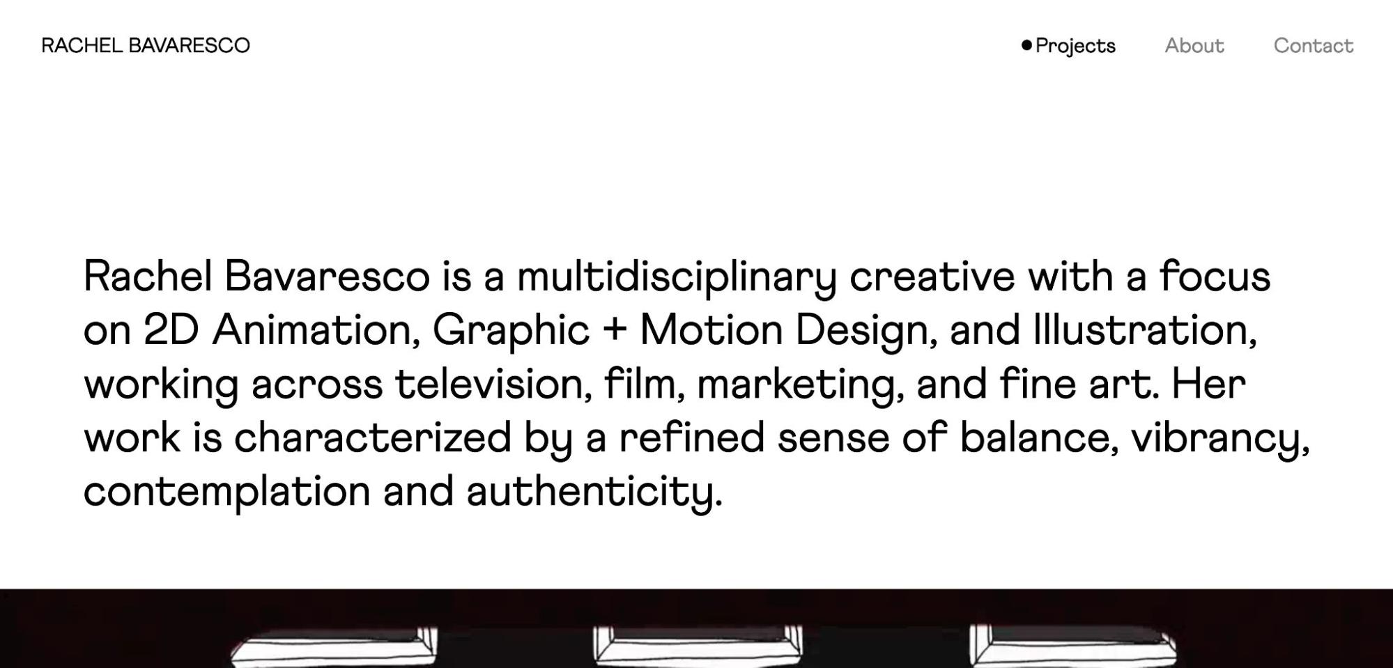
This site — built by Mason Pajunas — does a great job of demonstrating Rachel’s multidisciplinary skillset. Right below the fold, you’ll see video snippets from Rachel’s reel, followed by still images of her selected work. Images come to life when you hover over them, much like a highlights reel for each project.
Hover Animations Puzzle (cloneable)
Hover Animations Puzzle is a straightforward cloneable by Bryce Tanner that could be used for various purposes.
Moving your mouse cursor around the page activates the animation square-by-square to reveal an image. Once activated, each square remains for a few seconds before fading back to white. This cloneable would be great for building excitement for a special announcement or image.
Stephanie Ma
Visual designer Stephanie Ma opens her portfolio with what looks like a connect the dots page. And while you can’t actually connect the dots, a curving line follows your cursor as you move around.
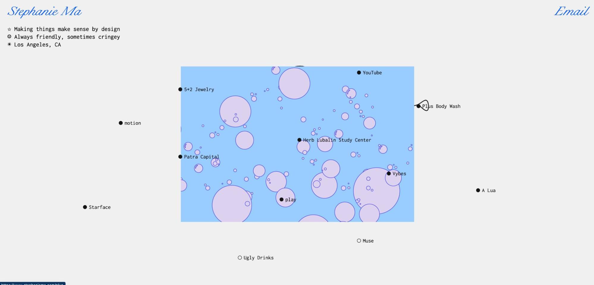
Each dot corresponds to a project and hovering over it will bring up an animated preview of the work. Stephanie keeps the theme going by incorporating the cursor interaction throughout the portfolio. Adding that playful element to her website creates a more engaging experience for anyone checking out her work.
If these projects make you want to add movement to your next design, be sure to account for accessibility and build for people who prefer motion and as well as those who don’t.
Projects with standout typography
How you arrange text and pair fonts can make a big difference in your overall aesthetic. These projects pack a typographic punch with unique fonts and oversized typefaces.
It’s Chris
Designer Chris Nelson grabs your attention with large, pixelated text that announces who he is and what he does.
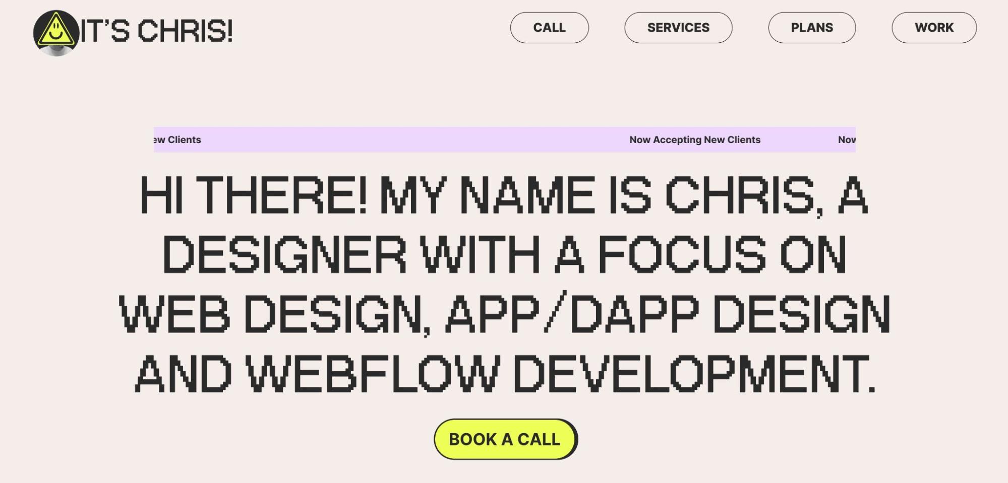
The pixelated font and bright colors and give the entire website a 90s web design vibe with modern touches. Chris also plays with animation — hover over any project name and the letters will move in an upward scroll while a thumbnail of the project appears.
Ekilab
Ekilab combines oversized typography with minimalist design.
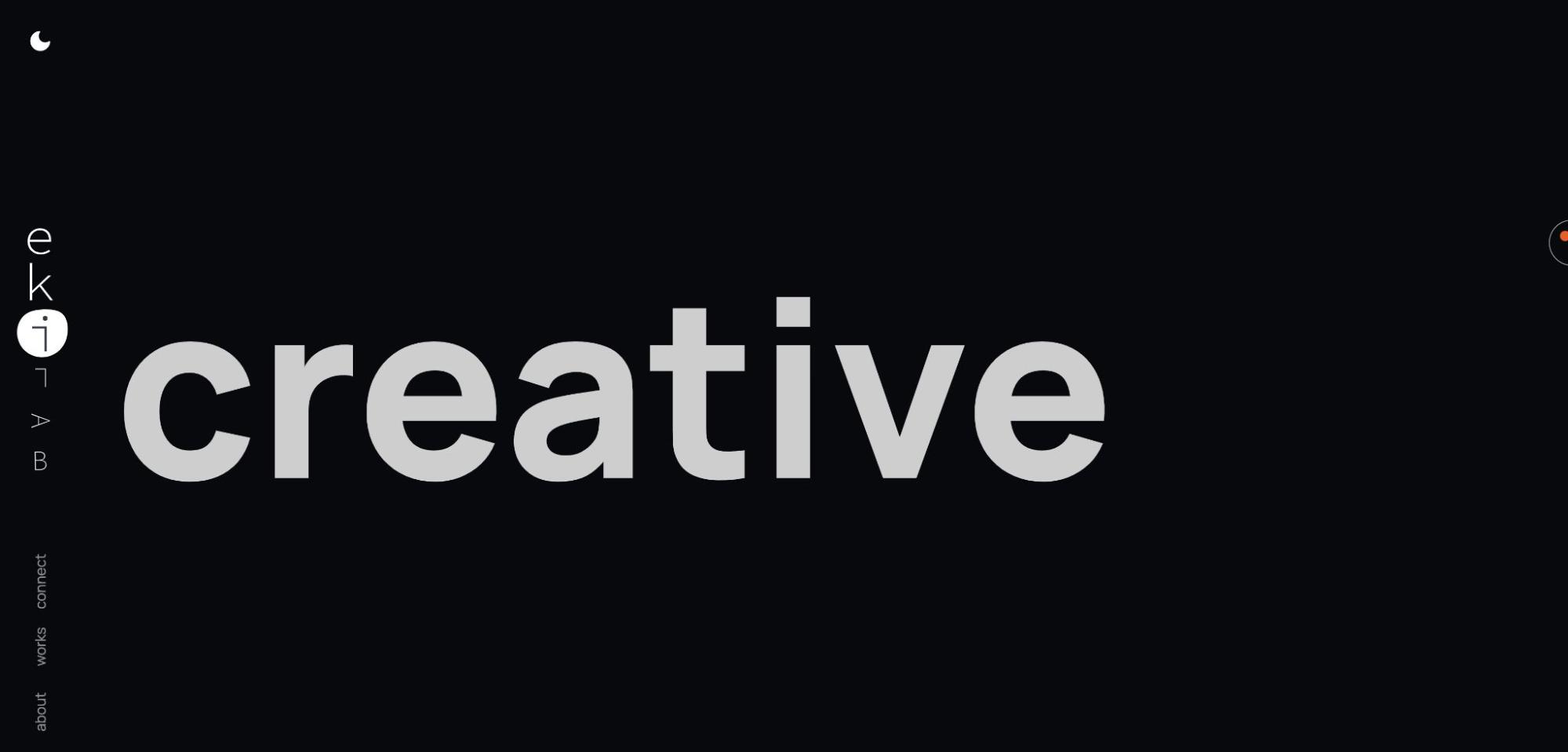
This one page website keeps you scrolling by limiting the amount of text you see on the page. If you’re tired of scrolling, you can also use the menu on the left side to jump to the section you’re interested in.
Jade Sheng
Visual designer, illustrator, and art director Jade Sheng specializes in typography, so it’s no surprise that her portfolio shows off her skills.
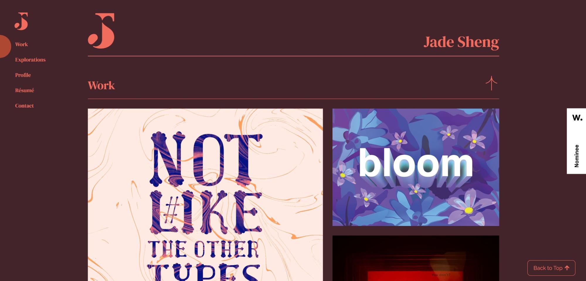
Jade’s website feels like an interactive resume. You can either scroll through or use the side navigation to see different types of work including original typography, design experiments, and illustrations.


Build websites that get results.
Build visually, publish instantly, and scale safely and quickly — without writing a line of code. All with Webflow's website experience platform.
Projects with playful professionalism
Who says professional has to mean plain? Each of these websites show off playful design for professional businesses.
My Design Buddy
My Design Buddy presents a summary of what they do with pastel colors and quick descriptions within shapes that look like stickers.
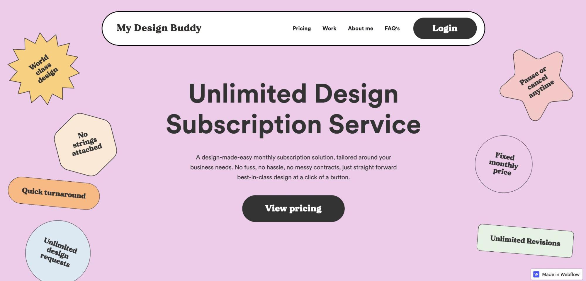
Exploring the site feels like flipping through someone’s notebook thanks to the doodle-like squiggles surrounding the text. While the design and color choices are whimsical, My Design Buddy still describes their work and expertise well, creating a perfect balance of work and play.
Snackable Copy Tips
Both the design and copy of Snackable Copy Tips feel fun while still providing plenty of helpful information.
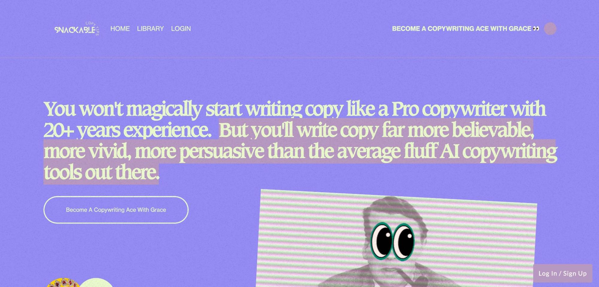
A subtle animation effect makes the background look like static and black and white photos are accented with silly additions like googly eyes or bright red lips. The copy is also quirky, with lines like “become a copywriting ace with grace” and “snackable lessons good enough for visual learners.”
OH! she sells
The OH! she sells website designed by Sandra Junker is full of bright colors and fun patterns — something you don’t normally expect from a sales and marketing management website.
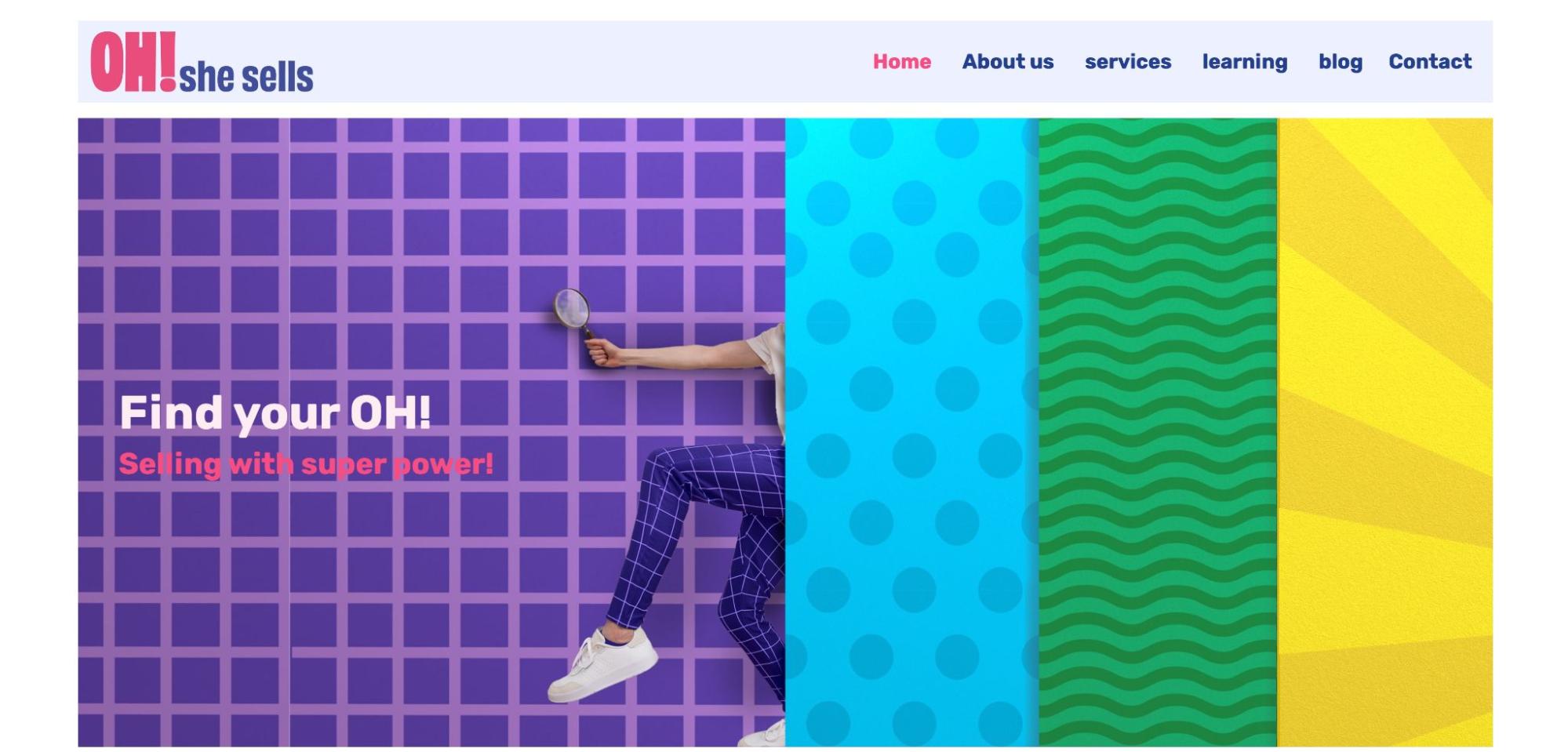
All throughout the site, you’ll see loud patterns and cartoonish designs that make you feel like you’re walking through a funhouse. OH! she sells balances busy design with clear copy that explains their services and invites you to reach out to learn more.
Keep sharing your Made in Webflow work
We always watch out for new submissions to Made in Webflow, and so does our community! Next time you create something you’re proud of, be sure to submit it to the Made in Webflow collection.