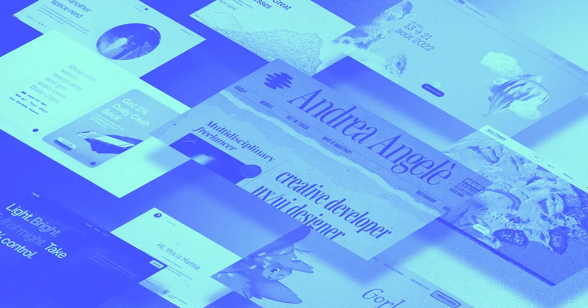
Creators continue to wow us with what they can make in Webflow.
For our June 2022 roundup, we focused on three themes: unique formats, cool cloneables, and eye-catching colors. Take a look at the projects that stood out in each category.
Projects with unique formats
Rather than go with traditional layouts, these projects showcase intriguing site experiences and distinctive formats.
It’s Just a Piece of Paper
Contrary to what the name implies, Andrea Angelè’s project is much more impressive than a simple piece of paper.

Scrolling through Andrea’s portfolio feels like reading news highlights in a magical newspaper. Text and images gently float, bounce, or slide into place as you explore Andrea’s work. Using this unique layout makes this portfolio not only an impressive collection of work, but also a memorable experience.
Gorbals
Venbos Media created this custom website, Gorbals, to promote a children’s book by the same name.
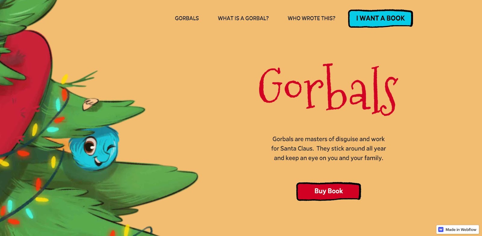
Instead of a static landing page with general information about the book, the Gorbals website provides a glimpse into the world from the book. As you scroll, illustrations appear alongside brief descriptions of elements of the story like the premise, the Gorbal creatures, fun facts, and information about the author.
True Altitude
Studio Morfar intentionally chose a nontraditional look for the True Altitude website. “With competitors that primarily use cold color palettes, sans serif typefaces, and generic stock imagery, we wanted to push True Altitude in a radical direction by creating a warm, minimal yet punchy website,” says Studio Morfar.

Not only does this site feature gorgeous illustrations by Liam Cobb, it also has unique navigation options. Rather than place the menu at the top, this site has a sticky navigation bar that stays at the bottom of the page as you scroll.
Cool cloneable projects
A few fun projects that you can clone and use for your own website.
Flipping Cards
Flipping Cards is a simple yet effective cloneable by Asad Digital.
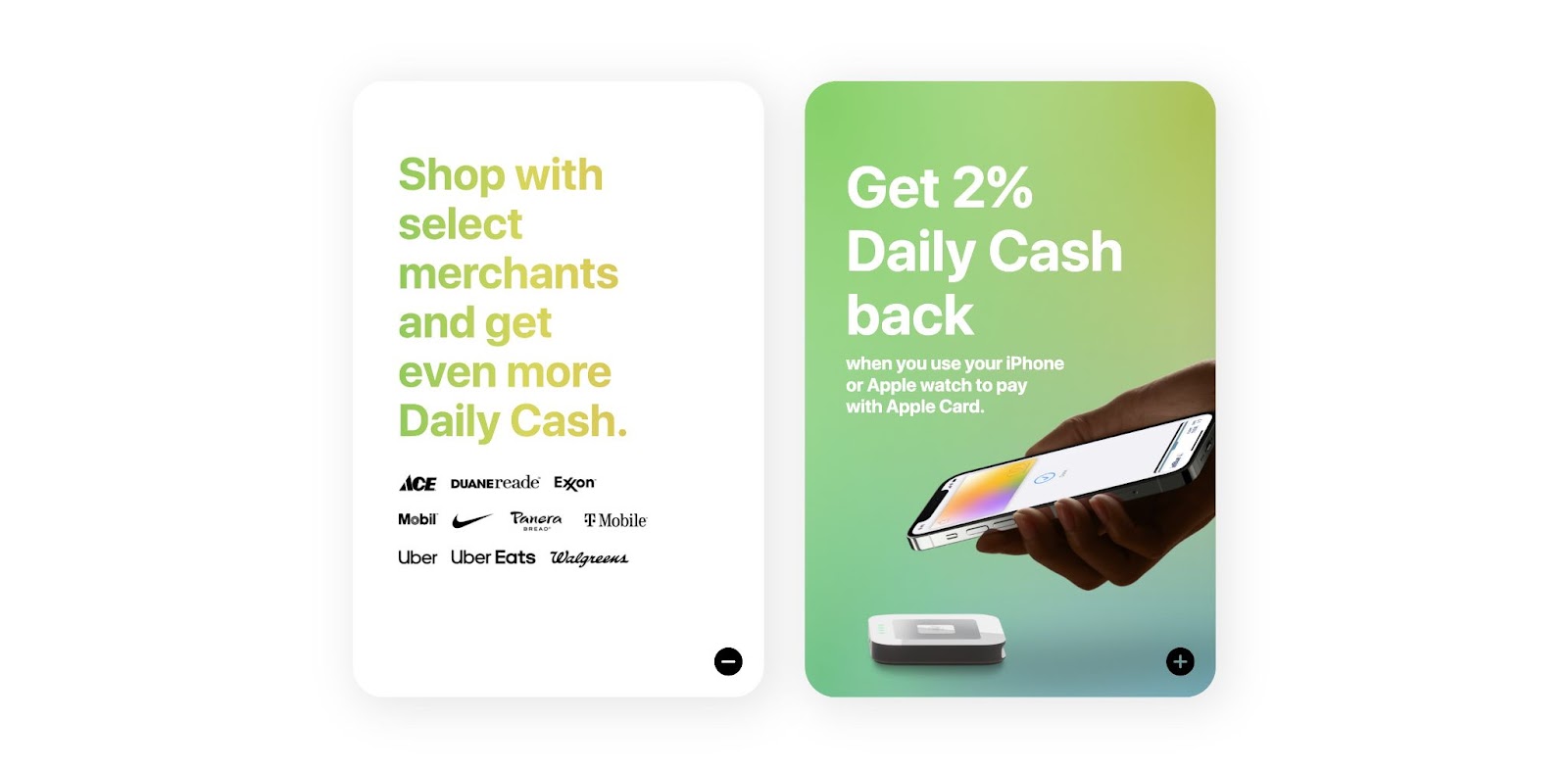
The project includes two identical cards that flip over when clicked. This would make a great interactive element for product listings, pricing packages, team photos with bios on the back, and more.
Webflow Design Portfolio 2022
Mattia Bernini’s portfolio has several fun aspects that make it worth cloning and customizing for your own portfolio.
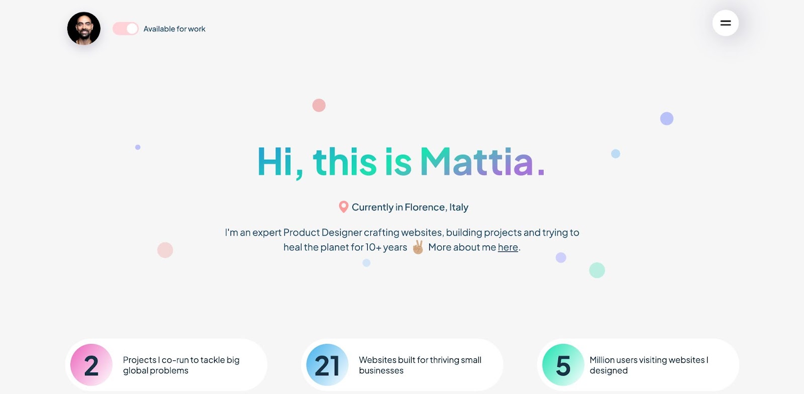
We love the “Available for work” toggle in the top left corner (click for a fun surprise!) and the subtle cursor interaction that makes the colorful dots in the hero section move around. Mattia keeps the toggle theme going throughout the site, using it to filter projects and link out to more in-depth descriptions of their work.
Laura Landing Page Template
If you’re looking for a landing page to promote an app, the Laura Landing Page Template by James Baduor is a great option.
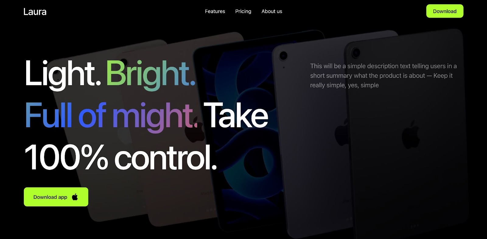
This template features large typography and a background animation in the hero section, followed by several different grid and card options for showcasing app features. We especially enjoy the rainbow gradient text used for emphasis throughout the design.
Projects with eye-catching colors
Take a look at some projects that pack a punch with their use of color.
Alice Straker Art
Studio Folk Lore wanted to create an artist website that embraced Alice Straker’s style which includes “bright, bold, and delicious artwork featuring yummy treats.”

Alice’s artwork is perfectly complemented by bright colors, handwriting-style typography, and an adorable little ice cream cone cursor. Every aspect of this website — from the photography to the illustrated icons — feels right for a playful artist portfolio.
Color Changing Theme Buttons
KC Katalbas provides a choose-your-own-color-adventure on their website. Three circles at the top of the page let you choose between day, sunset, and night mode for the color scheme.

Including color options is a nice interactive touch for this personal website. KC’s site serves as a resource hub for her many interests. Sections like Music, Space, KC Kat Creative, and Art include a brief description and link out to a more detailed landing pages
International de Montgolfière
Francois Lemiux uses brightly colored hot air balloons and iridescent 3D art that seems to drift around this event website for International de Montgolfière, a balloon festival in France.
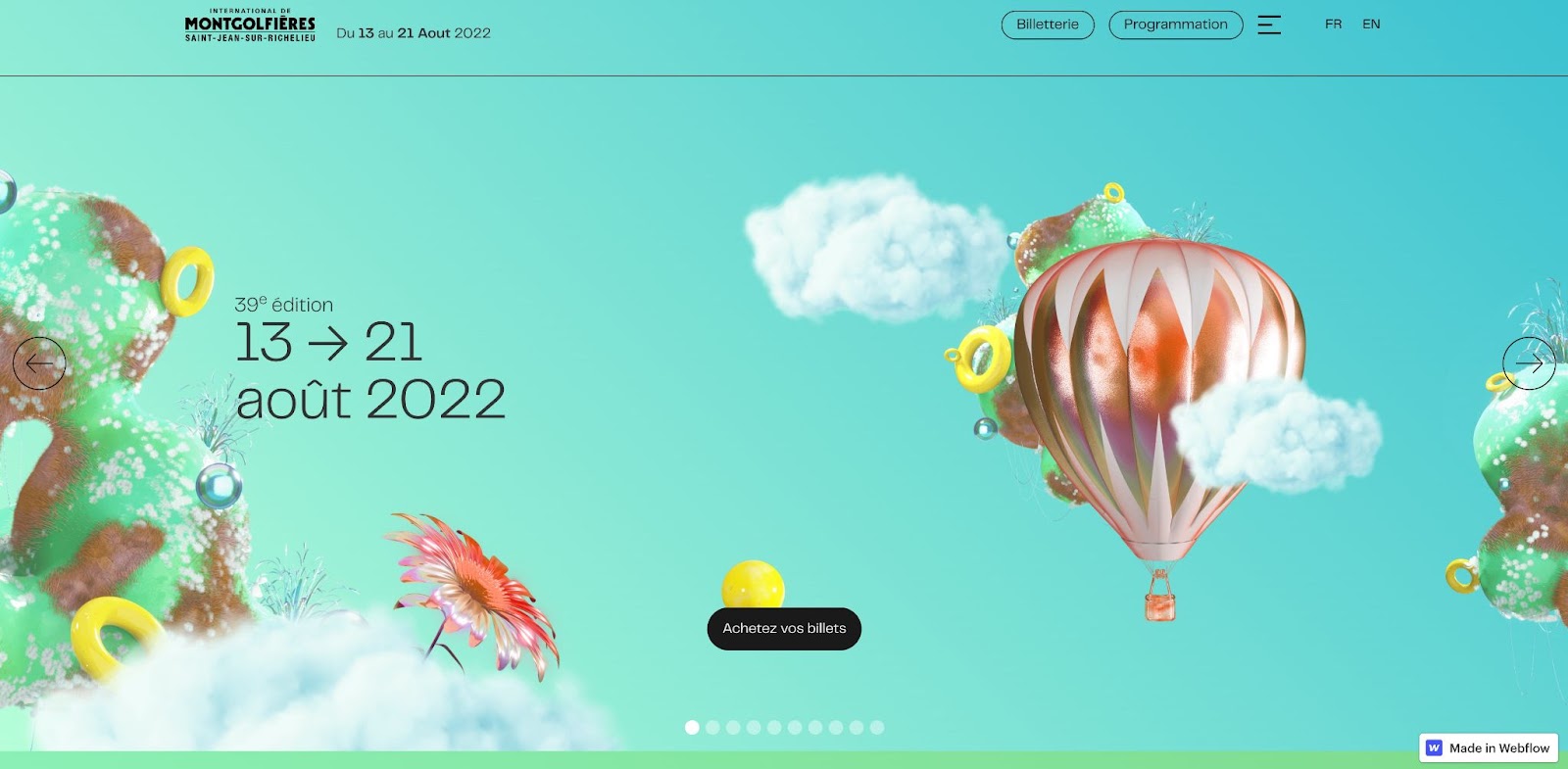
As you scroll, the background colors change and various 3D elements hover, float, and shift into place. Both the colors and subtle motion set the tone for what’s sure to be an exciting and colorful experience. The International de Montgolfière’s website is a beautifully designed site that perfectly matches the event it promotes.
Explore more Made in Webflow creations
Every day, Webflow creators add fresh designs to Made in Webflow. Browse through for a bit of inspiration or submit your own projects!


Discover inspiring design work from the Webflow community
Made in Webflow is the place to browse, clone, and customize the latest websites built by the Webflow community.


