


Our first proiects roundup of 2023 takes a closer look at the sites that feel unified, engaging, and enjoyable to navigate.
Whether it’s something as simple as using bold photography or creating an easily accessible menu — you can turn a good website into an amazing experience.
Here’s some of our favorites we’ve seen.
Put the graphic in photographic design
Recently, mixing minimalism with bold graphic elements has taken center stage in web design. In particular, an emphasis on photography has been used to make websites feel fresh, contemporary, and exciting.
Cinch PR

The website of SF-based PR firm Cinch is a great example of how to effectively blend photographs into a modern design. By shaping and layering their graphic elements, the photography is able to feel unified and harmonious within the design rather than separate like a traditional gallery or lightbox might.
We also love how the design uses a lot of curved shapes, backgrounds, and even thick, curvy serif fonts. Soft shapes and arches have been popular in the worlds of both graphic and interior design, so Cinch’s combination of these elements with soft neutral colors feels very on-trend.
What’s most interesting is how those curved edges help the images feel more unified with the rest of their design. The overlapping cutout photographs look almost like doorways and windows – adding depth and complexity to the design so that the images feel like part of the whole design rather than standalone objects.
South Forty Snacks

The South Forty Snacks website, designed by Jesse Morrow at oldfriend.co and developed in Webflow by Lauren Alexander, takes a similar approach to blending photos into the web design, but this time it highlights product shots.
Like Cinch PR’s site, they use a lot of similar curved shapes and cutouts that stand out with bright colors against a neutral background.The standout cutout is an oversized product shot of one of their snack bars that floats against the background. It’s big, bold, and eye-catching, with a drop shadow makes it visually pop off the page. It even has a little scroll animation for added fun.
Other tricks used include photos within shapes that cut off the edges like a window and stamps and text overlaid on some of the images, giving more visual depth and making them feel more integrated with the rest of the design. The brand name is even incorporated as negative space against the hero image, flowing right into the background as you scroll down.
South Forty has a little interactive easter egg in the bottom right corner of their site in the form of a customizable viewing experience. Click the sun to swap it for a mood and throw a little dance party.
Thoughtful, minimalist portfolios
Not only can Minimalism be beautiful and intriguing — it also can focus the viewer's attention on the most important part — the content of a site. This makes it perfect for portfolios or other sites that show off work and different projects.
Philipp Girzalsky

Philipp Girzalsky’s portfolio site reduces visual clutter that would distract from his portfolio highlights. With his portfolio site, he lets his hero section do a lot of the work. The main visual element is his name, featured in an oversized script. By using randomized slanted letters, Philipp is able to give a sense of movement and disrupt the clean design of the header text — providing some more visual interest.
He also adds depth to the neutral background with subtle lines and includes his headshot as a cutout image. Without a busy background, visitors to the site can really focus on his picture, building personal connection and some human interest.
We love how Phillipp placed his Dribbble and LinkedIn links in floating, moving bubbles — giving a quirky approach to an otherwise refined site.


Discover inspiring design work from the Webflow community
Made in Webflow is the place to browse, clone, and customize the latest websites built by the Webflow community.
Breanna Beckmeyer
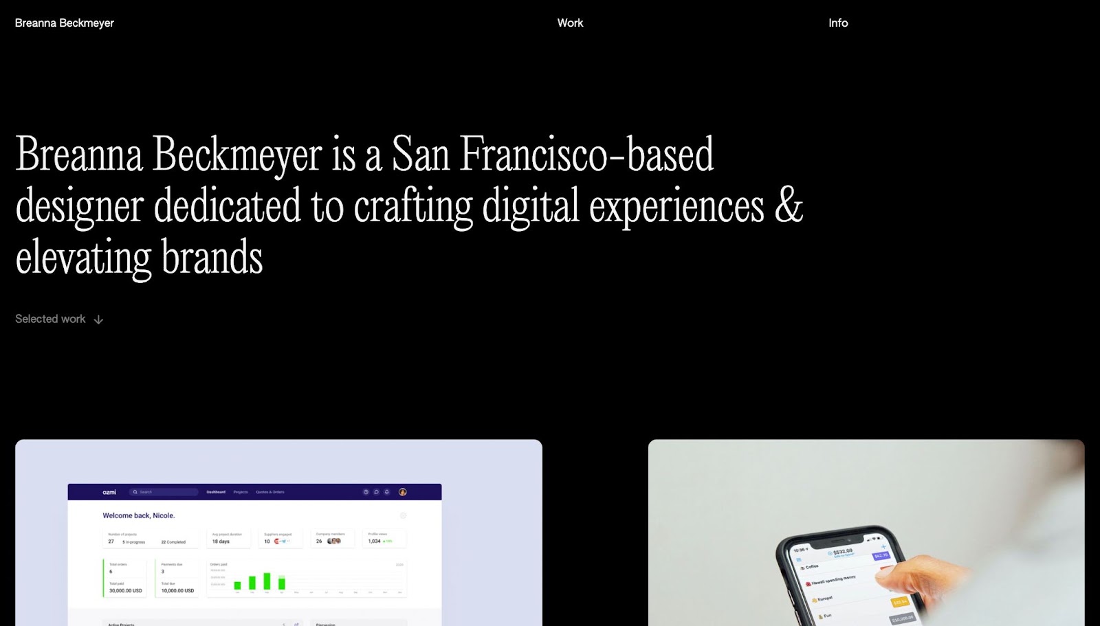
At first, web designer Breanna Beckmeyer’s portfolio site looks like a simple design of text and photos on a black background. As you scroll, however, the background changes color with the movement of your mouse. This is a simple but effective trick to get the viewer more engaged while looking through her work.
Additionally, Breanna’s unfinished work, like her project for Zoom, blurs the main image with a “coming soon” message. It’s a more creative way of giving the reader information about her projects.
Entertaining interactive animation — with accessible navigation options
Scrolling animations are a particularly entertaining way of laying out a website. These websites incorporate all sorts of creative movements and reactions as the viewer scrolls down their pages. However, it isn’t always the most accessible or convenient navigation system for all users. The following designers effectively incorporate clear and easy menus into their scrolling, animated sites to make them fun and accessible.
Refokus 2022 Year in Review
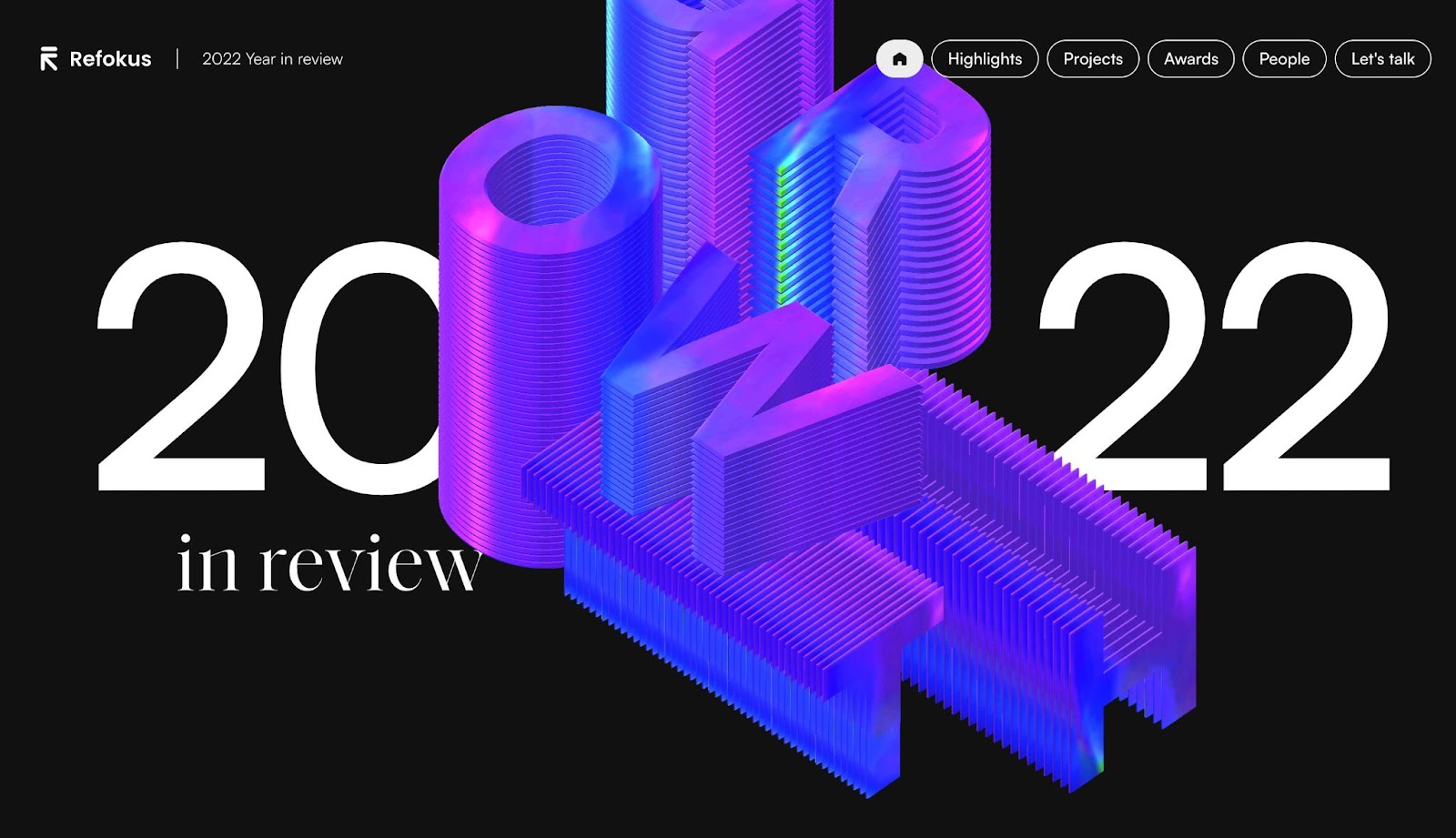
Refokus makes gorgeous websites, and their 2022 Year in Review site is no exception. It incorporates moving elements and animations between sections that are visually appealing and break up the page sections. Changing background colors and animated text also make it feel more narrative as they summarize their year.
Scrolling isn’t the only way to navigate the site, though. In the upper right corner, there is a consistently available menu for anyone who needs to be able to navigate to a specific section. A subtle, effective detail they’ve added is the progress bar in the menu. As you scroll, the empty menu buttons fill, letting you know which section you’re in and how much more content you have to read.
The Flow Party
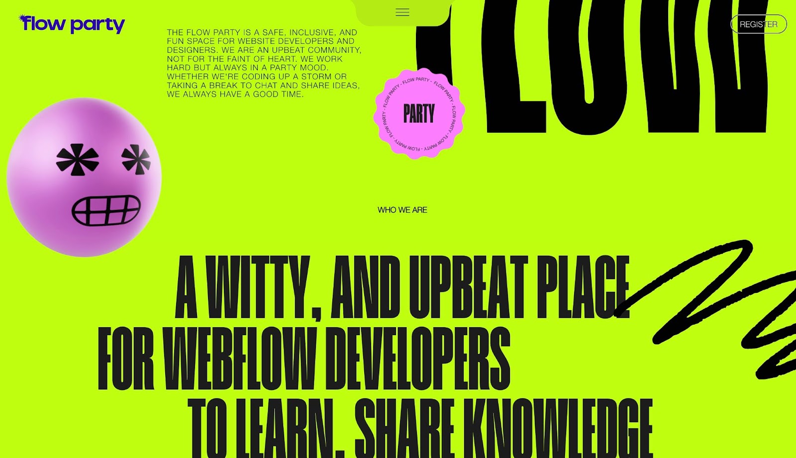
The Flow Party social project identifies as fun, and that fun is reflected throughout their website. If your brand is a party, your website might as well feel festive! Even the animated face that stares at your mouse pointer on the first part of the page is entertaining.
Their scroll navigation pulls pages up visually, almost like you’re turning pages in a calendar. They incorporate wiggly moving borders on some section backgrounds, so they “flow” just like their name, and entertaining interactions throughout make the experience of browsing their site feel even more dynamic.
They’ve chosen to hide their menu in a card that lives at the top center of the webpage. Clicking on the tab with the hamburger symbol pulls down the menu, so you can navigate with buttons, and a “back to top” button at the bottom means you don’t have to scroll all the way up to retrieve information.
By combining interactive elements with easy-to-use navigation, Flow Party is able to embrace a fun experience without sacrificing functionality.
Kin
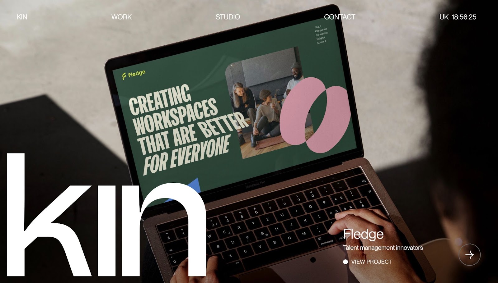
Kin Virtual Studio’s design portfolio is both intriguing and watchable. The homepage is effective at drawing the viewer in with a mix of animations, video clips, and photos from their projects that flip past like a slideshow. You can watch them scroll by or click through to view the details of each project.
They don’t limit the users to just one way of viewing their projects, though. By clicking through to their Work page in the top navigation bar, you have the option of viewing their portfolio in a more traditional gallery format. Giving users multiple options on how they want to view your site is a great way to respect their needs and preferences while still allowing yourself the creative freedom to build inventive websites.
Share your own graphic design, animation, or navigation creativity on Made in Webflow
Each month, the Made in Webflow front page showcases interesting, creative, and exciting work from the designers who build on the Webflow platform. Share your next site with the Webflow community and maybe you’ll get featured in next month’s roundup.