

December brought a wide range of delightful websites to Made in Webflow.
Continuing the trends of 2022 and using many of our own design predictions for 2023, these design and interactive elements are a great place to find creative inspiration for the new year.
High-impact hero sections
Beginnings are important. The opening shot of a film, the first line of a book, the first few notes of a song — they capture the audience's interest and prepare them for what comes next. A high-impact hero section on a website can do the same thing.
Simpler designs for hero sections have been in vogue recently. Lots of designers have opted for typographical designs and minimalist aesthetics over photographs or images in heroes, which used to dominate web design.
However, a visually striking image to start off a webpage can still be an effective and impactful design choice — perhaps even more so now that it’s less expected.
Matthis Garnier
Matthis Garnier’s portfolio site is the definition of striking. The hero image is literally a hero looking forward and decked out in gear that evokes a sci-fi setting. The details on this page are all beautifully considered. The image’s hair is even windswept in the same direction as the scrolling text, giving a sense of movement and harmony within the design.
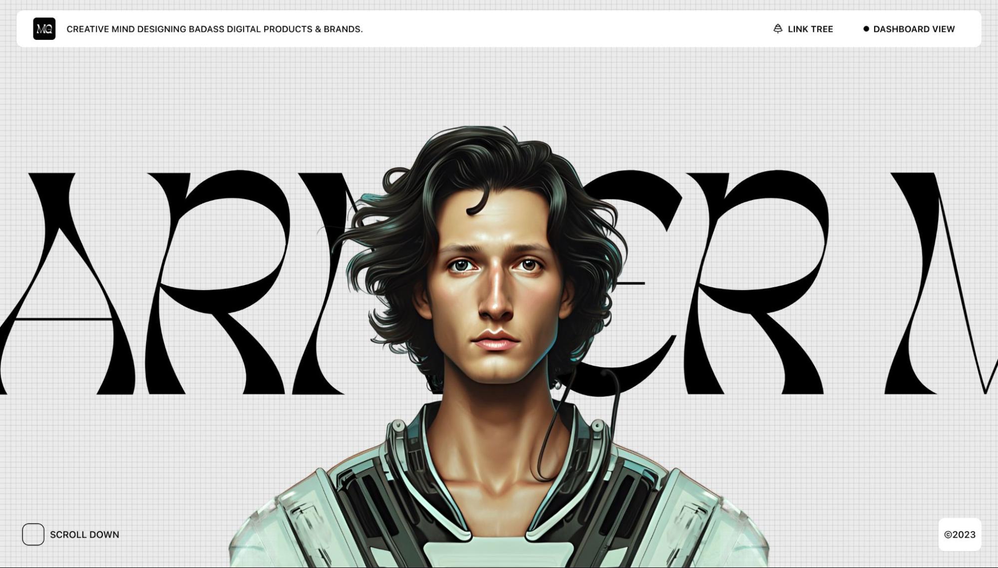
This hero section draws the viewer in and makes you want to scroll through the rest of the site. He follows up the visual opulence of the first section with a clean, minimal section containing clear, easy-to-read information about who he is and what he does.
There is another nice detail in the Past Projects section. On the page, it looks like a clean, text-based list, letting the reader take in the names and descriptions easily. However, mousing over the list prompts animated pop ups of each site, giving you a taste of what the design looks like. It’s another clever way of inviting users’ curiosity.
Western Sydney Lakes
Designed by Q Agency, the website for Western Sydney Lakes greets you with a spectacular bird’s-eye view of the future development. The image is crisp, the water sparkles, and you can see for miles into the distance around the lakeshore.
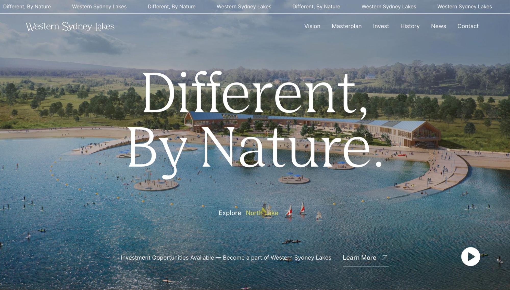
The Western Sydney Lakes development is a future mixed-use development project, and the website’s role is to attract investors. It can be hard to get someone interested in an idea that doesn’t exist yet, but the impactful hero image grounds the entire concept and website. It makes the place feel more real and more visually grounded — and hopefully easier to imagine investing in.
Western Sydney Lakes also chooses to make the bulk of its website minimal and clear. It uses a limited color palette, solid-colored sections, and oversized typography for graphic effects. This makes the information easy to access and read and guides the viewer's eye to the spectacular images throughout without being distracted by clutter.
Retro-influenced designs with a sweet tooth
Nostalgia was called out as one of the big web design trends for 2023. Two websites we loved this month combine a retro vibe with a modernized color palette that evokes both millennial pinks and Gen Z brights.
They’re also a reminder that retro inspiration doesn’t necessarily have to mean a full-strength aesthetic. You can also use more subtle design elements throughout a design, such as icons, text, images, or colors, that evoke some of the feelings of a specific era without feeling costumey.
Webflow’s year in review
Webflow’s 2022 year in review pulls from the Atomic Age design, popular from the 1940s through the 60s. Like commercial patterns from that era, it uses an energetic assortment of graphic elements like stars, arrows, text, and images. Elements also overlap and use canted angles (on a diagonal instead of square with the page) like a lot of mid-century graphic design.
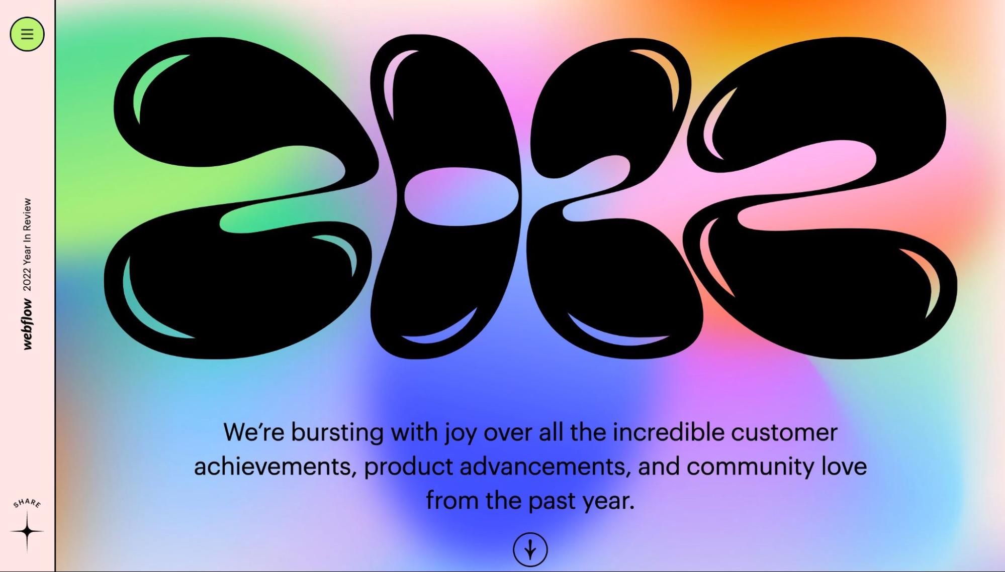
A groovy typeface for the header brings additional fun to the design. Brighter colors and a gaussian blur that creates a glassmorphism effect on the background anchor the design in the modern day, despite the clear retro elements.
Bubble letters, colorful illustrations, and gradients that change as you scroll bring a fun, playful, and whimsical mood to the design. It perfectly expresses the joy and excitement of the last year at Webflow.
What IF
What IF’s website has a toned-down 90s aesthetic. The background uses a graph paper grid, and there are sticker-like graphics throughout, including alien heads, smiley faces, and pixelated mouse icons. There’s even a popup-window effect that draws attention to their name, which is also the intro to their hero section. It's a fun effect, especially with various easter eggs hidden throughout, along with a retro loading animation.
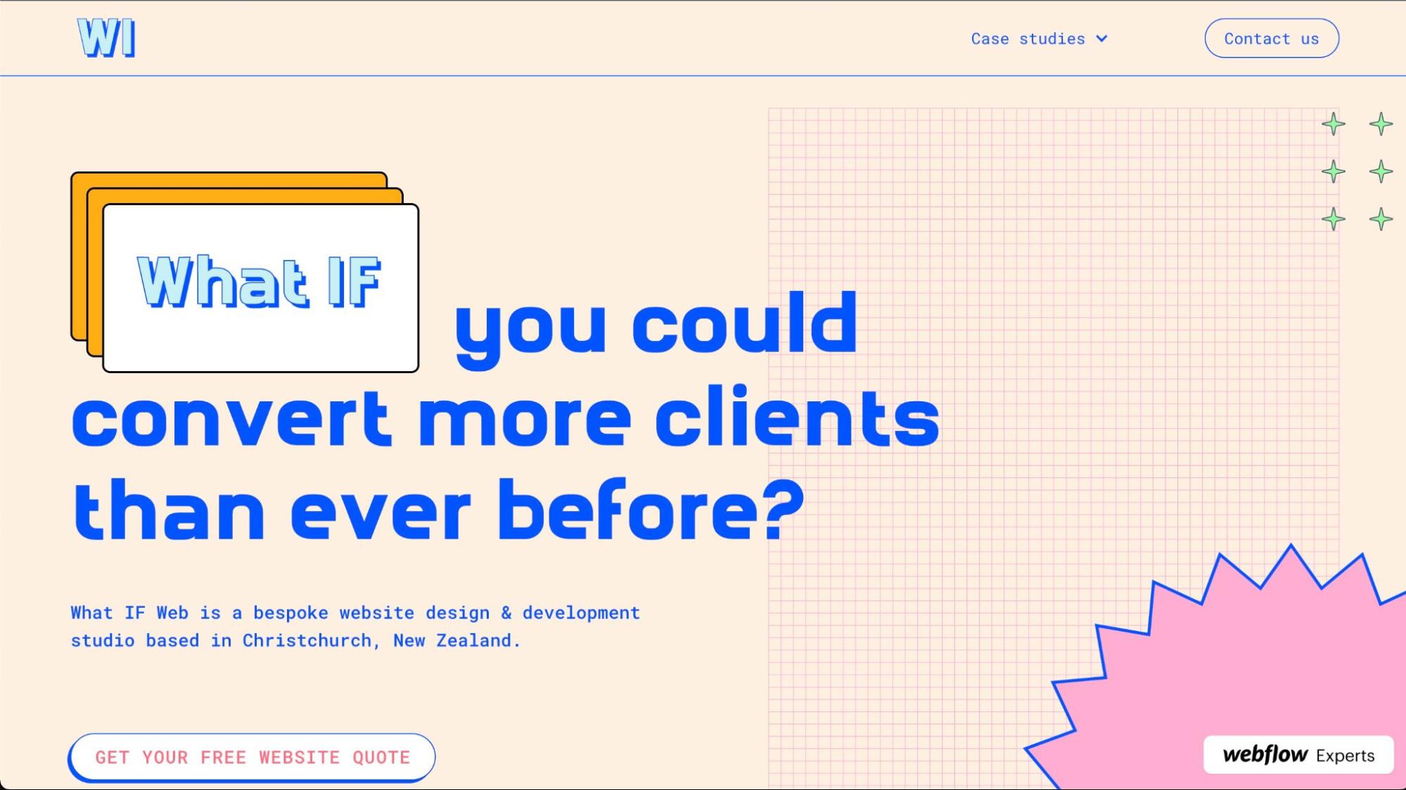
Another nicely done element is the mouseover effect on the example sites they feature. A soft glow behind each helps them pop, and each image gently scrolls upward, giving the viewer a better sense of the full site. It’s a clever and effective way of showing what they’re capable of.
They bill themselves as “Not your average website agency,” so the retro-fun vibes of the site help to communicate that perspective.
Mouseover effects that keep designs minimalist
Mouseover effects are an interaction that can be used to add visual interest and interactivity to a design. But they aren’t just useful for aesthetics! They can also be incorporated to help a design look less visually cluttered while still giving easy access to text and images.
Grace Walker
Grace Walker’s portfolio site keeps it simple, straightforward, and effective. She forgoes a lot of the text that would usually make up the bulk of a design. Instead, she uses a grid of colorful boxes with screenshots of her past work in each. This really lets her design take front and center in her portfolio.
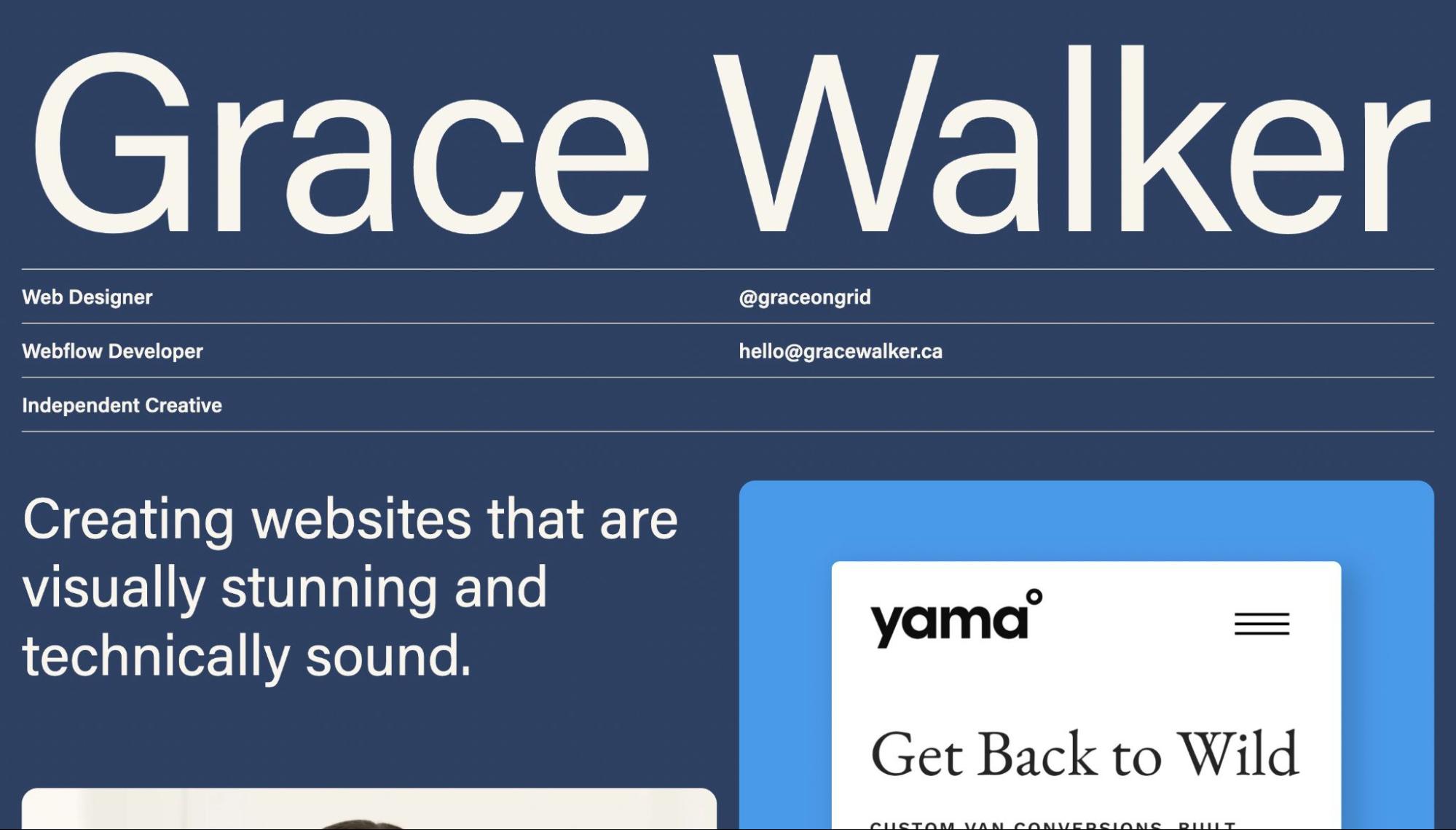
Still, the viewers need to know more about each site, so she adds a mouseover effect to reveal the title, tags, and links. It’s an effective way to simplify the site without sacrificing necessary details.
Raca Design Studio
Raca Design Studio by Marcin Mikołajczyk uses a mouseover effect to reduce visual clutter as well. Without interaction, the site is a subtle two-tone of blue and gray, almost like an architectural blueprint. When the mouse hovers over an image, it either blooms into full color or converts an architectural illustration into a full 3D render.
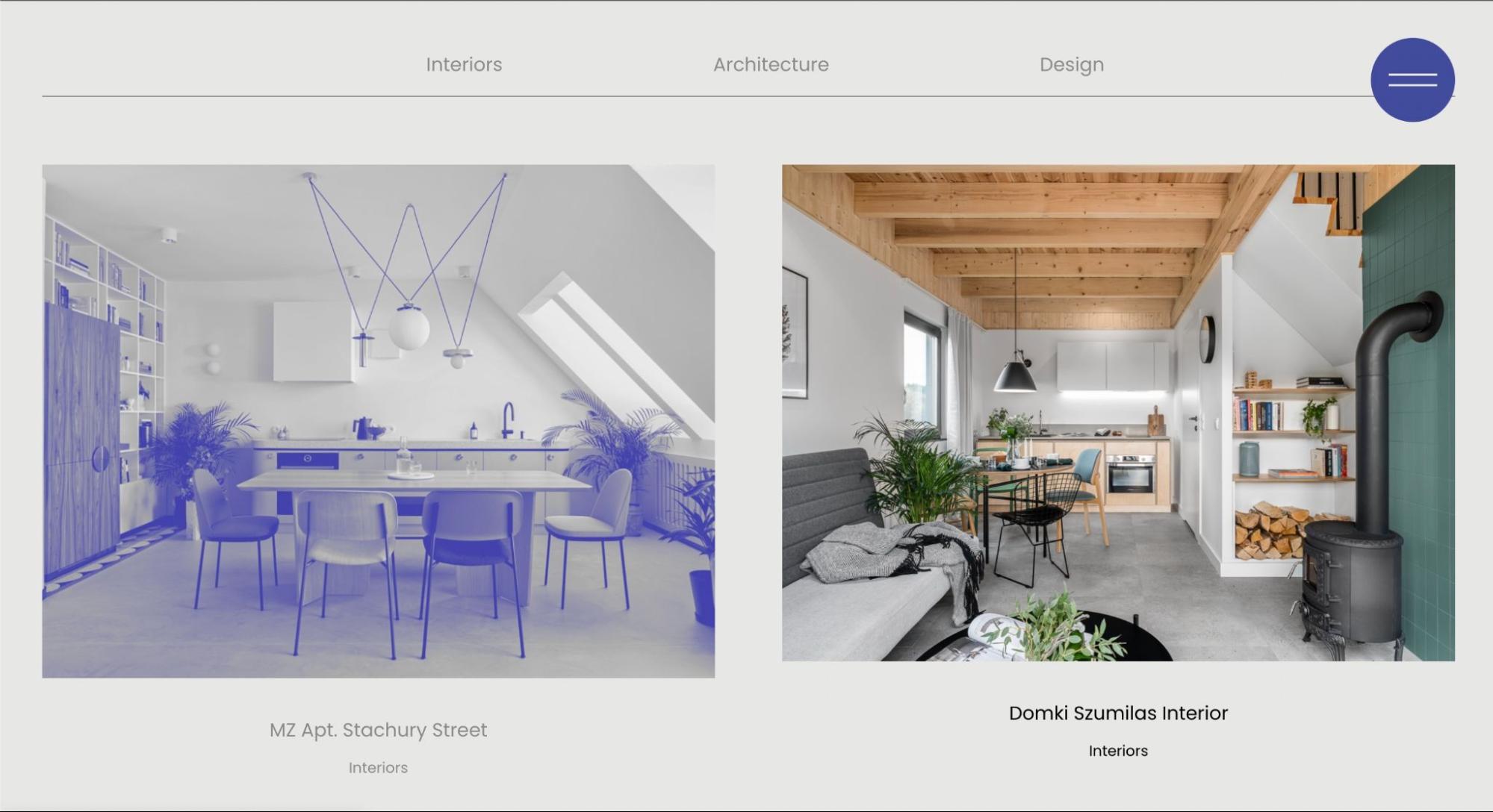
The effect is a sophisticated site, appropriate for an architecture and interior design studio, that lets the images of their work shine individually.


Get started for free
Create custom, scalable websites — without writing code. Start building in Webflow.
Scrolling animations that educate and entertain
The vertical scroll can be a simple way of navigating a web page, or it can be used in more creative ways. Adding an element of storytelling or an interesting animation will motivate viewers to continue exploring your site.
Pablansh
Juan Pablo Sanchez’s portfolio site, Pablansh, is a visual stunner, and it has the kind of introductory scrolling animation that tickles the brain.
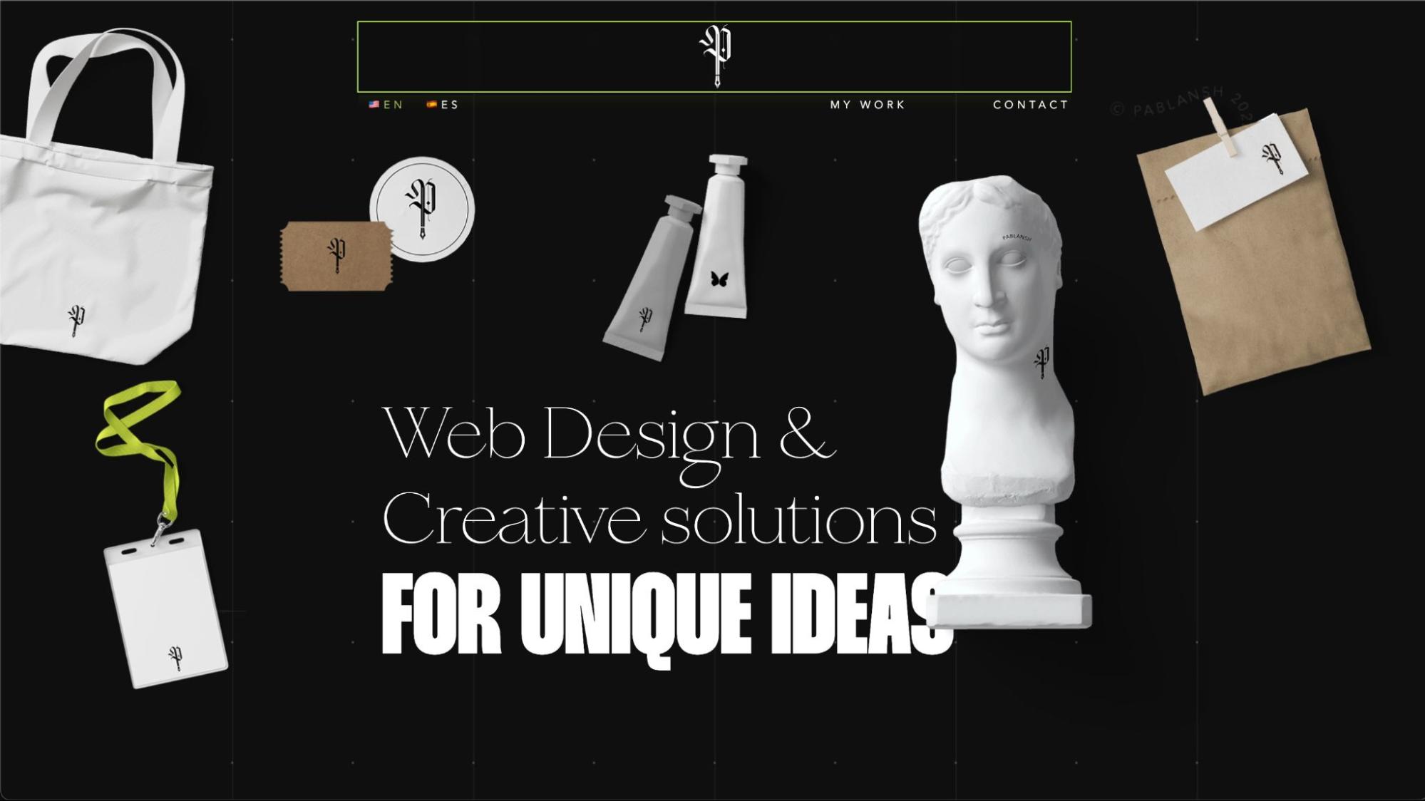
As visitors scroll down from the hero section, the visual elements tumble off the page and three wavy text scrolls wiggle their way across the site. It’s such an enjoyable effect — visitors might find themselves scrolling up and down just for fun.
Automator Wrapped 2022
Automator Wrapped 2022 by Diagram is scroll storytelling done well. As visitors scroll, the site walks you through all of the exciting accomplishments and benchmarks their community has participated in over the last year. Users can interact with each page and scroll through an incredibly impressive accounting of the last year’s activities.
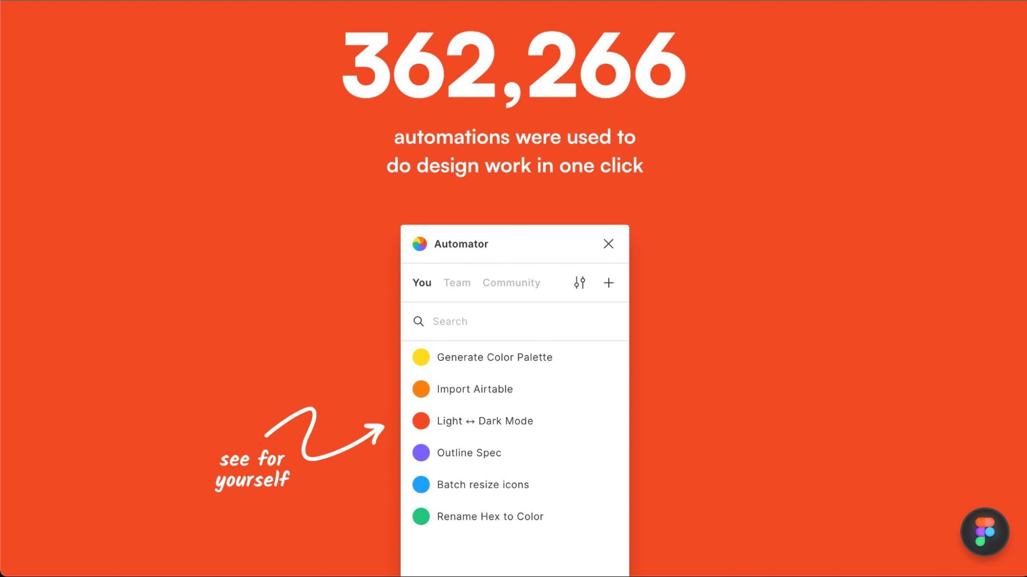
This design is cloneable, making it a great one for Webflow users to experiment with and learn useful techniques from.
Dictionary for non designers
A delight to use and genuinely useful, the Dictionary for non designers by Unknw Studio is an interactive dictionary that designers can send to anyone they’re working with to help get them on the same page.
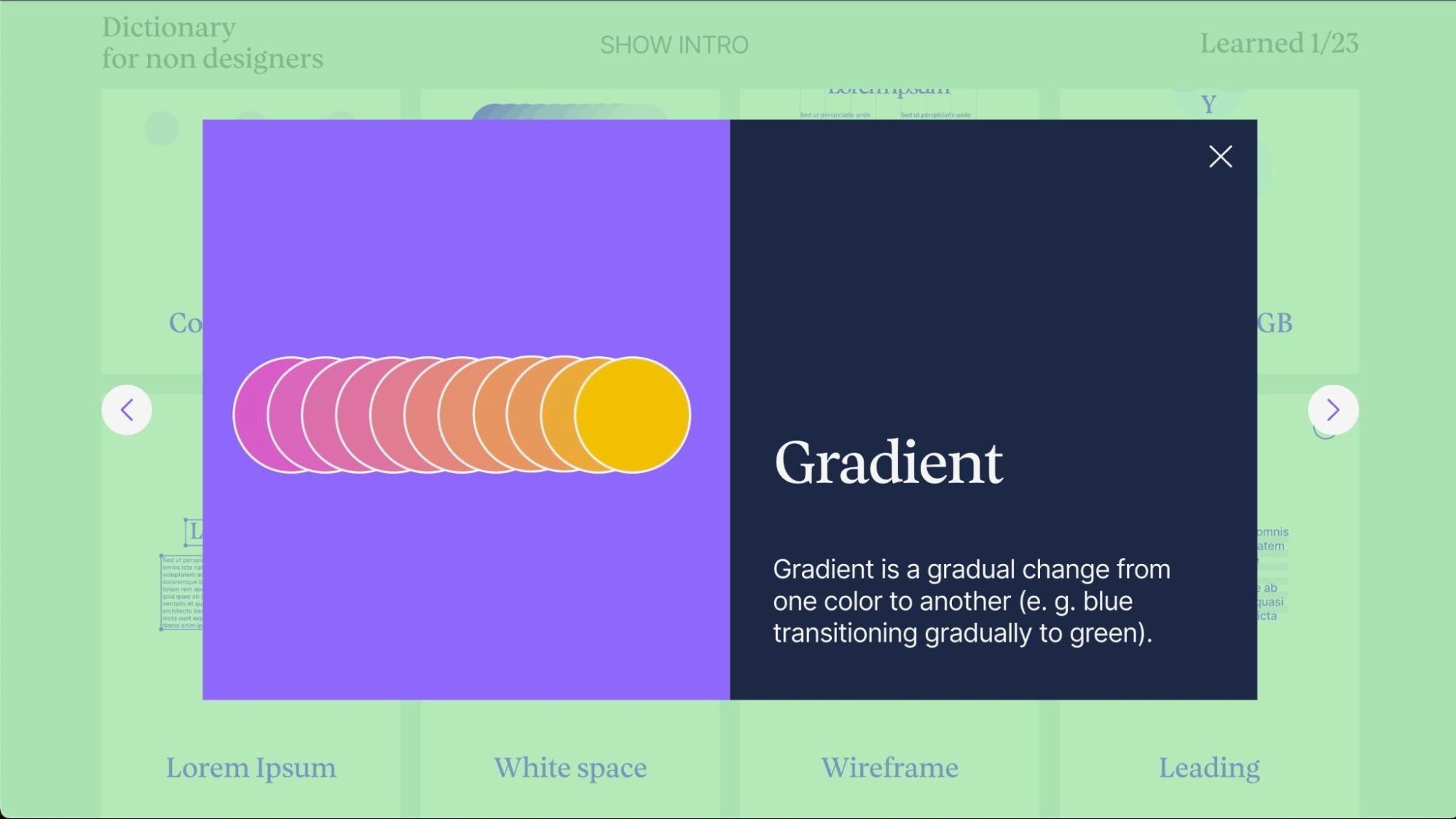
As anyone who has designed for clients can attest, sometimes the lack of a shared language is the biggest barrier to mutual understanding and bringing that shared vision to life. This is a handy tool to send to anyone you might be working with.
The dictionary is presented like an interactive game, complete with a quiz at the end. The scroll effect here works almost like a retro video game cutscene, adding dialogue and vocabulary words as the visitor scrolls down to the actual dictionary section. It’s engaging and intriguing — an effective way to introduce the tool.
Build something to share with the community on Made in Webflow
The Made in Webflow showcase is a great place to look for inspiration or share projects you’ve built — whether professionally or just for fun. You might even get featured in next month’s roundup!