


Creating a new website can be a lengthy, involved process. From setting goals with stakeholders to creating content and building the design, there are tons of steps to take before you can flip the switch. Reviewing and testing functionality is key to a successful site launch.
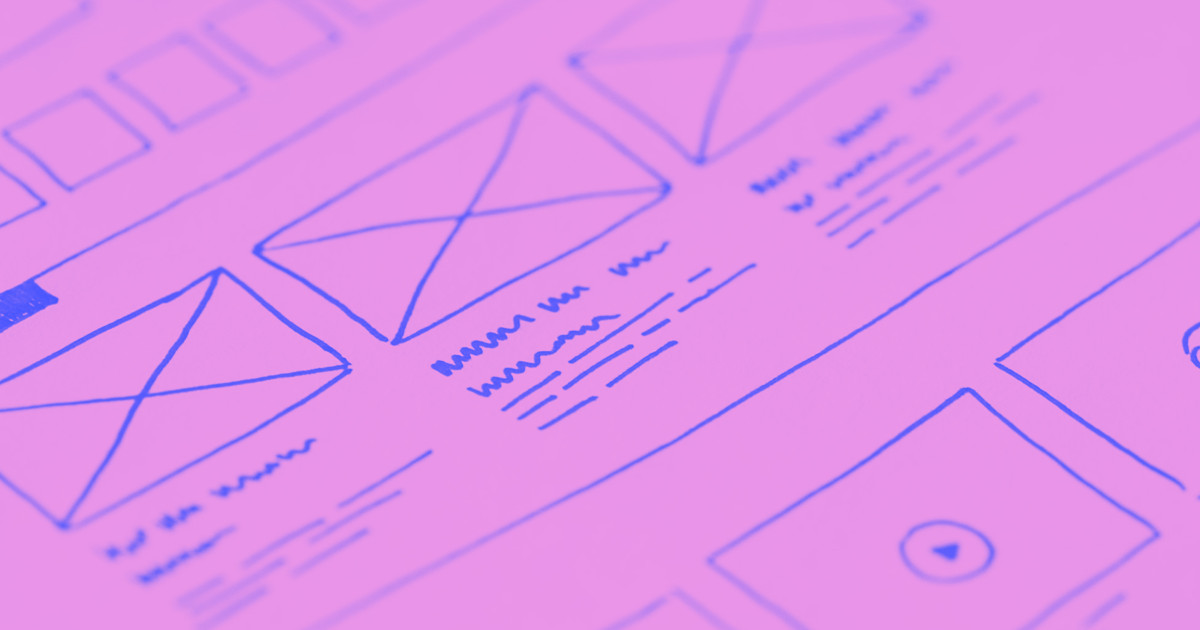
Inspect the design
Before you get into testing the functionality, take a look at the visual elements of the design. Are you using the right final-final-final logo? Are there new photos to swap in? And did you increase the font size on the calls to action?
The design process almost always involves a wealth of feedback and suggested edits. It's easy to miss something. But it's these small details that will either delight or frustrate your audience when when the site goes live. So keep a running list of edits and changes — and make sure they get resolved before launch.
Check for inconsistencies. Font styles and sizes should be the same from one page to the next. It’s easy to overlook an incorrect font or body text that’s a point too big. After all, you’ve been staring at this design for a long time.
Have someone else look the site over for inconsistencies and details you may have missed.
At this stage, decision makers should be happy with how the design looks. It’s normal for there to be minor tweaks and edits, but if there’s been good communication and collaboration, there shouldn't be any major changes at this point.
If you’re getting more time-consuming edit suggestions, evaluate their potential value before you tackle them.
Will these changes improve the user experience? Will they delay the website's launch?
It's okay to push back if what's being recommended won’t enhance usability or improve a site’s visual aesthetic. Stay professional, but be clear about why some edits aren't necessary — especially in the final stages of the design process.
Pay attention to the details

There are so many details to think about and check when it comes to web design. Especially for a business or an ecommerce site. It’s important to verify things like hours of operation, nutritional information on a menu, addresses, and phone numbers.
Ecommerce sites need to have accurate photos and descriptions for each product. It’s always a bummer to open a box of something you ordered, only to find it doesn’t look at all like what you thought you’d bought.
Make sure a stakeholder who’s a brand expert for the company and its products has a look before a site goes live. Ask your client who should do this review, and make sure that reviewer is well-aware of the timeline.
Test the functionality of integrations
Integrations can include shopping carts, newsletter sign ups, and quote request forms — and so, so much more.
Test any part of the site that requires data collection (and make sure you’ve set up SSL!). If a form submits to an email address, make sure it’s the right one. And double-check email addresses with the client.
Forms should have clear instructions and fields. It’s a good idea to have someone who’s not involved with the company or the project fill out a test form and give feedback on their experience.
Same thing with the checkout process — have a couple people go through looking for glitches and ambiguity. How many of us have abandoned a shopping cart because the process was too complicated? Everything from shipping options to payment choices should be checked. Make sure everything is clearly defined and easy to navigate.
Before launch, find out what kinds of electronic payment your client plans to accept. Do they have PayPal or Stripe set up already? If not, make sure they tackle that — gathering last-minute info to get an account set up can be an annoying delay.
Check your links
Links are a major chunk of functionality, and you need to check them all. And don’t forget to create that 404 error page — make this part of your standard protocol. This one can be easy to overlook.
Manually checking every link can be overwhelming. Good news — you don’t have to! Use a link crawler tool like W3C Checker or Screaming Frog. Both will quickly scan for broken links and make sure the content is accessible.
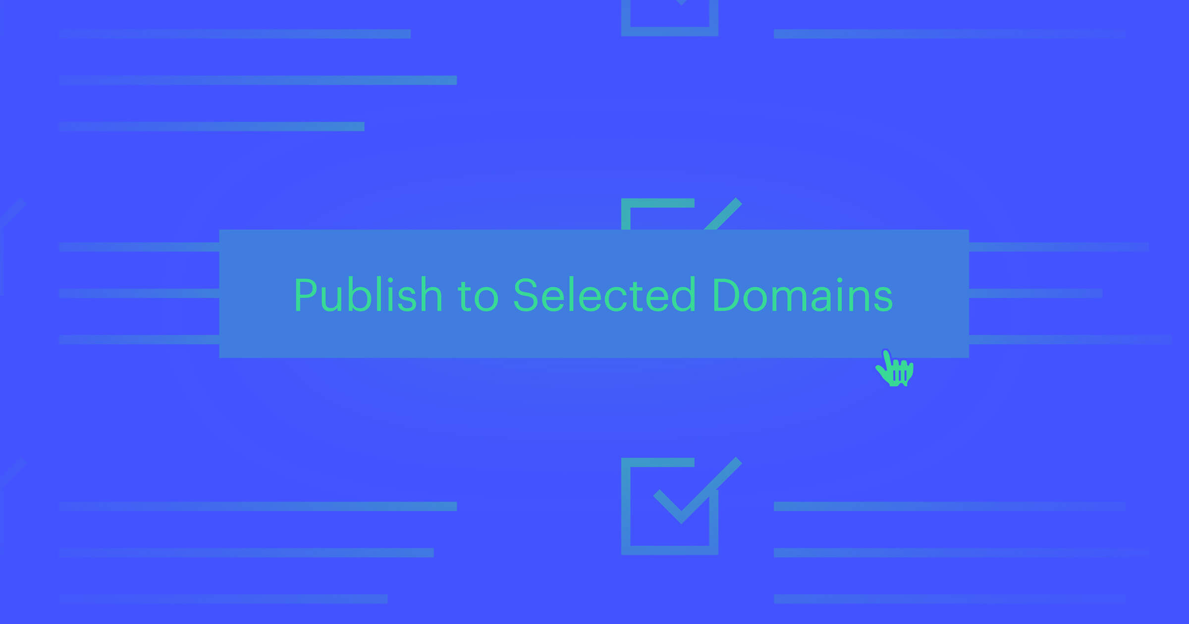
Ensure your design is cross-browser compatible
Your design needs to function, look, and offer a similar user experience in every browser. Each browser has its own advantages and limitations. If your design only works well on one, visitors who use others will be frustrated.
You could download all the popular browsers and test your design in each, but that would be time consuming. There are cross-browser compatibility tools that make this step quick and easy, like Browsershots, Browser Sandbox, and Browsera.


The modern web design process
Discover the processes and tools behind high-performing websites in this free ebook.
Check design functionality on different devices

People use different devices throughout the day to access content. Someone’s out shopping and checks for nearby coffee places on their cell. Later, they order shoes on their laptop while catching up on Netflix. Your design should be seamless on every screen. The practical applications of responsive design result in websites that offer a more uniform experience.
Check that navigation, buttons, and other interactive elements remain functional on different screen sizes. Test the design on different devices and network speeds. If it’s slow to load, see if your high-resolution images and animations are affecting the site’s performance. Excessive dynamic elements could also hinder its usability.
It’s not likely that you can get your hands on every major device for testing. Surprise — there’s several apps for that! Browserstack, Google Mobilizer, and other tools let you see how your site will function on different mobile devices. And, once again, Webflow lets you preview your site on different screens as you build.
Just note that no emulator perfectly reproduces every on-device experience, so be sure to actually test on as many real devices as possible. You can’t have every device on hand, but your friends, colleagues, and clients can lend a hand here too!
Take a look at the content
“The more you leave out, the more you highlight what you leave in.”
–Henry Green, novelist
Rewriting a paragraph here or a sentence there (probably) won’t have a major impact on the final design. Hopefully you had — at the very least — a rough draft of the site’s copy before you began the design process, and iterated on it throughout your process. Designing with the content in mind allows you to make thoughtful decisions. Tweaks to the copy can always be made later, even after the site goes live.
But that doesn’t mean you should skip a thorough content review right before launch. A simple typo or grammatically mangled sentence can seriously impact audience perception, so make sure your words are as polished as your design.
Make sure your content is useful and easy to scan
As sad as content creators might be about this, people don’t come to a site to read it like a book. They wanna get in, get the information they’re looking for, and get out. Delight them by making this possible.
Here’s how:
- Use descriptive headers
- Write sentences with simple structures and limit paragraphs to three or four sentences
- Group related ideas or items together in bulleted lists
- Get rid of copy that doesn’t add meaning
- Check that your copy is concise, engaging, and consistent with the brand’s voice
- Proofread for grammar and spelling errors
- Get help from a second and third set of eyes to help catch possibly embarrassing mistakes
- Ask a skilled editor to look over your copy
Great news: more tools! Hemingway, Grammarly and Ginger can help you with the editing process. They’ll also teach you some writing skills along the way.
Practice good SEO habits
Hopefully some well-researched SEO keywords and phrases have been carefully woven into the content. You should also make sure the code has proper heading and paragraph tags throughout. Meta titles and meta descriptions should be included for each page.
A meta title should define the focus of the page. Only use relevant keywords, especially at the beginning of the description, and keep things under 70 characters words. A meta description should be a bit longer, but keep it under 160 characters and write in a voice that connects with your intended audience.
When your website appears in search results, it’s the meta title and description that (usually) appear. This helps your audience know they’ve found a site that matches their needs. Google uses the meta title to rank your content properly, so it should reflect the essence of your page. H1 tags also help with ranking and make it easier for web crawlers to determine your content’s purpose. Make sure those tags are specific.
Meta descriptions don’t really matter to web crawlers, but they’re still important. A good meta description tells someone they’ve found what they’re looking for. Use the same primary keywords from the title somewhere in the description. Google will bold words used in the search query that show up in your description. This also helps your audience see that your site matches their search.
Ready for liftoff

When everything has been tested and reviewed, it’s time to reveal your hard work.
With a bit of patience and a lot of preparation, your design is ready to go live. Making time to review and test your site is an important step in your design process. Don’t let impatience — yours or your clients’ — push you to launch before it’s ready.
Be sure that your work reflects the thought and dedication you’ve put into it. Use the lessons learned to make the next project you tackle even better.
What’s essential to your design process?
The design process helps us build great sites and good client relationships. I’m always interested in what’s working for other designers. Does your process have a step you think the design community could benefit from? I’d love to hear about it in the comments!