A website is much more than a group of pages connected by links. It’s an interface, a space where different things — in this case, a person and a company’s or individual’s web presence — meet, communicate, and affect each other. That interaction creates an experience for the visitor, and as a web designer, it’s your job to ensure that experience is as good as it can possibly be.
And the key to that is to think about your user first, foremost, and always.
Thankfully, while web design is a relatively new discipline, it owes a lot to the scientific study of human-computer interaction (HCI). And these 9 handy guidelines straight from HCI research will help you focus on your users when going through the design process.
Interface design, which focuses on the layout of functionality of interfaces, is a subset of user experience design, which focuses on the bigger picture: that is, the whole experience, not just the interface.
10 essential web UI tips
1. Know your users
Above all else, you have to know who your users are—inside and out. That means knowing all the demographic data your analytics app(s) can pull, yes. But more importantly, it means knowing what they need, and what stands in the way of them achieving their goals.
Getting to that level of empathy requires more than careful analysis of stats. It requires getting to know the people who use your website. It means speaking with them face to face, watching them use your product (and maybe others), and asking them questions that go deeper than, "What do you think of this design?"
What are their goals? What stands in the way of them achieving those goals? How can a website help them overcome or work around those challenges?
Don't stop at knowing what your users want. Dig deeper and find out what they need. After all, desires are just outgrowths of needs. If you can address a user's deep-seated need, you'll address their wants while also fulfilling more fundamental requirements.
The insights you'll uncover from analyzing data and speaking with users will inform every decision you make, from how people use your interface to what types of content you’ll highlight within that interface.
2. Define how people use your interface
Before you design your interface, you need to define how people will use it. With the increasing prevalence of touch-based devices, it’s a more pivotal concern than you might think. Just look at
Tinder: the app’s user experience is literally defined by the ease and impulsivity of a simple swipe.
People use websites and apps in two ways: directly (by interacting with the interface elements of the product) and indirectly (by interacting with ui elements external to the product).
Examples of direct interactions:
- Tapping a button
- Swiping a card
- Dragging and dropping an item with a fingertip
Examples of indirect interactions:
- Pointing and clicking with a mouse
- Using key commands/shortcuts
- Typing into a form field
- Drawing on a Wacom tablet
Who your users are and what devices they use should deeply inform your decisions here. If you’re designing for seniors or others with limited manual dexterity, you wouldn’t want to lean on swiping. If you’re designing for writers or coders, who primarily interact with apps via the keyboard, you’ll want to support all the common keyboard shortcuts to minimize time working with the mouse.
3. Set expectations
Many interactions with a site or app have consequences: clicking a button can mean spending money, erasing a website, or making a disparaging comment about grandma’s birthday cake. And any time there are consequences, there’s also anxiety.
So be sure to let users know what will happen after they click that button before they do it. You can do this through design and/or copy.
Setting expectations with design:
- Highlighting the button that corresponds to the desired action
- Using a widely understood symbol (such as a trash can for a delete button, a plus sign to add something, or a magnifying glass for search) in combination with copy
- Picking a color with a relevant meaning (green for a “go” button, red for “stop”)
Setting expectations with copy:
- Writing clear button copy
- Providing directional/encouraging copy in empty states
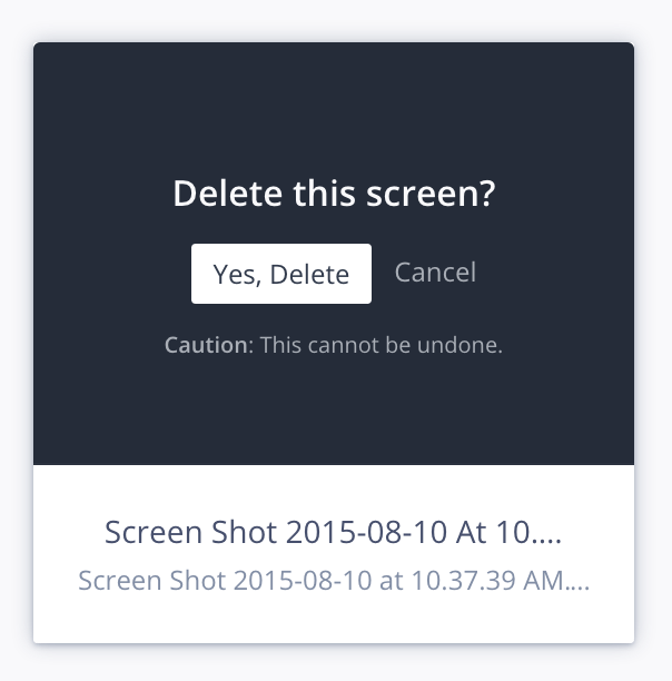
- Delivering warnings and asking for confirmation
For actions with irreversible consequences, like permanently deleting something, it makes sense to ask people if they’re sure.
4. Anticipate mistakes
> To err is human; to forgive, divine.
Alexander Pope, "An Essay on Criticism"
People make mistakes, but they shouldn’t (always) have to suffer the consequences. There are two ways to help lessen the impact of human error:
- Prevent mistakes before they happen
- Provide ways to fix them after they happen
You see a lot of mistake-prevention techniques in ecommerce and form design. Buttons remain inactive until you fill out all fields. Forms detect that an email address hasn’t been entered properly. Pop-ups ask you if you really want to abandon your shopping cart (yes, I do, Amazon—no matter how much it may scar the poor thing).
Anticipating mistakes is often less frustrating than trying to fix them after the fact. That’s because they occurbefore the satisfying sense of completion that comes with clicking the “Next” or “Submit” button can set in.
That said, sometimes you just have to let accidents happen. That’s when detailed error messages really come into their own.
When you’re writing error messages, make sure they do two things:
- Explain the problem. E.g., “You said you were born on Mars, which humans haven’t colonized. Yet.”
- Explain how to fix it. E.g., “Please enter a birthplace here on Earth.”
Note that you can take a page from that same book for non-error situations. For instance, if I delete something, but it’s possible to restore it, let me know that with a line of copy like “You can always restore deleted items by going to your Trash and clicking Restore.”
The principle of anticipating user error is called the poka-yoke principle. Poka-yoke is a Japanese term that translates to “mistake-proofing.”
5. Give feedback—fast
In the real world, the environment gives us feedback. We speak, and others respond (usually). We scratch a cat, and it purrs or hisses (depending on its moodiness and how much we suck at cat scratching).
All too often, digital interfaces fail to give much back, leaving us wondering whether we should reload the page, restart the laptop, or just fling it out the nearest available window.
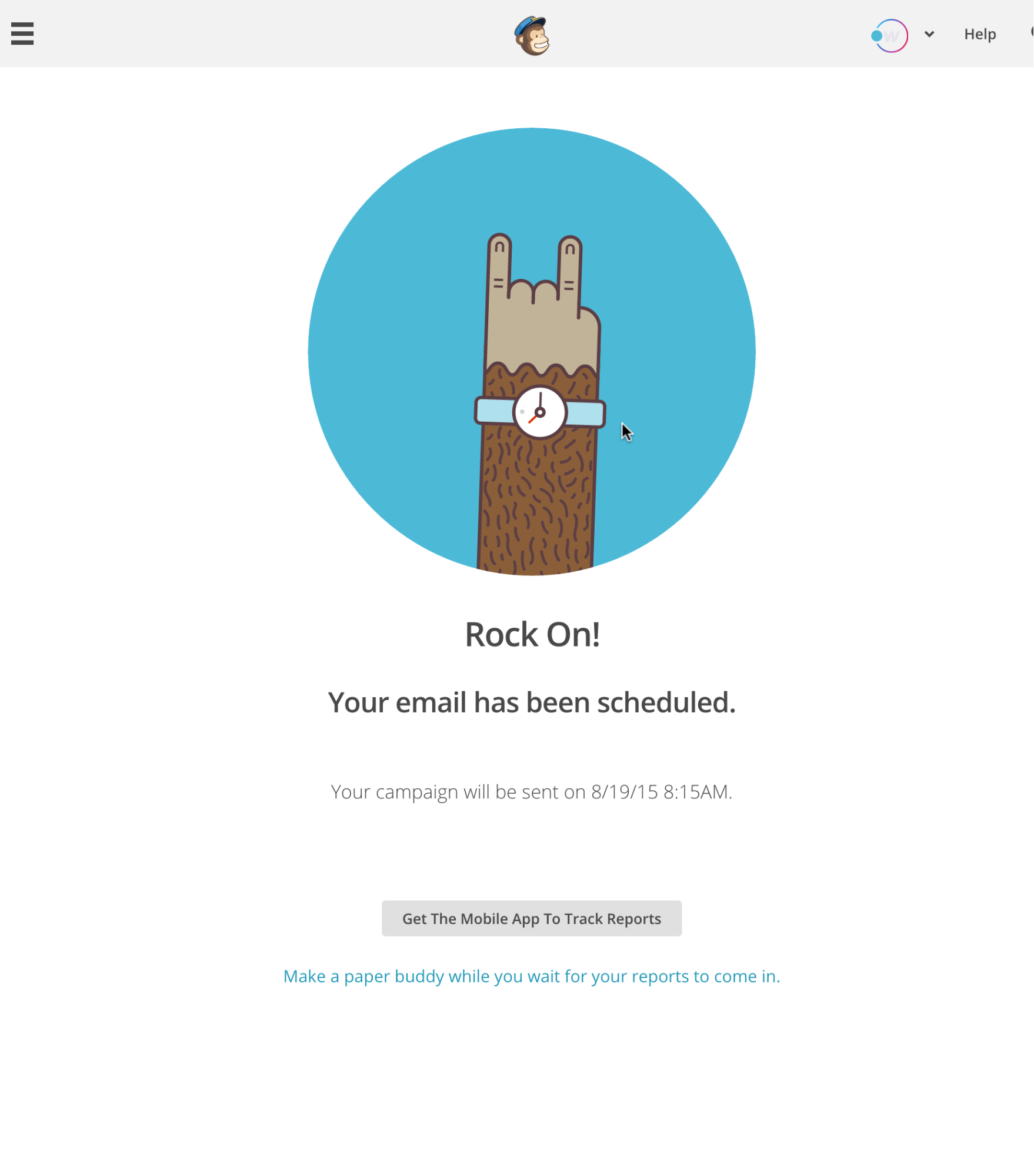
So give me that loading animation. Make that button pop and snap back when I tap it—but not too much. And give me a virtual high-five when I do something you and I agree is awesome. (Thanks, MailChimp.)
Just make sure it all happens fast. Usability.gov defines any delay over 1 second as an interruption. Over 10 seconds, a disruption. And the latter’s generous: for about half the U.S. population, 3 seconds is enough to cause a bounce.
If a page will load in under 5 seconds, don’t display a progress bar, as it’ll actually make the loading time seem longer. Instead, use a visualization that doesn’t imply progress, like Mac’s infamous “pinwheel of death.” But not that. If you do use progress bars on your site, consider trying some visual tricks to make the load seem faster.
6. Think carefully about element placement and size
Fitts’ Law, a fundamental principle of human-computer interaction (HCI), states that:
The time to acquire a target is a function of the distance to and size of the target.
In other words: the closer and/or bigger something is, the faster you can put your cursor (or finger) on it. This obviously has all kinds of implications for interaction and user interface design techniques, but three of the most important are:
Make buttons and other “click targets” (like icons and text links) big enough to easily see and click. This is especially important with typography, menus, and other link lists, as insufficient space will leave people clicking the wrong links again and again.
Make the buttons for the most common actions larger and more prominent.
Place navigation (and other common interactive visual elements, like search bars) on the edges or corners of the screen. This last might seem counterintuitive, but it works because it lessens the need for accuracy: a user doesn’t need to worry about overshooting their click target.
While you’re thinking about element placing and size, always keep your interaction model in mind. If your site requires horizontal scrolling rather than vertical scrolling, you’ll need to consider where and how to cue users to this unusual interaction type.
7. Don’t ignore standards
Being highly creative types, designers tend to love to reinvent things—but it’s not always the best idea.
Why? Because a revamped version of a familiar interaction or interface adds “cognitive load”: it makes people think again about a process they’ve already learned. Obviously, you can reinvent the wheel all you want—but only if it actually improves the design.
This rule of thumb explains why Google Docs’ menu bar features almost all the same options as Microsoft Word’s before Vista:


It also explains why Pocket had to change the placement of the archive button in their Android app a few years back.
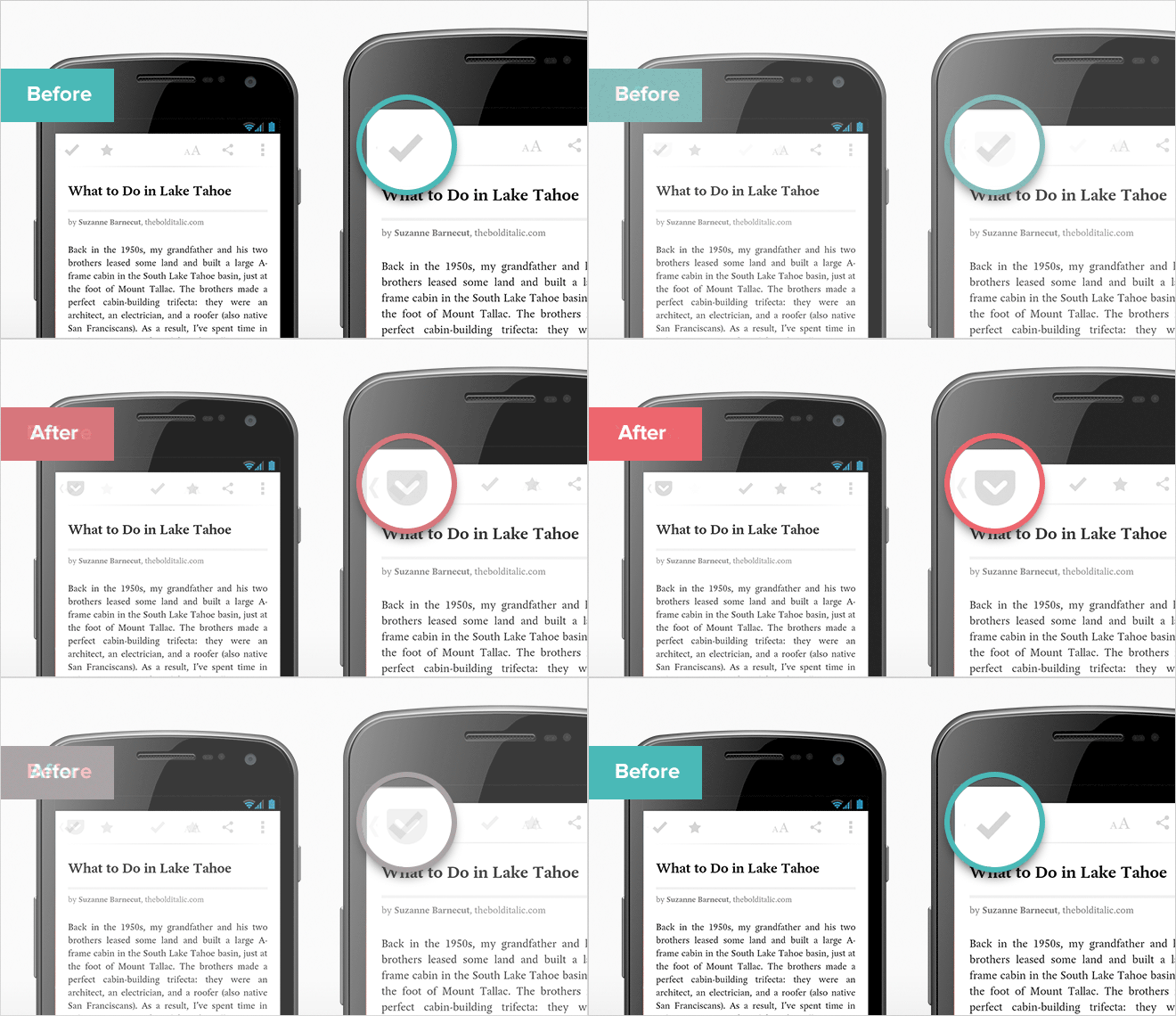
Up till fall 2013, the archive button was at the top left of the screen—right where Android design specs said the “Up” button should be. Pocket wanted to focus people on the reading experience, and not duplicate an existing hardware control, but the inconsistent placement caused new users to accidentally close and archive the article they were reading, rather than simply returning to their reading list as expected.
That tiny change "increased the likelihood [new users] would continue using Pocket from this point onwards by 23%."
8. Make your interfaces easy to learn
When it comes to simplicity, people often cite a paper by Harvard psychologist George Miller called, “The Magical Number Seven, Plus or Minus Two: Some Limits on our Capacity for Processing Information.” The article suggests that people can only hold 5 to 9 things in their short term memory with any reliability. Miller himself called this a coincidence, but that doesn’t seem to hold anyone back from citing him.
That said, it’s only logical that the simpler something is, the easier it is to remember in the short term. So, whenever possible, limit the number of things a person needs to remember to use your interface efficiently and effectively. You can facilitate this by chunking information, i.e., breaking it into small, digestible chunks.
This idea dovetails with Tesler’s Law of Conservation of Complexity, which states that UI designers should make their interfaces as simple as possible. That can mean masking the complexity of an application behind a simplified interface whenever possible. A popular example of a product failing to follow this law is Microsoft Word.
Most people only do a few things in Word—e.g., typing—while others can use it to do all sorts of powerful things. But around the world, everybody opens the same version of Word, with the same UI, leaving your average Joe—who's not a power user—overwhelmed by the variety of options they’ll probably never use.
This led to a concept called progressive disclosure, where advanced features are tucked away on secondary interfaces. You’ll often see this on websites’ home pages, where short chunks of copy introduce a product or feature, then link off to a page where users can learn more. (This also happens to be a best practice for mobile design, where robust navigation is always a challenge.)
Pro tip: Avoid using “learn more” and similarly non-specific text in links and buttons. Why? Because it doesn’t tell users what they’ll “learn more” about. Often, people simply scan a page looking for a link that takes them where they want to go, and “learn more,” repeated 15 times, doesn’t help. This is especially true for users of screen readers.
9. Make decision-making simple
Too much of the web screams at us: “Banners” suddenly expand to become full-screen ads. Modals pop up, imploring us to subscribe to blogs we haven’t had a chance to, you know, read yet. Video interstitials stop us in our tracks, forcing us to watch precious seconds tick oh-so-slowly by. And don’t even get me started on the widgets, flyouts, tooltips …
Sometimes I long for a calmer web—and Hicks’ Law gives us all a reason to build one. The idea’s as simple as its end result: the more ui options you present a user, the harder it becomes for them to make a decision.
This impacts almost everything we build:
- Overall layouts
- Navigation menus
- Pricing pages
- Blog indexes
- Content feeds
The list goes on. But the upshot is: the simpler we make our designs, the faster and easier it is for users to make the decisions we want them to make. That’s exactly why landing pages and non-newsletter emails should only have one call to action.
Pro tip: Sometimes, you actually do want users to slow down and consider their options. That’s why the tiled designs of Pinterest, Dribbble, and many blogs actually work well. After all, the more options you have to decide between, the more likely it is you’ll find one that works for you.
Related reads: UX vs UI: key differences every designer should know
10. Listen to the data
While we all might wish our designs were evaluated purely on their artistic merit, the reality is that optimizing your design to meet its objective is just as important.
While we all might wish our designs were evaluated purely on their artistic merit, the reality is that optimizing your design to meet its objective is just as important.
While user research and testing can be incredibly helpful in guiding your design decisions toward fulfillment of your site’s goal, data gathered after launch remains invaluable.
So set up analytics for your site, and analyze them regularly. There’s a bunch of different analytics tools out there, but I recommend Google Analytics and/or Mixpanel, depending on the project type.
Mixpanel focuses on events, so it collects data based on actions a visitor takes on your site, while Google Analytics is more behavioral, giving you session times, traffic sources, etc. While both tools can provide both forms of data, they really shine in their focus areas, so choose whichever best fits your needs.
Note: both of these tools are free for up to a certain amount of data points. Webflow and similar platforms usually make analytics setup easy through a simple API key exchange.
Related reads: 17 useful tools for UI/UX designers
Great interaction design in Webflow sites
Many designers who use Webflow have applied these guidelines to build intuitive and engaging interactions. Here’s a few examples.
Expanding circle navigation
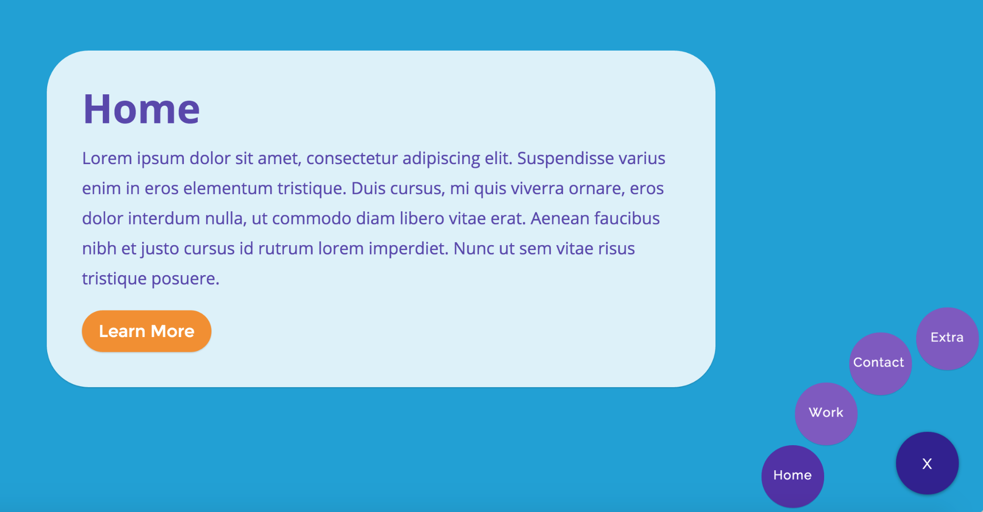
Waldo Broodryk created a fun mobile- and desktop-friendly animated menu. On page load, the circle in the lower right reads “Menu.” On click, it expands to reveal the available pages and changes to an X, allowing the user to close the menu and refocus on the content.
It’s a great combo of clear and engaging design, and plays close attention to Fitts’ Law: it’s easiest to target links at the edge of the screen. Circular navigation makes for an interesting option when you don't want to imply hierarchy in your navigation.
Do you buy that girl a drink?

Designer Shane Hurt put together this amazing interactive decision tree to help you decide whether or not to buy that girl a drink. The design packs in a ton of content, but keeps you laser-focused on the task at hand: answering the current question, and moving on toward your decision. Way to keep the interface simple, Shane.
Uniqlo redesign

Designer Tim Noah was shopping on the Uniqlo website one day when he realized how complex and unique their navigational system is. Inspired, he decided to “recreate this but in a more tablet and mobile friendly way.”
My favorite thing about it is how he turned Uniqlo’s multi-level nav, which takes several clicks and page loads to traverse on the brand’s actual desktop website, into a single-page experience. (To be fair, Uniqlo does the same thing on their mobile site, but it’s a mobile subdomain, not a responsive version of their desktop site.)
Note: this redesign was a personal project only, and in no way affiliated with Uniqlo.
Lead Sport Accelerator

Early in 2017, designer Jaro Quastenberg launched a site that really shows the power of visual interactions in Webflow: Lead Sport Accelerator.
The site really shines on two of the above mentioned tips. The first: knowing your users. Lead Sports Accelerator knows they’re trying to attract product-builders, and to do that they must make a great first impression via their website. The second is giving feedback. Whether you’re scrolling, hovering, or clicking an element on the page, it immediately responds to the visitor’s action, often in dramatic and delightful ways.
From the menu to scroll interactions – this is a great example of optimized function on what some may consider art combined.
Ok, you’ve nailed the basics
Now go forth and make some gorgeous, usable interfaces. And feel free to share the best—and worst—examples of UI design you’ve seen in the worldwide wilds of the web in the comments.


Build websites that get results.
Build visually, publish instantly, and scale safely and quickly — without writing a line of code. All with Webflow's website experience platform.


