Do you ever find yourself scratching your head every time someone talks about Squircles? Are you confused on how they differ from round squares? You're not alone.
Designers are often confused by the differences between squircles and round squares. In short — squircles are a combination of a circle and square — as the name suggests — while round squares are simply rounded-off versions of regular squares.
If you try to imagine these two different shapes in your mind, they probably look nearly identical. But understanding the slight nuances between these two shapes is important in order to determine how and where to use each one in your designs.
Let’s take a closer look.
It all begins with a rounded square
To understand squircles, the first step is understanding rounded squares — the proverbial starting point for creating a squircle.
A rounded square is a square with rounded corners. Instead of the sharp corners you would find with a plain old square, you replace them with curved edges like you see in the image below.

What’s important to note here is that besides the curved corners, nothing else about a rounded square deviates from a normal square. Like a square, the edges are straight and sharp, transitioning starkly from the curvature of the corners.
What is a squircle?
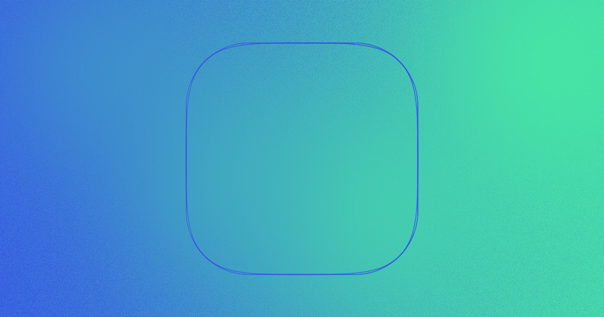
Now, let’s bring in the squircle. Like rounded squares, they have curved corners, but they’re ever so slightly different.

As you can see in the picture above, a squircle looks very similar to a rounded square. However, unlike a rounded square, where the curved corner transitions directly into a straight line˜— the line and the corner both gently curve together to form a slightly more circular and rounded shape.

Squircles have long been an integral part of design and have been used for everything from the shape of Apple iOS applications and speedometers in Fiat cars to dinner plates and pots and pans.
Squircles have been even used as traffic circles and roundabouts — most notably by Dutch polymath Piet Hein to help decongest the city of Stockholm after the Second World War.

The difference between a squircle and a rounded square
As we mentioned above, a squircle and a rounded square may look similar but they are two distinct shapes.
The main difference between these two shapes lies in their angles; whereas the corners of a rounded square remain 90-degrees, the edges of a squircle curve smoothly outwards from each corner, forming an arc.
The easiest way to visualize their difference is on a chart. If a square anchors on one end of the axis, and a circle on the other end — the rounded square would be more comparable to a square and the squircle would be more comparable to the circle as shown below.
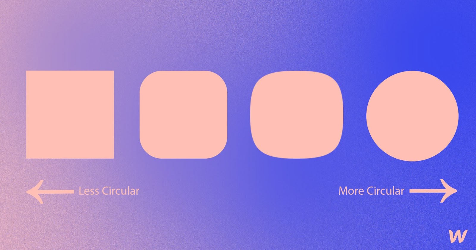
We love how Daniel Furst, senior software engineer at Curative and ex-Figma engineer, describes the difference between squircles and rounded squares in his piece Desperately Seeking Squircles:
“The curvature of a squircle’s perimeter is continuous, whereas a rounded square’s is not,” says Daniel. “This may seem trivial, a cool story, but subconsciously it really makes a big impact: a squircle doesn’t look like a square with surgery performed on it; it registers as an entity in its own right, like the shape of a smooth pebble in a riverbed, a unified and elemental whole.”
Which one should I use — a squircle or a rounded square?
So, you might be wondering — which one should I use in my next design? The answer: it depends.
In Orana Velarde’s Flaticon blog “The Meaning of Round Corners,” humans seem to have a psychological aversion to sharp edges. Sharp edges are established as dangerous, painful and negative. Orana says, “Beyond psychology, curves also enjoy better visual perception. When you look at two-dimensional shapes, those with curves are perceived faster than those with sharp lines.The fact that our brain captures the information of curves faster than right-angled corners ensures that emotionally we do the same. That’s why we prefer curves.”
Both shapes provide the curves and roundness that the human eye finds friendly and inviting. However, a squircle’s natural curvature makes the shape friendlier and easier on the eyes. This is because a squircle doesn’t contain the sharp and sudden breaks of a rounded square and instead your eyes are allowed to continuously follow the curvature of the shape.
Despite this, many users and designers alike find this difference negligible — making the best choice completely based on personal preference and what works best with your overall design.
Squircle Resources for Designers
If you’re looking to learn more about this delightful shape or use it in a project, here’s a roundup of some of our favorite resources to check out.
- Circling the Square: Designing with “Squircles” Instead of Rounded Rectangles by Kurt Kohlstedt
- Squircle on Wikipedia:
- The Hunt for the Squircle by Michael Flarup
- The Squircle by Wolfram Mathworld
- John D Cook’s Blog discussing the history of the term and the curvature of the squircle
- Desperately Seeking Squircles by Daniel Furse. Rounded corners in the Apple ecosystem by Arthur Van Siclen
- Squirclemorphism by Uxmisfit
- Superellipse by Piet Hein
- Apple’s Icons Have That Shape for a Very Good Reason by Mark Stanton
- The meaning of round corners by Orana Velarde
Squircles vs rounded squares
Whether you’re Team squircle, a rounded square die-hard, or prefer to use a little bit of both in your designs, one thing is for certain — there’s no wrong way to use either.
To show us how you’re using these shapes in your Webflow designs, be sure to submit to #MadeinWebflow — we can’t wait to see what you create!


Discover inspiring design work from the Webflow community
Made in Webflow is the place to browse, clone, and customize the latest websites built by the Webflow community.


