


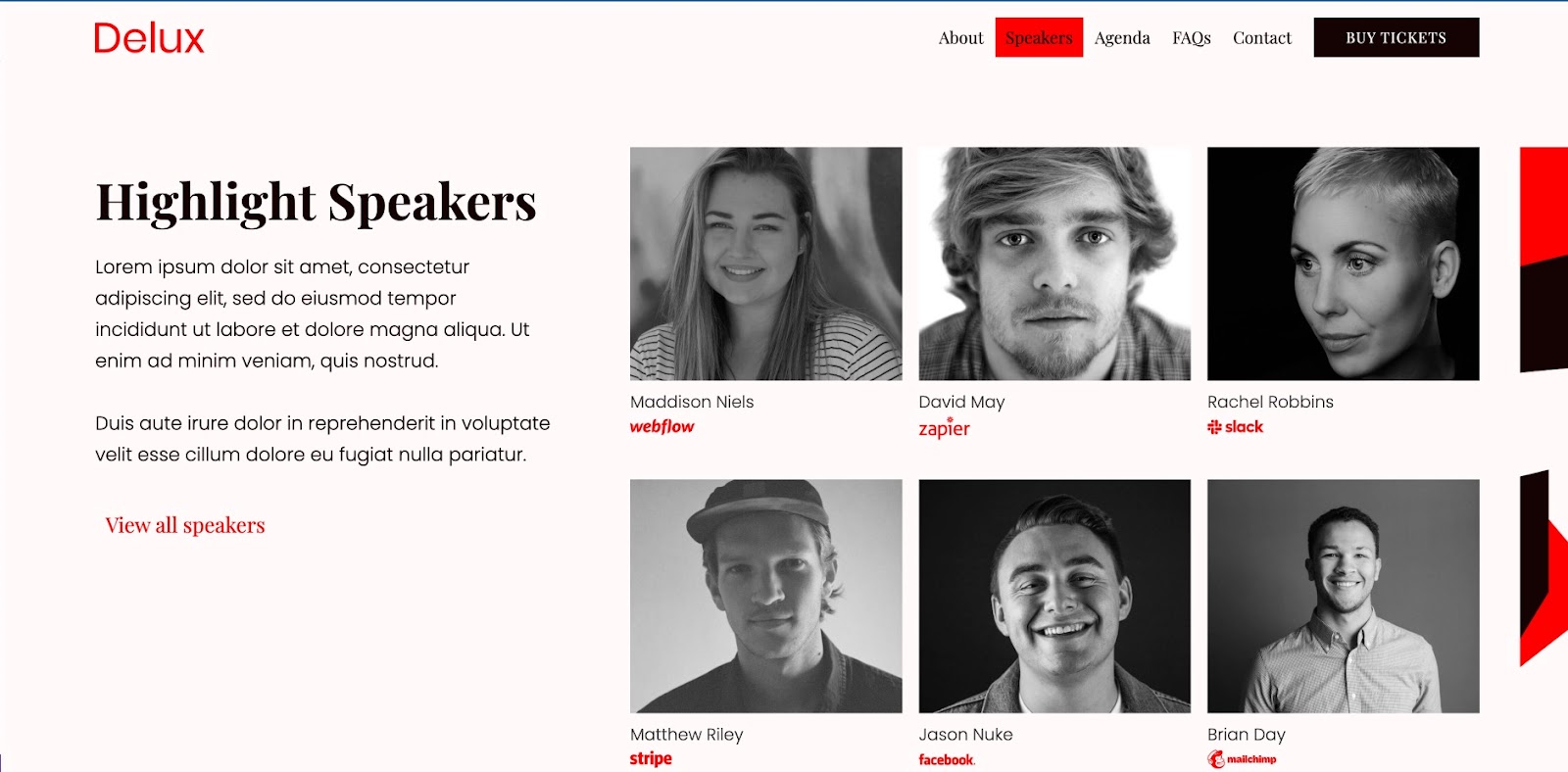
Navigation bar design sets the stage for a user-friendly experience across your website.
Navigation bars, or menus, are one of the key elements of usable web design. A navigation bar (navbar) or menu is an organized way of linking other (usually internal) webpages, and they help us move along smoothly within a website. Navbars can be hidden or be easy to access, allowing site visitors to navigate to the pages that are most useful or interesting to them.
If you have a poorly designed navbar, no matter how great your content is, your site visitors could struggle to find it. So, if you’re a newbie web designer or just a beginner looking for navigation bar design best practices, you’ve come to the right place. It’s perhaps the most important design element on a website, and we’re giving you tips and tricks to create user-friendly and effective navbars.
What are the types of navigation bars?
Navigation bars design best practices involve focusing on functionality. It’s best to make sure login, search toolbars, brand logos, and key content are easily accessible for users. Different navigation menu structures may have distinct uses based on their designs and placements.
Here’s a quick overview of three popular navigation styles: the horizontal navigation bar, the scroll menu, and the vertical sidebar. Each approach offers unique advantages for user journeys and site aesthetics.
Standard horizontal navigation bar
The most common type of menu style is a horizontal text-based navigation bar. Usually, they include a list of important site pages or sections, which can be nested within each other. The labels often consist of one or two words to briefly describe the section. In the example below, you can see six menu items, including the “Hurry” logo which brings visitors back to the homepage when clicked from other pages.

Horizontal navigation bars are often sticky or fixed menus, meaning they stick to the top of the page as users scroll. This style is useful when the main CTAs — such as “log in” or “contact us” — are located directly on the bar because no matter where the user is on the site, they’ll have a CTA to click into for next steps.
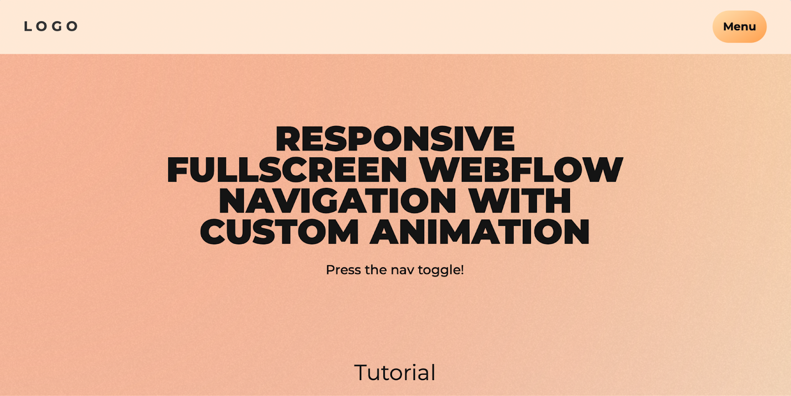
Hamburger menu
Hamburger menus involve a compact, three-line button that consolidates a list of links. It’s a very popular menu style, particularly on mobile apps and sites due to its efficient use of space. However, this type of navigation bar can be inaccessible to screen readers, so make sure you build hamburger menus with accessibility in mind.
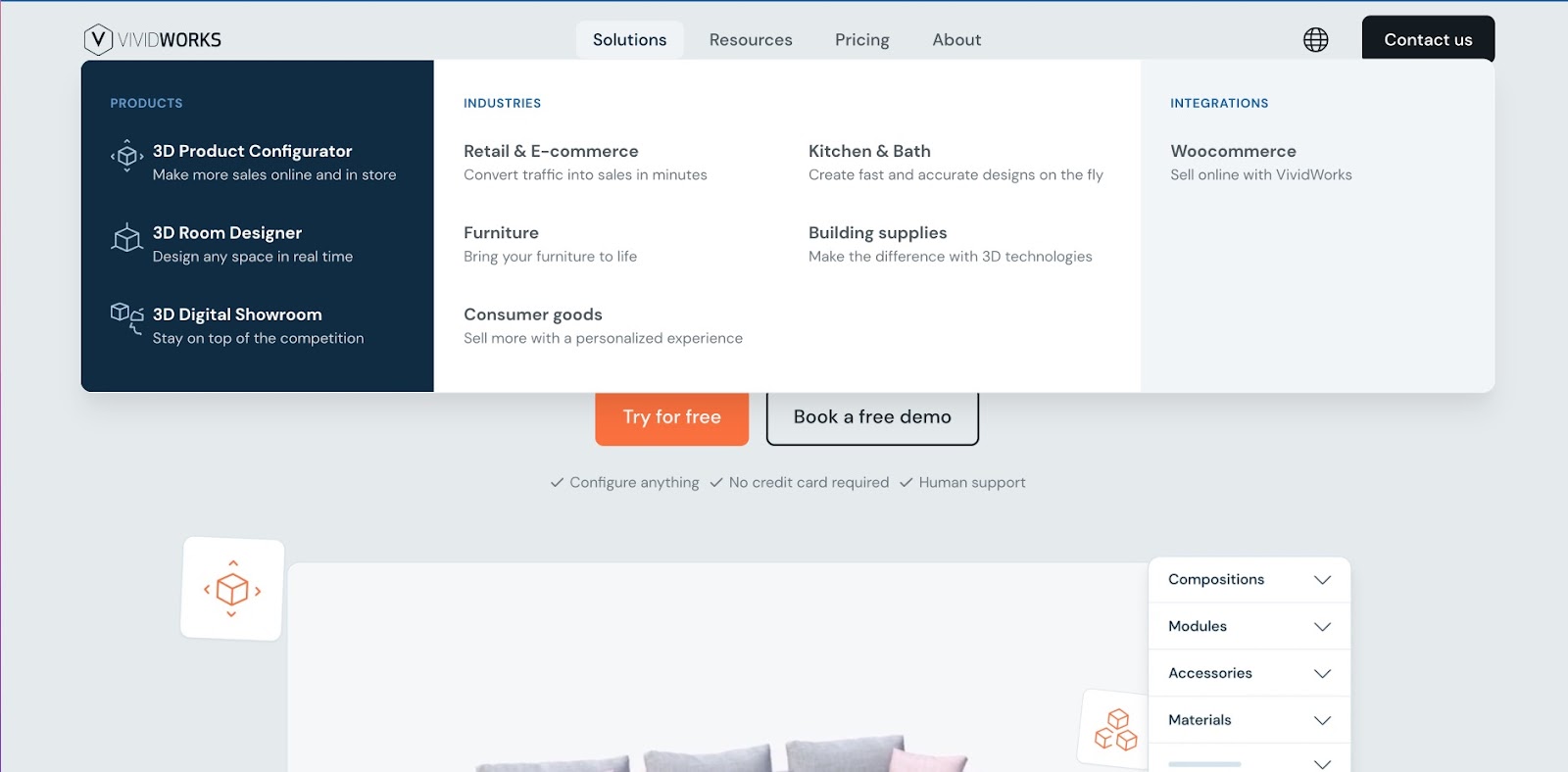
Mega menu
Mega menus are common in many ecommerce websites like Amazon or other similar retailers. The design features a large panel that contains every category and subcategory on the site. This format helps people understand the contents of the website at a glance and quickly find their preferred category.
The disadvantage of mega menus is that they can overwhelm site visitors with too many options at once. Mega menus can also become crowded, particularly on mobile devices, making them less visually appealing. One way to avoid this is to build mega menus under a category of your site, like the example below.
Hover-based dropdown menu
The mega menu is often nestled under this type of navigation bar. As you hover over an option in the navbar, a menu drops down via animation and lets you see more second-level categories and sections.
While this is a great way to get more direct links to site pages in the menu, it can be a controversial choice for user experience. The dropdown function assumes visitors will want to interact with every option they hover over — which may or may not be true. This style of navigation can also be tricky to design responsively, as the drop-downs don’t always work as well on mobile devices.
Scroll menu
Scroll menus stray from the traditional layout, but are becoming a popular choice for one-page website designs. Often, scroll menus mimic the look of a top navigation bar, but instead of routing visitors to a separate page when they click on an option, the page will auto scroll to the selected section.
This form of viewing a website can make a single-page website feel more immersive and organized.
Vertical sidebar
Vertical sidebars involve menus that expand from the side of the page on click, stacking menu items on top of each other in list form. Keeping the menu hidden until the site visitor opens it offers a few advantages. First, the menu is available at any time, but doesn’t crowd the design with all the options at once. Second, because the menu only opens when the user wants it to, you’ll be able to use longer text and take up more menu space. These advantages make it a popular choice for agency websites and portfolios.
Ryder International’s site has a fresh take on the vertical sidebar. When collapsed, the menu takes up only a fraction of the page. But when expanded, the menu can take over half the page, so options and text are not limited by space constraints.

What are the benefits of footer navigation for SEO?
Many websites make the most of their footer design by including an extended list of shortcut links within the footer. The footer is valuable real estate because it’s available from any page of the site. And because it’s at the bottom of the page, space constraints are not a major concern. Footer menus often contain a large number of shortcut links — more than than top menus — and give websites a nice SEO boost thanks to the amount of information stored within them.


Get our 100 video course on web design — for free
From the fundamentals to advanced topics — learn how to build sites in Webflow and become the designer you always wanted to be.
How to make navigation bar design? Best practices for beginners
When building a navigation bar, it’s a must to put a heavy emphasis on great UX, which means focusing on usability, learnability, and accessibility. Using these three lenses as a framework can help you create navigation bar designs that cater to site visitors with ease and speed.
- Usability helps users achieve their goals effectively and efficiently. It’s also a measure of a good overall experience.
- Learnability is how easily users accomplish a task the first time, and how quickly they can do it again.
- Accessibility is the first step to inclusive design. Making sure your website is accessible to all kinds of users adds that extra *chef’s kiss* to your work as a designer.
Here are 8 navbar design best practices that incorporate this framework.
1. Use breadcrumb navigation
Breadcrumb navigation is the cornerstone of wayfinding online. It’s the easiest way to find your way back home (literally and metaphorically). As designers, it’s our job to make sure that users can retrace their steps back to the beginning, preferably without hitting the back button countless times.
Breadcrumbs allow users to visualize the path they have taken so far by building upon the URL structure. You often see this in complex ecommerce websites with many different categories, like the example below.

This cloneable project was designed to create breadcrumbs for different categories and subcategories of foods. Check out Baymard’s extensive resource on making ecommerce websites usable.
A breadcrumb navigation is typically made up of text links interspersed with the ‘greater than' symbol (>). It can look somewhat like this: Page viewed > Page viewed > Current page. This is the easiest and most accurate way to improve and smooth out navigation.
2. Use familiar language and intuitive navigation
Don’t crack open a thesaurus for menu options — keep language as simple and universal as possible. Save your puns and quirky copy for body text and keep the menu straightforward and intuitive.
Information architecture and hierarchy must support good navigation through a flat organization of navigation buttons. Within one or two clicks, the user should be able to find what they need, no matter how deep the link goes.
As the Nielsen Norman Group states, the aim is for people to “rely on recognition rather than recall,” meaning menus should be short and scannable, but also focus on clarity. We can do this by limiting the number of levels to a maximum of three to four. The more the levels, the easier it is for the users to lose themselves in a maze of pages. Nielsen Norman Group also has a great library on understanding wayfinding and navigation.
3. Order your navigation strategically
The goal that you want to achieve through your website must be reflected in the navigation bar. Navigation bar design best practices also include adding a CTA so that you can lead users to fulfill those goals. And this aspect must be considered before you even begin building your website.
For example, if you have an ecommerce website that provides updates to the user, then adding a bell icon or a notification panel can be useful. This directs return-users to the most important information for them.
4. Be consistent in structure and style
Inconsistencies usually show up when we aren’t sure where something goes. Or other times, Google reports show that users search for certain pages and the designer feels compelled to add quick links that don’t fit into the existing navigation menu.
Unfortunately, consistency is all about making difficult choices. Either something makes logical sense or it doesn’t. Either all categories have subcategories or none at all. Thus, primary and secondary navigation must have the same user experience.
Style is also an important part of consistent design. Commonly recognized design patterns help users identify menu items and help with discoverability and ease overall. For example, using an underline under text signals to the user that it’s a link and can be clicked on. Something as simple as that can make your user’s journey smoother.
5. Design responsively
Navigation bars must be designed for both desktop and mobile, including all screen sizes. This helps readers who are using non-standard screen sizes. Here’s a really great project with a tutorial to create a responsive navbar.
6. Check color contrast
Since navigation menus reflect the underlying structure of the websites, having them follow the color contrast and screen reading best practices set up by WCAG is crucial.
It’s best to test color contrast ratios to make sure that content is accessible to people with color blindness or other visual impairments. You can use a contrast checker to make sure that people with moderately low vision and who aren’t using contrast-assisting technology can access your content.
7. Consider accessibility in navigation
When you’re designing your navigation, it’s best to think about how all users will interact with your menus. Consider color contrast, keyboard navigation, and responsive elements to provide an inclusive experience.
Making sure that drop-down menus can be appropriately used by mouse and keyboard allows keyboard users to access submenus. Adding markup and keyboard behavior can help assist with keyboard operability and help operate menus in different ways.
8. Make sure menus are legible and functional across devices
When designing and developing navigation bars, it’s important to also keep in mind users who use touch screens, often on smaller devices like smartphones, as well as users with fine motor limitations. For example, some people need a larger target area to tap on and lag in time to use drop-down menus efficiently. Menus disappearing too quickly can be a bad experience for any user.
Of course, there’s a lot more you can do to increase the accessibility of your website — our accessibility checklist is a good starting point.
Build effective user journeys
We know that this might be a lot to keep in mind. However, if you listen to your users and build what feels most intuitive to them, you’ll be well on your way to creating a navigation bar that will not only wow your users but make it easy for them to peruse your site.
Build websites that get results.
Build visually, publish instantly, and scale safely and quickly — without writing a line of code. All with Webflow's website experience platform.