

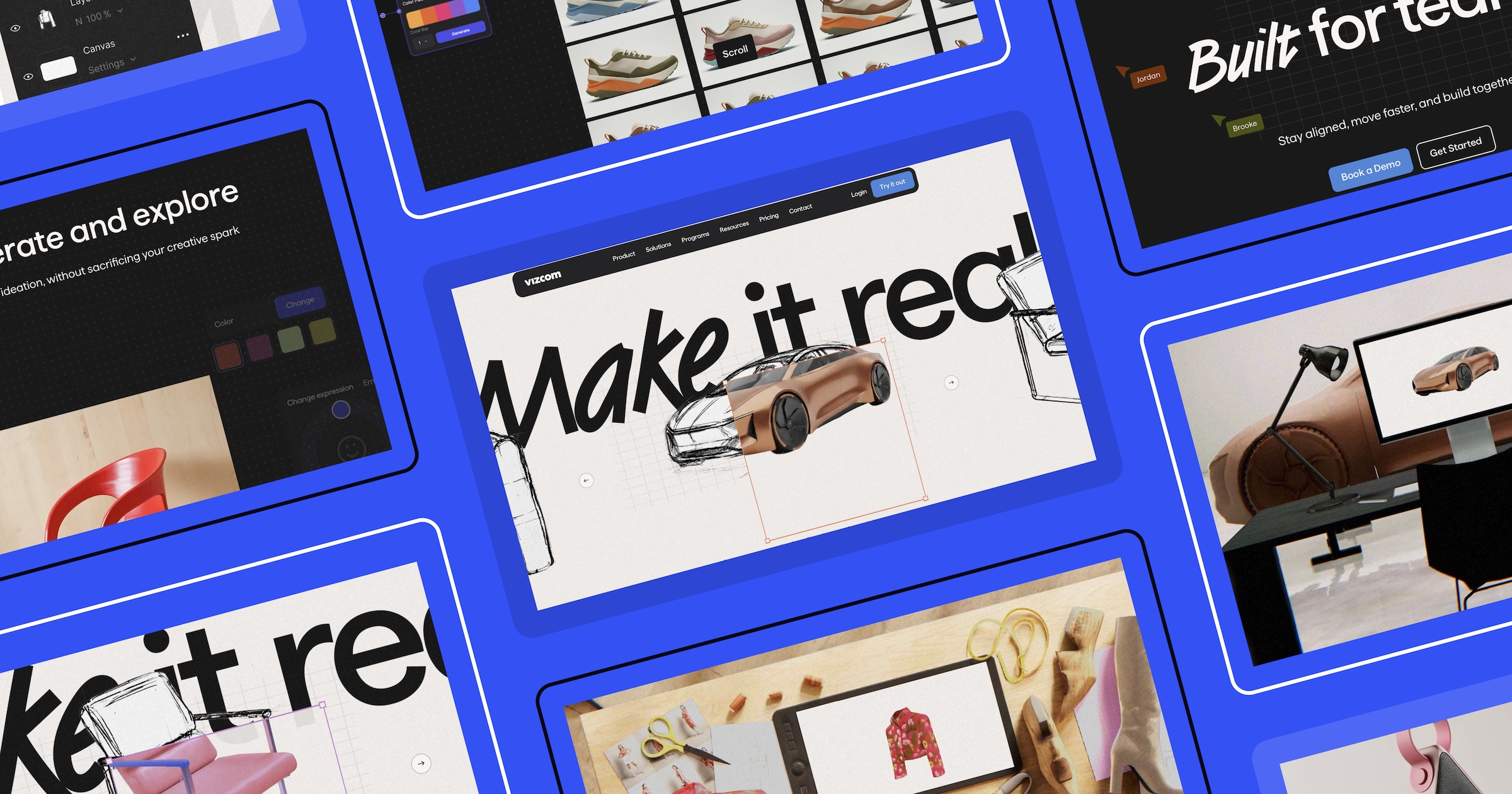


When we first walked through a Vizcom demo, we saw something that genuinely surprised us.
Sketches became renders; renders became dozens and dozens of colour and style variations; and then the idea became a 3D model, which became exportable assets for real world production — all within minutes. As designers ourselves at OFF+BRAND, it was akin to the feeling of those first moments experimenting with an AI tool where the output is surprisingly better than expected. Only this time, the result was not just visually impressive; it was a real, usable product that takes on a familiar creative workflow.
That feeling of excitement, speed, and possibility became the foundation of our approach to designing Vizcom’s homepage — and the lens through which every design decision was made. Motion and WebGL weren’t chosen to simply describe the product, but to help users feel what Vizcom does before they ever read about it.
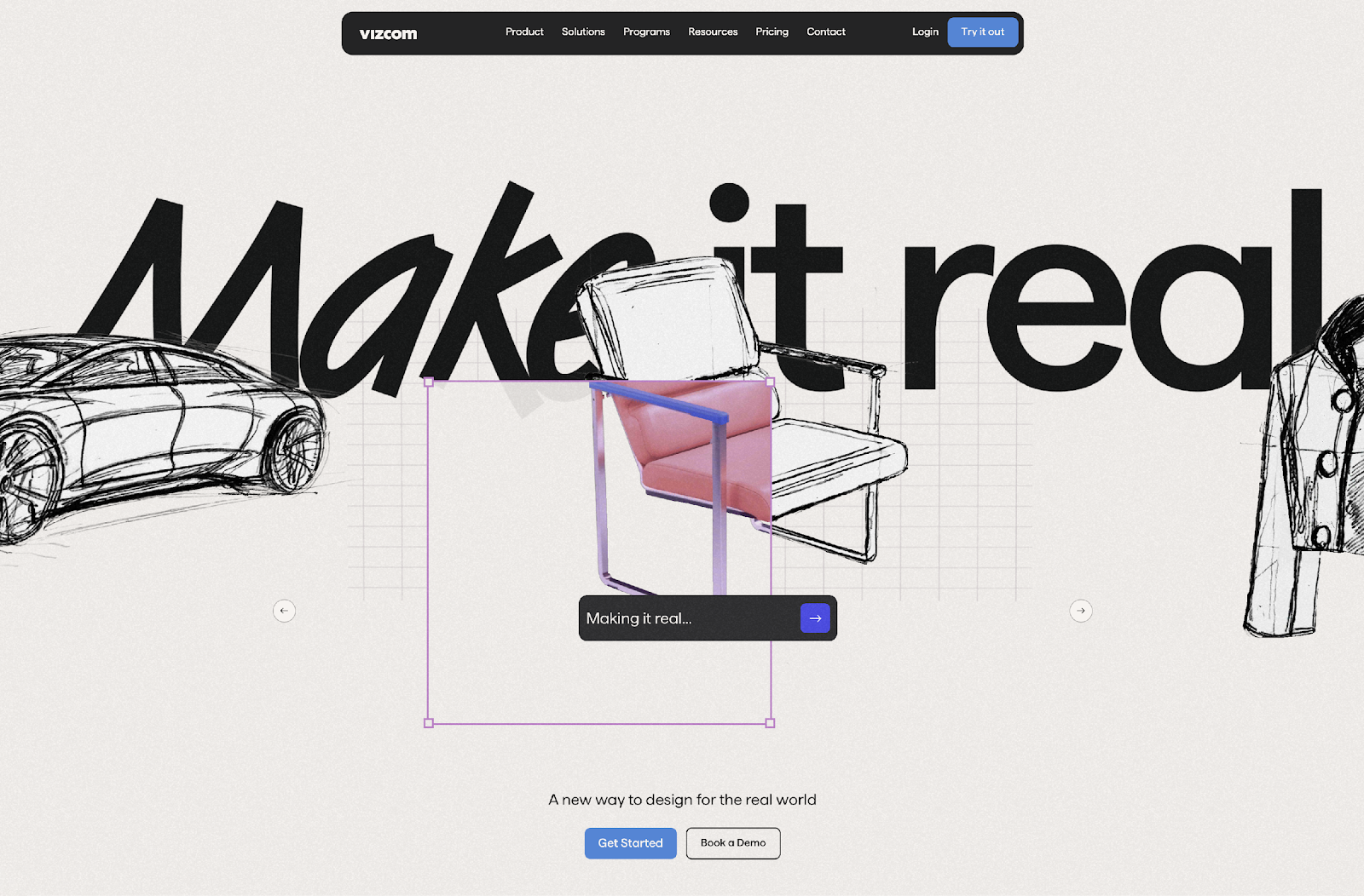
Turning “make it real” into an experience
For designers, an idea is often followed by a daunting reality. To see whether something will actually work, it usually requires a long chain of sketching, modeling, iterating, and reworking across multiple tools. Vizcom is an AI design tool built to collapse that chain, and its tagline — “make it real” — is deceptively simple, but incredibly powerful. One tool. One place. A much faster answer.
From the start, we knew this promise could not be communicated with copy or static imagery alone. The homepage needed to give users an honest, tangible sense of the creative ideation that happens inside Vizcom itself.
This shift — from explaining to letting users feel — shaped every decision that followed.
The first moment: from sketch to reality
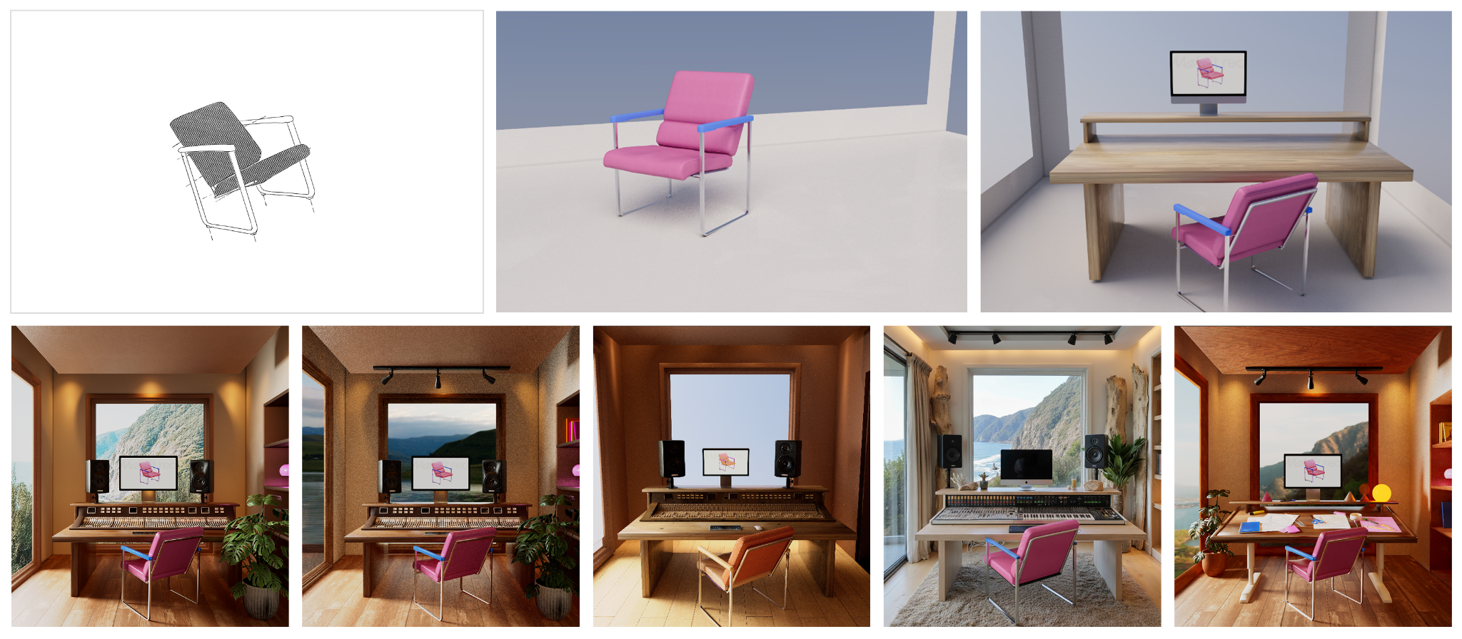
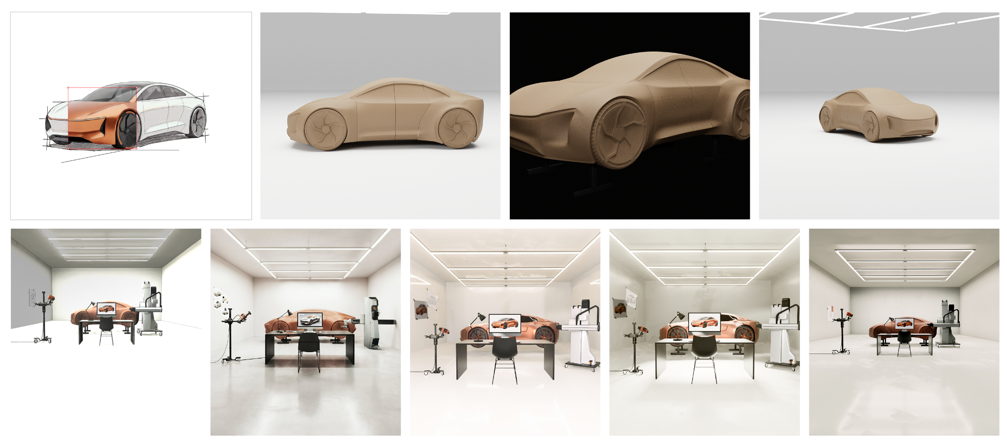
The hero section introduces users to three familiar design objects: a car, a coat, and a chair. Each begins as a sketch and quickly transforms into a dimensional, rendered object. This mirrors the moment inside Vizcom when an idea suddenly crosses the threshold from abstract to tangible.
Rather than explaining this process, we wanted users to experience it immediately.
Users who engage with the hero visuals have a much clearer picture of what Vizcom does before ever signing up for a demo, making every subsequent conversation more useful because our users are self-qualifying, leading to higher quality conversions. In short, they know what the tool does.
The experience is the explanation
There are many product websites that explain what their tools do. Far fewer allow users to feel it.
We wanted users to experience a snapshot of the transformation that happens inside Vizcom’s workbench, not just read about it. We designed the homepage as its own form of product education — a deliberate choice to let motion, interaction, and progression guide users to a genuine understanding, because words alone shouldn’t have to carry that weight. This takes pressure off sales and onboarding — and makes the homepage do real work in the user journey.
Crafting momentum-centered design
We chose scroll effects as the primary mechanism for transformation because it mirrors the experience of using Vizcom. During early demos, the ideation process felt continuous and fluid, with ideas evolving quickly rather than moving through rigid steps.
As users scroll, they feel that same sense of momentum. The experience flows from sketch to product without interruption — reinforcing that making something real doesn’t have to be slow or fragmented.
Crossing the threshold into the real world
The most important moment in the experience occurs when the user transitions out of the screen and into a real, physical space. This movement symbolizes the speed at which ideas can become tangible outcomes using Vizcom.
In the chair scene, the sketch becomes a chair that now sits beneath the designer’s desk. It is a small, almost poetic moment, but it delivers a clear message: the idea did not disappear into software — it arrived somewhere real.
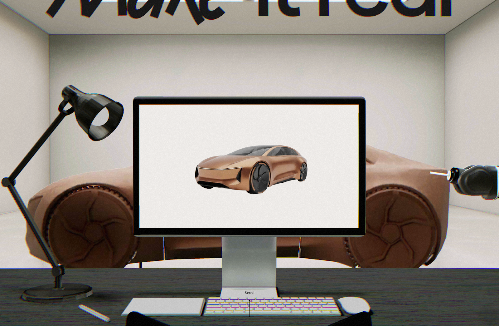
Placing the output in a real space — a chair beneath a desk, not floating in a render — makes the outcome feel less speculative. That moment of recognition does more than any call to action.
Preserving ambiguity and play
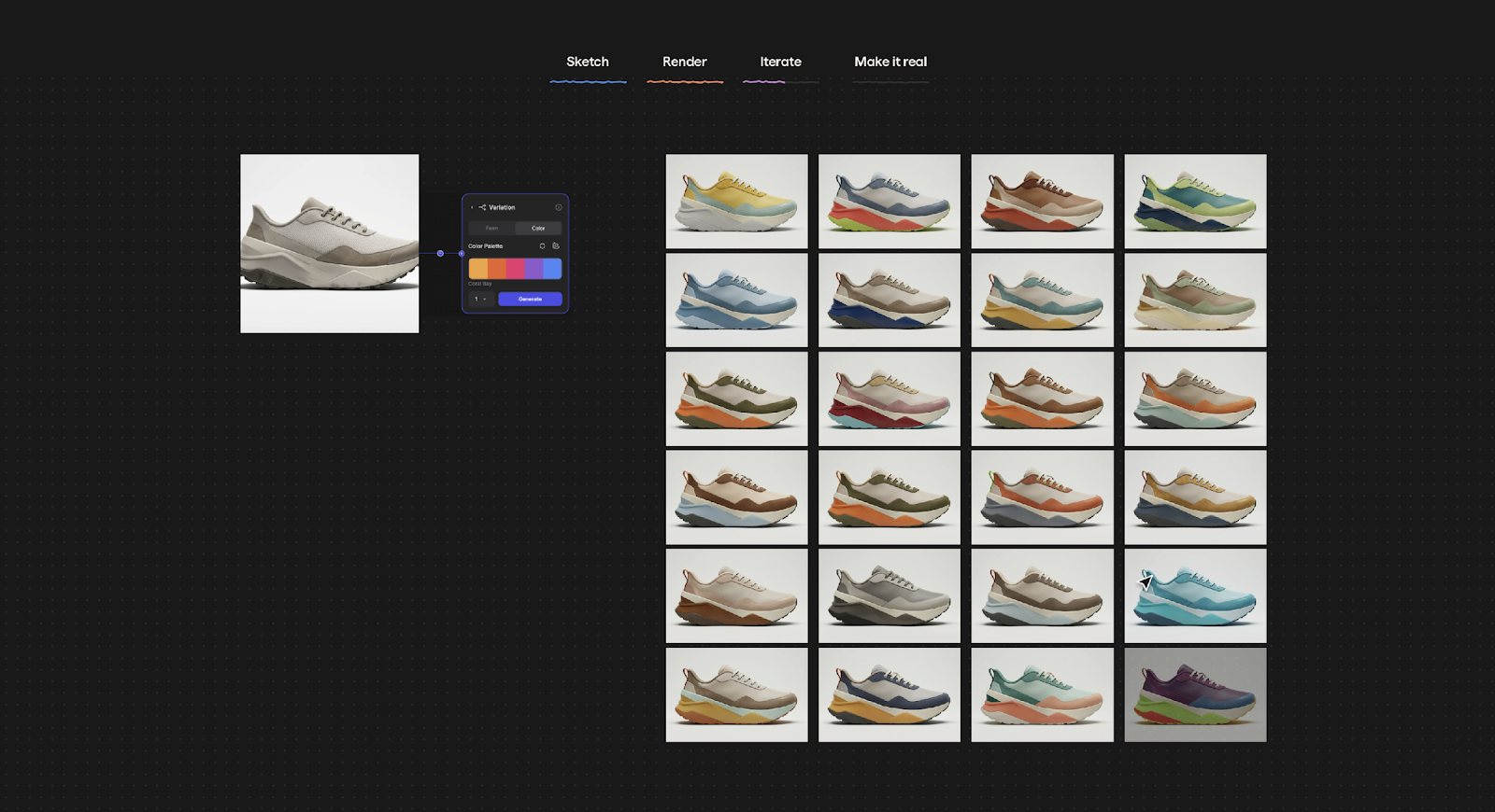
Early design thrives on exploration, variation and ambiguity. We wanted the homepage to reassure users that this part of the creative process isn’t lost when working with Vizcom.
The second section of the experience shows a spectrum of outputs rather than a single result. This reflects how ideation actually works — and shows Vizcom as a tool that can keep pace, rather than one that forces a single direction.
These decisions reinforce Vizcom’s position as a professional design tool — not a one-click generator, but a serious creative environment that earns its place in a professional workflow.


Designing the moment an idea becomes real
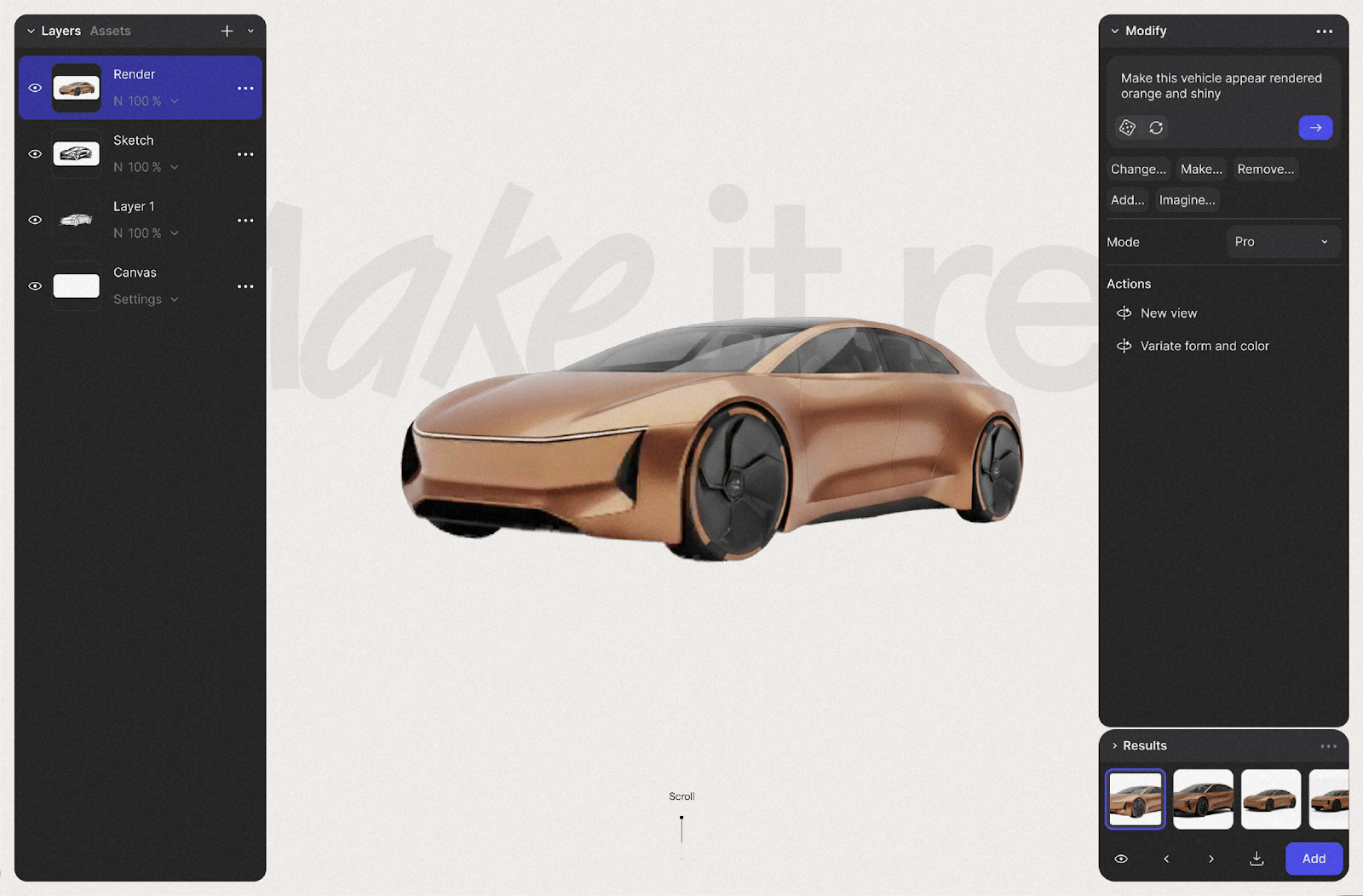
“Make it real” is rooted in the early phase of product design, where ideas exist mainly as rough sketches rather than finished objects. The Vizcom app is built to help designers move from these initial, loosely defined ideas toward a real product with industry-leading tools. From the start, we were focused on capturing this moment — when an abstract concept first takes on real form.
To enhance the exploratory phase, we created a playful carousel as an entry point to the experience. The carousel reacts with natural, bouncy motion that immediately responds to user input, drawing attention and encouraging users to swipe through the sketched 3D objects and discover what lies behind them. To push the playfulness further, one of the carousel items — the coat — features custom motion mechanics that naturally react to user swiping.
Avoiding 3D for 3D’s sake
One of the biggest risks when using WebGL on a homepage is creating spectacle without meaning. From the start, every 3D element had to earn its place — serving the story rather than simply demonstrating what was technically possible.
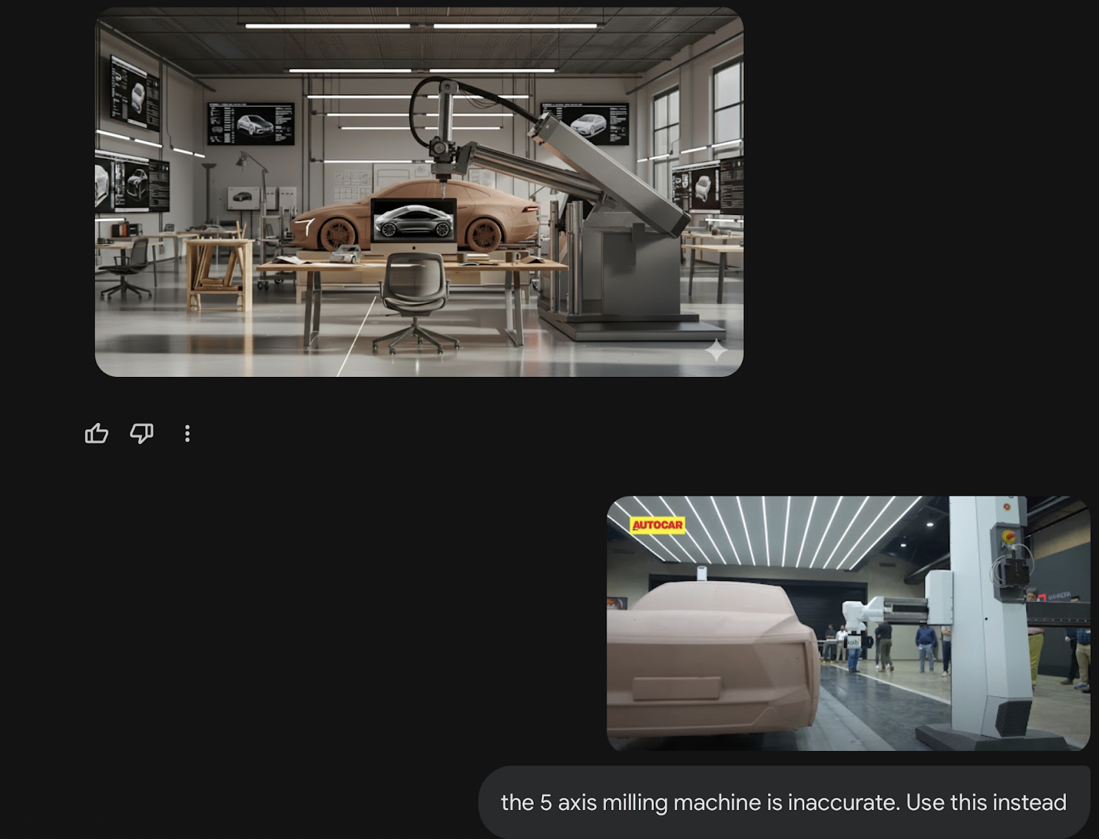
The final scenes needed to represent believable, relatable outcomes. We designed each environment to reflect the real working world of the designer viewing it. When approaching the automotive scene, for example, we researched real fabrication processes and found that five-axis milling machines are commonly used to speed up clay modeling. Including this machine was not decorative; it was a recognizable signal to automotive designers that the output from Vizcom was production-ready.
Working with AI at this stage meant we could move through multiple visual directions quickly, without losing momentum. It kept our own process as fluid as the tool we were designing for.
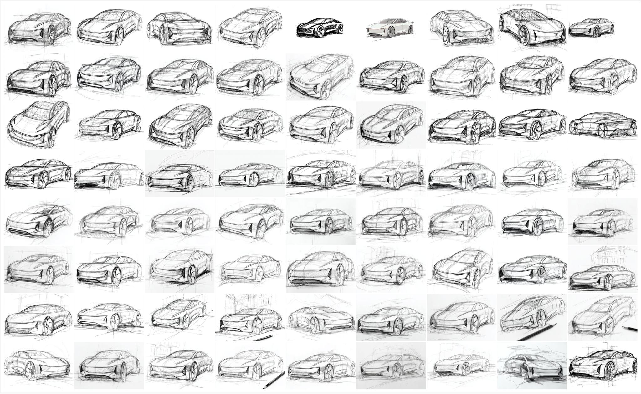
Iterating the visual language
We also used AI to support the iteration process, generating multiple sketch styles for all three objects, their rendered counterparts, and the room they ultimately appear in. This allowed us to iterate quickly across visual directions while maintaining a consistent relationship between the sketch phase and the final rendered state.
We even extended the sketch language into other UI elements, including parts of the interface and the colourful transition window within the WebGL scene, ensuring the visual style carries through the entire experience.
Creating a meaningful “wow” moment
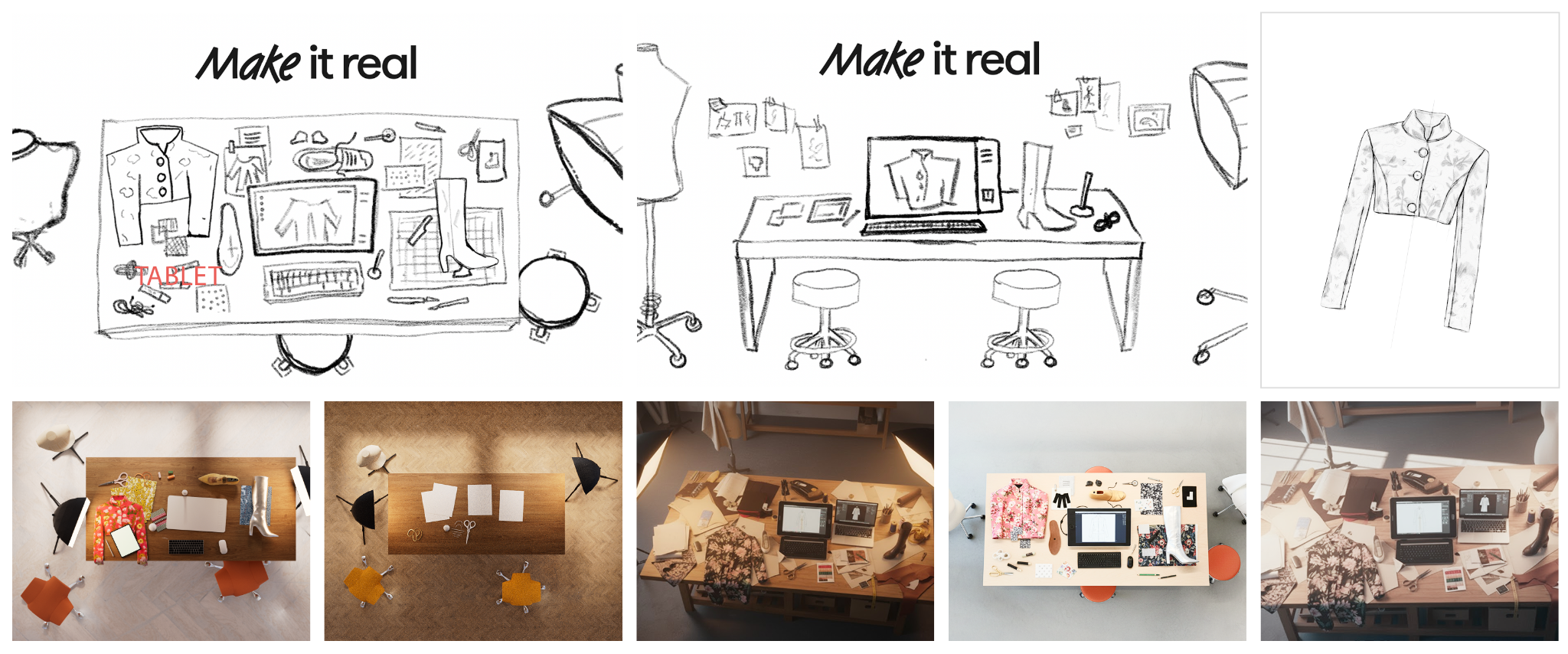
We designed the transition into the final scene to create a clear “wow” moment for the user. To achieve this, we had to render the room as realistically as possible while working within the resource limitations of a high-performance WebGL experience.
We explored several approaches to balance realism and performance. We used Vizcom’s tools to generate the main models in the scene, combined with detailed AI-powered modeling and texturing for the rest. The scenes were further extended with planar reflections on the ground and windows to add depth and richness.
Performance as a design principle
With the high-performance nature of the website in mind, we optimized assets wherever possible. We implemented strong compression alongside an asynchronous loading system and on-demand parsing, ensuring that only assets initially visible to the user are downloaded and processed during the first load.
To reduce asset size and improve performance even further, especially on low-end devices and slower mobile connections, a separate set of lower resolution textures is used for mobile users – without compromising the visible quality of the scene.
Instead of relying on a physics engine for the coat movement in the carousel, we studied real life coat material properties on a hanger and recreated its behaviour using a simpler algorithmic approach directly in the shader. This helped us achieve believable motion while keeping the solution cheap and efficient.
The WebGL experience was built using OGL.js — chosen for its small bundle size and straightforward architecture — which helped keep the final build lightweight compared to more commonly used libraries.
Collaboration as a creative accelerator
Working with a WebGL specialist from the very beginning fundamentally shaped the outcome of the project. Early wireframe prototypes allowed us to test scroll behavior, interaction timing, and scene smoothness before committing to final assets.
This meant the concept was grounded from the start — something Vizcom can build on and extend over time, without ever rethinking the system from scratch.
Design the feeling, not the explanation
Ultimately, this wasn’t built to showcase technical capability. It was built to answer one question: Can this actually make my ideas real?
By designing an experience rather than writing a statement, the homepage becomes part of the product journey itself. Motion design compresses understanding, demonstrates credibility, and gives users the confidence to take a next step.
The experience is not showing what Vizcom can do; it’s showing what it feels like when an idea finally comes to life.

Work with a Webflow Partner
Webflow Certified Partners have verified experience and a proven track record with client satisfaction.


