You don’t have a lot of time to create that all-important first impression on a website.
Research shows you get about 50 milliseconds to grab website visitors’ attention. If you want to get new clients and grow your business, having a compelling web developer portfolio is crucial. It takes a keen eye and attention to detail. Understanding your audience is also vital.
A one-size-fits-all portfolio doesn’t exist. However, you’ll find plenty of inspiration from developers who have honed their talents and displayed them in their own portfolios. Regardless of what kind of portfolio site you’re building, the best portfolio sites focus on what web developers offer with examples that show their best work.
Let’s look at 9 of our favorite web dev portfolios that have inspired us, and we hope will inspire you as well.
If you’re building a minimalist portfolio, check out:
Lauren Waller
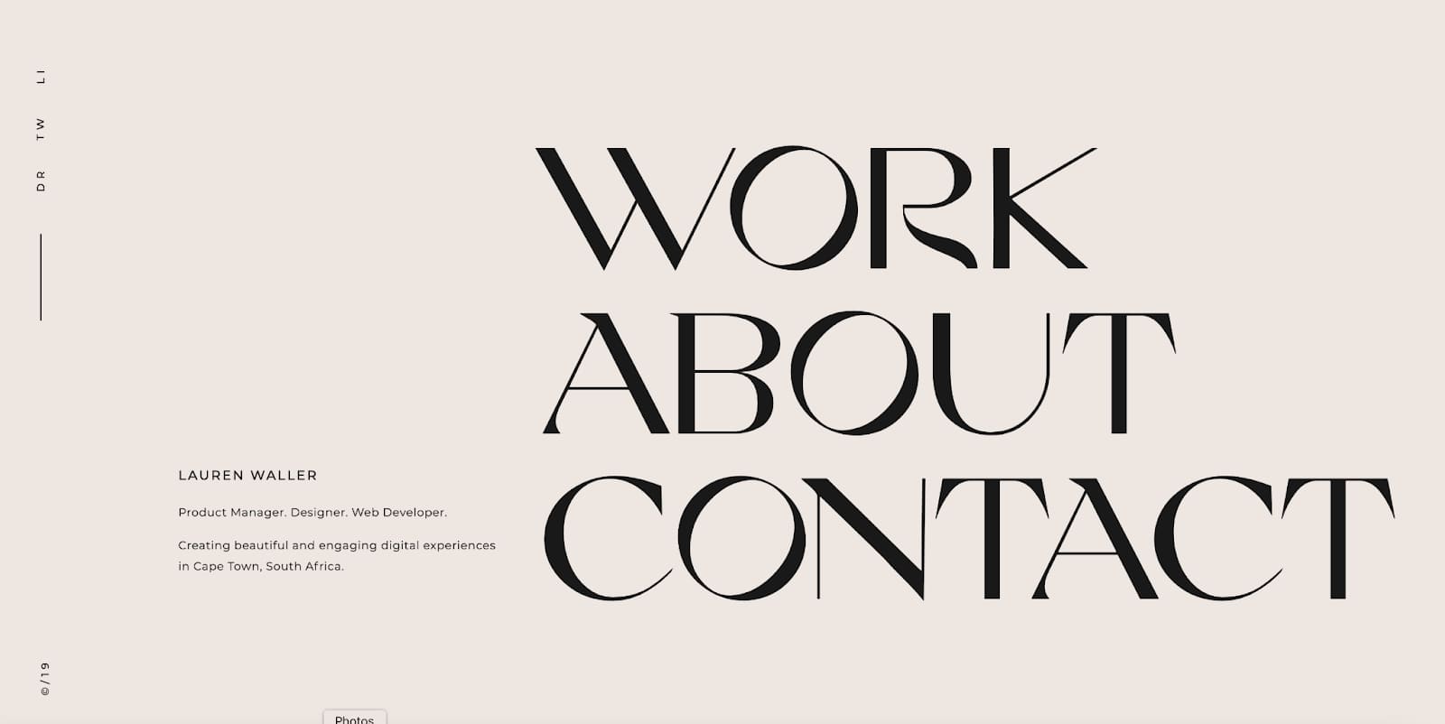
Lauren Waller is a web developer who wants to do more than create an engaging landing page. She wants to design a digital experience. Her online portfolio is clean, and concise, with information about her role as a front-end developer and responsibilities with her personal projects.
For her portfolio’s design, Lauren leans into using large typography and white space to create a dramatic contrast. We love how Lauren uses large headers throughout her site to emphasize the most important sections and aspects of her work that a client would need to know.
Koysor Abdul
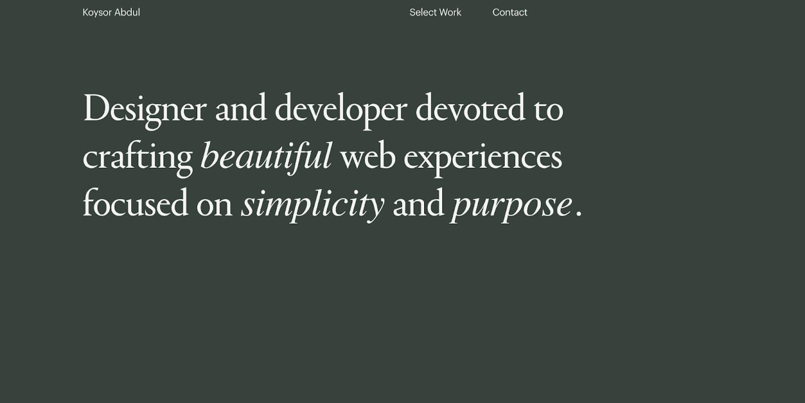
Similar to Lauren, Koysor Abdul also uses fonts and white space as the key design of his portfolio. Instead of playing with size contrast — as Lauren did — we love how Koysor uses italics to emphasize the key elements of his style.
Additionally, he makes clever use of the screenshots of his portfolio examples, creating a fun, interactive experience on its own, along with links to the sites.
If you’re building a maximalist portfolio, check out:
Lars Olson
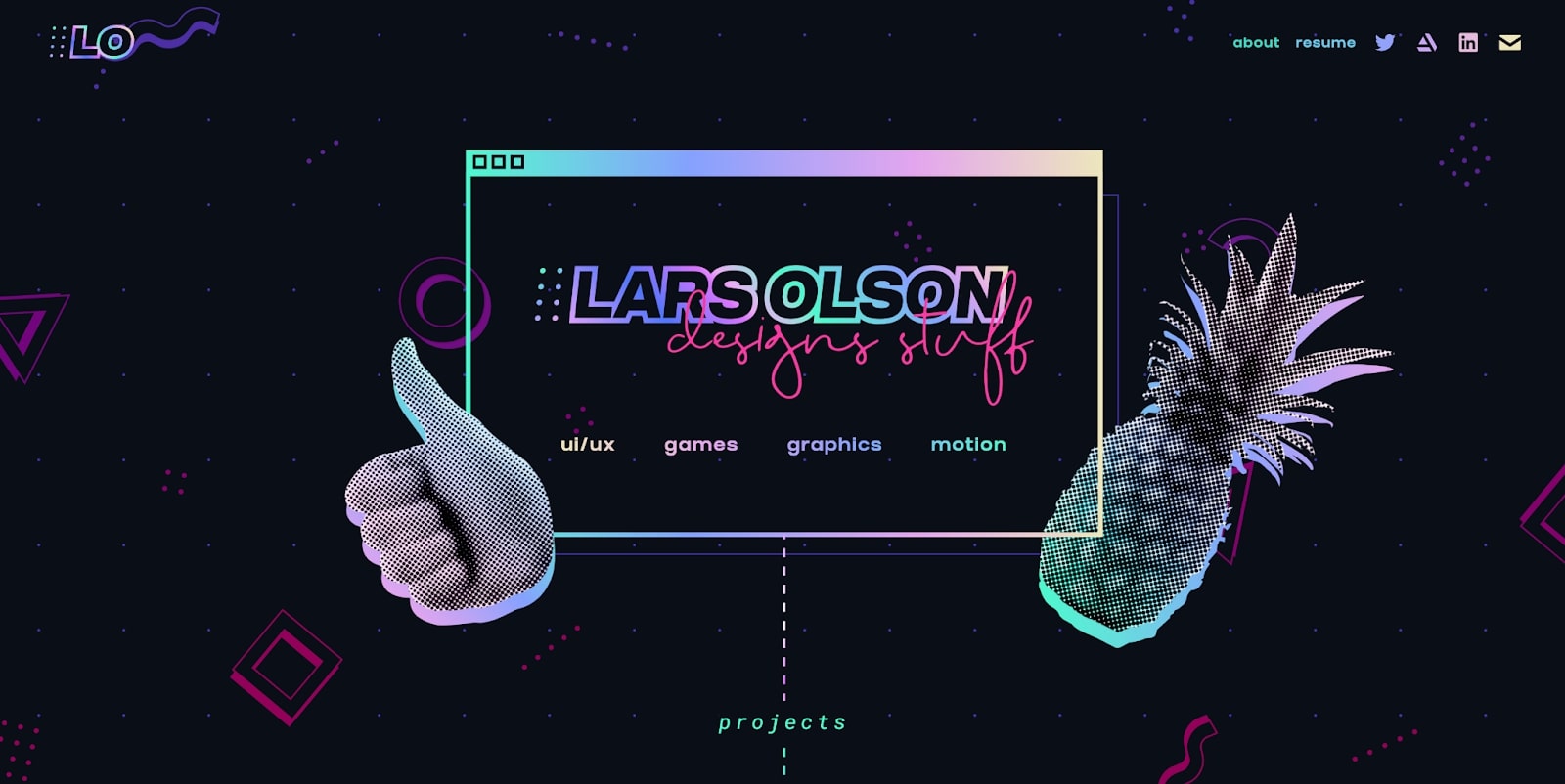
Lars Olson specializes in UI/UX design and game development, and his portfolio is a great showcase of his abilities — and more importantly his personality as a designer.
Lars leans into colorful, maximalist design with fun elements like hover animations, a rainbow-gradient color scheme, and wacky graphics such as pineapples and dolphins.
In a world where clean and minimalist design is often favored, it’s great to see designers who step out of the box and be able to clearly showcase their work while still bringing in their personality and fun.
If you love to use color, check out:
Niall Mc Dermott
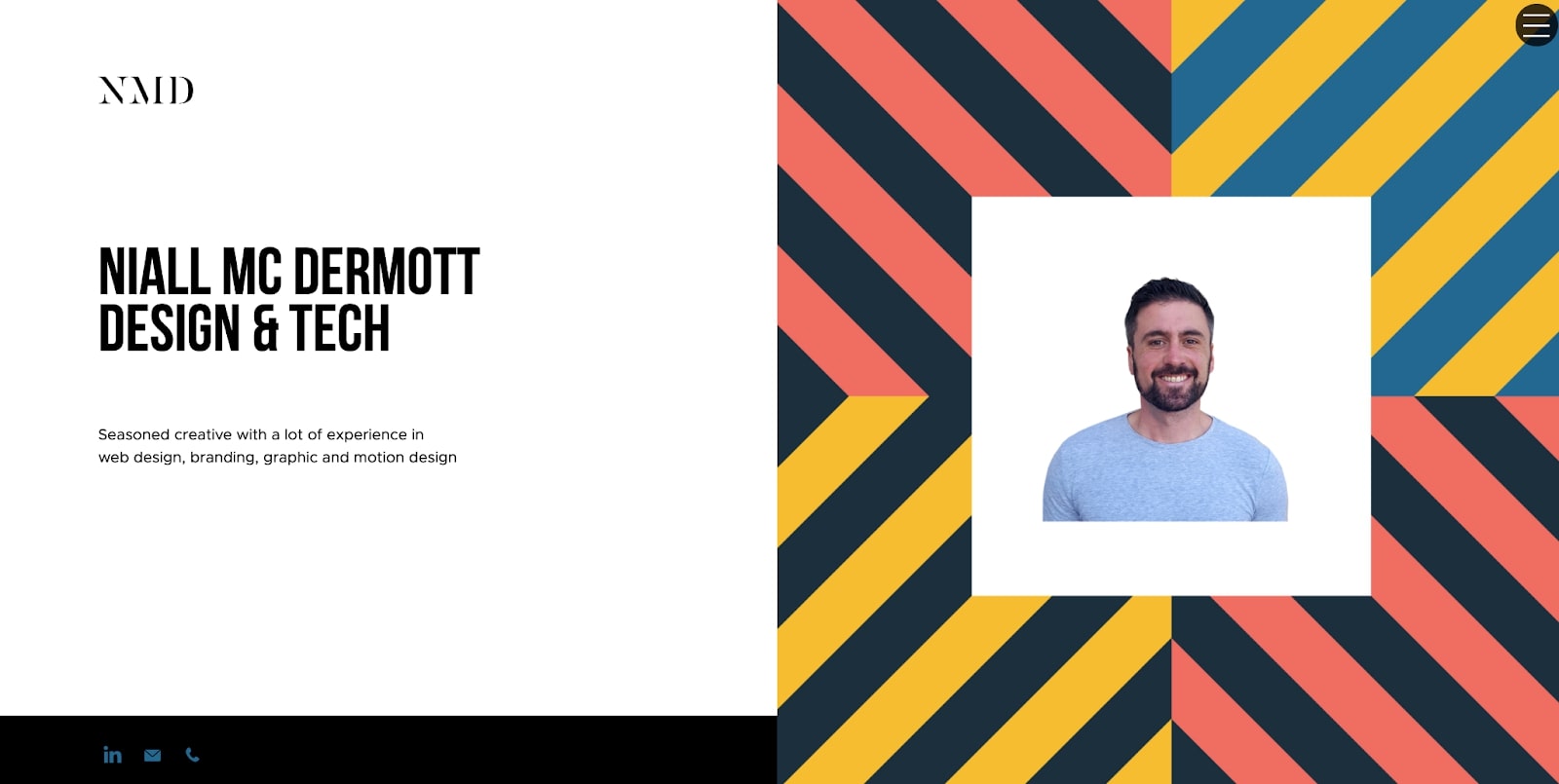
Though his site is minimal, Niall Mc Dermott’s portfolio brings in a bold mix of color, pattern, and animation to showcase his style as a designer.
It’s easy when playing with color — and in Niall’s case clashing colors — to accidentally create an overwhelming experience for potential clients. We like how Niall utilizes color and pattern as an accent to accompany pictures or words, versus having it be the main focus.
Even though Niall’s colors are loud, he keeps the rest of his site neutral with blacks and whites and a bold typeface to balance the entire site out.
Edgar Deiner
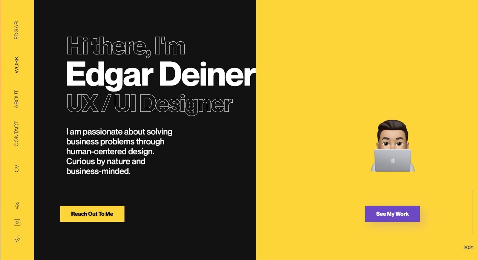
Instead of using clashing colors and patterns, Edgar Deiner sticks to one single, bold, color — yellow — and balances it out with a neutral black for his portfolio.
Edgar’s portfolio is a great example of using bold color, but still having a clean and streamlined site. By choosing one bold color to be your main design element, and keeping the rest of your design elements minimal you’ll create an eye-catching site without visual noise, an easy trap to fall into when using color.


Get started for free
Create custom, scalable websites — without writing code. Start building in Webflow.
If you’re looking to use animation, check out:
Matan Assulin
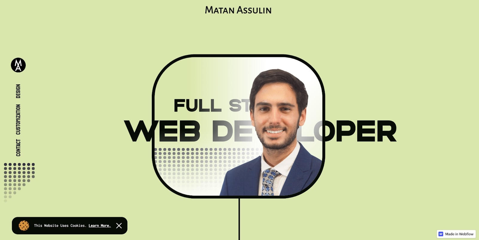
When it comes to advocating for your animation skills to potential clients — showing, not telling is often the best course of action. Matan Assulin’s online portfolio is a great example of this with a clean and intuitive website design and responsive animation throughout.
Matan’s approach is to let the animation speak for itself in every aspect of their portfolio. By doing so, Matan is able to clearly communicate their abilities to clients and showcase what they can do for their sites.
Rick Bossenbroek
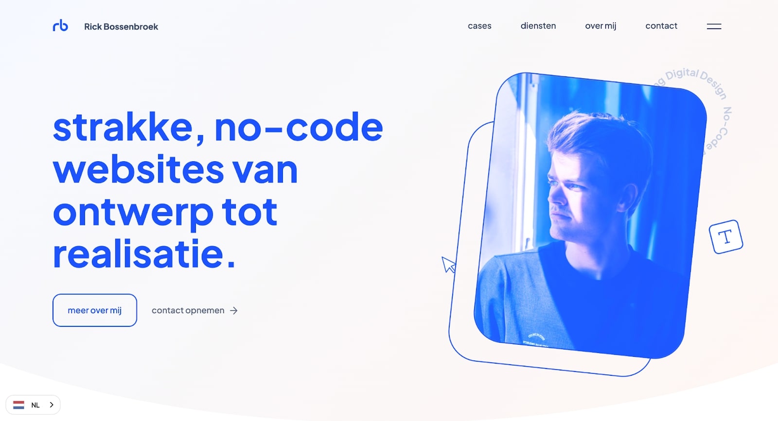
Rick Bossenbroek’s approach to animation is a bit more subtle. Instead of filling the site with animations, Rick leans into a few animated elements with small motion patterns.
This allows them to subtly draw attention to certain things like their picture, various skills, and past projects without creating too much distraction.
If you’re looking for clean layouts, check out:
Mariela Lopez
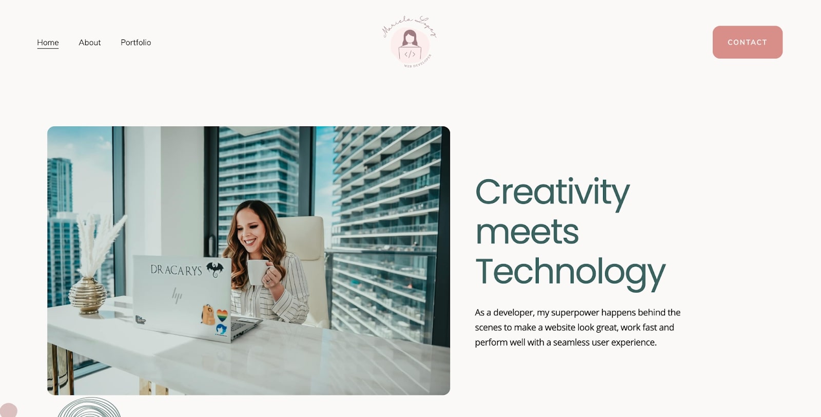
Mariela Lopez shows that sometimes simple is best when building a layout for your portfolio. It can be easy — especially as creatives — to get carried away, create too much on your site, and end up with a messy and confusing layout.
Mariela keeps it streamlined by having an easy-to-use navigation bar, a clear and concise “about” page and a well curated portfolio of work. Everything is focused on what she can offer to the client and what skills she brings to the table.
Alexander Tampier
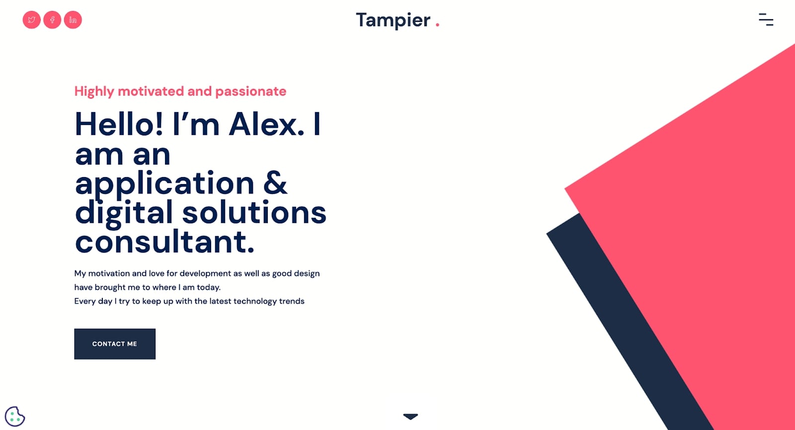
Alex Tampier’s portfolio site is another great example of a well done layout. Instead of having multiple pages, Alex keeps it to a single scrollable page. On their page, Alex highlights their skills, goals, skillset, and projects in a clean and concise way.
We especially love how Alex uses graphics to show their level of expertise when it comes to different skill sets such as Java and SQL.
Creating your own web developer portfolio
Perhaps the best way to create a web developer portfolio is to design and build a site that emphasizes who you are and what your strengths are. Your portfolio is often the first impression many clients have, and when they’re looking at your site, regardless of its style, they should be able to quickly understand what you can bring to the table, and why you are the best person for them to hire.
So, in this case, emphasize the user experience, focusing on what matters most from their perspective. Remember, you have so little time to get your message across with your web dev portfolio. Make it count.





.jpeg)
.jpeg)

