
Building a wedding website is the modern-day equivalent of picking out stationary for your wedding invitations.
Like most parts of wedding planning, it’s an involved, complex process. Not only are you trying to accurately represent yourselves as a couple, but you’re inviting your nearest and dearest to share in the celebration of your union.
And just like with traditional paper wedding invitations, it’s easy to get caught up in the whirlwind of different fonts and color schemes. When you’re trying to design the best wedding website, the pressure to get things perfectly right can lead to a lot of stress, especially if you’re working with third-party website builders.
Sometimes it’s good to take a step back and search for a bit of online inspiration.
Here’s a rundown of some of our favorites to get you started.
8 beautiful wedding website examples
Below, we’ve compiled a list of some of our favorite wedding website examples, each designed with Webflow’s easy and intuitive visual-first tools. There’s a pretty wide variety here – everything from elaborate animations to minimalist designs. Let’s take a look.
1. Rachel & Conor

Rachel and Conor’s wedding website is beautiful and uncluttered, presenting the happy couple in a beautiful archway design and with a color scheme that beautifully represents the wedding’s locale.
One key aspect of any good wedding website design is to make it easy for guests to find key information (and this holds especially true when it comes to a destination wedding). Guests are likely going to be coming back to this website more than once to find answers to different questions that come up leading up to the big day. Therefore, a simple, easy-to-read menu at the top of the site is a great idea.
With its use of gorgeous greens to evoke the natural landscape of the Catskills Mountains, this wedding website is a great example of how the location of your wedding celebration can inform your wedding website design. s. Scroll through the site to find a simple and beautiful illustrated representation of the wedding venue, with the pertinent information spaced out just enough to let it shine.
One of our favorite parts of this website is how it incorporates video footage (employing a filter to match the site’s gorgeous, understated color scheme). It’s a good example of how video can be used as a decorative element to make your website pop.
2. Mycaela & Chase

Mycaela and Chase’s wedding website greets visitors with a gorgeous, full-screen portrait of the happy couple posing in front of greenery. The information is laid out very simply and beautifully, with each section spaced out just enough. It’s a clean, elegant design that remains stylish and easy to read.
Scroll further down and you’ll find a lovely photo gallery, with the added twist that it isn’t just photos of the couple, but various mementos and handwritten notes from the history of their relationship.
This is a nice personal touch that gives Mycaela & Chase’s wedding website a more distinctly intimate feel. It’s less like you’re just looking through an online photo gallery, and more like you’re flipping through the pages of a scrapbook of their lives together — while also getting the pertinent wedding event details.
We love how Mycaela and Chase’s wedding website feels personal and authentic to them as a couple, while still providing all the necessary wedding day info.
3. Lorelai & Luke (Template)
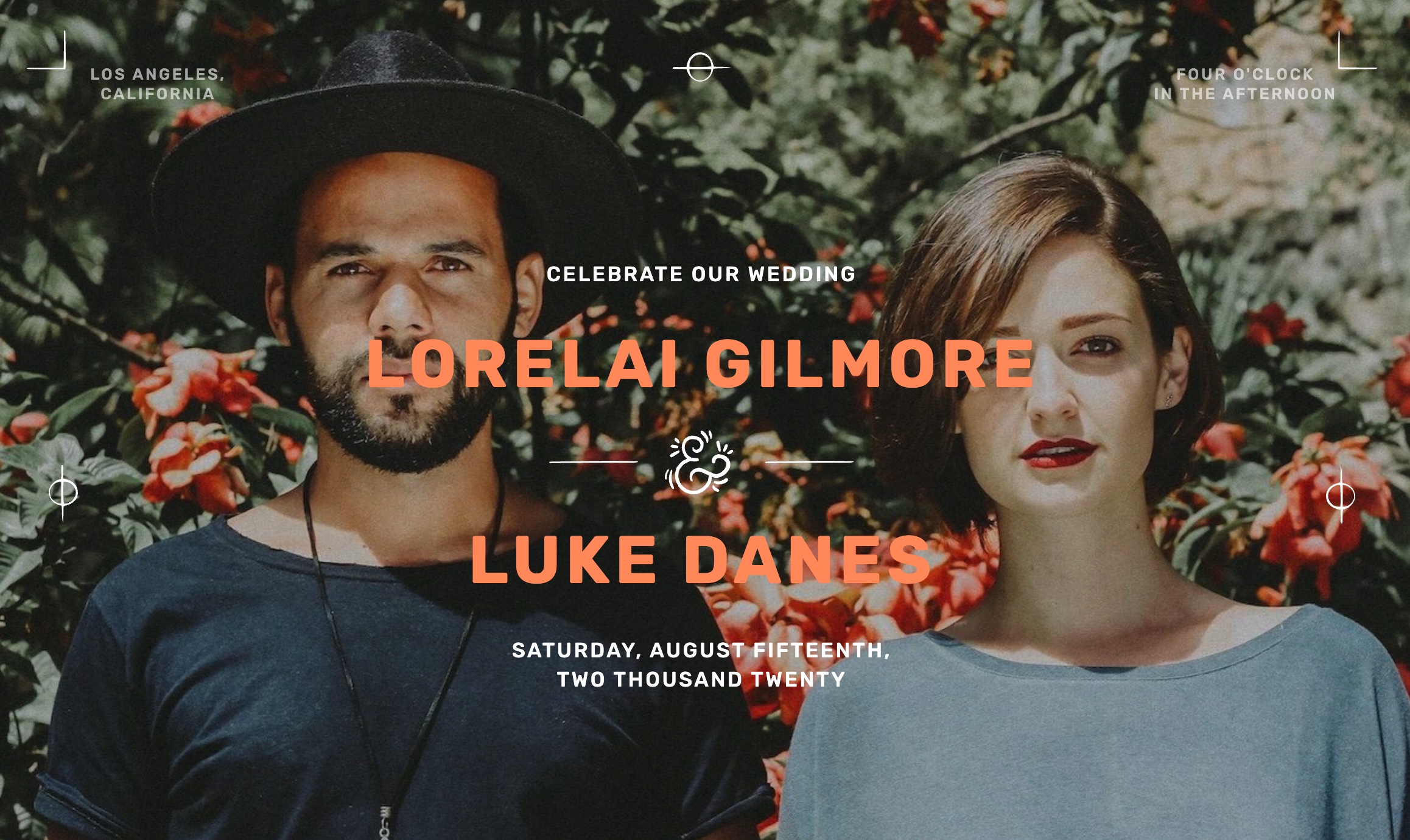
The Lorelai and Luke wedding template greets you with an image that might as well be a plucked straight out of a Wes Anderson film. And with the beautiful orange and white text over it, it looks like a film poster.
When it comes time to build your wedding website, you must ask yourself how much information you want to put on it. You can choose to go the more reserved route, like Mycaela and Chase above, or you can create a more complete picture of your time together. And if you’re choosing to do the latter, you need to be smart about how that extra information is outlined.
Kevin Haag, creator of this template, crafted a full wedding website that provides a detailed breakdown of the festivities schedule, fun additions like a full relationship timeline, and a section for headshots and bios for each member of the wedding party — a great way to give your closest loved ones some site space to shine as well.
You can use this exact template for your own wedding website — to get started check it out on Made in Webflow.
4. Danielle & Bradford (cloneable)
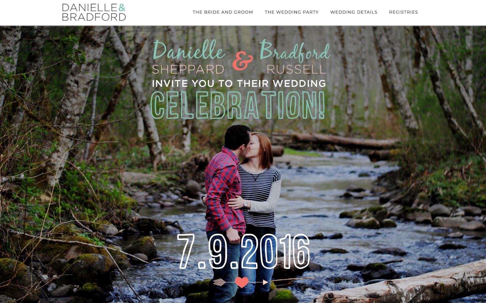
This is a personal favorite. Danielle and Bradford pack in a ton of information while spacing out everything in a way that feels stylish and clean. Not only that, but the website makes clever use of parallax scrolling to let us peek into the couple’s life together, as well as the beautiful backdrop of the wedding.
We love how they organized the page, especially the designated section to highlight the wedding party. We also love that the wedding itinerary is helpfully laid out right above the link for hotel accommodations, with a brief section on the history of Waterloo Village that adds a bit of local charm to the proceedings.
Even better, Danielle and Bradford have made their wedding website free to clone — so you can use it for your own ceremony and festivities.
5. Jessica and Robin

If you want to really leave a lasting impression, you could go with something like Jessica et Robin — a stunning wedding website created by French Webflow designer L Matthew. When you enter, the first thing you see are gorgeous animated flowers that rise up to greet you over a purple background. When you move your cursor over the flowers, you’ll see them part to reveal the couple’s name.
Once on the homepage, the menu folds out to display the different sections you can access, making this website not only visually stunning but very user-friendly and easy to navigate.
There’s a strong emphasis here to make the information accessible and easy to read. The instructions around the wedding venue and directions, linking to Google maps and providing additional directions for context, make it a tremendously useful resource for out-of-towners. If you have folks flying in from other places, this might be a thing to consider when you’re building your own wedding site.
6. Nick & Allison

This is a great example of a couple using their wedding website design to reflect their personalities and interests. Nick and Allison take an interesting approach to their wedding website, modeling it after a website for a camping expedition.
Scroll through the main page and you’ll see large, bold buttons that take guests to each section, with the “Location & Lodging” banner showing a beautiful animation of a campsite. There’s a useful “Packing List” section, which directs to a page with the weather for the wedding date and the dress code for each wedding-related event.
This couple loves the outdoors, and their wedding website perfectly reflects that. Our favorite part is that the link to the “Our Story” section doubles as a slideshow of their various hikes and outdoor adventures together, further adding to the website’s personal feel.
7. Alex & Yvette
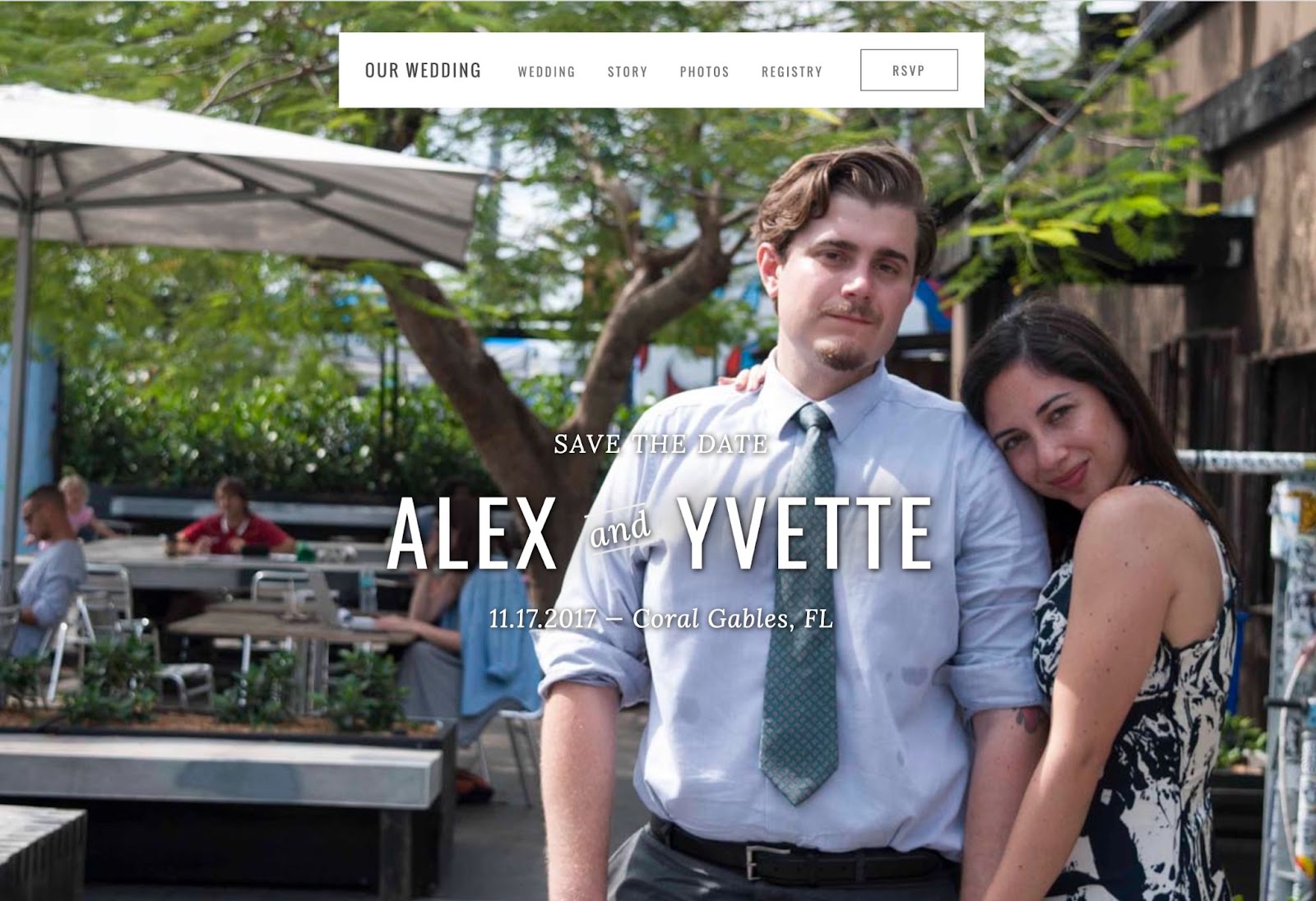
Alex & Yvette emphasize the visual elements on their website, and rely largely on photographs. The first thing you see upon entering the site is a lovely full-frame portrait of the couple. Scroll down and you’ll find that each section is accompanied by brightly colored photos, giving this wedding website the feel of a photo album.
The website includes a countdown to the actual wedding ceremony, providing a sense of excitement and anticipation for their big day. They also included an “Our Story” section, which features a bio for the bride and the groom, along with the story of how they fell in love and a recap of their engagement. Below that, there’s a simple and beautiful photo gallery section featuring the couple’s engagement photos.
This design is low-key, straightforward, and fun. It focuses on functionality and delivers the wedding details while still reflecting the couple’s personality and style.
8. Petra & Venca
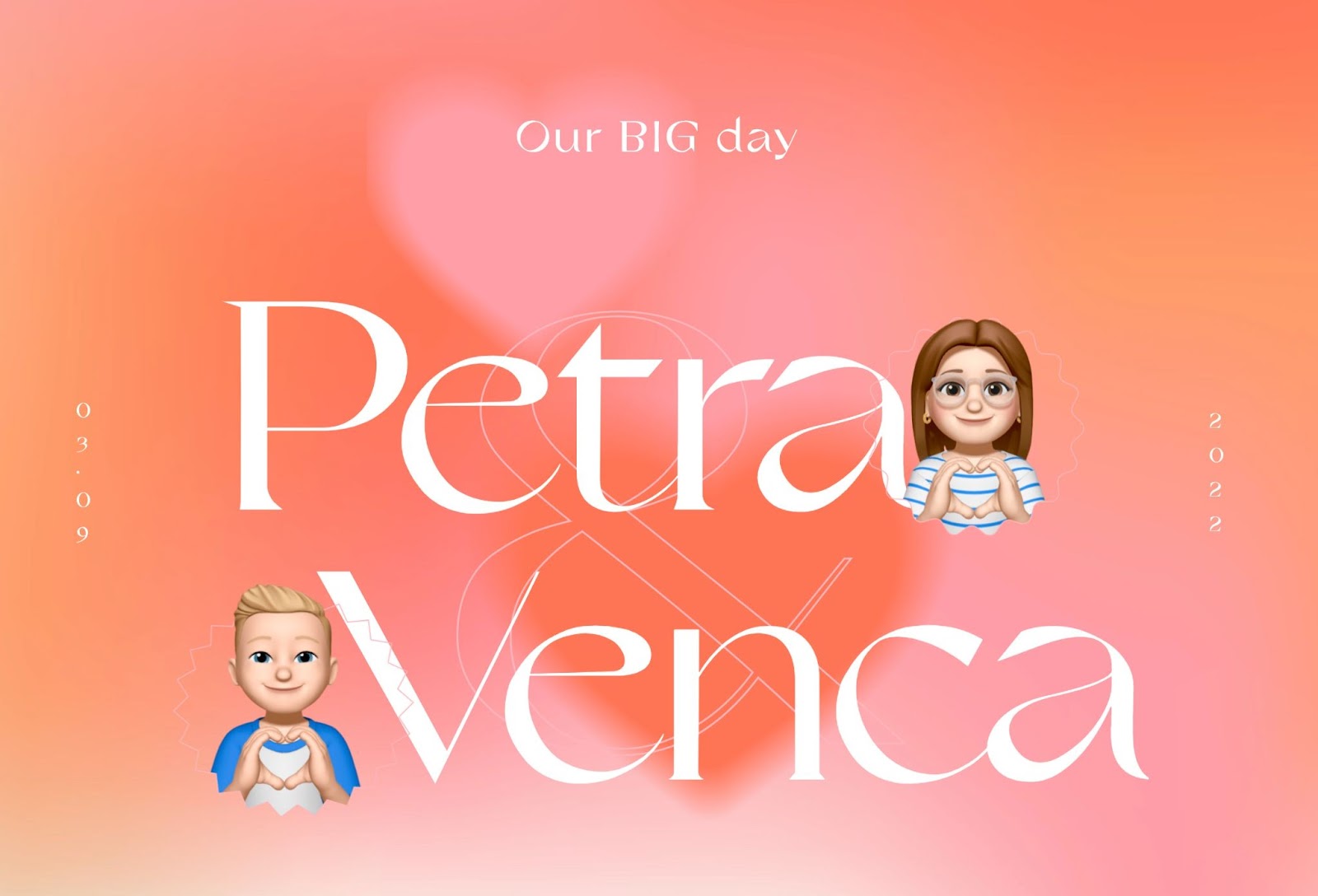
The first thing you see when you open Petra and Venca’s wedding website is a charming header with the couple illustrated as their Apple Memojis layered atop an animated banner with two beating hearts. The hearts are out of focus — creating the illusion of depth.
As you scroll through the wedding website, the text starts to unfurl before you. Petra and Vecna went with a cheerful, upbeat feel that has a palpable sense of childlike wonder throughout. When you get to the wedding details, lovely illustrations appear on scroll and CTA buttons direct visitors to Google Map for directions to the venue.
We love how they included a Frequently Asked Questions section, where every question a guest might have – from dress code to gifts – is answered.
Start building your own wedding website today
Whether you choose to go with something fancy and elaborate or something simpler and more minimalistic, your wedding website should be a reflection of your personality; personal and unique. To get started, check out these and other sites for inspiration on Made In Webflow.


Discover inspiring design work from the Webflow community
Made in Webflow is the place to browse, clone, and customize the latest websites built by the Webflow community.

.jpeg)