

Designing a web page that pulls off the near-magical feat of combining aesthetic beauty and the punch of your message takes a good mix of art and science. The secret lies in giving yourself a little creative freedom — while sticking to a proven structure.
Sound impossible?
Don’t worry, here’s a quick guide to building a conversion-boosting web page layout for any business website.
A 3 step process to designing a business website layout
Step 1: Think through the user journey first
Doing your research and thinking about the home page structure before you even start sketching ideas is of paramount importance to the design process. As you do your research, make sure you’re focusing relentlessly on your potential customers’ first impression. After all, designing a business website that provides an excellent user experience is next to impossible without knowing the target users’ expectations.
And a website that doesn't pay attention to accessibility, or lacks great user experience, has a much less chance of attracting a decent volume of traffic — after all, UX and SEO go hand-in-hand. There are outliers with careless UX still attracting tons of users — see: Craigslist. But companies with better UX like Uber, Airbnb, and Slack stand a much better chance of reinventing their industries.
There are many ways to research user needs and expectations, but interviews and card sorting are probably the most popular methods. Once you gain a deeper insight into what your target audience expects from a page, you can start working on the information architecture.
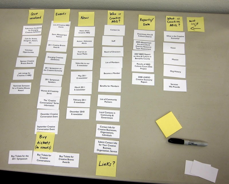
Information architecture (IA) is all about organizing information on the website in a way that’s clear, intuitive, and sensible. Think about your own experience browsing the web: landing on a web page that is poorly planned and doesn’t prove its relevance in a matter of seconds is frustrating and likely makes you hit the close or back button immediately.
Good IA will create a hierarchy that emphasizes the most important elements and keeps visitors engaged. Without a solid “skeleton” to build on, you’ll be setting yourself up for failure.
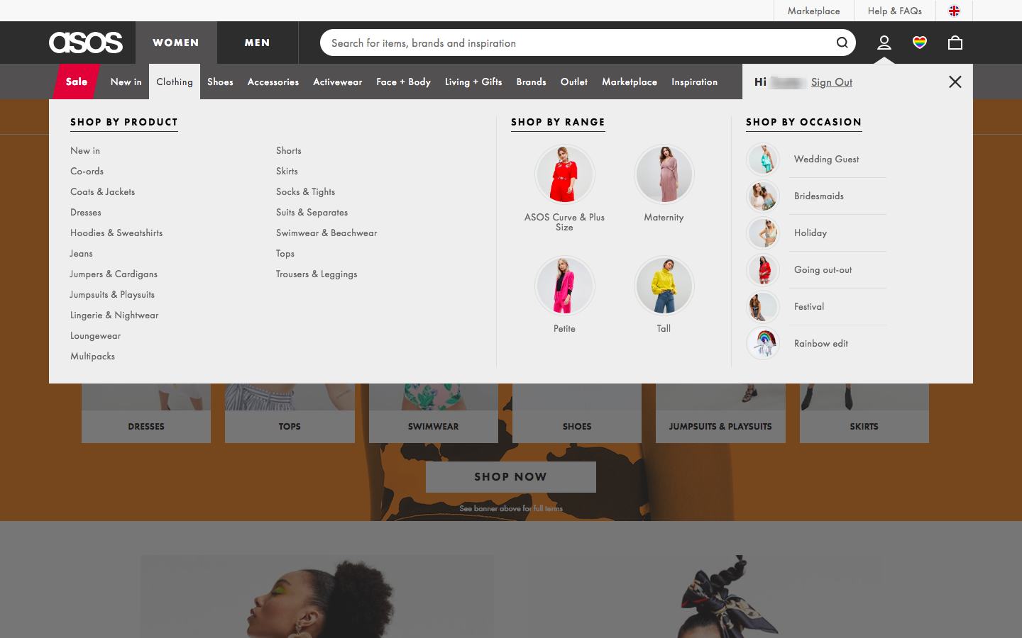
Navigation is one of the key aspects of IA that you should consider early. It doesn’t matter how gorgeous your website is if users can’t find their way around it.
Good navigation has three main characteristics:
- Simplicity
- Clarity
- Consistency

Your goal should be to guide users to the information they’re seeking in the fewest clicks possible. You achieve that with clear, concise, and useful language in your navigation bar and a consistent design throughout your site. Adding a backup feature like breadcrumbs can also greatly boost the usability of your site, helping the visitor understand their location on the site at all times.
Step 2: Get the visual hierarchy right
The best websites get this right. Strong visual hierarchy makes the difference between a website layout design that guides users to the action you want them to take and a site that just looks nice. Humans are incredibly visual beings and when it comes to consuming content online, we often scan the page to quickly discern whether we’ll find what we need before diving in.
As a designer, you can make sure the most important information is seen and draws users in.
Without a clear visual hierarchy, all the content on the page seems equally important, making it overwhelming.
Various design principles help create a strong visual hierarchy.
Use a grid
Grids provide powerful customization for creating connections between different elements on the page and give a sense of order to your layout design. The grid shows how all the elements interact with each other on the page and ensures you have a responsive design that uses a clear structure to accentuate the right information.
Design for natural scanning patterns
There are two main eye-scanning patterns that people use to quickly scan blocks of content:
- The F-shaped pattern
- The Z-shaped pattern
As a designer, you have a lot of control over where website visitors will look when they’re scanning your page, so it’s crucial to set up the right paths for them to follow. We often come across the F-shaped pattern on text-heavy websites like blogs and news sites.
It’s important to note that the Nielsen-Norman group — the people who discovered this reading pattern in 2006 — have recently revisited their research and clarified some of the misconceptions surrounding it: the F-shaped pattern is actually bad for users and businesses and should be avoided.
If users are scanning your website in an F-pattern, it means they’re showing a strong preference to the left side of the page and are missing important content on the right. To prevent F-scanning, you must format the content on your site in a way that directs them to the information you consider most important.
Here are a few ways to guide visitors to reading your most important content:
- Include the most important information in the first two paragraphs
- Use headings and subheadings
- Bold important words or phrases
- Group small amounts of related information visually
- Use bulleted and numbered lists frequently
Strive to do the hard work for your users to minimize distractions and discourage them from taking shortcuts.
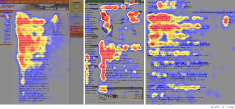
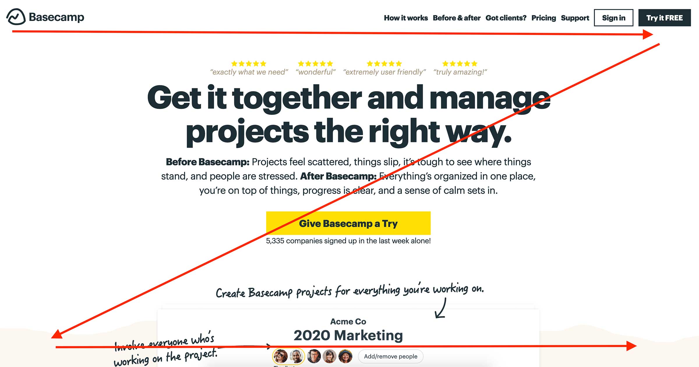
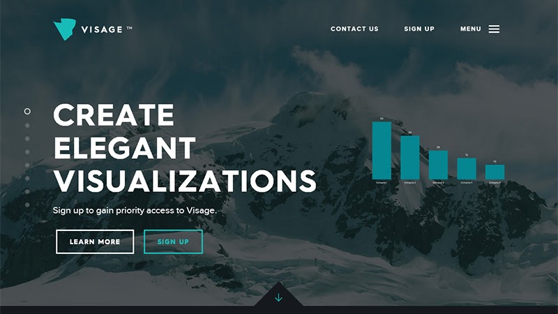
Designing to discourage F-shaped scanning lends itself well to text-heavy websites like blogs and news sites. The Z-shaped pattern is better suited for sites that have minimal copy and a few key elements designed to grab the user’s attention. Landing pages often make use of the Z-shaped pattern to guide users down the conversion path.


Design interactions and animations without code
Build complex interactions and animations without even looking at code.
Visually prioritize key elements
Use the five essential building blocks of design to construct a visual hierarchy with HTML and CSS that’s clear at a glance:
1. Size
It’s important to correlate size with importance in any design — the most important information should be the biggest on the page and demand the most attention.
2. Color
Remember that a color scheme can function as an organizational tool as well as a branding/personality tool in a design.

3. Layout
Good formatting encourages visitors to engage with the content throughout the page and find the most important information faster.
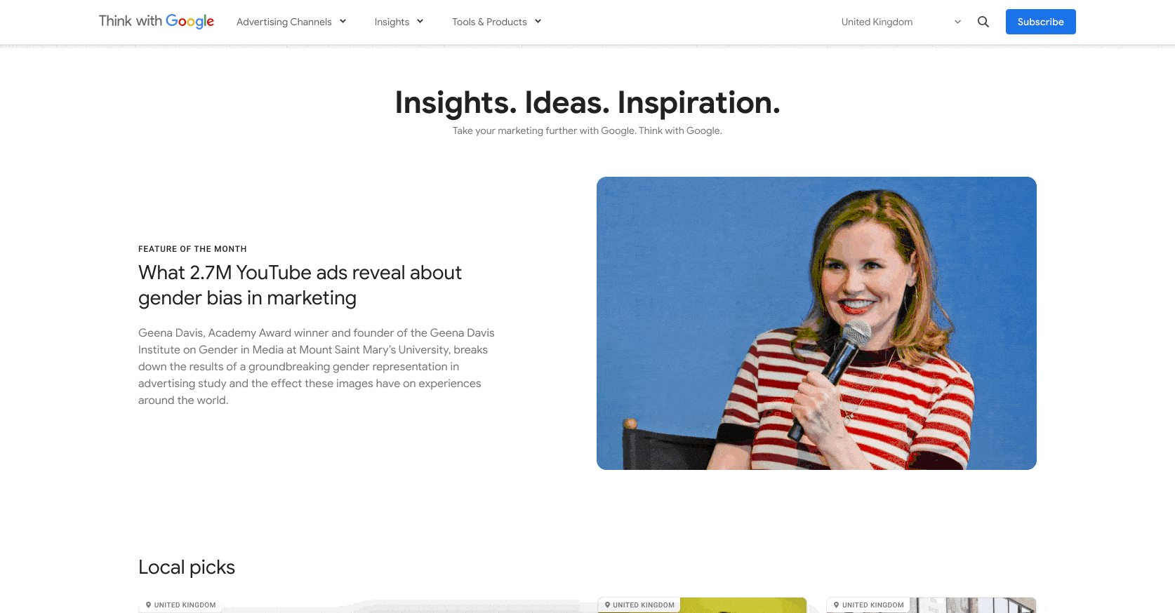
This quarterly publication by Google uses card-based design to organize the content on the page and encourage their main goal: subscriptions. Source: Think with Google.
4. Spacing
White space, or negative space, is a design tool designers use to draw attention to the most important UI elements
5. Style.
Picking a style that matches and highlights your brand will help you communicate your message more effectively.
Apply the rule of thirds
This principle requires you to divide your design into thirds (three rows and three column layout) to see where the lines intersect and figure out where the design’s focal points are. It’s an effective technique to kick off your website’s composition and choose the positioning and framing of design elements. Using a grid is the easiest way to apply this technique to any design.
Step 3: Focus on your call-to-action buttons
No website is complete without call-to-action buttons (CTAs). In fact, marketers would say they’re the most important element on the page and all efforts should be focused on getting people to click through. Strategic use of well-designed CTAs can greatly improve the flow of the page and guide the user toward conversion, so it’s critical to get this right.
Here’s what you need to keep in mind when designing your buttons.
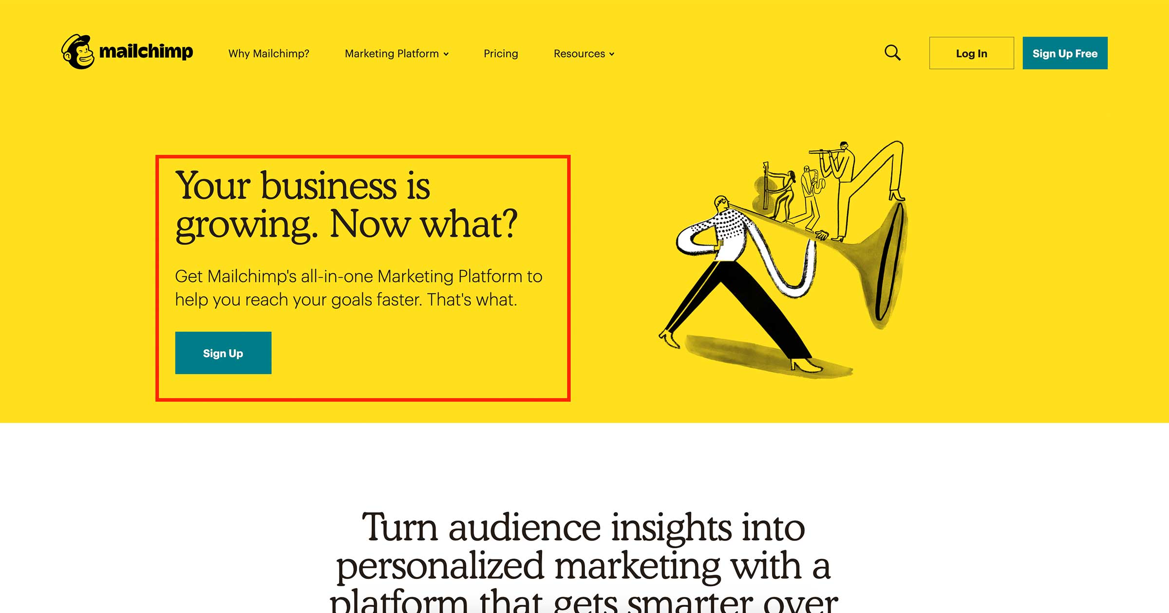
Ensure your buttons look clickable
This may sound obvious, but you’d be surprised how often web designers ditch functionality and clarity in favor of creativity or some whacky new JavaScript trend (yes, I’m talking about you, ghost button). To make sure users understand an element is a button, use the standard visual cues to help them determine clickability, such as shape, shadows, and highlights.

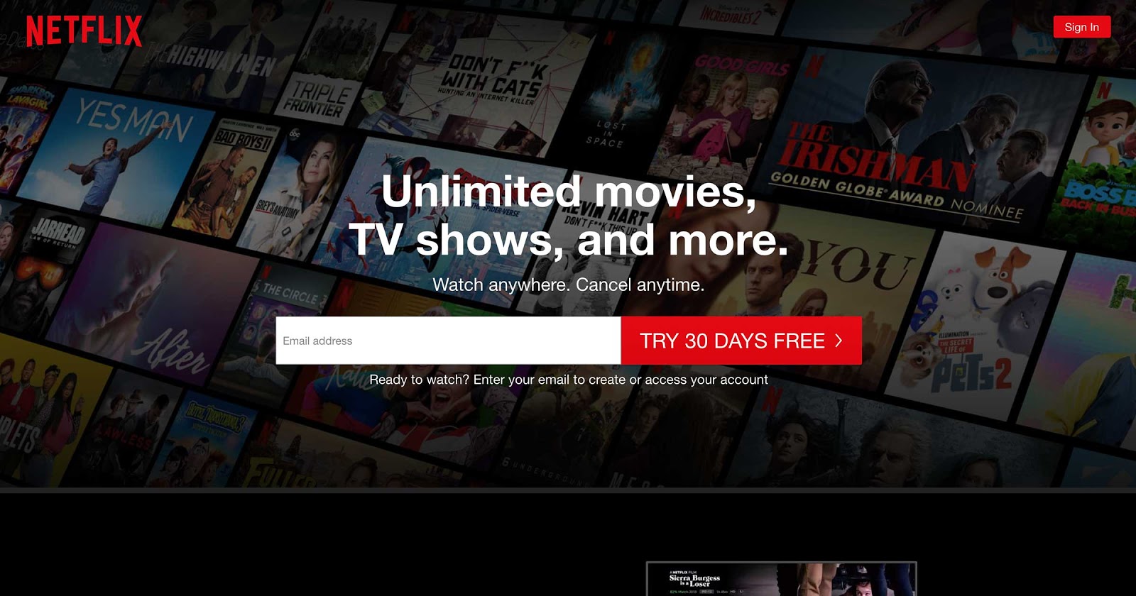
Clearly label all buttons
Buttons are there to tell users what they should do next. If the copy is vague, people will think rather than act. Be clear with users about what will happen if they click through. Here’s a clever example from Netflix.
Visually highlight the most important CTAs
There are three important aspects to designing a distinct CTA: color, contrast, and location. Use eye-catching color with enough contrast to help primary buttons stand out — and place them in prominent locations where users can’t miss them.
What else would you like to know about layout?
We’re eager to dig deeper than a 101 on this vital topic — so let us know what else you’d like to learn!
Also, don't forget to check out the Webflow template marketplace to find a variety of high-quality beautiful website templates — from ecommerce to portfolio websites.